
Let me tell you something — I once spent an embarrassing amount of time standing in a paint store, holding seventeen different swatches against a single beam of fluorescent light, absolutely convinced that “Accessible Beige” and “Agreeable Gray” were basically the same color. (They are not.
I learned this after painting an entire wall.) Choosing the right wall paint color for your living room feels simple until you’re actually doing it — and then suddenly it’s one of the most stressful decisions you’ve ever made. But honestly? It doesn’t have to be.
For years, I’ve been obsessed with the colors of paint for the inside of my house. I’ve tried different colors in my own home, helped friends choose colors, and spent way too much time on Pinterest at midnight. I’ve made mistakes, I’ve won, and I’ve formed some very strong opinions.
This article lists 40 of the most beautiful wall paint colors for living rooms, covering all styles and types of rooms. Let’s get into it, whether you want something bold, something safe, or something that will surprise you with how smart it is.
Why Your Living Room Paint Color Is a Bigger Deal Than You Think
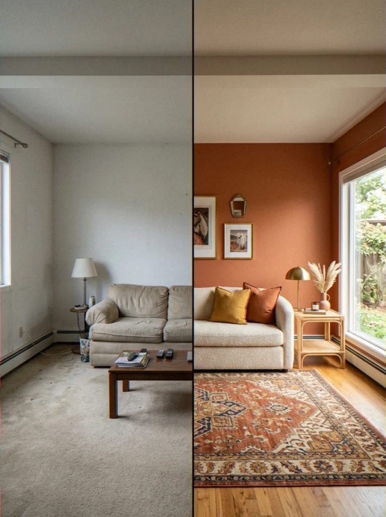
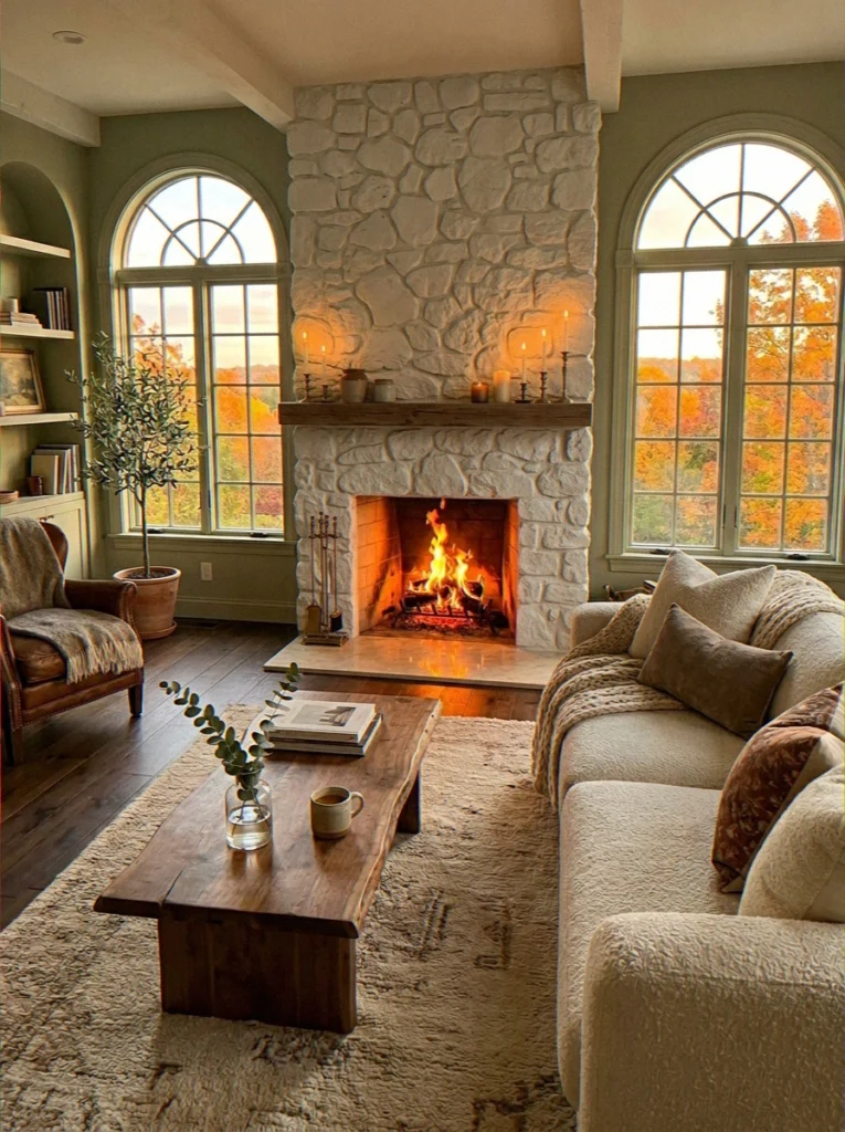
Paint is the cheapest, most high-impact upgrade you can make to a living room. Full stop. A well-chosen wall color can make a cramped space feel open, a boring room feel intentional, and a dull apartment feel like a real home. And the reverse is equally true — a bad color choice can make even beautiful furniture look off.
Color psychology really does change how people feel in a room. Warm colors like terracotta, amber, and deep red draw people in and make them feel close and energized.
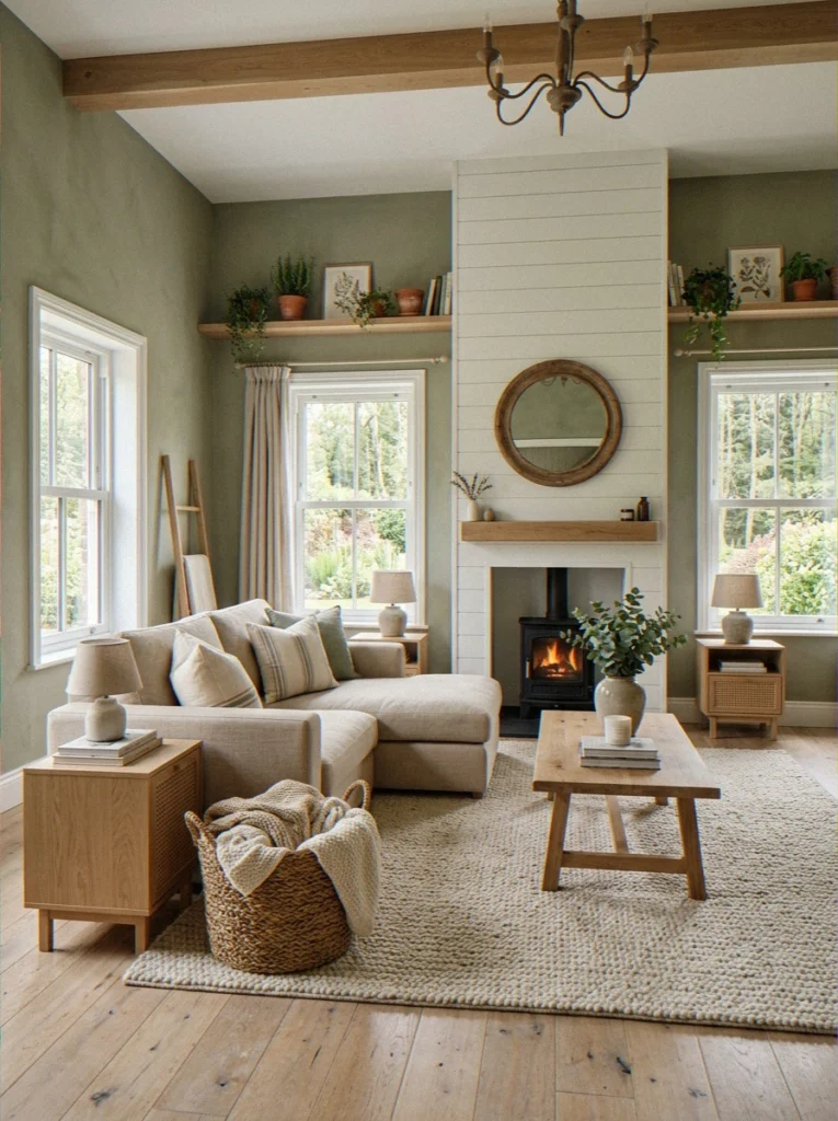
Cool colors like sage green, dusty blue, and slate make the heart beat slower and add a sense of space. Neutrals are the workhorses of interior design because they let you be creative without making a strong mood in any one direction.
Before you pick a color, you need to know how you want your living room to feel.
The color of your paint also affects how light works in the room. Light colors reflect natural light. It gets absorbed by dark colors. A matte finish looks warmer and softer, while a satin finish looks cleaner and brighter.
None of this is hard to understand. It’s just good to know before you make a decision and then find out three months later that your room feels like a cave. You can ask me how I know 😬
Timeless Neutral Paint Colors for Living Rooms
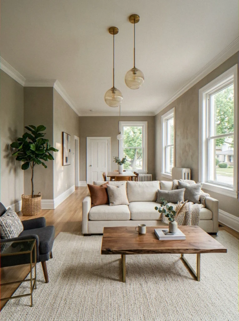
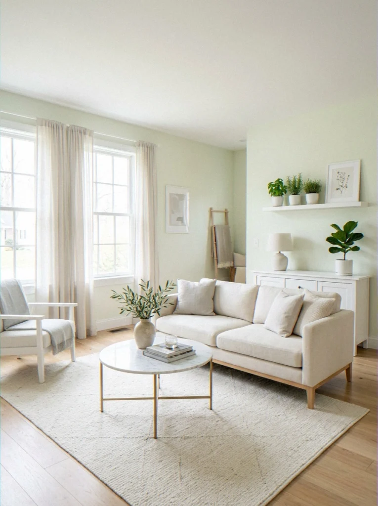
Okay, I know neutrals sound boring — but hear me out. A great neutral isn’t just beige. It’s a color that does all the quiet work while letting your furniture, art, and personality take center stage.
The best neutrals are warm, complex, and honest. And honestly, they’re why so many living rooms look so good for so long.
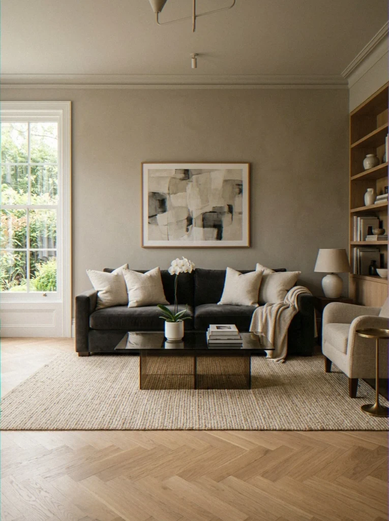
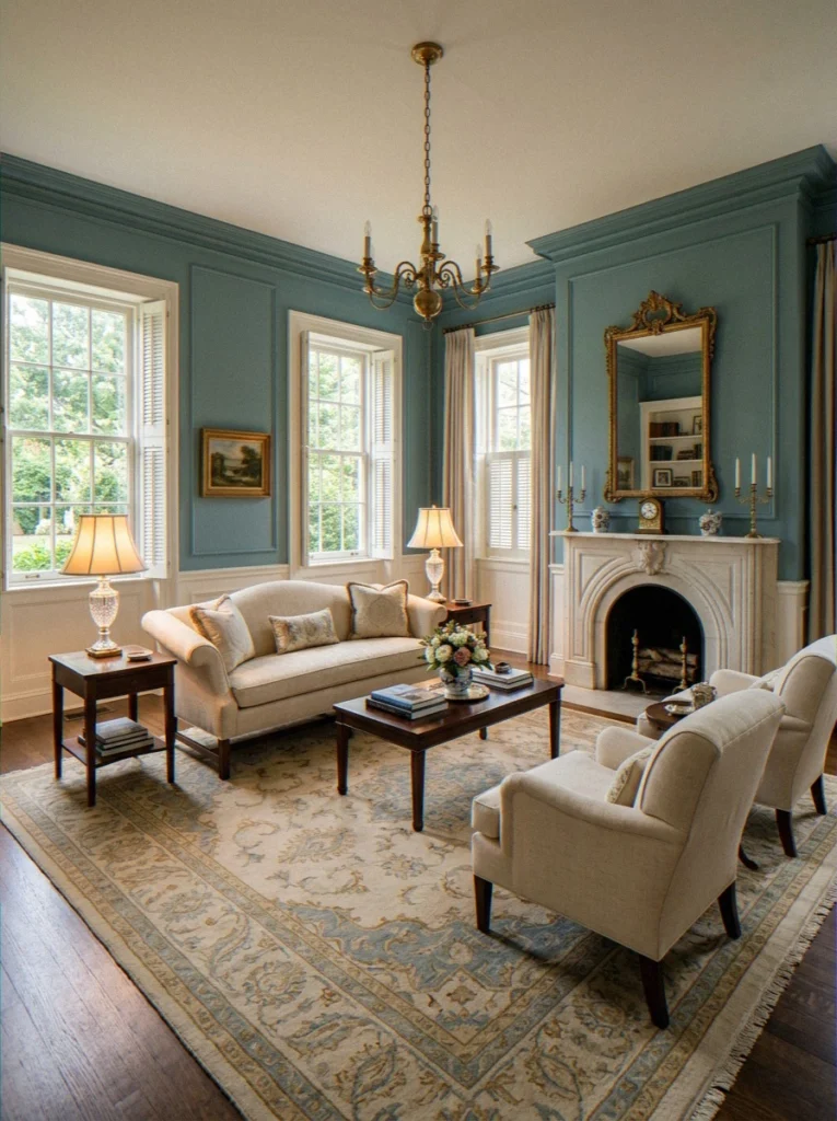
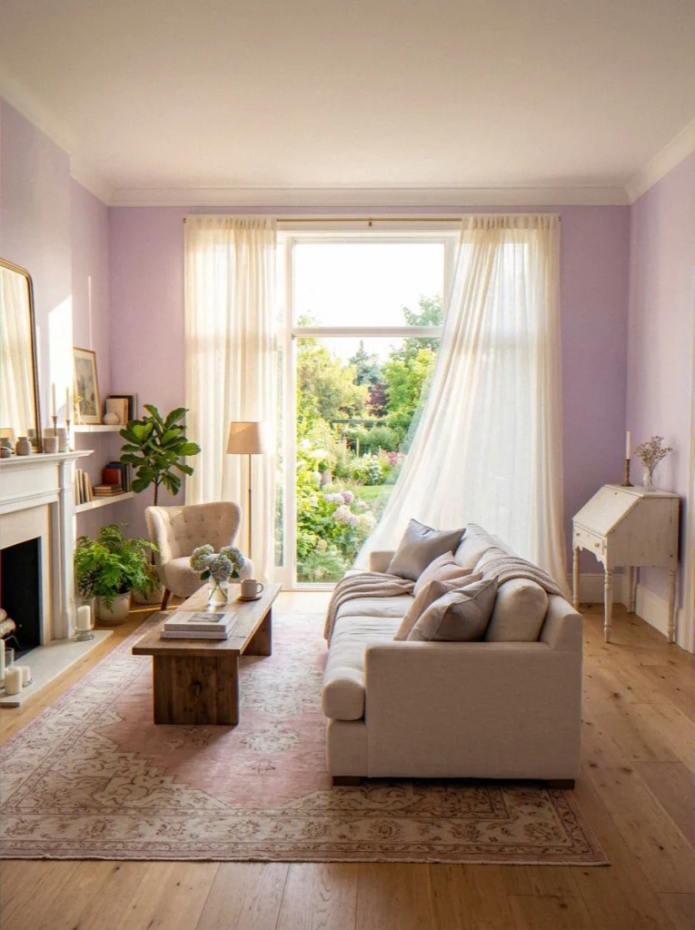
1. Agreeable Gray — Sherwin-Williams SW 7029
This is likely the most popular paint color in North America, and it deserves every bit of that reputation.Agreeable Gray is right in the middle of warm and cool.
It looks like a soft greige (gray meets beige) and changes slightly depending on the time of day and the light source. I painted my own living room this color, and I still like it two years later, which I think says it all.
It pairs beautifully with warm wood tones, white trim, brass fixtures, and practically every sofa color on the planet. This is your “safe but not boring” pick.
- Undertone: Warm, slight violet in certain lights
- Best for: Open-concept spaces, traditional and transitional styles
- Pairs with: White oak floors, charcoal sofas, warm brass accents
2. Chantilly Lace — Benjamin Moore OC-65
Chantilly Lace is the answer if you want white but not sterile. It’s bright and clean, with just a hint of warmth that makes it feel welcoming without being yellow.
This color really shines in a room with good lighting. It works every time, and interior designers use it all the time.
3. White Dove — Benjamin Moore OC-17
A little creamier than Chantilly Lace, White Doveis warm without being golden. It’s especially good in living rooms that don’t get a ton of direct sunlight — it keeps things feeling bright and airy without fighting the light.
I used this in my sister’s north-facing living room and it transformed the whole space. One of those “why didn’t I think of this sooner” moments.
4. Repose Gray — Sherwin-Williams SW 7015
Think of Repose Gray as the cooler, more contemporary cousin of Agreeable Gray. It leans more gray than beige, which makes it a natural fit for modern farmhouse and Scandinavian-leaning living rooms. Clean, calm, and seriously versatile.
| Color Name | Undertone | Light Reflectance | Best Style |
|---|---|---|---|
| Agreeable Gray | Warm greige | LRV 60 | Traditional, Transitional |
| Chantilly Lace | Warm white | LRV 92 | Minimalist, Coastal |
| White Dove | Creamy white | LRV 85 | Classic, Soft Modern |
| Repose Gray | Cool gray | LRV 58 | Contemporary, Farmhouse |
Bold and Dramatic Living Room Paint Colors
Okay, now this is where things get interesting. I don’t judge anyone who doesn’t like bright colors.
These colors are worth thinking about, though, if you want to feel something when you walk into your living room. A dark or bright wall color can completely change a room if done right.
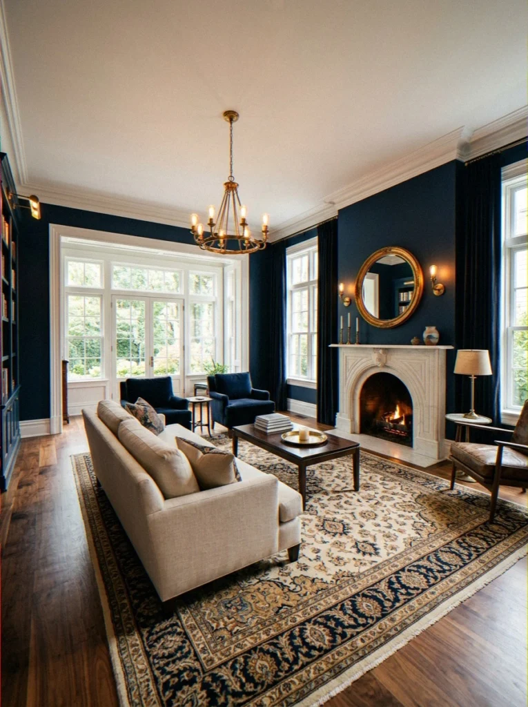
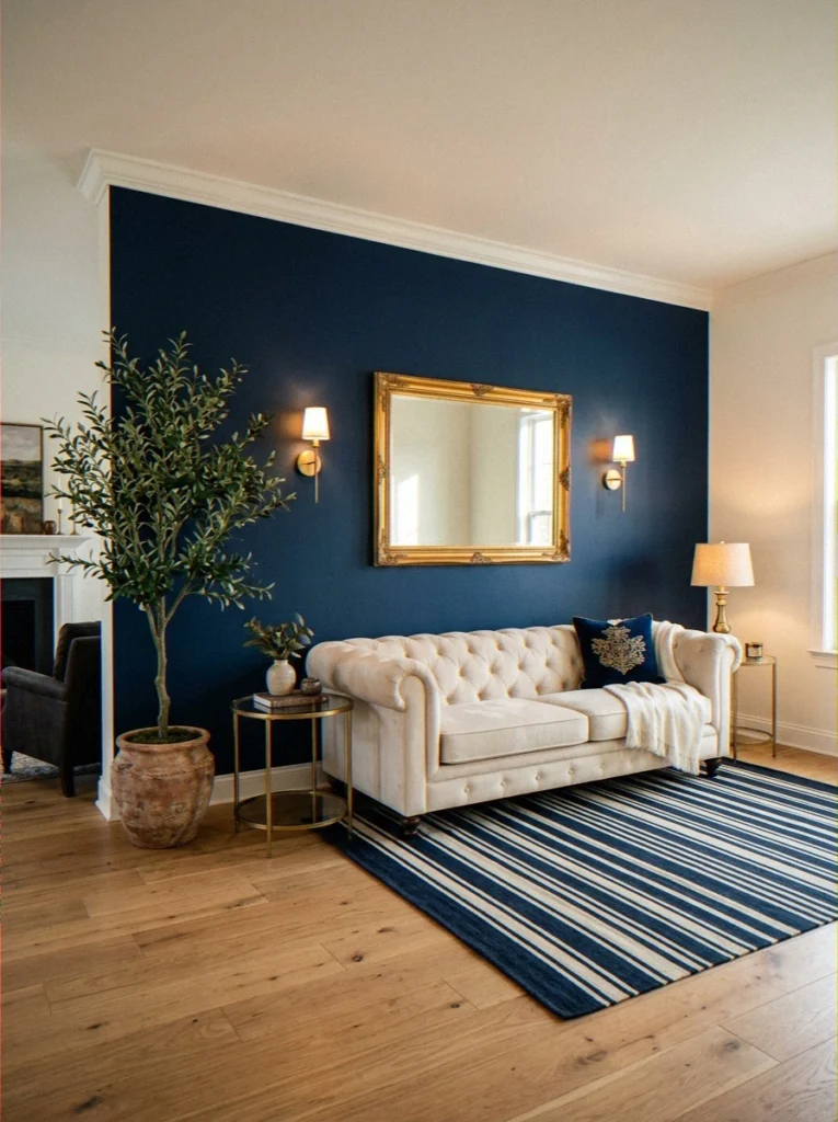
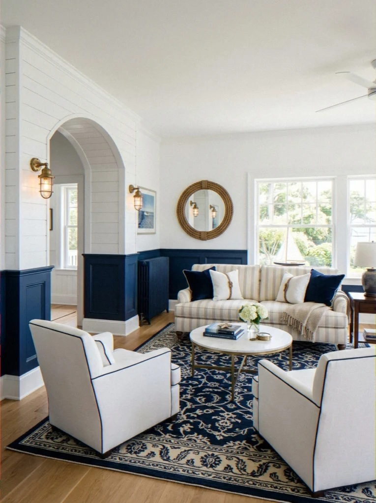
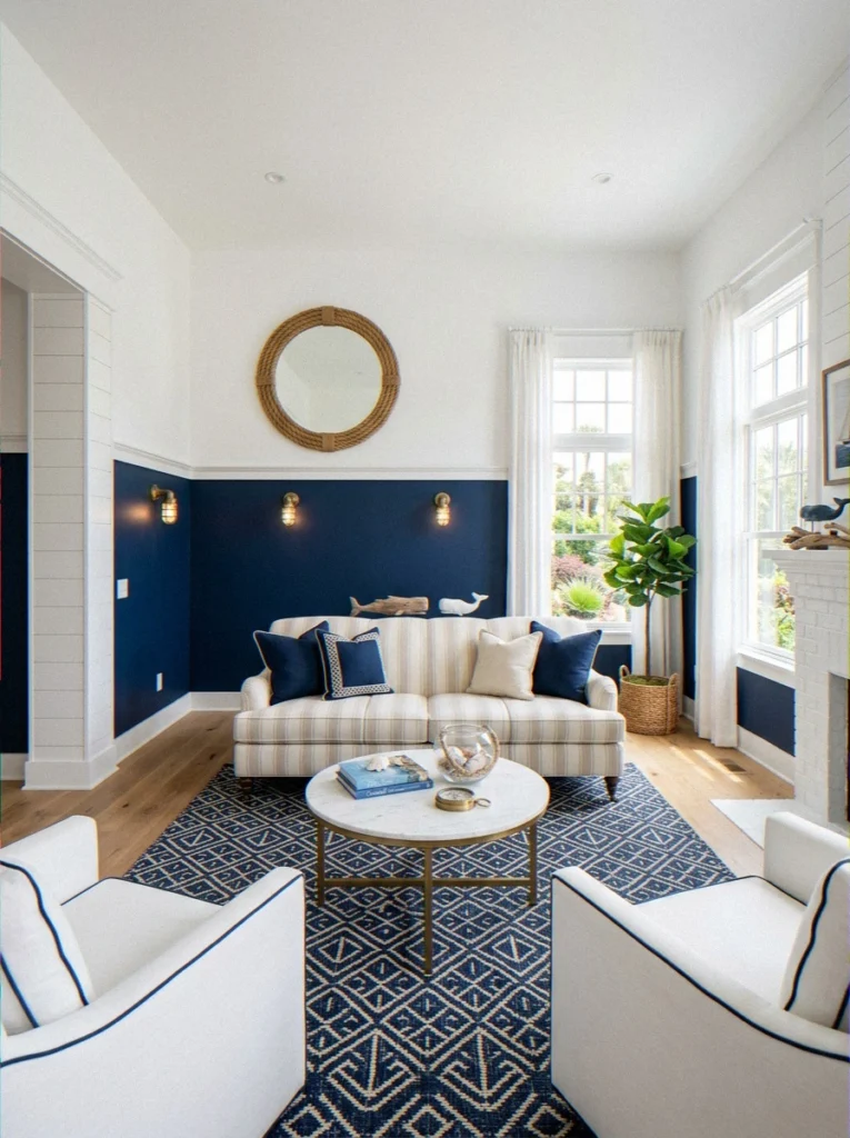
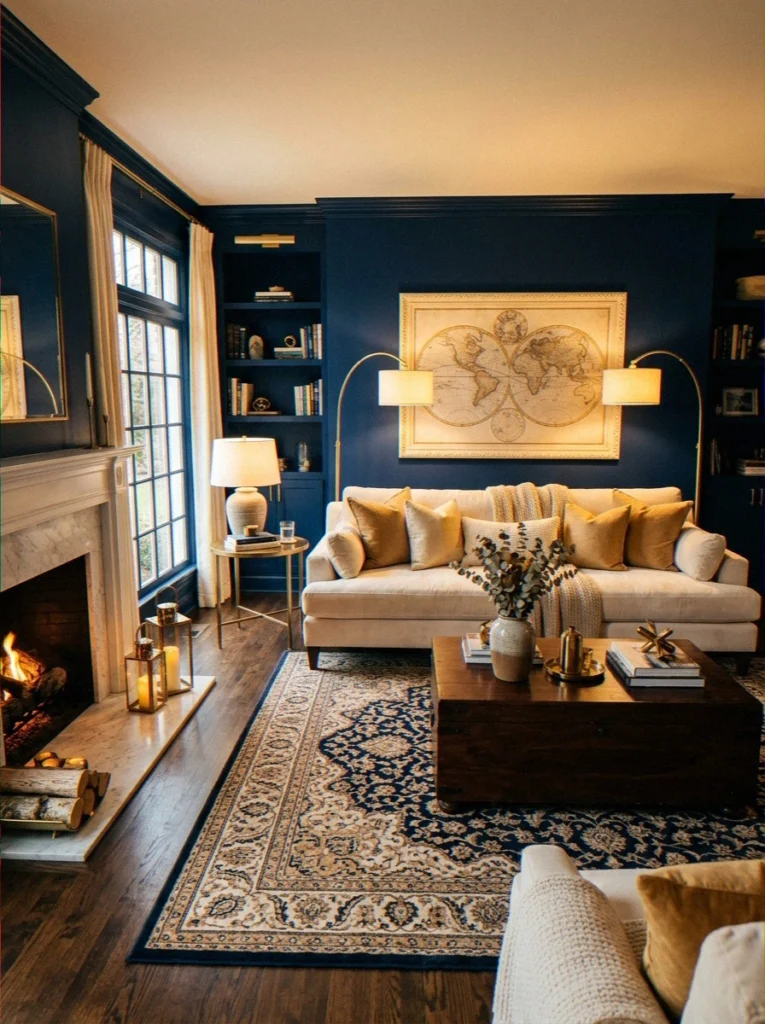
5. Naval — Sherwin-Williams SW 6244
Naval is a dark, rich navy blue that looks amazing when lit right. For a good reason, Sherwin-Williams chose it as their 2018 Color of the Year.
Naval makes a room feel like the study of someone very cool and well-read by using warm lighting, light-colored furniture, and some gold or brass accents.
The trick is contrast. Light trim, light furniture, warm bulbs. Don’t paint the whole room dark and leave it dim — that’s a cave, not a design choice.
- Undertone: Deep blue-black, hint of purple in low light
- Best for: Traditional, maximalist, old-world glamour styles
- Pro tip: Try it on an accent wall first if you’re nervous. Then you’ll want to do the whole room, trust me.
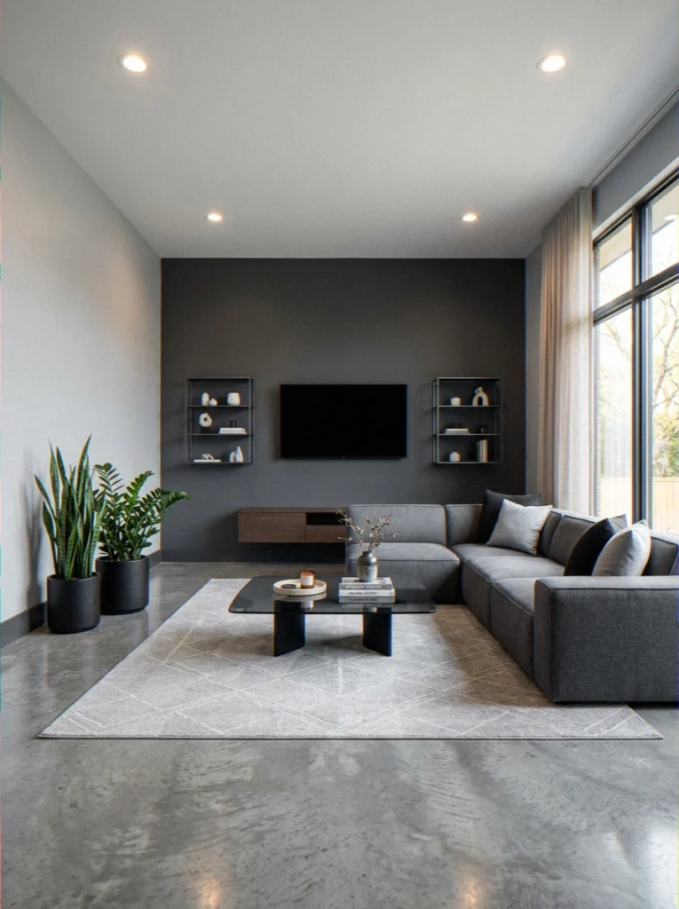
6. Tricorn Black — Sherwin-Williams SW 6258
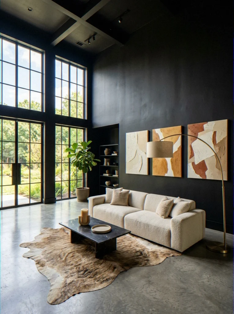
Yep — black walls. I know. But Tricorn Black in a living room with high ceilings and strong natural light is genuinely one of the most jaw-dropping things I’ve seen in a real home.
Everything pops against it like art in a gallery. It’s bold. It’s dramatic. And it’s not actually as scary as it sounds once you see it in person.
7. Soot — Benjamin Moore 2129-20
Soot is a warm charcoal color that isn’t quite black, brown, or gray. It lives in this very complex middle ground that feels very planned. One of my favorite things to do when I want drama without going full black.
8. Newburg Green — Benjamin Moore HC-158
A deep, historic hunter green that feels like it belongs in a New England library or a classic British drawing room.
Newburg Green pairs brilliantly with mahogany furniture, aged brass, and antique accents. If you’re going for old-world richness, this is your color.
9. Radicchio — Benjamin Moore 2082-10
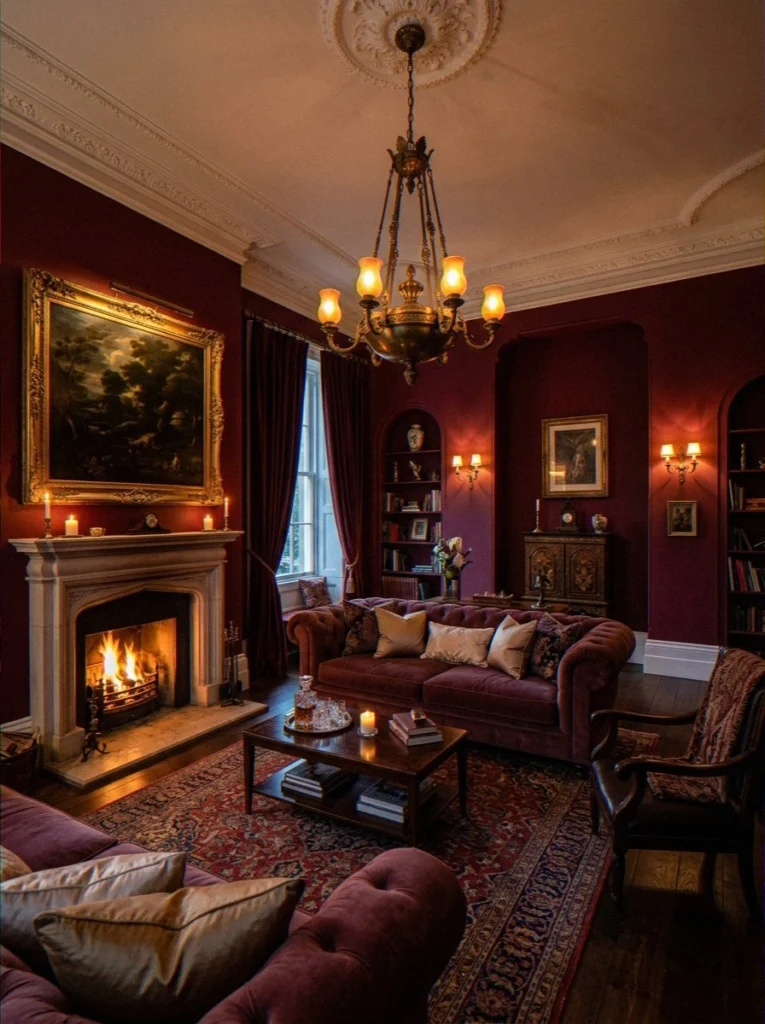
A deep wine red. Completely crazy in the best way possible. People who want their living room to feel rich, a little dramatic, and very impressive should get radicchio.
Put it next to velvet furniture and old art, and you’ll feel like a queen or king every time you sit down.
10. Wrought Iron — Benjamin Moore 2124-10
A near-black with complex blue-green undertones that reads differently depending on the light. Wrought Iron is a favorite in modern and industrial spaces, especially on built-in shelving or an accent wall. Moody and complex in exactly the right way.
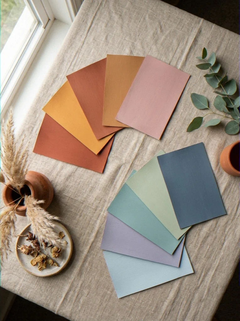
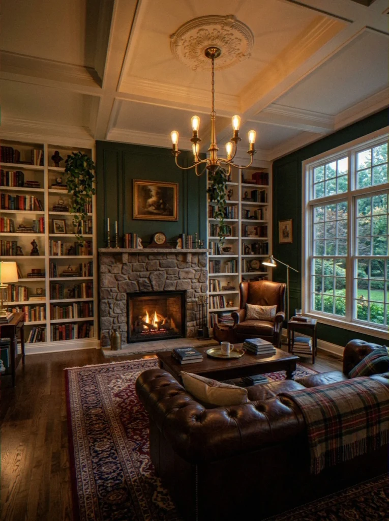
Warm and Earthy Living Room Paint Colors
The earthy color trend has stayed around because it’s really good, both for how it looks and how it makes you feel.
These earthy, natural colors are warm and real in a way that bright or very cool colors can sometimes be. They also look good in a lot of different styles, like mid-century, bohemian, Mediterranean, and cozy cottage.
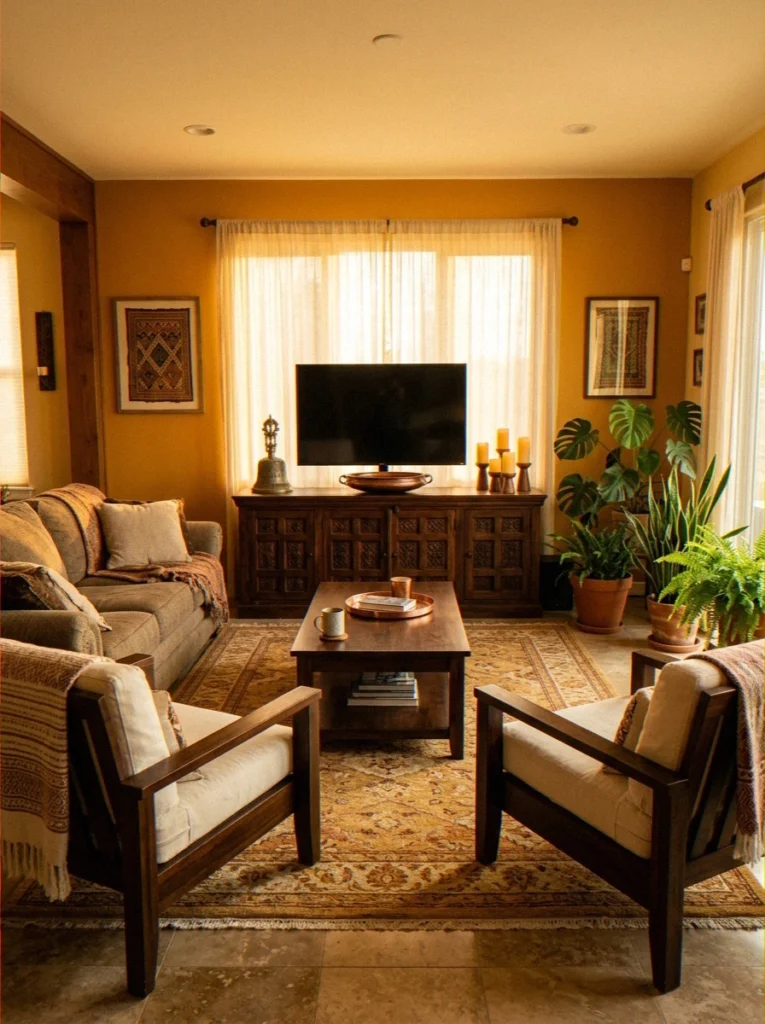
11. Caramel and Honey Tones
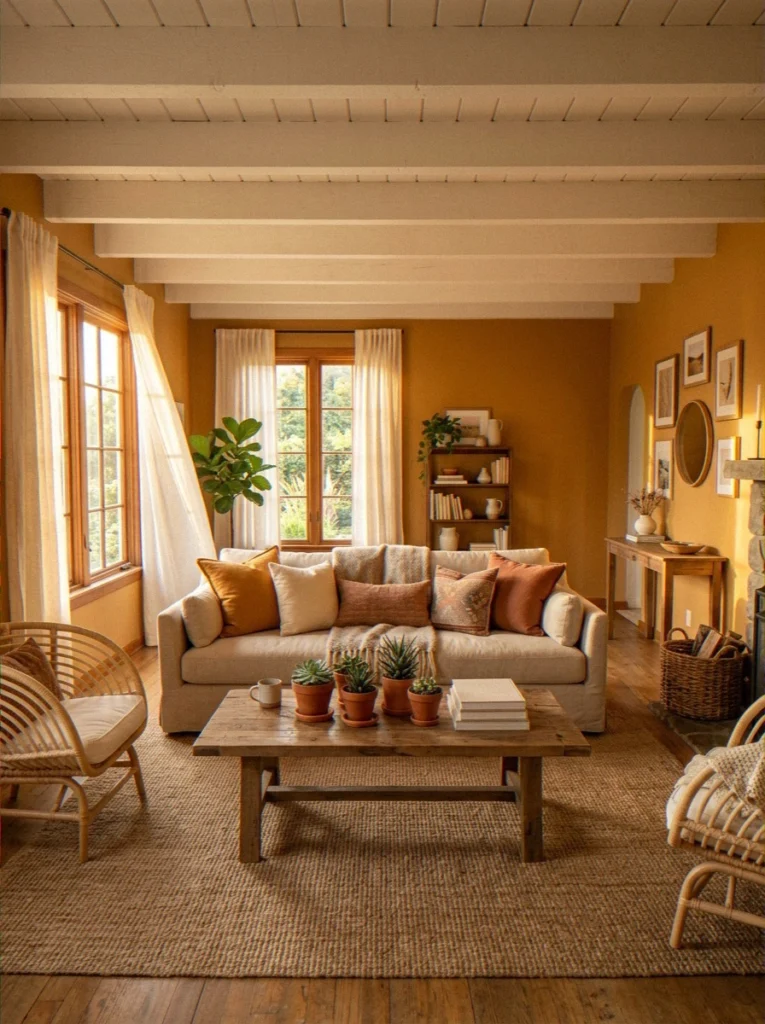
Warm, golden, and unashamedly cozy — caramel and honey wall tones feel like your living room is permanently bathed in afternoon sunlight. FYI: these work especially well with white ceilings, exposed wood beams, and woven textures like rattan or jute.
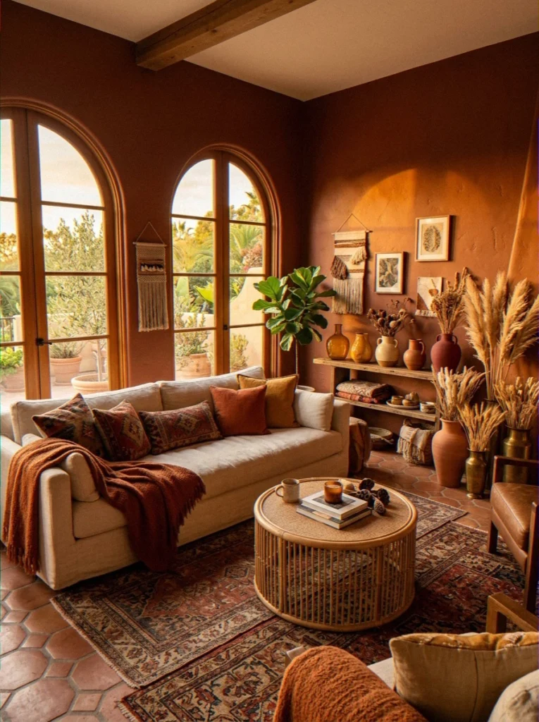
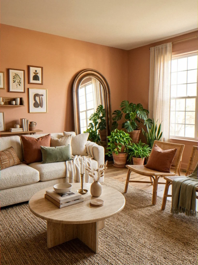
12. Burnt Sienna
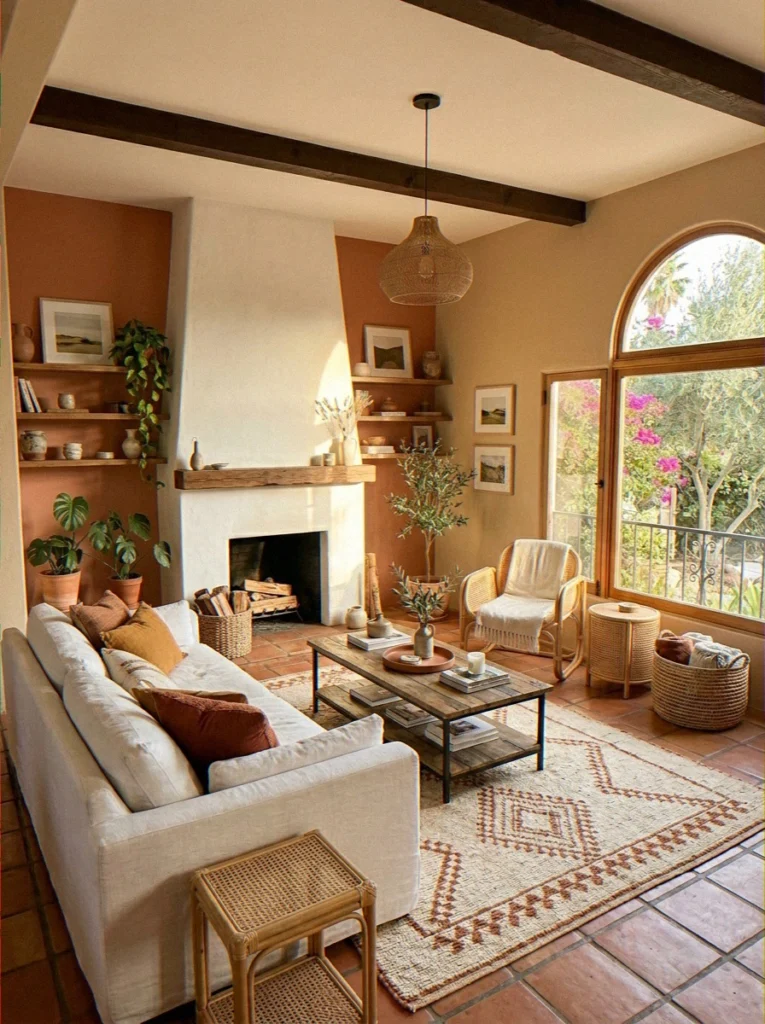
The color of the walls of Tuscan farmhouses and the pots made of sun-baked terracotta. Burnt Sienna is both earthy and bright. It has a richness that feels lived-in and lively.
People walk into a room and say, “Wow, what color is that?” right away. 🎨
13. Pale Oak — Benjamin Moore OC-20
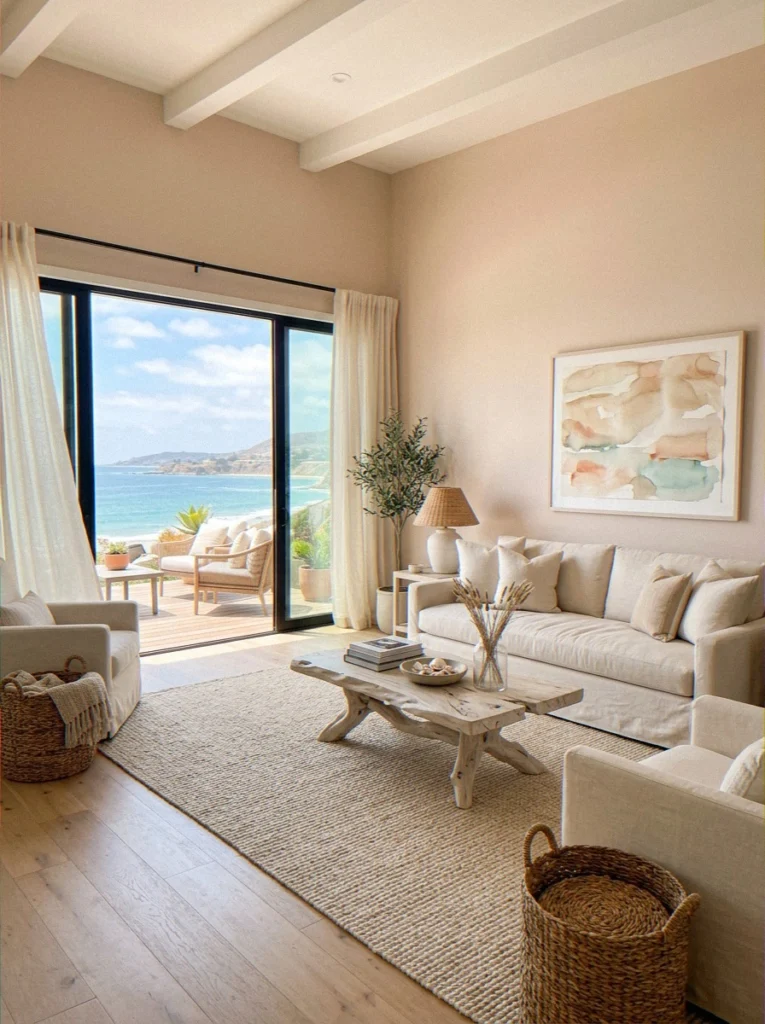
Pale Oak is one of those gentle, warm neutrals that shifts between beige and the palest blush depending on the light.
In a coastal or California casual living room, it feels like sand and sunshine. It’s not loud. It’s just quietly beautiful, and it never seems to go out of style.
14. Roycroft Copper Red — Sherwin-Williams SW 2839
A deep, Arts and Crafts–inspired copper-red that brings history and serious warmth to a living room.
This one looks stunning against natural wood trim and stone fireplace surrounds. It’s not a trendy color — it’s a forever color.
15. Warm Spice and Paprika Tones
Think rich, energetic orange-red that stops just short of being overwhelming. Warm spice tones work brilliantly in living rooms with a global or eclectic aesthetic — pair with cobalt blue accents and woven textiles for a jewel-toned, well-traveled look.
I tried a paprika-adjacent color in my own living room once. It was too intense for my space (not enough light), but in a larger, brighter room? Absolutely killer.
16. Dried Thyme
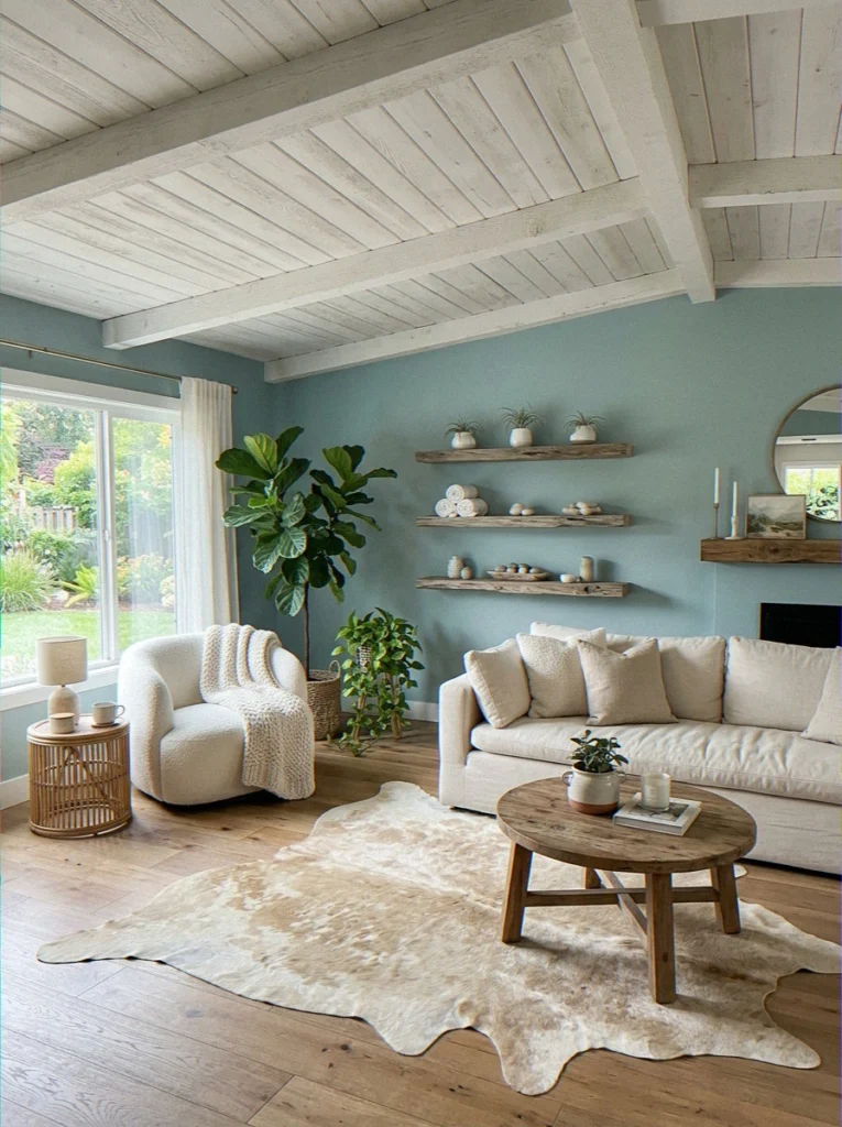
A muted sage green with an olive tone that fits well with earthy colors. It’s not a bright green or a gray-green; it’s a settled, grown-up green that goes well with natural wood, cream, and earthy terracotta accents. Perfect for bohemian and modern organic styles.
17. Toasted Sesame
A warm, golden-brown that reads like the inside of a well-used bakery — in a really good way. Toasted Sesame is a backdrop that makes wooden furniture glow and gallery walls look intentional.
18. Brainstorm Bronze
Muddy, warm, and beautifully complex. Brainstorm Bronze has a grounded, amber-brown character that makes a living room feel deliberate and mature. Not an obvious choice — which is exactly why it works.
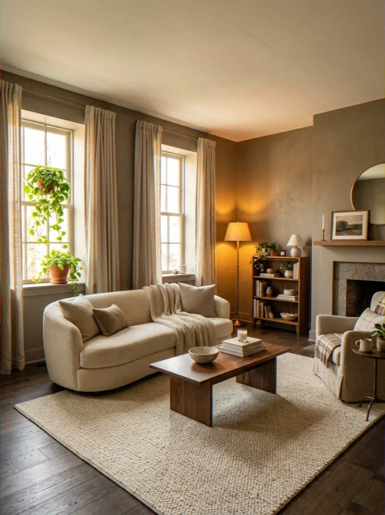
Cool and Calming Living Room Paint Colors
Some living rooms should feel like a long, slow breath out. If your home is your safe place where you can really relax, then cool colors might be just what you need.
These blues, greens, and dusty purples don’t stand out. They make you feel better without saying anything.
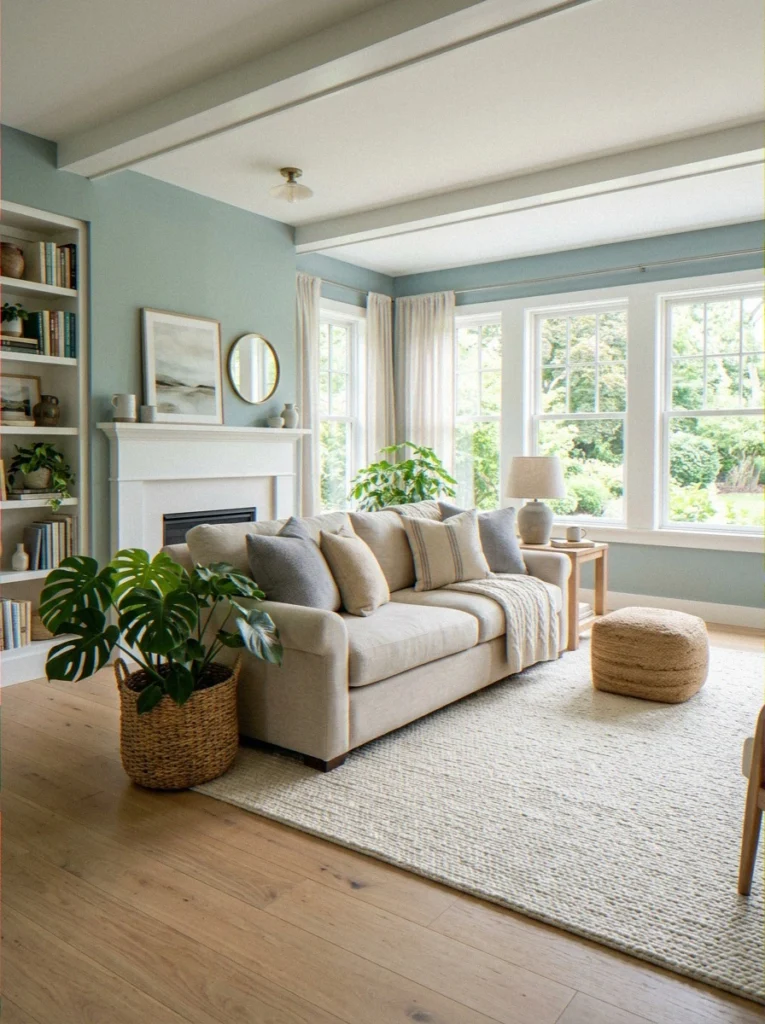
19. Rainwashed — Sherwin-Williams SW 6211
This is, without a doubt, one of my all-time favorite paint colors. I’ve spent way too much time studying paint, so I know what I’m talking about. Rainwashed is a blue-green color that changes throughout the day.
In the morning, it’s green; in the afternoon, it’s blue; and by evening, it’s almost silver-gray. It has a life to it that most colors don’t.
Works beautifully in coastal, farmhouse, and transitional living rooms. Pairs with natural linen, white oak, and woven baskets like they were all designed together.
- Undertone: Blue-green, shifts significantly with light
- LRV: 57
- Best for: Serene, nature-forward living rooms
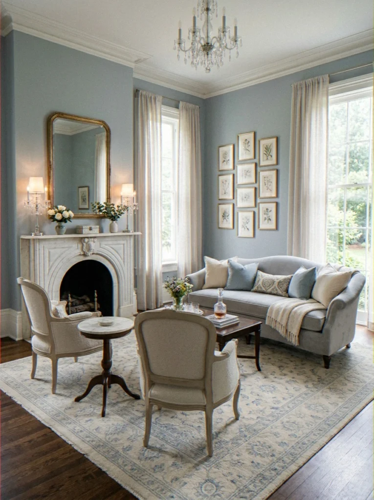
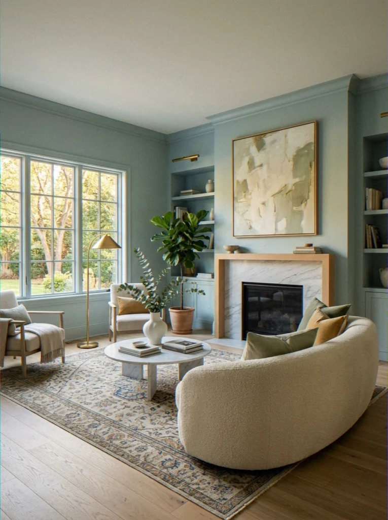
20. Palladian Blue — Benjamin Moore HC-144
A classic, sophisticated blue-green that leans more blue than green. Palladian Blue has been a go-to for interior designers for decades because it’s genuinely timeless. It’s not trendy — it’s just good.
21. Iceberg — Sherwin-Williams SW 6252
A cool, clean icy blue that’s refreshing without being cold. Iceberg is particularly great in north-facing rooms that need help feeling brighter and more alive.
22. Sea Salt — Sherwin-Williams SW 6204
Honestly, this is probably the most talked-about paint color on the internet for good reason.
Sea Salt is a soft, spa-like blue-green that feels genuinely relaxing in a way that’s hard to explain until you’re standing in a room painted with it. Calm, fresh, and a little magical.
| Color | Temp | Vibe | LRV |
|---|---|---|---|
| Rainwashed | Cool-neutral | Complex, shifting | 57 |
| Palladian Blue | Cool | Sophisticated, timeless | 65 |
| Iceberg | Cool | Fresh, light | 67 |
| Sea Salt | Cool-neutral | Spa-like, serene | 63 |
23. Dusty Miller Blue
A silver-blue with gentle lavender undertones — refined, quiet, and unexpectedly beautiful. Great in formal living rooms or spaces that lean traditional.
24. Quietude — Sherwin-Williams SW 6212
Aptly named. Quietude is a muted, dusty teal softened by gray — it’s the color equivalent of background music. Present and pleasant without demanding any attention at all.
25. Celestial Blue
A medium, airy blue — lighter than navy, deeper than sky blue. Celestial Blue gives a living room a bright, optimistic energy that never tips into childish.
26. Vintage Vessel
A warm dusty blue with hints of gray. It feels like old porcelain—quietly beautiful and with a bit of a story. By the way, this color looks great in photos.
Green Living Room Paint Colors: Nature Is Winning
Okay, green has completely taken over home design, and I’m not complaining at all. There is a shade of green that will look good in almost any living room, from dark forest green to light pistachio.
It’s very popular right now because it connects a space to the outside world, which people really need right now. The trend of “bringing the outdoors in” seems to be getting more and more relevant every year.
For broader color trend inspiration, Architectural Digest’s paint trend coverage is genuinely worth bookmarking.
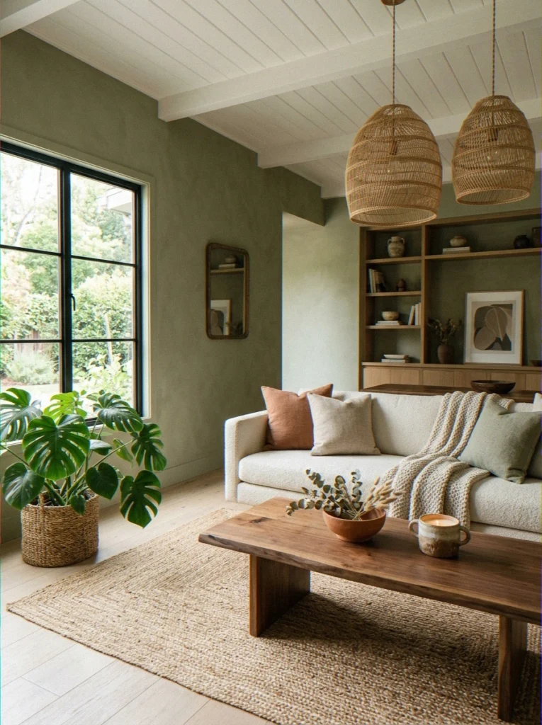
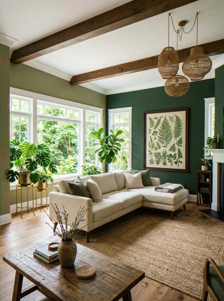
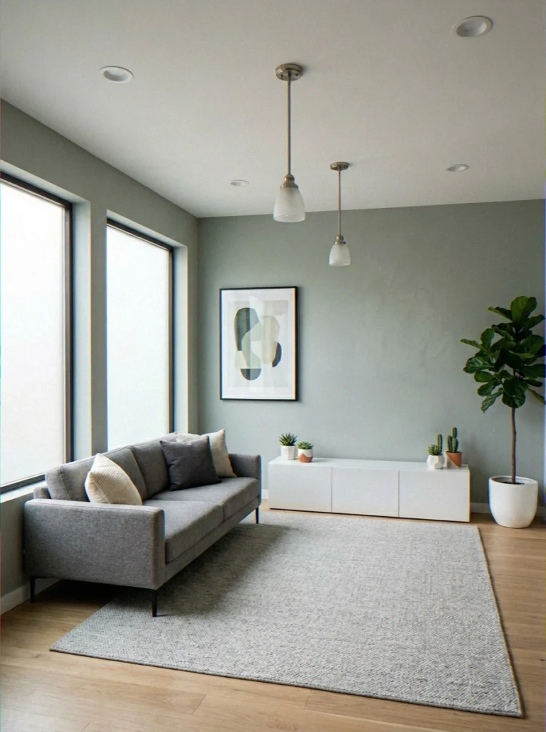
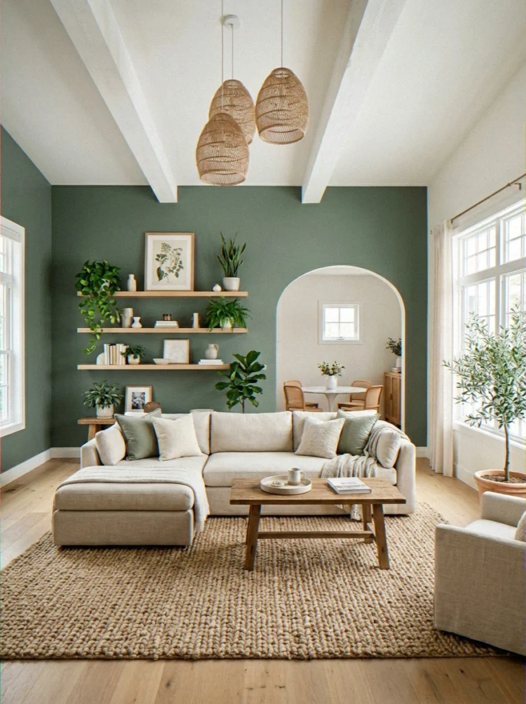
27. Sage Green
The undisputed star of the past few years. Sage Green is muted, organic, and somehow compatible with literally every furniture color and material. Light wood? Works. Dark walnut? Works. White, cream, black metal — all yes. I’ve recommended this color to more people than any other, and I’ve never had anyone come back disappointed.
- Versatile across styles: boho, Scandinavian, transitional, modern farmhouse
- Works in both bright and lower-light rooms
- Ages well — doesn’t feel trendy in a way that dates quickly
- I genuinely tried this in three different rooms. All three look awesome.
28. Clary Sage — Sherwin-Williams SW 6178
A slightly warmer, more complex version of basic sage. Clary Sage has golden undertones that keep it from going cold or clinical — in afternoon light, it looks genuinely stunning.
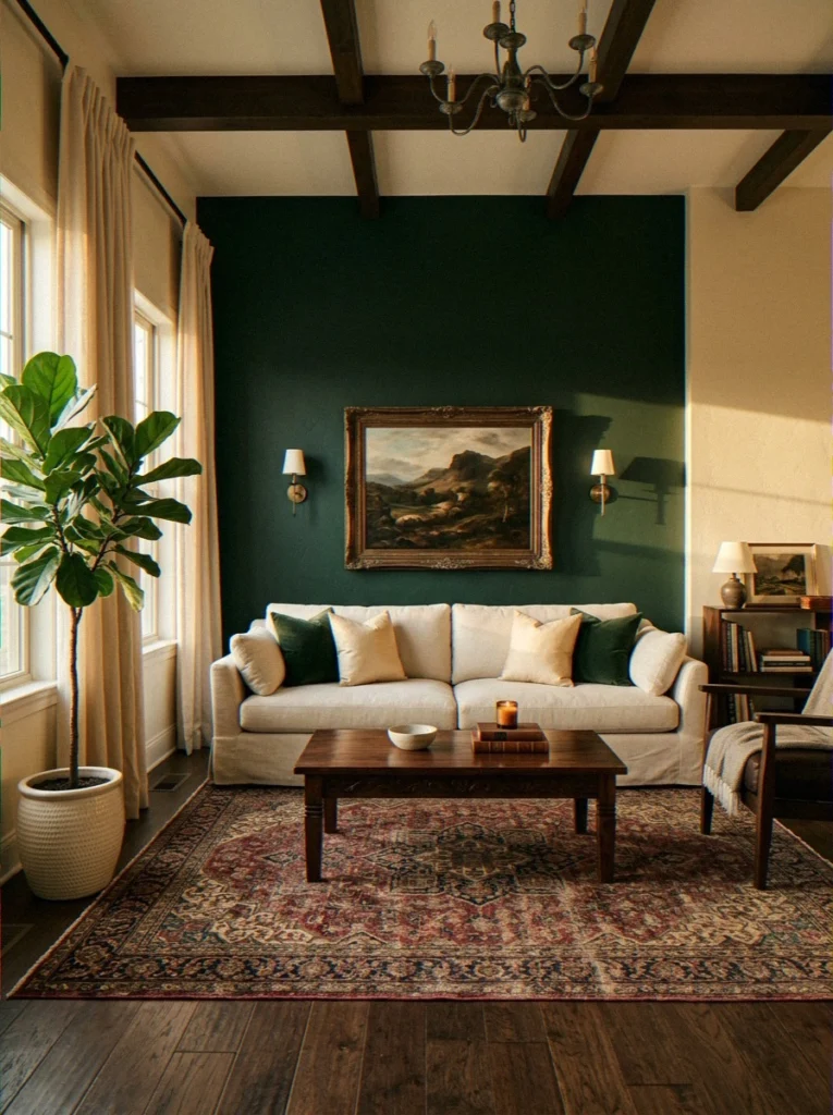
29. Forest Floor
A deep, rich forest green with earthy brown undertones. This color makes a living room feel enveloped — like being inside a woodland, in the best possible way. Pair with warm brass and cream linens for a killer combination.
30. Pale Pistachio
An almost-white soft green — airy, fresh, and subtly cheerful. Great for small living rooms that need to feel bigger without sacrificing all personality.
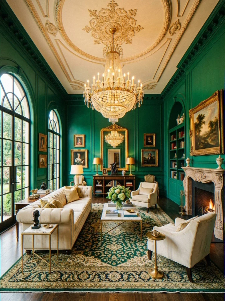
31. Deep Emerald
High ceilings. Good natural light. Deep emerald green. This combination is, without exaggeration, one of the most opulent things you can do to a living room.
Old-world European drama meets contemporary boldness. Not for every space — but when it works, it’s insane. 🌿
32. Backdraft Olive
A deep, bold olive that mixes green and brown to make something that looks like it came from the military. I really didn’t like this one.
I tried it in a small room and it felt too much. But what about a bigger room with high ceilings? A whole different story.
33. Dried Herb
A dusty, muted green that feels ancient and organic — like something out of an old apothecary or a Provençal farmhouse. Pairs beautifully with terracotta, rattan, and warm linen.
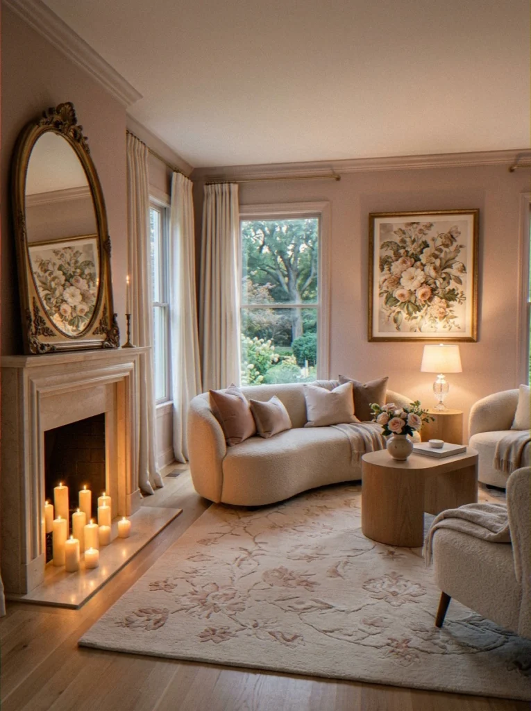
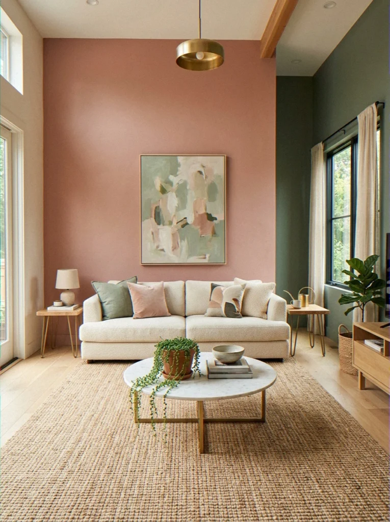
Soft and Romantic Living Room Paint Colors
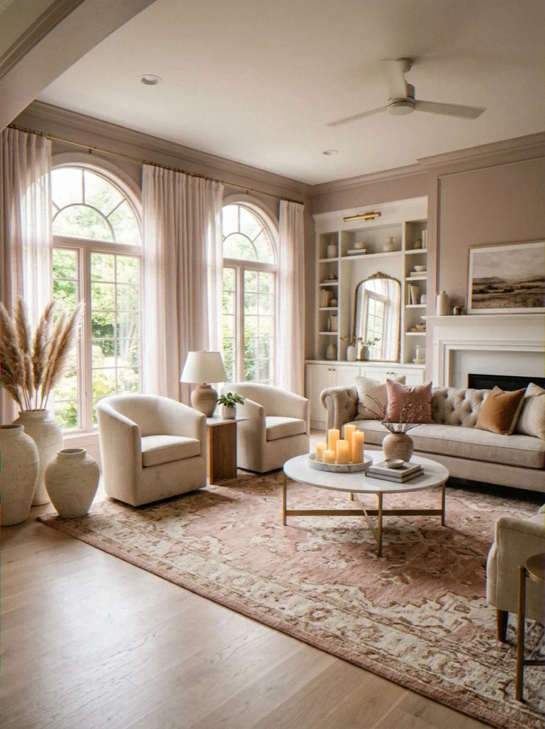
These colors are for the living rooms that feel like retreats — soft, dreamy spaces where you want to curl up with a good book or a better glass of wine. They’re gentle but never boring.
34. Muted Blush
Dusty pink with enough gray to keep it sophisticated and grown-up. Muted blush paired with warm cream, natural wood, and some deep green accents creates a living room that feels genuinely luxurious. It’s not “pink” — it’s complex and beautiful.
35. Lavender Mist
A soft, calm whisper of lavender that isn’t too strong. Works best in reading rooms or living rooms that also serve as creative spaces. Being around it for long periods of time is very calming.
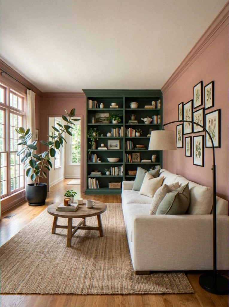
36. Dusty Rose
Deeper than blush and firmly in the romantic category, dusty rose is having a genuine design revival right now. Pair it with deep forest green and matte black for a sophisticated, surprisingly modern contrast.
37. Lilac
This one needs light — a lot of it. In a dim room, lilac falls flat and looks sad. But in a south-facing, sun-drenched living room? It’s genuinely magical. Airy, dreamy, and completely unique.
Asian Paints: Best Wall Paint Colors for Living Rooms
One of the most common searches I see — especially from readers in India — is about Asian Paints wall color combinations for living rooms. And honestly, they make some brilliant options that deserve their own mention.
Asian Paints has a fantastic digital tool called ColourNext that lets you virtually try colors on your own room — worth trying before you commit to anything.
Top Asian Paints Picks for Living Room Walls:
- Autumn Gold (8083) — A warm, amber-tinted gold that brings incredible warmth and energy to living rooms. Especially popular in Indian homes where warm, welcoming tones dominate.
- Misty Memories (8765) — A soft, grey-green that works beautifully in modern Indian apartments. Clean, calm, versatile.
- Winter Sky (8280) — A cool, muted sky blue that makes smaller living rooms feel bigger and more open.
- Sandalwood (8078) — A warm, neutral sandy beige that pairs brilliantly with dark wood furniture — which is huge in traditional Indian living room setups.
- Mystical Green (8769) — A muted sage-meets-teal that’s been trending significantly across Asian Paints’ Indian market collections.
Asian Paints’ Royale range is their premium interior offering — better coverage, richer pigment, and a genuinely superior finish. If you’re painting a main living room wall, it’s worth the extra cost.
| Asian Paints Shade | Tone | Best Paired With | Finish |
|---|---|---|---|
| Autumn Gold 8083 | Warm amber | Wood furniture, earthy accents | Royale |
| Misty Memories 8765 | Cool grey-green | White trim, modern furniture | Royale/Apcolite |
| Sandalwood 8078 | Warm neutral | Dark wood, traditional decor | Apcolite |
| Mystical Green 8769 | Muted teal-sage | Cream, brass, cane furniture | Royale |
Best Two Colour Combinations for Living Room Walls
One of the best things you can do for your living room is to use two colors, like an accent wall, a two-tone split, or trim that is different from the rest of the room.
It gives your space depth, dimension, and character without making you have to redecorate. Here are some combinations that really work:
Classic Two-Tone Combos That Work
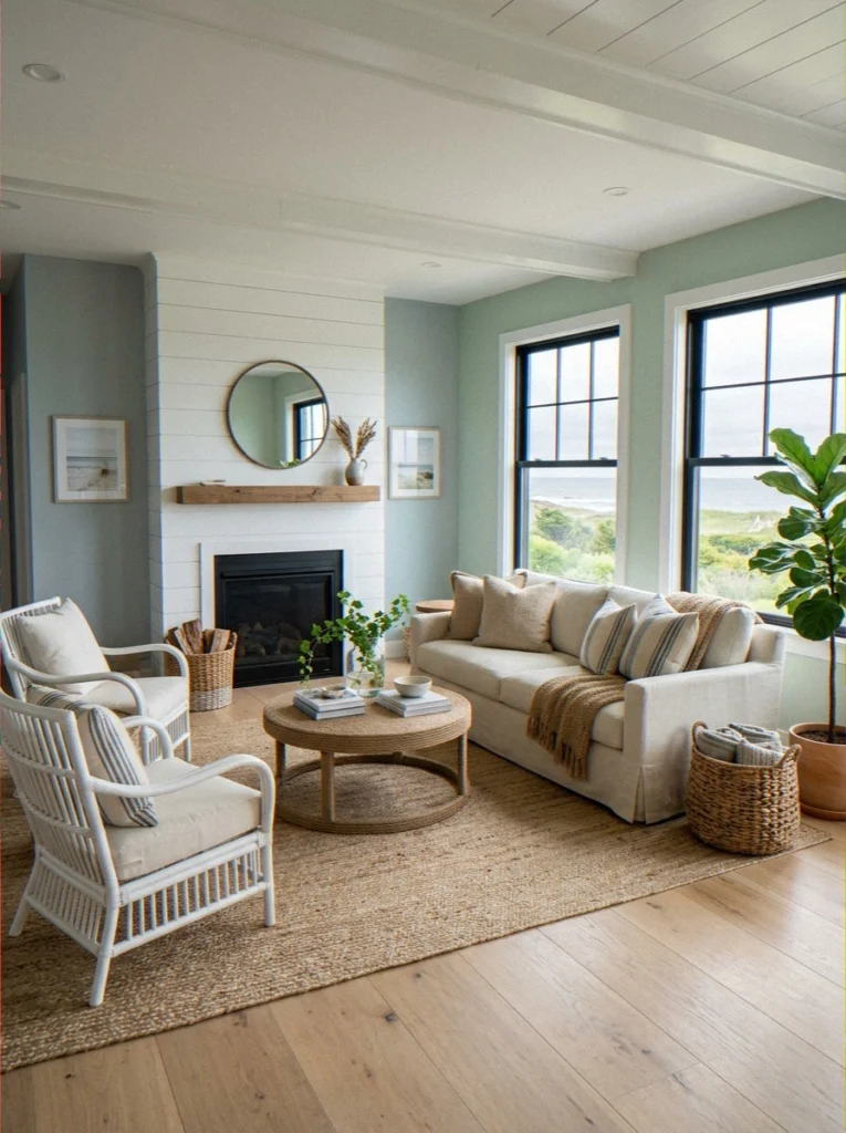
1. Sage Green + Warm White This is the combination I’ve seen most consistently pull a room together. Sage on the main or accent wall, warm white on the remaining walls and ceiling. Calm, natural, and completely cohesive.
2. Navy Blue + Crisp White Bold navy on one wall or as a lower half (with a chair rail), crisp white above and on other walls. Nautical without being cheesy — classic and stunning.
3. Deep Forest Green + Cream Rich, dramatic, and incredibly grounding. The deep green anchors the space while cream keeps it from feeling heavy.
4. Terracotta + Sand/Beige Mediterranean, warm, and endlessly charming. These two earthy tones work together because they share the same warm undertone family — they never clash, they just harmonize.
5. Charcoal + Light Gray A sophisticated two-tone approach where the darker charcoal goes on the accent or fireplace wall, and light gray wraps the rest of the room. Modern, calm, and very grown-up.
6. Dusty Rose + Sage Green This is the unexpected combination that absolutely kills it when done right. Dusty rose on one wall, sage green as an accent — unexpected, but completely harmonious because both colors share a muted, earthy quality.
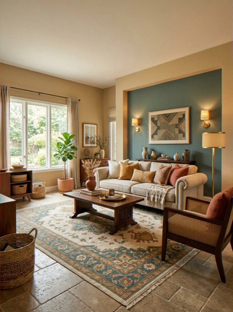
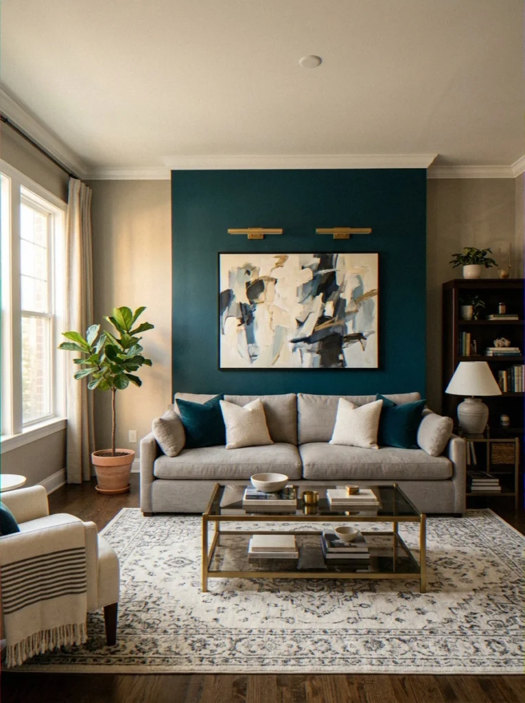
7. Warm Greige + Deep Teal Main walls in your favorite warm neutral, accent wall in a moody, deep teal. Adds drama without committing fully to a dark room.
| Combo | Mood | Best Style |
|---|---|---|
| Sage Green + Warm White | Calm, natural | Farmhouse, Scandi |
| Navy + Crisp White | Bold, classic | Coastal, Traditional |
| Terracotta + Sand | Warm, earthy | Mediterranean, Boho |
| Charcoal + Light Gray | Modern, calm | Contemporary |
How to Actually Choose the Right Color — Without Losing Your Mind
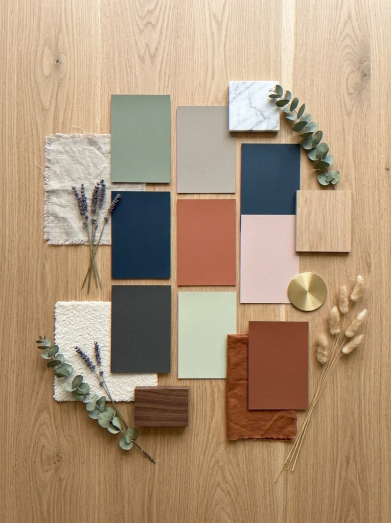
Here’s my honest, experience-tested approach. No fluff, just what actually works.
Start With What You Already Have
Look at your current sofa, rug, and curtains before you choose anything. The color of your walls has to go with these things, not against them. Take the secondary colors from your furniture and look for wall colors that go well with them instead of against them.
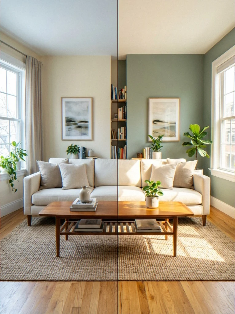
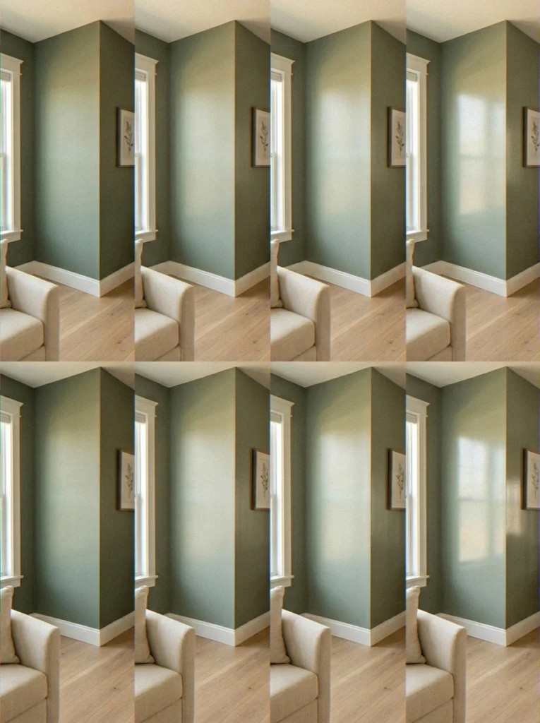
Test In Your Real Light — Seriously, Don’t Skip This
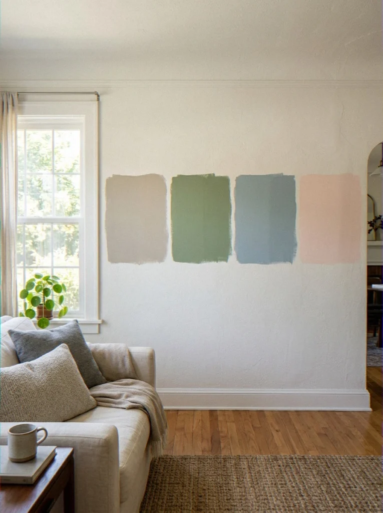
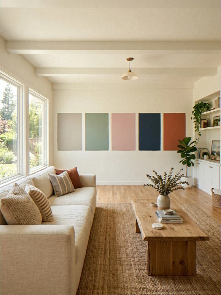
Buy sample pots. Paint large swatches — at least 12×12 inches — directly on your wall, not cardboard. Live with them for 48 hours and observe in morning light, midday, and evening with your artificial lights on.
The same color can look wildly different across conditions. I once painted a swatch that looked like a warm gray on the chip and turned distinctly purple under my lamps at night. Not ideal. This step saves you from expensive regrets.
Room Orientation Matters More Than People Realize
- North-facing rooms get cool, indirect light — warm up the walls with beige, cream, or warm green tones
- South-facing rooms get abundant warm light — you can handle cooler or darker colors without the room going gloomy
- East-facing rooms get warm morning light — cool blues and soft greens look stunning
- West-facing rooms get warm afternoon and evening light — rich, warm tones glow beautifully
Pick the Right Finish
- Flat/Matte — hides wall imperfections brilliantly, velvety and rich, but harder to wipe clean
- Eggshell — the sweet spot for most living rooms; slight sheen, washable, looks great
- Satin — more reflective and very cleanable; better for homes with kids or pets
- Semi-gloss — high sheen; keep this for trim and doors, not main walls
Quick Tips Before You Buy That Paint
- Always buy samples before committing to full gallons — always
- Two proper coats always beats three rushed ones for coverage and richness
- Light colors make small rooms feel bigger; dark colors make large rooms feel intimate
- Undertones matter enormously — a “gray” can read purple, green, or blue-purple depending on surroundings
- Follow the 60-30-10 rule: 60% dominant wall color, 30% large furniture, 10% accents
- Don’t paint over dirty walls — clean surfaces first or the paint won’t adhere properly
People Also Ask: Frequently Asked Questions
Which wall color is best for a living room?
There’s no single “best” color — it depends on your room’s light, size, and your personal style. That said, warm neutrals like Agreeable Gray, White Dove, and Pale Oak consistently perform well across the widest range of living rooms.
For something with personality, sage green has become the most universally beloved color of the current era. If you want something bold, Naval navy or deep forest green make stunning, high-impact choices.
Which color is best for a home wall?
For home walls in general — across multiple rooms — versatile, warm neutrals are the safest bet. Agreeable Gray (Sherwin-Williams) and White Dove (Benjamin Moore) are two of the most recommended colors by interior designers worldwide.
For Indian homes specifically, Asian Paints’ Sandalwood and Autumn Gold are brilliant warm-neutral options that work with a wide range of furniture styles and traditional décor. The best home wall color is ultimately the one that feels natural in your specific light and suits your furniture.
Get More Decor Inspiration
How to Use Permeable Pavers for Driveway Flood Prevention?
42 Coffee Table Decor Ideas Living Room for a Cozy & Aesthetic Look
What Is the Best Layout for a Narrow Living Room With a Fireplace on the Long Wall?
Which color is lucky for a living room?
According to Vastu Shastra — the traditional Indian system of architecture and spatial arrangement — yellow, light green, cream, and white are considered auspicious and positive for living rooms. Yellow is associated with happiness and optimism; light green with growth and harmony; white with purity and clarity.
From Feng Shui’s perspective, earth tones (warm beige, terracotta, sandy yellow) are considered grounding and lucky for living spaces because they promote stability and warmth in the home. That said, the color that makes you feel good in your home is always the luckiest choice.
What color looks best in a living room?
“Best” is always going to be personal, but if I had to pick the colors that consistently photograph well, feel amazing to live in, and get the most positive reactions from people — it’d be this shortlist:
- Sage Green — universally loved, endlessly versatile
- Rainwashed — complex and magical; people always ask what it is
- Naval Navy — dramatic and sophisticated; stunning with the right furniture
- Agreeable Gray — reliable, beautiful, and works with everything
- Pale Oak — soft, warm, and quietly gorgeous
The colors that look best in a living room are the ones that work with your light, your furniture, and the mood you want to create.
Style guides are helpful — but your gut feeling after living with a sample on your wall for two days is more reliable than any list.
What are the best wall paint colors for living room from Asian Paints?
Asian Paints offers an enormous range, but their most popular living room picks include Autumn Gold (8083) for warm, welcoming spaces; Misty Memories (8765) for modern, neutral spaces; and Mystical Green (8769) for the sage-green lovers.
Their Royale range offers superior finish and coverage for main walls. Use their free ColourNext visualization tool to preview colors in your actual room before buying.
What are the best two-colour combinations for living room walls?
The combinations that consistently look the best in real homes include Sage Green + Warm White, Navy + Crisp White, and Terracotta + Sand. For a bolder approach, Deep Forest Green + Cream or Dusty Rose + Sage Green are surprisingly stunning.
The key to any two-color combination working is shared undertone — warm tones with warm tones, cool with cool — so the colors feel like they belong together rather than fighting for attention.
My Final Thoughts — And an Honest Confession
Choosing a color for your living room is one of the most personal things you can do in your home. There’s no right or wrong answer, and no blog post can make the choice for you, but some choices are better thought out than others.
The more time you spend with samples on your real wall, in your real light, and with your real furniture, the better your choice will be. That advice isn’t new, but it does work.
My personal favorites from this entire list? Rainwashed — because it’s alive and endlessly interesting.
Naval — because when someone walks into a room painted Naval with warm lighting and cream furniture, their jaw drops every single time. And Sage Green — because bro, it just works. Every time. For everyone.
Whatever color you choose — test it, live with it briefly, and trust yourself. You know your home better than any paint company’s marketing team does. Now go grab some swatches and make something beautiful. 🎨
Have you tried any of these colors in your own living room? Which ones worked, which ones flopped, and what would you do differently? Drop it in the comments — I genuinely want to know!
For more inspiration, browse House Beautiful’s color guides and Apartment Therapy’s paint coverage — both are brilliant resources for real-home paint transformations.