
So you’ve finally mounted that gorgeous TV on your wall, and now you’re staring at it thinking, “Hmm, something’s missing.” Trust me, I’ve been there. Your TV wall isn’t just a spot where you binge-watch Netflix—it’s basically the focal point of your living room. Getting the colors right around it? That’s where the magic happens.
Let me walk you through some seriously stylish color combos that’ll make your TV wall look less “electronics store display” and more “interior design magazine spread.”
Why Your TV Wall Color Actually Matters More Than You Think
Here’s the thing: your TV wall sets the entire mood for your living room. Pick the wrong colors, and you’ll either strain your eyes during movie marathons or create a space that feels cold and uninviting. Been there, regretted that.
The colors you choose affect everything from how vibrant your screen looks to how relaxed you feel after a long day. Colors influence our emotions, and since you probably spend hours in front of that screen, why not make it work for you instead of against you?
Plus, FYI, the right color combination can actually make your TV look more expensive than it actually is. 🙂
Classic Gray and White: The Timeless Duo
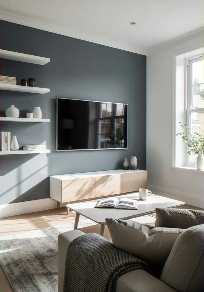
Let’s start with the combo that literally never fails. Gray and white is like the little black dress of interior design—always appropriate, always elegant.
I painted my TV wall a soft charcoal gray last year, and honestly? Best decision ever. The neutral backdrop makes the screen pop without competing for attention. White trim or shelving units alongside it create this clean, modern aesthetic that works whether you’re into minimalism or just hate making bold choices.
Why This Combo Works
- Reduces eye strain during long viewing sessions
- Complements any TV brand or screen size
- Easy to accessorize with pops of color through artwork or plants
- Hides fingerprints and smudges way better than pure white
The key here is choosing the right shade of gray. Go too dark, and your room feels like a cave. Too light, and you might as well stick with white. Aim for mid-tones that have a slight warm undertone—it makes all the difference.
Navy Blue and Gold: Drama Without the Trauma
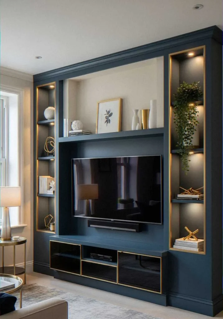
Want something bolder? Navy blue paired with gold accents brings serious sophistication without screaming “I tried too hard.”
I’ve seen this combo transform boring living rooms into spaces that look like they belong in luxury apartments. The deep blue creates depth and richness, while gold elements (think picture frames, light fixtures, or decorative shelving) add just enough glamour.
Making Navy Work for You
Here’s what I learned: navy can make small rooms feel smaller if you’re not careful. Balance it out by keeping adjacent walls lighter—maybe a soft cream or even that trusty white. Add warm-toned lighting to prevent the space from feeling too cold.
| Element | Color Choice | Purpose |
|---|---|---|
| Main TV Wall | Navy Blue | Creates depth and drama |
| Accent Shelves | Gold/Brass | Adds warmth and luxury |
| Surrounding Walls | Cream/Beige | Maintains brightness |
| Decorative Items | Mixed metallics | Provides visual interest |
Check out Architectural Digest’s color theory guide for more insights on how deep blues affect spatial perception.
Sage Green and Natural Wood: Bringing the Outdoors In
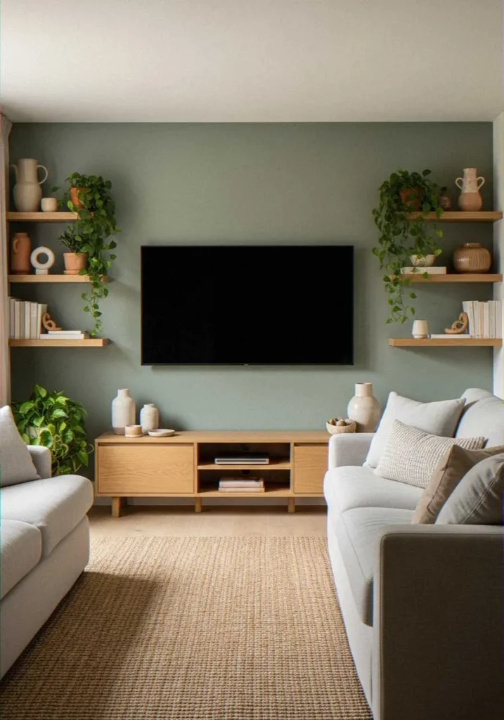
Ever walked into a room and immediately felt calmer? That’s the sage green and natural wood combo at work.
This pairing has blown up recently (hello, biophilic design trends), and honestly, I get why. Soft sage green behind your TV creates this serene, nature-inspired backdrop that doesn’t overwhelm. Pair it with wooden floating shelves or a wooden media console, and you’ve got yourself an organic, Instagram-worthy setup.
The Psychology Behind Green
Green reduces stress and promotes relaxation—exactly what you want in a space where you unwind. Unlike brighter greens that might feel too energetic, sage is muted enough to be soothing but interesting enough to prevent your wall from looking bland.
Pro tip: Add real plants on those wooden shelves. The living greenery reinforces the color scheme while purifying your air. Win-win.
Charcoal and Copper: Industrial Meets Sophisticated
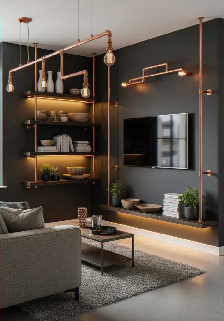
Looking for something edgier? Charcoal gray with copper accents delivers that modern industrial vibe without feeling too masculine or cold.
I visited a friend’s apartment last month where they nailed this combo. The dark charcoal wall made their TV almost disappear when turned off (which is genius, IMO), and the copper pipe shelving system they installed? Chef’s kiss. The warm metallic tones prevented the dark wall from feeling depressing.
Getting the Balance Right
- Keep the charcoal to just the TV wall
- Use copper sparingly—light fixtures, shelf brackets, or decorative bowls
- Add soft textiles in warm neutrals to prevent the industrial look from feeling too harsh
- Consider matte finishes for the wall to reduce glare on the screen
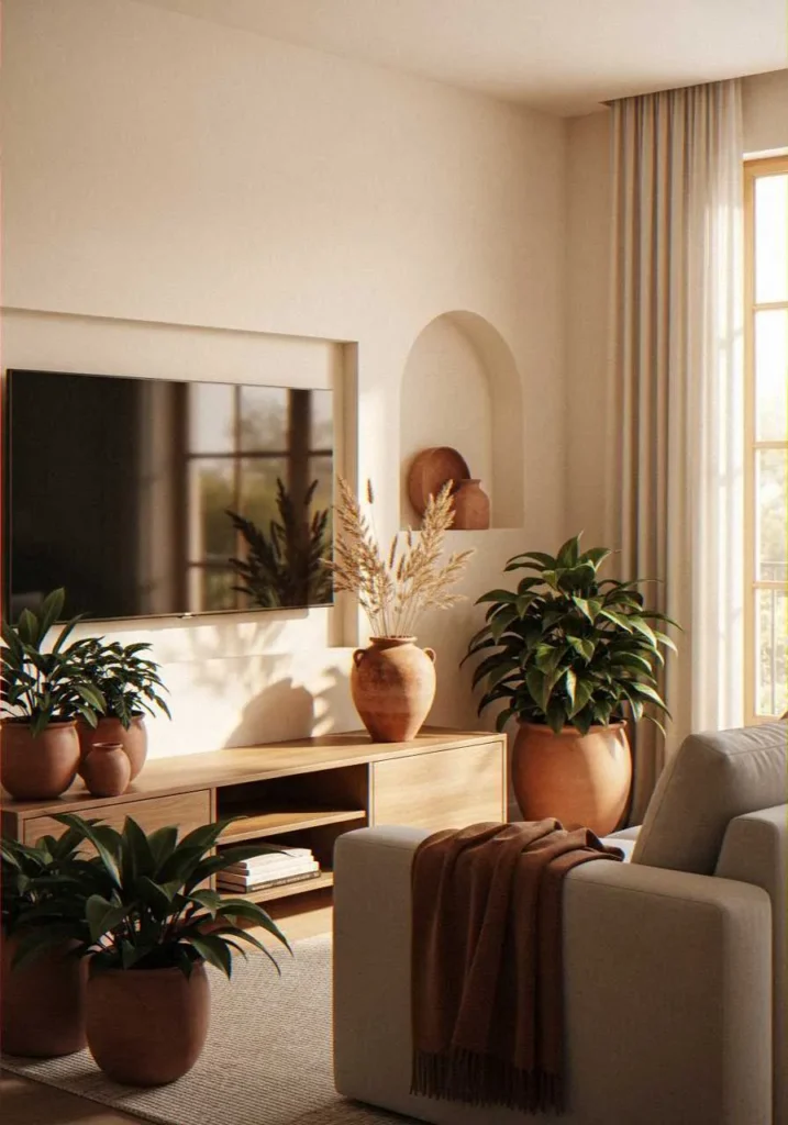
Cream and Terracotta: Warm Minimalism
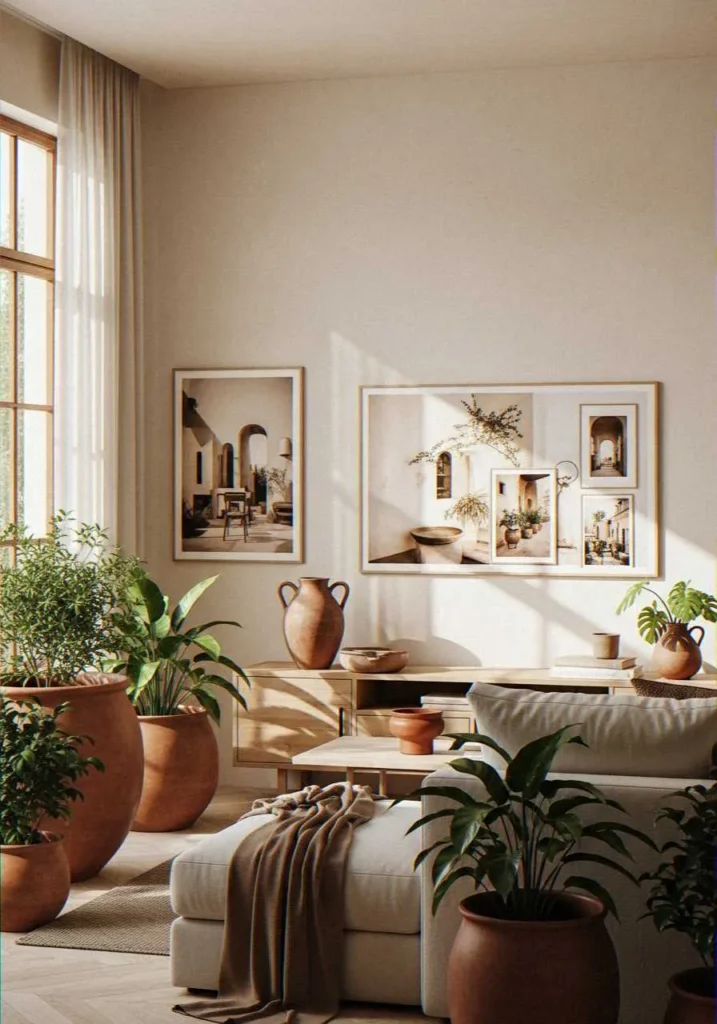
If you’re tired of cool-toned spaces, let me introduce you to cream and terracotta. This combo brings warmth without the commitment of bold reds or oranges.
A creamy white base with terracotta accents creates this cozy, Mediterranean-inspired feel. Think terracotta pots with trailing plants, rust-colored throw pillows visible from the TV area, or even a terracotta-toned rug anchoring your seating arrangement.
Why Warm Neutrals Win
We’re seeing a massive shift away from the stark gray-and-white trend toward warmer neutrals. People want spaces that feel inviting, and nothing says “come relax here” quite like warm earth tones.
The National Kitchen & Bath Association reports that warm neutrals are dominating design preferences for 2024, and your TV wall is the perfect place to experiment with this trend.
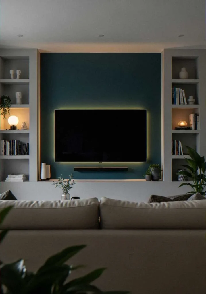
Black Accent Wall: Bold and Unapologetic
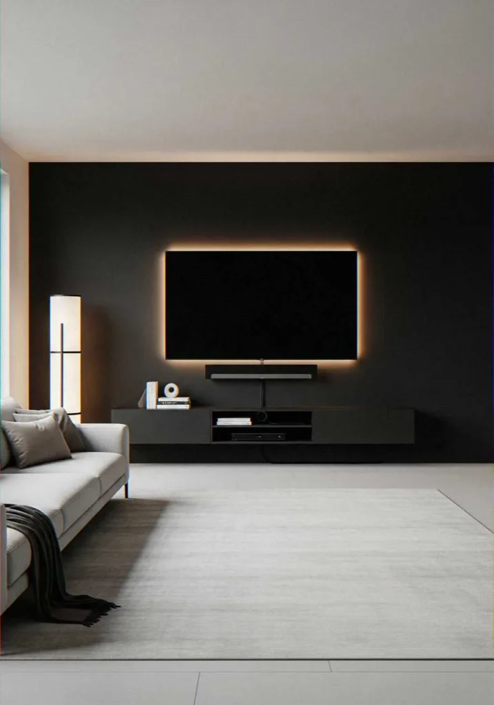
Okay, hear me out on this one. A matte black accent wall behind your TV is actually genius—if you do it right.
Black absorbs light instead of reflecting it, which means zero glare on your screen. It makes your TV bezels disappear and creates this theater-like atmosphere. But (and this is important) you need to balance it with lighter colors everywhere else, or your living room will feel like a dungeon.
How to Pull Off Black
- Use matte paint only—glossy black reflects light and defeats the purpose
- Paint only the TV wall; keep other walls light and bright
- Add plenty of lighting: table lamps, floor lamps, maybe even LED strips behind the TV
- Incorporate white or light-colored furniture to create contrast
I won’t lie—this one intimidates people. But if you’re going for that sleek, modern aesthetic? Nothing beats it.
Soft Pink and Brass: Surprisingly Sophisticated
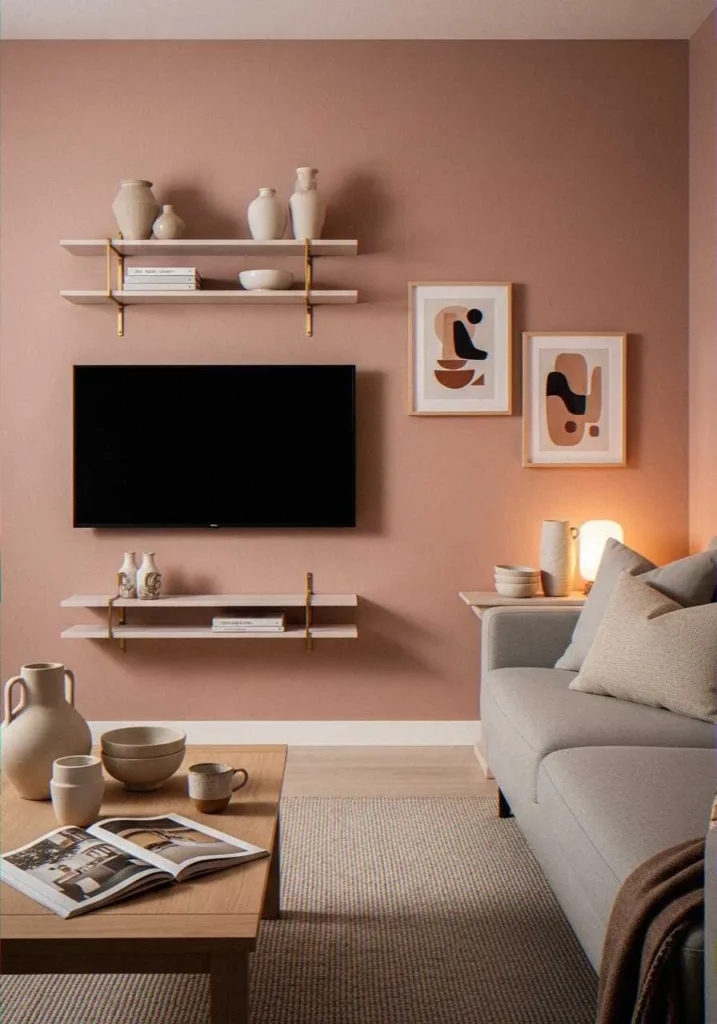
Before you roll your eyes, let me explain. We’re not talking bubblegum pink here. Dusty rose or blush pink paired with brass creates an unexpectedly elegant look that works beautifully in contemporary spaces.
This combo adds personality without feeling childish or overly feminine. The muted pink provides a soft, warm backdrop, while brass fixtures and accents add shine and sophistication.
Making Pink Work in Adult Spaces
Choose pink shades with gray or beige undertones—these look refined rather than playful. Pair with neutral furniture in grays, whites, or taupes. The brass elements (picture frames, shelf brackets, lamp bases) tie everything together with a touch of luxury.
Two-Tone Walls: Creating Visual Interest
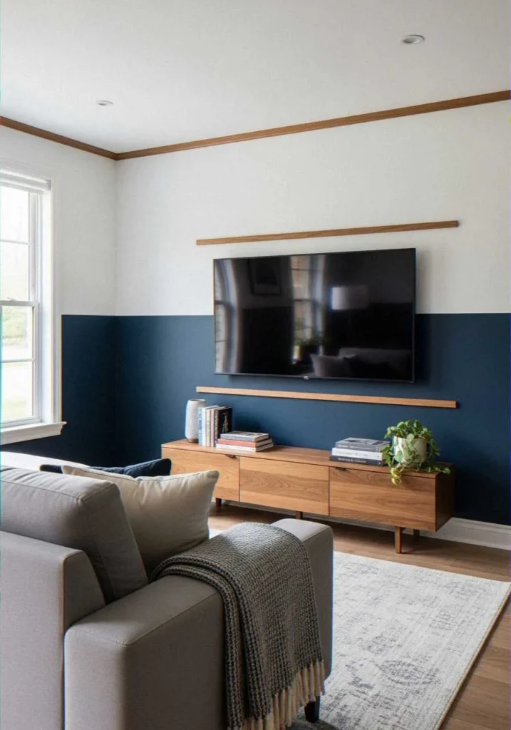
Can’t decide on one color? Two-tone walls let you have the best of both worlds.
I’m talking about painting the lower half of your TV wall one color and the upper half another, divided by a chair rail or simply a clean horizontal line. Navy bottom with white top? Classic. Sage green bottom with cream top? Fresh and modern.
Design Tips for Two-Tone Success
- Mount your TV centered on the color division for a balanced look
- Use the darker color on the bottom to ground the space
- Keep the color split at roughly one-third to two-thirds ratio, not straight down the middle
- Ensure your TV size works with the proportions—massive screens look better with more single-color space
Monochromatic Magic: Shades of One Color
Sometimes, the most sophisticated choice is the simplest. Monochromatic schemes—using different shades and tones of one color—create depth without visual chaos.
Try light gray, medium gray, and charcoal all in one space. Or cream, tan, and deep brown. The variation in tones provides interest while maintaining a cohesive, calming atmosphere.
Why Designers Love Monochromatic
It’s basically foolproof. You can’t really clash shades of the same color, which makes decorating way less stressful. Plus, it forces you to play with texture instead of color for visual interest—think smooth painted walls, nubby throw blankets, sleek metal accents, and natural wood grains.
Practical Considerations Beyond Just Looking Pretty
Alright, let’s talk about the stuff design blogs sometimes skip. Your color choice needs to be practical, not just photogenic.
Light and Reflection
Consider how much natural light your living room gets. Dark colors in a north-facing room with minimal windows? Recipe for a depressing cave. Save the charcoals and navies for rooms with plenty of light, or balance them with strategic artificial lighting.
Screen Glare Matters
Ever tried watching TV with the sun reflecting off a glossy white wall behind it? Nightmare fuel. Choose matte or eggshell finishes rather than satin or semi-gloss. Your eyes will thank you during those marathon gaming sessions.
Room Size Reality Check
Dark colors make rooms feel smaller and cozier (great for huge open-plan spaces, less great for tiny apartments). Light colors make spaces feel larger and airier. Basic design principle, but worth remembering when you’re falling in love with that dramatic navy blue.
Bringing It All Together: My Personal Recommendations
After trying several of these combos myself and seeing countless friends’ attempts, here’s what I’ve learned works best:
For small rooms: Stick with light, neutral bases (cream, soft gray, white) with pops of color through accessories. You need that visual space.
For large rooms: Go bold with your TV wall. Navy, charcoal, or even black create intimacy in spaces that might otherwise feel cold and cavernous.
For rentals: Removable wallpaper in interesting patterns or colors lets you experiment without losing your security deposit. :/
For the commitment-phobic: Gray-and-white or cream-and-wood combos work everywhere, always, with everything. You literally cannot go wrong.
The Pantone Color Institute releases annual color trend reports that can inspire your choices while ensuring your space feels current rather than dated.
Quick Implementation Guide
Ready to actually do this? Here’s your game plan:
- Test paint samples on your wall—colors look completely different in your specific lighting
- Move furniture away and protect your floors (learned this the hard way)
- Paint in sections, starting from the top and working down
- Wait for proper drying time between coats (impatience leads to streaky walls)
- Add accents and accessories only after the paint has fully cured
FAQ: Your Burning TV Wall Color Questions Answered
Q: Should my TV wall be lighter or darker than the other walls?
A: Either works, but darker TV walls reduce screen glare and make the TV less visually dominant when turned off. Lighter walls make small rooms feel bigger. Choose based on your room’s needs.
Q: What’s the best color to reduce eye strain during viewing?
A: Medium-toned neutrals like mid-gray or soft sage green work best. They provide enough contrast with the bright screen without being too dark or reflective.
Q: Can I use wallpaper instead of paint for my TV wall?
A: Absolutely! Textured or patterned wallpaper adds depth and interest. Just avoid overly busy patterns that compete with your screen for attention.
Q: How do I choose colors if I have a small living room?
A: Stick with lighter shades as your base (cream, light gray, soft white) and add personality through accent colors in your furniture and decor. This maintains the feeling of space while preventing blandness.
Q: Do I need to paint all four walls or just the TV wall?
A: One accent wall behind the TV often looks more intentional and modern than painting the entire room. It creates a focal point without overwhelming the space.
Q: What finish should I choose for TV wall paint?
A: Matte or eggshell finishes work best because they don’t reflect screen light. Avoid semi-gloss or satin finishes, which create annoying glare during viewing.
Look, transforming your TV wall doesn’t require a design degree or unlimited budget. It just takes some thoughtful color selection and the courage to move beyond builder-beige walls. Whether you go safe with gray and white or bold with navy and gold, make sure it reflects your style and creates a space where you actually want to spend time.
Now get off your phone, grab some paint samples, and start experimenting. Your living room is waiting for its glow-up!
5 thoughts on “Best Color Combinations for TV Wall Decoration: Stylish Ideas to Transform Your Living Room”