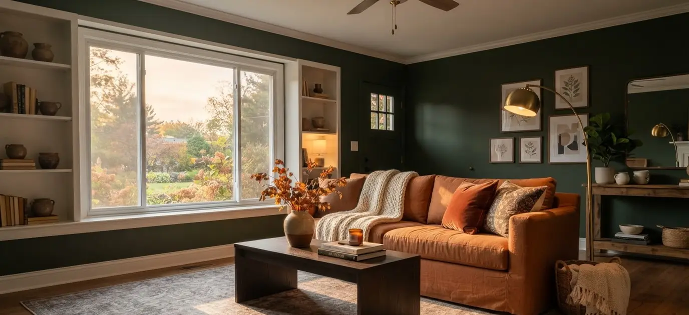
Pull up any moody living room board on Pinterest right now and you’ll see the same thing happening over and over.
Deep greens next to burnt orange. Charcoal walls with brass lamps.
A single mustard throw pillow doing more work than the whole rest of the room.
Something about fall just makes us want our living rooms to feel like a hug instead of a hotel lobby.
I redid my own living room two Octobers ago, and I’m still not over it.
I went from a beige box (safe, boring, forgettable) to a space with olive walls, rust-colored curtains, and a rug the color of black coffee.
My mom walked in and said it looked like a cabin in the woods. I took that as a compliment. IMO, that’s exactly the point of moody fall decor: it should feel like the outside came in.
This guide covers everything I wish someone had told me before I bought the wrong paint sample three times.
Colors that actually work together, textures that make a space feel expensive without being expensive, lighting tricks, and a few mistakes worth skipping entirely.
Why moody colors work so well once the leaves start falling
There’s a reason interior designers lean into darker palettes every autumn.
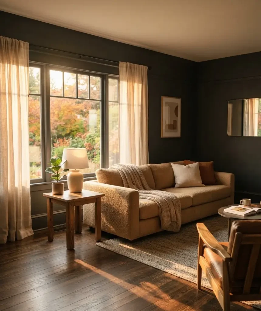
Rich colors like terracotta, forest green, and deep plum mimic what’s already happening outside your window. Your brain reads that as seasonal and correct, even if it can’t explain why.
Light, airy rooms suit spring and summer.
They feel fresh and open. But once the days get shorter and the air turns crisp, that same airy room can start to feel cold and empty.
Darker tones absorb light instead of bouncing it around, which makes a room feel warmer and more intimate even before you turn on a single candle.
Here’s the part that surprised me during my own redo: darker walls don’t actually make a small room feel smaller.
When you paint all four walls (and sometimes the ceiling too) the same deep shade, the edges of the room blur together.
Your eye stops counting corners. A 200-square-foot living room can genuinely feel more expansive in a deep color than in a flat, builder-grade white.
Ever wondered why hotel lobbies and moody restaurants go dark instead of bright? Now you know.
The color palette that actually works together
Not every rich color plays nicely with every other rich color. I learned this the expensive way after buying a rug in a red so saturated it fought with everything else in the room.
Here’s a quick breakdown of combinations that consistently work.
| Base Color | Best Accent Colors | Mood It Creates |
|---|---|---|
| Deep forest green | Rust, brass, cream | Woodsy, grounded, calm |
| Charcoal or espresso brown | Mustard, burnt orange, camel | Warm, cozy cabin feel |
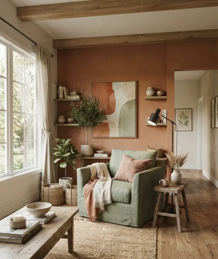
| Terracotta or clay | Sage green, black, ivory | Earthy, sun-baked, relaxed |
| Deep plum or burgundy | Gold, blush, dark wood | Romantic, dramatic, rich |
A few notes on using this table well. Pick one base color for your largest surfaces (walls, sofa, or a large area rug), then let the accent colors show up in smaller doses through pillows, throws, and accessories.
Trying to give three rich colors equal visual weight in one room usually backfires and starts to look busy instead of intentional.
If you want a deeper dive into color theory before committing to paint, Sherwin-Williams’ color visualizer lets you test shades against your actual room photos, which saved me from at least one regrettable can of paint.
The one rule I actually follow
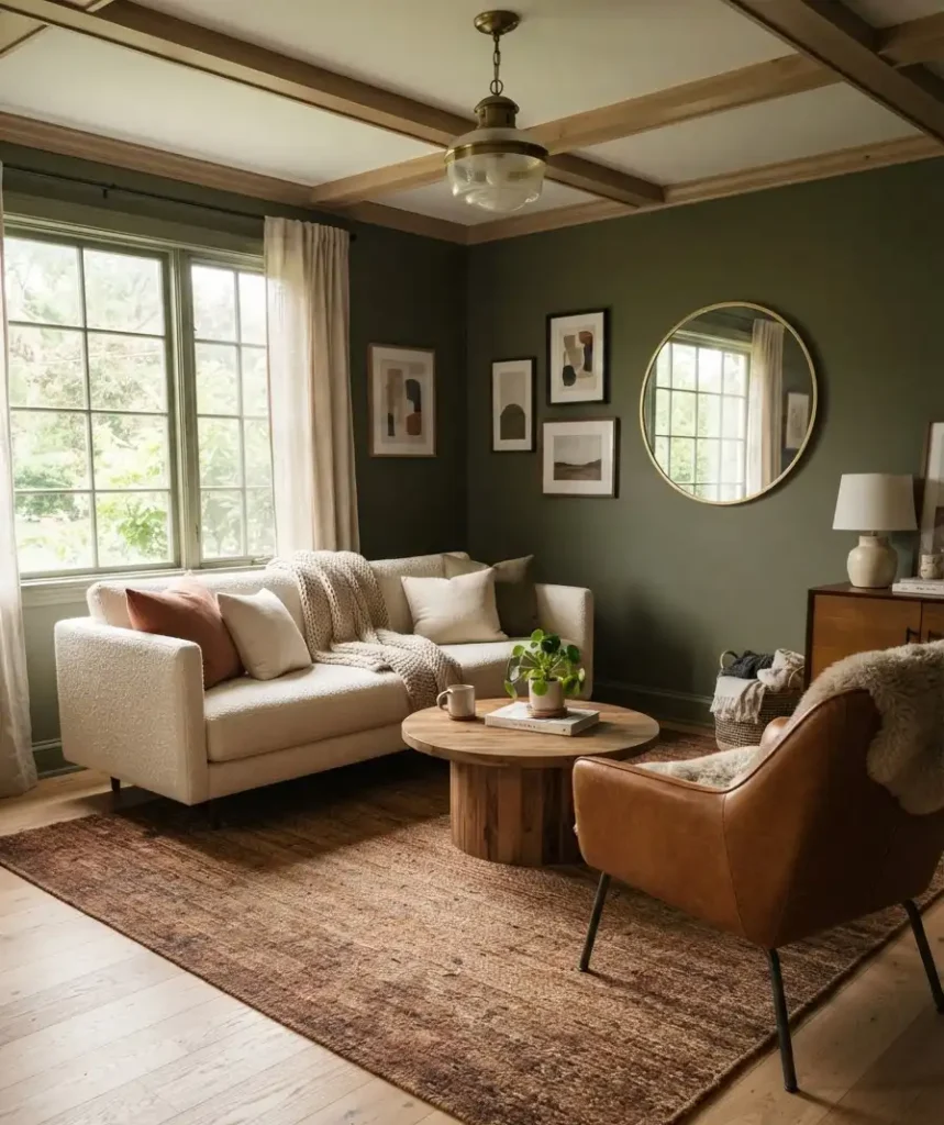
Whatever base color you choose, keep at least 20 percent of the room in something lighter. A cream sofa, a pale wood coffee table, an off-white lamp shade.
Without that breathing room, even the best moody palette can start to feel heavy instead of warm.
This is the difference between “designer cabin” and “I live in a cave.”
Layering textures matters more than the paint color
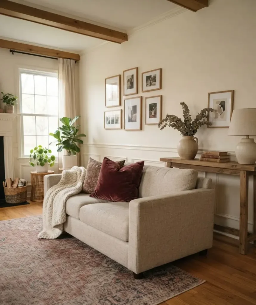
Honestly, this is the part most people skip, and it’s the part that makes the biggest difference.
A room painted the perfect shade of olive will still look flat if everything in it is smooth and shiny. Fall decor lives and dies on texture.
Think about what actually feels like autumn: chunky knit throws, worn leather, matte ceramic, rough linen, aged brass.
Mix at least three or four different textures in one room and it instantly reads as intentional instead of accidental.
A few combinations that have worked well for me and for friends who’ve asked me to help style their spaces:
- Boucle or chenille sofa paired with a smooth leather armchair and a jute rug underneath. The contrast between soft and structured keeps the eye interested.
- Velvet throw pillows against a linen or cotton sofa. Velvet catches candlelight in a way that flat cotton just can’t.
- Wool blankets draped over the arm of a chair, not folded perfectly. A little mess actually sells the coziness.
- Matte ceramic vases instead of glossy glass ones. Glossy surfaces read as more modern and cool-toned, which fights against the moody fall vibe.
If your budget only stretches to one or two new pieces this season, spend it on a good throw blanket and a textured area rug.
Those two items touch the most surface area in a room and do the most visual heavy lifting for the least money.
Lighting changes everything, and I mean everything
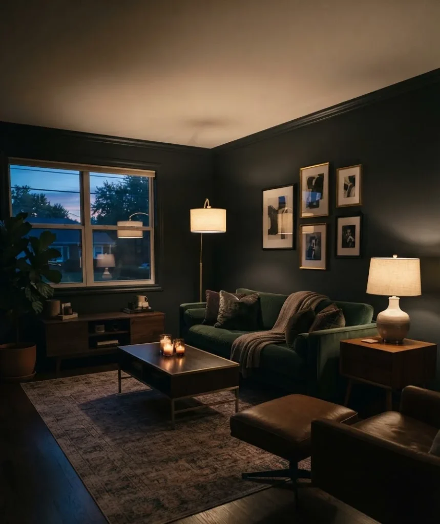
I used to think lighting was the least important part of decorating. I was wrong, and honestly a little embarrassed about how wrong.
Rich, dark colors need warm light to look their best. Cool white LED bulbs will make your deep green walls look muddy and gray instead of lush.
Swap your bulbs to something in the 2700K to 3000K range (most packaging lists this now, thankfully).
That warmer temperature is what makes brass fixtures glow instead of looking dull, and it’s what turns a burgundy accent wall from “dark and depressing” to “dark and dramatic.”
Layer your light sources too. A single overhead fixture creates flat, harsh light that flattens out all the texture you just spent money on.
Add a floor lamp in one corner, a table lamp near the sofa, and a few candles on the coffee table.
Three or four smaller light sources scattered around a room will always beat one bright light in the middle of the ceiling.
One more thing, and this might be my most controversial opinion in this entire article: skip the string lights unless you’re going for a very specific bohemian look.
For moody fall decor, they read as more college dorm than autumn retreat.
Where I actually shop for this stuff
FYI, you don’t need a massive budget to pull this off. Some of my favorite finds have come from unexpected places.
- West Elm for boucle and velvet throw pillows in the fall color range. Their seasonal drops usually hit in late August or early September.
- HomeGoods and TJ Maxx for ceramic vases and candle holders. You genuinely have to dig, but the deals are worth the hunt.
- Etsy for handmade wool throws and small-batch pottery. I bought a rust-colored mug set from a small shop there that I still use daily.
- Benjamin Moore for paint. Their “Kendall Charcoal” and “October Mist” are two shades that show up constantly in fall living room inspiration, and for good reason.
Mistakes I made so you don’t have to
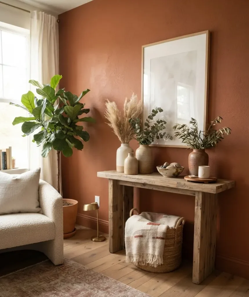
Let’s talk about what didn’t work, because that’s usually more useful than another highlight reel. I painted one wall a deep plum before realizing the rest of my furniture leaned very orange and brown. The clash was immediate and, honestly, a little painful to look at for the three weeks it took me to fix it.
Wow, that repaint was annoying. Lesson learned: test your paint against your existing furniture and rug before committing to a full wall, not just against a blank white swatch card.
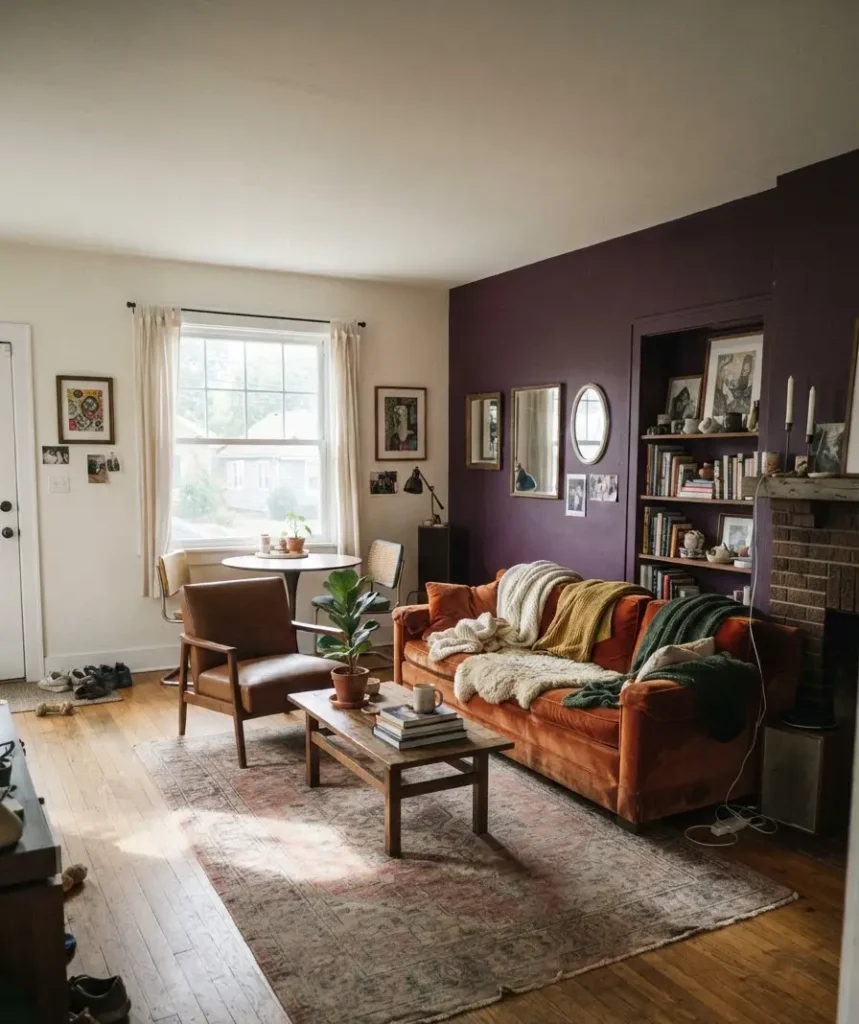
I also went overboard on plaid the first year. One plaid throw is charming. Plaid pillows, a plaid rug, and a plaid blanket in the same room starts to look like a lumberjack exploded. Pick one pattern to anchor the room and keep everything else solid or subtly textured.
A quick styling formula if you want a shortcut
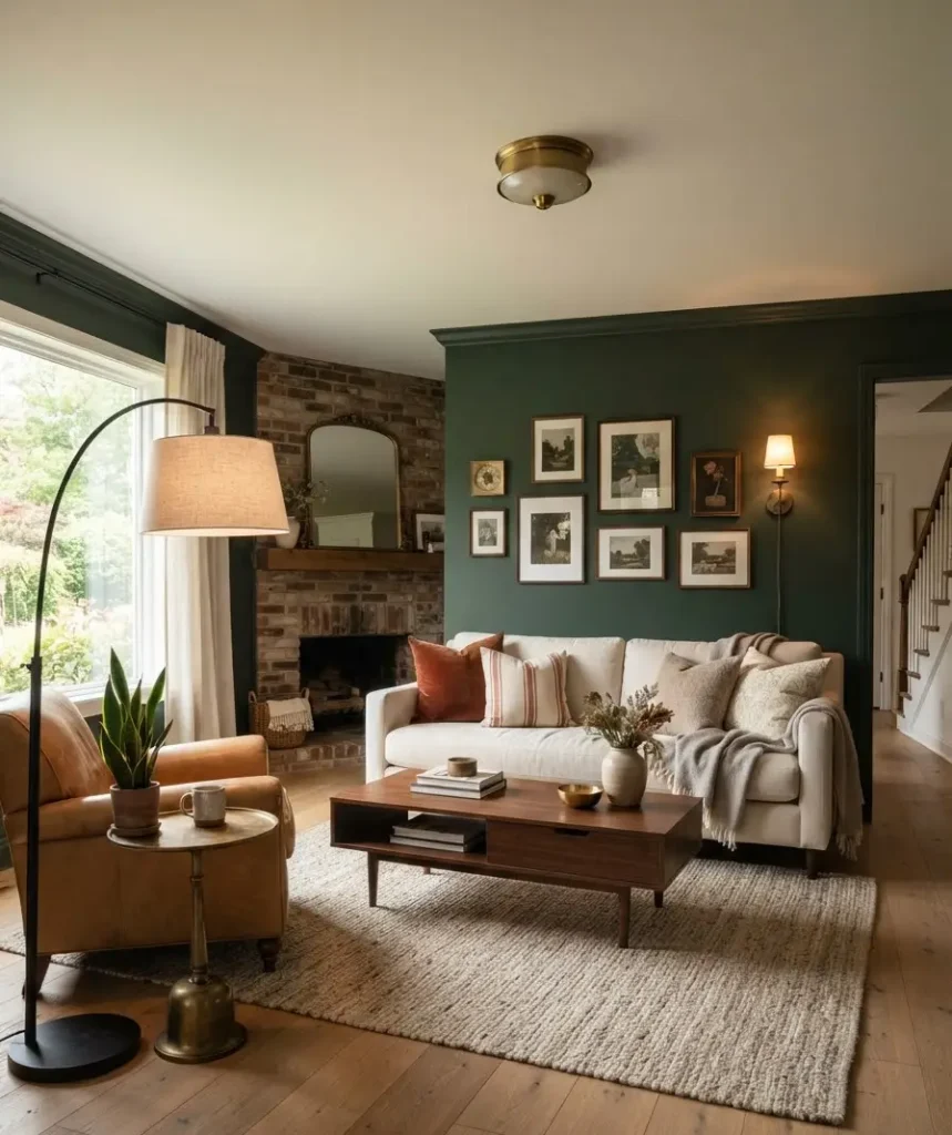
If you’re staring at your living room feeling overwhelmed, here’s the formula I now use every single time I redecorate for fall.
- Choose one deep base color for walls or a large piece of furniture.
- Add two accent colors in smaller doses (pillows, art, a vase).
- Mix at least three textures across your soft goods.
- Switch every bulb in the room to warm white.
- Add one unexpected metallic touch, whether that’s brass, aged bronze, or matte black.
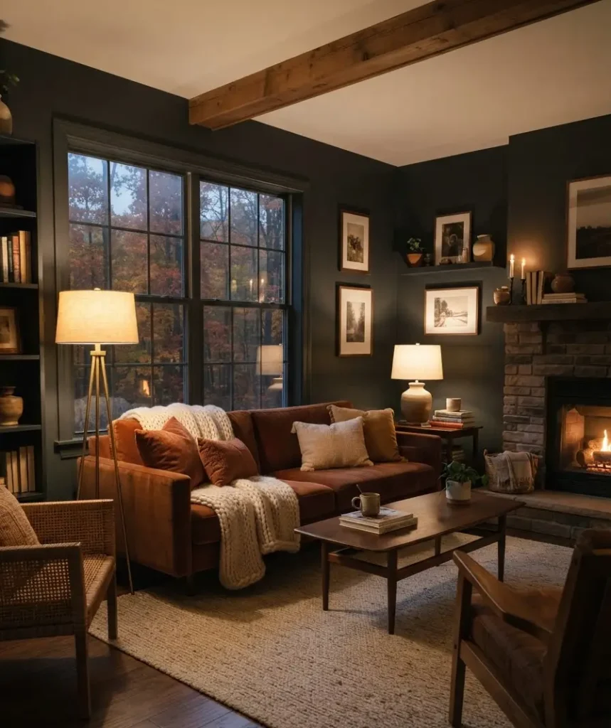
That’s genuinely it. You don’t need to overthink this further.
FAQs
Do dark walls make a room feel smaller? Not usually, and often the opposite happens. When all four walls match, the corners visually disappear and the room can feel larger and more cohesive than it does in a flat, bright white.
What’s the easiest way to add moody fall vibes without repainting? Start with textiles. A chunky knit throw, a few velvet pillows in rust or plum, and warm-toned bulbs can transform a room in an afternoon without touching a paint can.
Can moody fall decor work in a small apartment living room? Yes, and it often works especially well. Smaller spaces benefit from the cohesive, blended look that dark colors create, and you’ll need less fabric and fewer accessories to make an impact than you would in a larger room.
Final thought
Moody fall decor isn’t about following a trend perfectly. It’s about making a room you actually want to sit in once it’s cold and dark outside by 6 PM.
Pick colors that feel like you, layer in textures you’d actually want to touch, and don’t be afraid to get one thing wrong along the way (I certainly did).
What’s the one piece you’re adding to your living room this fall? Save this post, pin your favorite color combo, and let me know in the comments what you’re going with.
