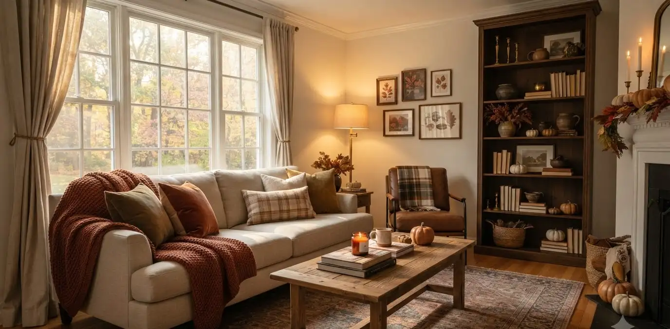
Fall decor has a reputation problem. Say the word “autumn” and half the internet pictures orange string lights, plastic pumpkins, and a doormat that says “gourd-geous.” I get why.
But you don’t need any of that to make a living room feel warm, seasonal, and genuinely elegant.
I redecorated my own living room last October with exactly one goal: make it feel like fall without turning it into a craft store.
It took three weekends, a few returns, and one rug that I still think about with regret. What came out of it is this guide.
Consider it the version I wish I’d had before I started.
Why elegant fall decor beats the pumpkin-everything look
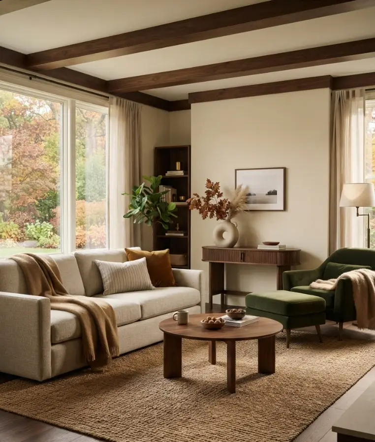
Classy fall styling isn’t about adding more stuff. It’s about shifting what’s already there: color, texture, and light. That’s it.
Designers pulling together 2026’s seasonal look keep circling back to the same idea: warm materials and mood over novelty items.
Living Spaces’ fall trend roundup points to sculptural accent pieces and handmade textures as the through-line this year, not seasonal knick-knacks.
Swap the framing from “decorating for fall” to “adjusting for fall,” and the whole thing gets easier and looks better.
Here’s the part that actually matters for your Pinterest board: elegant fall decor photographs well because it’s built on contrast.
Warm wood against a cool wall. A single amber lamp glow in an otherwise soft room. That contrast is what stops the scroll.
Start with a neutral base, then layer color in on purpose
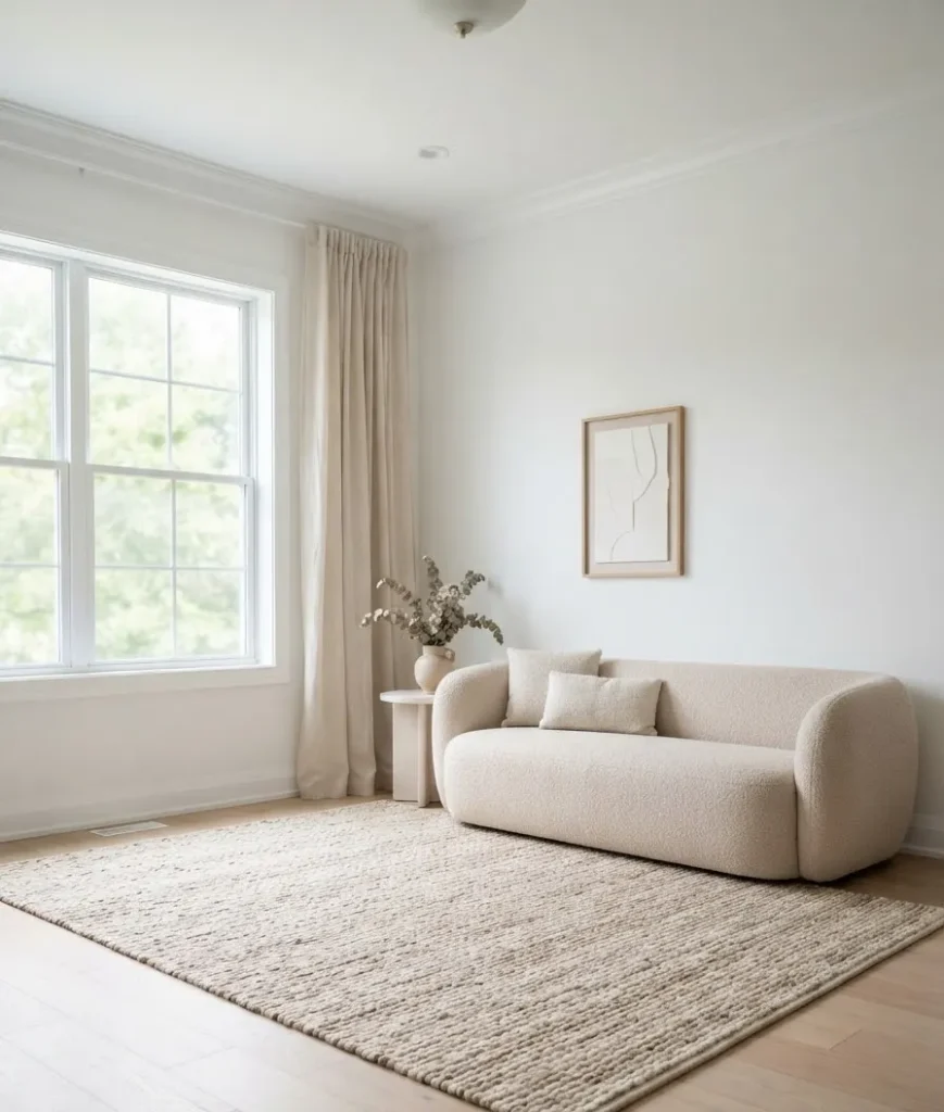
If your living room already leans neutral (beige sofa, white walls, the whole starter-home palette), you’re actually ahead.
A neutral base is the best canvas for fall color because you control exactly how much warmth to add.
Pick two or three colors, not eight
I made this mistake my first year decorating for fall.
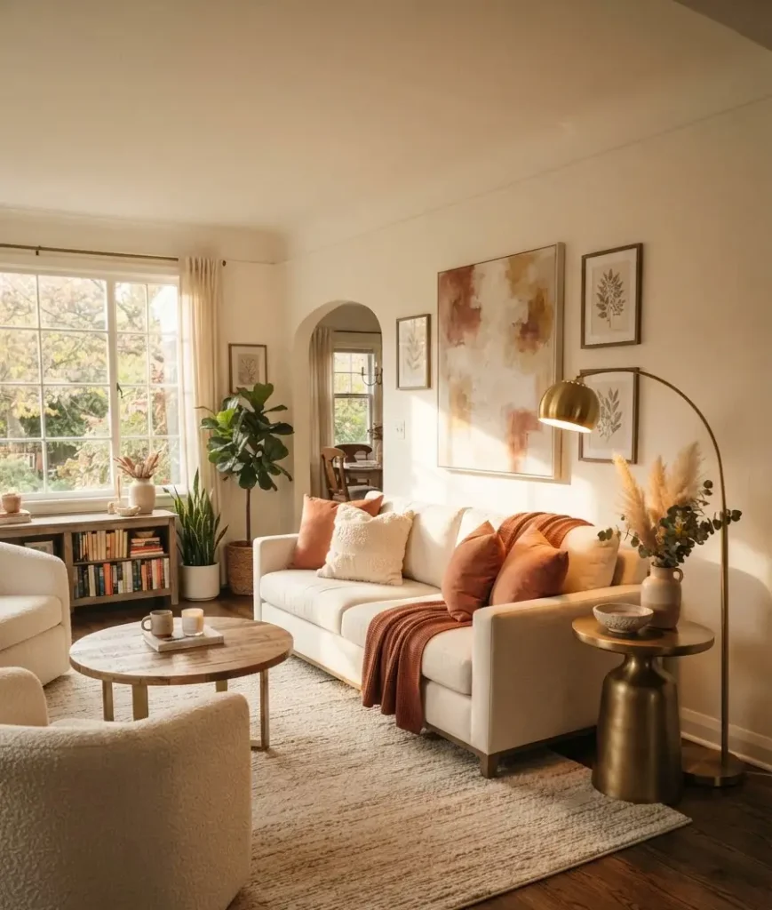
I bought pillows in six different shades of orange and brown and ended up with a room that looked like a Thanksgiving table exploded. Pick 2 to 3 colors and repeat them across the room instead.
Current guidance from Home & Gardens on 2026 living room trends leans into richer, moodier color this year rather than the muted, matchy palettes that dominated a few seasons back.
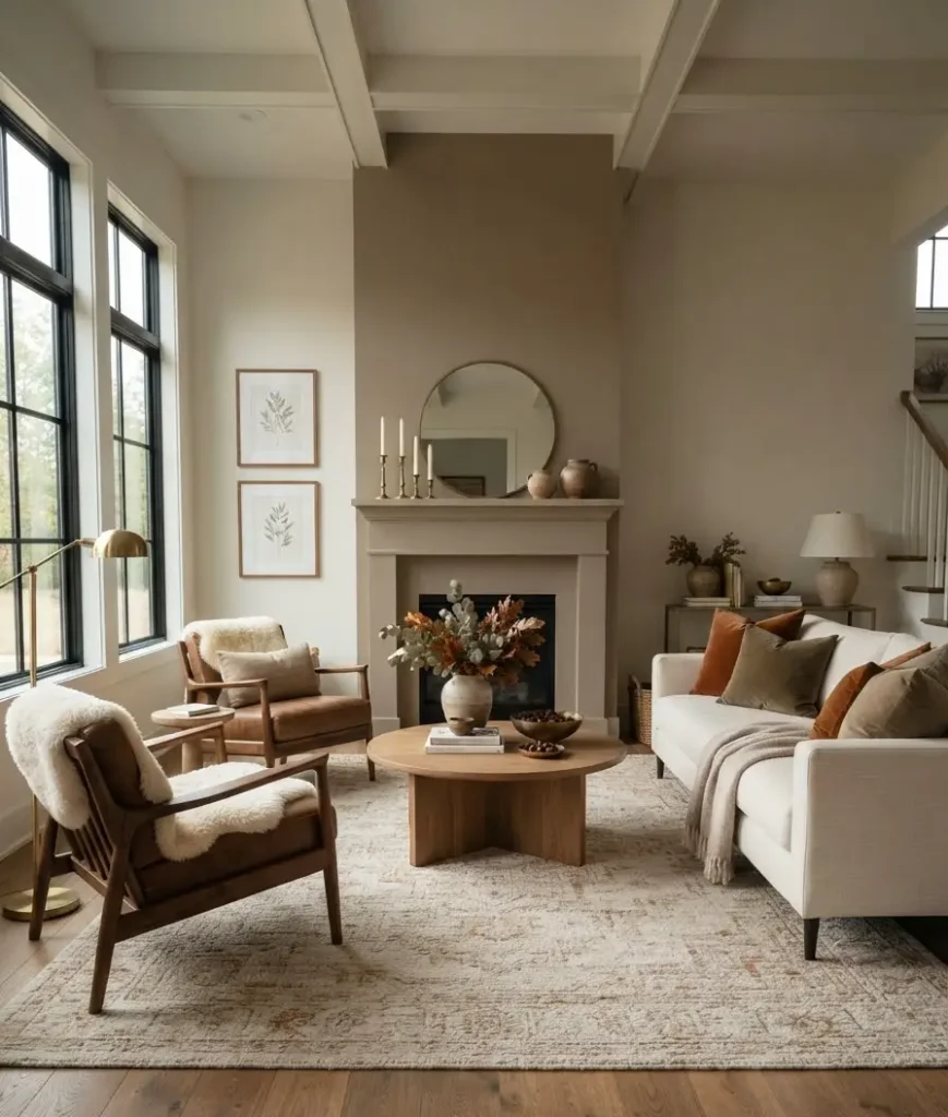
That tracks with what I’m seeing everywhere: terracotta, burgundy, forest green, and warm chocolate brown showing up again and again in fall living rooms.
A few combinations that actually work together:
- Terracotta + cream + brass for a warm, sunlit feel
- Deep green + camel + black accents for something more moody and editorial
- Burgundy + oatmeal + walnut wood for a cozy, almost library-like room
Textures do more work than color
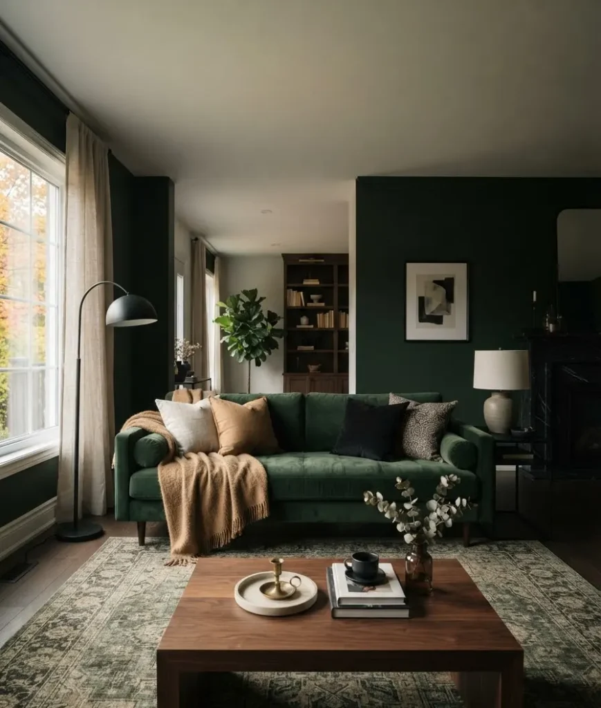
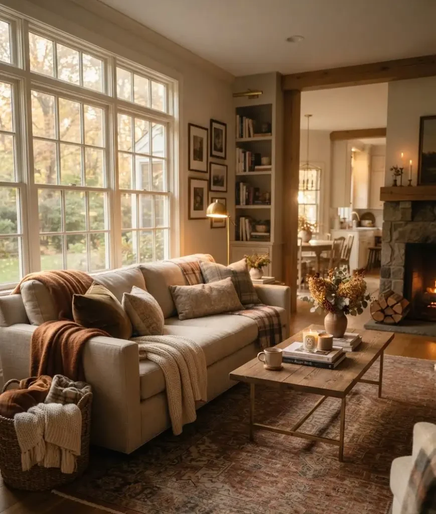
Honestly, texture might matter more than color for making a room feel like fall. Boucle, chunky knit, velvet, and raw wood all read as “autumn” even in a mostly neutral palette. Layer two or three textures on any single surface and the room instantly feels more considered.
Layer texture like you mean it
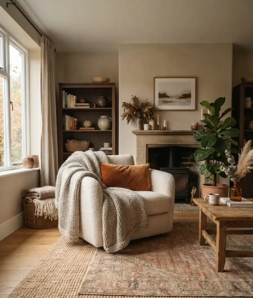
This is where a lot of fall living rooms fall flat (pun intended, sorry). One throw blanket and a single pillow doesn’t count as layering. You want depth.
Try this formula on your sofa: one chunky knit throw, draped, not folded. Two to three pillows in varying textures, not matching sets.
And at least one pillow with a pattern, whether that’s plaid, a botanical print, or something abstract.
A styling guide I trust for this kind of detail work recommends mixing pillow sizes deliberately, an 18-inch, a 20-inch, and one oversized lumbar, rather than a uniform set.
It sounds fussy until you try it, and then you can’t unsee a mismatched set. IMO that one tip alone upgrades a room more than any single decor purchase.
The coffee table actually matters more than you think
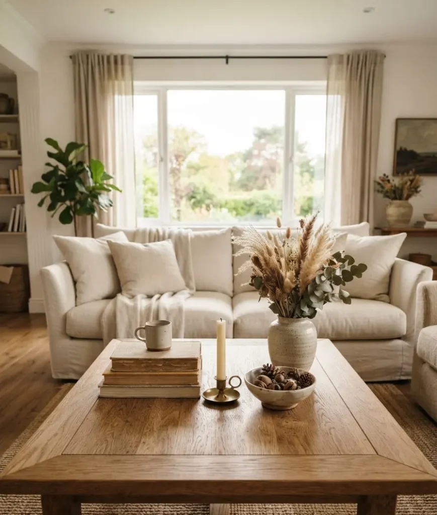
Your coffee table is doing a lot of visual heavy lifting, especially in photos.
It’s usually the first thing people notice in a living room shot, which is exactly why Pinterest is full of coffee table styling content.
Here’s a simple, repeatable formula:
- A stack of two or three books, spines facing in for a cleaner look
- One low, wide candle (unlit is fine for photos, lit is better in person)
- A small bowl or tray with something natural: pinecones, dried pods, a few acorns
- One taller element, like a small vase with dried grasses or branches
Notice what’s missing: fake pumpkins. You can absolutely include real mini pumpkins for a few weeks, but skip the plastic ones that stick around until March.
Nobody’s fooled, and they photograph terribly under real light.
Lighting changes everything, and it’s the cheapest fix
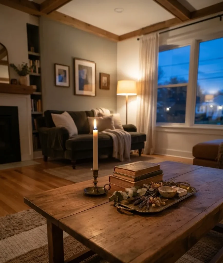
If you only change one thing in this whole guide, change your lighting. Fall rooms live and die on warm, layered light.
Overhead lighting alone makes everything look flat and a little sad, especially once the days get shorter.
Add at least two additional light sources at different heights: a table lamp, a floor lamp, or candles.
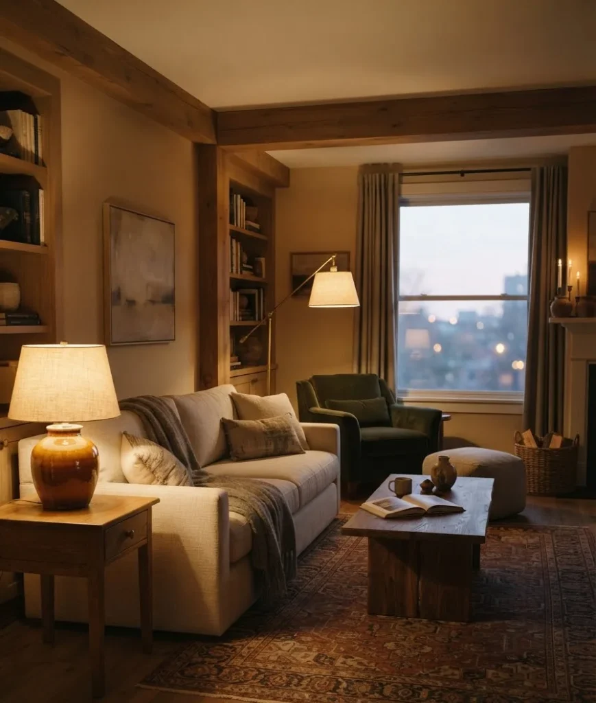
Ceramic lamp bases in amber or olive glazes are trending hard right now, and for good reason. They throw warm light and look good even when they’re switched off.
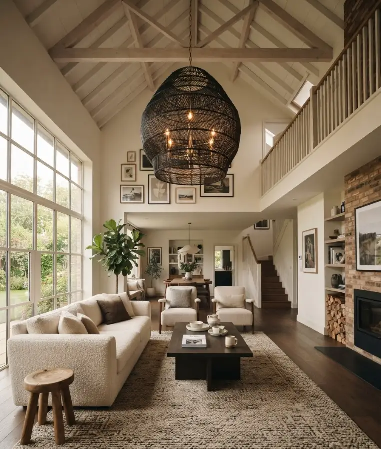
Statement lighting is also having a real moment. Designers surveyed for Living Spaces’ fall trend guide called out bold pendants and chandeliers as one of the defining features of this year’s fall look, with fixtures acting almost like art rather than pure function. You don’t need a $2,000 chandelier to get this effect.
A single statement pendant over a reading corner does plenty.
Where to spend money, and where to skip it
Not every fall decor item deserves your budget. Some things genuinely change a room. Others just take up space until January.
| Item | Worth the investment | Notes |
|---|---|---|
| Throw pillows/covers | Yes | Cheapest way to shift a whole color story |
| Area rug | Yes, if replacing | Anchors the room and reads as fall through texture, not just color |
| Fake pumpkins | Skip | Real ones for a few weeks look better and cost less over a year |
| Table lamps | Yes | Changes the whole mood of the room, works year-round |
I’ll be honest, I skipped the rug the first year and regretted it. A patterned rug over a jute base rug adds more depth to a room than almost anything else on this list, and it’s not close.
A few tips specifically for Pinterest boards
If you’re styling with Pinterest in mind (and let’s be real, a lot of us are), a few small adjustments make a big difference in how a room photographs.
- Shoot during the day with soft, indirect light whenever possible. Warm bulbs read orange in photos more than they look in person.
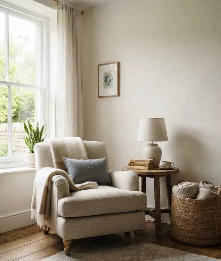
- Style one vignette at a time rather than trying to capture the whole room. Close-up coffee table shots and cozy corner shots outperform wide room shots almost every time.
- Leave a little negative space. A perfectly styled corner with breathing room around it looks more elegant than a room stuffed with fall touches on every surface.
Random aside, but I’ve noticed my own saved Pinterest boards are almost entirely corner shots and coffee tables, not full rooms. Worth thinking about before you stage anything.
Small mistakes that quietly ruin the look
A few things I see constantly on Pinterest and in real living rooms that undercut an otherwise good fall setup:
- Mixing warm and cool metals without intention (brass and chrome next to each other rarely works)
- Too many small decorative objects with no grouping or logic
- Skipping texture on the floor entirely and relying only on the sofa for warmth
- Leaving summer decor up alongside fall pieces, which just reads as clutter
None of these are hard to fix. Most take an afternoon.
Frequently asked questions
How do I add fall decor to a living room without spending much money? Start with what you already own. Swap pillow covers instead of buying new pillows, rearrange existing candles and books into a fresh coffee table vignette, and add one new textured throw. Color and texture do more than new furniture ever will.
What colors work best for an elegant, classy fall living room? Terracotta, burgundy, forest green, and warm chocolate brown are leading the way for 2026, according to jane at home’s fall decor trend coverage. Stick to two or three shades and repeat them through pillows, a throw, and one larger piece like a rug.
How long should fall decor stay up in a living room? Most people keep fall-specific pieces up from mid-September through late November, then shift to winter tones. Pieces built around texture and warm wood rather than pumpkins or leaves can honestly stay out well into winter without looking out of place.
Final thought
Elegant fall decor isn’t about buying more. It’s about noticing what your living room already has and adjusting the color, texture, and light around it. Start with your coffee table this weekend. See how far one good vignette gets you before you buy a single new thing.
What’s the one piece in your living room that already feels like fall without any help? I’d genuinely like to know.
