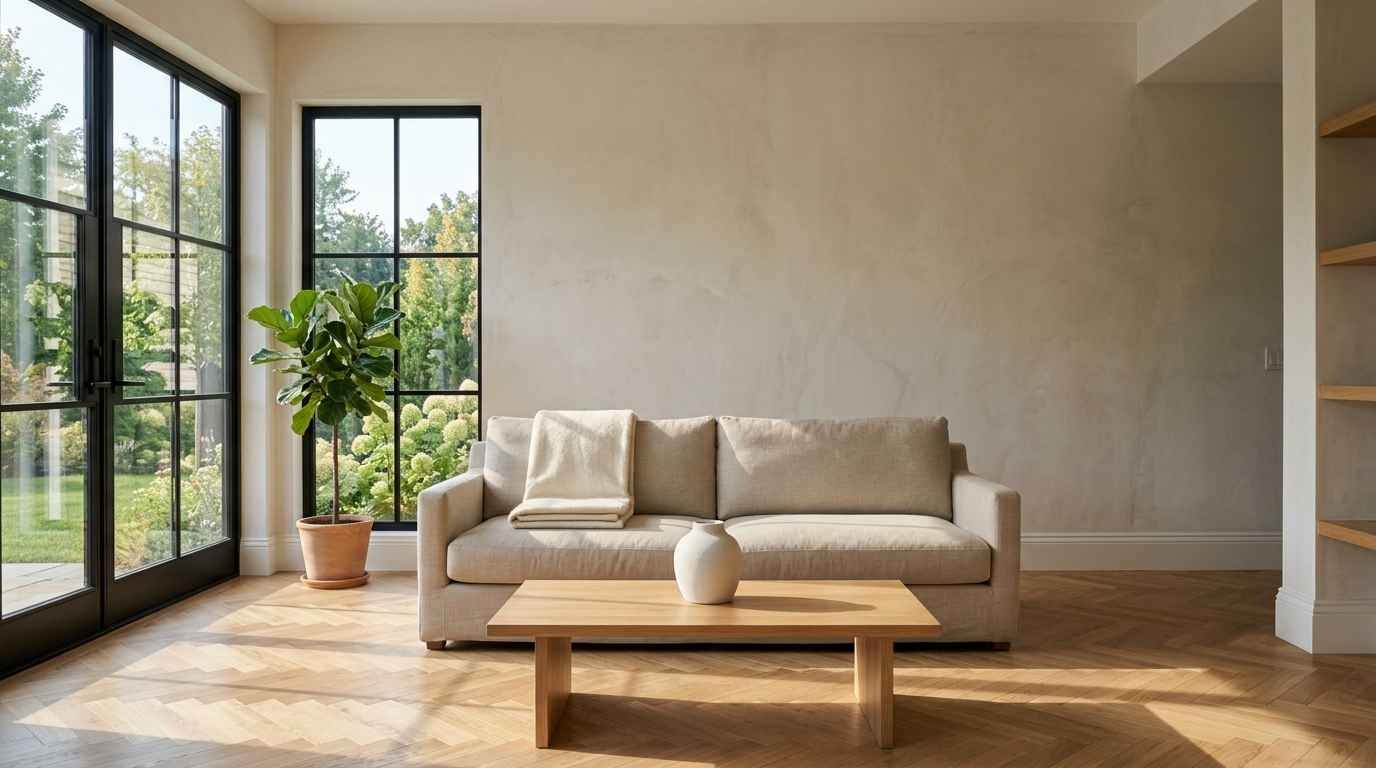
That blank wall above your couch has been staring at you for months. Maybe longer.
I get it, I stared at mine for almost a year before I did anything about it, and honestly, the fix was way easier than I made it out to be in my head.
If you’re the type who pins 40 living rooms a week but still hasn’t hung a single frame, this one’s for you.
Below are 23 ideas that keep things clean, calm and Pinterest-worthy, without turning your wall into a cluttered mood board.
Why the space above your sofa matters so much
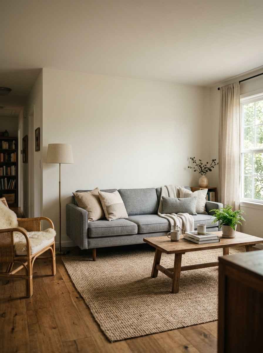
Your sofa wall is the first thing people see when they walk into the room.
It’s also the backdrop for every photo you’ll ever take of that space (and yes, you will take photos, don’t lie).
A minimalist approach works because it does one thing well instead of ten things poorly. One striking mirror.
Three prints with matching frames. A single floating shelf. That’s it. No fuss, no forty tiny frames fighting for attention.
I redecorated my own living room last spring and went from “let’s just add more stuff” to “what can I remove.” Big difference in how the room actually felt afterward. Calmer.
More finished. Less like a storage unit for art I bought on sale.
Get the sizing right first
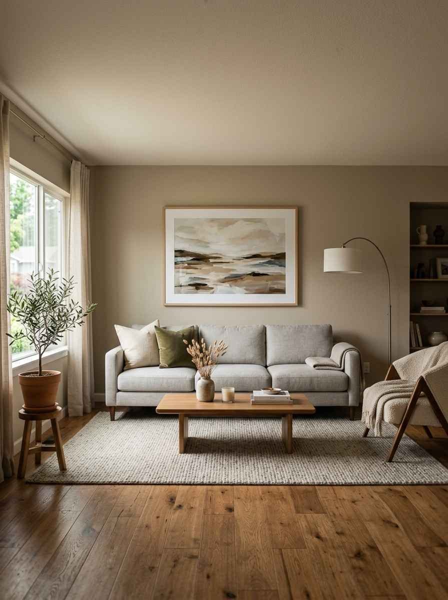
Before you touch a hammer, size matters more than style. Most designers agree your wall art, whether it’s one piece or a whole arrangement, should run about two-thirds to three-quarters the width of your sofa, and this sizing and layout guide breaks the math down if you want exact inches for your space. Hang the bottom edge roughly 6 to 10 inches above the sofa back.
Any lower and it feels cramped. Any higher and it floats off into no man’s land.
Here’s a quick cheat sheet I keep saving to my own boards:
| What you’re hanging | Width rule | Height above sofa | Best for |
|---|---|---|---|
| Single statement piece | 2/3 to 3/4 of sofa width | 6-10 inches | Small walls, renters |
| Grid gallery (4-9 frames) | 2/3 of sofa width | 6-8 inches | Photo lovers, symmetry fans |
| Mirror | 1/2 to 2/3 of sofa width | 6-10 inches | Small or dark rooms |
| Floating shelf | Full sofa width | 8-12 inches | People who redecorate often |
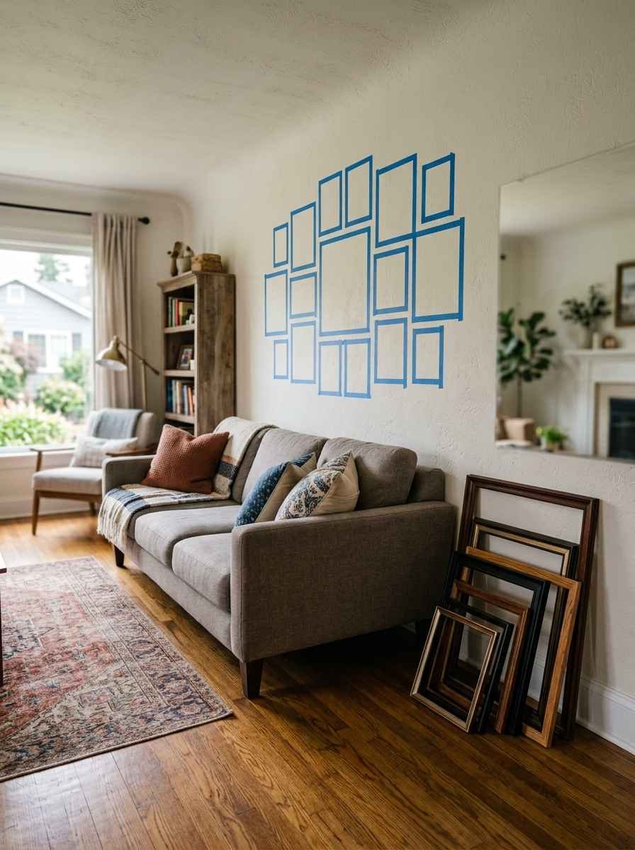
FYI, painter’s tape is your best friend here. Outline your layout on the wall before a single nail goes in. You’ll thank yourself later.
23 minimalist ideas to steal
Art and prints
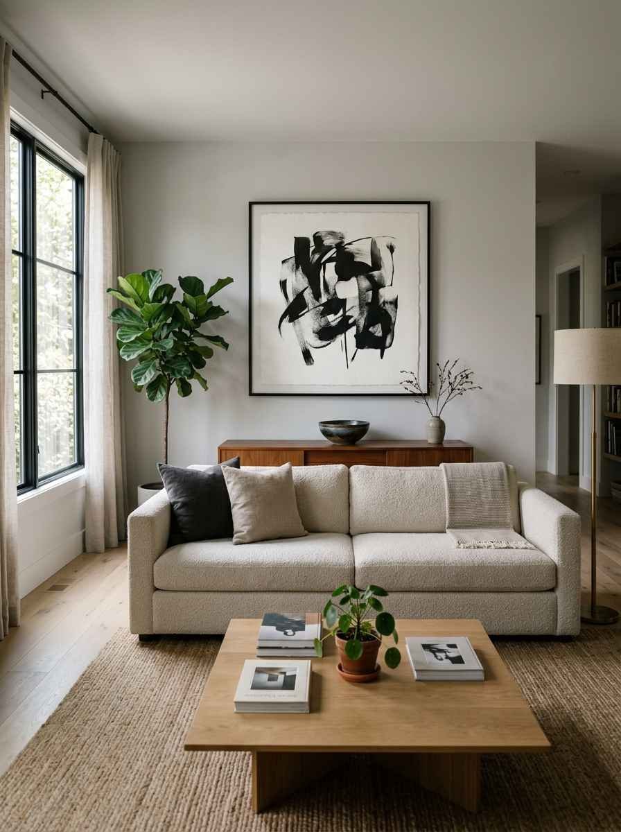
A single oversized print. Skip the gallery entirely. One large black and white photograph or abstract print does more for a minimalist room than six small ones ever could.
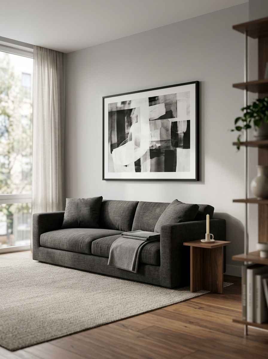
A matched pair. Two identical or complementary prints, evenly spaced, side by side. It’s simple, it’s balanced, and it never looks dated.
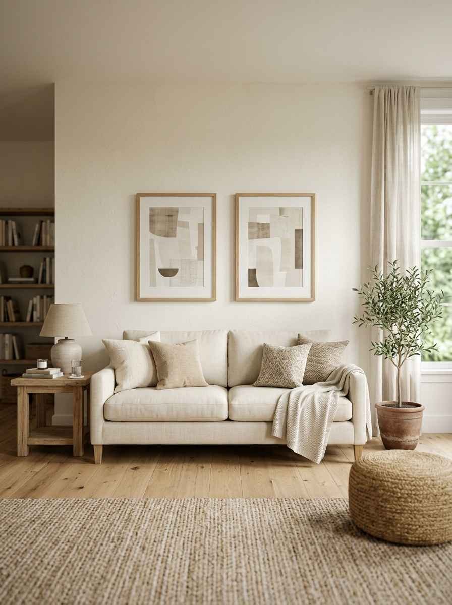
A linear trio. Three same-size prints in a row works beautifully over smaller sofas and loveseats, especially with the center piece as the visual anchor.
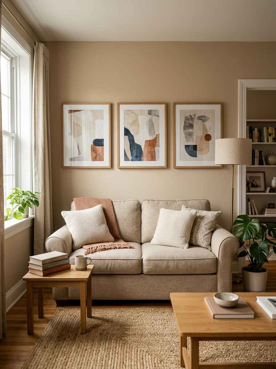
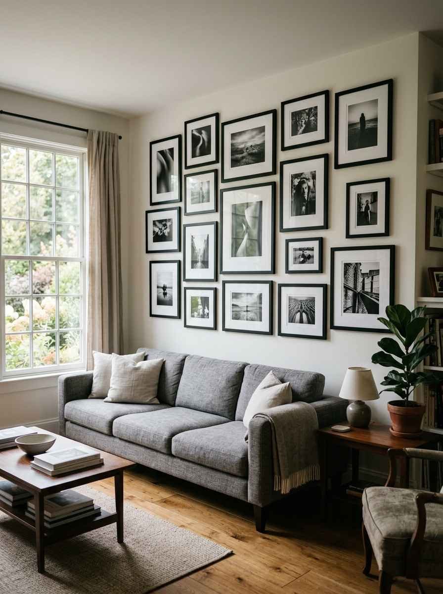
Black and white photography grid. A tidy 3×3 or 4×2 grid in slim black frames reads clean and architectural without trying too hard.
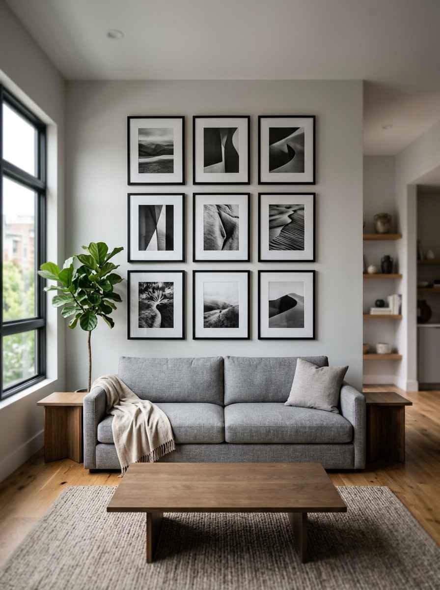
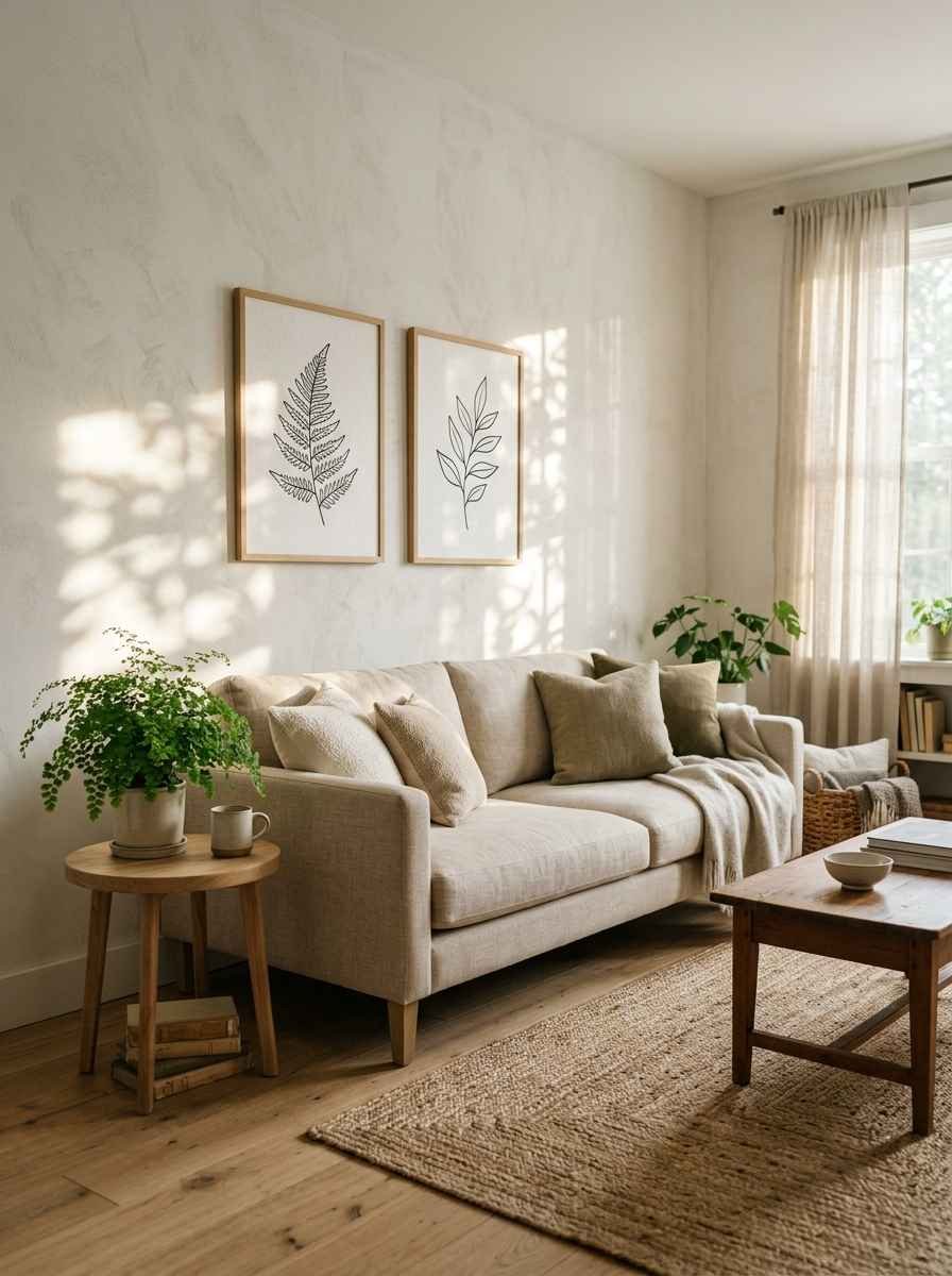
Botanical line art. Simple ink-style plant sketches bring warmth without adding color or clutter.
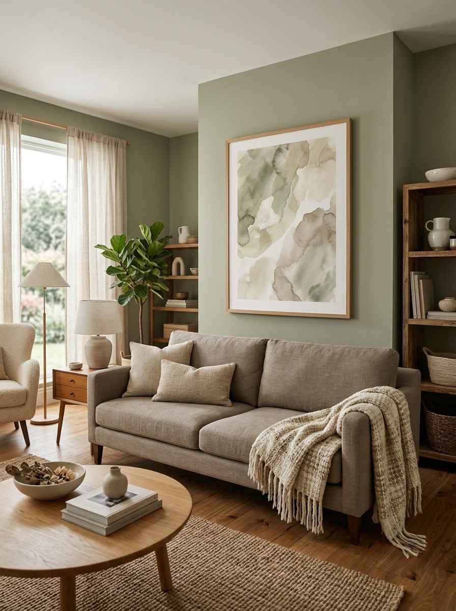
Abstract watercolor in muted tones. Sand, sage, soft gray. Anything that whispers instead of shouts.
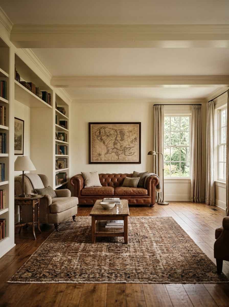
A large-scale map or travel print. Personal, but still restrained if you keep it black and white or sepia toned.
Typography art. One word or a short phrase in a clean font. I’m not usually a “live laugh love” person, but a well-designed typography piece can genuinely work if the font isn’t trying too hard.
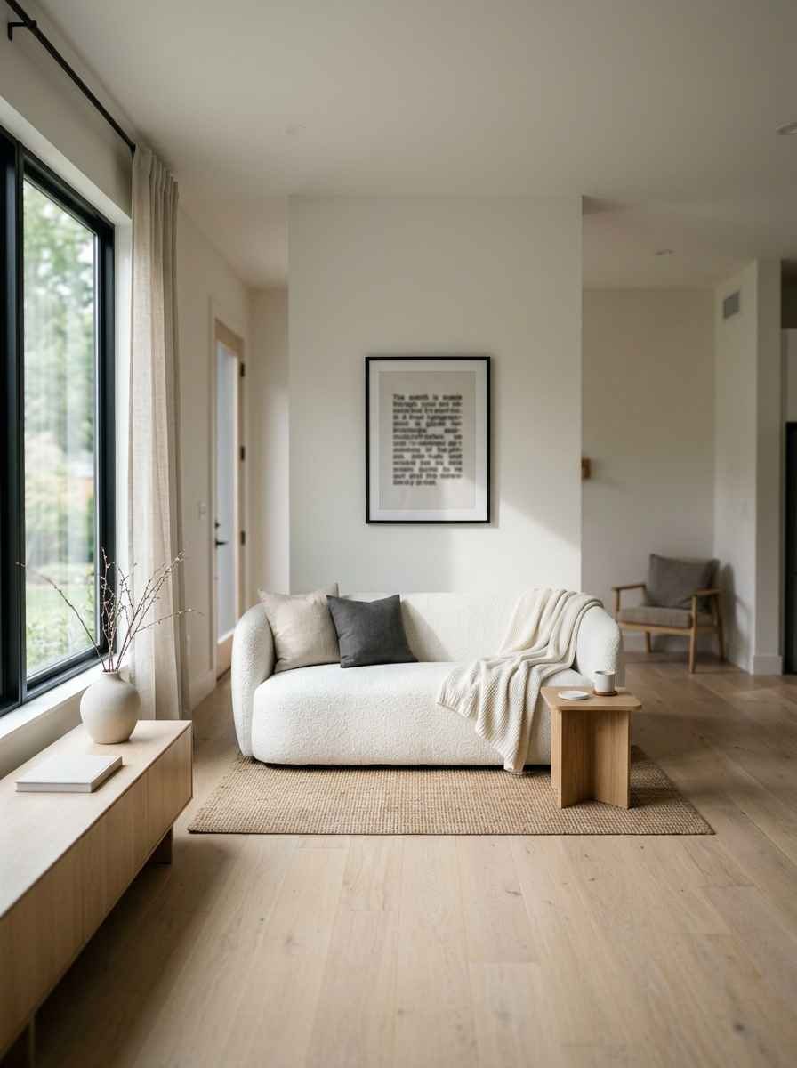
Mirrors and reflective pieces
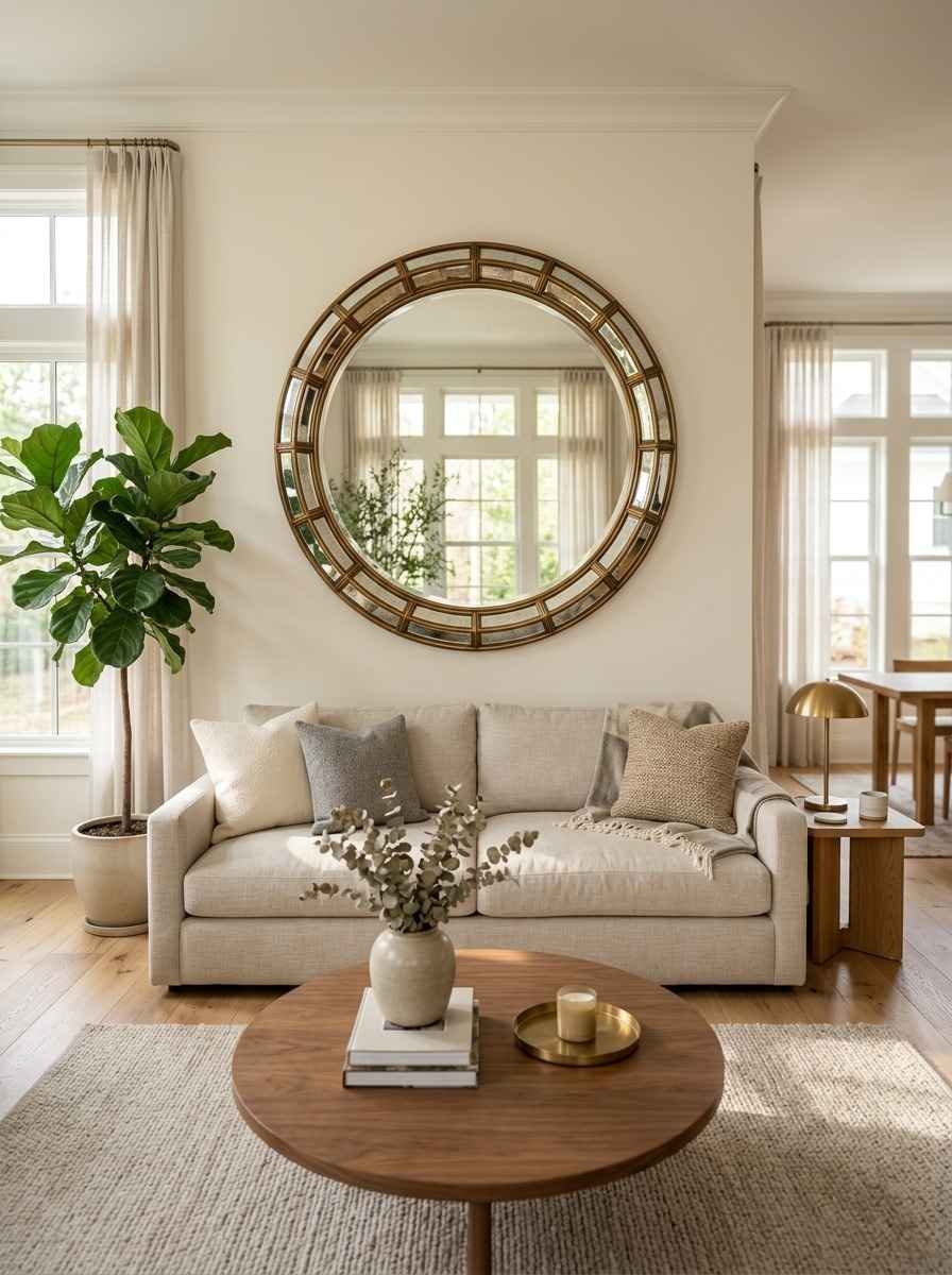
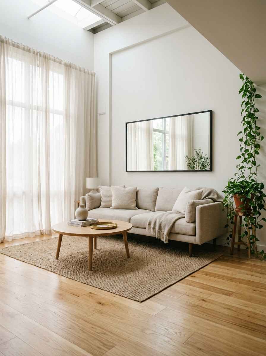
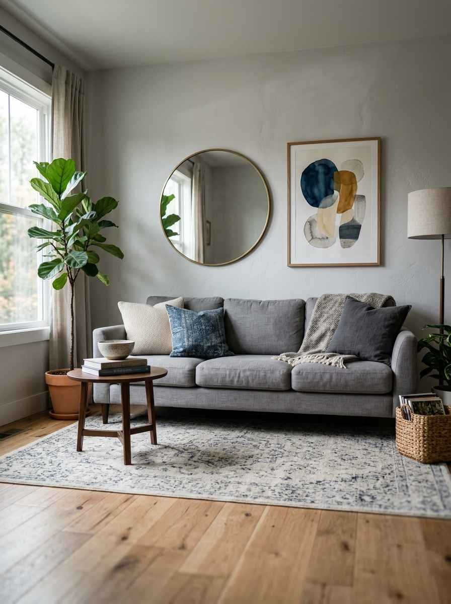
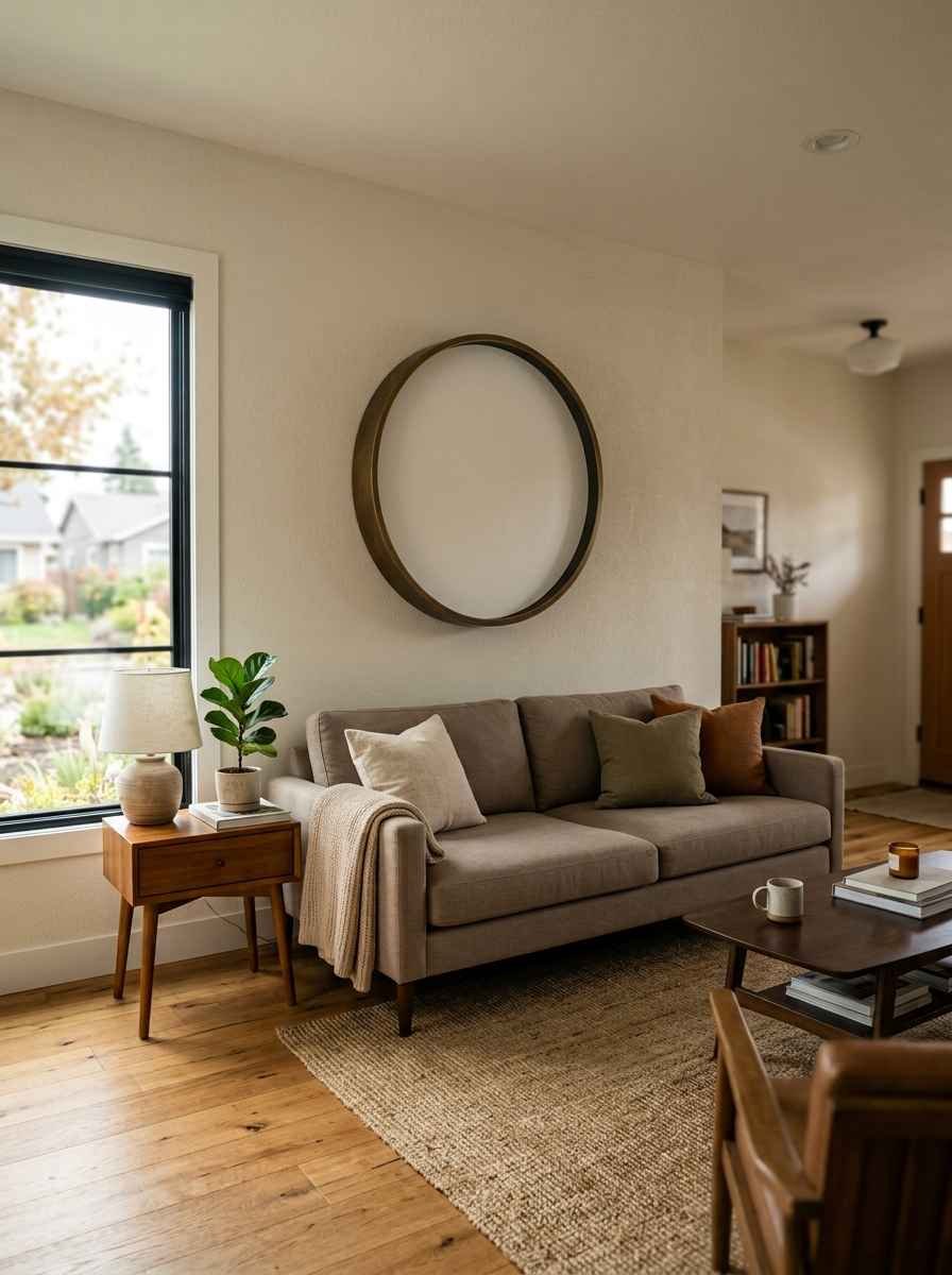
A round mirror. This is probably the most Pinterest-famous minimalist move there is, and for good reason. It bounces light around, makes the room feel bigger, and needs zero styling effort.
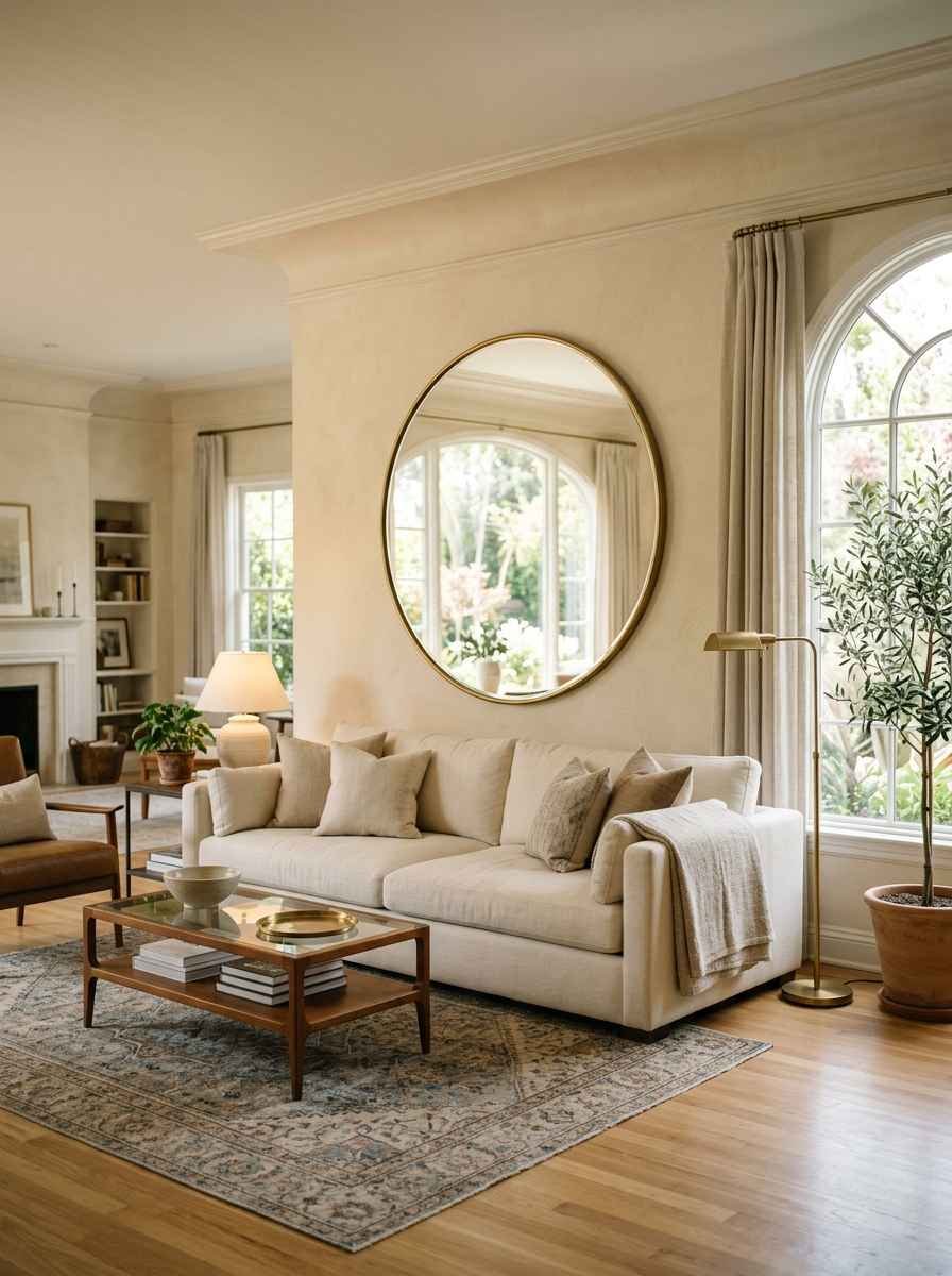
An arched mirror. Softer lines than a rectangle, still simple, still does the light-bouncing trick.
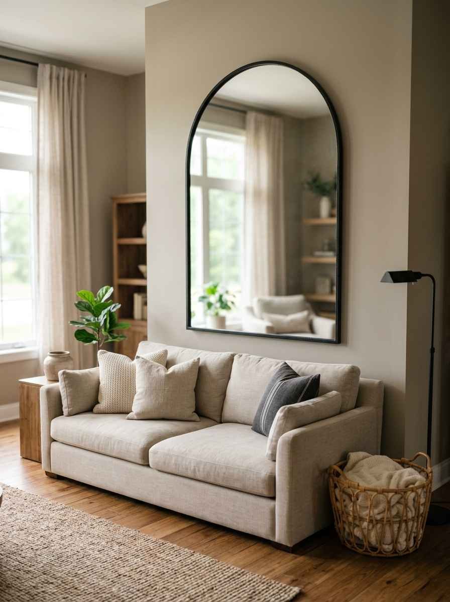
A mirror and print combo. One mirror, one framed piece, spaced evenly. It breaks up the reflection without overcrowding the wall.
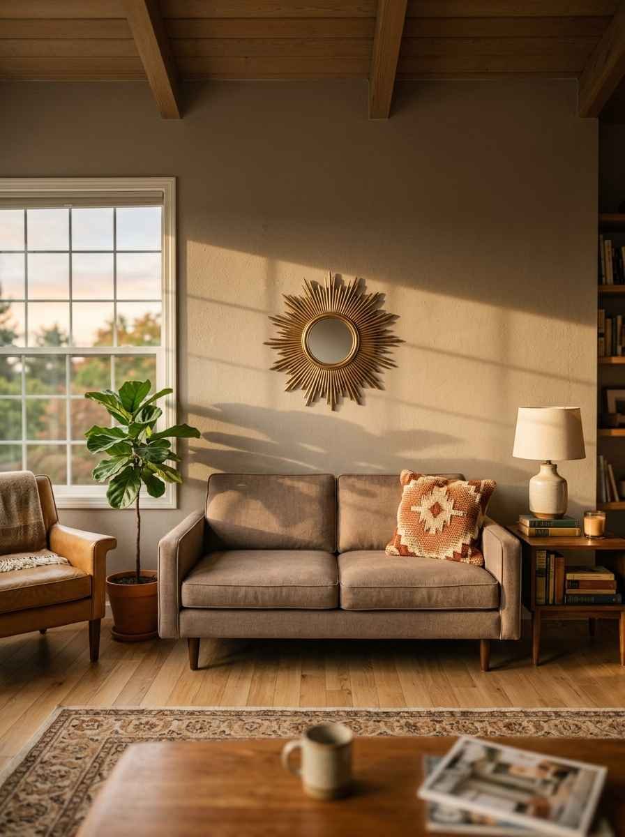
Sunburst mirror, scaled down. The oversized gold sunburst had its moment. A smaller, matte-finish version keeps that texture without going full 2016 Pinterest board.
Shelves and functional decor
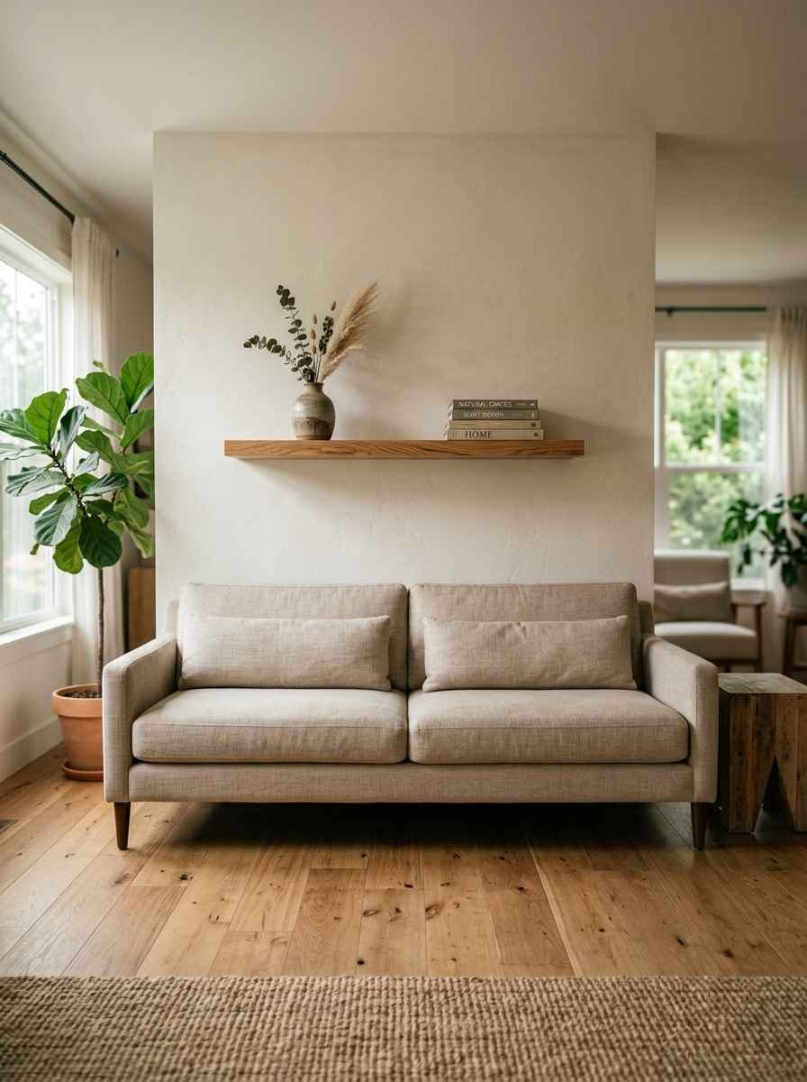
A single floating shelf. Style it with two or three objects max: a small vase, a stack of books, one framed photo. Swap it out whenever you’re bored, which, let’s be honest, is often.
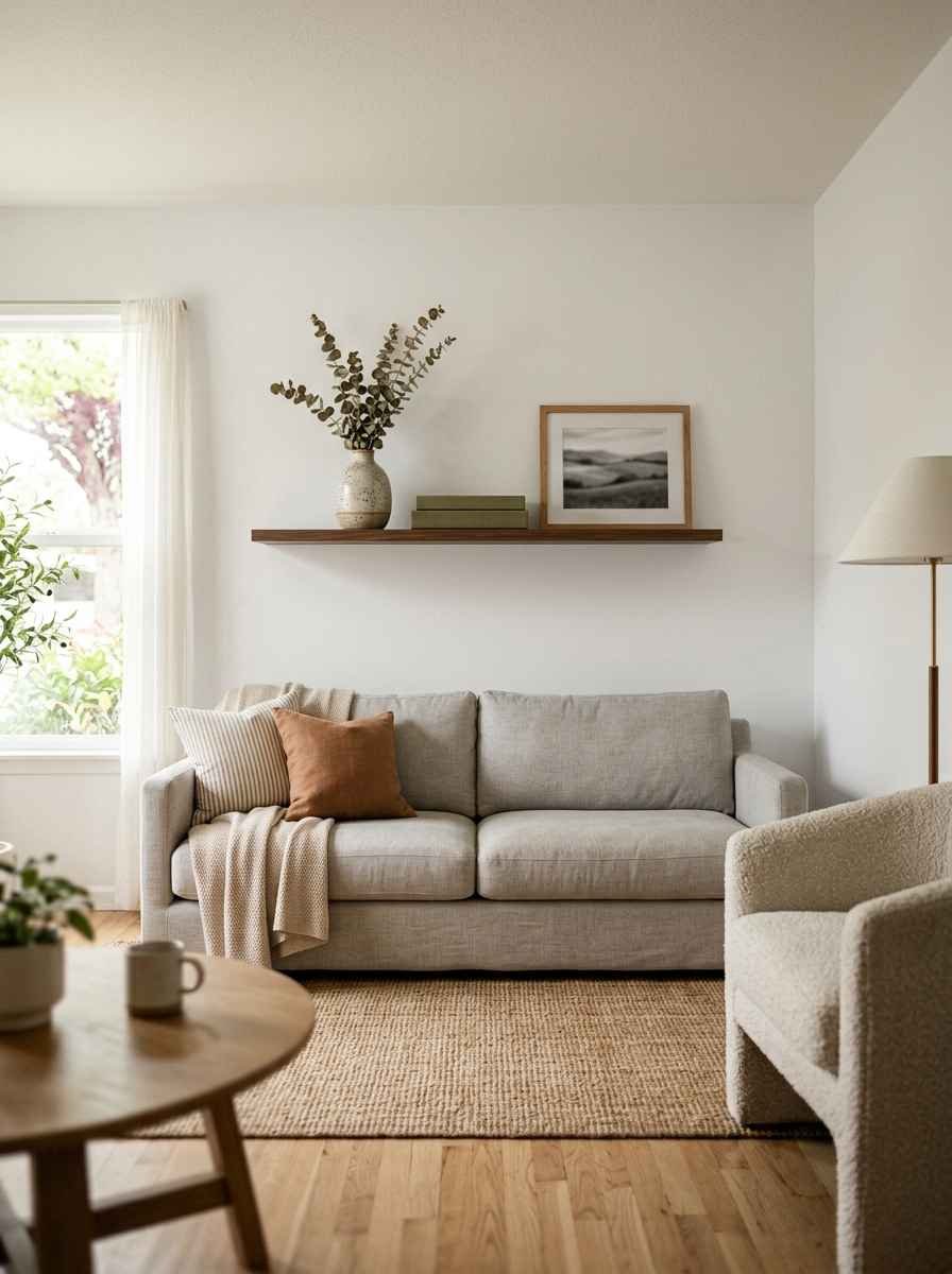
A picture ledge. Lean frames against the wall instead of hanging them. Ridiculously renter-friendly and easy to update.
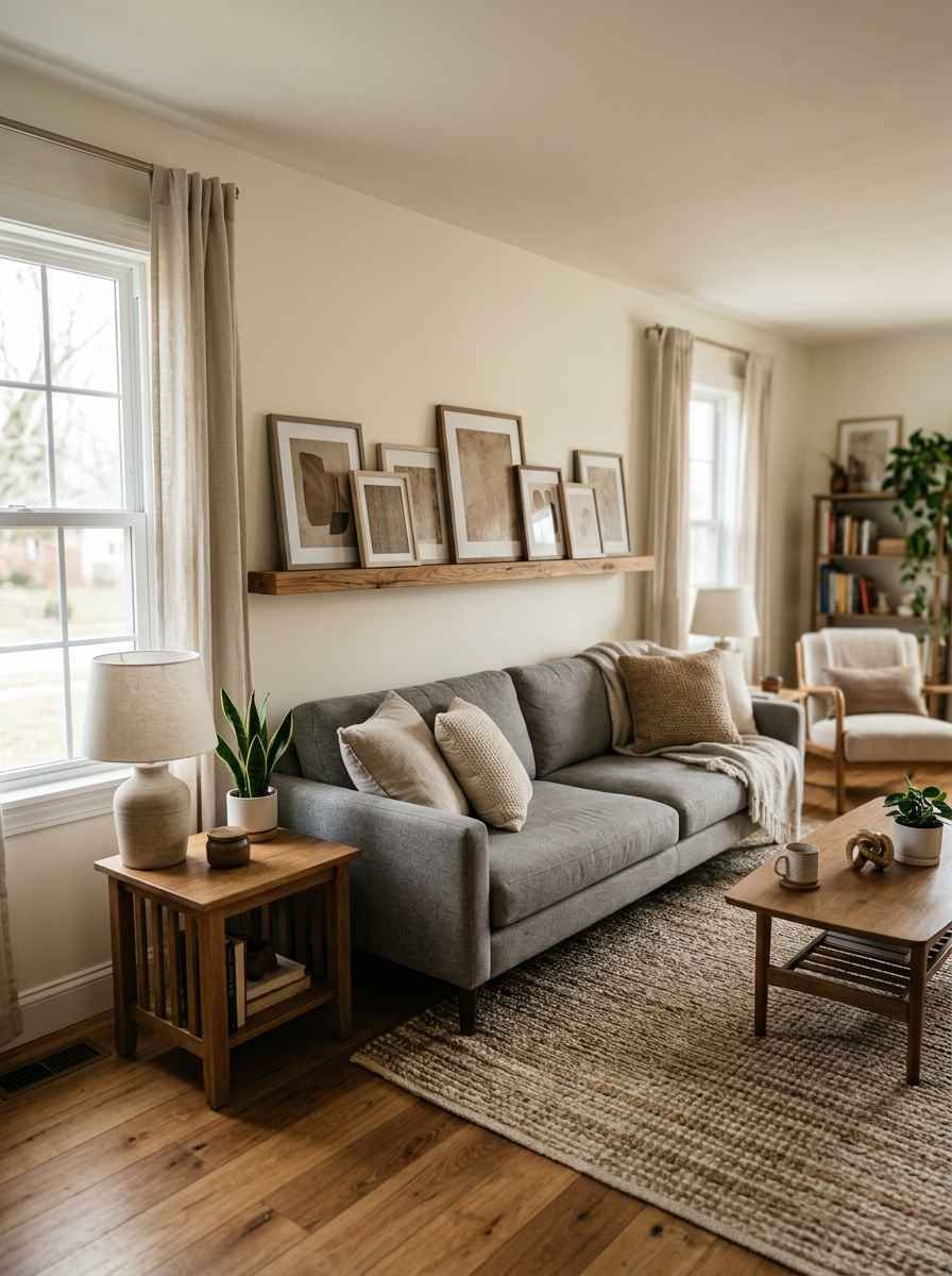
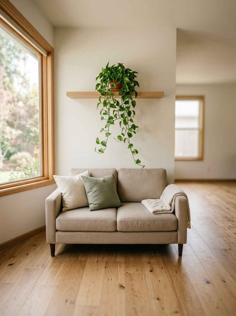
A slim wood shelf with greenery. One trailing plant, real or faux (yes, even a fake one counts), softens all those hard lines.
A clock as the anchor piece. A large, neutral-toned clock functions as art and keeps the wall practical.
Texture and mixed media
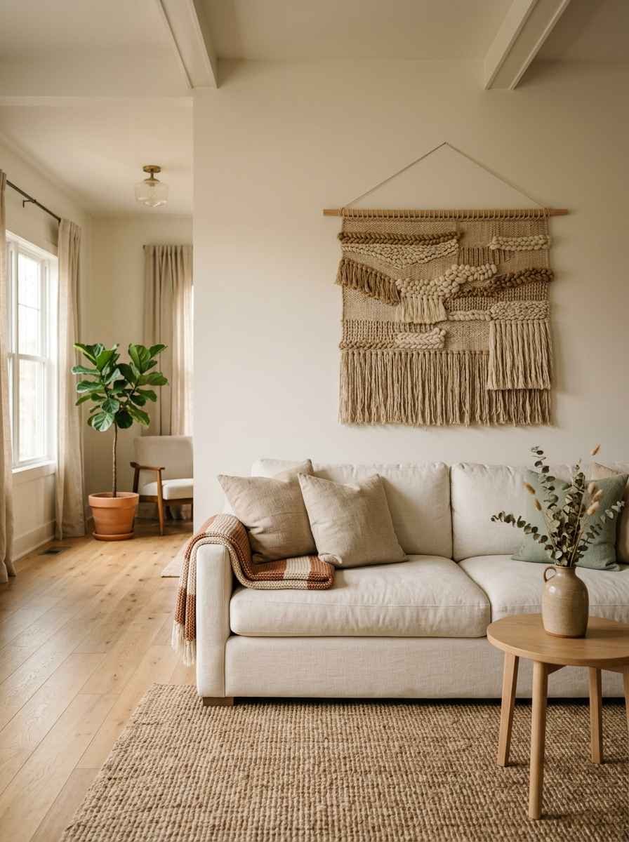
A woven wall hanging. Neutral macrame or a simple woven tapestry adds texture without adding visual noise.
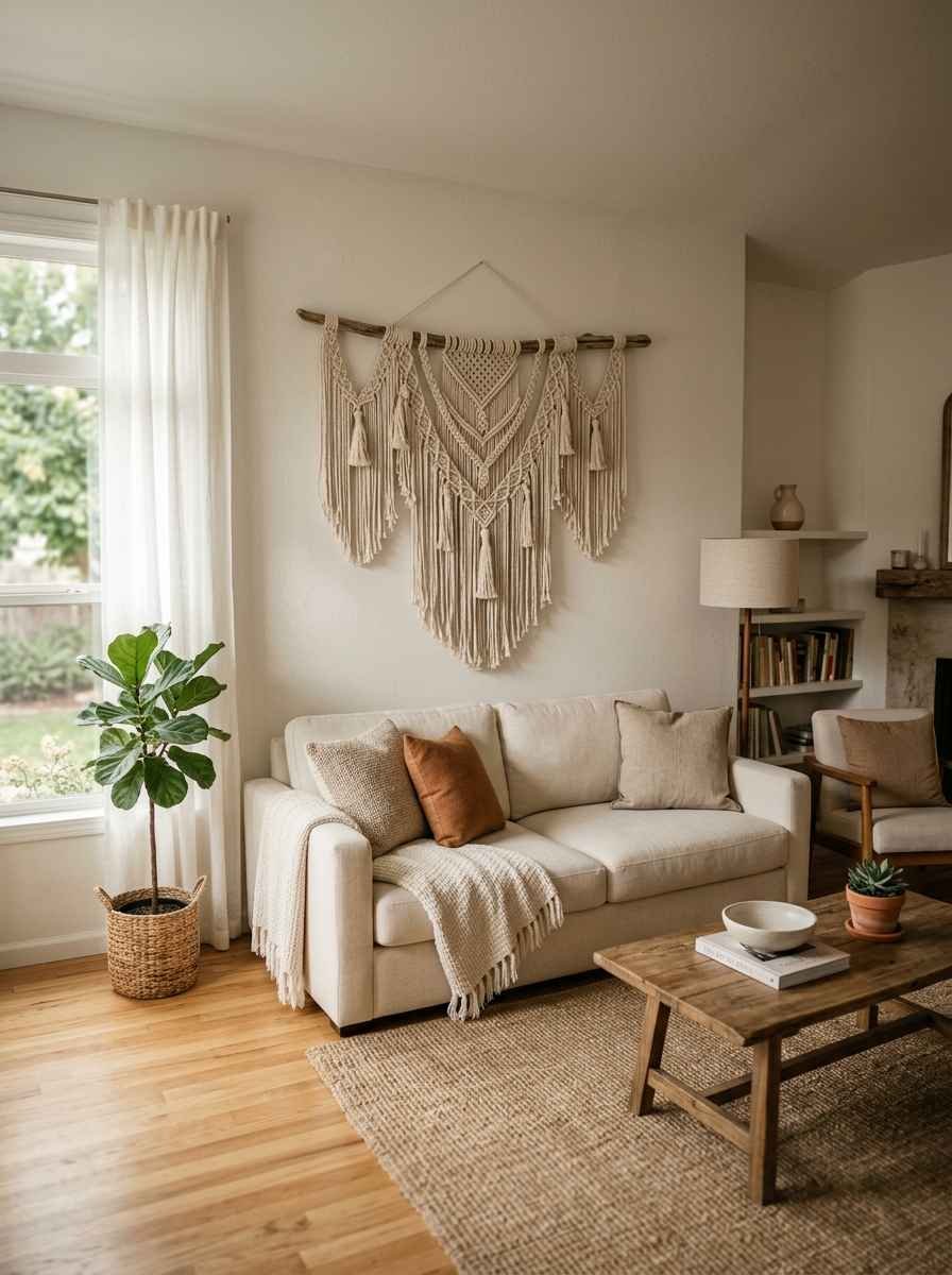
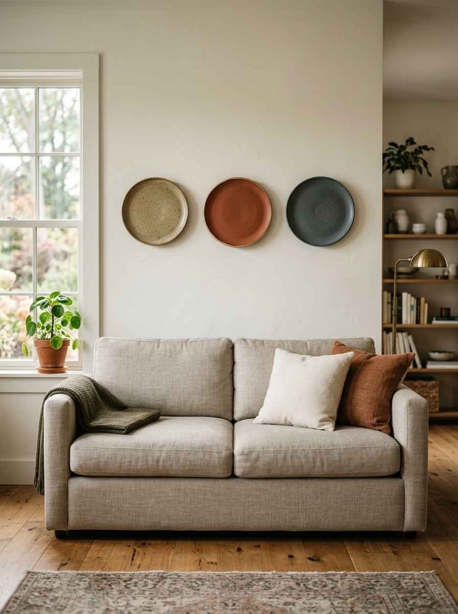
A textured ceramic plate display. A small cluster of three matte ceramic plates, evenly spaced, feels collected rather than cluttered.
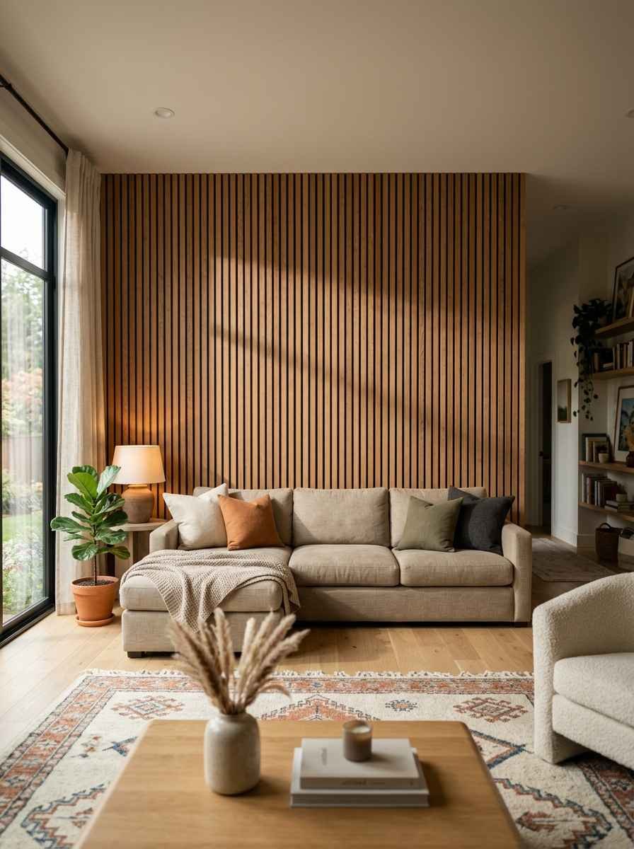
A wood panel accent. Slatted wood paneling behind the sofa gives texture and warmth, especially in a room that’s mostly white or gray.
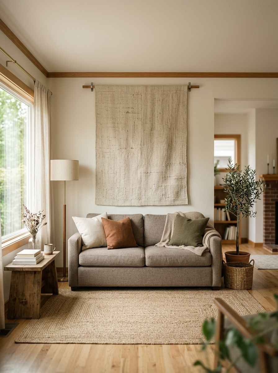
A single large tapestry or fabric panel. Think unbleached linen or a subtle geometric weave. It’s soft, quiet, and surprisingly easy to hang.
Personal and low-effort options
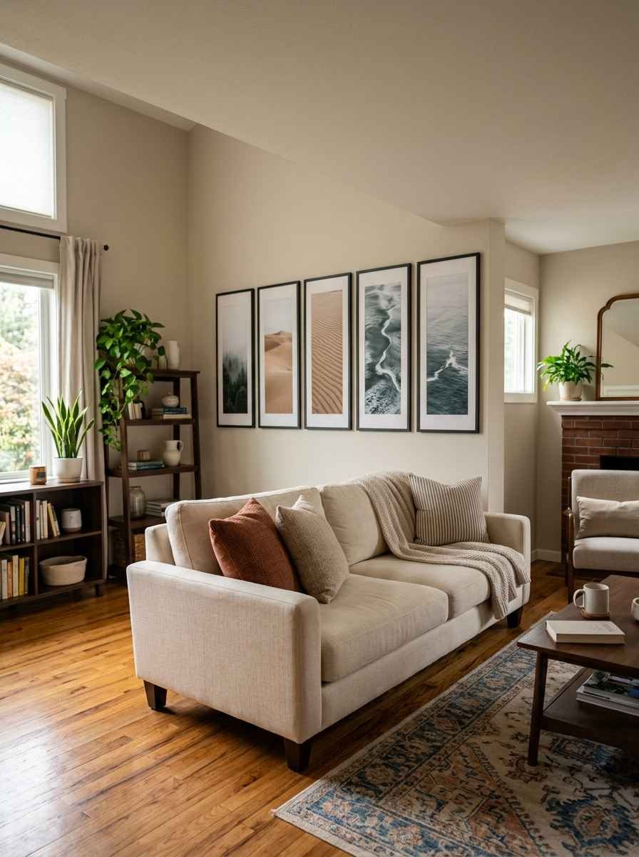
Family photos in matching frames. Keep every frame the same color and finish (all black, all wood) so the personal touch doesn’t turn chaotic.
This is genuinely my favorite option because it looks intentional even when you’re just tossing up whatever photos you love.
A gallery wall with a strict color rule. Only black and white.
Or only warm neutrals. The theme does the organizing for you, so you don’t need a design degree to make it look pulled together.
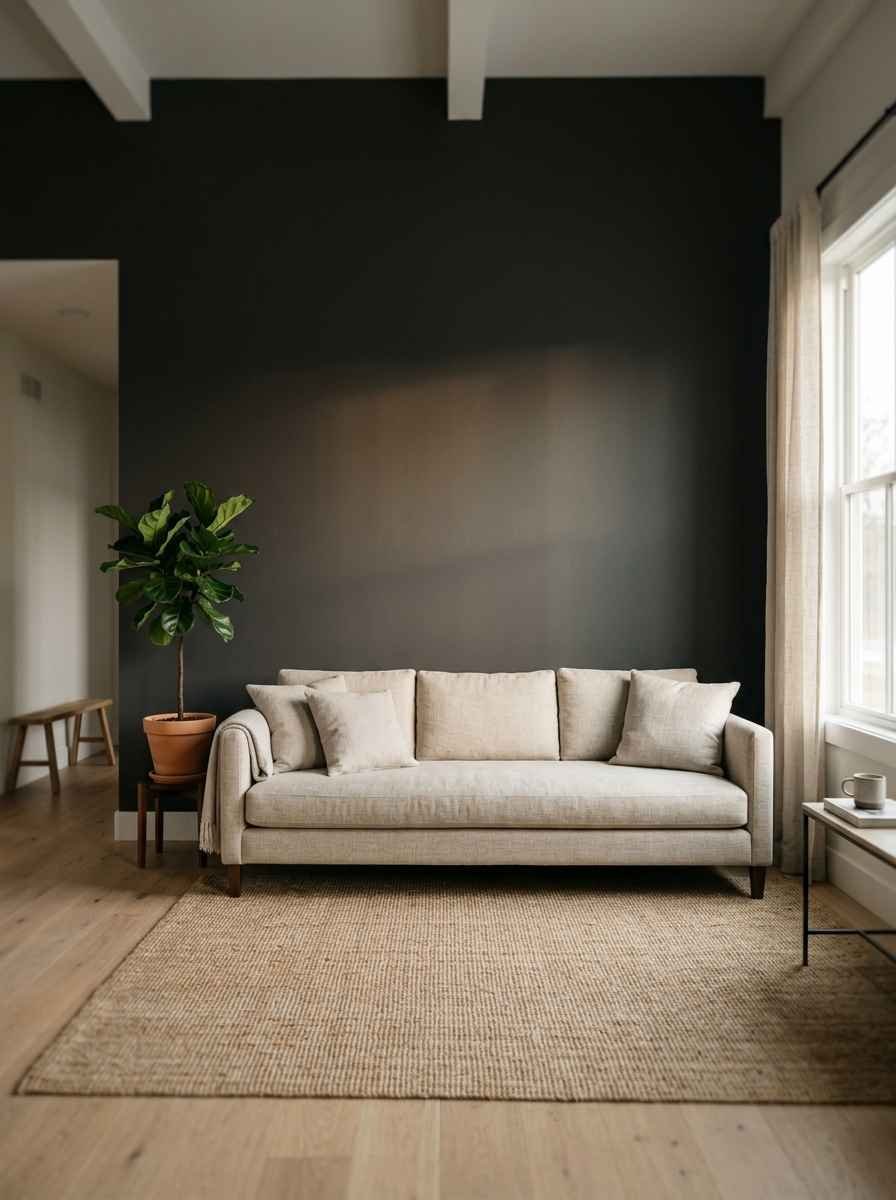
Nothing but a paint contrast. Sometimes the most minimalist decor above your couch is no decor at all.
A slightly darker accent shade on just that wall creates depth without a single frame.
Okay, random aside: I once spent three hours debating between two nearly identical shades of off-white for an accent wall, and my partner still brings it up.
Worth it? Honestly, kind of. Paint color matters more than people admit.
A few layout tricks that actually work
If you’re staring at your options and feeling stuck, a few tested layout formulas can save you a lot of trial and error, and this breakdown of layout formulas for gallery walls covers grids, linear trios and salon-style arrangements in more depth than I can fit here.
A couple of things I’d add from experience:
- Space frames 2 to 3 inches apart. Any tighter and the wall feels busy. Any wider and it looks unplanned.
- Start with your largest or most central piece and build outward. Trying to plan from the edges in is where most layouts fall apart.
- Cut cardboard templates the exact size of each frame and tape them to the wall first. It looks ridiculous for an afternoon. It saves your walls from a dozen unnecessary nail holes.
If you want more inspiration boards to pin before you commit, this collection of gallery wall ideas is a solid rabbit hole for a rainy afternoon.
Common mistakes I see constantly
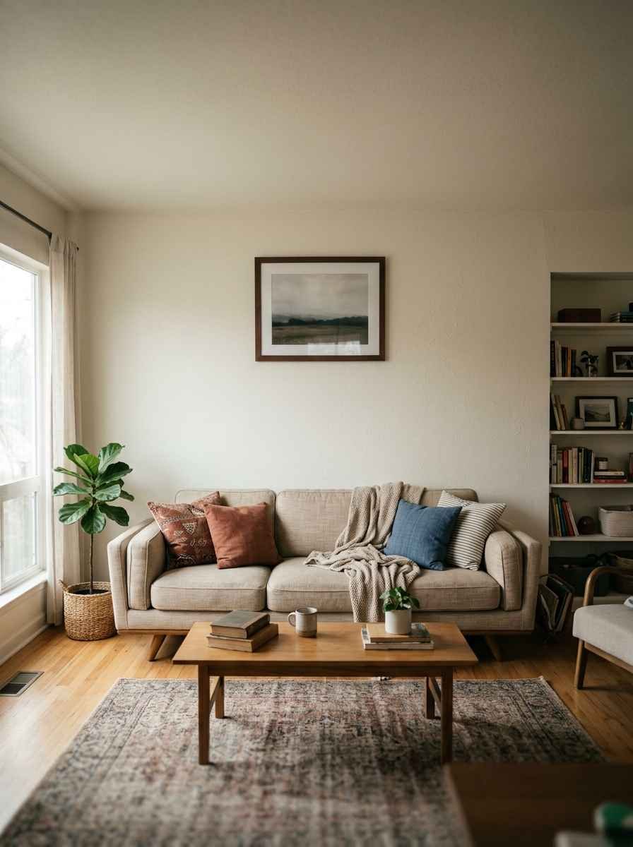
Hanging too high is the number one issue. IMO, most people overcorrect because they’re scared of looking cramped, and then everything ends up floating near the ceiling instead.
Mismatched frame finishes without a plan is another one. Mixing wood and black metal can look great, but only if there’s some kind of rule tying it together (same mat color, same general size, whatever). Otherwise it just reads unfinished.
And going too big, too fast. Wow, this one gets people every time. You don’t need to fill the entire wall in one weekend. Minimalism works because of restraint, not because you gave up halfway through.
Frequently asked questions
How high should wall decor be hung above a couch? Aim for 6 to 10 inches above the top of the sofa back. That gap feels intentional instead of accidental.
What’s the best minimalist option if I’m renting? A picture ledge or removable adhesive frames. Both let you style the wall without a single nail hole, and you can rearrange them in minutes.
Can I mix a mirror with framed art above the same couch? Yes, and it often looks great. Just keep the spacing even and stick to a shared color palette so the two elements feel like one arrangement instead of two separate decisions.
Final thought
A minimalist wall above your couch isn’t about having less to look at. It’s about giving your eye somewhere to actually land. Pick one or two ideas from this list, measure twice, and give yourself permission to keep it simple.
Which idea are you saving first, the round mirror, the linear trio, or something else entirely? Drop it on your Pinterest board and start planning your layout this weekend.
