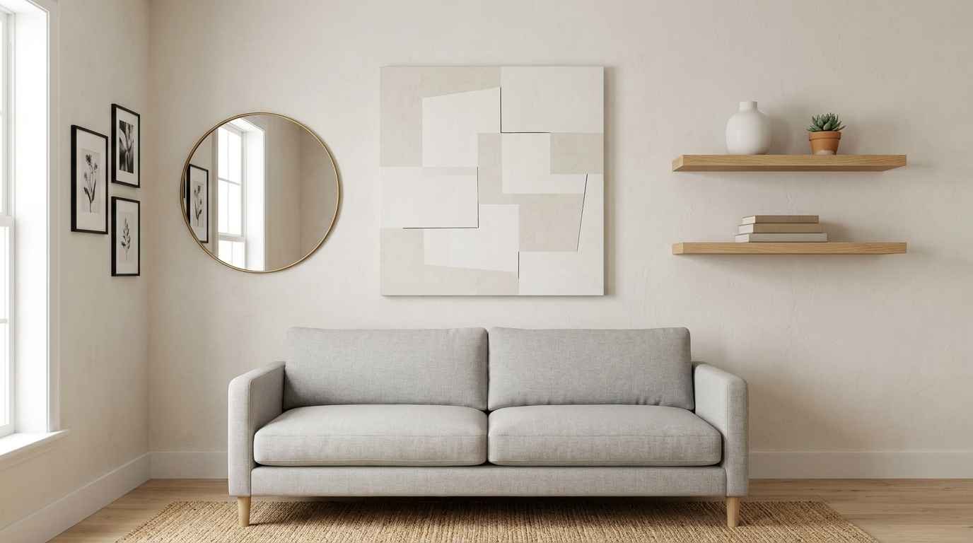
My apartment used to look like a thrift store exploded on one wall and a hospital waiting room took over the other. I owned zero cohesive plan. Just stuff I liked, nailed up wherever there was space.
Then I gutted it all and started over with a minimalist approach. Three weekends later, guests kept asking who I hired.
Nobody. I just followed a few rules that actually work, and I’m handing them to you right now.
If you’re pinning inspiration boards at midnight trying to figure out how “clean” and “cozy” coexist on the same wall, this list is for you.
20 ideas, zero fluff, and a couple of things I got wrong the first time so you don’t have to.
Minimalism gets a bad reputation for looking sterile. Cold walls, empty corners, a single black and white print floating in a sea of white paint. That’s not what we’re doing here. Real minimalist decor still feels lived in.
It just gets there with fewer, better choices instead of piling on everything at once. Think of it less as subtraction and more as editing: you keep what earns its place on the wall and let go of the rest.
I’ll walk through these in loose categories, from the foundational stuff (color, spacing, scale) to the fun part (texture, gallery walls, functional pieces). Grab a coffee. This one’s long, but you’ll leave with an actual plan instead of another vague inspiration board.
Start with the bones: color and space
Minimalism lives or dies on restraint. Before you buy a single frame, get these fundamentals right.
1. Pick one neutral base, then stop. White, warm greige, soft oat, whatever you like. Just commit to one dominant tone across the wall. I went with a muted clay color in my bedroom and it instantly made the room feel warmer without adding a single extra object.
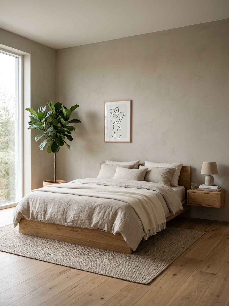
2. Let negative space do the work. Empty wall isn’t wasted wall. It’s breathing room. A single framed print on a large blank wall reads more expensive than five prints crowded together, every time.
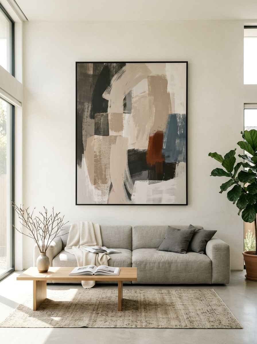
3. Use the two-thirds rule for scale. Art hung above a sofa or bed should span roughly two-thirds the width of the furniture below it.
Go smaller and it looks like an afterthought. This guide to wall art sizing breaks the math down if you want exact numbers.
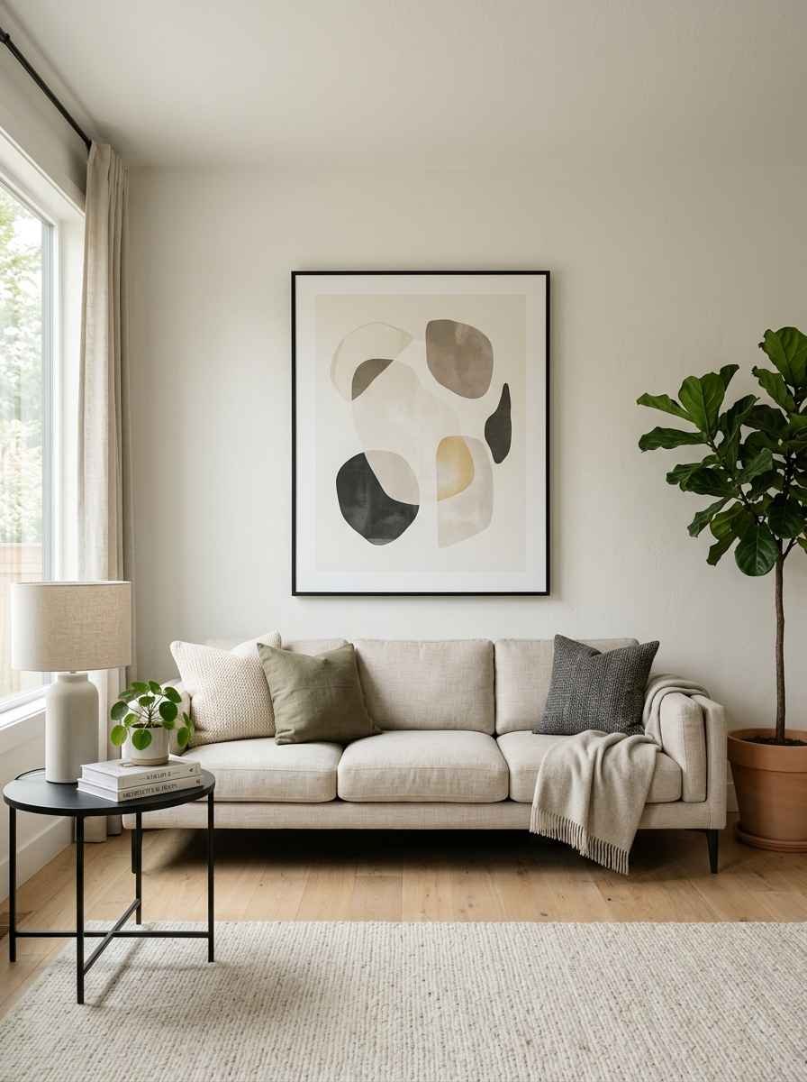
4. Choose one accent color, max. Sage green, dusty blue, a warm terracotta. Pick it once and repeat it sparingly.
Two accent colors on a minimalist wall starts to look like you couldn’t decide.
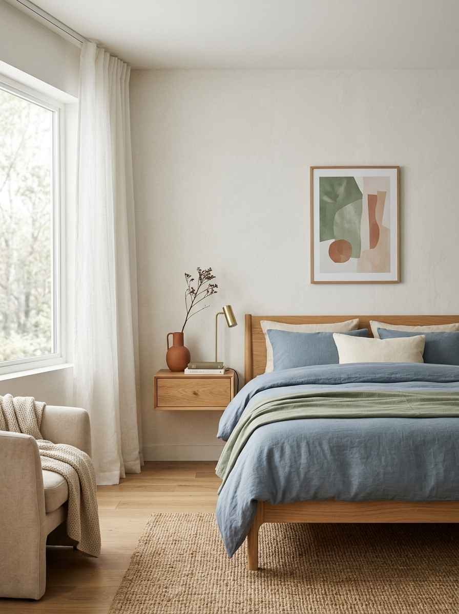
Bonus tip: match your frame finish to your metal hardware. Small detail, big payoff. If your light fixtures are brushed brass, keep your frames brass or wood, not chrome.
It’s a tiny consistency check most people skip, and it’s the reason some rooms feel pulled together without you being able to say exactly why.
I learned this one the hard way. My first apartment had black door hinges, silver light switches, and gold frames all fighting for attention on the same wall.
It looked like three different people decorated it.
Took me an embarrassingly long time to figure out why nothing felt right, until a friend pointed at the mismatched metals and just laughed.
Texture over clutter
Here’s something people get wrong constantly: they think minimalist means bare. It doesn’t. It means intentional. Texture is how you keep a clean wall from feeling cold.
A flat white wall with a single flat black frame can look great in a photo. In real life, at 7pm with the lamps on, it can feel a little clinical.
Texture fixes that. It catches shadow, it catches light differently throughout the day, and it gives your eye something to settle on besides color.
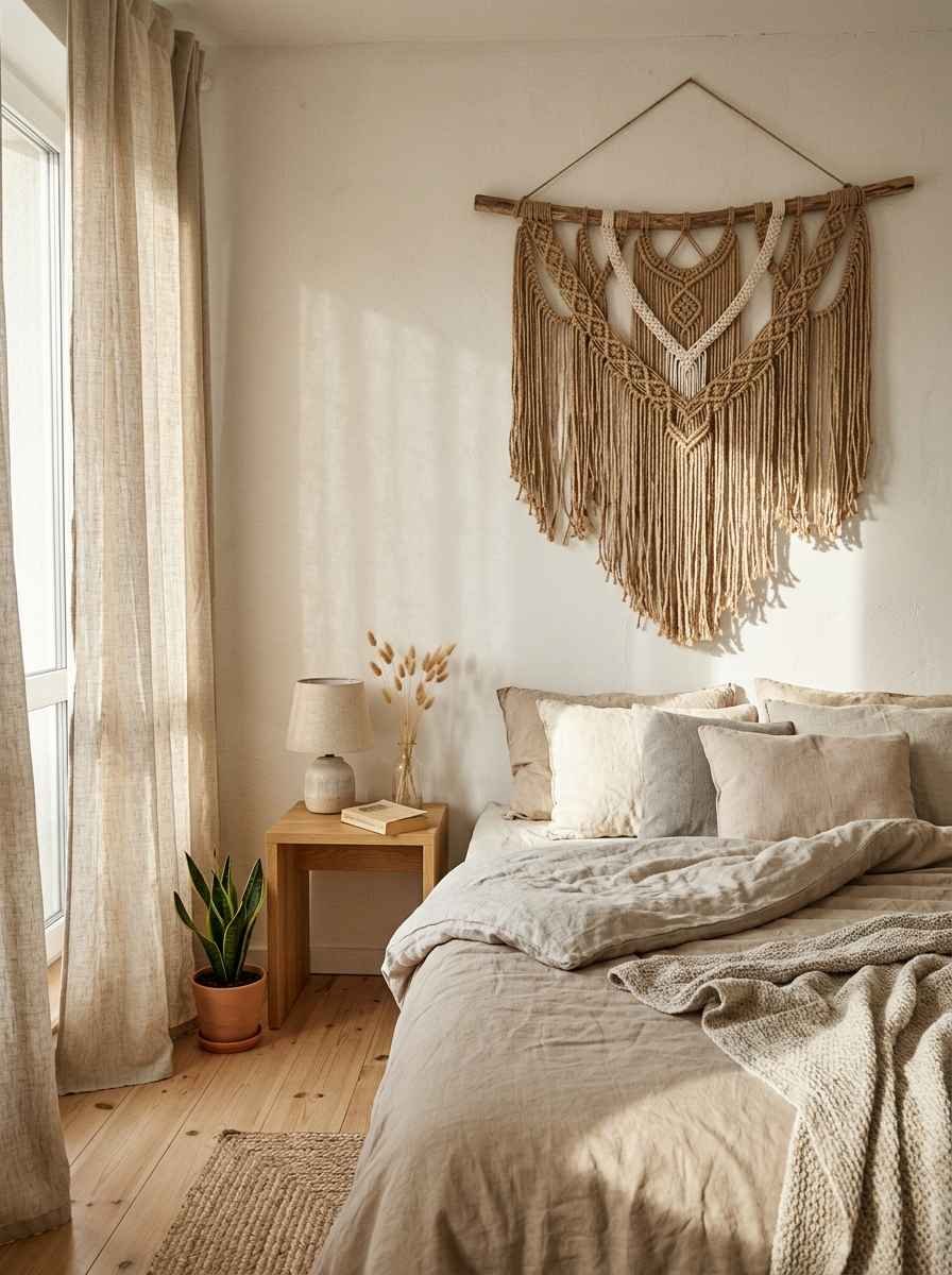
5. Woven wall hangings. A single macrame or jute piece adds warmth without adding visual noise. Look for one with simple geometric knotting rather than anything busy.
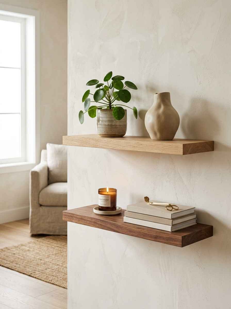
6. Natural wood shelving. A floating oak or walnut shelf holds a small plant, one ceramic piece, maybe a candle.
Keep it to three items max or it stops being minimal and starts being a display case.
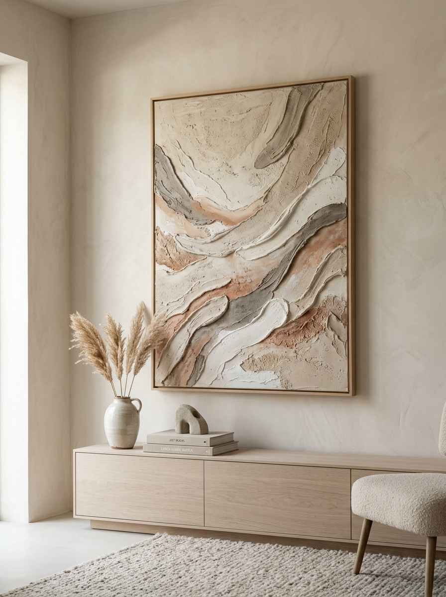
7. Plaster or lime wash wall art. These pieces have depth and shadow built into the texture itself, so you get visual interest without adding color or clutter.
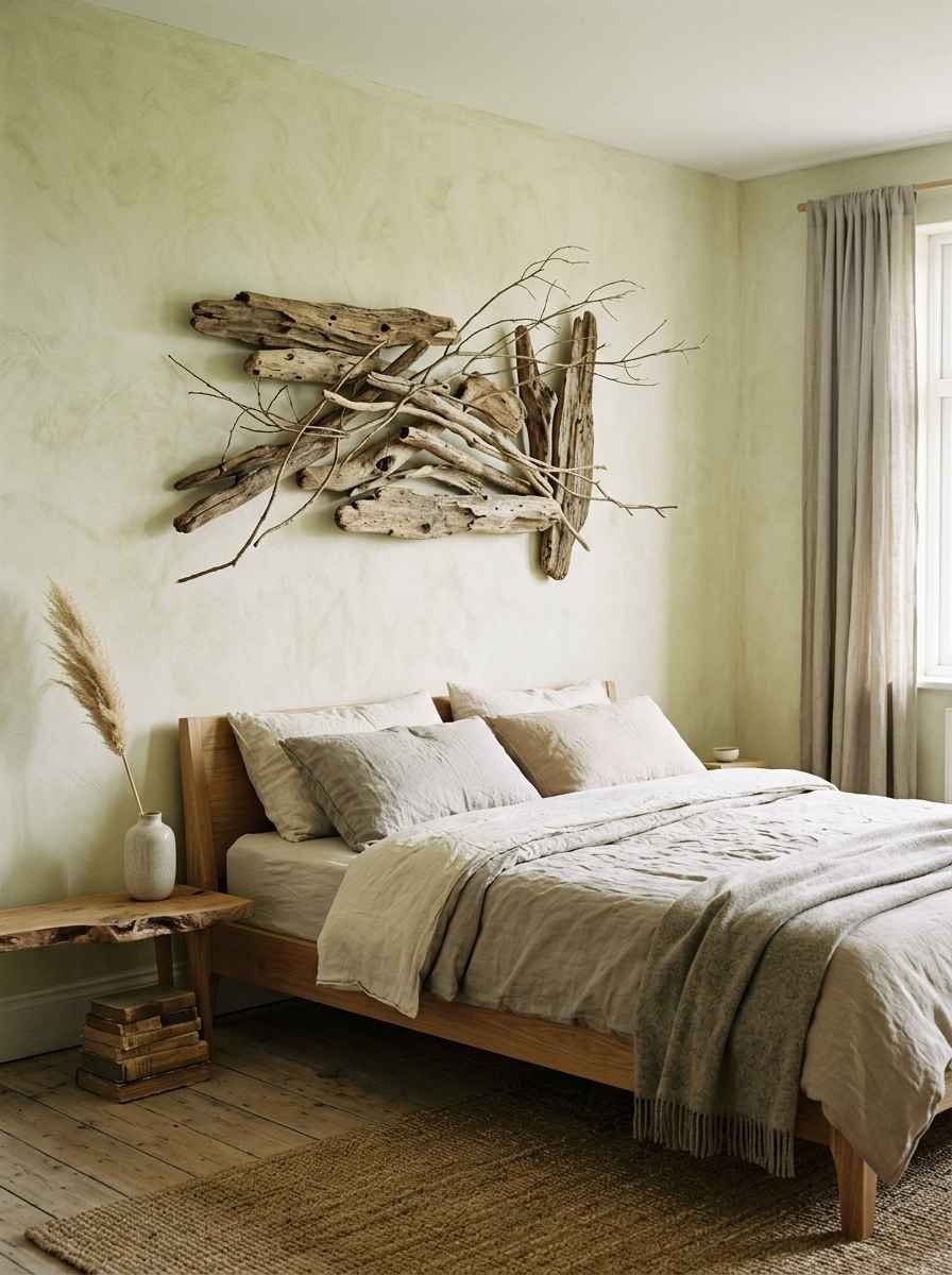
8. A single dried branch. I found a curved piece of driftwood on a hike two years ago, cleaned it up, and mounted it with two small nails. Cost me nothing. Still gets more compliments than anything I’ve bought since.
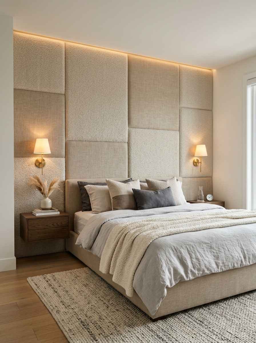
9. Boucle or linen wrapped panels. Soft fabric panels in a neutral tone add a tactile layer that photographs beautifully for Pinterest, and they double as light sound dampening if your room echoes.
Gallery walls, minimalist style
Yes, you can have a gallery wall and still call yourself a minimalist. The trick is discipline.
Most gallery walls fail because people treat them like a scrapbook. Every trip, every pet, every quote they liked on Pinterest, all crammed onto one wall. It ends up busy instead of curated.
A minimalist gallery wall works the opposite way: fewer pieces, tighter rules, more restraint on what actually earns a spot.
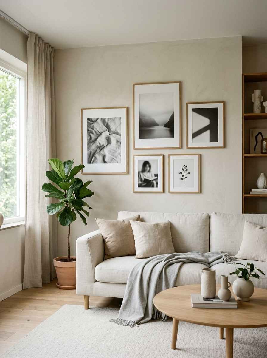
10. Stick to one frame color. All black, all white, all natural wood. Mixing finishes is what makes gallery walls look chaotic instead of curated.
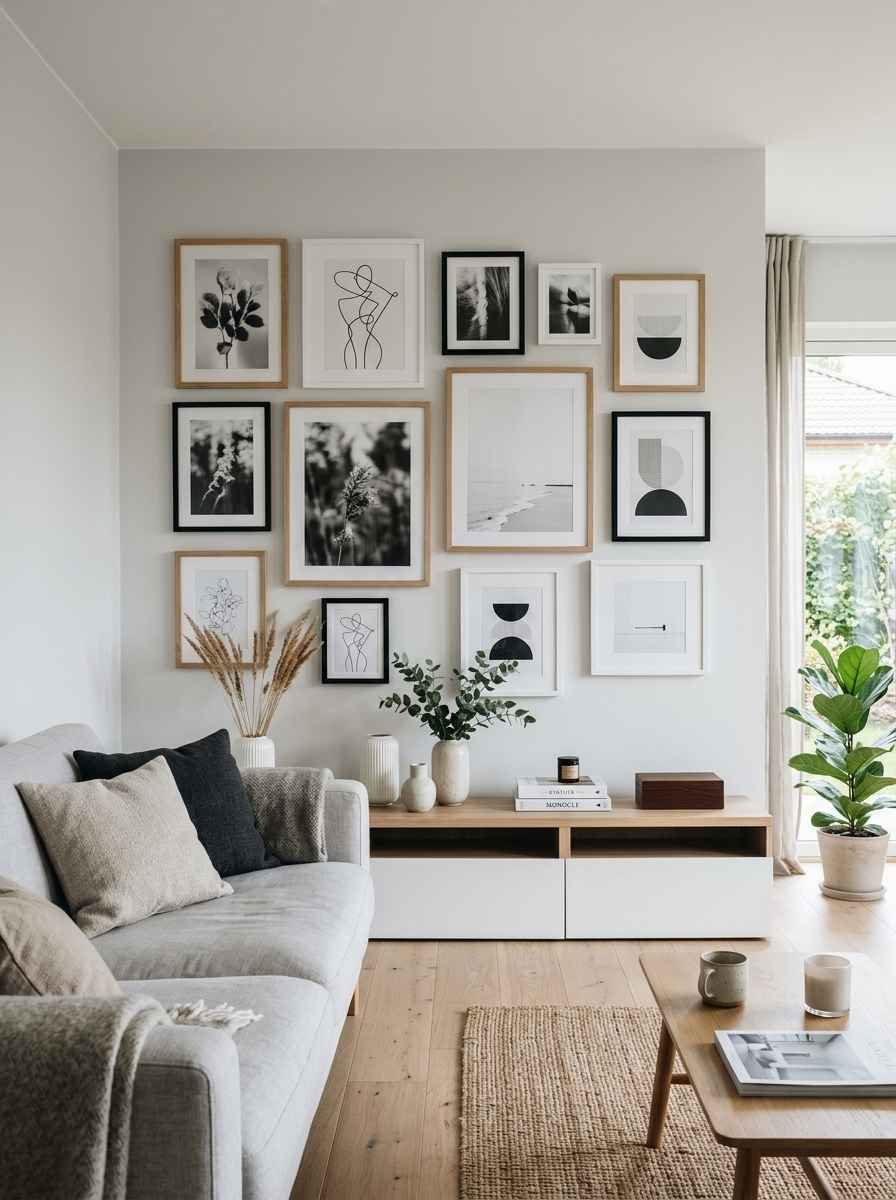
11. Repeat one shape. All squares, or a consistent mix of only two sizes. Uniform spacing between frames (2 to 3 inches works well) keeps the whole thing feeling ordered rather than scattered.
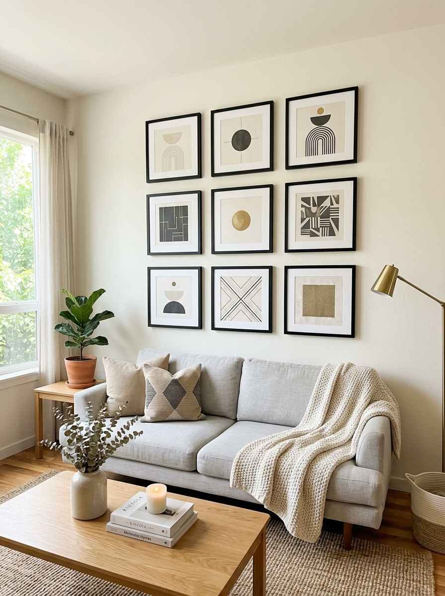
12. Odd numbers of frames. Three, five, seven. Odd groupings read as intentional to the eye in a way even numbers don’t. Not sure why. It just works.
13. Black and white photography. A tight cluster of black and white personal photos, printed on matte paper, is one of the easiest ways to add warmth and story without breaking your neutral palette.
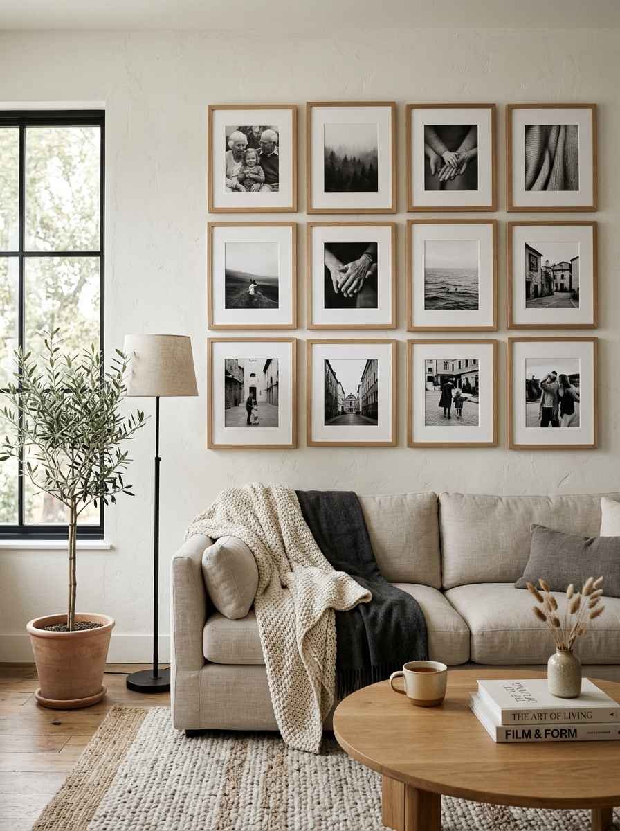
Quick side note, completely unrelated: I once spent an entire Sunday reframing 11 photos because the “matte white” frames I ordered turned out to be closer to eggshell yellow next to my actual white trim.
Always order a sample swatch first. Learn from my chaos.
Typography and negative space art
Words and shapes can carry more weight than color when they’re used sparingly.
This is where a lot of Pinterest boards go wrong, packing in five different quote prints that all say some version of the same thing.
Pick one statement and let it breathe.
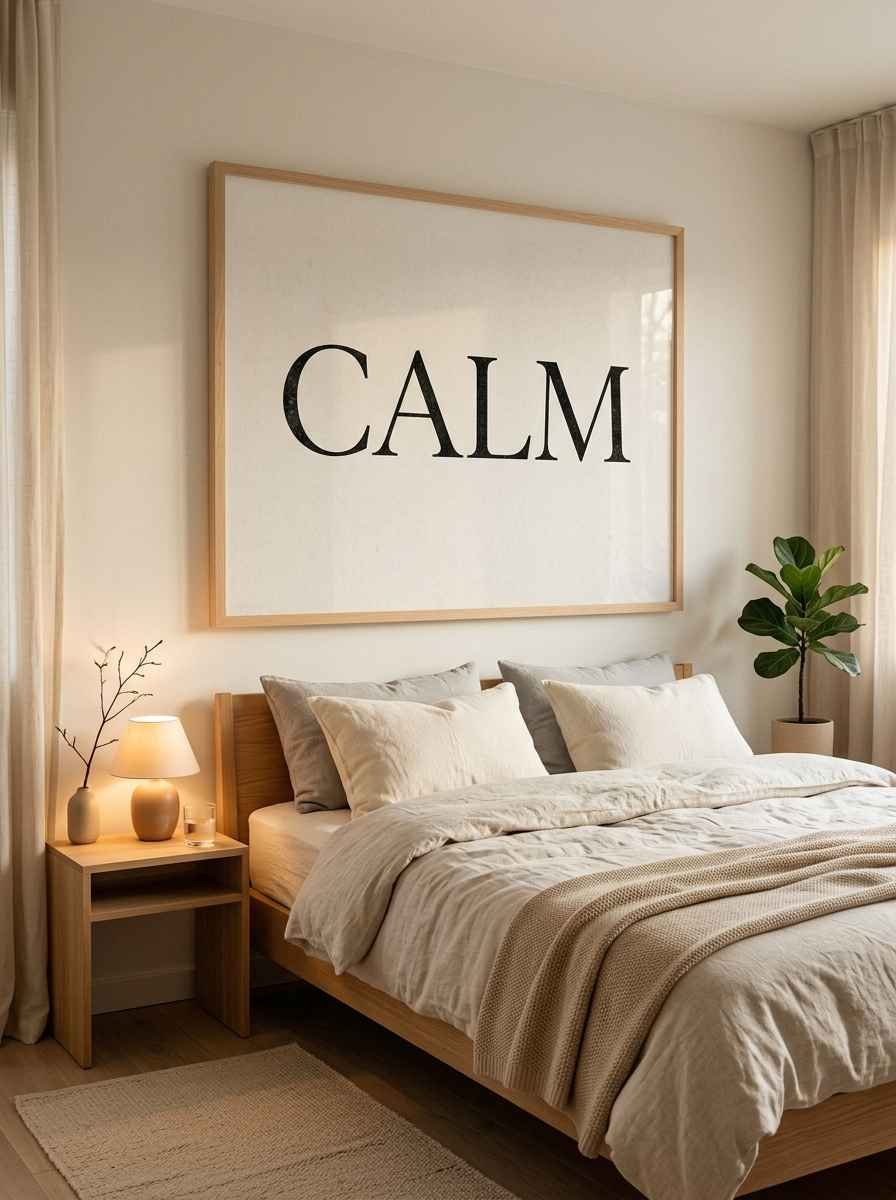
14. One oversized word or short phrase. A single word like “calm” or “home” in a simple serif font, printed large, makes a stronger statement than five small quotes scattered around a room.
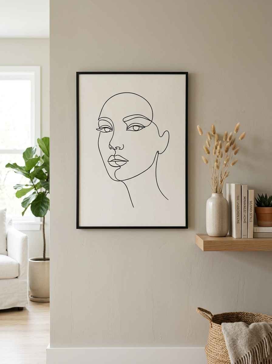
15. Line art. Single continuous line drawings of a face, a body, or a plant silhouette are everywhere on Pinterest for a reason. They’re simple, they’re cheap to print, and they never feel dated.
16. Abstract shapes in muted tones. Think a soft arch, a circle, an organic blob shape. Keep it to one or two colors that echo your room’s palette.
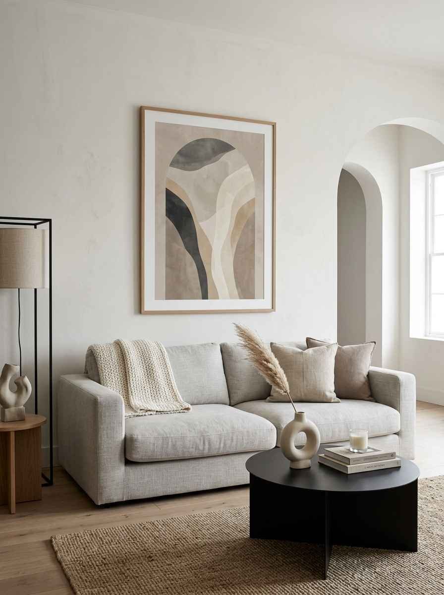
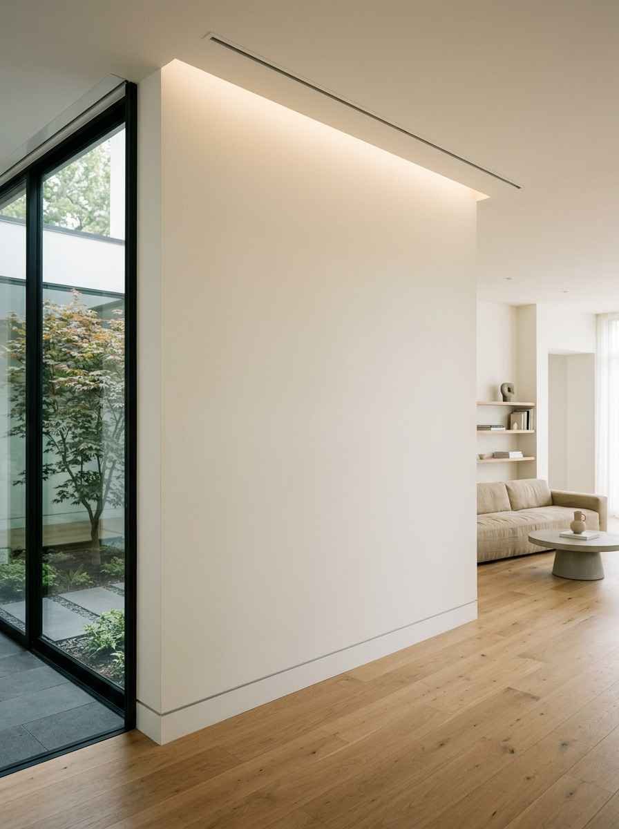
17. Blank space as the decor. Sometimes the boldest move is a beautifully painted wall with absolutely nothing on it, framed by simple trim or a picture ledge left empty on purpose.
IMO this is the hardest one to pull off but the most striking when it works.
Functional decor that doubles as art
Minimalist rooms feel cozier when the decor earns its keep.
If a piece can hold your keys, reflect more daylight into the room, or grow something green, it’s doing double duty.
That’s the difference between a wall that looks styled for a photo shoot and one that actually functions for the way you live day to day.
| Idea | Best room | Why it works |
|---|---|---|
| Floating shelf with 2-3 objects | Living room, office | Adds function without clutter |
| Woven wall hanging | Bedroom, nursery | Softens hard lines, adds warmth |
| Mirror as wall art | Entryway, small rooms | Reflects light, expands the space |
| Single statement plant | Any room | Brings life without adding “stuff” |
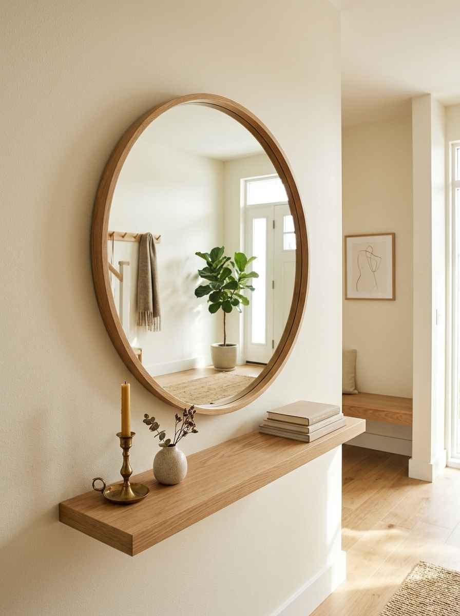
18. A round mirror. It bounces light around the room, makes a small space feel bigger, and counts as wall decor without you needing to hang anything else nearby.
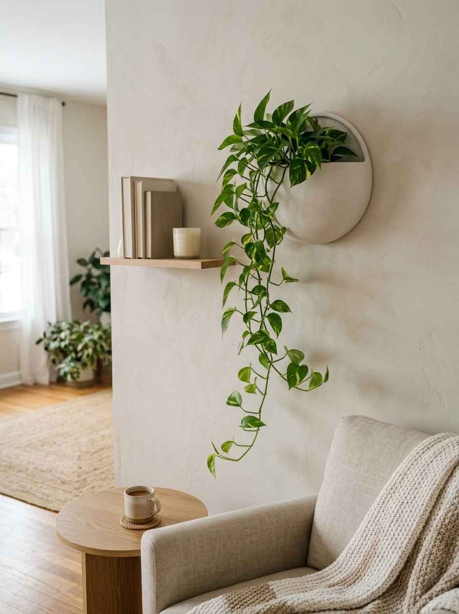
19. Wall-mounted planters. One or two trailing plants like pothos in a simple ceramic wall planter bring color and life into an otherwise neutral space.
This is honestly my favorite trick for renters, since most planters mount with removable hooks.
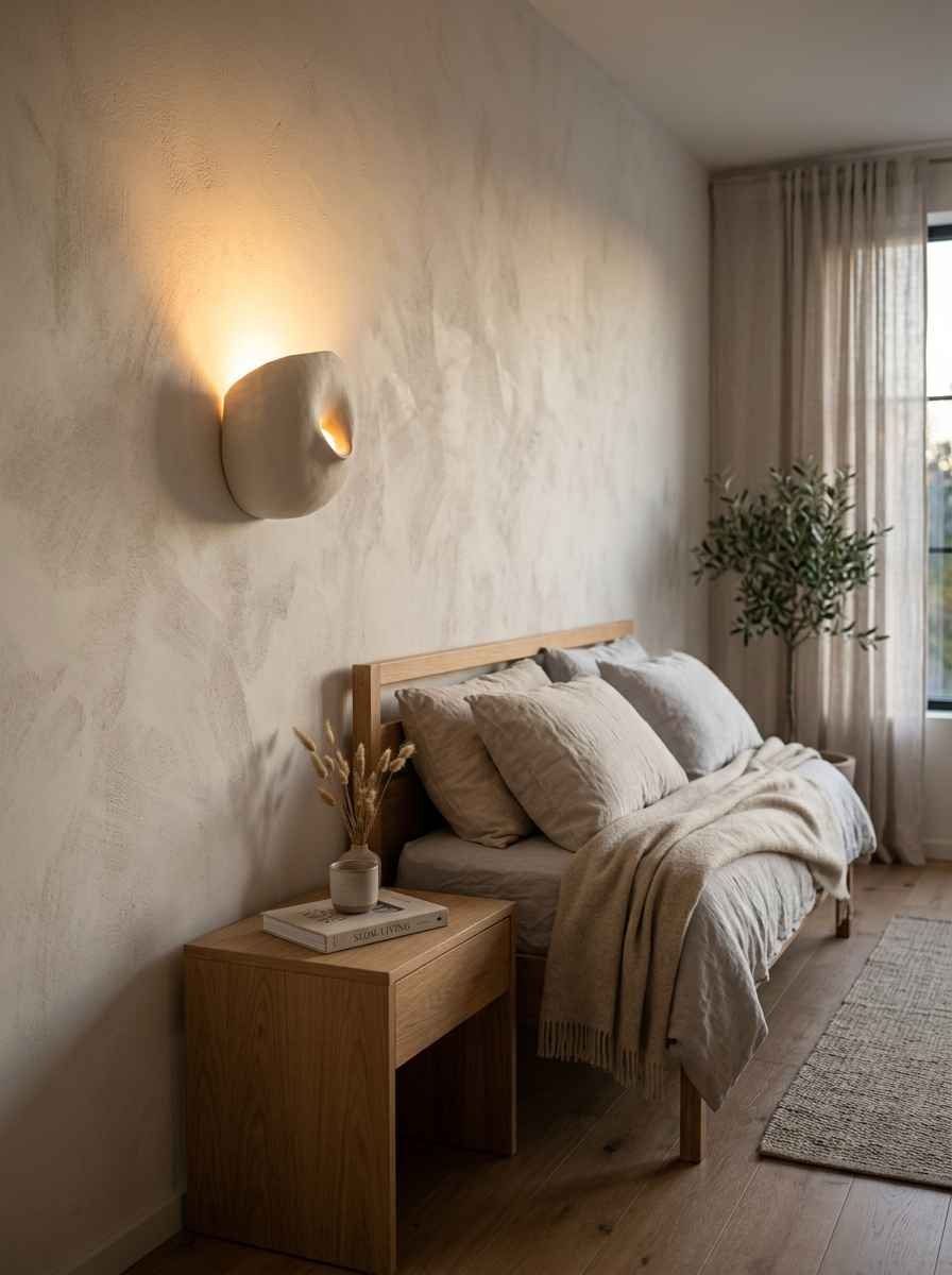
20. A ceramic wall sconce with warm bulb light. Function and form in one. Skip the overhead lighting entirely in that corner and let the sconce do the work. It changes the whole mood of a room after dark.
A quick comparison: minimalist vs. maximalist walls
I get asked this constantly on Pinterest, so let’s settle it. Maximalist walls layer color, pattern, and objects to create richness through abundance.
Minimalist walls create richness through restraint, texture, and negative space.
Neither is “better.” I just find minimalist easier to live with long term, because it doesn’t demand constant curating to avoid looking messy.
That’s my honest opinion, and I know plenty of maximalists who’d fight me on it.
FAQs
How many pieces of wall art is too many for a minimalist room? For a standard wall, three to five pieces is usually the ceiling. Past that, you’re building a gallery wall, which needs its own rules around spacing and frame consistency.
What’s the cheapest way to start a minimalist wall makeover? Paint. A single fresh coat in a warm neutral costs far less than new furniture or art, and it’s the single biggest visual reset you can make. After that, one statement piece beats five small ones.
Do minimalist walls work in small apartments? Yes, arguably better than in large homes. Empty space reads as square footage to the eye. Cluttered walls make small rooms feel smaller. This small-space decorating breakdown covers a few extra tricks specific to tight layouts.
Final thought
Twenty ideas is a lot to take in at once, so don’t try to do all of them this weekend. Pick two. Maybe the floating shelf and one oversized art print. Live with it for a month before adding anything else.
Wow, I know that sounds slow for a Pinterest crowd used to instant before-and-afters. But minimalist rooms built in a weekend rarely stay minimalist. The ones that last get built one intentional choice at a time.
What’s the first idea on this list you’re pinning right now?
