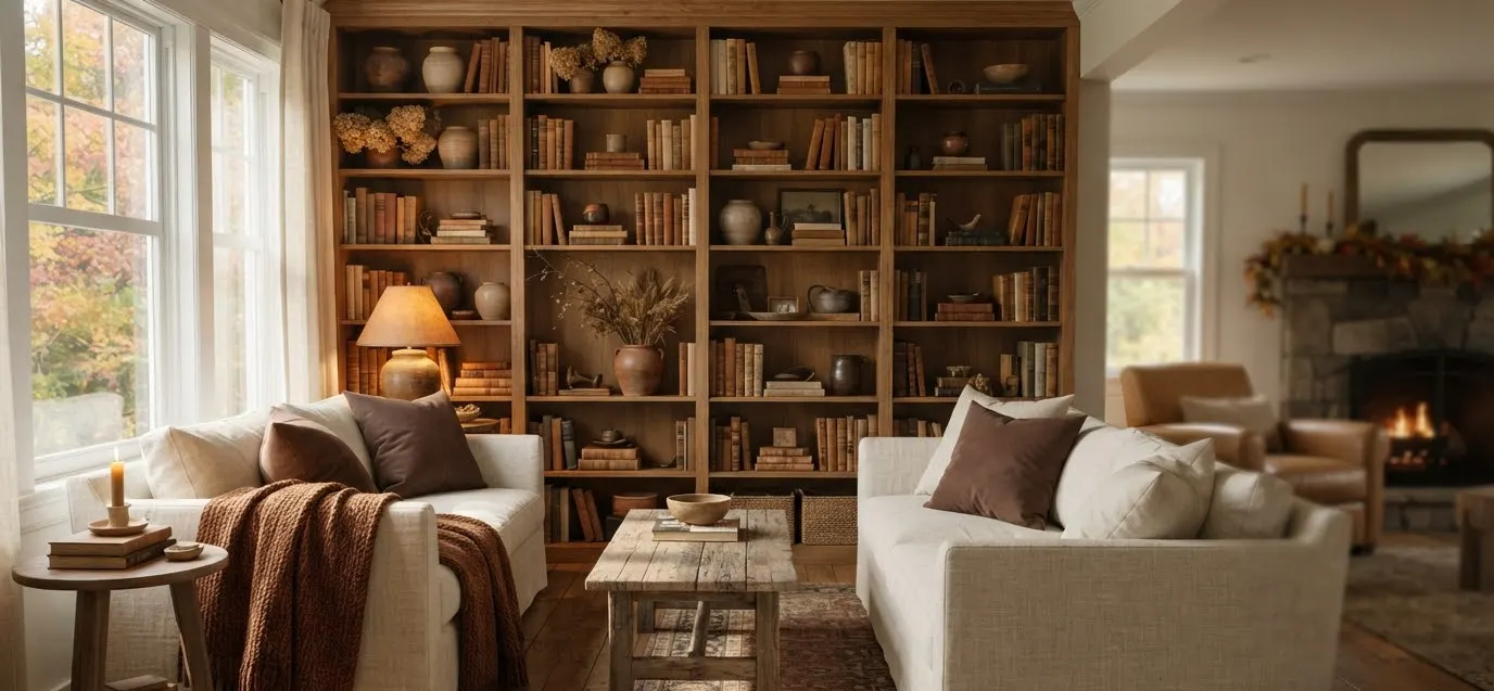
My bookshelf used to be a graveyard for college textbooks and a single dead succulent.
Then one October I got obsessed with making it look like something out of a design magazine, and I fell down a three-week rabbit hole of trial, error, and one too many trips to HomeGoods.
IMO that shelf is still the best $40 I’ve ever spent on a room.
If your living room bookshelf currently looks like a storage unit that got lost on its way to the garage, you’re in the right place.
These 15 ideas cost almost nothing, take an afternoon, and actually hold up once the candles get lit and the guests show up. No pumpkin explosions required.
Start with color, not clutter
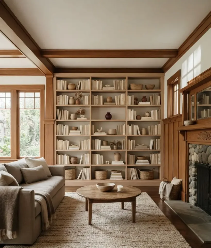
Before you touch a single object, think about your palette. Fall decor goes wrong the second someone dumps every orange item they own onto one shelf.
Designers keep it restrained, and that restraint is exactly what makes a shelf look expensive instead of seasonal-aisle-at-Target.
1. Lean into warm neutrals first, accent colors second
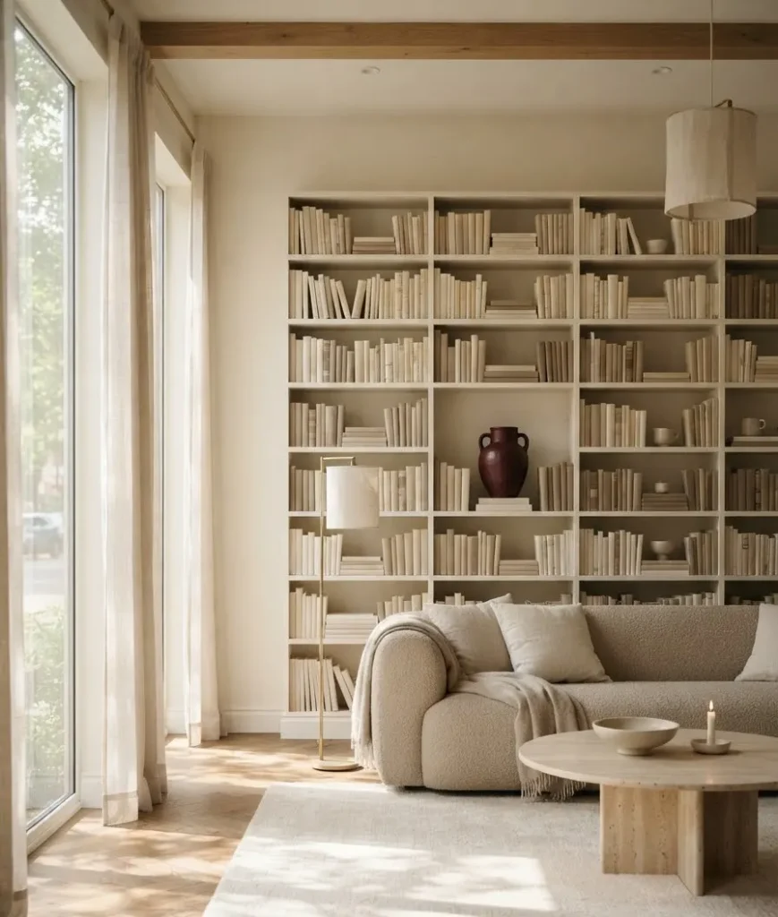
I tried the opposite approach once. Full orange, every shelf, no breaks. It looked like a Halloween store threw up on my bookcase. Never again.
2. Pick one “anchor color” and repeat it three times
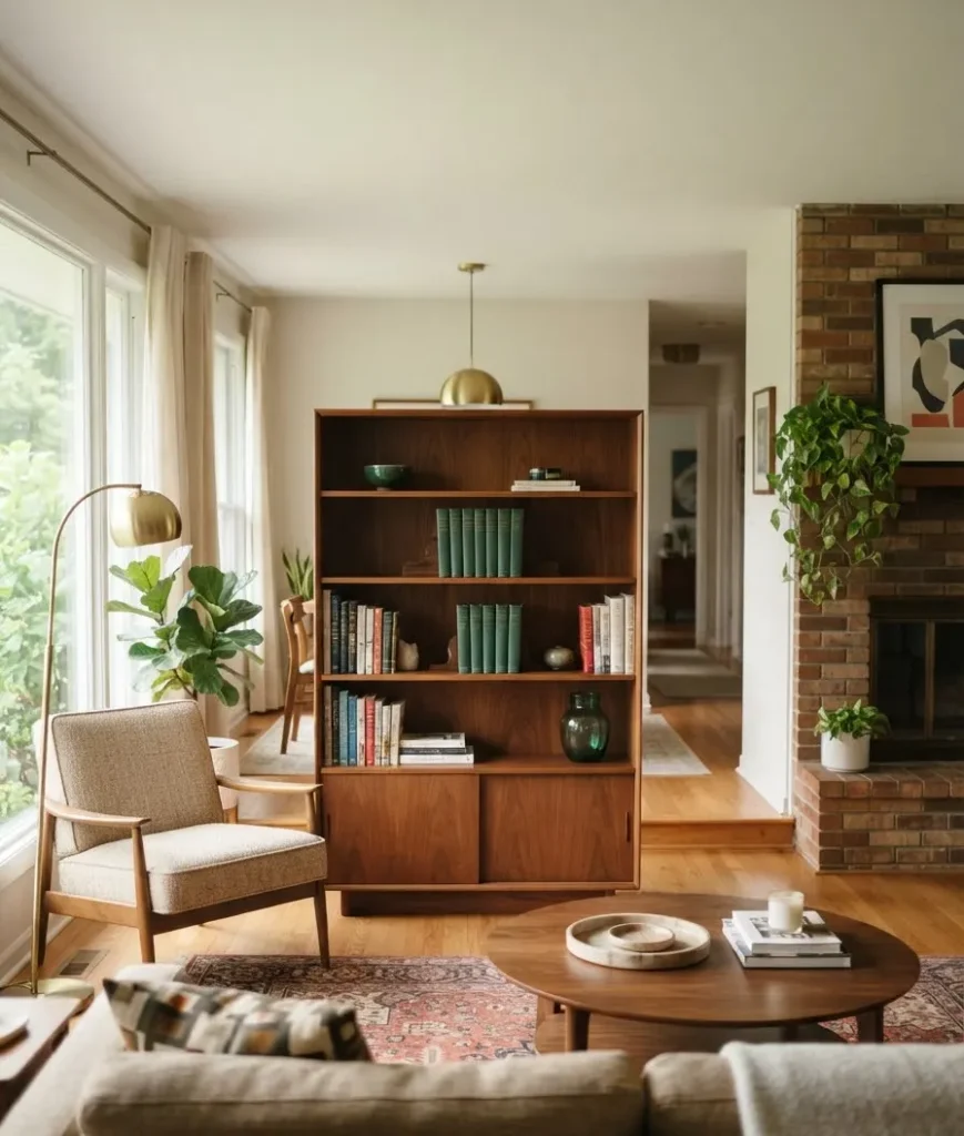
Choose a single fall hue, maybe burnt umber or forest green, and use it in three different spots on the shelf: a vase, a stack of books, a small frame.
Repetition creates rhythm without matching everything (matching everything reads as a hotel lobby, not a home).
3. Swap warm bulbs into any shelf lighting
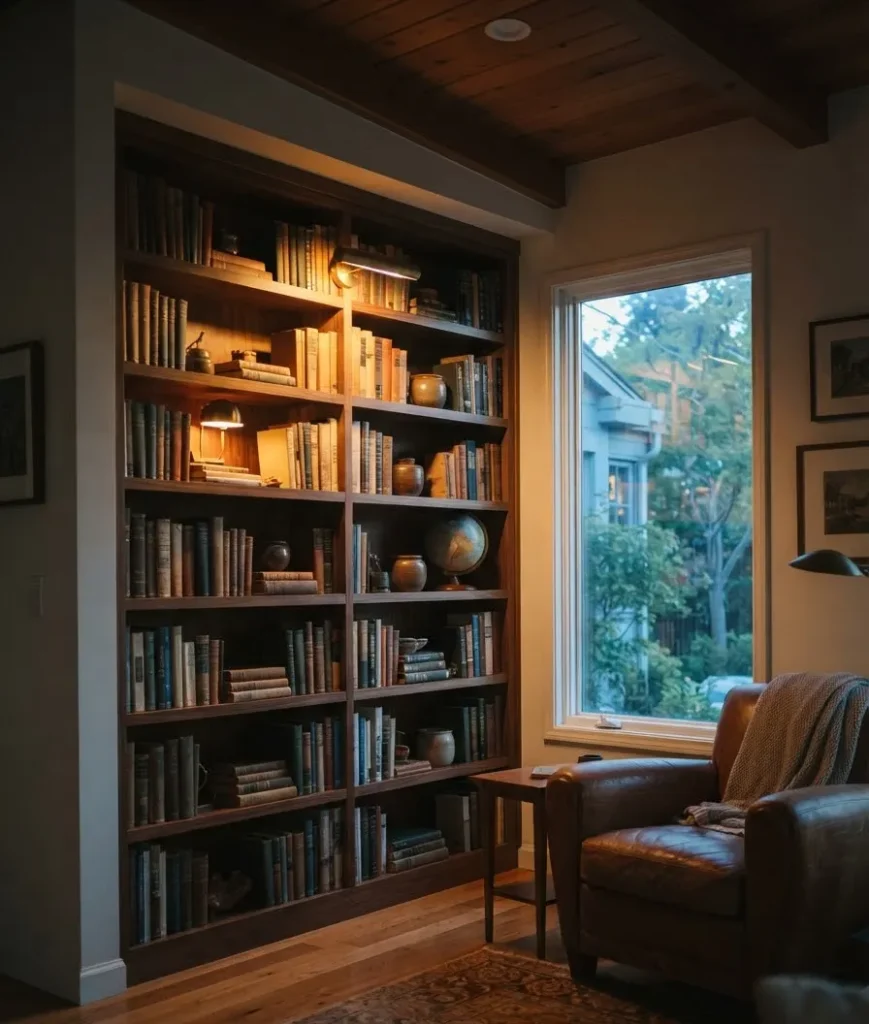
If your bookshelf has a puck light or small lamp, change the bulb to something around 2700K.
Warm light makes deep colors like burgundy and umber look rich instead of murky, and it’s genuinely one of the cheapest upgrades you can make to a room.
Play with height, texture, and negative space
Here’s what separates a “fine” shelf from one that stops people mid-conversation: variation. Flat, same-height rows of books read as storage. Varied heights read as curated.
4. Stack some books flat, stand others upright
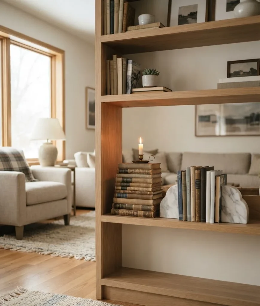
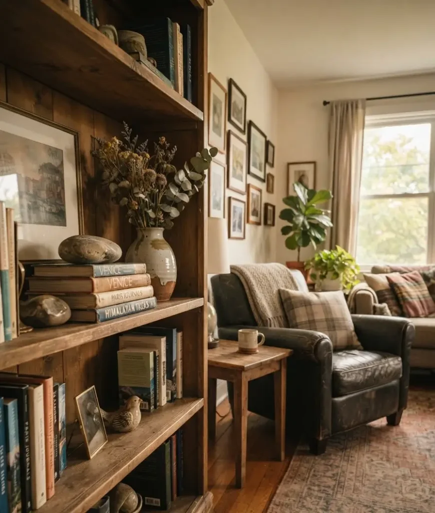
Don’t line every book up spine-out like a library. Stack 3 to 5 books flat and set a small object, a candle, a little pumpkin, whatever, on top. Then let the next section have upright books with a bookend. The contrast does most of the visual work for you.
5. Bring in one tall thing per shelf
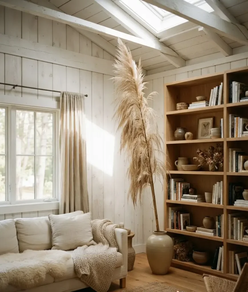
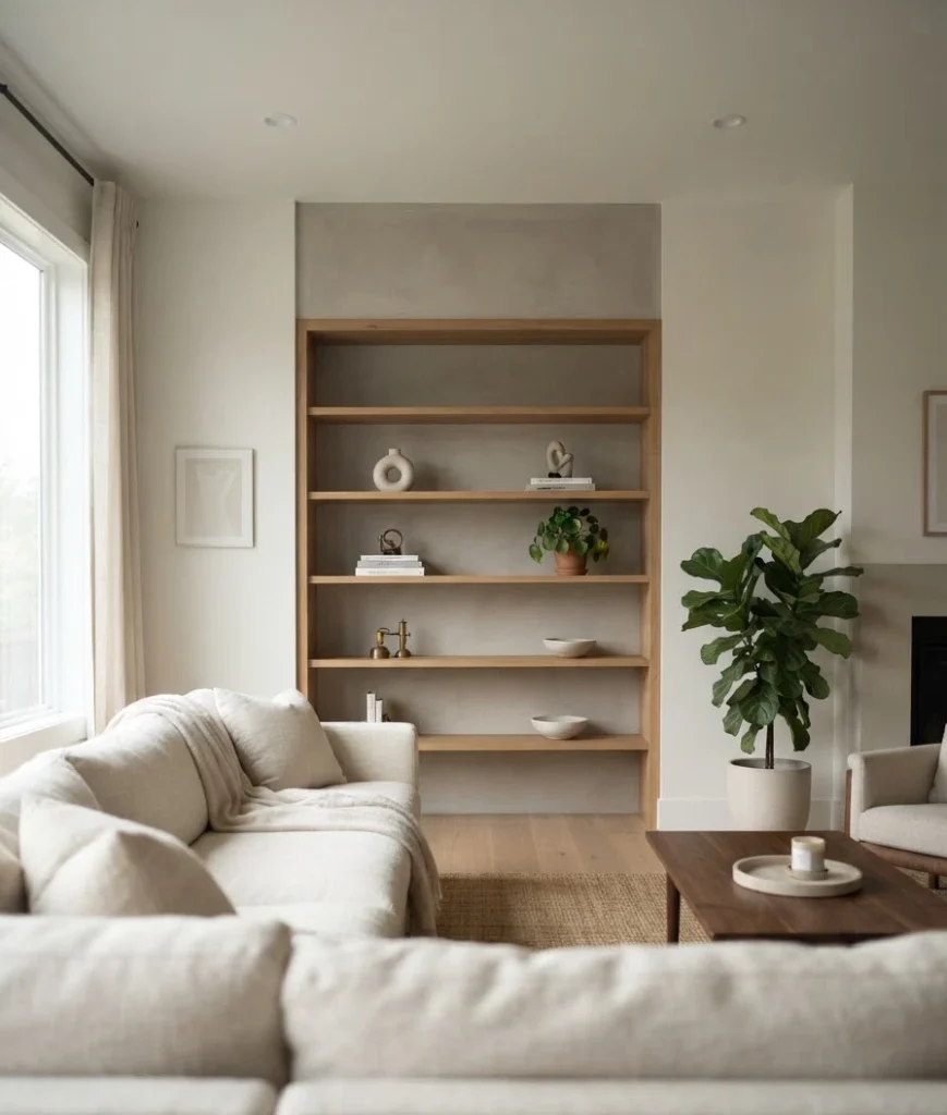
This one’s hard for hoarders (I say this with love, I am one). Every shelf doesn’t need to be full. Empty space next to a styled cluster makes the styled part pop. If you’re staring at a shelf and it feels busy, the fix is usually removal, not addition.
7. Layer textures: wood, ceramic, woven, glass
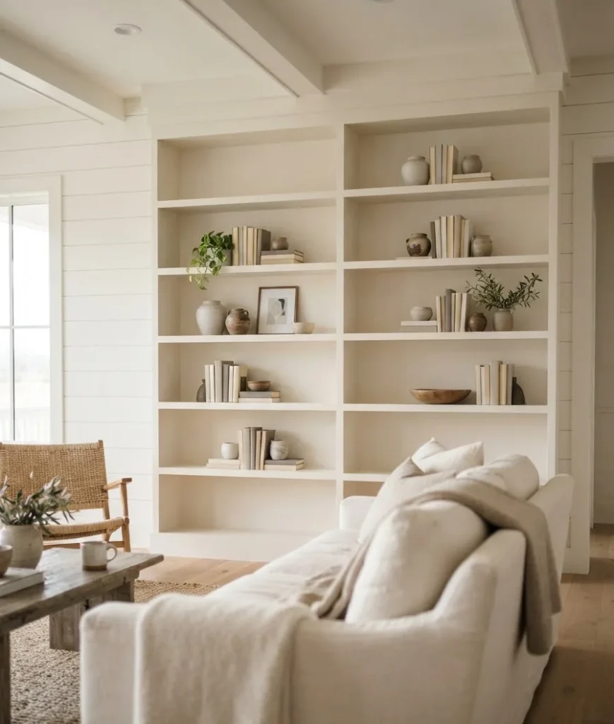
One interior designer’s guide to shelf styling recommends layering in items with real texture, like <a href=”https://roomfortuesday.com/how-to-style-a-bookshelf-easy-designer-approved-tips-for-a-curated-look/”>wood accents, ceramics, and collected books</a>, rather than sticking to one material. A woven basket next to a smooth ceramic vase next to a stack of linen-bound books does more for the eye than three identical objects ever could.
Make it feel like yours, not a showroom
Ever walked into a perfectly styled room and felt weirdly unwelcome? That’s what happens when decor skips the personal stuff. Fall is the season for cozy, and cozy needs a little bit of you in it.
8. Frame a photo that actually matters
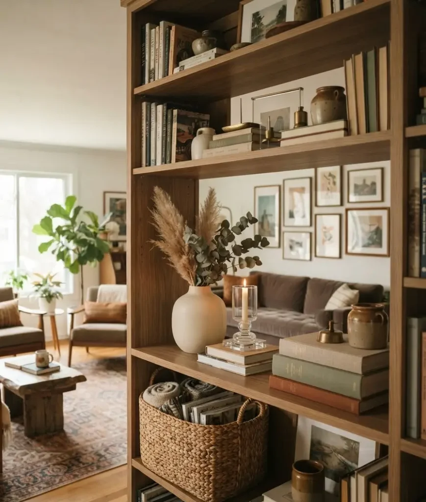
Skip the stock-photo-looking frame filler. Grab one real photo, a trip, a family shot, whatever, and give it a small frame on the shelf. It anchors the whole display in something true, and it’s usually the first thing people ask about.
9. Add one object with a story
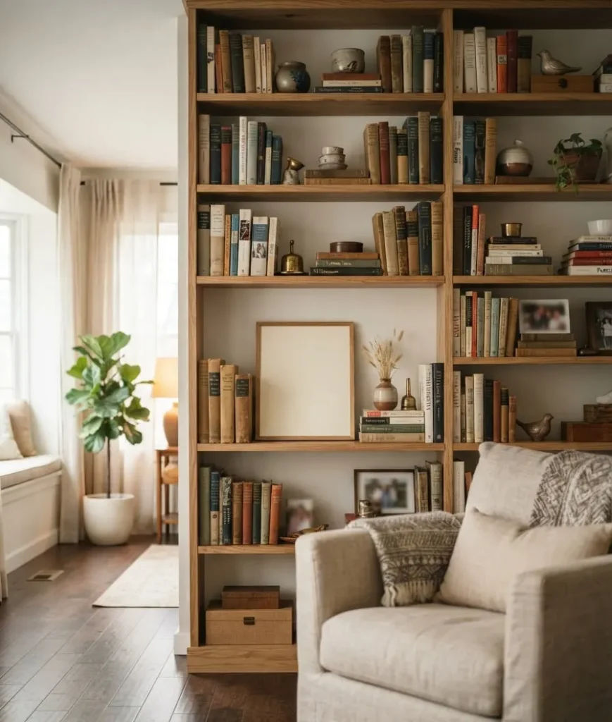
A rock from a hike, a mug from your grandmother, a small souvenir from somewhere you actually went. This is the detail that makes a shelf feel collected over years instead of bought in one Target run last Tuesday. Wow, does it change the whole vibe.
10. Use real dried botanicals, not the plastic kind
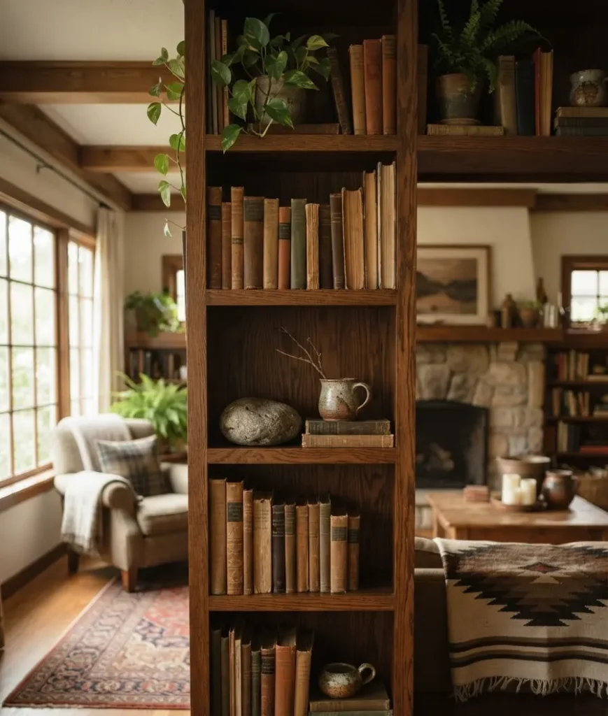
Dried pampas grass, wheat stems, or eucalyptus in a small vessel bring in fall texture without screaming “seasonal aisle.” A few 2026 decor guides specifically call out swapping fresh florals for <a href=”https://jane-athome.com/fall-decor-trends/”>dried arrangements in copper or amber vessels</a> as one of the season’s defining moves, and honestly it just looks better long-term than anything plastic.
Small tricks that make a shelf read “designer”
These are the little moves that don’t cost much but somehow do the heaviest lifting.
11. Turn a few book spines inward
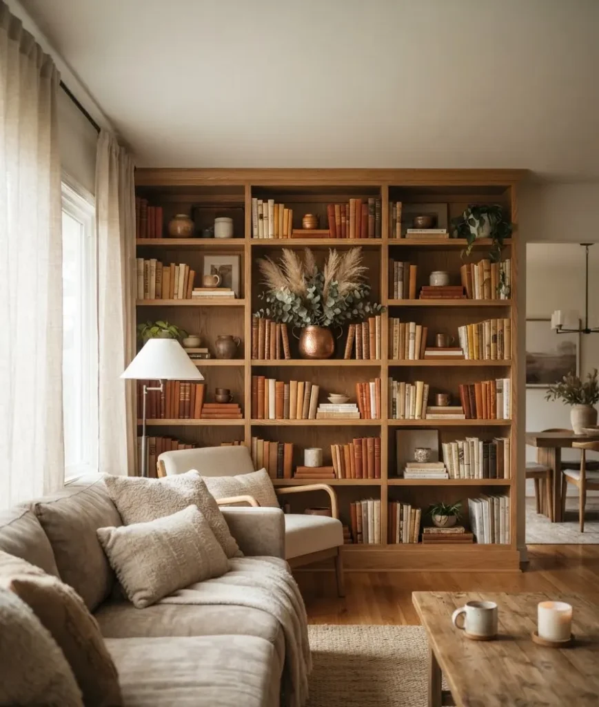
Show the pages instead of the spine on one or two stacks. It’s an old stylist trick that hides mismatched book colors and adds a soft, neutral texture block. FYI, this also works great if half your books have ugly, dated covers.
12. Use odd numbers when grouping objects
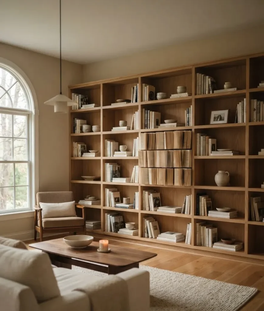
Group small items in threes. Two feels incomplete, four feels like a set from a store. Three feels arranged. It’s a small rule, but it shows up in almost every professional styling guide, including Martha Stewart’s breakdown of how to <a href=”https://www.aol.com/lifestyle/style-bookshelves-professional-designer-210200193.html”>style bookshelves like a professional designer</a>.
13. Vary shape, not just color
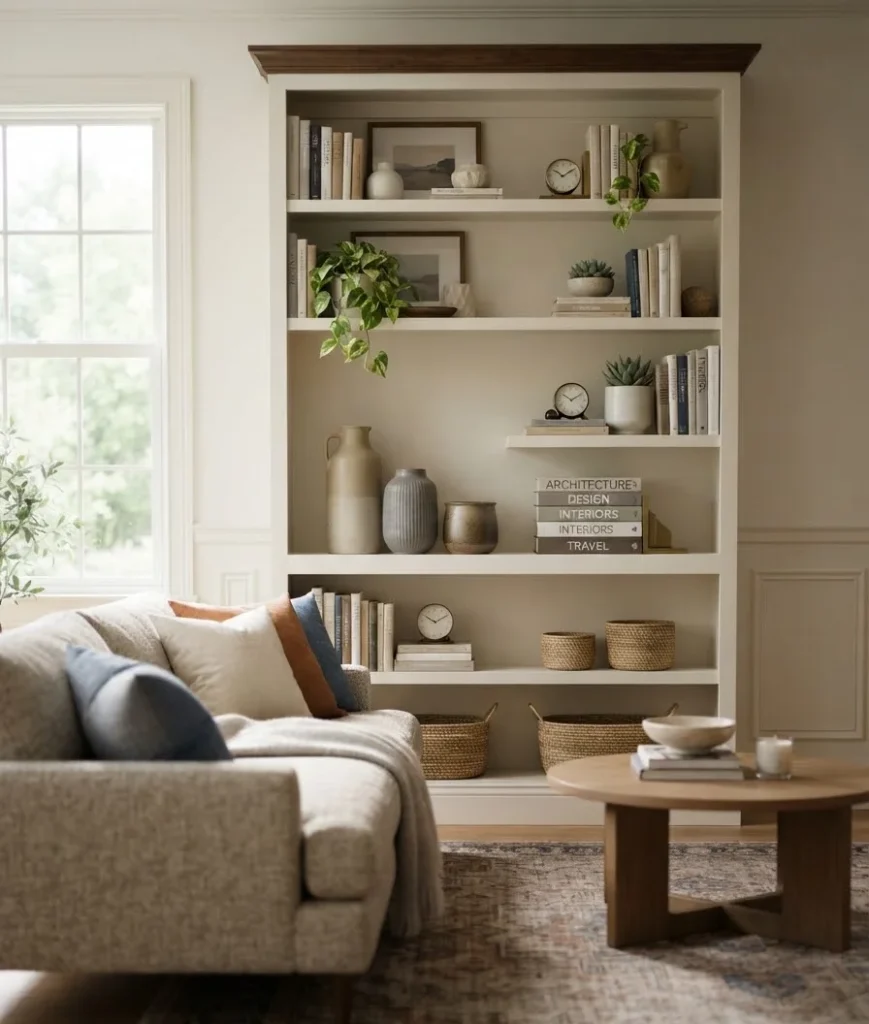
Round bowls next to square frames next to tall, narrow vases. Mixing silhouettes keeps a shelf from feeling stiff, even when the color palette is tight and controlled.
The finishing touches
14. Add one moody, dark piece of art or a small mirror
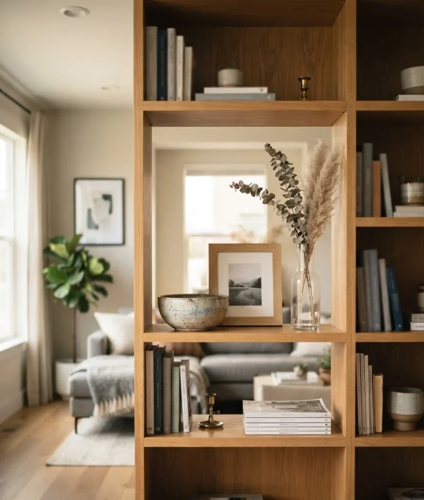
A tiny framed piece of dark, autumnal art, think a moody forest scene or an antique-style botanical, leaning against the back of the shelf adds depth.
A small mirror does something similar and also bounces light around, which matters once the days get shorter.
15. Step back and edit ruthlessly
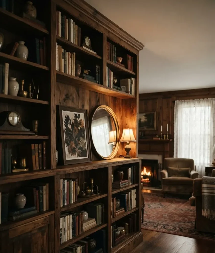
Once everything’s placed, walk 10 feet away and look at the whole shelf, not each individual item.
Remove whatever your eye skips over. This is the step almost nobody actually does, and it’s the one that turns “pretty good” into “wait, did you hire someone for this.”
Quick fall bookshelf color guide
| Color | Where to use it | Vibe |
|---|---|---|
| Chocolate brown | Books, wood objects, frames | Grounded, warm base |
| Burgundy | One accent vase or a few books | Rich, moody pop |
| Forest green | Dried greenery, a single object | Natural, earthy contrast |
| Cream / taupe | Backdrop, majority of books | Neutral canvas that lets accents shine |
A quick side note
I know this is a decor article, but can we talk about how a bookshelf is basically a tiny autobiography of your taste?
Mine has three travel books I’ve never finished, a rock from Big Sur, and a vase my mom insists is “worth something.” None of it matches perfectly. All of it feels like mine.
That’s kind of the whole point of any of this.
FAQs
How many books should I actually keep on a styled shelf? There’s no magic number, but a good rule is to fill about 60 to 70 percent of the shelf with books and leave the rest for objects and open space. A shelf packed floor to ceiling with books looks like storage, not styling.
Do I need to buy new decor every fall, or can I reuse what I have? Reuse what you have. Swap in warmer-toned books, a seasonal candle, or a dried arrangement, and rotate out anything summery. Most of the “fall look” comes from color and texture shifts, not brand-new purchases.
What’s the easiest fall bookshelf update if I only have 10 minutes? Change the lightbulb near the shelf to a warmer temperature, and stack 3 to 4 books flat with one small object on top. Both take almost no time and make an immediate visual difference.
Final thought
You don’t need a design degree, a big budget, or a Pinterest board with 400 saved pins to make your bookshelf look intentional.
You need a warm palette, some height variation, one object that actually means something to you, and the discipline to remove more than you add.
That last part is the hard one, IMO, but it’s also the one that separates “decorated” from “designer.”
So which of these 15 are you trying first? Grab three books, one warm-toned object, and give your shelf 15 minutes before you second-guess yourself. That’s usually all it takes.
