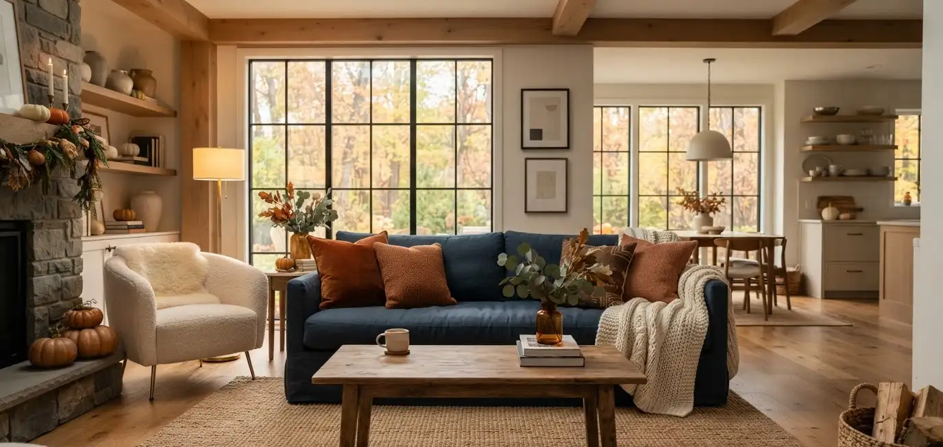
Blue and orange sound like an odd pairing until you actually see them together in a living room.
Then it clicks. Fall usually gets stuck with the same three colors: rust, cream, and every shade of brown ever invented.
This year, I’m done with that. Blue and orange bring in the coziness fall demands, but with way more personality.
I redid my own living room with this combo last October, and honestly, I wasn’t sure it would work.
It did. Guests keep asking where I got the throw pillows (linked below, you’re welcome). So let’s get into how to actually pull this off in your space, room by room, detail by detail.
Why blue and orange work so well together for fall
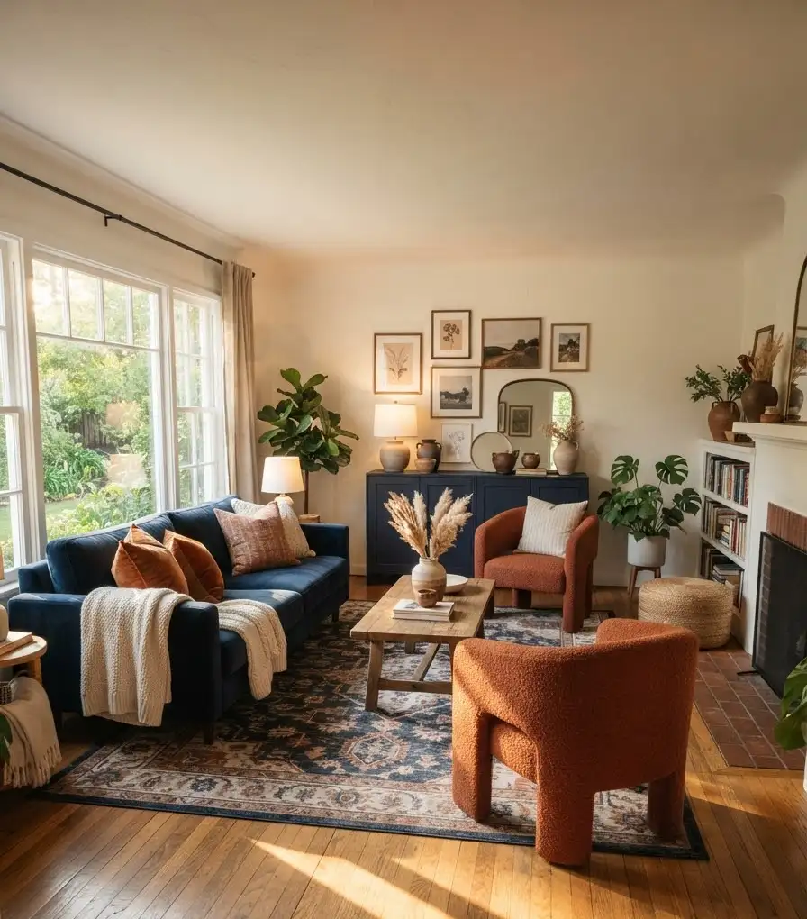
Blue and orange sit directly across from each other on the color wheel. That makes them complementary colors, which is a fancy way of saying they make each other pop.
Orange brings warmth. Blue brings calm. Together, they balance out instead of fighting for attention.
Think about a sunset. Orange sky, deep blue shadows creeping in underneath.
That’s basically what you’re recreating in your living room, just with throw blankets instead of clouds.
IMO, this combo also just feels more grown-up than the standard “pumpkin spice everything” fall palette. It still reads as autumn, but it doesn’t scream Halloween store clearance rack.
The psychology behind the pairing
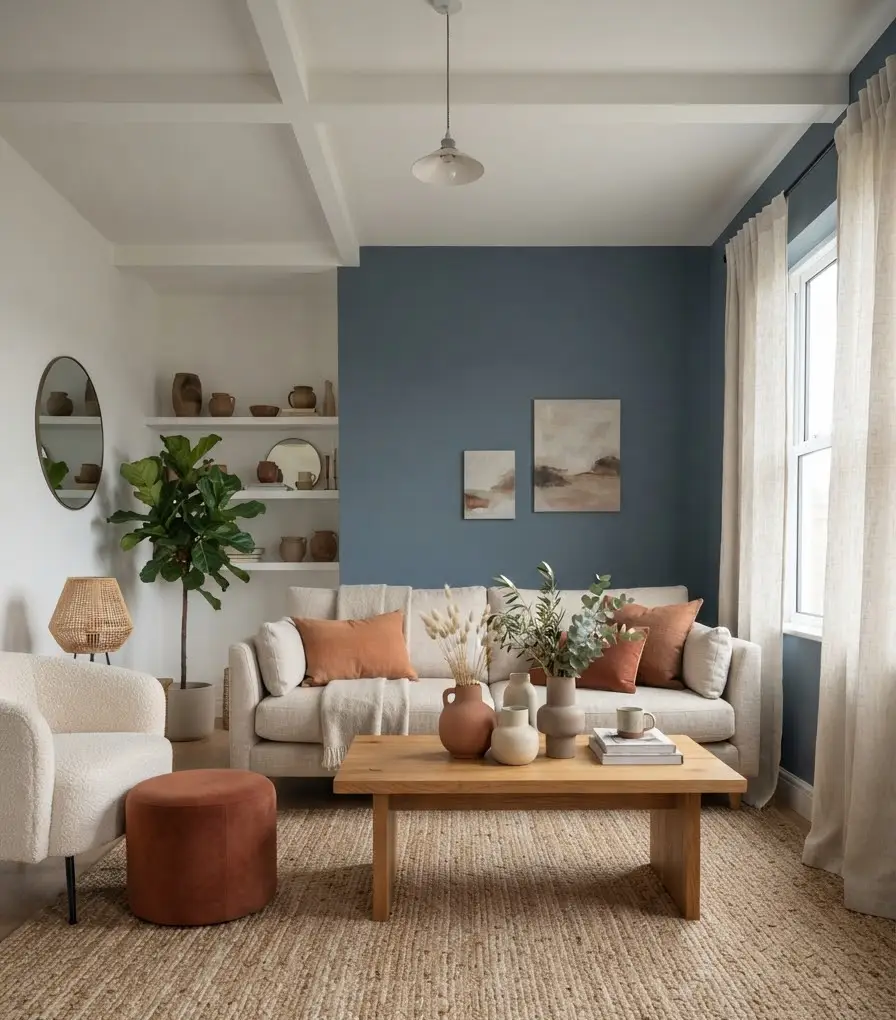
Color psychology matters more than people give it credit for. Blue is associated with calm and stability.
Orange is tied to energy and enthusiasm. Put them in one room, and you get a space that feels both relaxing and alive, which is honestly the whole point of a living room.
Design experts at Sherwin-Williams have talked about how complementary color schemes create visual balance without needing a ton of extra colors thrown in.
That’s good news if you don’t want to overhaul your whole room.
Choosing your base: which color should dominate
Here’s where people mess up. They go 50/50 blue and orange, and the room ends up looking like a sports jersey. Don’t do that.
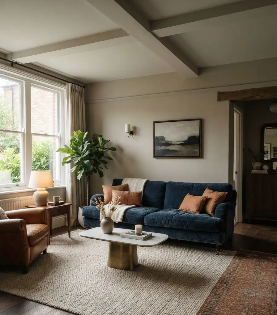
Pick one color to be your dominant tone and let the other one act as an accent. Most fall-inspired rooms work best with:
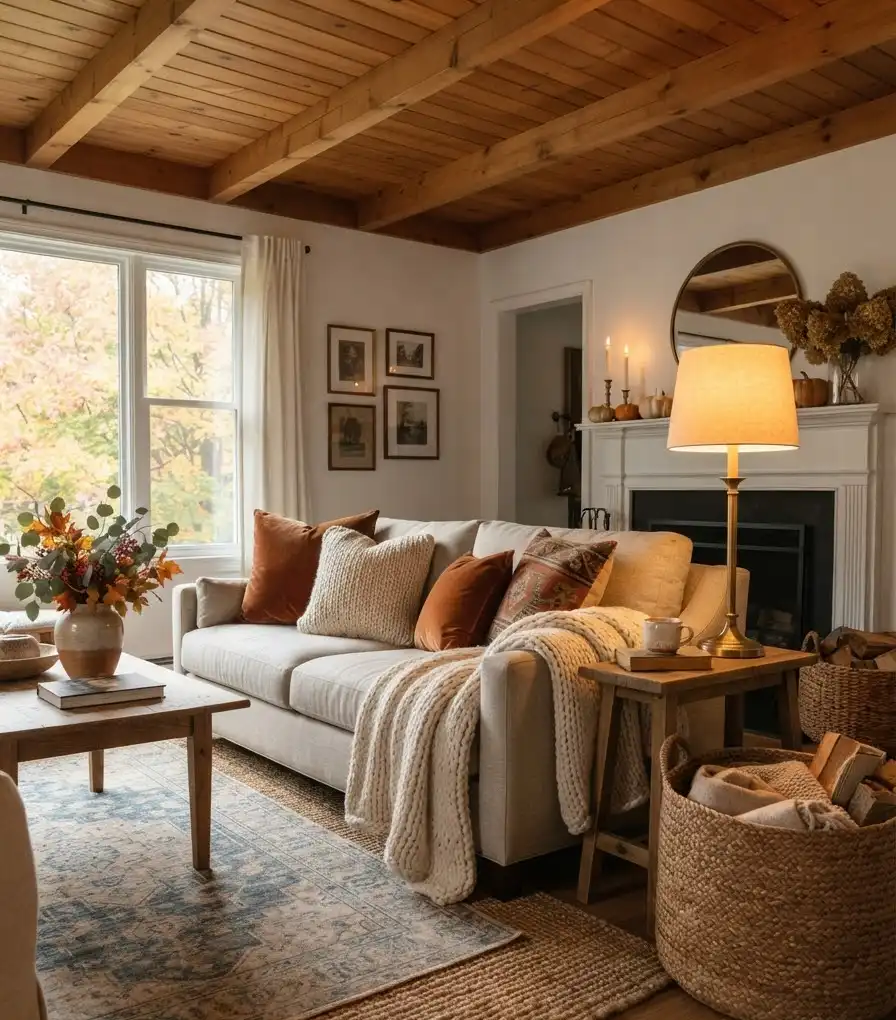
- Navy or slate blue as the dominant wall, sofa, or rug color
- Burnt orange or terracotta as the accent through pillows, throws, and accessories
- Neutral base pieces like a tan sofa or oatmeal rug to keep things from feeling too loud
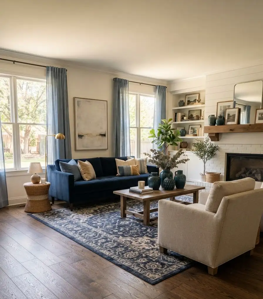
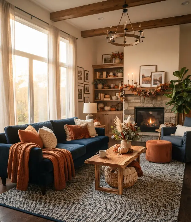
I went with a deep navy sofa and added rust-orange pillows.
Cheap fix, huge visual payoff. My sister did the opposite in her apartment (orange accent chair, blue everything else) and it looks just as good. There’s no single right answer here, just personal taste.
A quick reference table
| Room element | Blue option | Orange option |
|---|---|---|
| Sofa or accent chair | Navy velvet | Burnt orange linen |
| Throw pillows | Dusty blue with texture | Rust or pumpkin tone |
| Wall accent | Slate blue paint | Terracotta art print |
Keep it simple like this and you can’t really go wrong.
Layering textures for that cozy fall feel
Color gets people in the door, but texture is what makes a room feel like fall. A flat blue couch with flat orange pillows just looks like a color swatch, not a home.
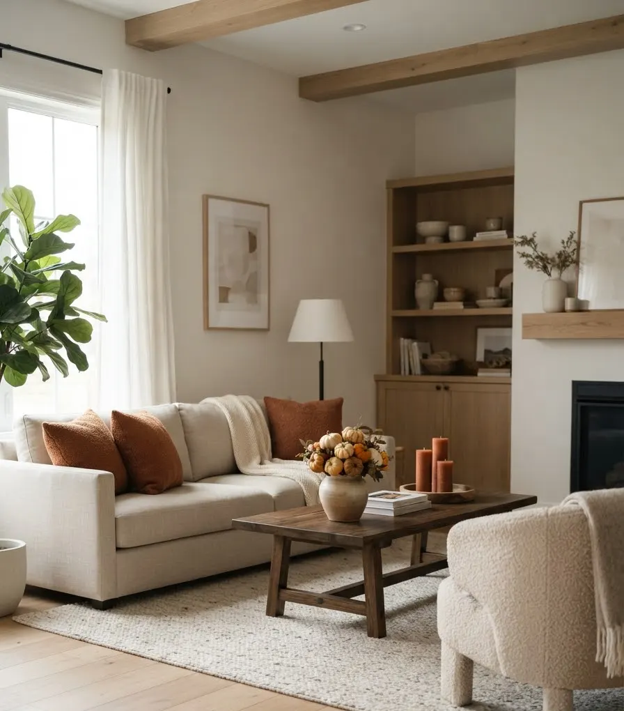
Mix materials on purpose. Chunky knit throws, velvet cushions, woven baskets, and a jute rug all bring different textures into play.
Each one catches light differently, and that’s what creates depth.
- Add a chunky knit blanket in cream or blue draped over the arm of your sofa
- Toss in velvet pillows in burnt orange for a little shine
- Layer a jute or sisal rug under a smaller blue accent rug for dimension
Ever notice how a hotel lobby always feels more “finished” than a regular living room? A lot of that comes down to layered textures, not just color choice. Same trick applies at home.
Where to actually put the orange (without overdoing it)
This is the part people overthink. You don’t need an orange wall. Please don’t paint an orange wall unless you’re really committed.
Small doses of orange go a long way.
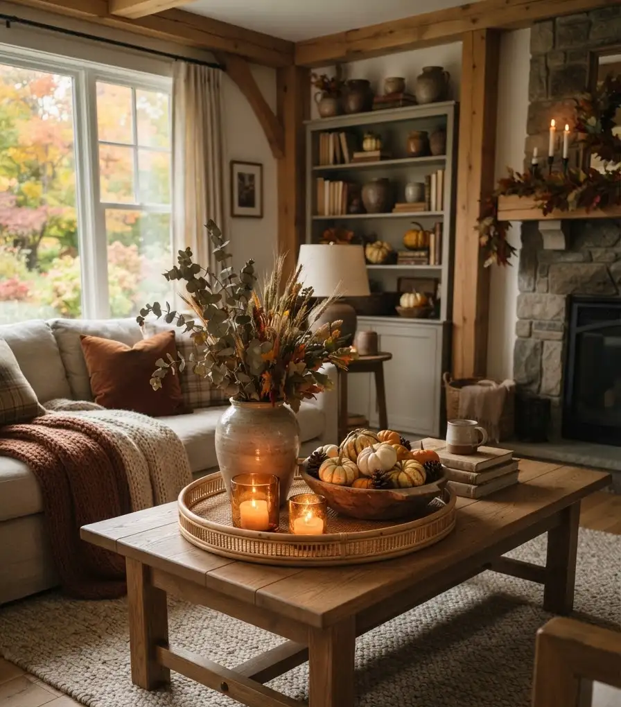
A few pumpkins on the coffee table, one statement lamp, a couple of throw pillows. That’s usually plenty for a whole room.
Here’s my personal ranking of where orange works best, from safest to boldest:
- Throw pillows and blankets (low commitment, easy to swap out)
- Candles, vases, and small decor objects
- A single accent chair
- Framed art or a gallery wall with warm tones
- An accent wall (only if you’re feeling brave)
I started at option one two years ago. Now I’ve got the accent chair. Baby steps work fine here, and honestly they save you money too.
Blue accents that actually feel intentional
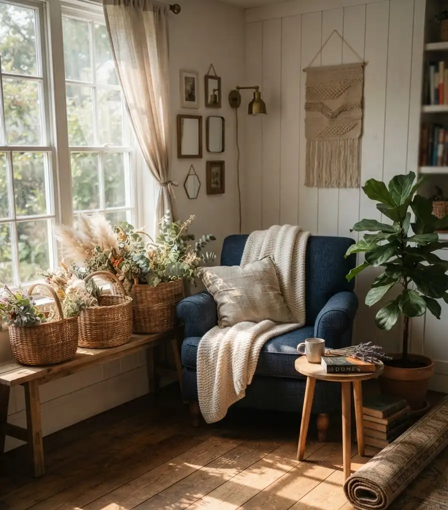
Blue is easier to commit to in bigger doses since it reads as calm rather than seasonal. A navy sofa works year-round, not just in October.
That’s actually one of the best things about this color combo: it doesn’t scream “fall decor” so loud that you have to pack it all away in December.
Consider these blue touches:
- A navy or indigo area rug as your anchor piece
- Ceramic vases in deep teal or cobalt
- A gallery wall with a few blue-toned prints mixed among warmer pieces
- Curtains in a soft dusty blue to soften natural light
The folks at Better Homes & Gardens have pointed out that blue tends to photograph beautifully in natural light, which matters a lot if you’re the type who’s constantly rearranging furniture for the perfect Pinterest shot. No judgment. I do it too.
Pulling in natural fall elements
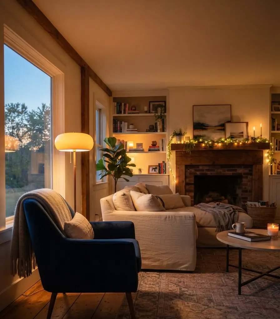
Fall decor isn’t just about color. Texture and nature play a role too.
Pinecones, dried florals, wood accents, and woven baskets all tie the room together and stop it from feeling like a paint chip come to life.
A few ideas that work well with a blue and orange scheme:
- Dried eucalyptus or wheat stalks in a ceramic vase
- Small wooden bowls filled with mini pumpkins or gourds
- Rattan or wicker baskets for blankets and magazines
- Candles in amber or terracotta glass holders
This is honestly my favorite part of fall decorating. Wow, does a good candle change a room’s whole vibe.
Cinnamon or clove scented ones fit this palette perfectly, and they make the space feel finished even before your guests notice the color scheme.
Lighting matters more than you’d think
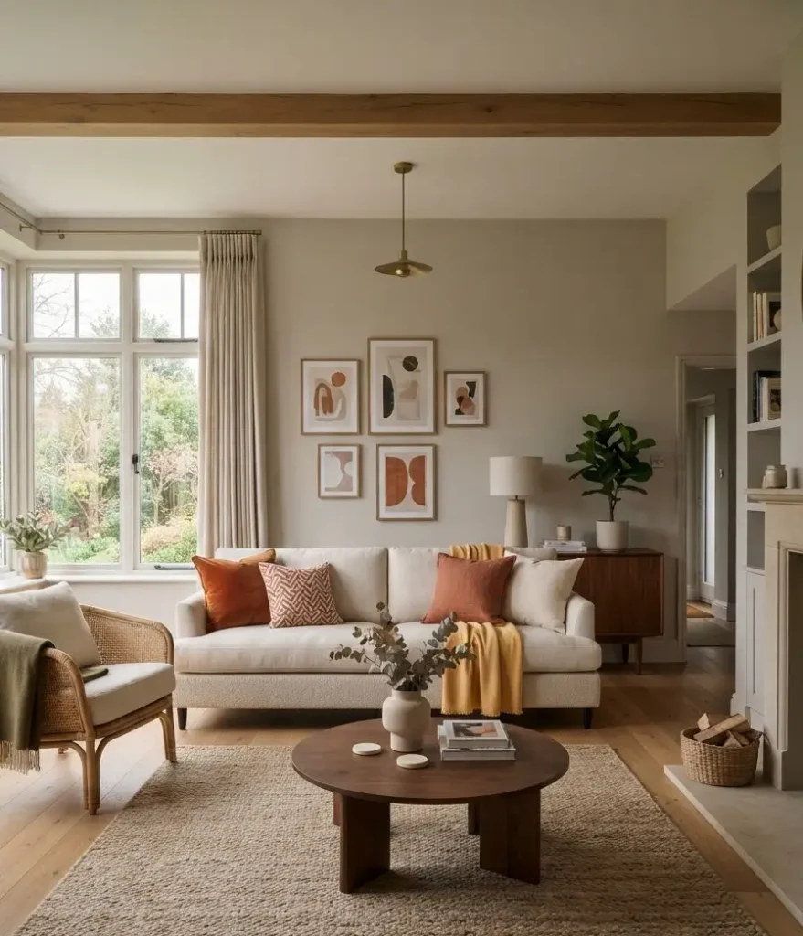
A well-decorated room falls flat under harsh overhead lighting. Fall decor especially needs warm, layered light to feel cozy instead of clinical.
Swap out any cool white bulbs for warm white ones, somewhere around 2700K. Add a floor lamp with an amber or linen shade near your reading corner.
String lights along a shelf or mantel add a soft glow without looking like a college dorm room, as long as you keep them subtle.
Random thought, but has anyone else noticed that half of decorating advice online completely ignores lighting?
People obsess over pillow colors and forget the bulbs. Get the lighting right and even a basic room looks pulled together.
Common mistakes to avoid
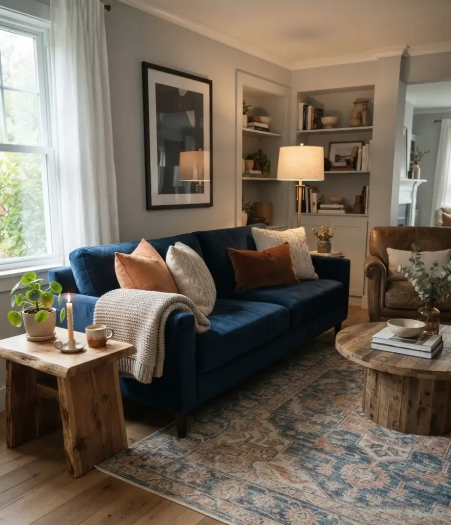
I’ve made most of these myself, so consider this a shortcut past my trial and error.
- Going too matchy-matchy. Every pillow in the exact same orange looks staged, not styled. Mix shades and patterns instead.
- Skipping neutrals entirely. Without a neutral base like tan, cream, or gray, the room can feel visually exhausting.
- Forgetting scale. One tiny orange pillow on a huge navy sofa gets lost. Go bigger or add more pieces.
- Ignoring the rest of the year. Pick pieces you’ll still like in February, not just pumpkin season.
A simple shopping and styling checklist
If you’re starting from scratch, here’s the order I’d tackle things in:
- Pick your dominant color (blue or orange) and commit to it for big furniture pieces
- Add one statement accent piece in the opposite color
- Layer in three to four different textures through pillows, throws, and rugs
- Add natural elements like dried florals or wood bowls
- Finish with warm lighting and a scented candle
Takes a weekend, tops. And unlike a full furniture overhaul, none of this requires touching your wallet too hard.
FAQs
Do blue and orange decor work outside of fall? Yes. Lean into deeper, muted tones like navy and terracotta for fall, then swap in brighter cobalt and coral accents come spring or summer. The base pieces stay the same.
What if I already have a brown or beige sofa? Perfect actually. Neutral sofas are the easiest base for this combo. Just layer blue and orange through pillows, throws, and a rug instead of buying new furniture.
Is this color scheme too bold for a small living room? Not if you keep the wall color neutral and let blue and orange live in your accessories. Small rooms actually benefit from a little contrast since it stops everything from blending into one flat tone.
Final thought
Blue and orange decor gives your living room that fall feeling without turning it into a pumpkin patch. Start small with a few pillows and a candle, see how it feels, then build from there.
What’s your dominant color going to be, blue or orange? Save this for your next Pinterest board and let me know how your room turns out 🙂
