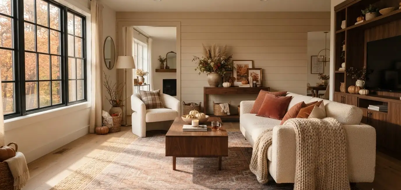
Autumn walks in and suddenly your living room looks… tired. Same throw pillows. Same beige everything. Same energy it had in July.
I redecorate my living room for fall every single year, and I still mess it up half the time. Too many pumpkins one year.
Zero texture the next. So this guide is the version I wish I had before I started buying orange candles like they were going out of style (they kind of were, honestly).
If you’re on Pinterest hunting for a living room that feels like a hug the second you walk in, you’re in the right place.
Let’s get your space ready for sweater weather.
Why the modern fall aesthetic works so well right now
Fall decor used to mean scarecrows and plastic leaf garlands.
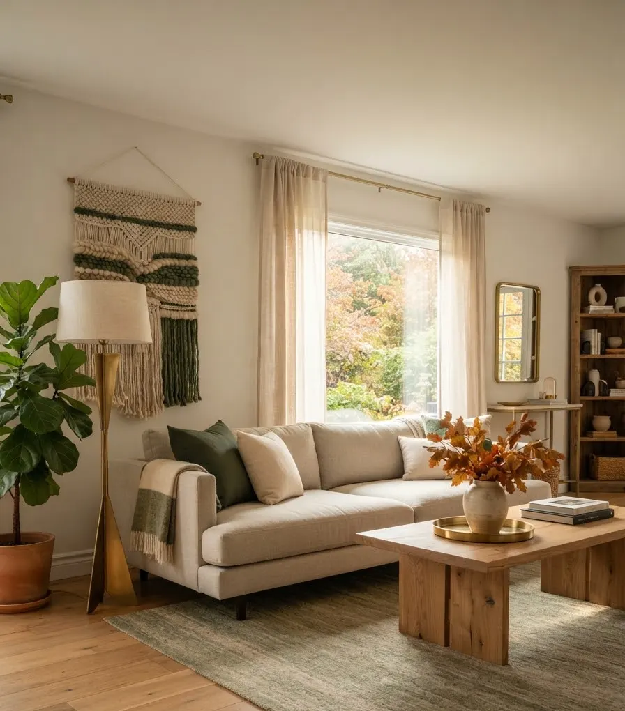
Not anymore. The modern fall aesthetic strips out the kitsch and keeps the warmth: think tonal color, natural texture, and a few well-chosen statement pieces instead of a Michaels aisle exploding across your coffee table.
Pinterest search data backs this up too. Interest in “moody living room” and “earthy autumn decor” spikes hard every September, and designers are leaning the same way for 2026: rich, saturated color paired with tactile, handcrafted materials rather than the flat neutrals that dominated the last few years.
Why does this style translate so well to Pinterest specifically?
It’s visual. It photographs beautifully in low, warm light. And it’s achievable, you don’t need a full renovation, just smart layering.
Start with a color palette that actually makes sense
Here’s where most people go wrong: they buy orange because “it’s fall” and call it a day. IMO, that’s the fastest way to make a room look like a costume shop.
Instead, build around 2 to 3 anchor tones and let everything else support them.
According to Pantone’s Color of the Year announcement, 2026’s palette direction leans toward calm, grounded neutrals paired with deeper accent colors, a nice base for autumn styling that still feels current instead of costume-y.
A few combinations that hold up all season:
- Terracotta + cream + walnut brown for a warm, sun-baked look
- Forest green + burnt umber + brass for something moodier
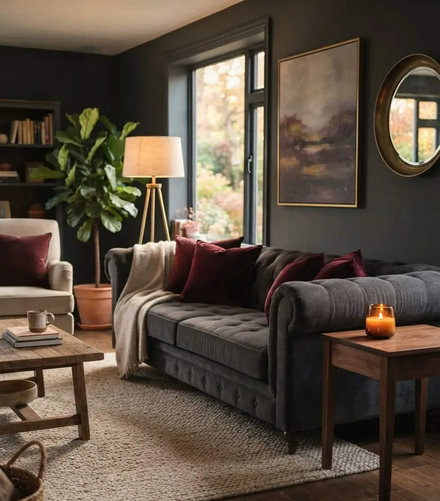
- Burgundy + charcoal + oatmeal if you want drama without going full Halloween
Quick color reference table
| Palette | Best For | Mood |
|---|---|---|
| Terracotta, cream, walnut | Small or bright rooms | Warm, airy |
| Forest green, umber, brass | North-facing rooms | Cozy, moody |
| Burgundy, charcoal, oatmeal | Statement spaces | Bold, dramatic |
| Cloud white, sage, rattan | Minimalist homes | Calm, understated |
Pick one row. Not all four. I learned that the hard way with a living room that ended up looking like a fall-themed fruit basket.
Layer textures like you mean it
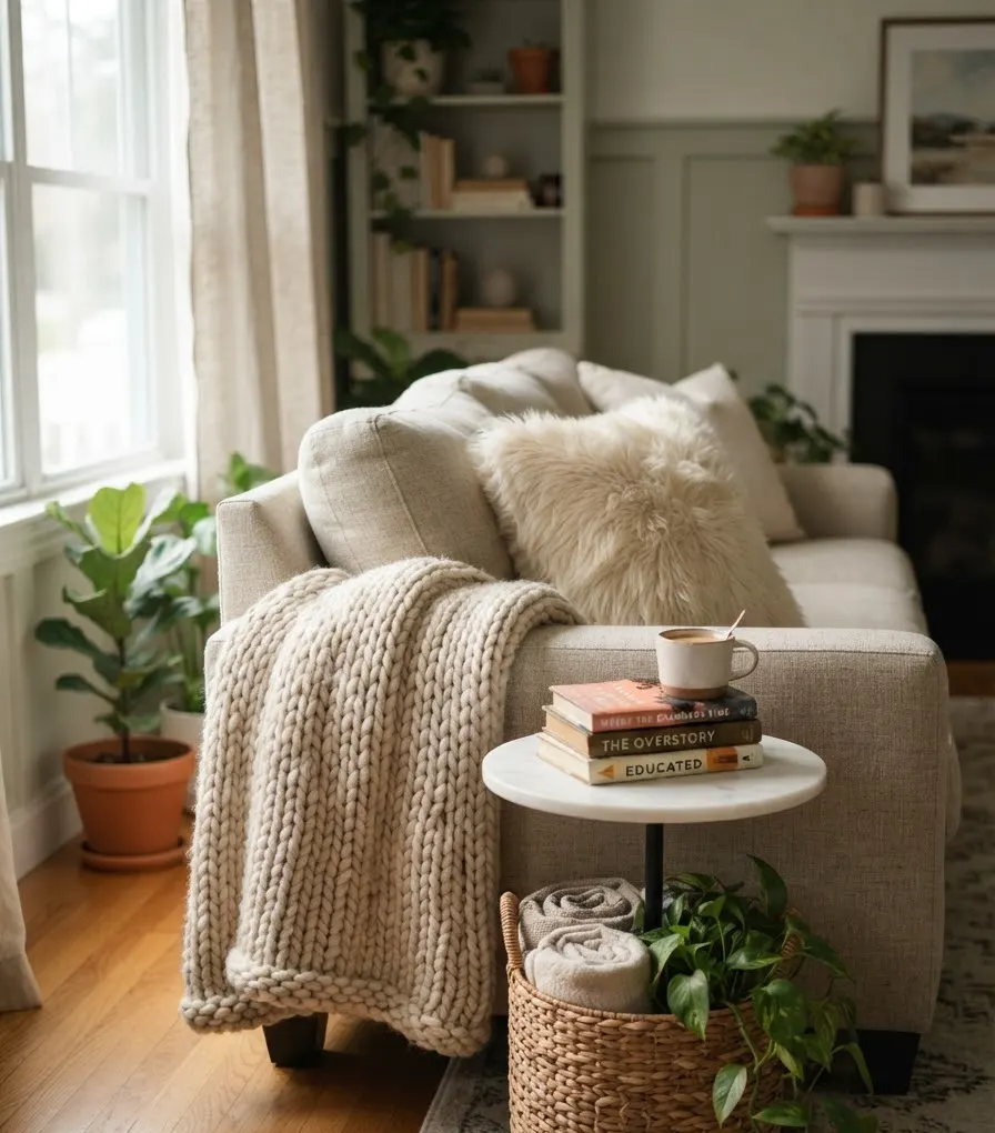
This is the part people skip, and it’s the part that actually sells the aesthetic. Flat, single-texture rooms read cold no matter what color you use.
Fall decor lives and dies by texture layering.
Rugs and throws
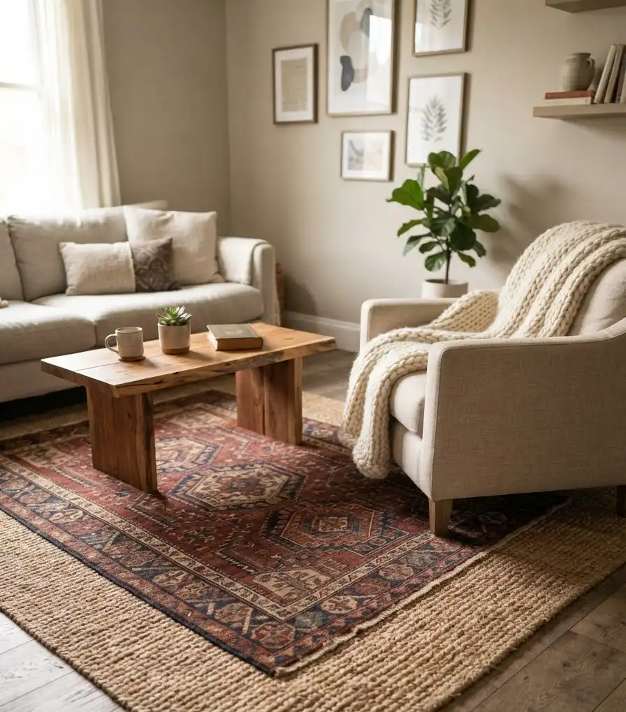
Put a chunky wool or boucle throw over the arm of your sofa. Add a vintage-style rug (or a good faux one) layered over a jute base if your floor allows it.
The mix of rough and soft is what makes a space feel collected instead of staged.
I own exactly one good throw blanket and I use it in every single Pinterest photo I take. Nobody needs to know that 🙂
Candles and scent
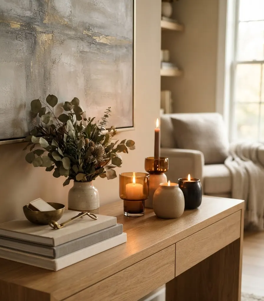
Ceramic or amber-glass candle holders do double duty, they look good lit or unlit, and warm scents like fig, cedar, or clove genuinely change how a room feels the second you walk in.
Skip anything that smells like a pumpkin spice candle factory exploded. A little goes a long way.
Wall art and shelf styling
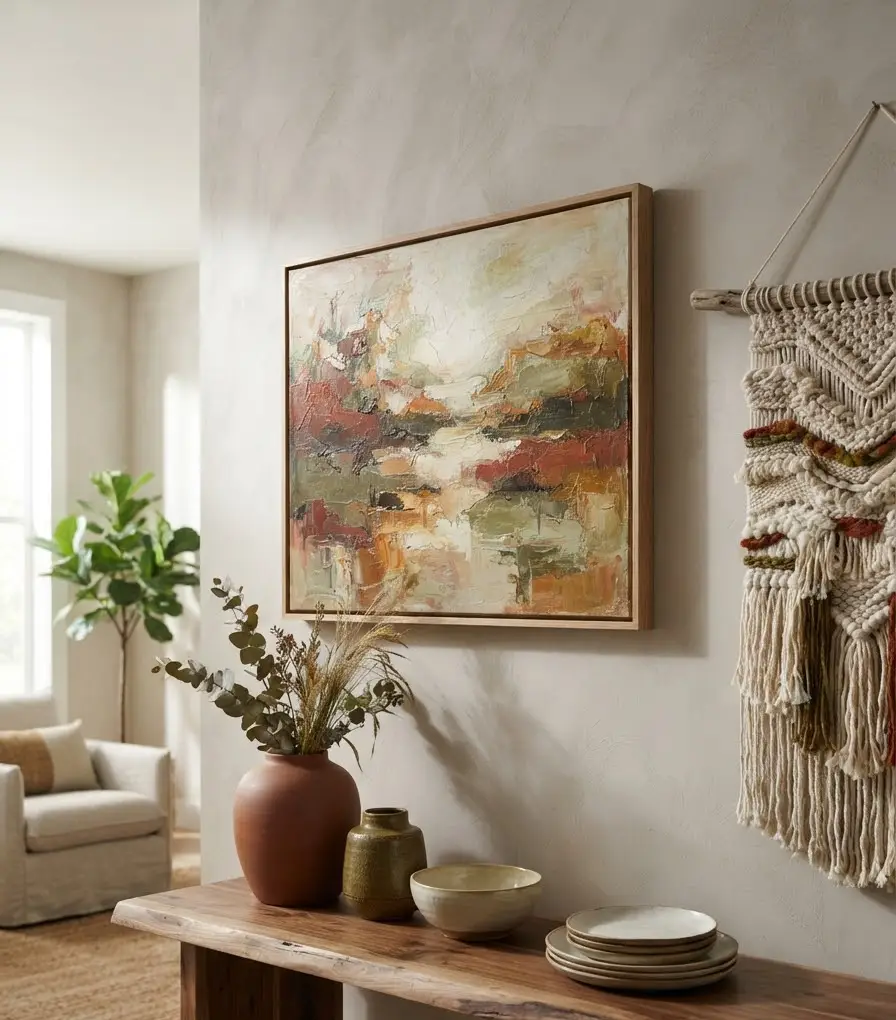
Swap out one piece of art for something with a warmer tone, a landscape print, an abstract in rust or olive, even a textured woven wall hanging.
You don’t need to redo the whole wall. One swap changes the whole read of the room.
Furniture arrangement: don’t skip this step
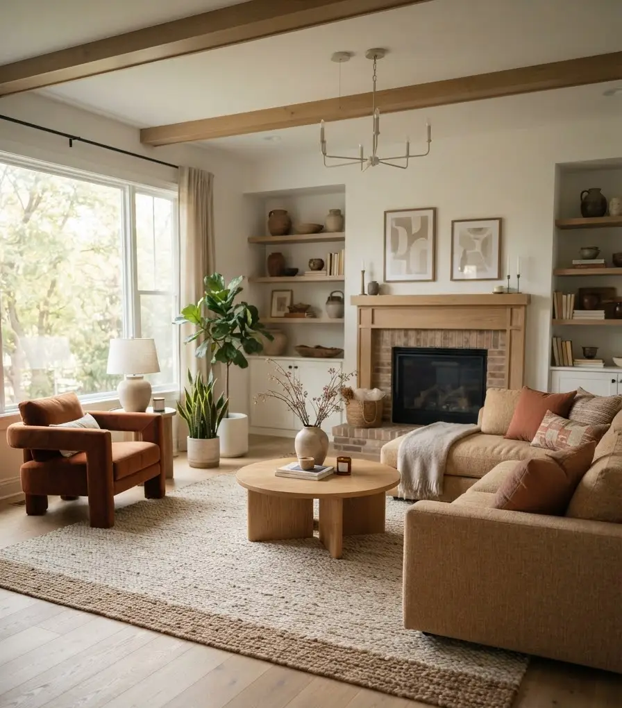
You can have the best color palette on Pinterest and still have a room that feels off if the furniture layout fights the space.
Fall styling is a great excuse to actually rearrange, not just accessorize.
A few things I always check before I start decorating:
- Is the main seating cluster facing a natural focal point (fireplace, window, TV)?
- Are there at least two lighting sources besides the overhead fixture?
- Is there a spot for a cozy reading chair, even a small one?
- Does the coffee table have breathing room for styling without looking cluttered?
Ever notice how the living rooms that go viral on Pinterest almost always have an oversized, sculptural light fixture?
That’s not an accident. Statement lighting is one of the biggest trends heading into this season, and it does a lot of visual work for very little effort.
Lighting sets the whole mood
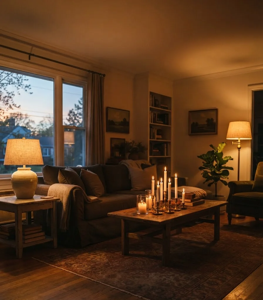
Fall is shorter days and longer evenings, so your lighting needs to work harder. Overhead lighting alone makes a room feel clinical, not cozy.
Layer in:
- A table lamp with a warm-toned shade near your main seating
- A floor lamp in a corner that otherwise goes dark
- Candles at varying heights on your coffee table or mantel
Warm-white bulbs (2700K, if you want the exact number) make a bigger difference than people expect. IMO it’s the single cheapest upgrade in this entire guide.
Budget-friendly styling moves that actually work
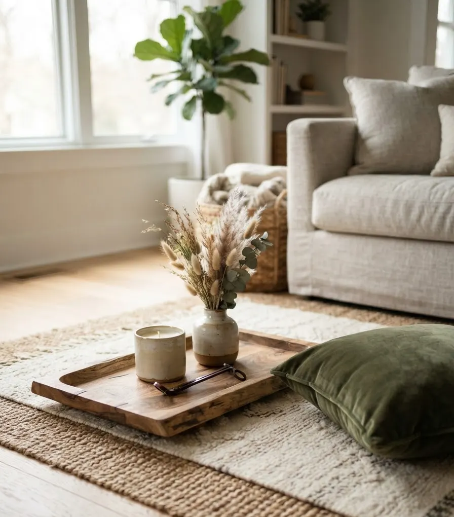
You don’t need a full furniture haul to pull this off. Here’s what I’d prioritize if I only had $150 to spend:
- New throw pillow covers in a fall-toned fabric, velvet or boucle over the existing inserts you already own
- One statement candle in a ceramic or amber vessel
- A small vase of dried grasses or branches, honestly free if you have a backyard
- A tray for your coffee table to anchor a few styled objects instead of scattered clutter
- A rug layered over your current one, even a small accent rug changes the whole floor plane
Skip anything plastic, anything that says “Fall Y’all” in cursive, and anything that only works for six weeks a year. Longevity matters if you actually want to reuse pieces next season.
Mistakes I’ve made so you don’t have to
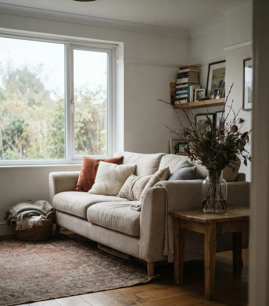
Let’s be honest for a second. Not everything I’ve tried has worked.
- I once bought four different shades of orange pillow covers thinking they’d “blend.” They did not blend. They fought each other for attention like siblings on a road trip.
- I put a fake pumpkin arrangement directly under a bright overhead light and it looked exactly as fake as it sounds.
- I skipped texture for an entire season because I was “keeping it minimal.” The room looked unfinished the whole time.
This is insane in hindsight, but honestly, that’s how you learn what actually works in your specific space. Every room lights differently, faces a different direction, and holds color differently. What works in a south-facing apartment might completely fall flat in a room that barely sees direct sun.
Slightly off-topic, but this is also why I’ve stopped fully trusting Pinterest inspiration photos without checking the room’s natural light first. A palette that looks stunning in a bright, sunlit shoot can read muddy and dark in a room with different lighting conditions. Worth keeping in mind before you commit to paint or a big rug purchase.
A quick styling checklist before you call it done
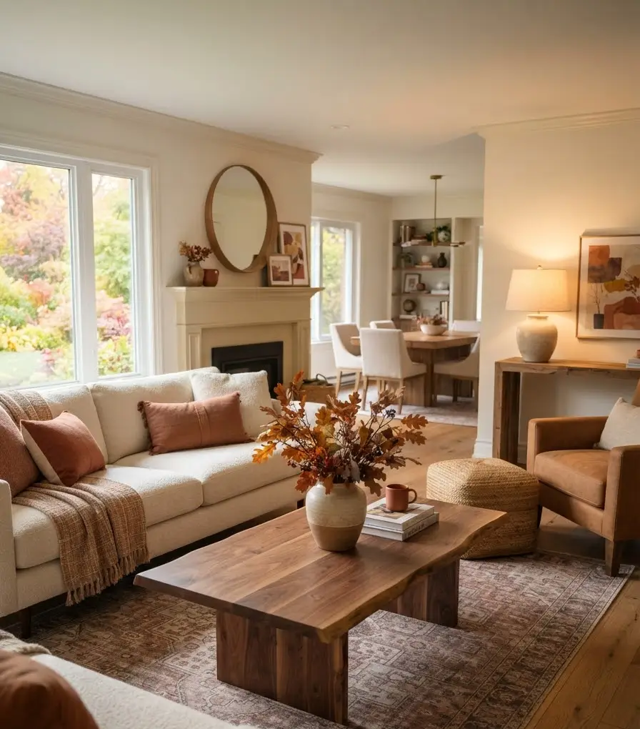
- Does the room have at least 2 to 3 texture types (wood, textile, ceramic, metal)?
- Is your color palette limited to 2 to 3 anchor tones?
- Do you have layered lighting, not just overhead?
- Is there at least one natural element (branches, dried florals, wood)?
- Does the space still feel like you, not a showroom?
If you can check most of those boxes, you’re in good shape.
FAQs
How do I make a small living room feel cozy for fall without making it look cluttered? Stick to one dominant color palette and lean on texture over quantity. A single chunky throw, one layered rug, and warm lighting will do more than five small decorative objects scattered around.
What’s the easiest fall decor update if I only have an afternoon? Swap your throw pillows and add one warm-toned candle. Both are low-cost, low-effort, and instantly shift the room’s temperature visually.
Do I need to redecorate my whole living room every fall? No, and honestly you shouldn’t. Build a small rotating collection of seasonal pieces (pillow covers, a throw, a few candles) and reuse them year over year. Your wallet and your closet space will thank you.
Final thought
A modern fall living room isn’t about how much decor you can fit into a room, it’s about picking the right handful of pieces and actually letting them breathe. Start with color, layer in texture, fix your lighting, and stop buying orange things just because it’s September.
What’s the one piece you’re adding to your living room this season? Save this guide, pin your favorite palette from the table above, and let me know how your space turns out.
