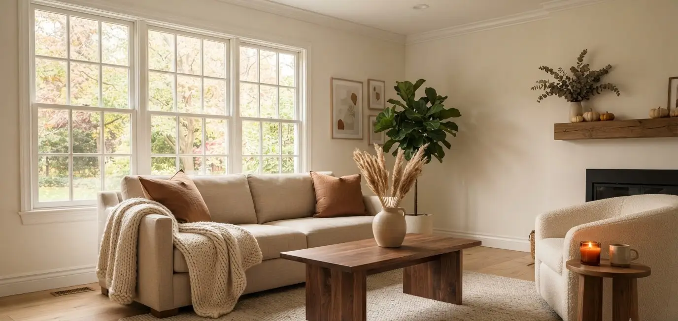
I used to be a “everything must have a pumpkin on it” person. Every surface, every shelf, every windowsill.
Then one October I stepped back, looked at my living room, and thought: this looks like a craft store threw up in here.
That was the year I switched to minimal fall decor, and I never looked back.
If you’re the type who scrolls Pinterest for hours saving cozy living room boards but panics at the thought of actually committing to a look, this one’s for you.
Minimal fall styling isn’t about doing less work.
It’s about doing the right work, on the right pieces, so your space feels like autumn without feeling like a seasonal aisle at Target.
Why subtle fall decor actually works better
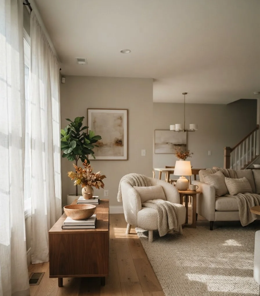
Here’s something nobody tells you when you’re buying your fifth fake pumpkin: more stuff doesn’t equal more cozy. It usually equals more clutter and more dusting.
A living room dressed in restraint reads as intentional.
A living room stuffed with every gourd-shaped object from the clearance bin reads as, well, a lot.
Design experts echo this too. One recent guide on fall decorating trends points out that tonal, textured palettes are dominating this season precisely because they feel cohesive instead of chaotic.
I learned this the hard way.
Two years ago I bought a wreath, three candles, a garland, a runner, and a ceramic pumpkin trio, all in one Target run.
My coffee table looked like a harvest festival exploded.
Now I own maybe six fall items total, and my living room gets more compliments than it ever did before.
Start with a neutral base, then whisper the season in
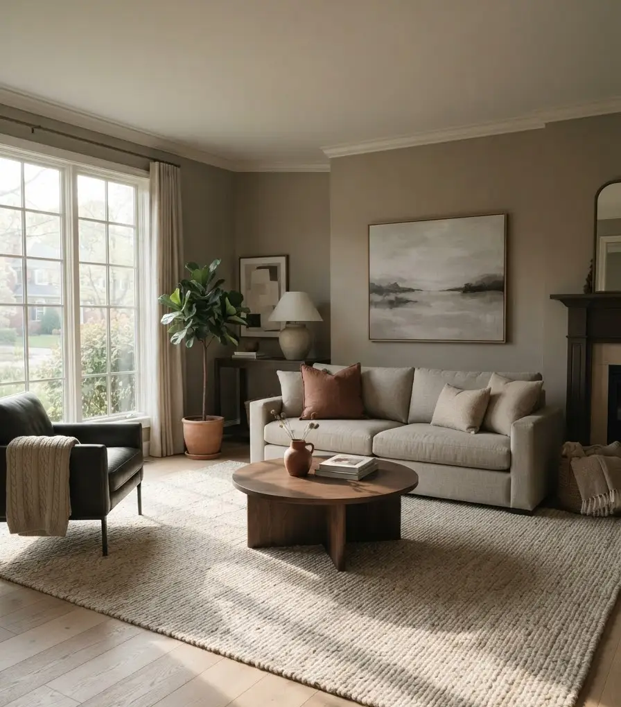
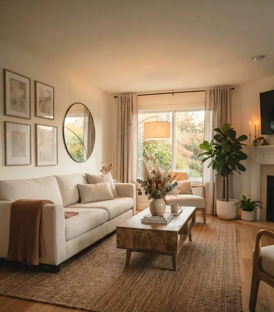
You don’t need to repaint your walls or reupholster your sofa. You need a foundation that already leans warm and quiet: think oatmeal, bone, taupe, soft gray, or greige.
Once that base exists, fall becomes a matter of accents, not overhauls.
The color rules I actually follow
- Pick one dominant tone. Rust, terracotta, or deep olive works. Pick one, not all three.
- Keep 80% of your palette neutral. The remaining 20% carries your seasonal color.
- Skip bright orange entirely. IMO it’s the fastest way to make a room look like a Halloween store instead of a styled home.
- Repeat the accent color at least twice. One pillow and one candle in the same rust tone reads as designed. One random orange object reads as forgotten.
I’m genuinely stubborn about that first rule. Every time I’ve tried mixing three “fall colors” at once, the room stops feeling calm and starts feeling busy.
One accent tone, done properly, beats three fighting for attention every time.
Texture over trinkets
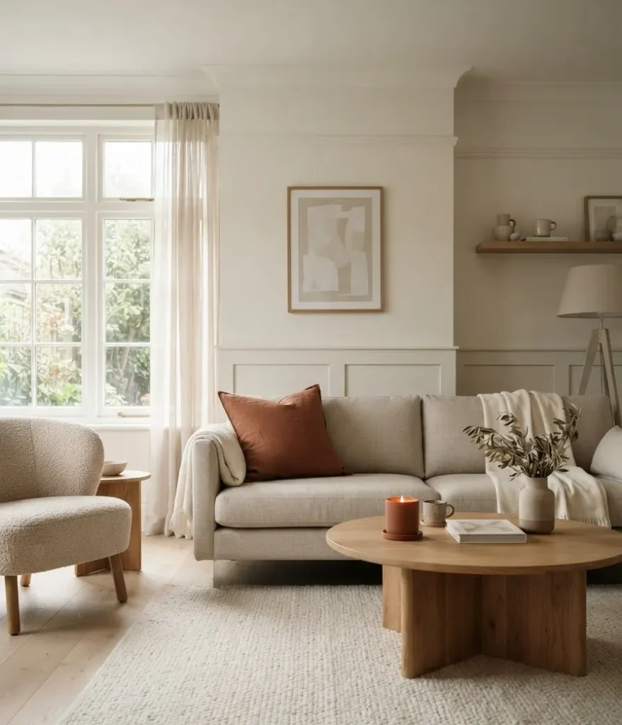
Ever notice how the coziest rooms on Pinterest rarely have a ton of objects in them? What they do have is texture, layered like you’d layer an outfit for a chilly walk.
Swap a smooth cotton throw for something chunky knit. Trade a flat linen pillow cover for boucle or faux fur.
Add a wood tray, a stoneware vase, a woven basket. None of that screams “fall,” but all of it feels like fall.
A minimalist living room styling roundup makes a similar point: rooms that lean into natural materials and layered texture tend to feel warm and elevated at once, without a single seasonal cliché in sight.
Honestly, this is the part most people skip because texture takes a bit more thought than grabbing a pumpkin off a shelf.
But it’s also the part that makes the biggest difference. Trust me on this one.
Where to actually place things
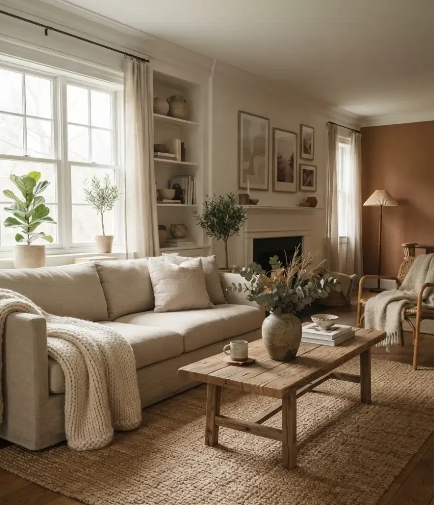
Minimal decor still needs placement strategy. Randomly scattering three items across a room reads as sparse, not intentional. Grouping them reads as styled.
Here’s how I break it down room by room:
- The coffee table. One tray, one small vase with dried stems or pampas grass, maybe one low candle. That’s it. Resist the urge to add a fourth thing.
- The mantel or console. A single piece of art or a mirror, layered with one textured object like a ceramic vessel or a small stack of books.
- The sofa. Two to three pillows max, one throw draped (not folded flat, actually draped like you just used it).
- The bookshelf. Tuck one or two seasonal touches, like a small dried floral arrangement, among your existing books instead of adding a whole new display.
This “less but grouped” approach is also something a neutral fall decorating guide recommends, capping visible seasonal items at three to five total pieces across an entire room.
That number sounded low to me at first. Then I tried it, and it worked better than anything I’d done before.
Candles, lighting, and scent: the sensory layer people forget
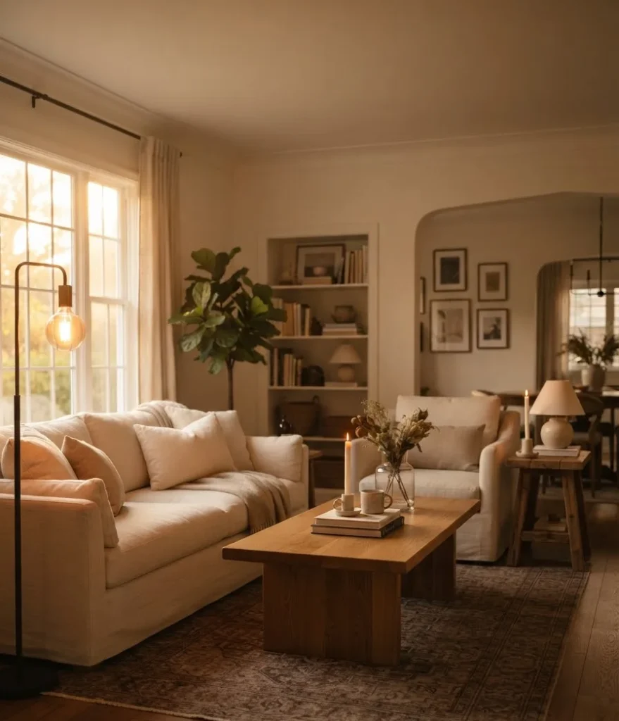
A room can look perfect and still feel unfinished if the lighting is wrong. Fall isn’t just visual. It’s warm light, low and golden, plus a scent that makes you want to stay put.
Swap your bright white bulbs for warm white or soft amber ones. Add one or two candles in a scent that leans woodsy or spiced rather than sugary.
Cinnamon and clove work. Pumpkin cupcake frosting does not, unless that’s genuinely your thing (no judgment).
I keep exactly two candles going in my living room during fall: one on the coffee table, one on a side table.
That’s enough to change how a room feels the second you walk in, without turning the space into a candle shop.
A quick at-a-glance styling table
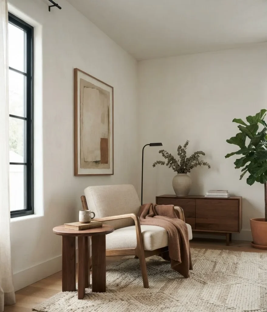
Sometimes a list format just makes decisions easier. Here’s a small breakdown I use when I’m second-guessing whether something belongs in the room:
| Element | Minimal fall approach | Skip this instead |
|---|---|---|
| Color | One accent tone, repeated twice | Three+ competing fall colors |
| Texture | Chunky knit, boucle, stoneware | Plastic pumpkins, glittery accents |
| Placement | Grouped in 2 to 3 zones | Scattered across every surface |
| Lighting | Warm bulbs, 1 to 2 candles | Bright white light, no candles |
Common mistakes that ruin the minimal look
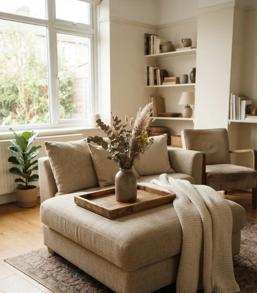
I’ve made most of these myself, so consider this a list of my own personal cautionary tales.
- Buying decor before editing what’s already there. Add a new pillow, and something else has to go. Otherwise you’re just adding clutter with better branding.
- Choosing decor by season instead of by room. A piece that looks amazing in a store display might clash horribly with your actual sofa color. Bring swatches, or at least photos, before you buy.
- Overdoing garlands. One small stretch of dried eucalyptus or fall foliage on a mantel is elegant. Wrapping garland around every doorway and shelf edge is a lot, and honestly, kind of exhausting to dust.
- Forgetting the “why.” Every piece should earn its spot. If you can’t say why an item is in the room, it probably shouldn’t be.
A quick side note, completely unrelated to decor: I once spent 45 minutes debating whether to buy a $12 candle versus a $34 one, only to realize I’d already spent more time deciding than either candle would last burning.
Sometimes the analysis paralysis is worse than just picking one and moving on. Anyway, back to the living room.
Budget-friendly ways to get the look
You don’t need a designer budget for this. A few of my favorite low-cost swaps:
- Repurpose what you already own. A summer throw in the right neutral color works fine into October. You don’t need a “fall specific” version of everything.
- Thrift your vases and trays. Secondhand stores are full of stoneware and wood pieces that look far more expensive than they cost.
- DIY a dried floral arrangement. Grocery store stems, hung upside down for a week or two, dry beautifully and cost a fraction of a styled arrangement.
- Buy one statement piece, skip the rest. A single well-made throw blanket does more for a room than five cheap accessories combined.
FAQs
Does minimal fall decor mean my living room has to look boring? Not at all. Minimal doesn’t mean empty. It means intentional. A room with three well-chosen, well-placed pieces usually reads as more stylish than one crammed with a dozen seasonal knickknacks.
How many fall items should I actually have in my living room? Somewhere around three to five total pieces tends to hit the sweet spot: enough to signal the season, not so much that it feels like a display case. Adjust based on your room size, obviously.
Can I still use orange for a subtle fall look? Sure, in small doses. Lean toward a muted, earthy orange like terracotta rather than a bright pumpkin shade, and keep it to one or two accents rather than the whole palette.
Final thought
Minimal fall decor isn’t about restraint for the sake of restraint. It’s about making your living room feel like the season arrived on purpose, not like a seasonal aisle exploded across your coffee table. Pick your palette, layer your textures, place things with intention, and let the rest of the room breathe.
So, which piece are you editing out of your living room first this week? Save this for your next Pinterest styling session, and let me know what your minimal fall corner ends up looking like.
