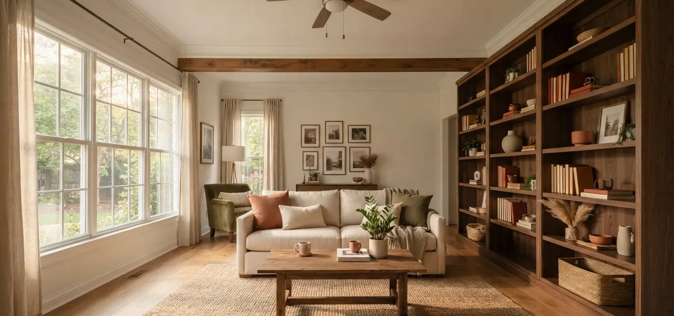
My bookshelf used to be a graveyard for college textbooks and one sad, dying pothos.
Then one October I got obsessed with Pinterest boards labeled “cozy autumn shelfie” and decided my living room deserved better.
Three weekends and one minor meltdown over a broken ceramic pumpkin later, I had a shelf that people actually stopped to look at.
That’s the thing about fall bookshelf styling. It’s not about buying a basket of plastic gourds and calling it a day.
It’s about layering texture, color, and a few good stories into a space you already own. FYI, you probably have most of what you need sitting in a closet right now.
This guide walks through how I approach it room by room, shelf by shelf, without turning your living room into a pumpkin patch explosion.
Why fall bookshelf styling matters more than you think
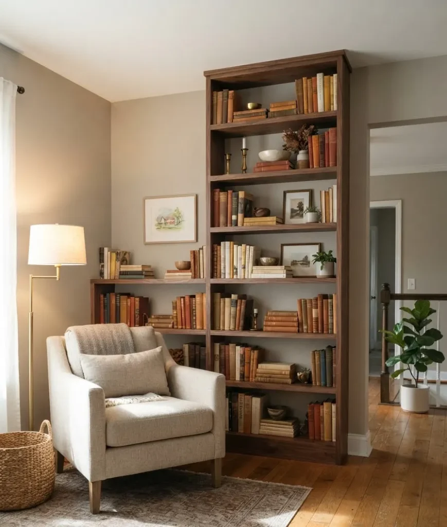
A living room lives or dies by its focal points. Your sofa sets the mood, sure, but your bookshelf tells people who you are.
Stack it wrong and it reads like clutter. Stack it right and it becomes the thing guests photograph before they even sit down.
Interior designers talk about this constantly. One home stylist puts it simply in her guide to styling built-ins, noting that shelf styling looks effortless but actually takes intention and a bit of trial and error.
I felt that in my bones the first time I tried and ended up with a shelf that looked like a thrift store threw up on it.
Fall gives you an easy excuse to refresh. The palette practically styles itself: rust, cream, olive, warm wood. You’re not fighting the season, you’re working with it.
Start with a blank shelf, always
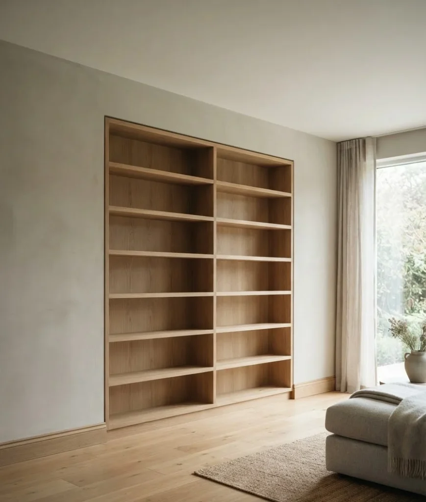
I know it feels counterproductive to empty a shelf you just spent an hour arranging last spring. Do it anyway.
A clean slate lets you actually see the bones of your shelf: the wood tone, the depth, the lighting. You can’t build a good composition on top of a messy one.
Pull everything off. Dust the shelf (nobody talks about this step but your future self will thank you). Then group your items into three rough piles:
- Books, sorted loosely by size
- Decorative objects: vases, bowls, small sculptures
- Anything seasonal you want to weave in
This is also the moment to be honest with yourself about what’s actually fall-appropriate versus what’s just brown. A dusty wicker basket isn’t autumn decor. It’s just a basket that needs a wash.
Build your fall color story first
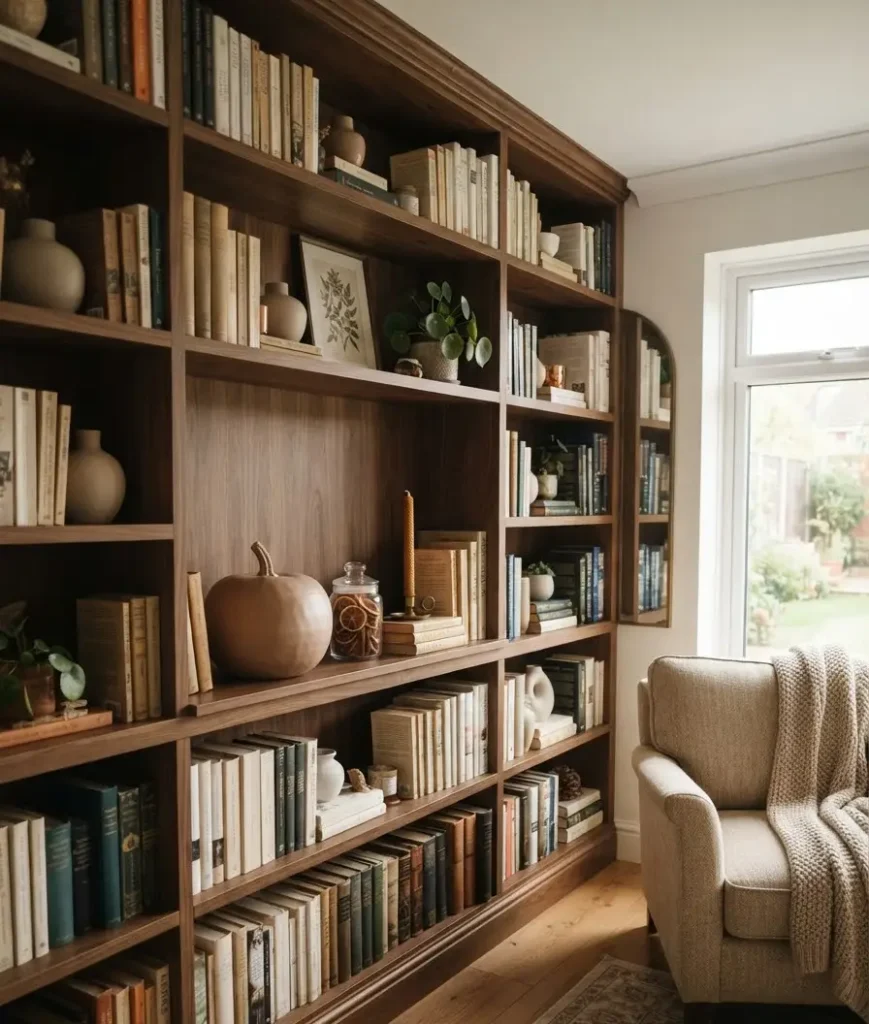
Before you touch a single book, decide on your palette. This saves you from the classic mistake of scattering five different oranges across one shelf until it looks like a Halloween store threw up on your built-ins (I’ve done this, don’t be me).
Stick to a tight range:
| Fall shelf palette | Best paired with | Where to use it |
|---|---|---|
| Rust and terracotta | Cream, black | Vases, book spines, small trays |
| Deep olive and sage | Warm wood, brass | Ceramics, candle holders |
| Camel and warm cream | Rust, dark wood | Book stacks, linen baskets |
| Charcoal and black | Any of the above | Bookends, frames, small accents |
Pick two, maybe three tones max. IMO this single rule fixes 80% of shelves that feel “off” but nobody can say why.
Layer books by color and by stack direction
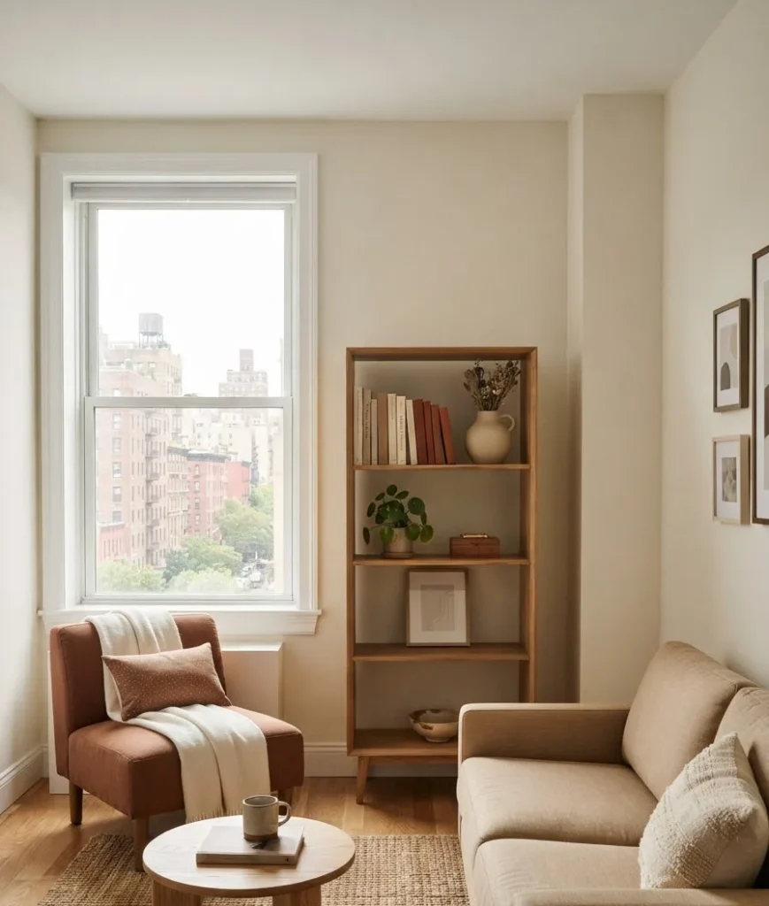
This is where most people freeze. Books are the bulk of what’s on your shelf, so getting this part right matters.
Mix horizontal and vertical stacks
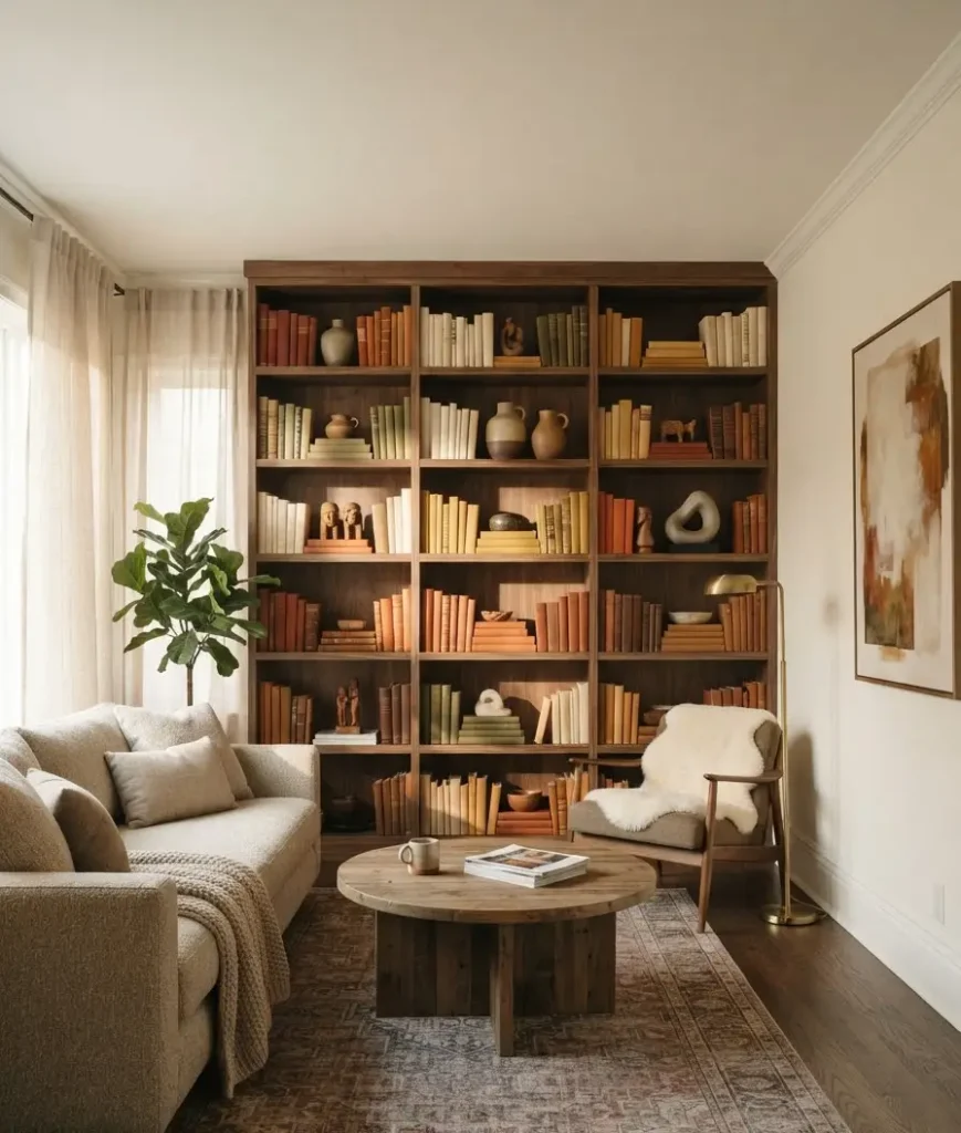
Don’t line every book up spine-out like a library catalog. Lay a few flat and stack a small object on top: a candle, a pinecone, a tiny vase. Then let a cluster of vertical spines lean against a bookend nearby.
This creates rhythm. Your eye moves across the shelf instead of getting stuck reading a straight row of titles. A design blog covering this exact formula suggests stacking books both horizontally and vertically before deciding where objects make the most sense, and honestly that order of operations changed how I approach every shelf now.
Sort loosely by color, not perfectly
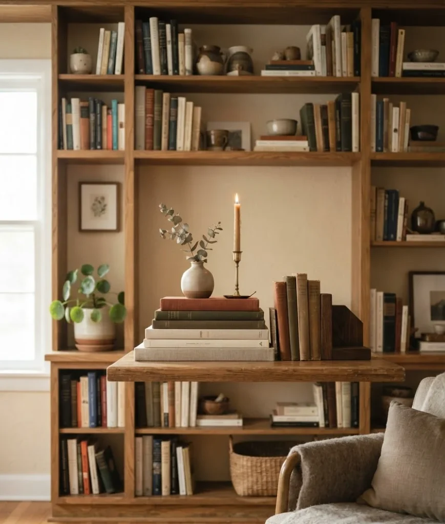
Full color-coded shelves look great on Pinterest and honestly a little sterile in real life. Instead, group warm-toned spines (browns, deep reds, mustard) together on one or two shelves.
Let the rest stay natural.
Ever notice how the “messiest” looking shelves on Pinterest are usually the most carefully considered? That’s not an accident.
Add texture before you add pumpkins
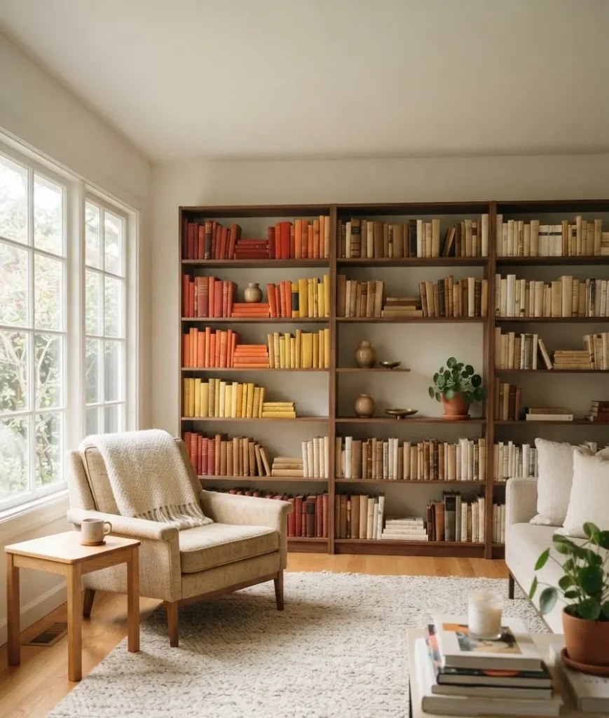
Here’s my slightly unpopular opinion: skip the fake pumpkins as your first move.
Texture should come before season-specific props, or the whole thing starts looking like a seasonal aisle display instead of a l
ived-in home.
Bring in:
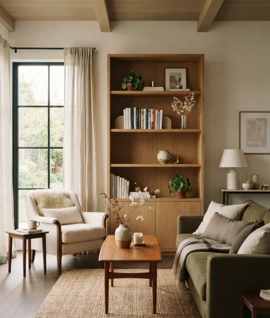
- A woven or rattan basket for a stack of magazines or throw blankets
- A ceramic vase in a matte, earthy glaze
- A small wood tray to corral candles or matches
- Dried florals: pampas grass, wheat stems, or eucalyptus that’s gone a little brown
Wood, ceramic, and woven textures do the heavy lifting. They read “autumn” without screaming it. One design roundup makes a similar point, noting that mixing books with decorative pieces provides more visual interest and helps highlight the objects that actually matter to you.
Now bring in the seasonal accents, sparingly
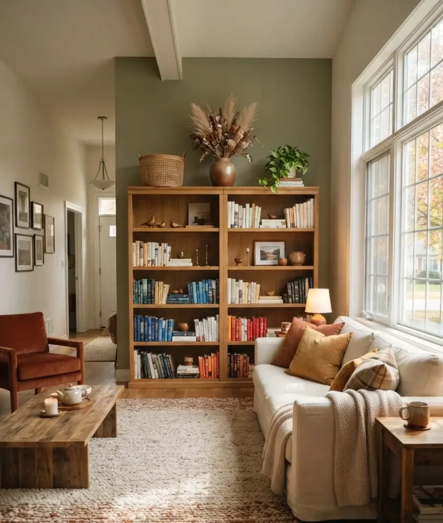
Once your texture base is in place, add two or three fall-specific pieces. Not ten. Two or three.
Good options:
- A small ceramic or wood pumpkin (skip the shiny plastic kind, IMO it cheapens the whole shelf)
- A cinnamon-stick or dried orange bundle tucked into a small jar
- A single stem of faux or dried leaves in a bud vase
- Warm-toned candles, unlit unless you’re actually in the room
I keep one rule for myself: if I could picture the item at a craft store checkout counter, it doesn’t make the shelf.
That’s harsh, maybe, but it’s saved me from a lot of regret purchases.
Don’t forget negative space
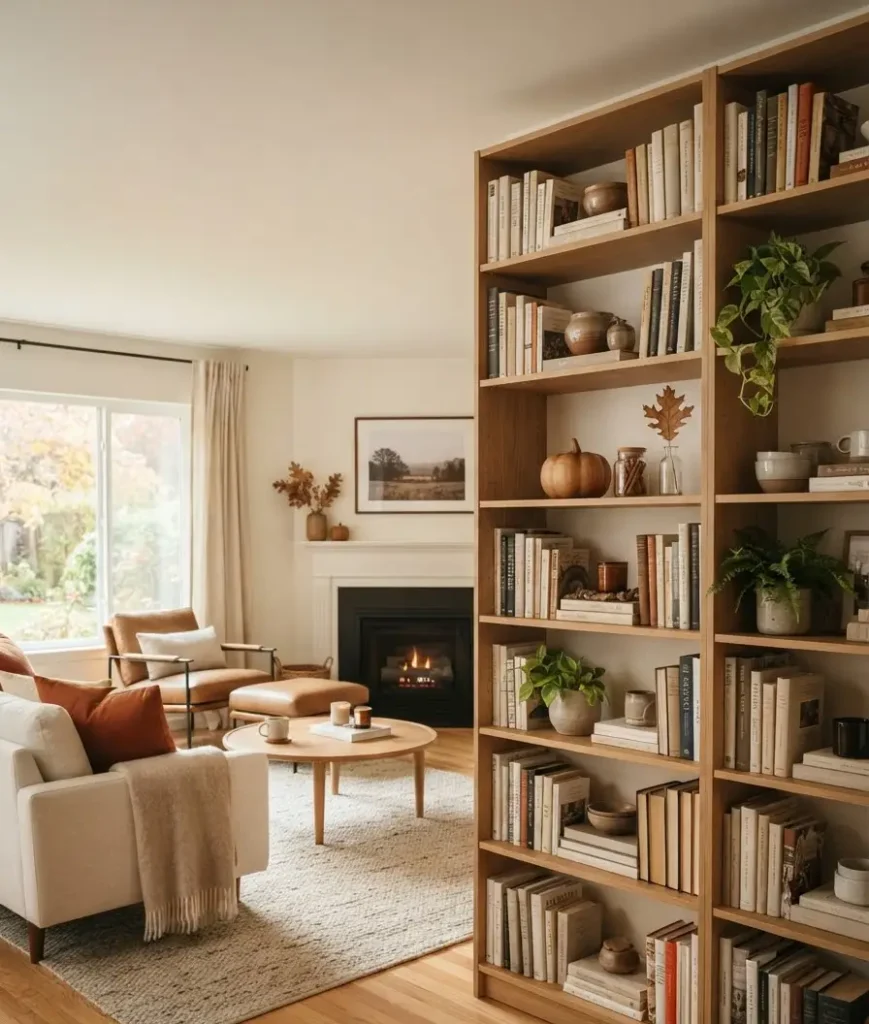
This is the part everyone skips and it’s the reason so many shelves feel cramped. Empty space isn’t a failure, it’s a design choice.
Leave breathing room around your tallest pieces. Let one or two shelves stay sparse compared to the others.
A recent roundup on shelf styling put it well: keeping some open space allows each item to shine, which lines up with basic principles of proportion and scale that designers lean on constantly.
Random thought while we’re here: I once spent an entire Sunday afternoon rearranging my shelf instead of doing laundry, and I regret nothing. Sometimes the “unproductive” hour is the one that actually makes your house feel like home.
Layer in height and vary your shapes
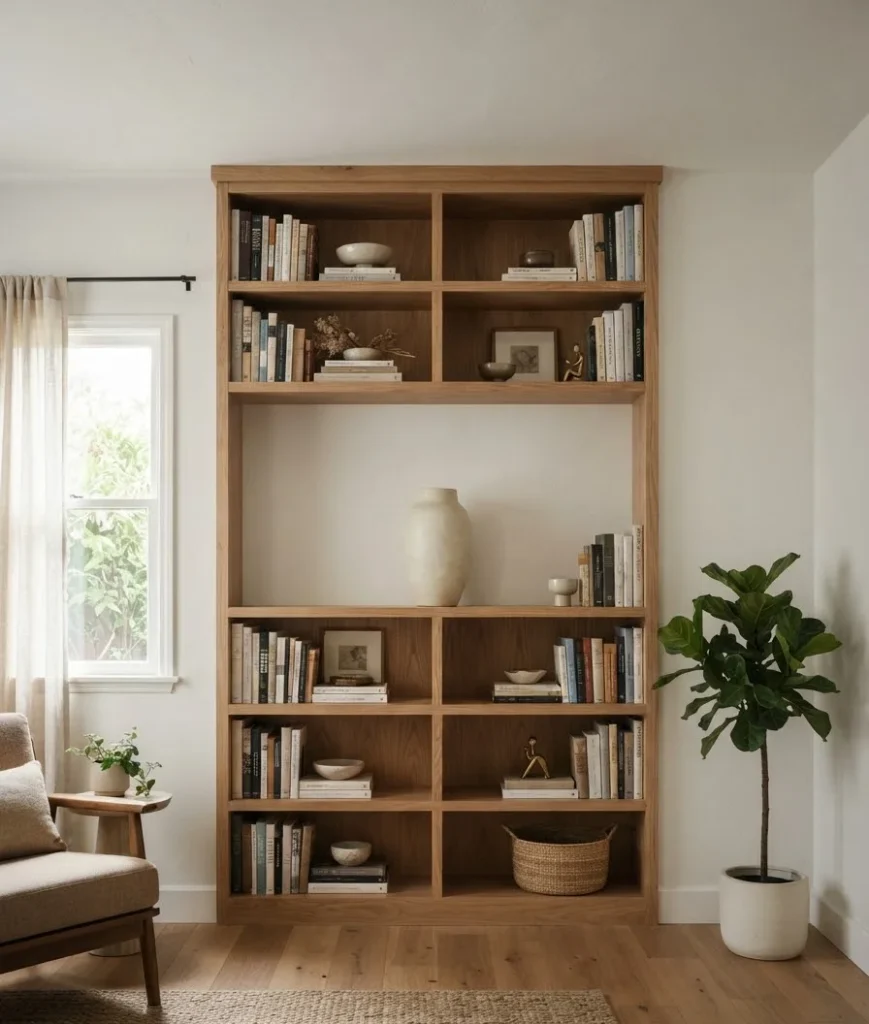
Group items in odd numbers, threes work well, and vary the height within each grouping. A tall vase next to a stack of two books next to a short ceramic object creates a little visual staircase.
Round shapes soften a shelf full of straight book spines.
A shallow bowl, a curved vase, even a smooth stone can break up all those hard rectangular lines.
Designers covering built-in styling mention combining different silhouettes so the shelf feels both dynamic and cohesive rather than flat.
Don’t skip lighting
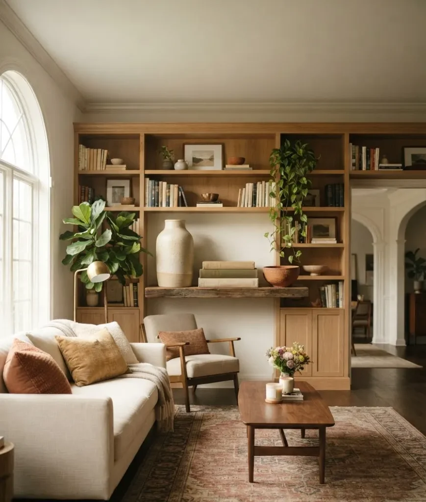
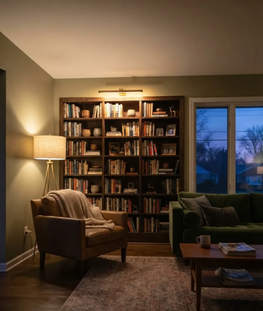
This one gets overlooked constantly. A gorgeous shelf in bad light just looks flat, and fall evenings get dark early, so lighting matters more this season than any other.
A small picture light mounted above the shelf changes everything.
It draws the eye up and gives your styling a gallery feel instead of a “stuff on a shelf” feel. If mounting isn’t an option in your space, a battery-powered puck light tucked behind a vase does a surprisingly good job.
Warm-toned bulbs beat cool white every single time for this look. Cool light makes rust and terracotta tones look muddy. Warm light makes them glow, which is honestly the whole point of a fall palette.
Candles help too, obviously, but be realistic about how often you’ll actually light them. I own three unlit pillar candles on my shelf right now purely for their shape and color. No shame in that.
Small living rooms need a different approach
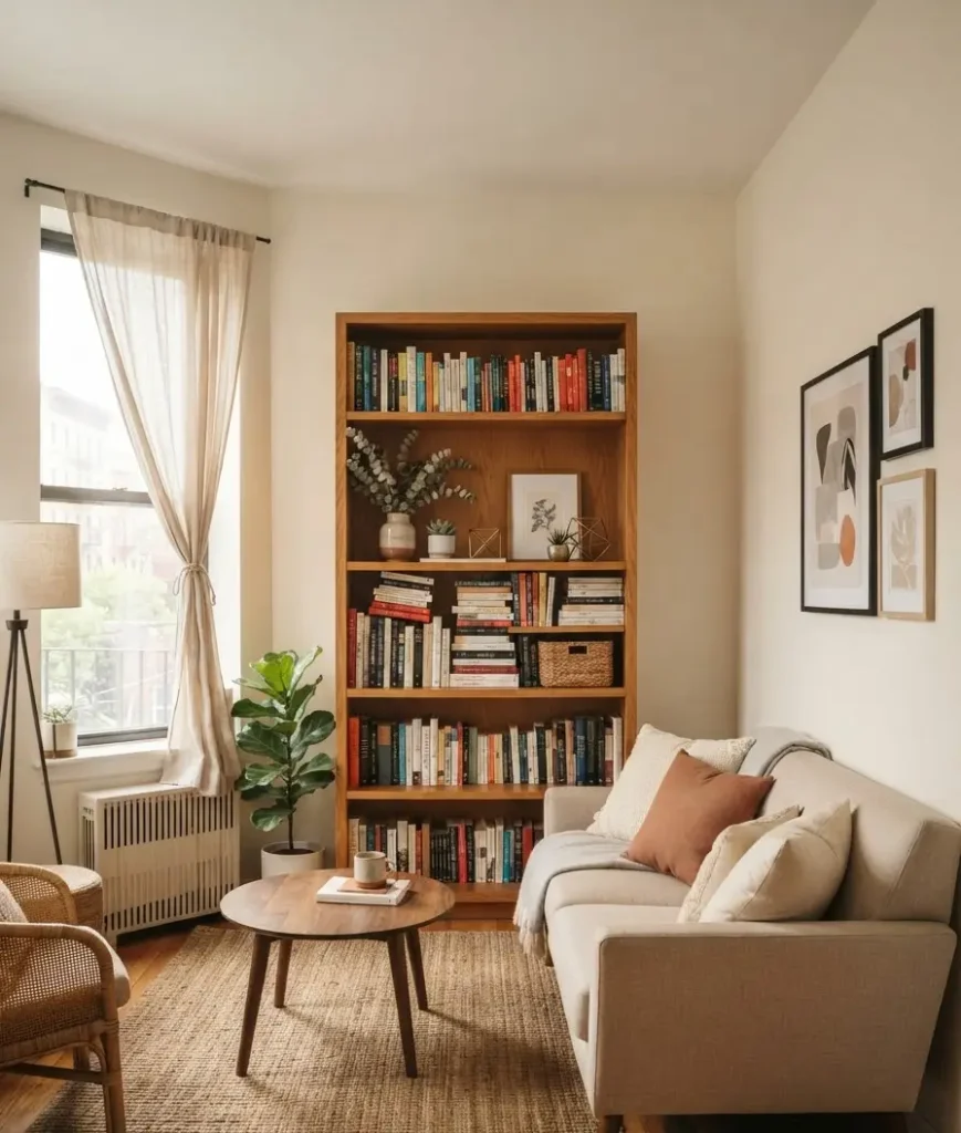
Not everyone has a wall of built-ins, and that’s fine. A single freestanding bookcase or a set of floating shelves can hold its own if you edit ruthlessly.
In a smaller space, pick one shelf to be your “hero” shelf, the one with the most styling detail, and let the others stay simple with just books and maybe one small object. Overdoing every shelf in a compact room reads as cluttered fast, even if each individual shelf looks fine on its own.
Scale matters here too. A large ceramic pumpkin that looks charming on a wide built-in will swallow a narrow bookcase whole. Go smaller than you think you need, then add a second small piece if there’s still room.
A few personal do’s and don’ts
Here’s where I get opinionated, because a guide without opinions is just a checklist.
- Do use bookends even on shelves that don’t need structural support. They frame a grouping and make it feel intentional.
- Don’t buy a “fall decor bundle” from a big box store and dump it straight onto the shelf. Break it up, mix it with what you already own.
- Do let one shelf be almost empty. It gives the eye somewhere to rest.
- Don’t forget to actually step back and look from across the room. What looks balanced up close can look lopsided from the couch.
- Do swap in real or dried botanicals over silk ones when you can. The texture difference is worth it, trust me on this one.
Quick reference: fall bookshelf styling checklist
| Step | What to focus on |
|---|---|
| 1. Clear and clean | Remove everything, wipe down the shelf |
| 2. Choose your palette | Two to three fall tones, no more |
| 3. Layer books | Mix horizontal and vertical, loose color grouping |
| 4. Add texture | Wood, ceramic, woven baskets before seasonal props |
| 5. Edit seasonal accents | Two or three max, skip anything plastic-looking |
Frequently asked questions
How many items should I put on one shelf? There’s no magic number, but a good rule of thumb is three to five grouped items per shelf section, with real negative space between groupings. More than that and things start competing for attention.
Do I need to buy new decor every fall? No, and honestly you shouldn’t. Rotate what you already have. A cream vase you used all summer works fine in fall, just swap what’s inside it or what sits next to it.
What if my bookshelf is small or a single unit, not built-ins? The same principles apply, just scaled down. Pick one or two shelves to feature your main grouping and let the rest stay simpler. Small shelves actually benefit from tighter color palettes since there’s less room for visual noise.
Final thought
A styled bookshelf isn’t about perfection. It’s about a shelf that looks like you actually live there, just a slightly more curated version of you.
Pull a few things off your current shelf this weekend, add one textured piece and one seasonal accent, and see what shifts.
What’s the one item on your current shelf that needs to go? Save this guide, pin your favorite idea, and start there.
