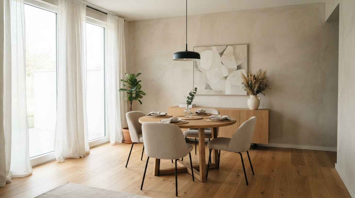
I redid my dining room wall three times before it finally felt right.
First too bare, then too busy, then somewhere in between that still didn’t sit well.
That third attempt taught me more about minimalist decorating than any Pinterest board ever did.
If you’re staring at a blank dining room wall right now, wondering whether to fill it or leave it, I get it. Minimalist doesn’t mean empty.
It means every piece earns its spot. Here are 26 ideas that actually work, pulled from rooms I’ve styled, mistakes I’ve made, and a few genuinely clever tricks I picked up along the way.
Why minimalist wall decor works so well in dining rooms
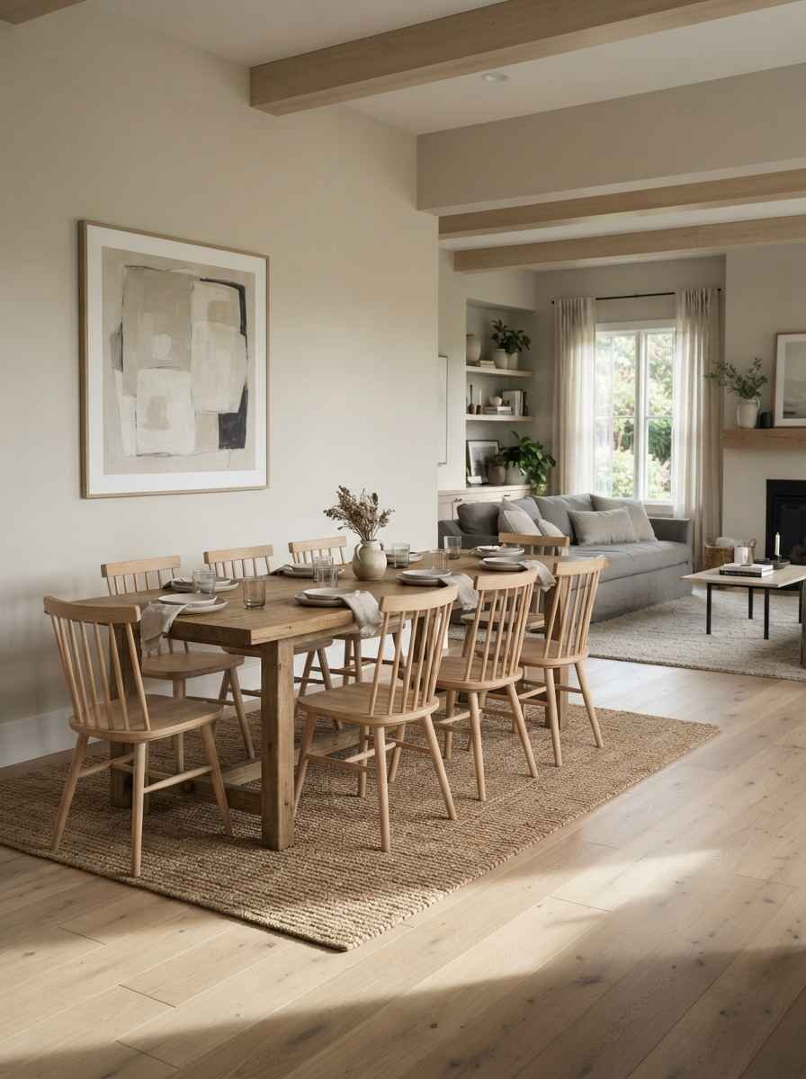
Dining rooms get used in short bursts. Breakfast, dinner, the occasional holiday chaos. A busy wall competes with conversation.
A calm one supports it. That’s really the whole case for minimalism here: less visual noise means more room for the people at the table.
There’s also a practical side. Dining rooms usually sit close to a kitchen or living space.
Keeping the wall simple helps the room breathe and keeps the whole floor plan feeling connected instead of chopped up into competing styles.
- One oversized piece of art, nothing else. A single large canvas above the table does more than five small ones scattered around it. Scale reads as intentional.
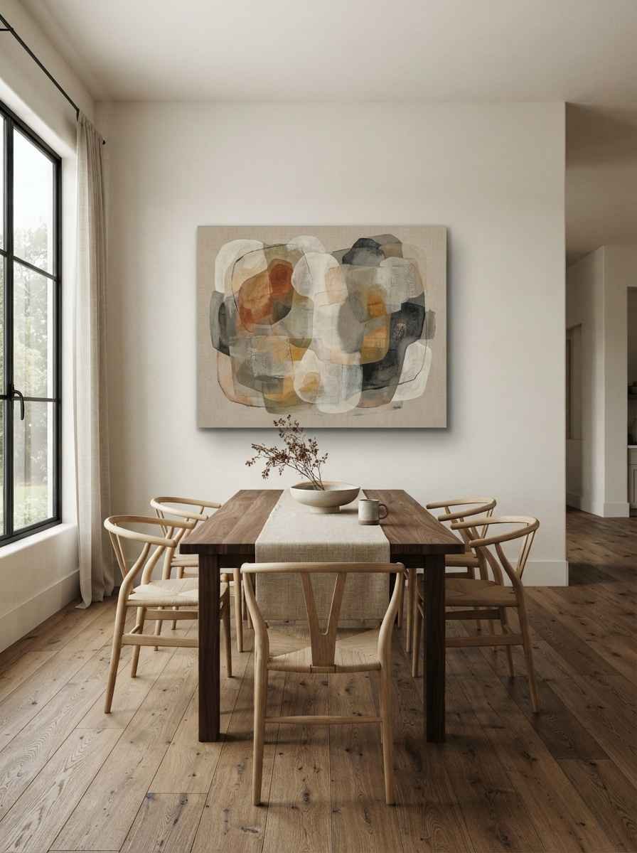
- A neutral abstract print in a thin black or oak frame. Skip anything busy or figurative if you want the room to feel quiet.
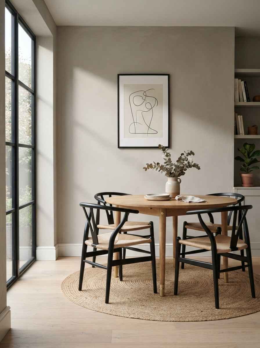
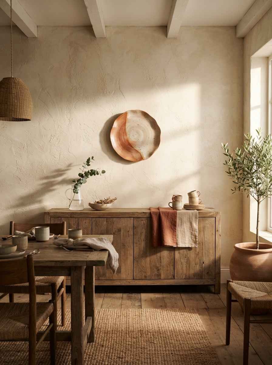
- A single ceramic plate mounted on the wall. Cheap, easy to swap out, and it doesn’t scream “decor.”
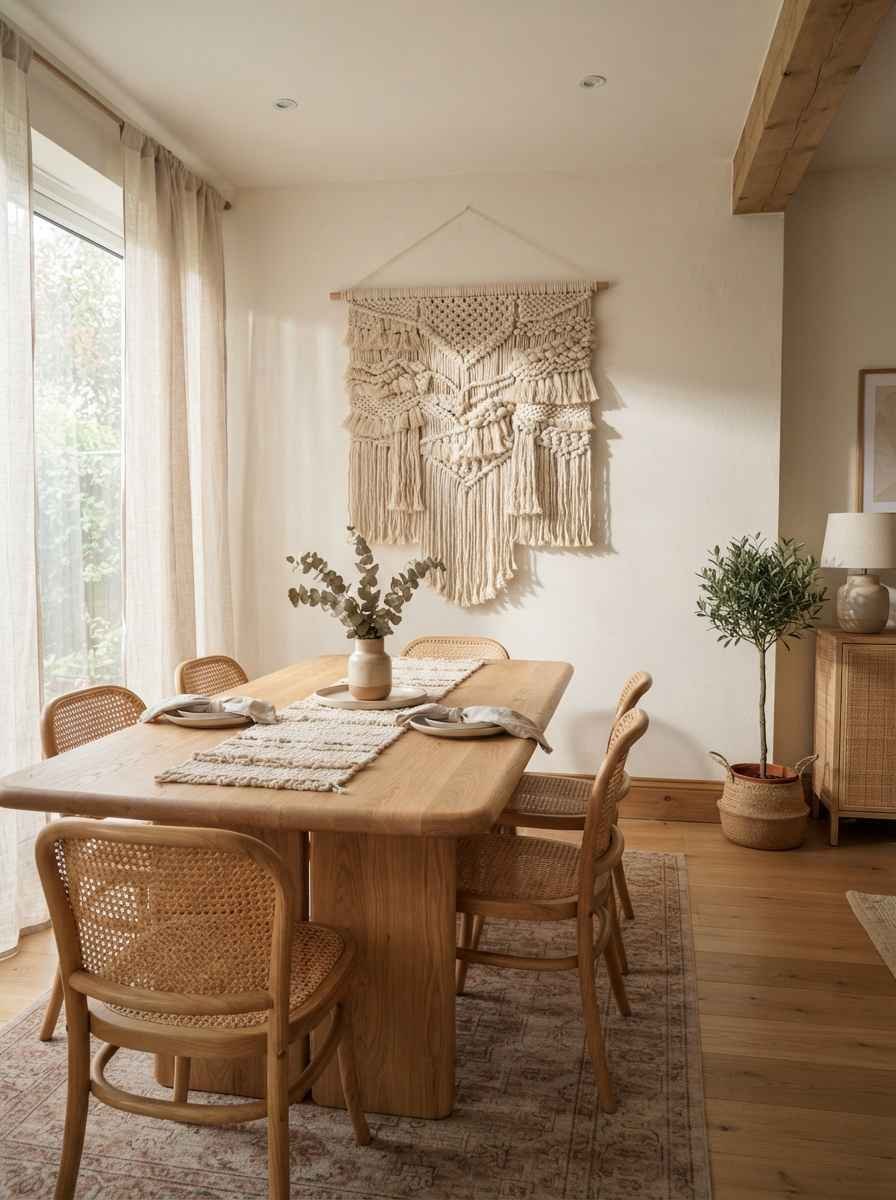
- Woven wall hangings in undyed fiber. Texture does a lot of the work minimalism usually skips.
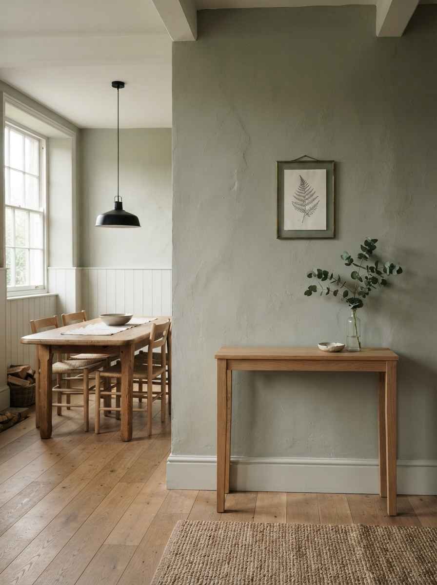
- A framed botanical line drawing. Not a full watercolor garden, just a few clean lines of a leaf or branch.
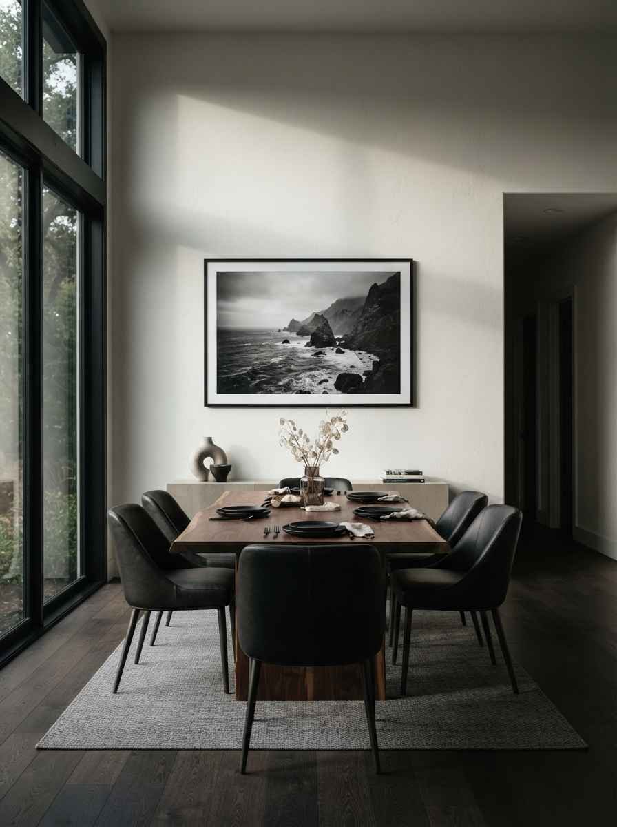
- Black and white photography, one large print. Portraits work here too, as long as the frame stays simple.
- A floating wood shelf with two or three objects, max. This is the one people overload constantly. Two candlesticks and a small vase is plenty.
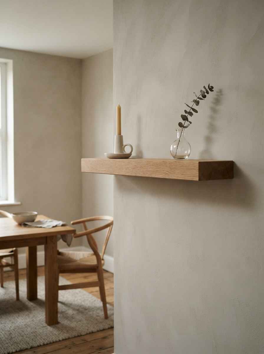
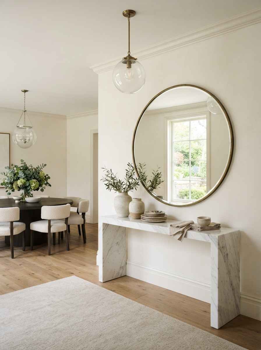
- A large round mirror. It bounces light around the room and gives you decor without adding visual clutter.
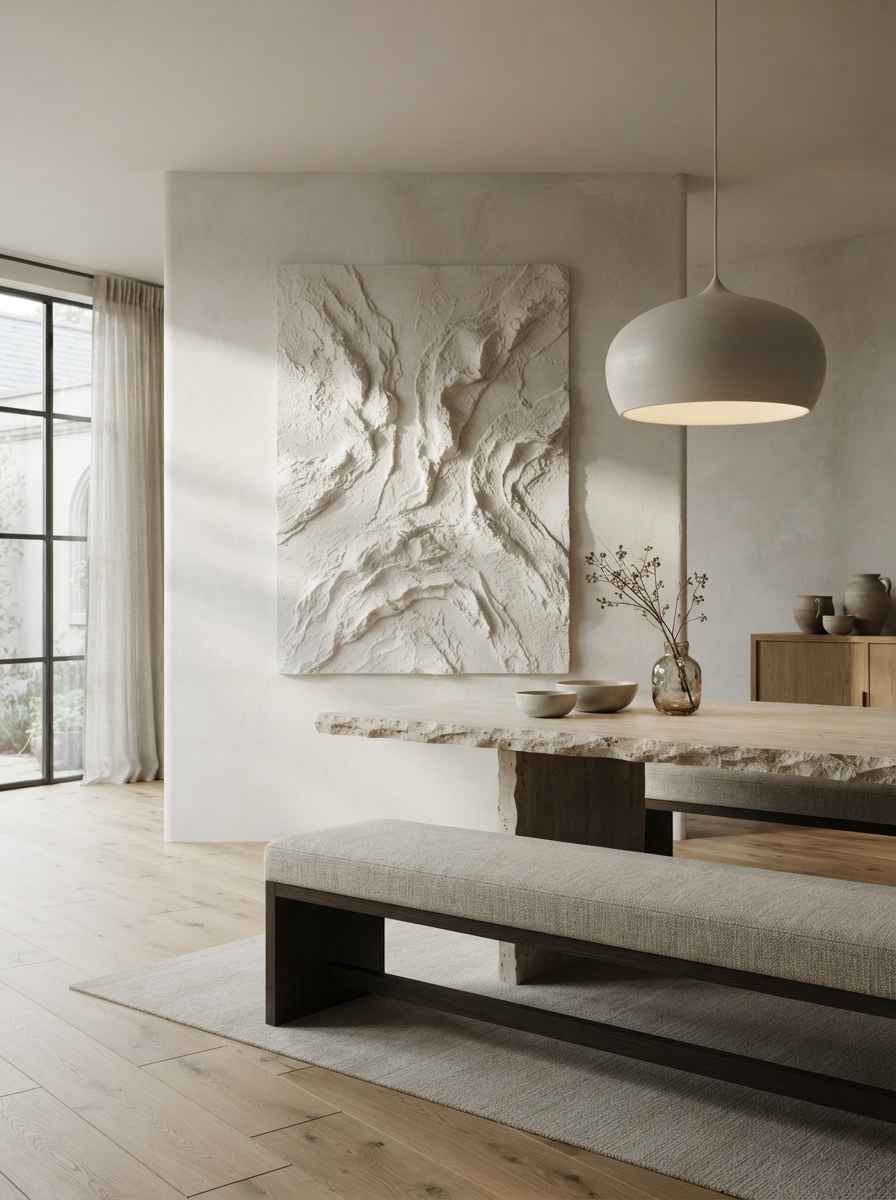
- Plaster or stone wall art. Rougher textures paired with a smooth palette photograph beautifully, which matters if this room ends up on your feed.
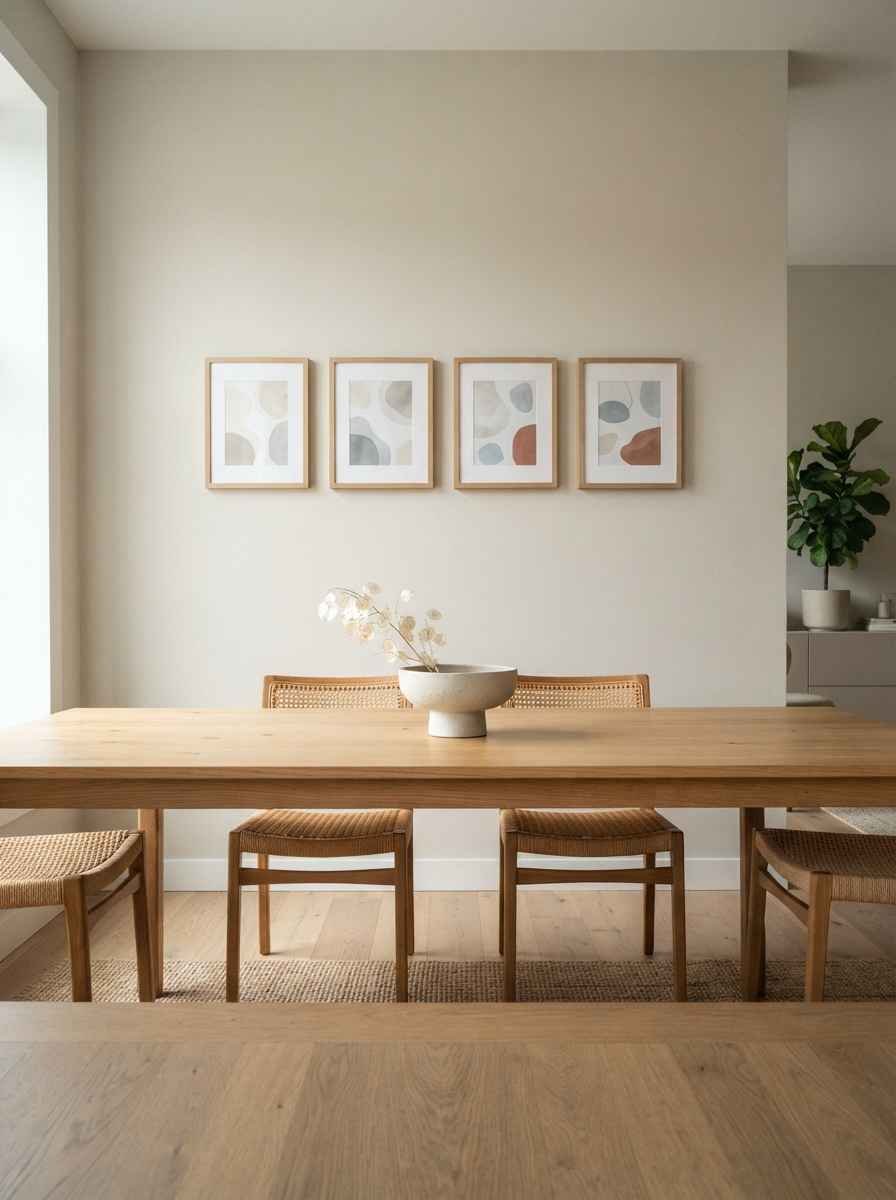
- A minimalist gallery wall, but with real restraint. Three to five frames, same color family, spaced evenly. According to the layout guide from The DIY Playbook, keeping frames about 2 to 3 inches apart is what makes a grouping read as one cohesive piece instead of a cluttered mess.
- A single long horizontal print above a bench-style seat. Horizontal lines make narrow dining rooms feel wider than they are.
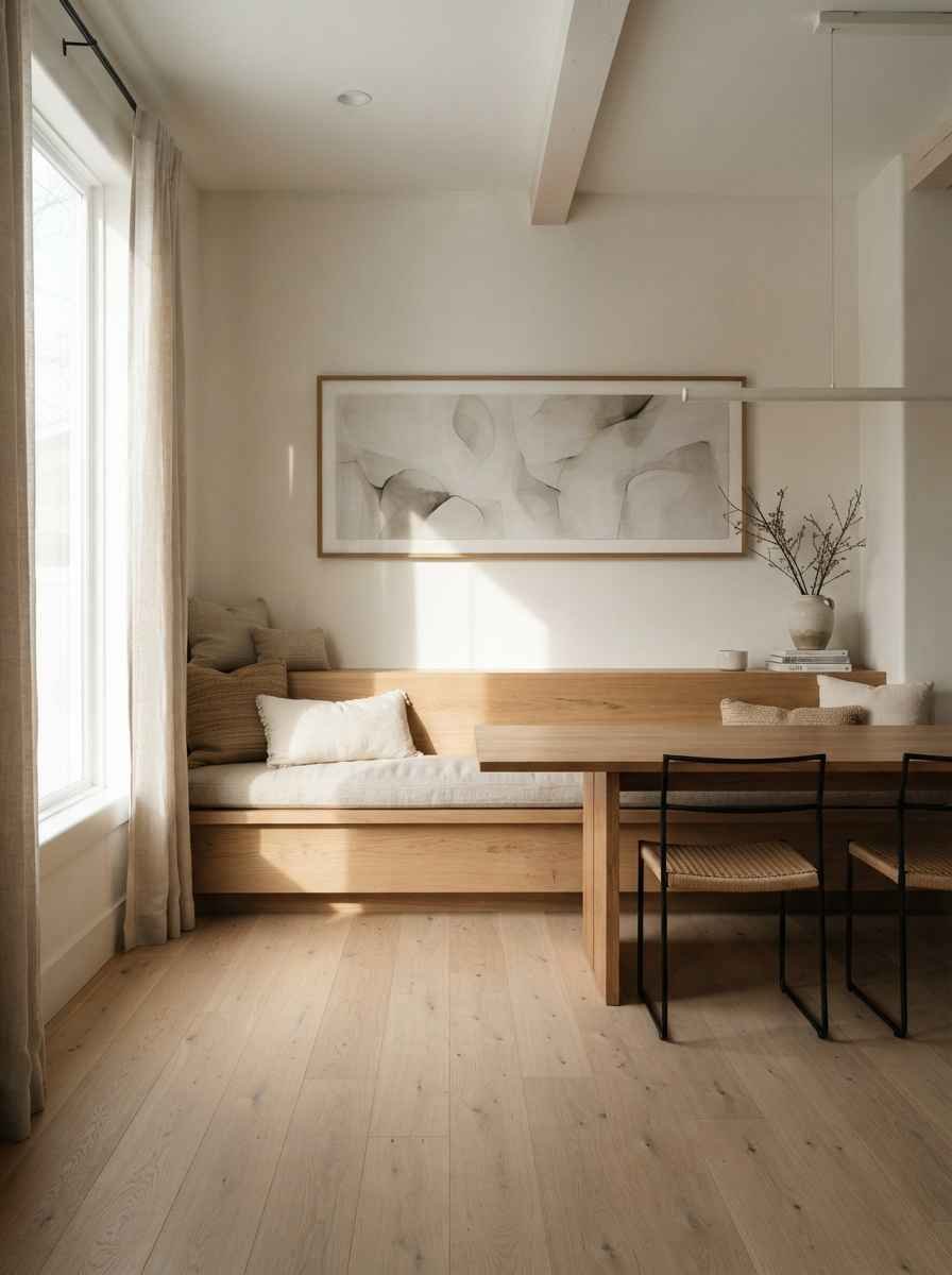
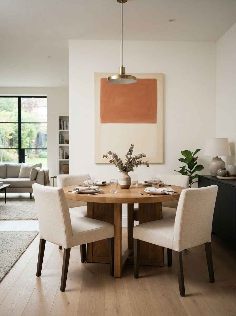
- A muted color-block canvas. Two tones, one soft line dividing them. Sounds too simple to matter, and yet it works every time.
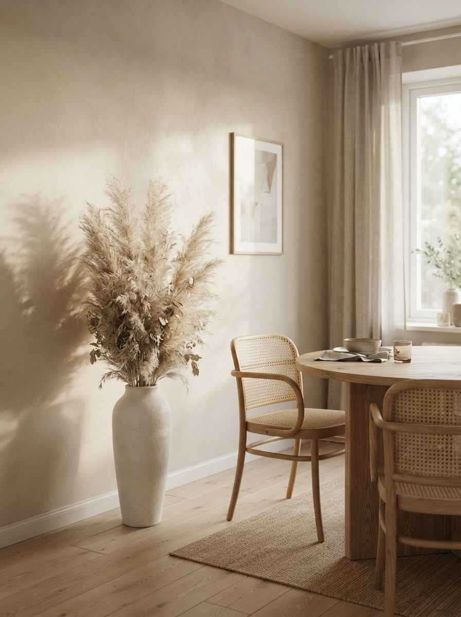
- Dried pampas grass or wheat in a tall thin vase, mounted or leaned against the wall. Not technically “wall art” but it fills vertical space without weight.
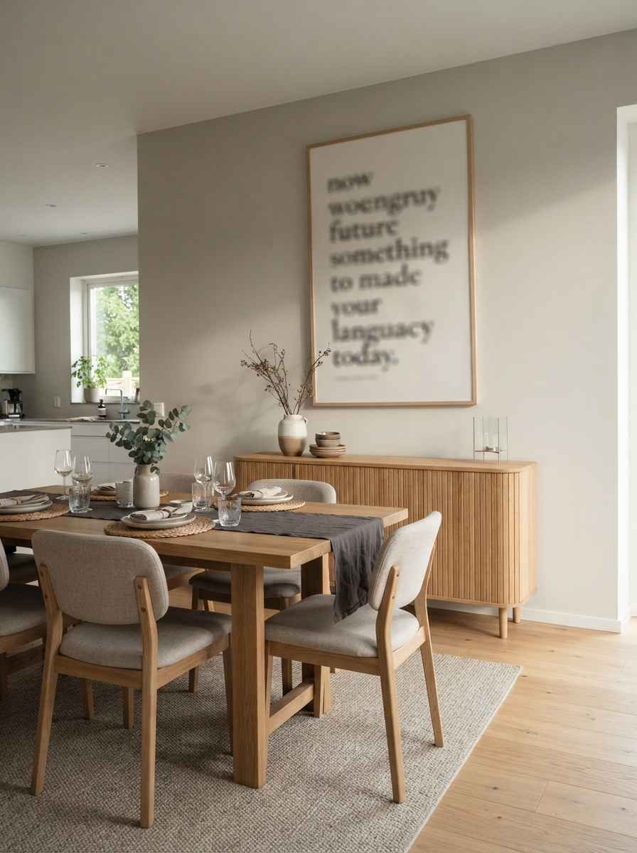
- A large-scale typography print with one word or short phrase. Keep the font simple. Skip anything script-heavy.
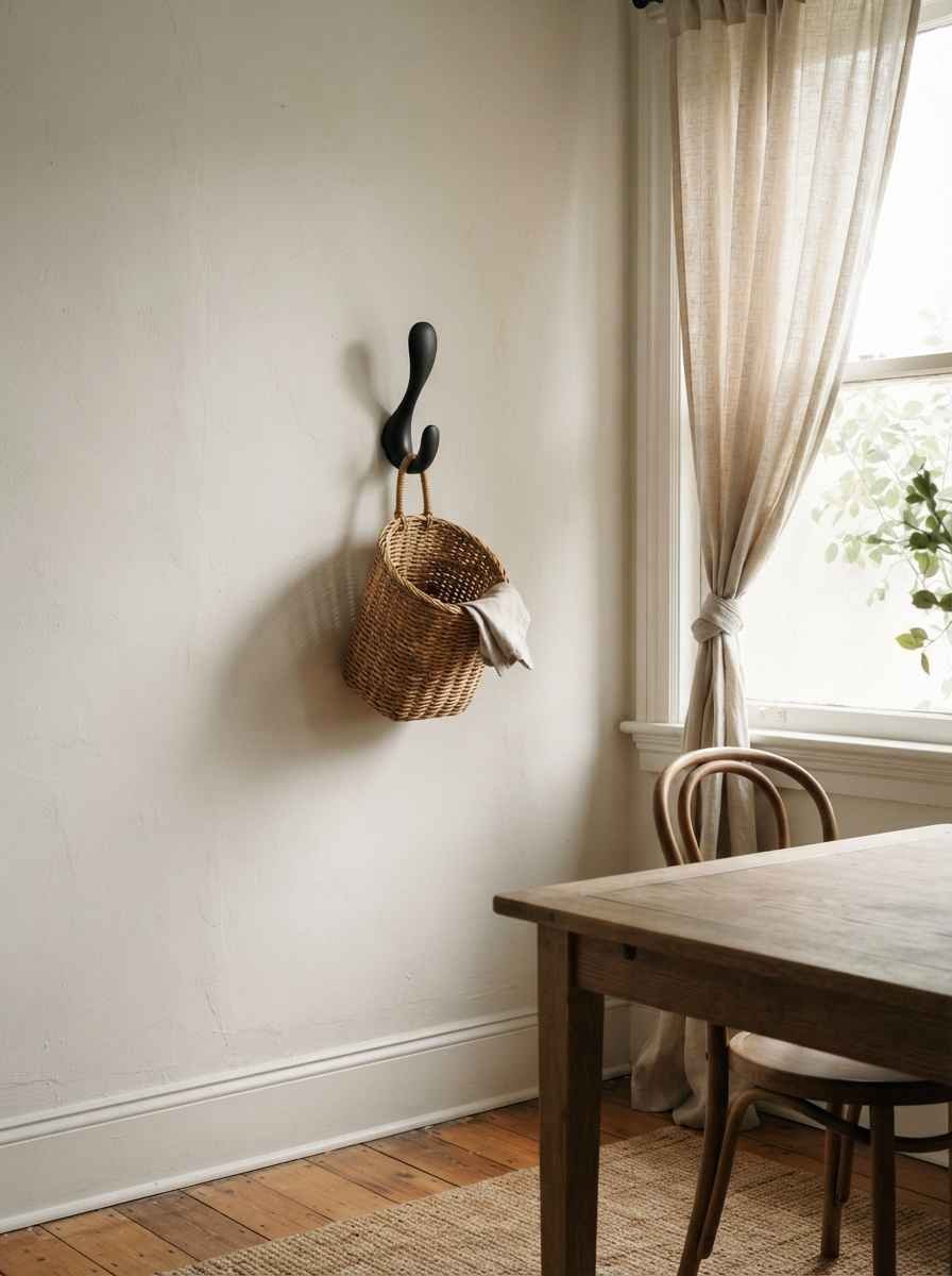
- A single sculptural wall hook holding a woven basket. Function and form in one move.
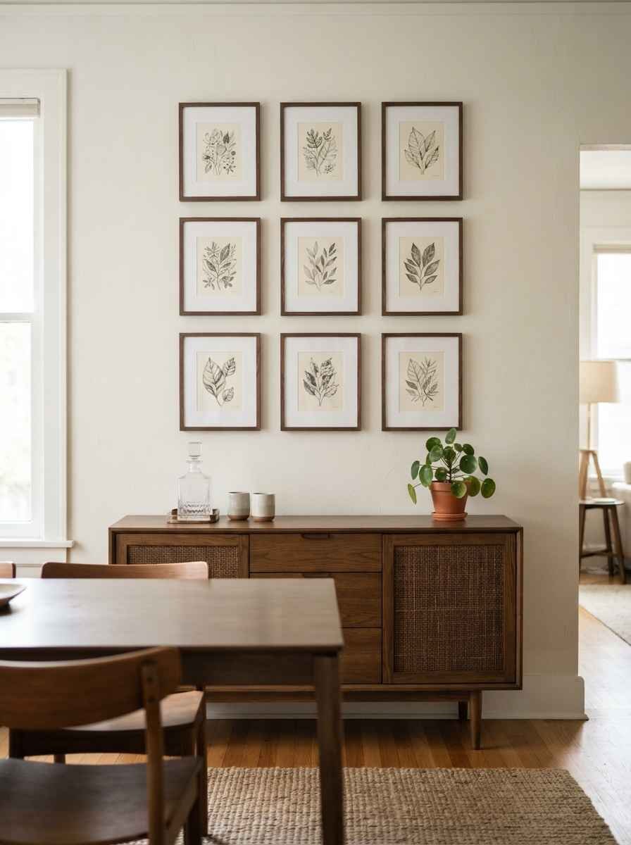
- A grid of small identical frames, all the same subject matter. Think nine tiny botanical prints in a perfect 3×3 grid. Uniformity reads as calm even when the count is high.
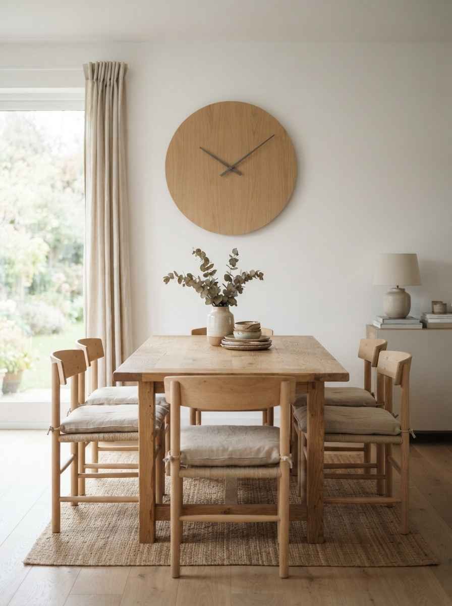
- A wood or metal wall clock as the sole focal point. Old idea, still works, especially in a Scandinavian-leaning room.
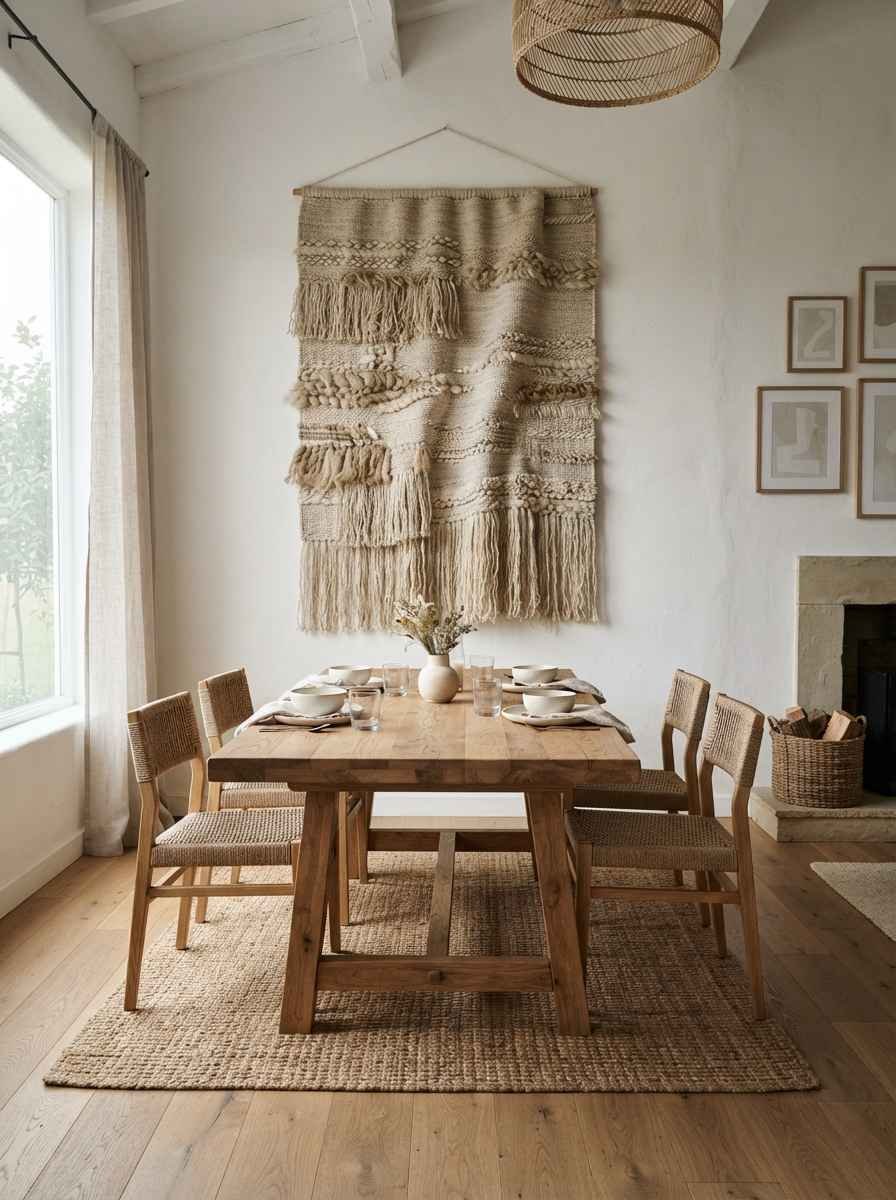
- A textured tapestry in oatmeal or bone tones. This one surprised me. I was sure it would feel too rustic for a modern room, and instead it softened everything.
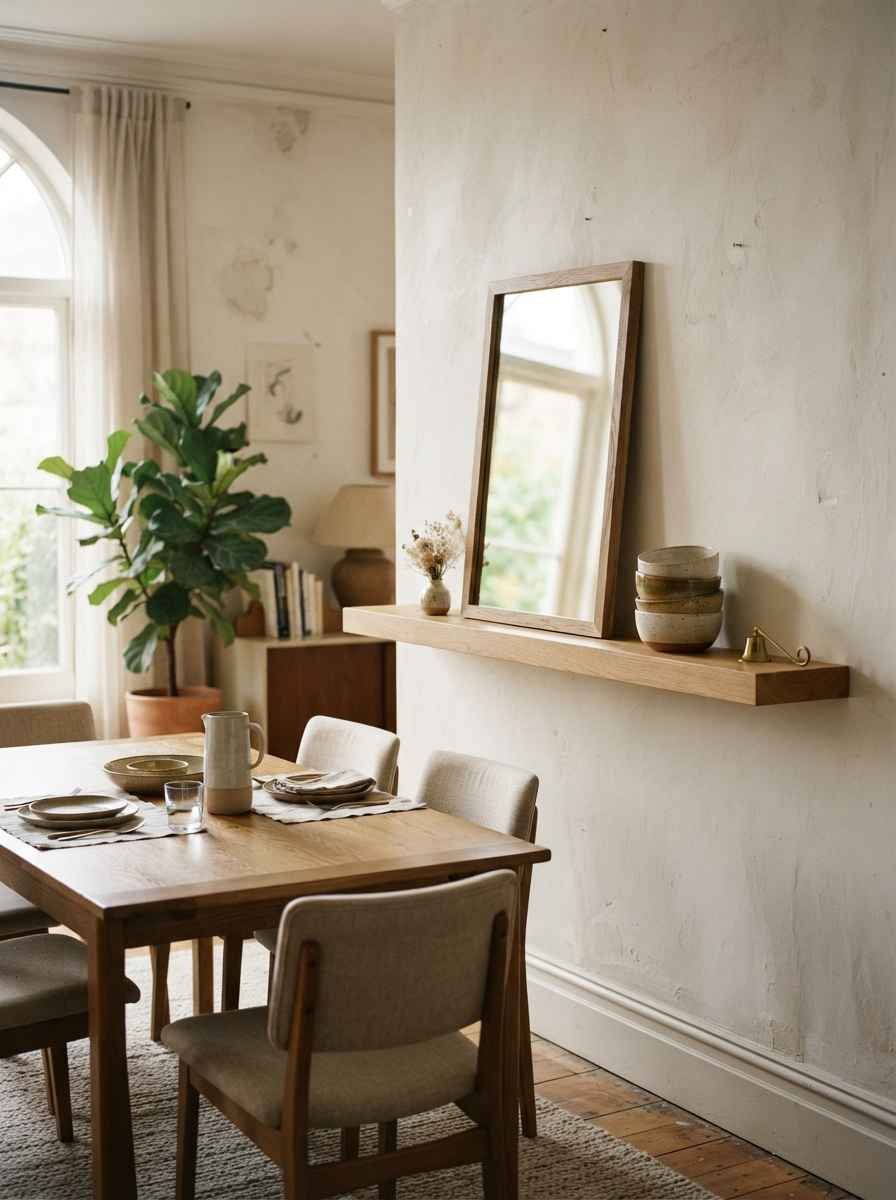
- A framed mirror leaning on a shelf rather than hung. Slightly imperfect, very lived-in, still minimal.
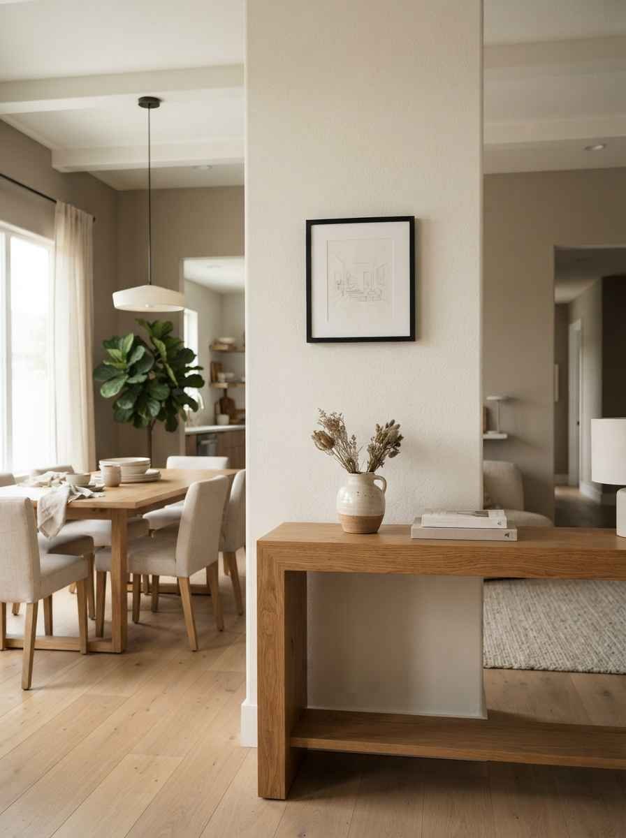
- Line art of the dining table’s own room, almost like a sketch of itself. A little meta, sure, but guests always ask about it.
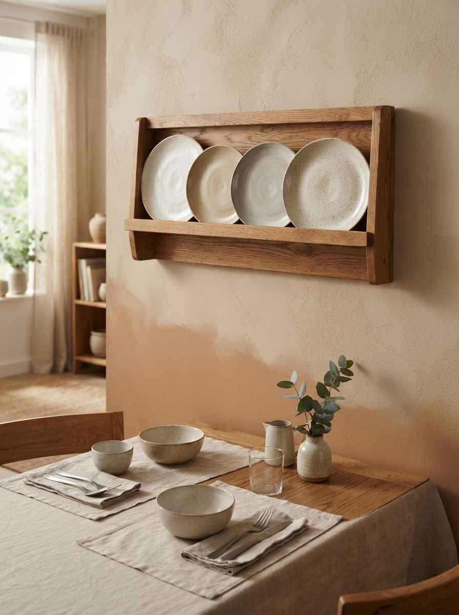
- A single large plate rack with three or four matching ceramic pieces. Function meets decor without trying too hard.
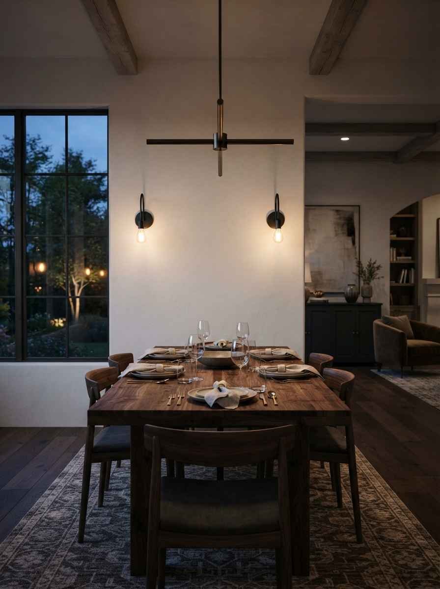
- Matte black wall sconces flanking a plain wall. Lighting counts as decor and nobody applies that rule enough.
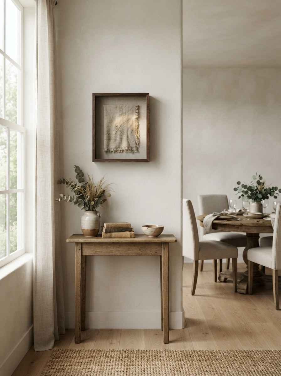
- A framed piece of textile art, like a scrap of vintage linen in a shadow box. Cheap, personal, and nobody else will have the same one.
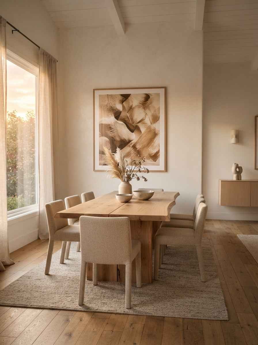
- A single large abstract photograph, printed in a warm neutral tone rather than stark black and white. Softer than you’d expect.
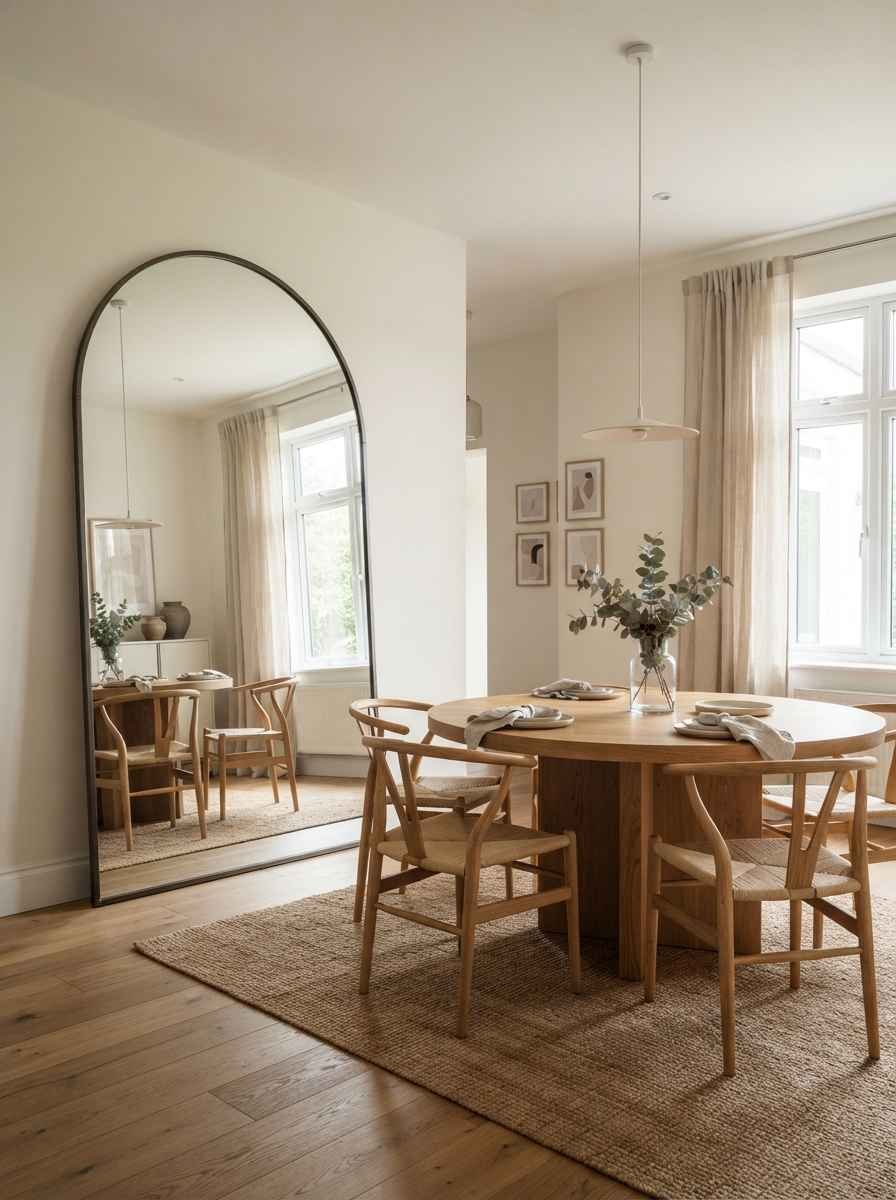
- An arched mirror leaning against the wall, floor to near-ceiling. This trend isn’t going anywhere, and for good reason. It makes even a small dining nook feel taller.
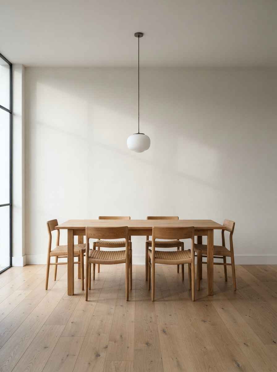
- Nothing. Genuinely. A perfectly painted, well-lit wall with zero decor can be the most minimalist choice of all, especially if your table and chairs already carry visual weight.
A quick note on color before you commit to any of this
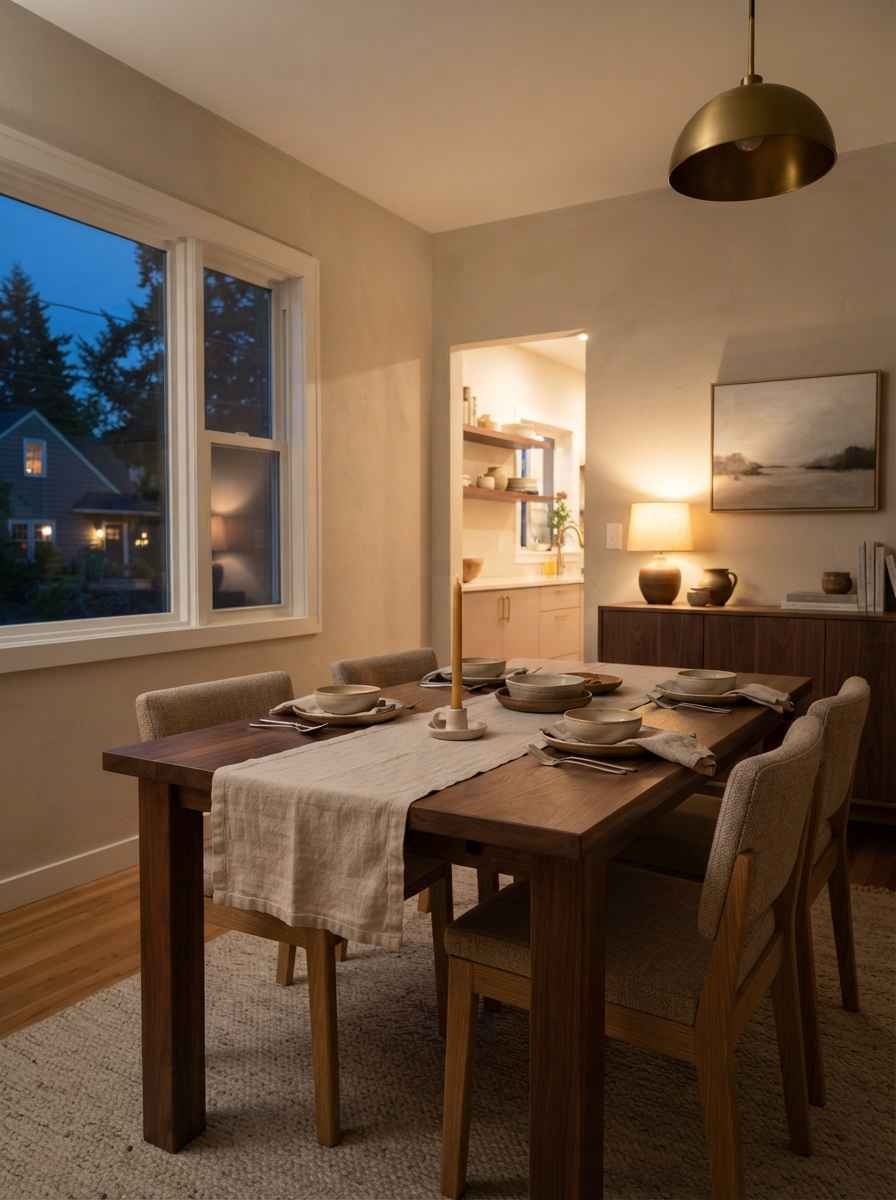
Paint sets the mood before a single frame goes up. If you want the room to feel restorative rather than sterile, warmer neutrals tend to outperform cool grays under evening light, which is when most dining rooms actually get used. The team at Paint Color HQ has a solid rundown of warm neutral options that hold up well once the sun goes down and the candles come out.
I’ll admit something slightly off-topic here: I spent an entire Saturday afternoon last year debating whether to hang art or just leave my dining wall bare, and I ended up doing neither. I painted a mural-style stripe instead, one soft band of color across the middle third of the wall. It wasn’t on any list. It’s still my favorite decision in that room.
How to actually choose between these ideas
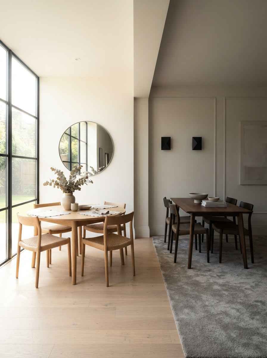
Start with what the wall already has going on. A room with big windows and good natural light can handle a bolder piece.
A darker, cozier dining nook usually looks better with something reflective, like a mirror, since it multiplies whatever light you’ve got.
Emily Henderson’s team makes a similar point in their gallery wall formula, where spacing and light both factor into how a wall grouping actually reads in a room.
Second, think about maintenance. Ceramic plates and metal accents don’t fade. Textiles and woven pieces can collect dust fast near a kitchen.
IMO, that matters more than people admit when they’re pinning inspiration photos at 11pm and not thinking about Tuesday’s cleaning routine.
Third, and this one’s personal: pick something you won’t get tired of in six months. A trendy typography print might look great now.
Will it still feel right at your daughter’s birthday dinner two years from now? Worth asking before you drill a hole.
A simple decision table
Wall size | Best decor style | Why it works Small or narrow wall | Single large mirror or one oversized print | Reduces visual clutter, adds light Wide open wall | Restrained gallery wall (3-5 frames) | Fills space without busyness Wall near a window | Woven or textured piece | Handles shifting natural light well Dark, low-light wall | Metallic accents or a mirror | Reflects available light
Common mistakes that ruin the minimalist look
Going too small. A tiny 8×10 frame on a big wall just looks lost, not intentional.
Mixing too many finishes. Gold frame, black frame, raw wood shelf, chrome sconce, all in one wall. Pick two finishes max and stick with them.
Forgetting scale relative to the table. Your wall art should roughly match two-thirds the width of the table below it. This is insane how often people skip this and wonder why the room feels off.
Overthinking symmetry. A slightly off-center piece, if it’s the only piece, still reads as calm. You don’t need museum-level precision in a room where people spill wine.
Frequently asked questions
What’s the best height to hang dining room wall art? Center the piece around 57 to 60 inches from the floor, which lines up with average eye level. If it’s hanging above furniture like a sideboard, leave 6 to 8 inches of space between the top of the furniture and the bottom of the frame.
Can I mix textures in a minimalist dining room? Yes, and honestly you should. Two or three textures, like wood, ceramic, and woven fiber, keep a minimalist room from feeling cold. Just keep the color palette tight so the textures don’t compete.
Do I need a gallery wall to make minimalism feel personal? Not at all. A single meaningful piece, even something as simple as a plate rack passed down from a relative, often feels more personal than five perfectly curated frames.
Final thought
Minimalist doesn’t mean boring, and it definitely doesn’t mean bare walls by default. It means choosing on purpose instead of filling space because it’s there.
Pick one or two ideas from this list, live with them for a few weeks, and adjust from there.
Which one are you trying first? Save this post and pin your favorite idea so you don’t lose it in your camera roll.
