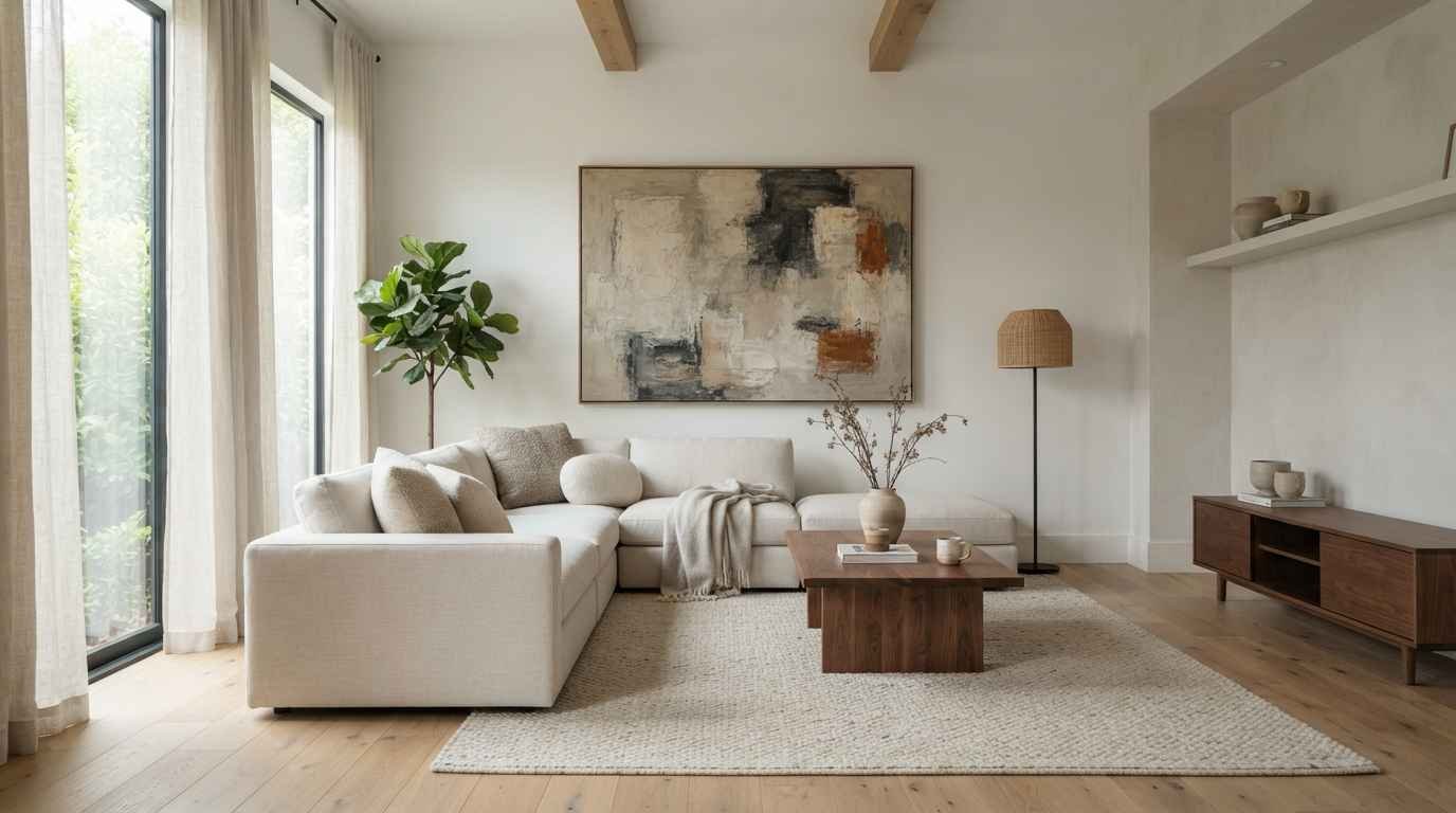
Staring at a blank wall and feeling nothing but pressure? I’ve been there.
My living room sat empty for almost 8 months because I couldn’t decide between “cozy gallery wall” and “one big statement piece.” Spoiler
I ended up doing a bit of both, and that’s exactly what this list is going to help you figure out too.
Minimalist wall decor isn’t about leaving everything bare and hoping for the best.
It’s about picking a handful of pieces that actually earn their spot on the wall. Less clutter, more intention. That’s the whole game.
I pulled these 27 ideas from years of scrolling Pinterest boards, redoing my own apartment 3 times, and talking to friends who somehow always have that “put together but not trying too hard” living room.
IMO, that’s the real minimalist flex.
Why minimalist wall decor actually works
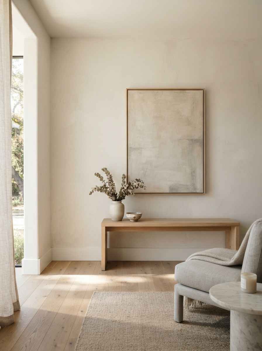
A busy wall competes with everything else in the room. A minimalist wall does the opposite. It gives your eyes somewhere to rest.
Design writers at The Spruce describe minimalism as intentional living with fewer, better things. That applies to wall art just as much as furniture.
You’re not decorating less because you’re lazy. You’re decorating with purpose.
There’s also a psychological angle here. Cluttered visual space has been linked to higher stress levels, and a calmer wall can genuinely change how a room feels.
If you’ve ever walked into a friend’s sparse, sunlit living room and immediately exhaled, you already know what I’m talking about.
Quick style snapshot
Here’s a fast breakdown before we get into the full list.
| Style | Best for | Vibe |
|---|---|---|
| Gallery wall | Renters and collectors | Curated, personal |
| Single statement piece | Small or narrow walls | Calm, confident |
| Textured decor | Cozy minimalist homes | Warm, tactile |
| Functional wall decor | Small apartments | Practical, stylish |
Use this table as a starting point, not a rulebook. Your wall, your rules.
Gallery and arrangement ideas
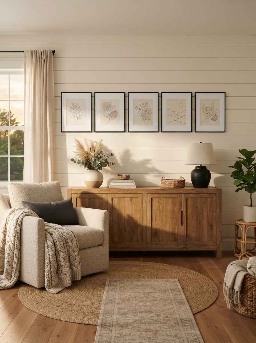
Gallery walls get a bad reputation for looking cluttered, but done right, they’re one of the most minimalist choices you can make. The trick is restraint.
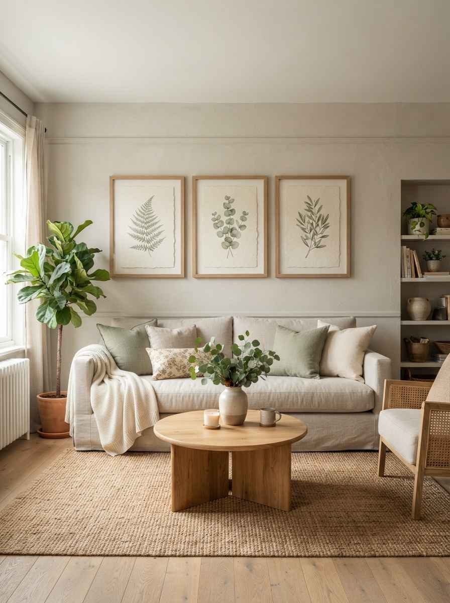
An odd-number grid of framed prints. Three or five frames, same size, same mat width. Odd numbers just feel more balanced to the eye.
Don’t ask me why, they just do.
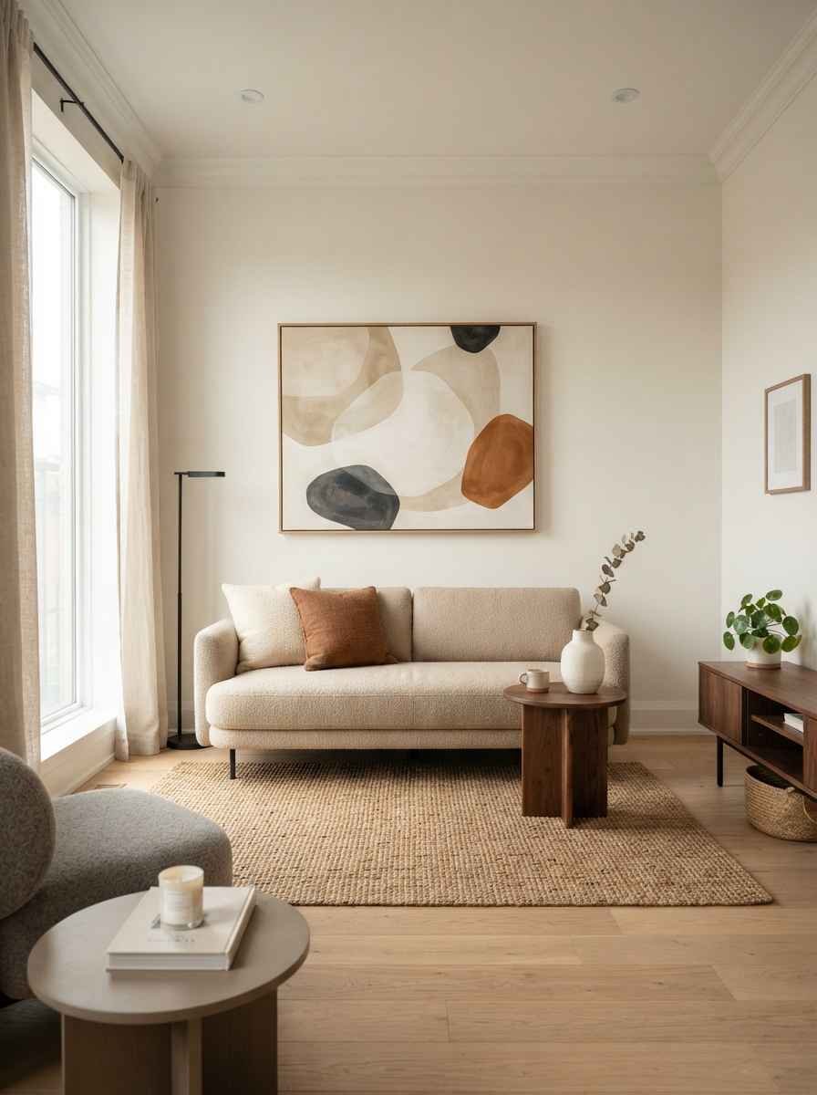
One oversized art piece instead of a cluster. This is my personal favorite for small living rooms. A single large print does more visual work than 6 small ones ever could.
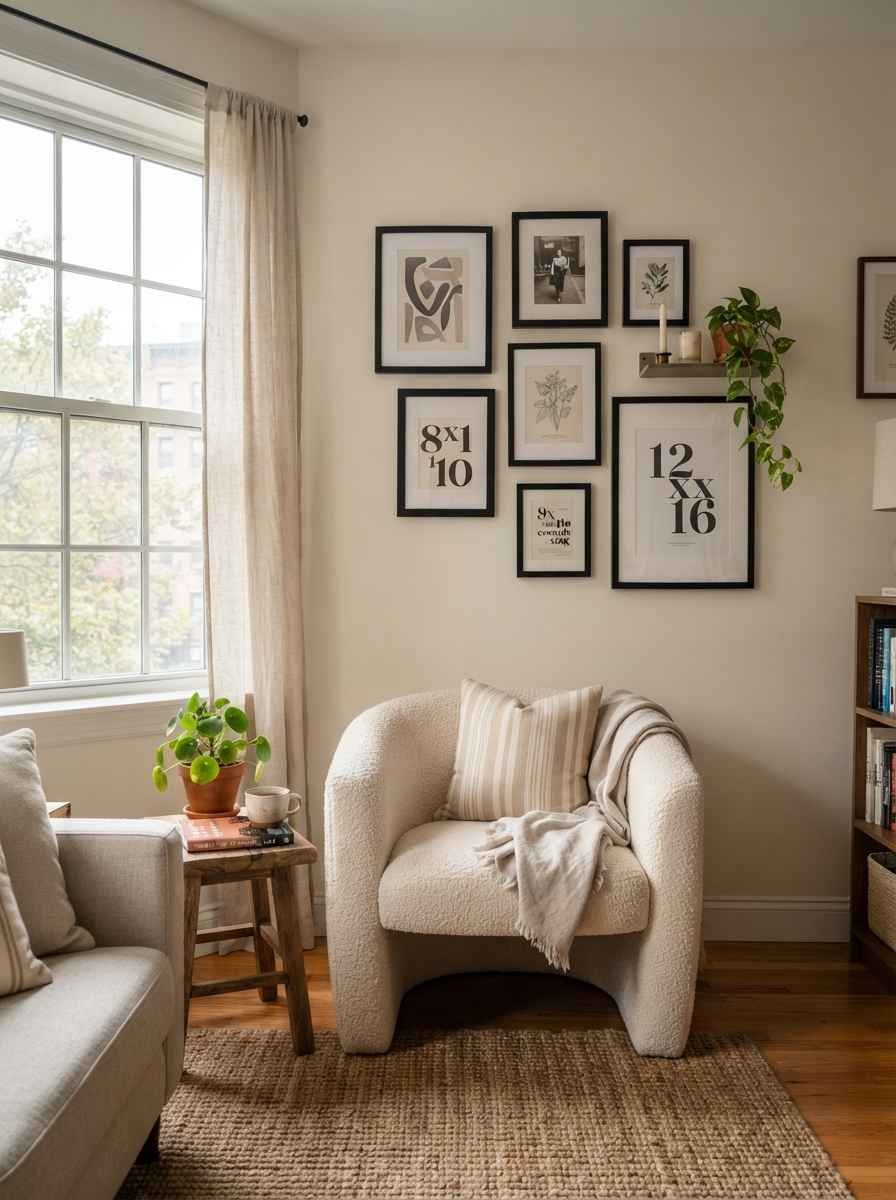
An asymmetrical gallery wall with matching frames. Vary the artwork, keep the frame color and material identical. It reads as curated instead of chaotic.
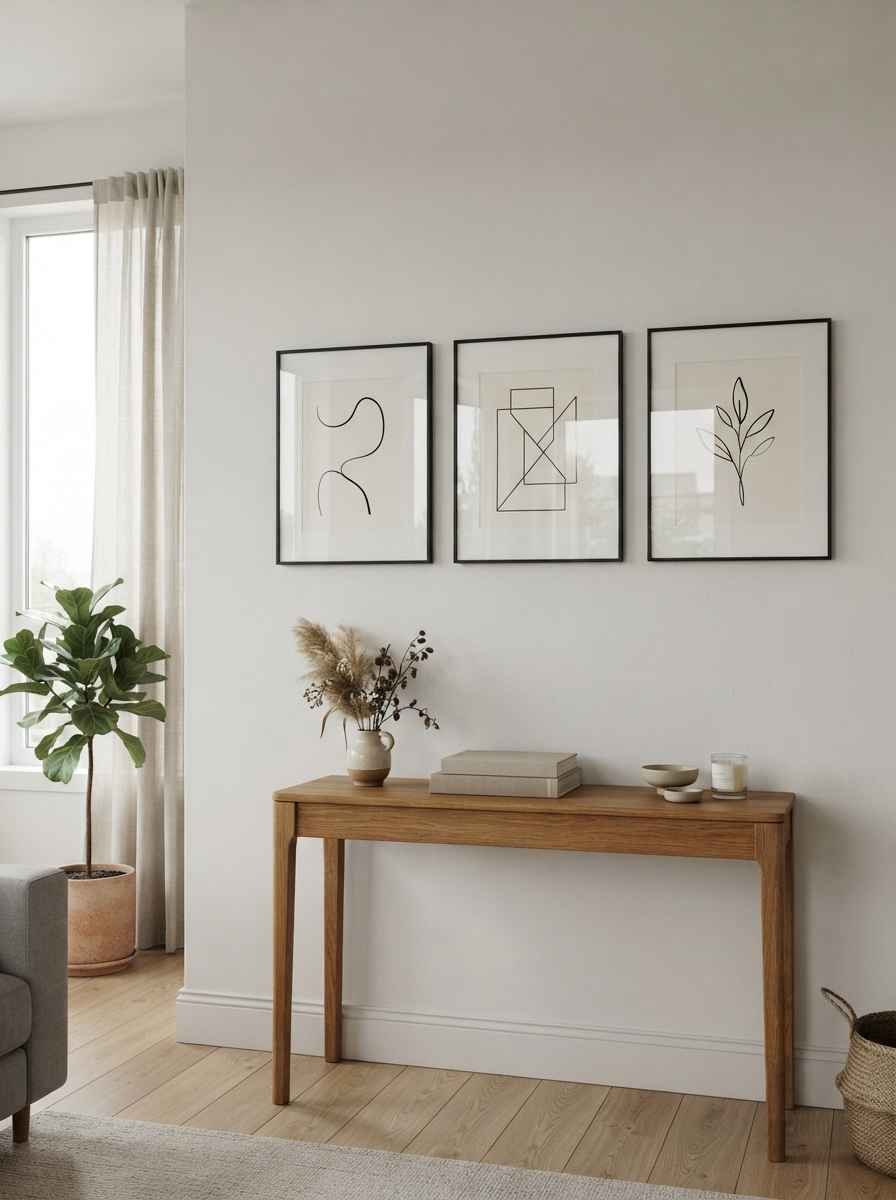
A line-art series in one color. Think 3 simple sketches in black frames. Cheap to source, easy to swap out when you get bored.
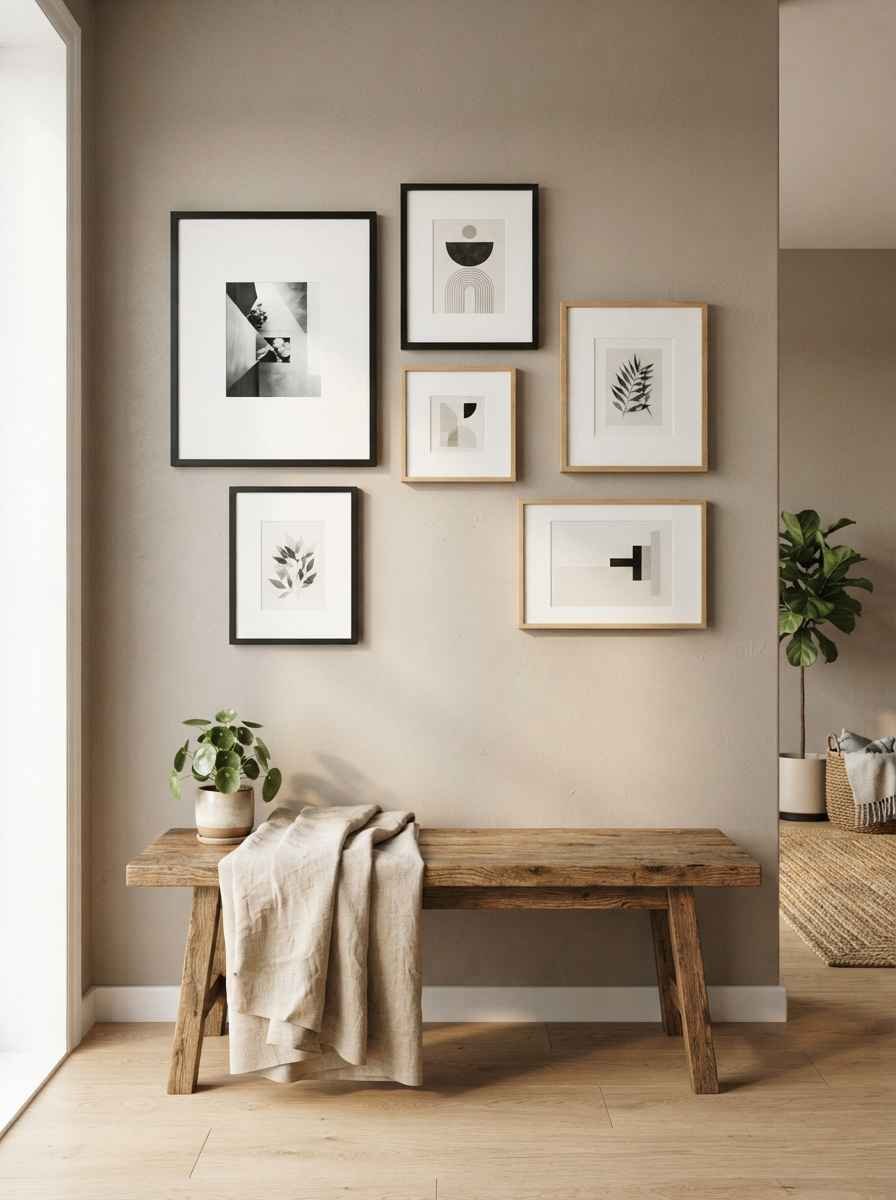
Mixed frame sizes with generous white mats. The white space is doing a lot of quiet work here. Don’t skip the mat to save money, it changes everything.
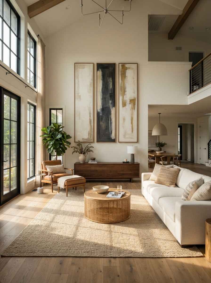
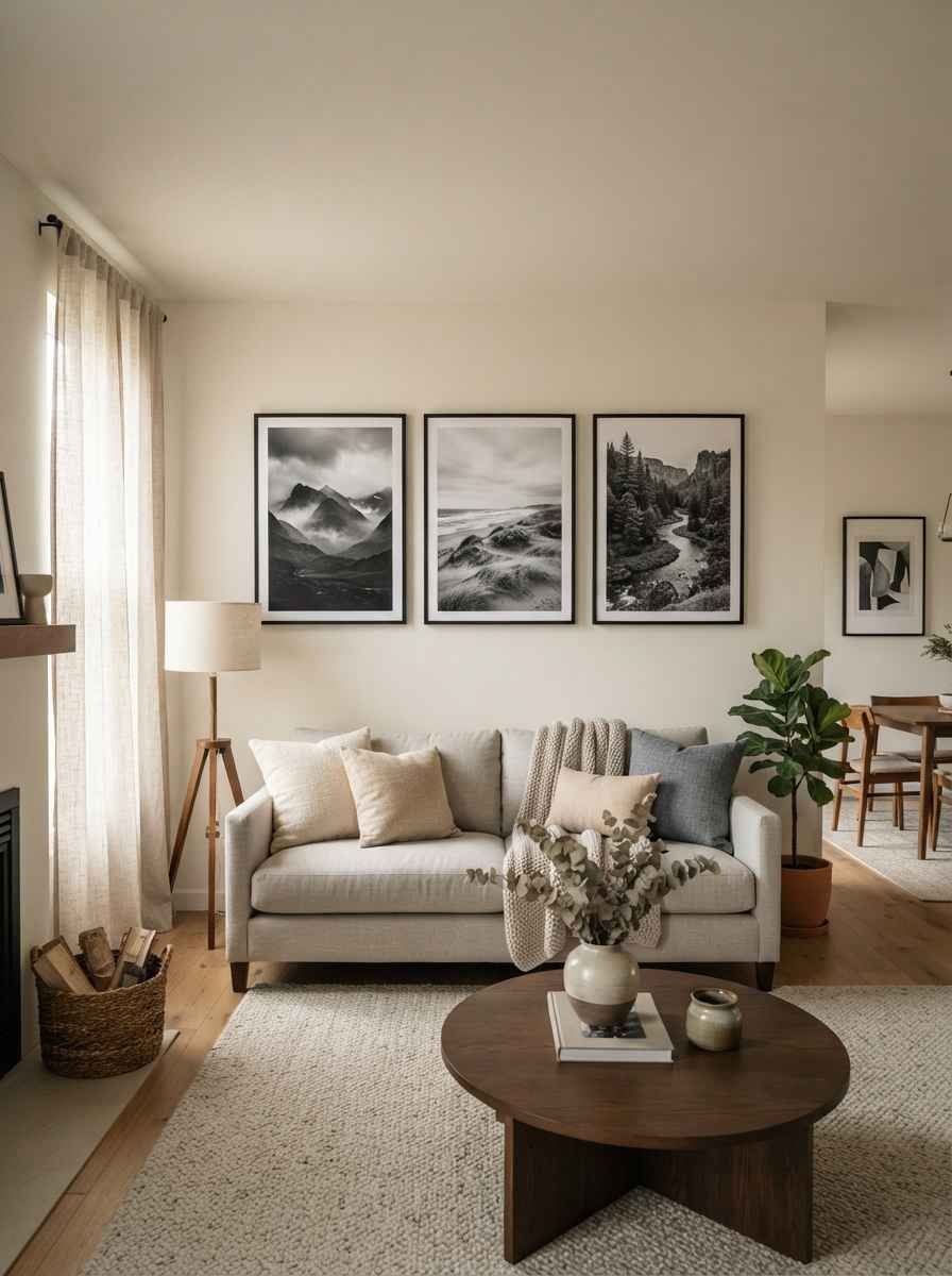
A vertical triptych above the sofa. Three tall, narrow pieces stacked side by side. Great for rooms with high ceilings that feel a little empty up top.
Texture and shape ideas
Flat prints are great, but minimalist doesn’t mean boring. Texture adds depth without adding visual noise.
Woven wall hangings. Skip the busy 1970s macrame look and go for a simple, modern weave in neutral tones. It softens a room full of hard lines.
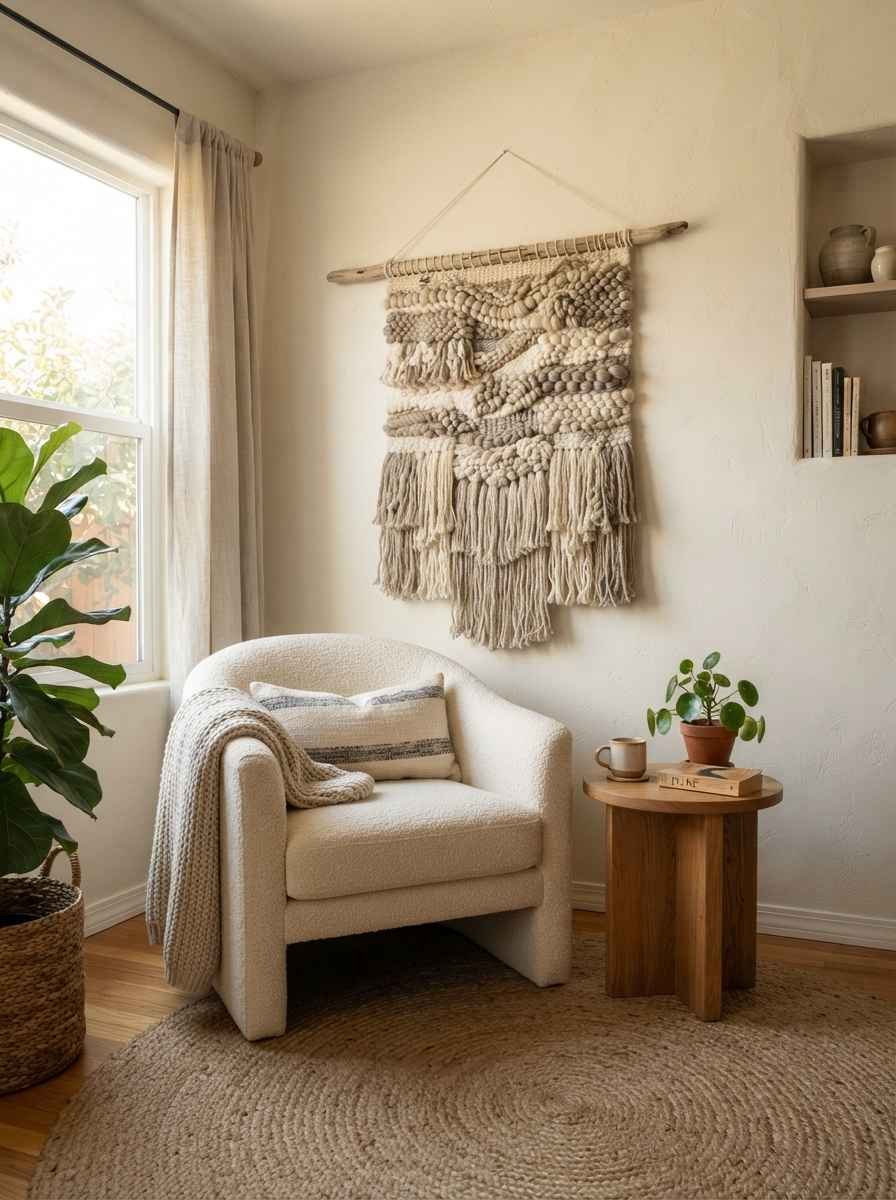
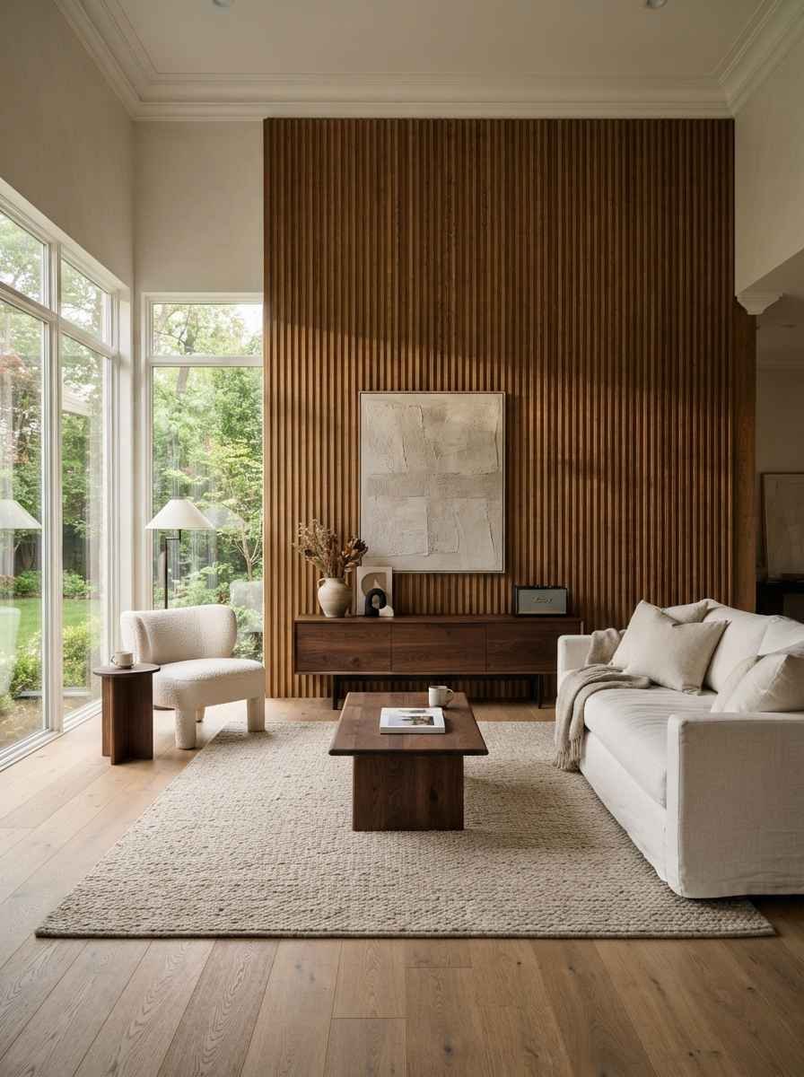
Fluted wood panels. These have shown up everywhere the last couple of years, and honestly, they earn the hype. Subtle shadow lines without a single extra color.
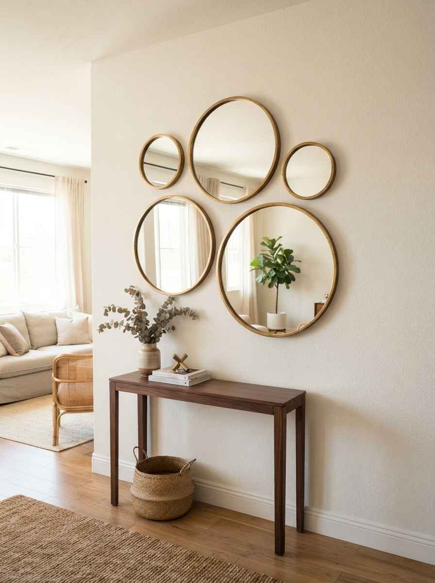
A cluster of round mirrors. Different sizes, same frame finish. They bounce light around the room, which is a genuine win in apartments with limited windows.
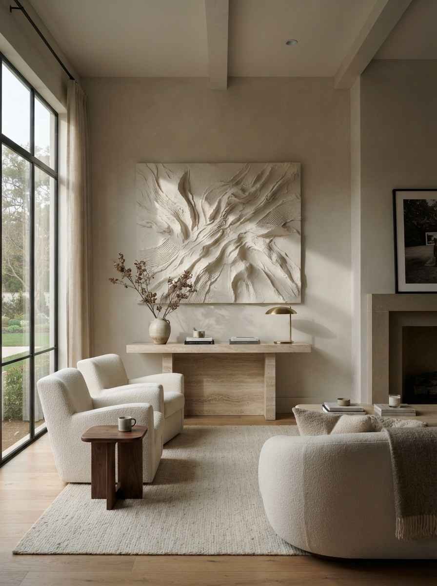
Plaster wall art with 3D relief. Slightly abstract, very tactile. This is one of those pieces guests always ask about.
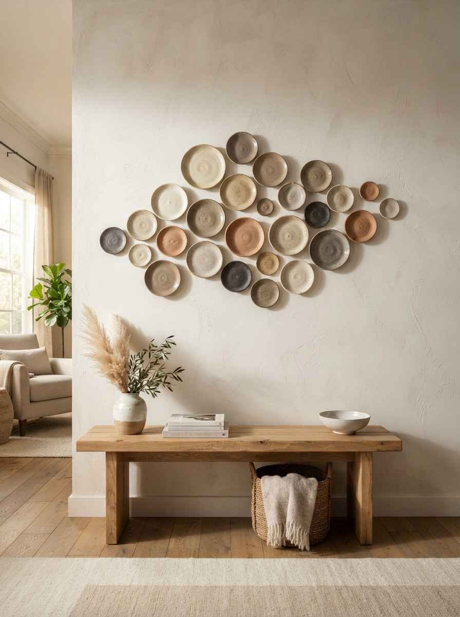
Ceramic wall discs. Small, sculptural, and surprisingly affordable if you shop local makers instead of big box stores.
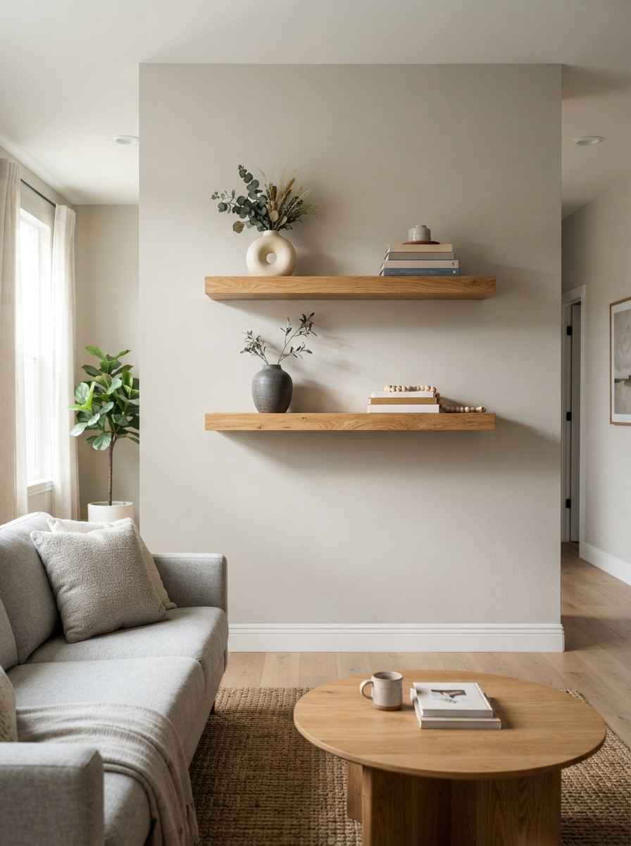
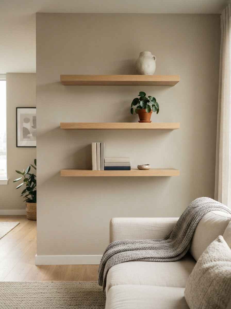
Floating wood shelves used as decor, not storage. Style them with 2 or 3 objects max. The empty space on the shelf is part of the design.
Color and print ideas
You can still use color in a minimalist space. The key is restraint, not avoidance.
Black and white photography. Timeless, and it works with basically any furniture color scheme you already have.
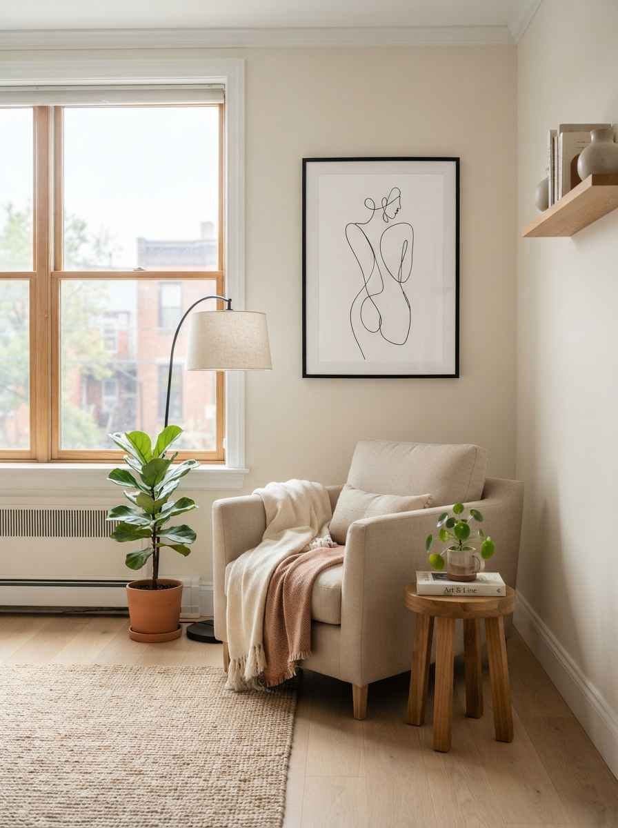
Abstract line drawings. A single continuous line sketch of a face or body has become a minimalist living room staple, and there’s a reason it’s stuck around this long.
Muted botanical prints. Skip the bright florals. Go for sage, dusty rose, or warm beige tones instead.
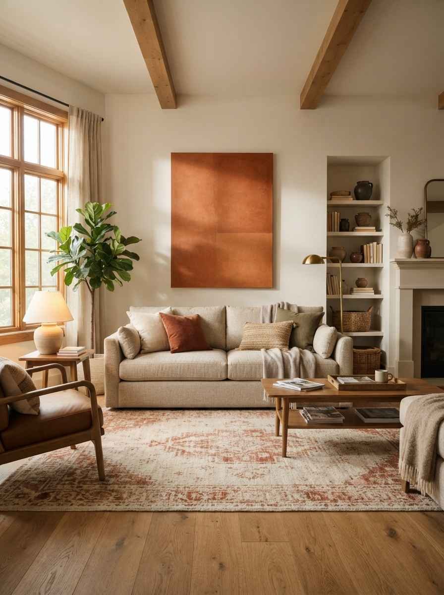
Monochrome color blocking. One large canvas painted in a single warm tone. It’s basically a Rothko-lite moment for your living room.
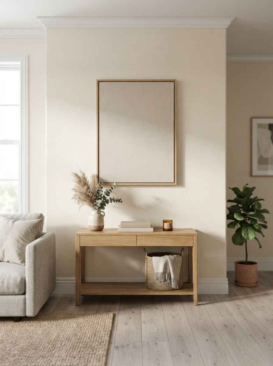
Typography art with a short quote. Use this sparingly. One word or a short phrase, nothing longer. A wall covered in text stops being minimalist real quick.
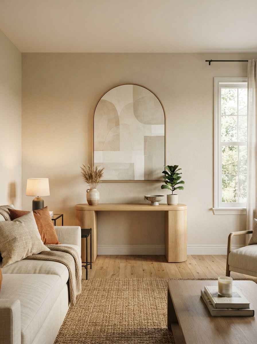
Subtle geometric patterns. Soft circles or arches in tonal colors. Not the loud, primary-color geometric prints from a decade ago.
Ever notice how the second you add color restraint to a room, it suddenly looks more expensive? That’s not a coincidence. Cheaper decor tends to lean on bold, saturated colors to grab attention. Quality minimalist pieces don’t need to shout.
Functional and unexpected wall decor
This is where minimalist design gets clever. Decor that also does a job earns double the value on your wall.
Open shelving with 3 to 5 curated objects. A small vase, a stack of books, one plant. Resist the urge to fill every inch.
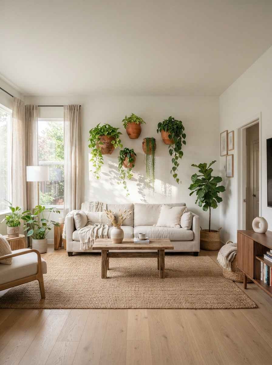
Wall-mounted planters. Greenery without taking up floor space. Also genuinely improves air quality, which is a nice bonus nobody talks about enough.
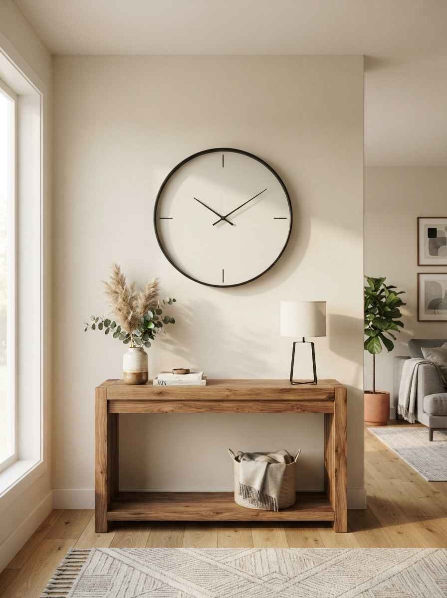
A statement clock. Oversized, simple face, no busy numbers. It functions as both art and a useful object.
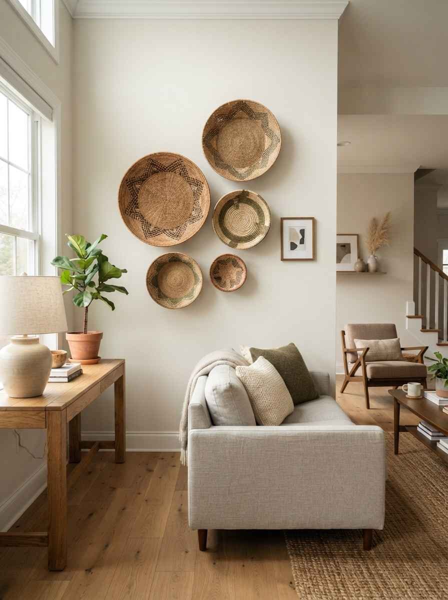
Woven baskets as wall art. Cluster 3 to 5 baskets of varying sizes. Popular in Scandinavian interiors for good reason, they add warmth without clutter.
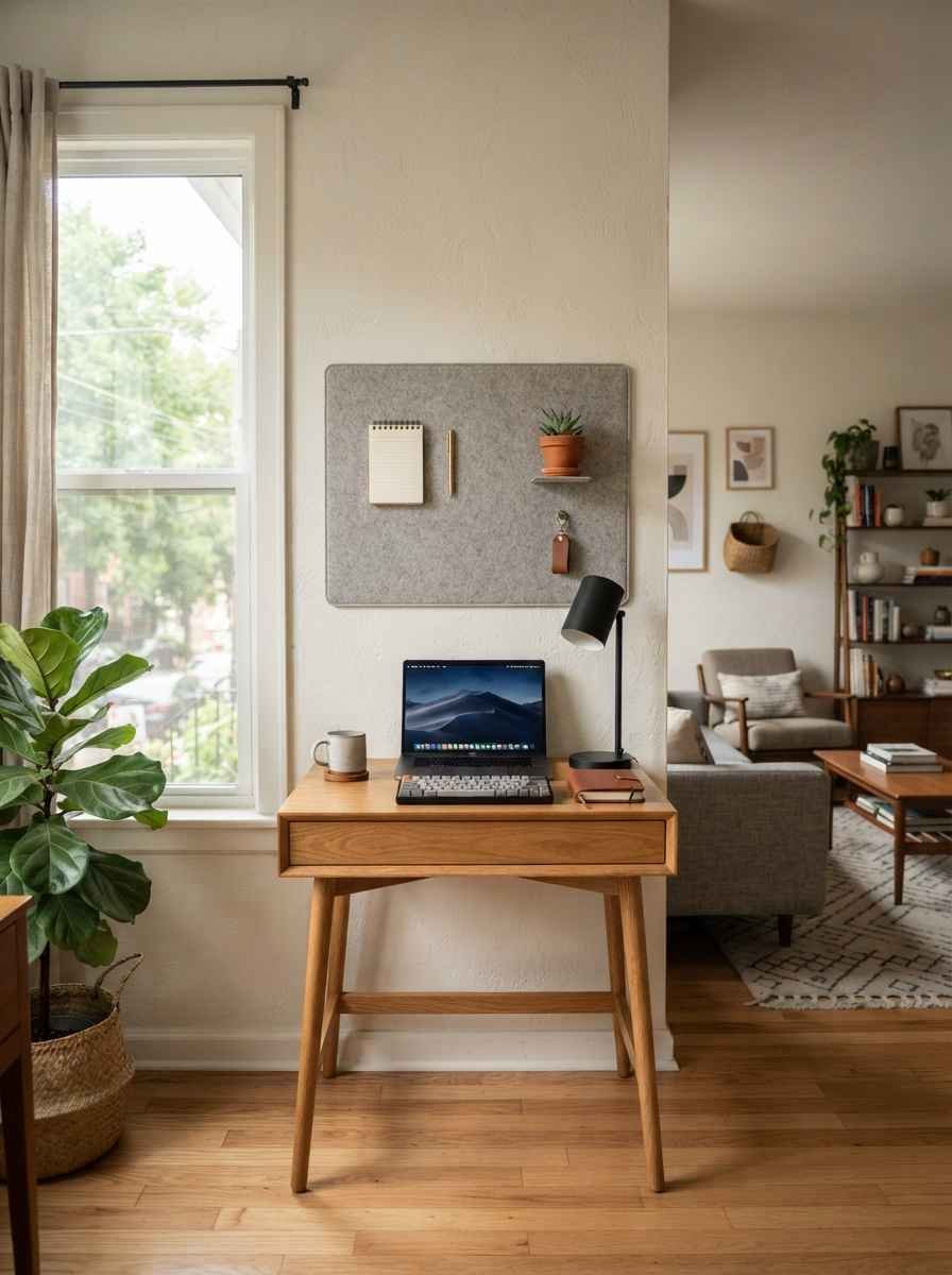
A wall-mounted organizer that doubles as decor. A simple cork or felt board in a neutral tone. Practical for small apartments where every surface has to work overtime.
By the way, completely unrelated, but does anyone else find it weirdly satisfying watching Pinterest home tour videos at 1 a.m. instead of sleeping? Just me? Okay, moving on.
Lighting-adjacent wall ideas
Lighting changes everything about how wall art reads in a room, especially after sunset.
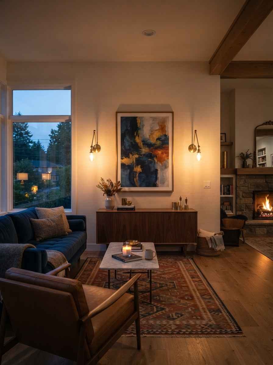
Sconces flanking a single piece of art. Symmetry plus soft light equals an expensive-looking setup for under $100 in most cases.
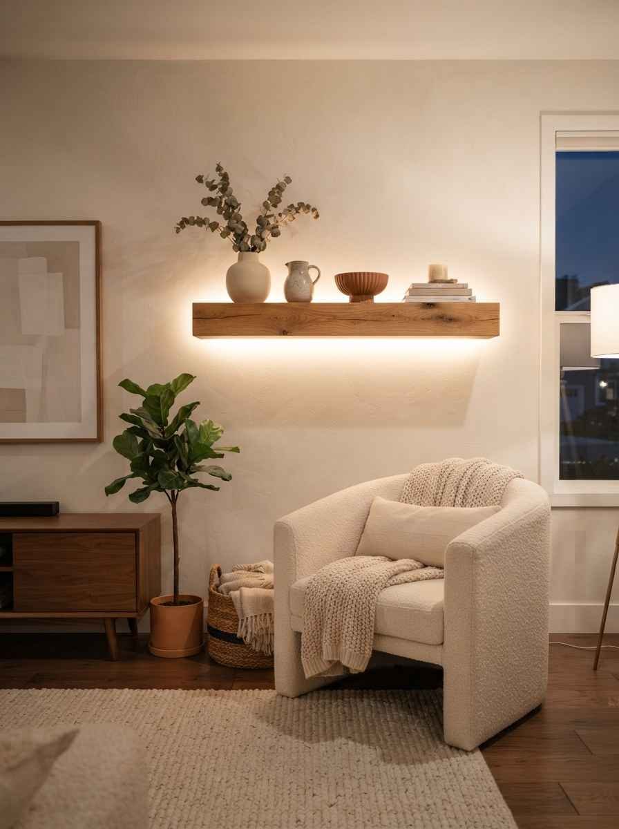
An LED strip behind a floating shelf. Warm white, not that harsh blue-white light. It creates a soft glow that makes the whole wall feel intentional.
A picture light mounted above a framed print. Museum-style, and it instantly makes even a $20 print from a thrift store look like it belongs in a gallery.
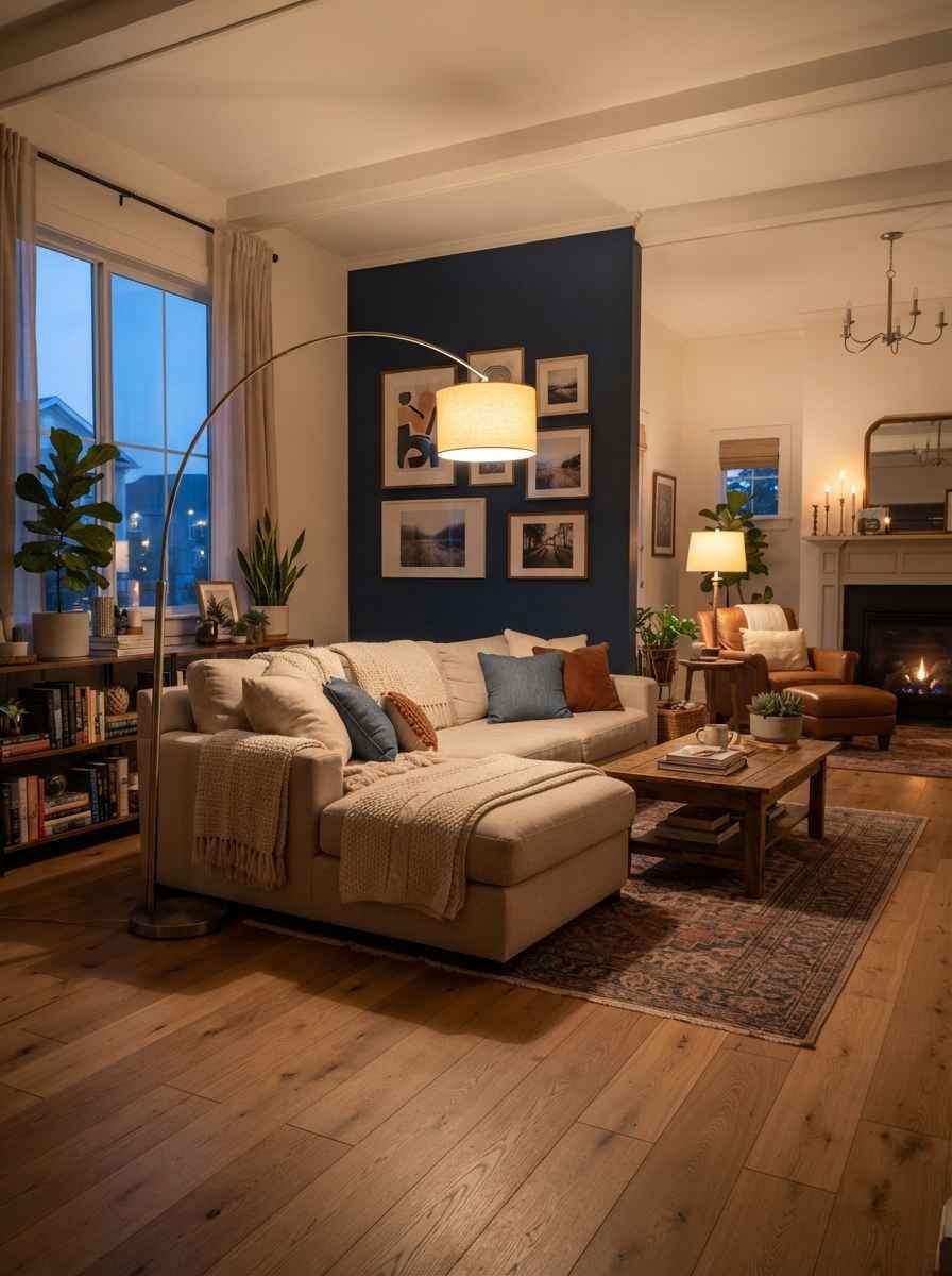
An arched floor lamp positioned beside a gallery wall. Not technically on the wall, but it changes how the whole arrangement is lit at night. Worth the floor space, IMO.
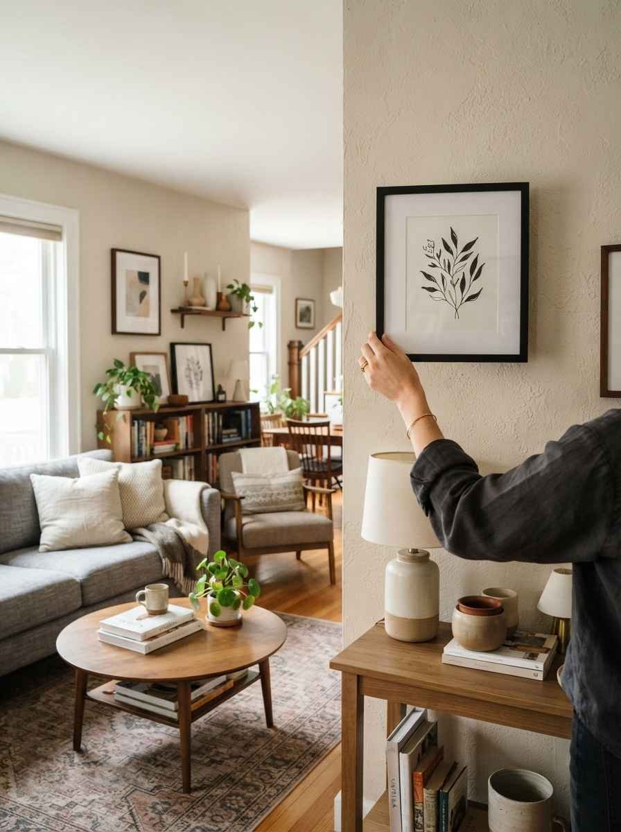
How to choose the right pieces for your space
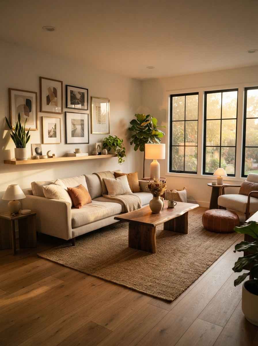
Don’t just pick what’s trending. Pick what matches your wall size, your lighting, and honestly, your patience for maintenance.
A few things I’ve learned the hard way:
- Measure before you buy. I once bought a print that looked huge online and turned out to be the size of a dinner plate. Wow, that was a waste of $60.
- Stick to 2 or 3 materials max across your whole wall (wood, metal, ceramic, whatever). More than that starts to look busy fast.
- Leave breathing room. Minimalist walls need empty space around the art, not just between pieces.
- Match your frame finish to your existing hardware where you can (brass with brass, black with black). Small detail, big visual payoff.
If you want more inspiration boards before committing, Pinterest’s home decor section is genuinely one of the best free tools for this. I still save new boards every month.
Common mistakes to avoid
- Hanging art too high. The center of your piece should sit around eye level, roughly 57 inches from the floor.
- Overcrowding a small wall just because empty space feels awkward at first.
- Choosing trendy colors over ones that actually match your existing furniture.
- Forgetting scale. A tiny print on a massive wall looks lost, not minimalist.
FAQs
How many pieces should I put on one wall for a minimalist look? Generally 1 to 5, depending on wall size. A small wall works best with a single piece, while a larger wall can handle a tight gallery grouping of 3 to 5 matching frames.
Is minimalist wall decor expensive? Not necessarily. Some of my favorite pieces cost under $30, especially prints you can order online and frame yourself. The cost usually comes from quality framing, not the art itself.
Can I mix textures in a minimalist living room? Yes, and you probably should. One or two textures (wood plus woven fiber, for example) add warmth without breaking the minimalist rule of restraint.
Final thought
Twenty-seven ideas is a lot to take in, so don’t try to use all of them at once. Pick 2 or 3 that actually fit your space and your budget, then build from there.
Which one of these are you trying first: the oversized single art piece, or the gallery wall with matching frames? Save this list to your Pinterest board now so you don’t lose it in the scroll.
