
If your Instagram feed is full of perfectly styled rooms but your actual apartment looks like a thrift store exploded, you’re probably trying too hard.
Bohemian modern design works because it stops pretending everything needs to match. It just needs to mean something.
The whole idea is simple: take bohemian’s colorful, wandering spirit. Mix it with modern design’s clean lines and restraint.
You end up with rooms that actually feel like home instead of a furniture catalog.
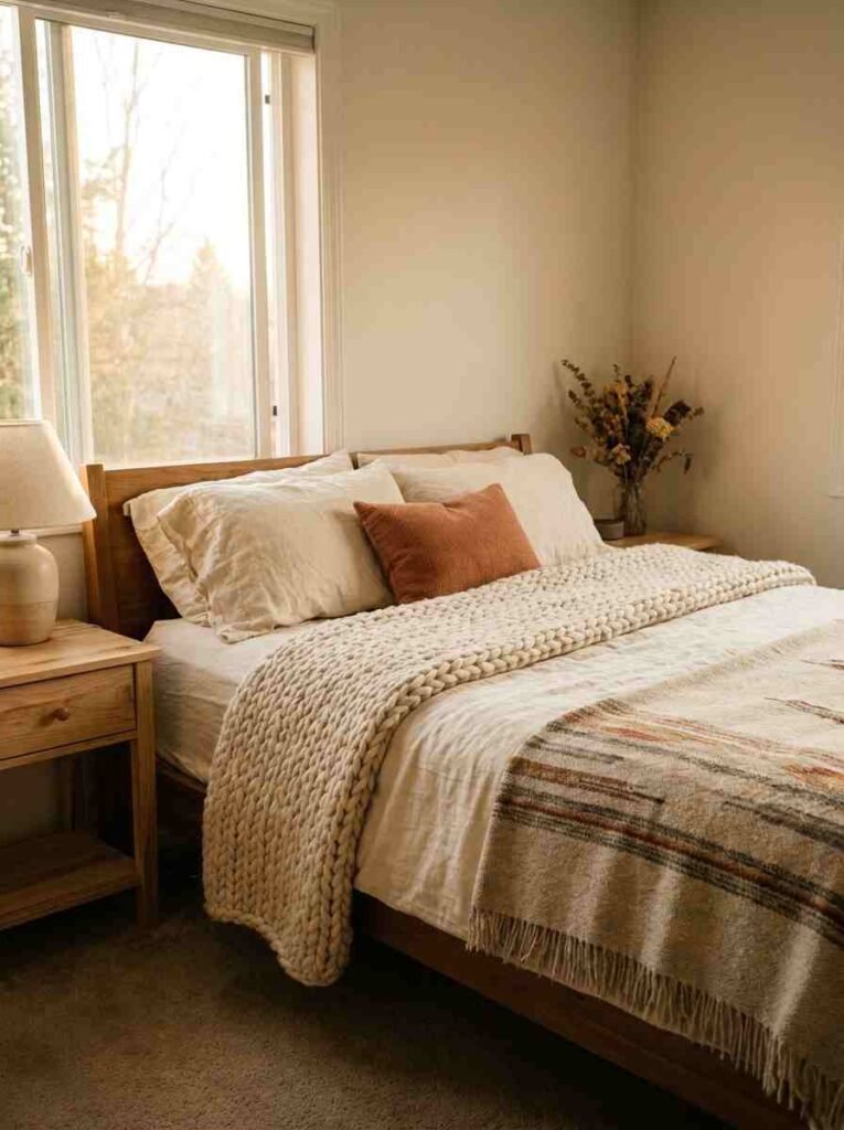
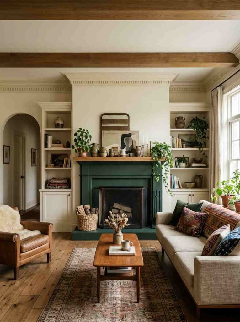
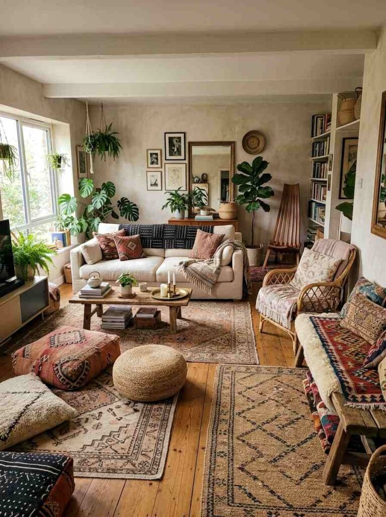
Layer your textiles strategically
This is where most people go wrong. They throw four throw pillows on a couch and call it bohemian.
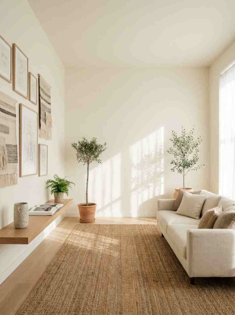
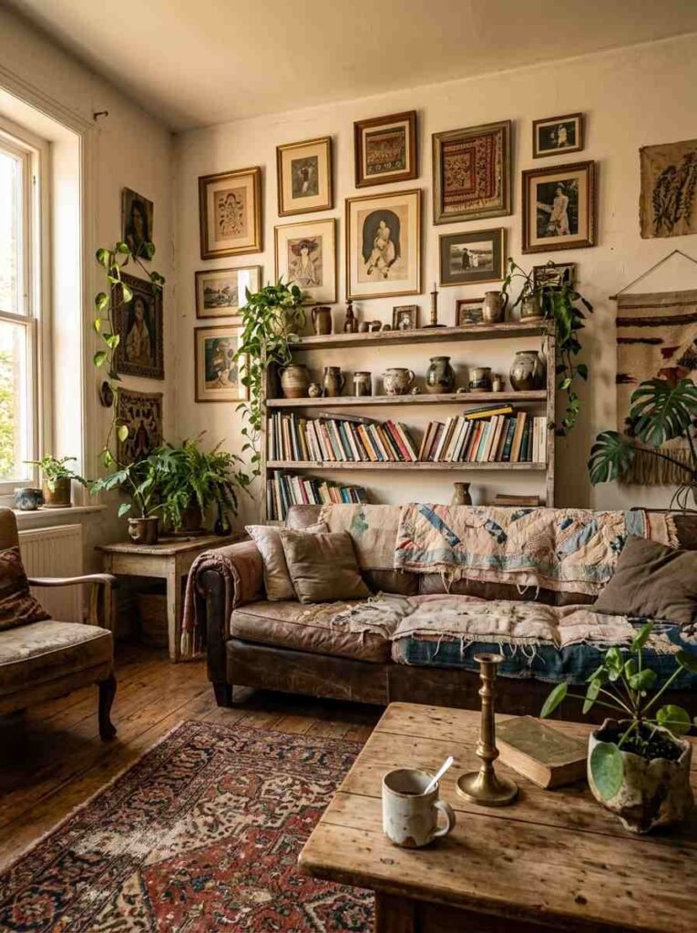
Texture is the muscle here. A chunky knit blanket next to a vintage kilim rug next to linen curtains—that’s how you build depth.
Each piece should feel different to touch. Linen against wool against cotton. Your eye picks up on that, even if you don’t realize it.
Start with two base fabrics (usually a neutral linen and something warmer like wool or cotton), then add one patterned piece that pulls colors from your room.
That’s the framework. Everything else hangs on it.
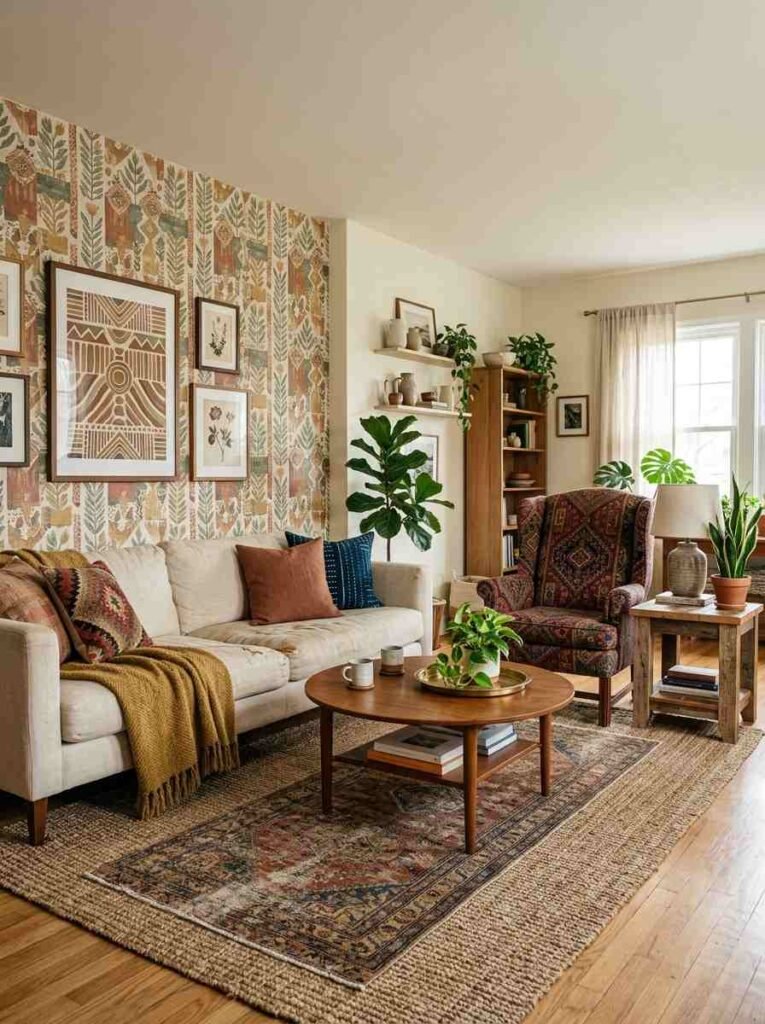
Embrace an actual color palette
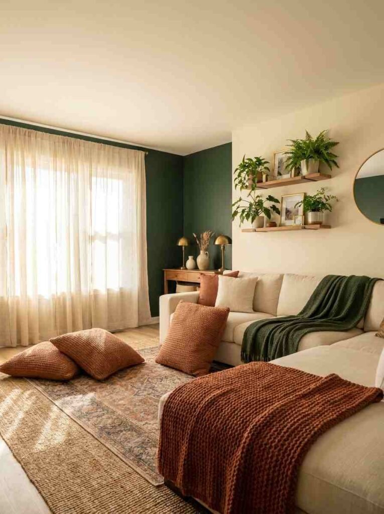
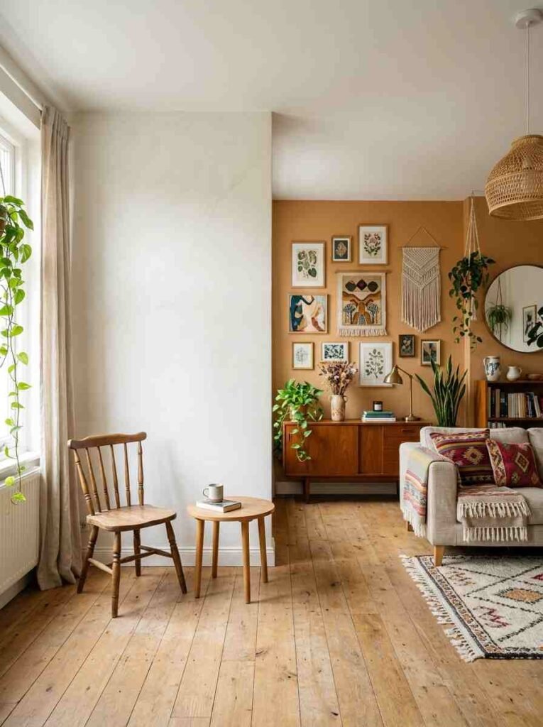
“Bohemian” doesn’t mean rainbow chaos. Pick 3–4 colors and stick to them.
Terracotta, cream, and forest green works. So does navy, sand, and mustard. The point is commitment.
When every wall, rug, and cushion follows the same family, the room breathes instead of screams.
Your dominant color (probably 60% of the room) should be neutral. Your secondary color gets 30%.
Accent colors handle the last 10%. Simple math. Rooms that feel intentional usually follow something close to this.
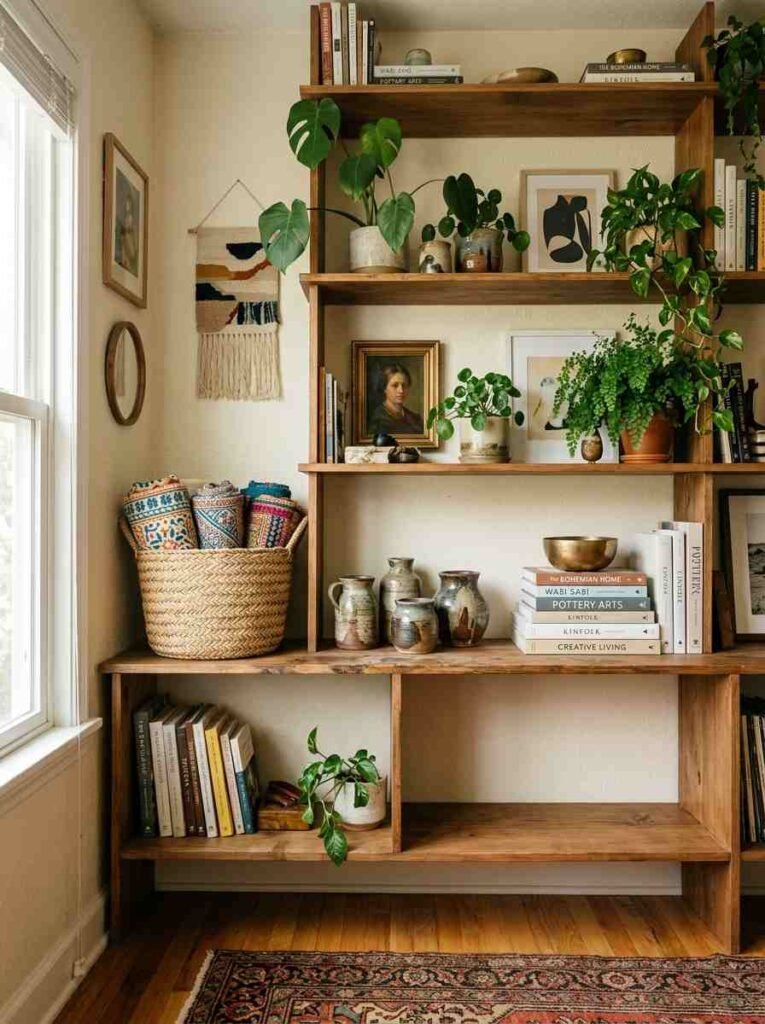
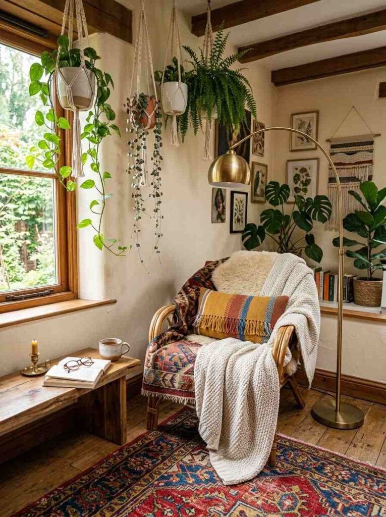
Put plants everywhere
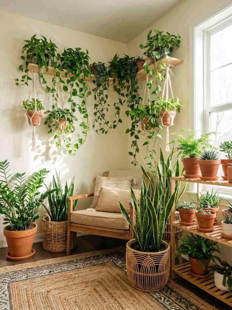
Not fake ones. Actually living plants.
A real trailing pothos looks chaotic and perfect.
A fake one looks like you gave up. If you kill plants, try snake plants, ZZ plants, or pothos—they survive neglect. A room without plants reads as sterile, no matter what else you do.
Cluster them in corners, on shelves, hanging from ceiling hooks. Small pots on high shelves.
Large floor plants flanking a chair. The variation in height and size matters as much as the plants themselves.
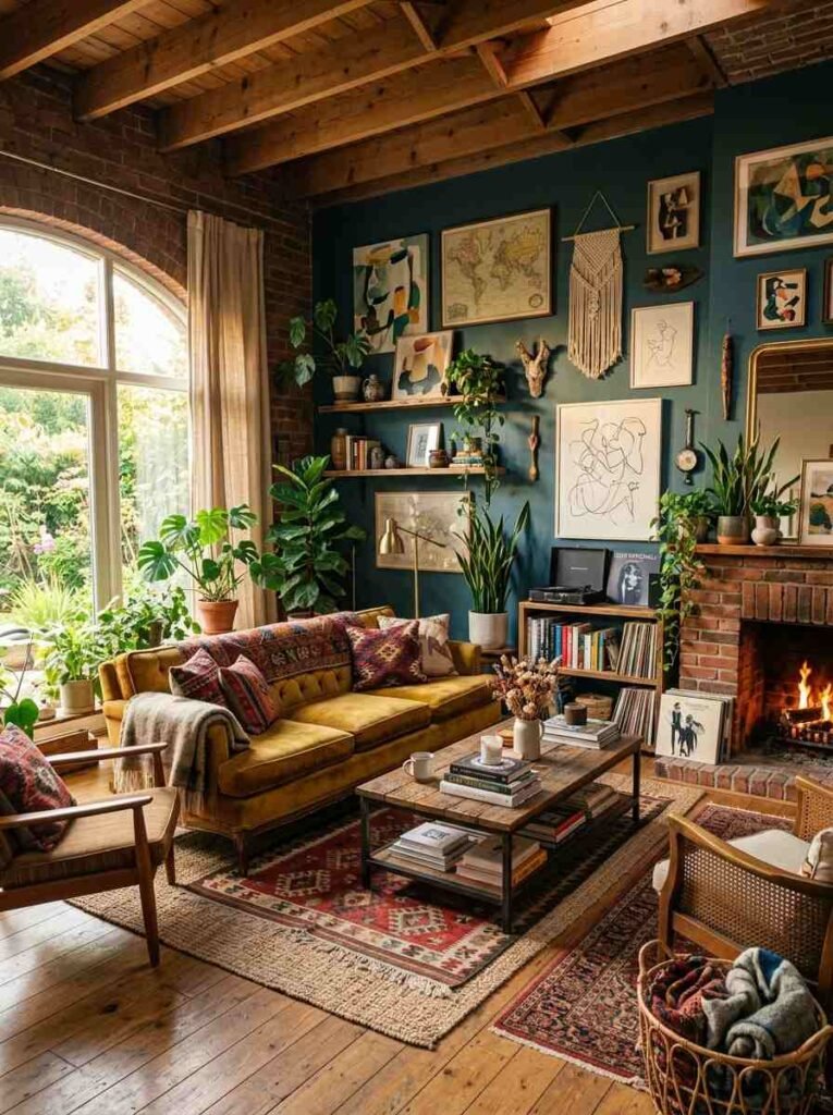
Mix eras and styles without flinching
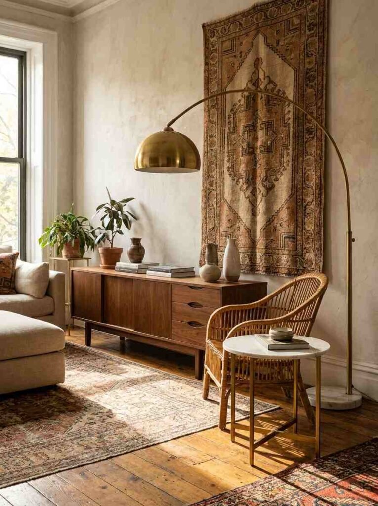
A 1970s credenza next to a modern sofa next to a woven wall hanging from Morocco. This shouldn’t work. It does because each piece is genuinely good on its own.
The rule: every item should have a reason for being there beyond “it fits the aesthetic.” That antique brass lamp?
You actually like that lamp. The mid-century chair? You sat in it and wanted it in your home. Authenticity is the glue.
Secondhand stores, Etsy, vintage markets, and family hand-me-downs are your friends here.
Avoid anything that looks intentionally distressed or “vintage-style.” Real old beats fake old every time.
Use white space (yes, really)
Bohemian doesn’t mean every surface covered.
Empty shelves look intentional. A blank wall becomes a feature. The opposite of bohemian is maximum maximalism—filling every inch because you’re afraid of emptiness.
Balance clutter with calm. A heavily styled shelf next to a bare one. A gallery wall across from plain white. This contrast is what keeps bohemian from reading as messy.
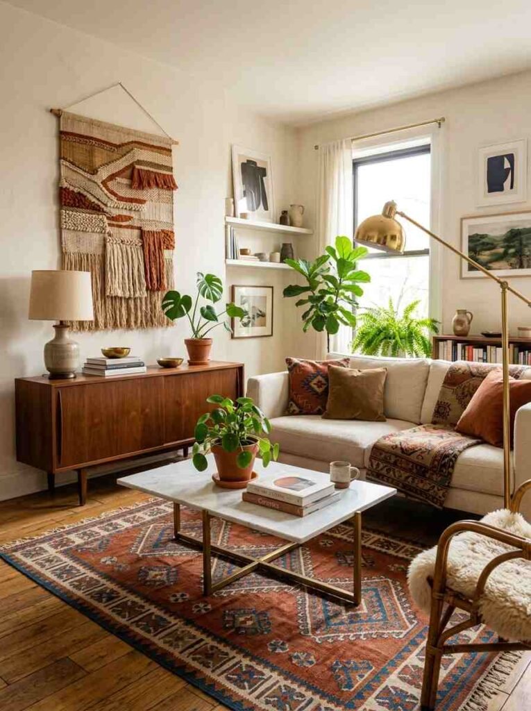
Hang textiles on walls
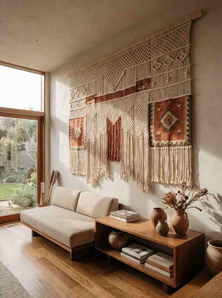
Macramé wall hangings. Woven tapestries. Even a beautiful rug mounted on the wall works.
This does two things: adds texture without eating floor space, and covers wall area that otherwise needs paint or wallpaper.
A large woven wall hanging in your main color family becomes an anchor point the whole room orbits around.
Layer different lighting sources
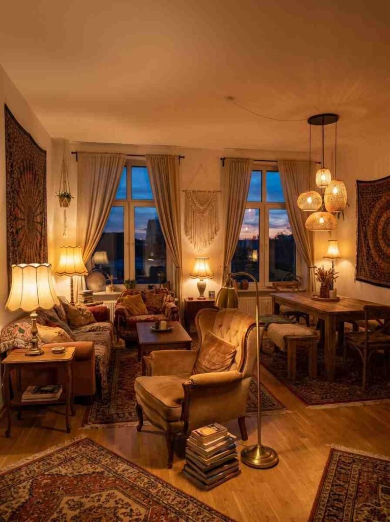
One ceiling light is not design, it’s a crime.
A warm floor lamp in the corner. Pendant lights over a table. String lights if you’re into that (keep them warm white, not cool). Candles count.
When you can dim different lights independently, the room transforms from day to night.
The goal: no harsh overhead shadows, no dark corners. Warm, layered light makes bohemian spaces feel like places you want to be.
Pick rugs by feel, not just appearance
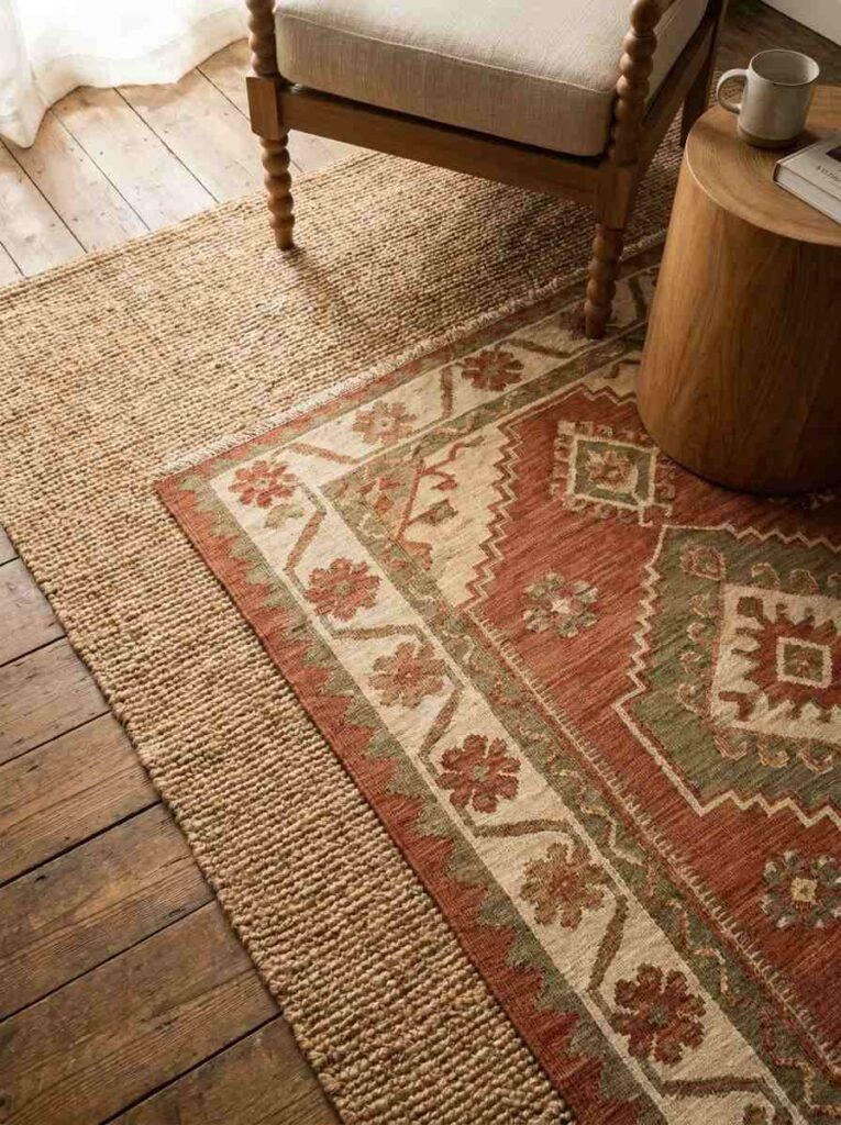
Rug shopping is about texture.
Run your hand across it. Would you actually sit on this? Is it thick enough to feel grounded underfoot, or does it feel like paper?
A jute rug with a kilim runner layered on top creates depth and interest.
A flat synthetic rug looks cheap no matter the pattern.
Natural materials (wool, cotton, jute) age better and get softer with use. They also cost more, but they last. One good rug beats three mediocre ones.
| Material | Feel | Best For |
|---|---|---|
| Wool | Soft, durable | High-traffic areas |
| Jute | Textured, natural | Layering under other rugs |
| Cotton | Breathable, thin | Layering for pattern |
| Kilim | Flat, patterned | Visual interest |
Create a gallery wall that actually works
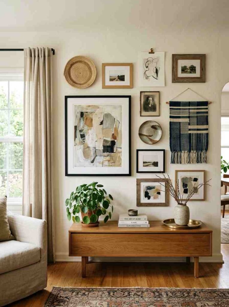
Not symmetrical, not chaotic. Somewhere between.
Lean pieces against the wall before hanging.
Move them around. Take a photo. The best layouts have one anchor piece (usually larger, in the center-ish area) with smaller pieces radiating around it—not evenly spaced, but balanced.
Mix frame styles. Wood, metal, no frame. Black, natural, painted. Hang some high, some low. Include non-art items: a woven plate, a tapestry, a textile.
The variety keeps it from looking like you assembled a set.
Use wood as your neutral
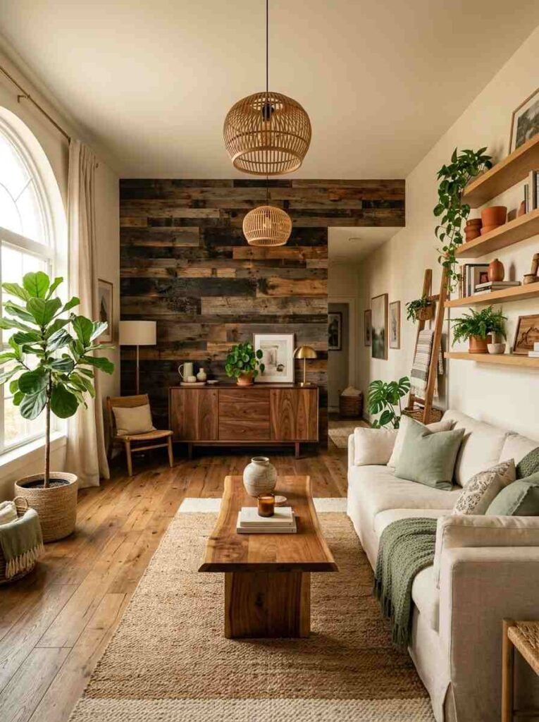
Stained wood, raw wood, reclaimed wood. This is your answer when white starts feeling too sterile.
Wood furniture, wooden shelves, wooden wall features. It adds warmth and texture without adding another color.
A room with natural wood tones and whites and greens reads as calm and intentional.
Hang low-profile shelving
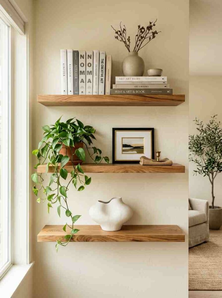
Not floating shelves that look like they’ll snap under weight.
Install proper brackets. Style three shelves: one with books stacked horizontally and standing vertically, one with plants and a small ceramic piece,
one half empty with one large object. Repetitive styling looks staged. Varied styling looks lived-in.
The gap between shelves matters too. If shelves are too far apart, the wall dominates. Too close and you’re just stacking. Aim for balance.
Commit to artwork you like
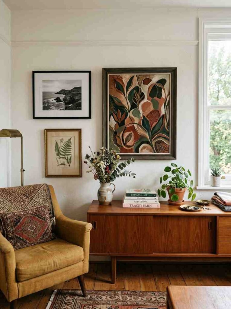
Not what matches the color scheme.
Buy the painting because something in it speaks to you. A print from an artist whose work you follow. A photograph you took. A vintage botanical print. If you love it, it belongs.
Your room is more interesting when other people can see your actual taste reflected in it.
The room becomes a portrait of what you care about, not a successful Pinterest recreation.
Break up wall color with architectural features
A dark accent wall reads as bohemian when paired with light furniture, not when it’s sitting alone.
Crown molding in a different color. Wainscoting. A fireplace surround. These structural elements give the room bones.
Bohemian modern respects the bones and works around them, not against them.
If your walls are plain, a built-in bookcase or shelving unit creates visual structure.
Add textural contrast with ceramics
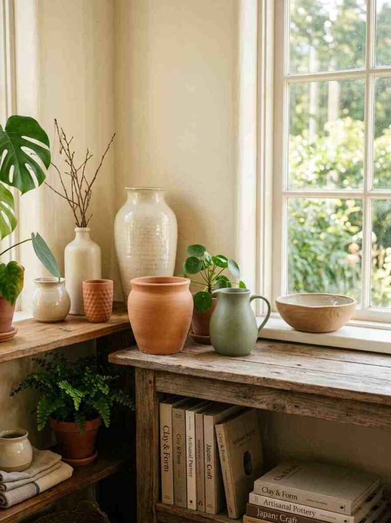
Handmade pottery. Glazed vases. Unglazed vessels.
Display them on shelves, windowsills, side tables. A collection of 3–5 ceramic pieces in varied colors and sizes becomes a focal point.
Each one tells a story. Together they anchor the room.
Ceramics are also one of the few decorative items where handmade actually looks better than manufactured. Buy from local potters if you can.
Use curtains to frame windows
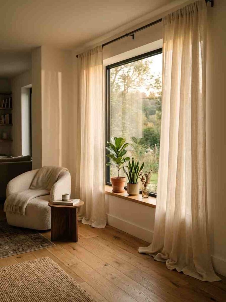
Not to block light unless you actually need to.
Linen curtains that puddle on the floor. Flowing fabric, warm white or cream.
The way fabric moves and light filters through matters more than what the curtains “do.”
If you need blackout capability, go with darker fabric, but keep the lines simple. A bohemian modern room prioritizes light over privacy every time.
Incorporate vintage brass or copper
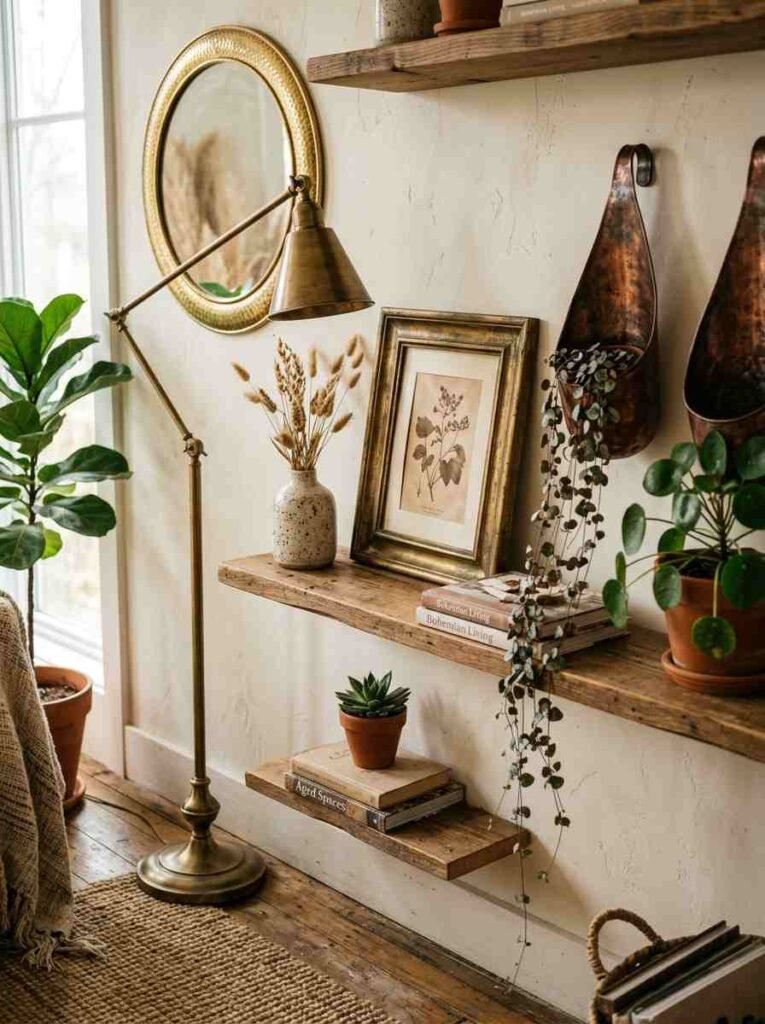
Not in abundance. Strategic placement.
A brass picture frame. Copper plant hangers. A gold-toned mirror.
Warm metals ground a space and add richness without screaming “I tried to be trendy.” Vintage brass reads as found and collected, which is the vibe.
Layer your seating
Don’t put chairs only where they fit the layout.
A chair in a corner with a plant and a floor lamp. A bench at the foot of the bed. A cushioned stool next to a side table.
Multiple places to sit means the room is genuinely livable, not just visually arranged.
Pick seating in different styles and heights. A low floor cushion, a standard chair, a taller stool. This variation is what keeps bohemian modern from looking like a furniture store.
Display collections with intention
Not every collection needs a dedicated shelf.
A few art books stacked on a coffee table. 3–4 ceramic vessels on a window ledge. Small textiles in a basket.
Collections look curated, not hoarded, when you’re selective about placement and don’t display everything at once.
Rotate seasonal pieces. Put some things away. The space feels fresh instead of permanent.
Use natural materials for storage
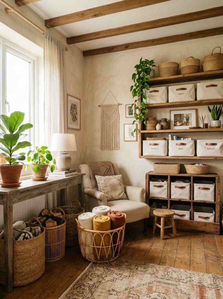
Woven baskets, wooden crates, linen bins.
These solve the “where do I put stuff” problem while staying on brand. A basket under a console table.
A wooden shelf with linen-lined storage boxes. Storage that looks intentional instead of like clutter management.
Add pattern through unexpected sources
Not just through pillows and rugs.
Patterned wallpaper on an accent wall. A bold print on a statement chair. Pattern on one wall is bohemian.
Pattern on every surface is confusion.
The pattern should feel balanced by neutral surfaces and natural materials elsewhere in the room.
Lean into imperfection
This is the whole point.
A slightly crooked gallery wall hangs better than a perfectly measured one. Uneven shelving looks more interesting than symmetrical shelves.
Handmade pieces with slight variations are more beautiful than mass-produced perfection.
Bohemian modern is about trusting your taste, not following rules exactly. The goal is a home that feels like you, not a room that could be anyone’s.
Keep one wall intentionally minimal
Give your eye a place to rest.
One wall stays simple. Clean color, maybe a single hanging piece, mostly empty.
This creates contrast with the walls that are more visually active. Your brain needs the break.
Make lighting decisions early
You can’t rescale a room that’s half-lit.
Before adding furniture, figure out where your light sources go. Run electrical outlets if you need them.
This planning prevents the dark corner situation that kills bohemian spaces.
Source from multiple eras
Fifties side table, seventies credenza, eighties mirror, modern sofa.
When pieces span different decades but share similar color families, the mix feels intentional rather than accidental.
Timeline variation is part of the charm.
Give corners purpose
Corner without a chair? Corner without a plant? Wasted space.
A reading nook with a chair and a floor lamp. Plants and a small side table. A shelf unit. Corners are where a room moves from being publicly presentable to actually livable.
Layer rugs with purpose
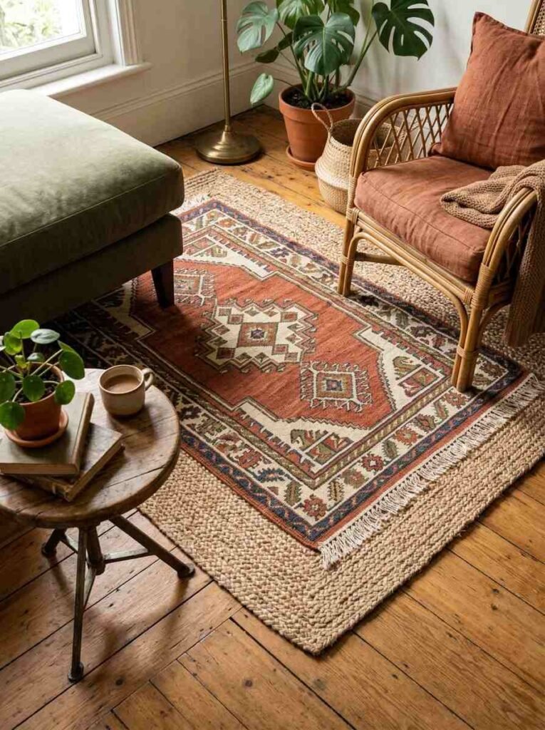
Not just “throw a rug over a rug.”
A jute base rug anchors the space. A kilim or patterned rug on top adds color and pattern. The smaller rug’s colors tie into your palette.
The layering creates depth and signals intentionality.
Trust your instincts
If you want it in your room and it makes you happy, it belongs there.
The internet has opinions about what “goes with” bohemian modern.
Your room is better when it reflects what you actually like, not a consensus of strangers. Buy the piece. Hang the art. Use the color.
Bohemian modern rooms feel effortlessly chic because they stop trying so hard. They’re built slowly, with intention, around things the person who lives there genuinely loves. Start there. Everything else follows.