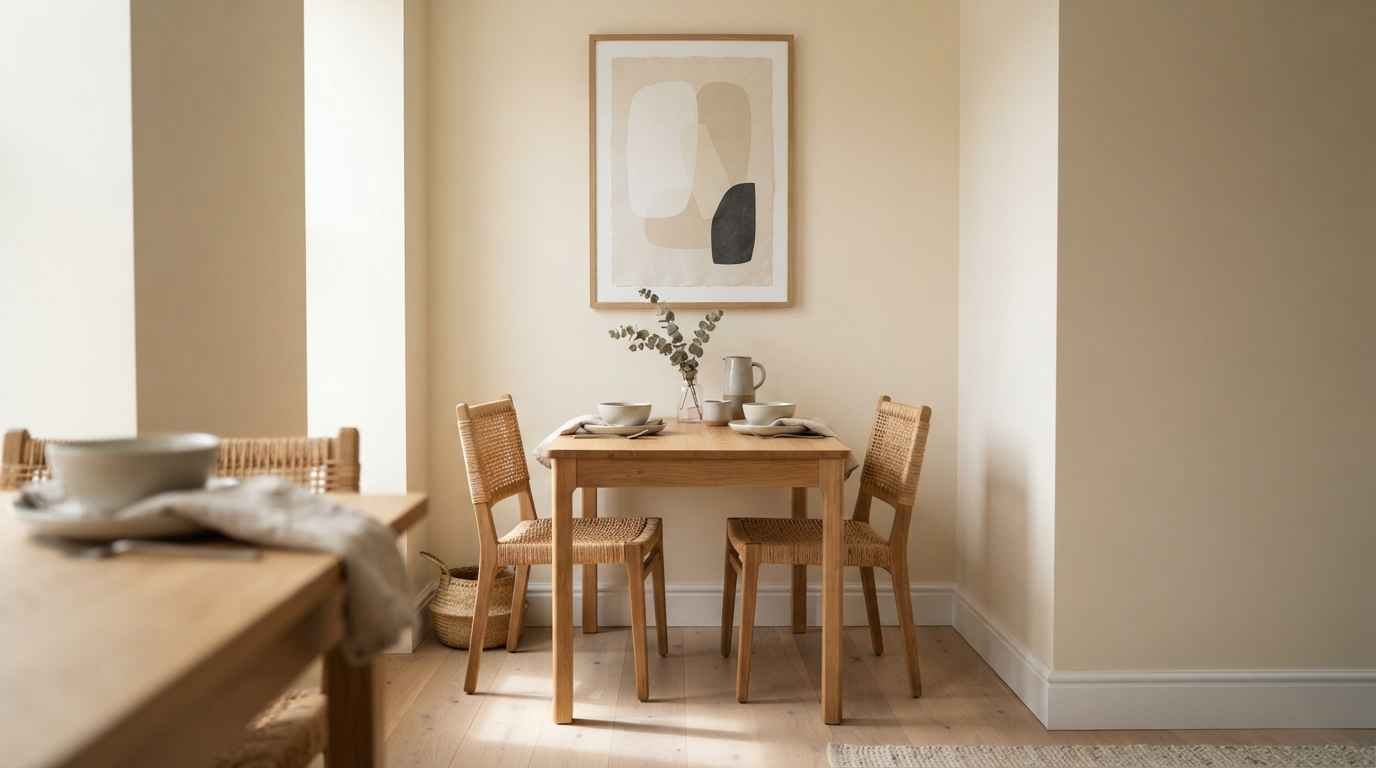
I moved into a 650 square foot apartment two years ago, and the dining nook was basically a hallway with a table shoved into it.
No windows on that wall. No room for a sideboard. Just a blank stretch of drywall staring back at me every time I sat down to eat cereal at 11pm.
So I got obsessed with minimalist wall decor.
Not because it’s trendy (though it is), but because it’s the only thing that actually works when your square footage is fighting you. Here are 26 ideas that turned my sad little eating corner into a space I actually enjoy.
Start with scale, not quantity
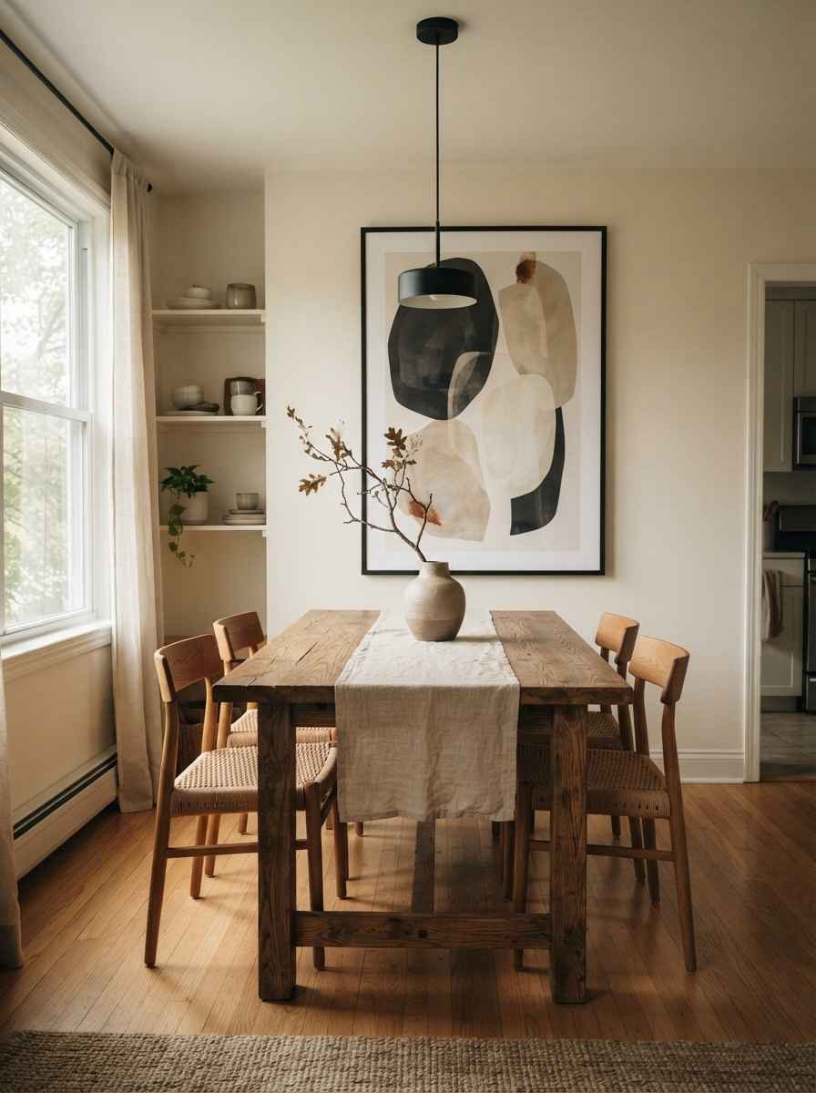
Small rooms don’t need small art. That’s the first thing I got wrong.
- Hang one oversized print instead of five small ones. A single 24×36 piece reads as intentional.
- Five 8x10s in a cramped hallway reads as clutter, even if each one is gorgeous on its own.
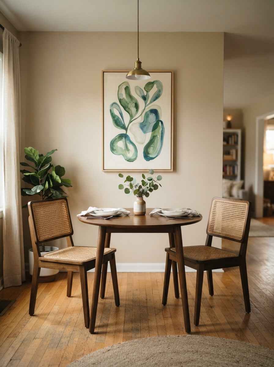
- Go vertical. Tall, narrow pieces draw the eye up and make low ceilings feel less oppressive.
- I found a 60-inch botanical print for $40 and it did more for my ceiling height than any paint color could.
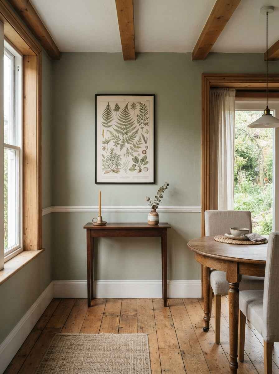
- Leave negative space around your art. IMO this is the single most underrated rule in small-space design. Crowding a wall edge to edge makes a room feel smaller, not bigger.
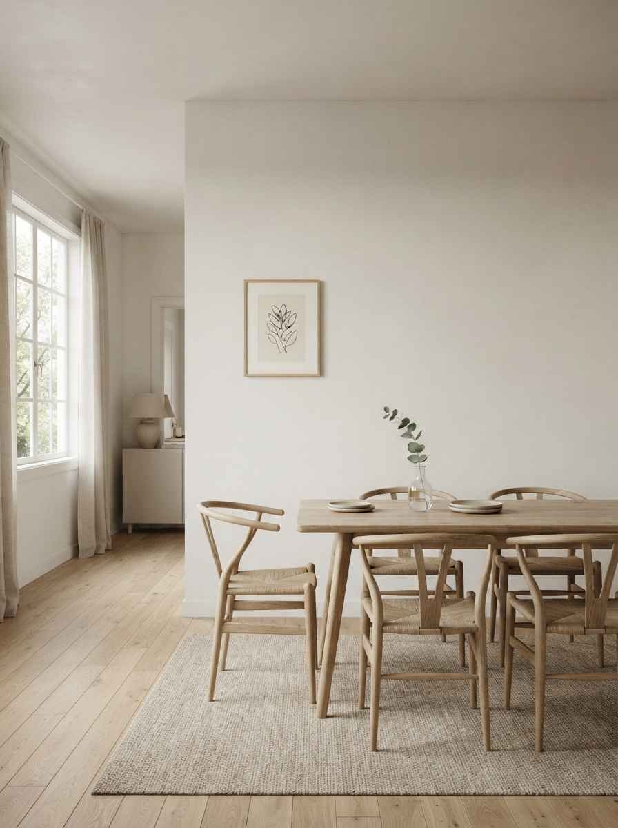
- Center art on the table, not the wall. Measure from your table’s centerline, not the wall’s. It sounds fussy, but it’s the difference between “styled” and “just kind of there.”
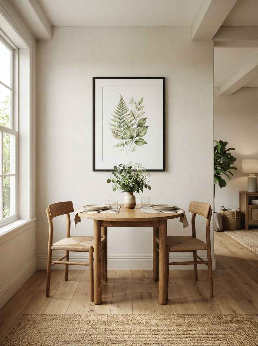
Mirrors do the heavy lifting
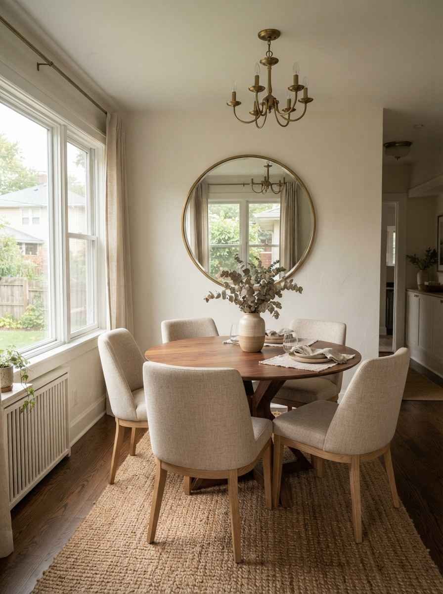
- Hang a large mirror opposite your main light source. This is the oldest trick in the book for a reason. It bounces light around and visually doubles your room.
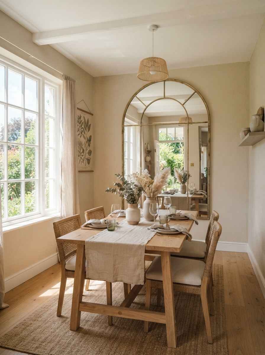
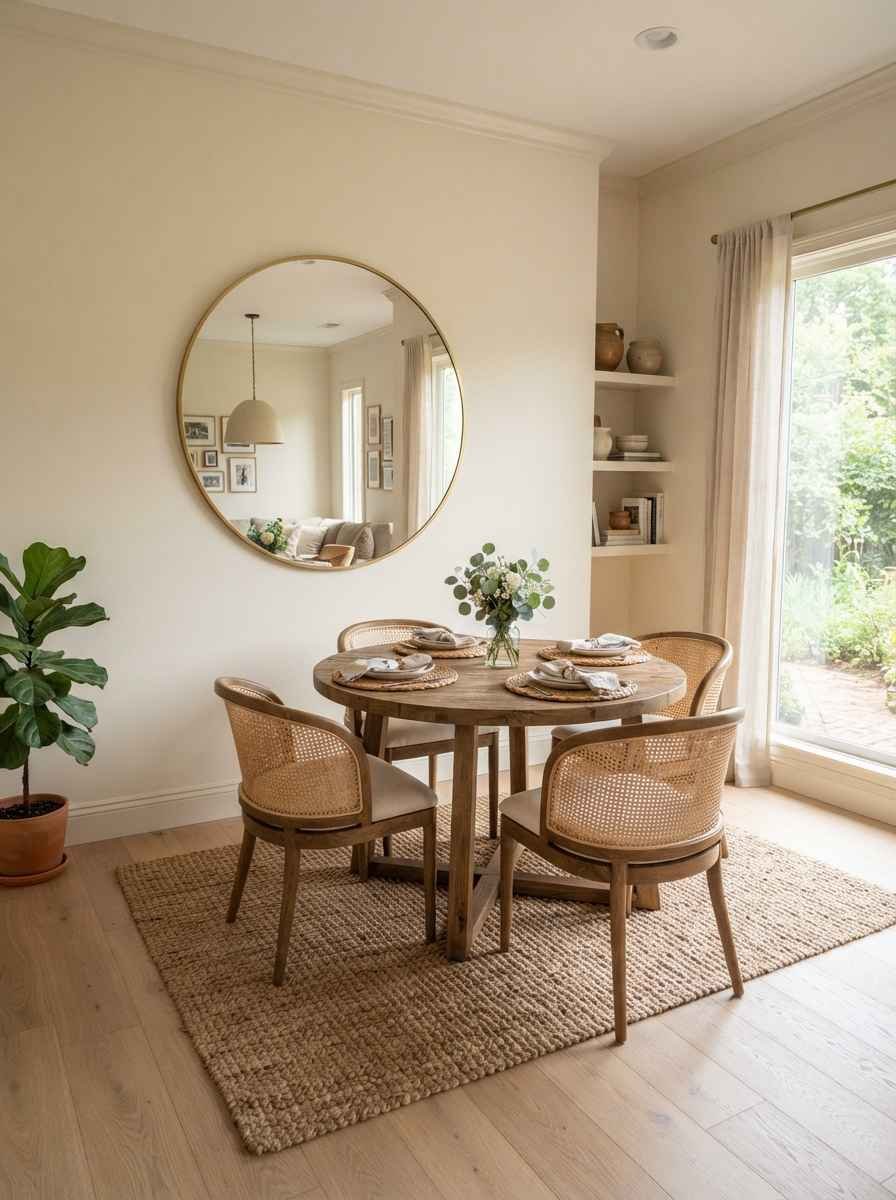
- Try a mirror instead of art entirely on your main wall. A round or arched mirror in a thin brass frame looks minimal, not grandma’s-hallway.
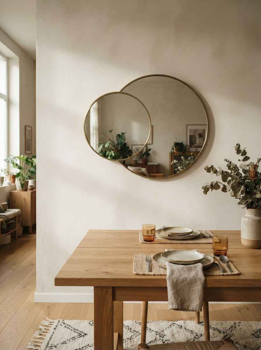
- Layer a small mirror over a large one. Two flat circles at different depths add dimension without adding clutter. It’s a trick I stole from a HGTV feature on <a href=”https://www.hgtv.com/decorating/design-ideas/10-smart-design-ideas-for-small-spaces-pictures”>smart small-space design ideas</a>, and it’s genuinely one of the better cheap upgrades I’ve made.
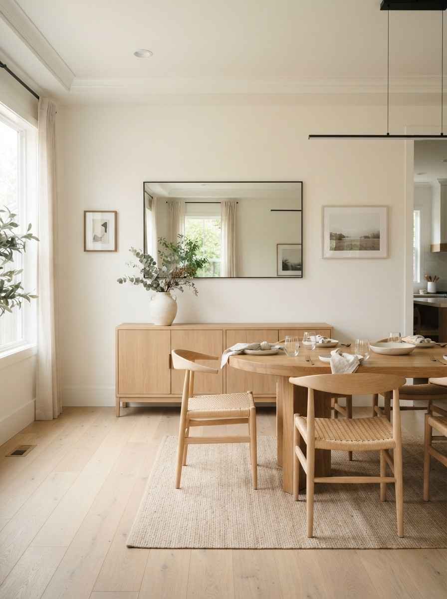
- Skip ornate frames. A thin black or unfinished wood edge keeps a mirror from becoming the loudest thing in the room, which defeats the point.
The gallery wall, minimalist edition
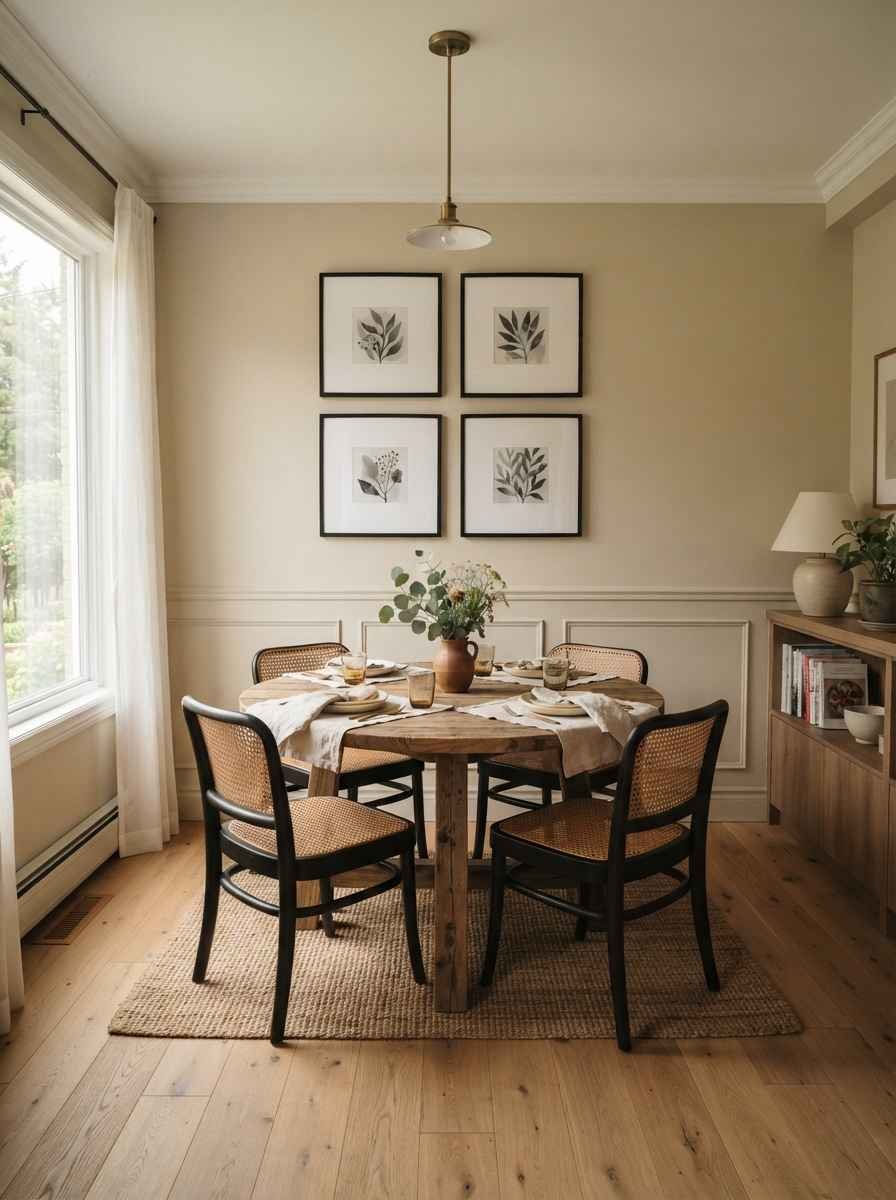
- Cap your gallery wall at 3-4 frames. A real gallery wall has 12 pieces. A minimalist one has a handful, tightly curated, in matching or complementary frames.
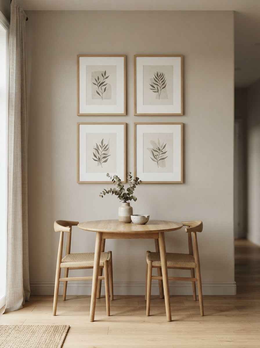
- Stick to one frame color. All black, all white, all natural wood. Mixing metals and finishes is how a small gallery wall turns into visual noise fast.
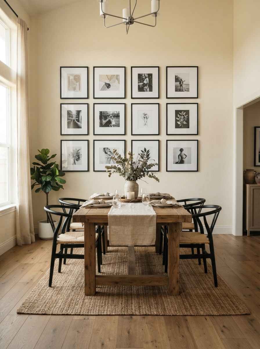
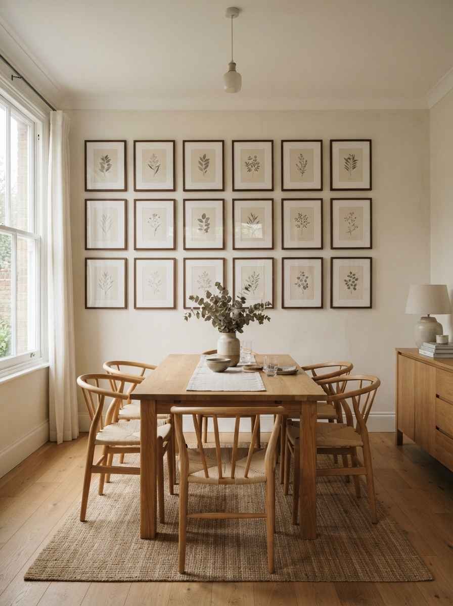
- Use a grid layout, not a scattered one. Even spacing (I use 3 inches between frames) reads as calm. Scattered “eclectic” layouts need more wall than a small dining nook has to offer.
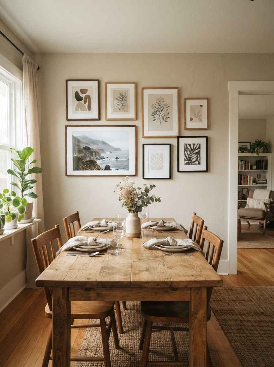
- Include one photo that actually means something to you. This is the personal touch that makes a wall feel like yours instead of a showroom. Mine is a photo my dad took of a lake nobody’s ever heard of.
Texture over volume
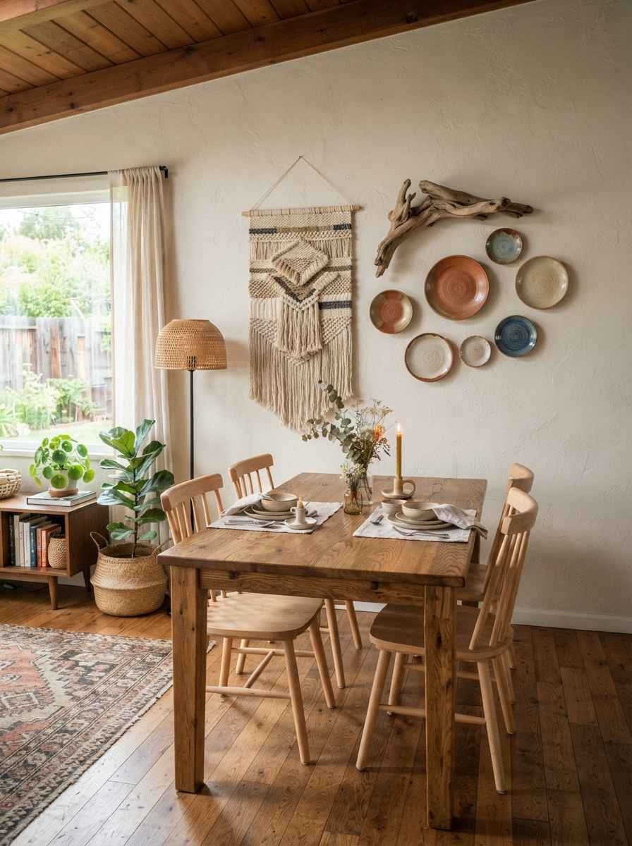
- Add one textured element instead of more flat art. A woven wall hanging, a piece of driftwood, a ceramic plate. Texture reads as depth without eating up visual real estate.
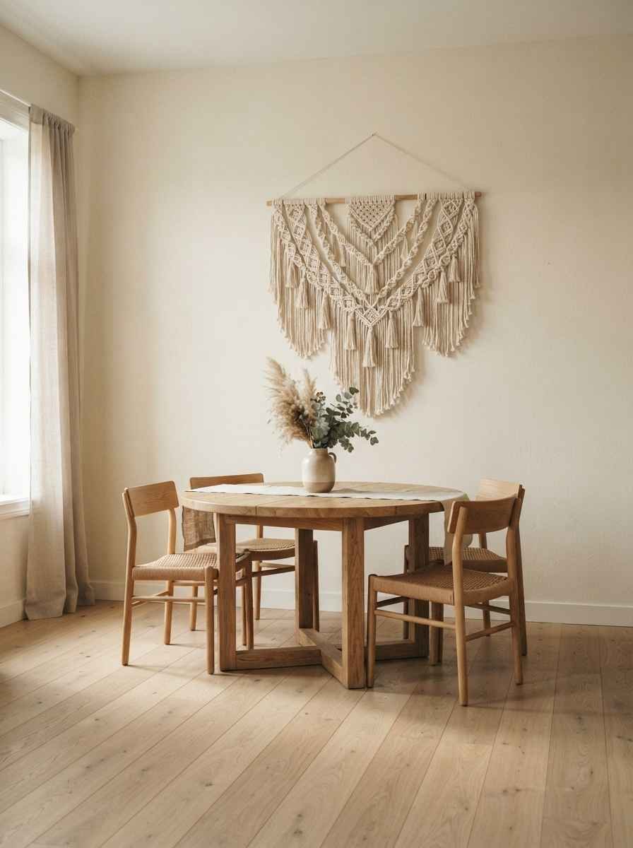
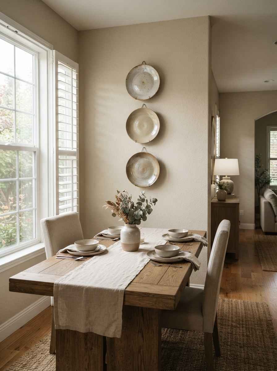
- Try a single ceramic plate display. Three plates stacked vertically is a classic for a reason, and it takes up less width than almost any other decor option.
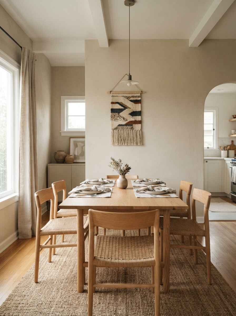
- Hang a small tapestry with restraint. One muted, geometric weave, not a full boho wall. The goal is texture, not a statement piece competing with your table.
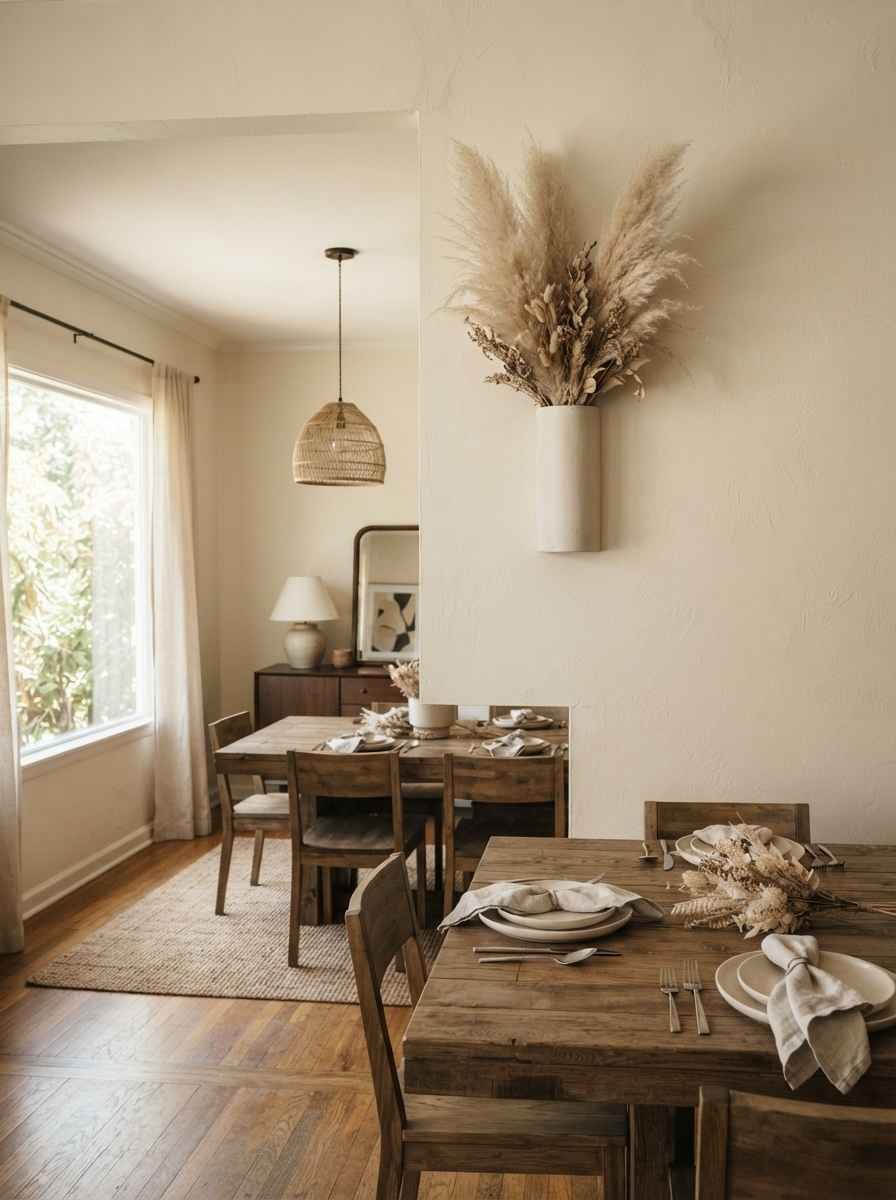
- Use dried florals in a flat wall vase. These wall-mounted bud vases barely stick out from the wall, so they won’t get knocked into during dinner.
Shelving that works as decor
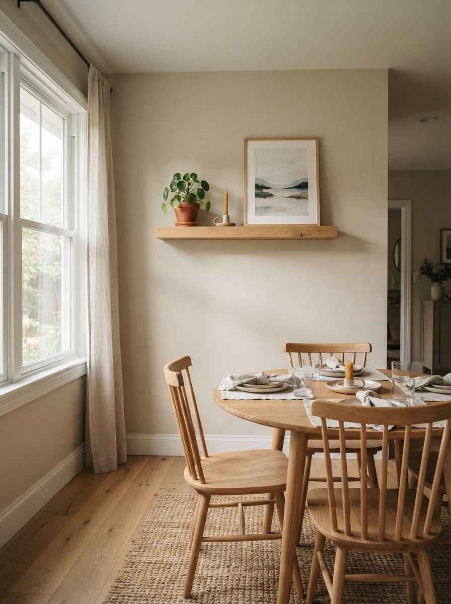
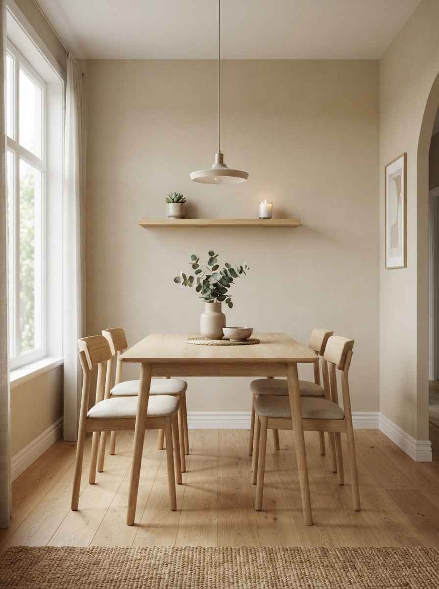
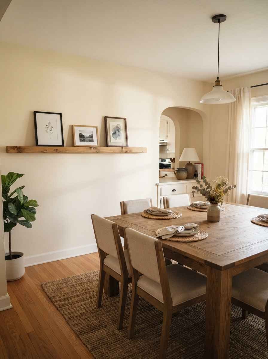
- Install a single floating shelf instead of a cabinet. It holds a plant, a candle, maybe a small print leaning against the wall, and it takes up almost no depth.
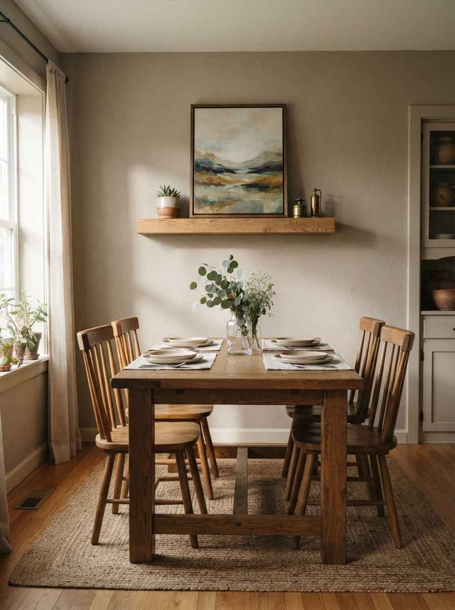
- Lean art on the shelf rather than hanging it. This is my favorite low-commitment trick. You can swap pieces seasonally without patching a single nail hole.
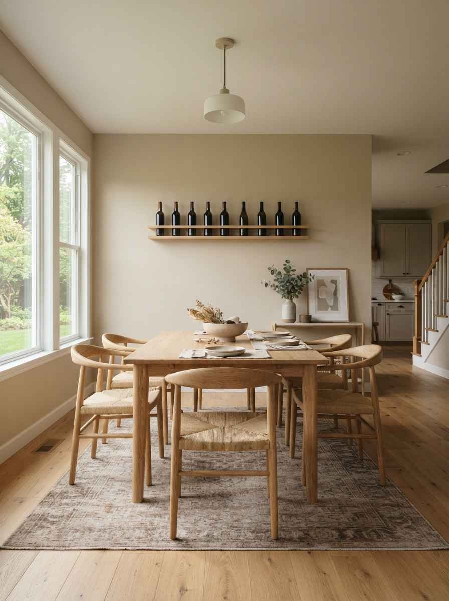
- Add a slim wall-mounted wine rack. Function and decor in one. It also solves the “where do bottles even go” problem that every small dining space has.
- Try a picture ledge instead of individual frames. One ledge, three or four small frames leaned at an angle. It looks curated and costs less than you’d think.
Color and material choices that keep things calm
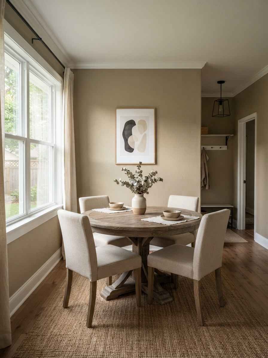
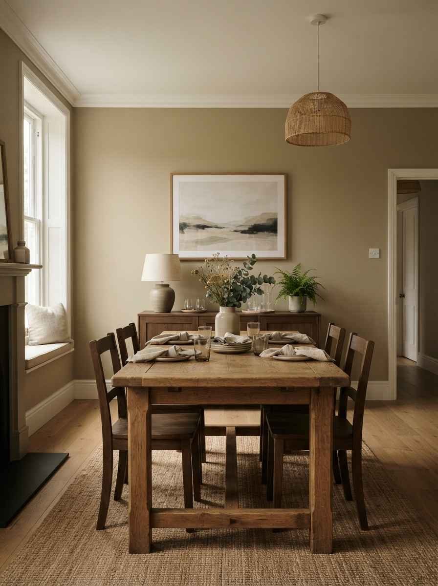
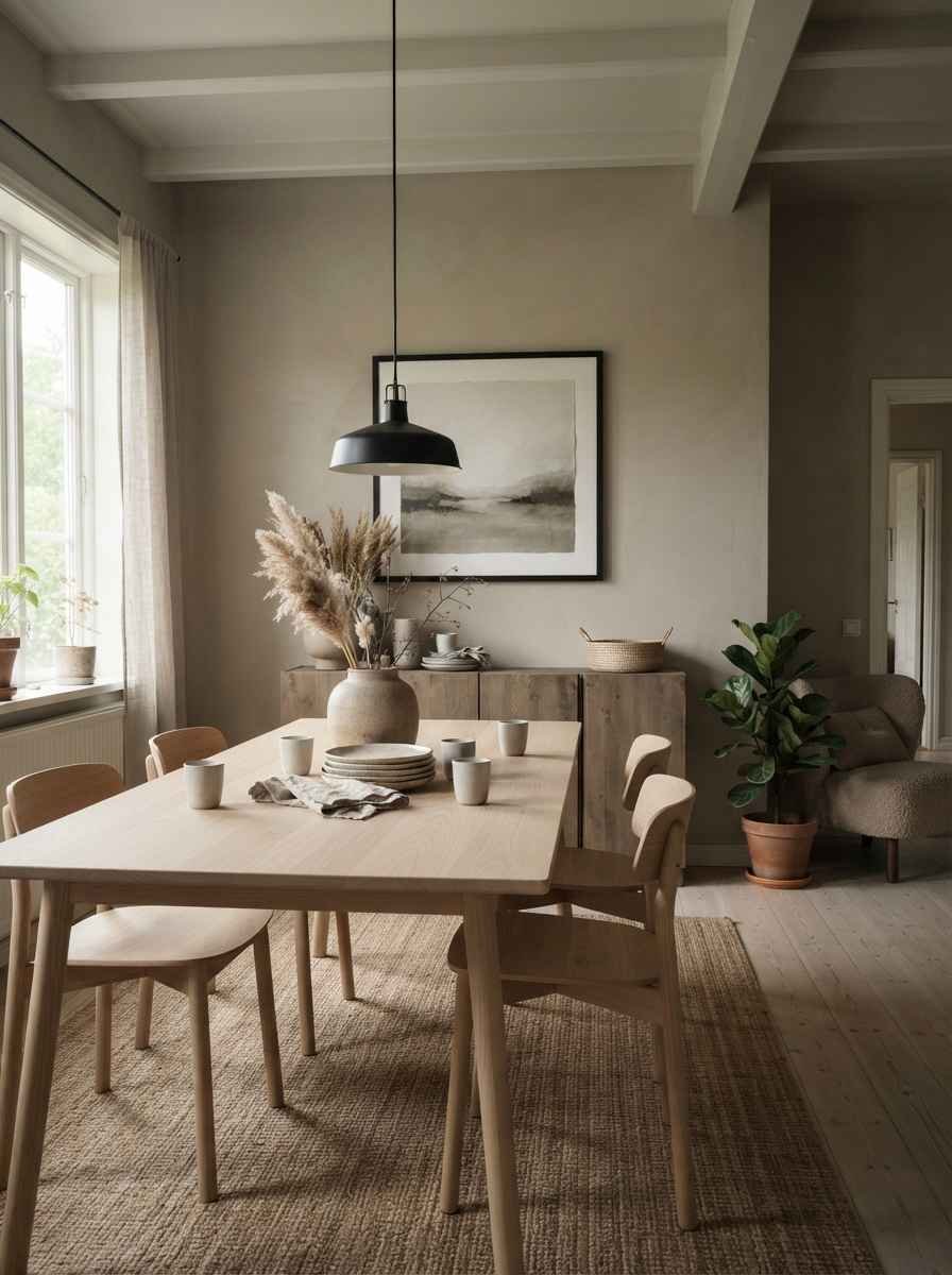
- Pick one neutral and commit. Warm neutrals are having a real moment right now. <a href=”https://www.sherwin-williams.com/en-us/color/color-of-the-year/2026″>Sherwin-Williams named Universal Khaki its 2026 color of the year</a>, and it’s exactly the kind of tone that makes small dining walls feel grounded instead of empty.
- Match your frame finishes to your light fixture. Brass frames with a brass pendant. Black frames with black hardware. Small rooms punish mismatched metals way more than large ones do.
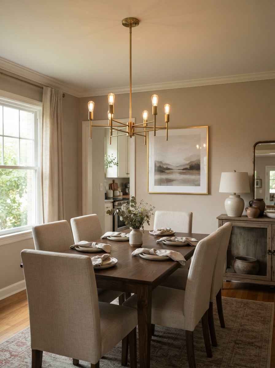
- Use matte finishes over glossy ones. Glossy frames and glass bounce light unpredictably in tight spaces, which can make a small room feel busier, not brighter.
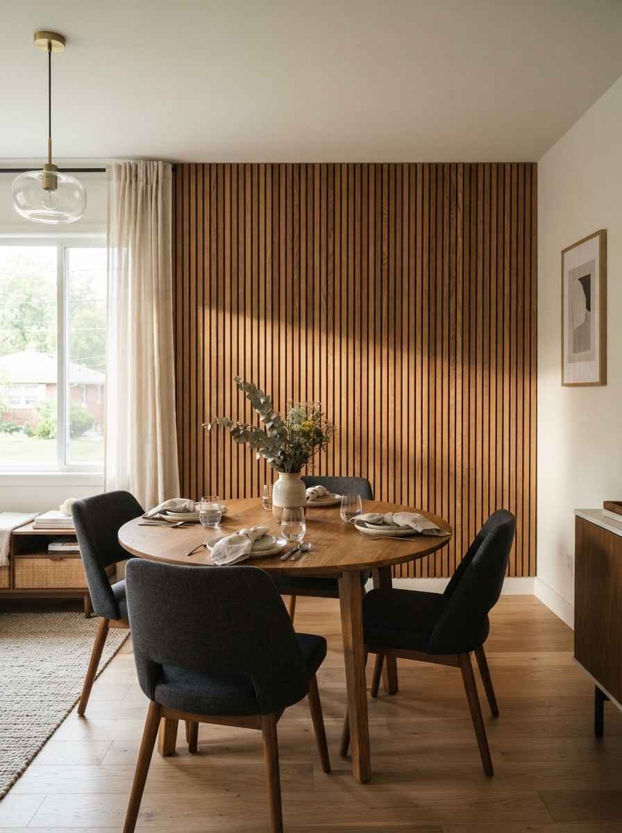
- Try wood paneling on just one wall. A slatted wood accent wall behind the table adds warmth and texture without hanging anything at all.
- This is genuinely one of my favorite non-art wall decor tricks.
Practical wall decor that pulls double duty
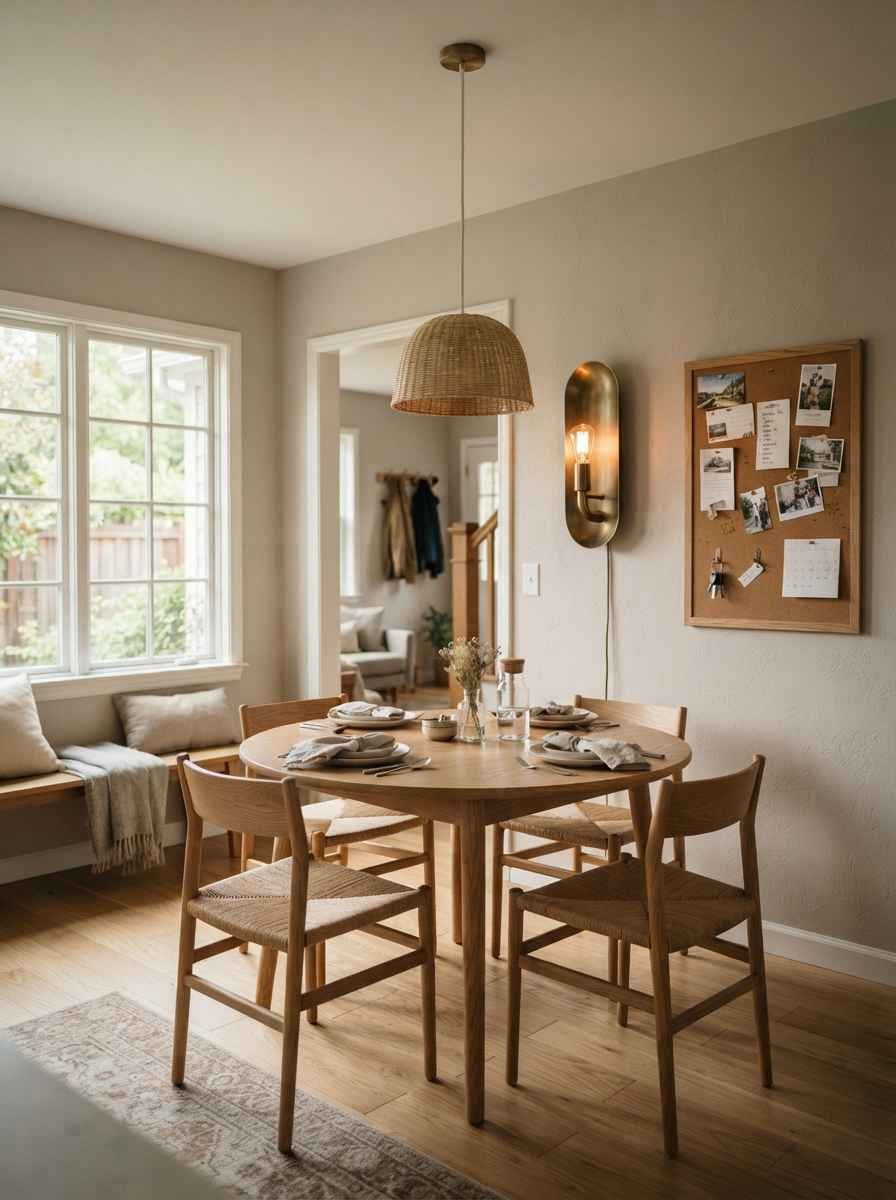
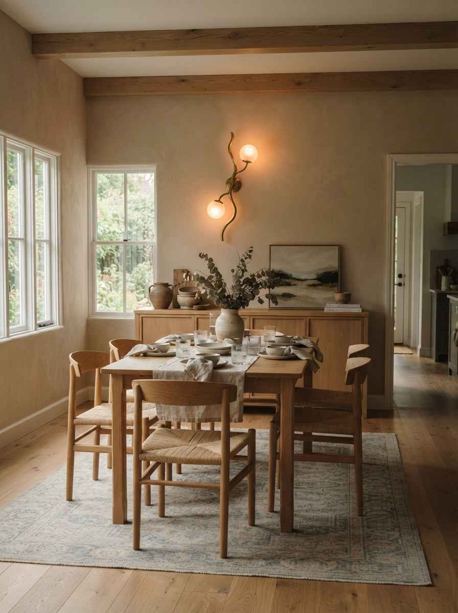
- Hang a wall-mounted light fixture instead of decor. A sculptural sconce is decor and function in one fixture, and it frees up your table for actual food.
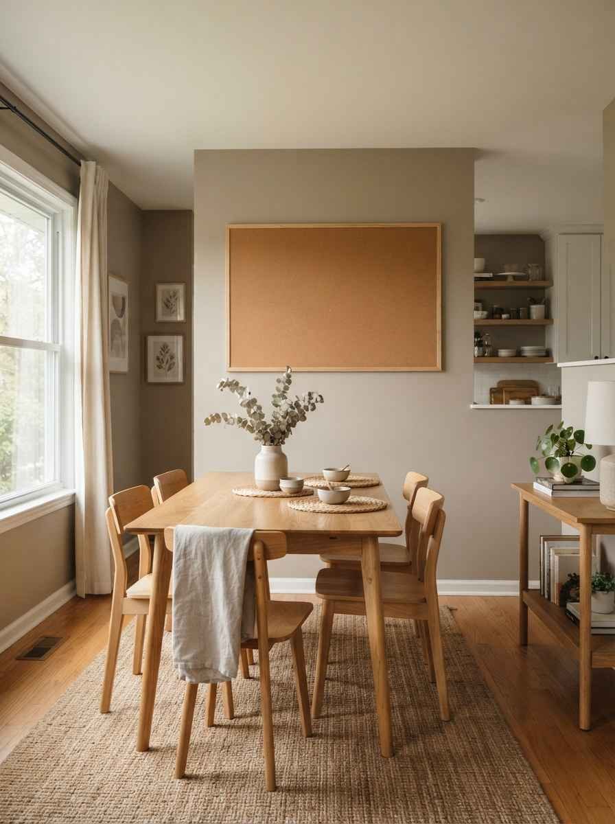
- Use a large chalkboard or framed cork board. It looks intentional, holds your grocery list, and gives you somewhere to swap in kids’ art or postcards without redoing your whole wall setup.
Random aside: I once spent an entire Sunday trying to hang a mirror perfectly level with a phone app, gave up, and just eyeballed it.
It’s been crooked for eight months and nobody has ever noticed. Wow, the things we stress about.
Quick reference table
| Decor type | Best for | Typical cost | Commitment level |
|---|---|---|---|
| Oversized single print | Visual calm, low clutter | $$ | Medium |
| Large mirror | Light and space illusion | $ to $$ | Low |
| Curated 3-4 piece gallery | Personal touch, texture | $ | Medium |
| Floating shelf + leaned art | Flexibility, low damage | $ | Low |
FAQs
Do I need matching frames for a small gallery wall to look minimal? Not identical, but matching in color and finish helps a lot.
Mixing wood, brass, and black frames on a small wall tends to look cluttered even when each frame is nice on its own.
What’s the cheapest way to fill a blank dining room wall? A large mirror or a single oversized print, honestly. Both cost less than most 3-piece gallery sets and do more visual work per square foot.
Is a gallery wall ever a bad idea in a small dining room? It can be, if you go bigger than 4-5 pieces. For tight spaces, a small, tightly grouped set with matching frames works better than a sprawling collage. If you want more general small-space strategies beyond wall decor, this <a href=”https://www.pods.com/blog/home-decor-tips-for-small-spaces”>roundup of small-space decorating tips</a> covers furniture and storage too.
Final thought
None of this requires a renovation or a big budget. Most of what I did cost under $150 total, spread out over a few months, one piece at a time.
Small dining rooms don’t need less personality.
They just need decor that earns its spot on the wall. What’s the one thing sitting in your cart right now that you’re still deciding on? Tell me, I might talk you into it.
