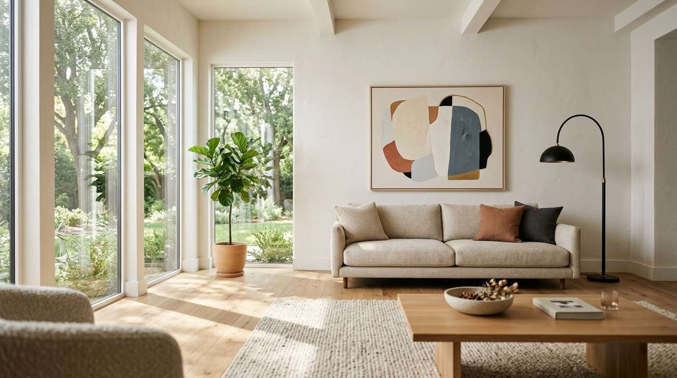
My living room used to look like a storage unit that lost an argument with a craft store. Frames everywhere. Random shelves.
A macrame thing I bought in 2019 and never once loved.
Then I stripped it back to almost nothing, and the room finally breathed. That’s the whole secret to minimalist wall decor: fewer things, better placed, doing more work.
If you’re pinning ideas for a refresh, here are 24 that actually hold up in real rooms, not just in a perfectly lit photo.
Why less on the wall works better than more
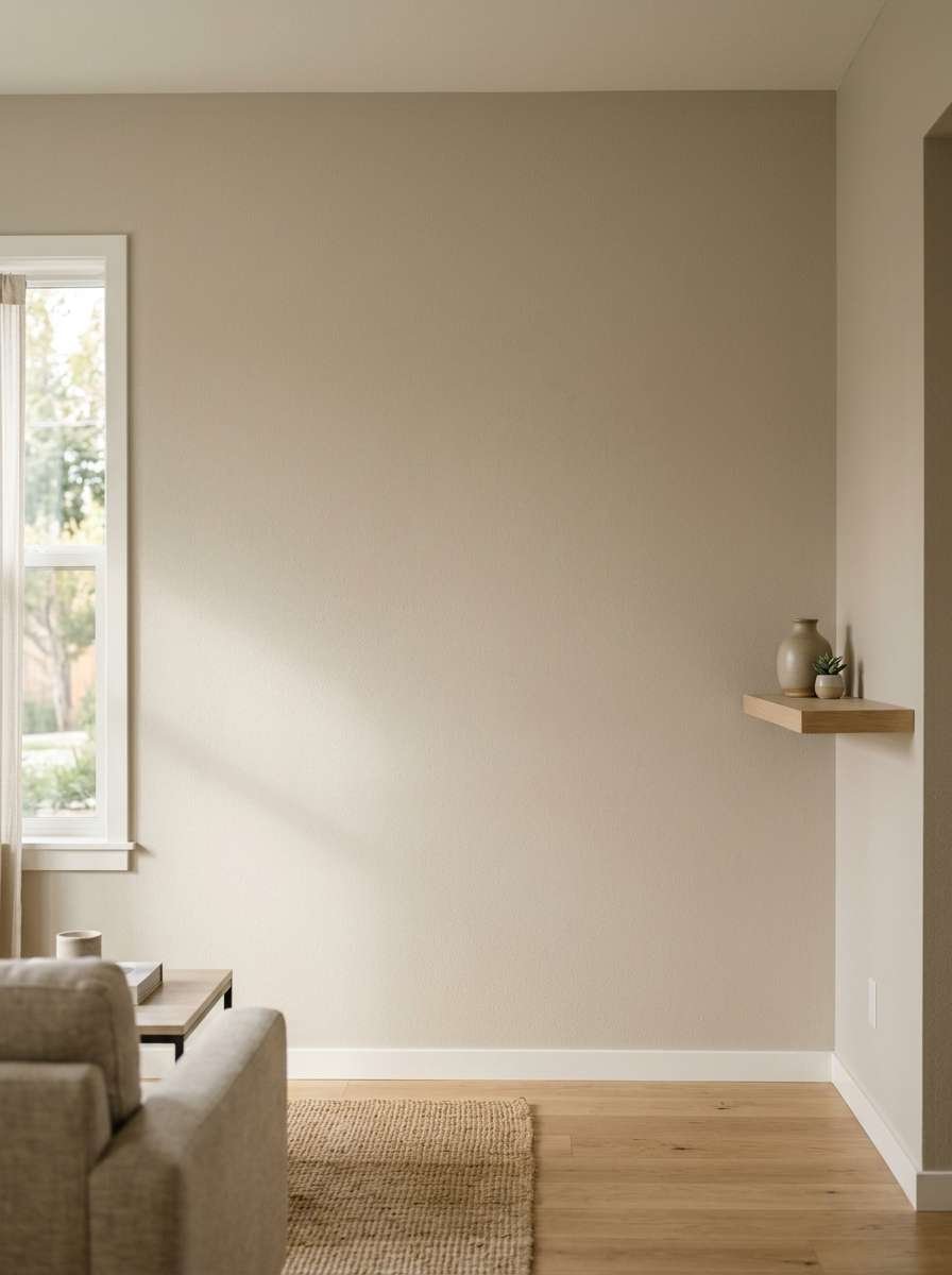
Minimalist doesn’t mean empty. It means every piece earns its spot.
A blank wall isn’t a failure. It’s breathing room for the one or two pieces that matter.
I learned this the hard way after crowding a 12-foot wall with six mismatched frames.
Guests kept asking what happened, not in a good way.
Pull two or three pieces down before you add anything new. You’ll be surprised how much better the survivors look on their own.
There’s a practical reason this works, not just an aesthetic one.
Your eye needs somewhere to land. Give it ten competing objects and it never settles anywhere, so the whole room reads as busy even if nothing in it is objectively ugly.
Give it one or two, and suddenly the room feels considered, even if you only spent an afternoon on it.
I’d also push back gently on the idea that minimalist has to mean cold or sterile. Some of my favorite rooms lean minimal but still feel warm, mostly because of texture, not color.
A wool throw, a wood frame, a slightly imperfect ceramic vase. None of that is “more decor.” It’s just decor with a little soul in it.
One more thing before the list: measure twice, hang once, and hang lower than you think you should.
Art hung too high is probably the single biggest wall decor mistake I see in living rooms, minimalist or otherwise.
Center your main piece around eye level while seated, since that’s where people actually look most of the time in a living room.
Statement pieces that do the heavy lifting
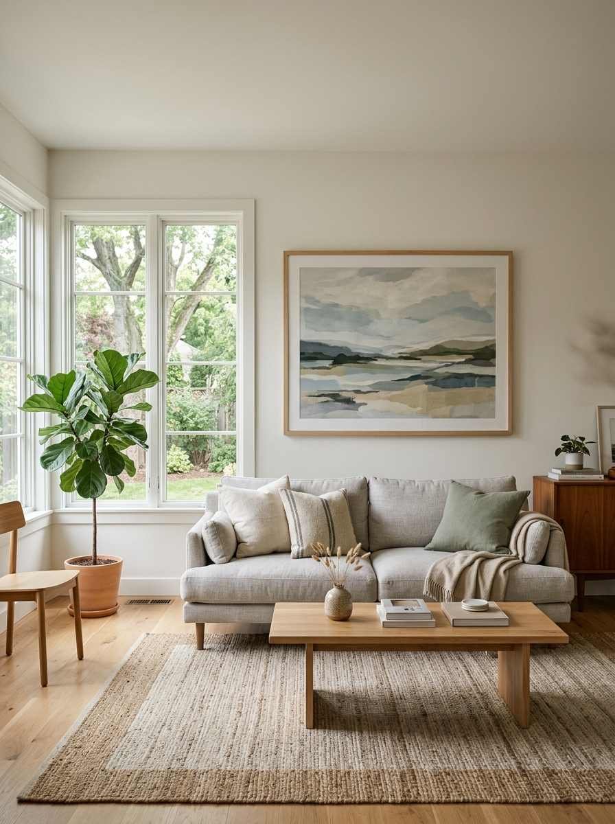
A statement piece isn’t about being loud. It’s about being the one thing in the room you’d actually miss if it disappeared.
Everything below can carry an entire wall on its own, no backup needed.
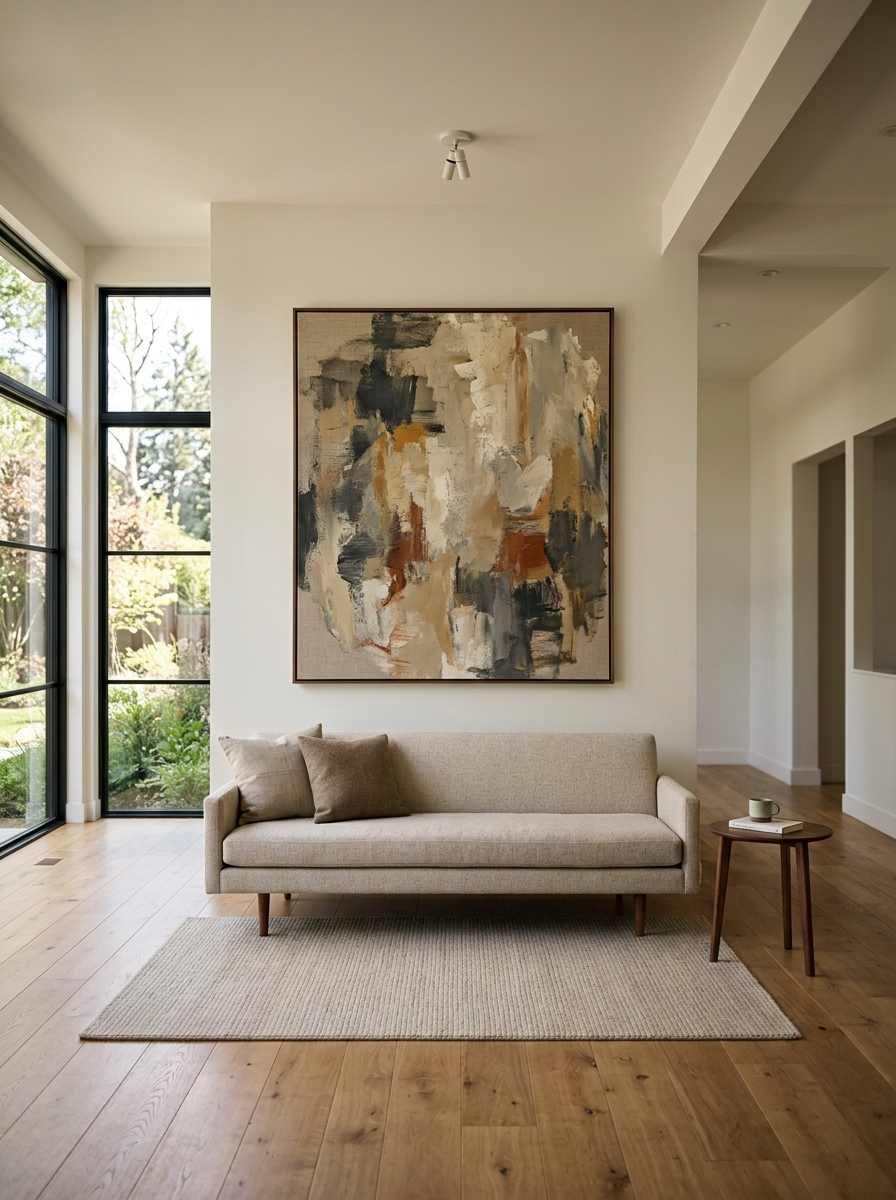
1. One oversized abstract canvas.
A single large painting reads as intentional in a way five small ones never do. Go bigger than feels comfortable; a piece that’s too small for the wall is the most common decorating mistake I see.
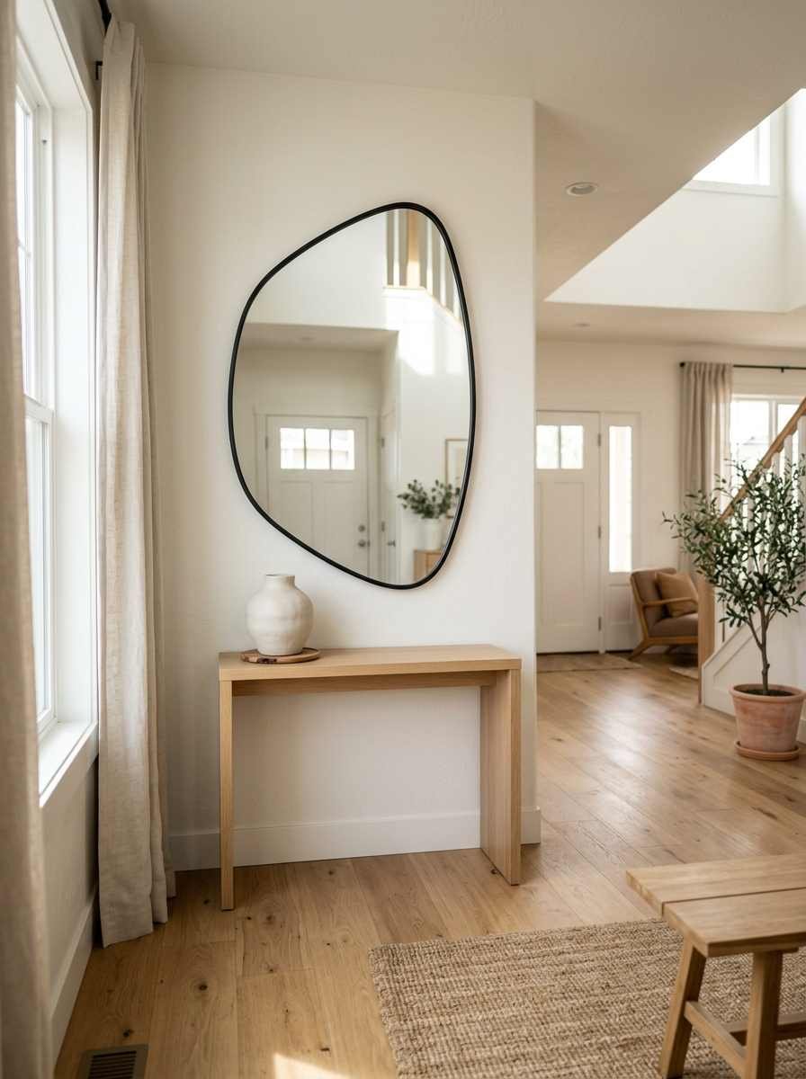
2. A sculptural mirror. Arched, round, or asymmetric frames bounce light around the room and make a small living room feel wider.
I put a 40-inch round mirror over my console table and the whole entryway opened up.
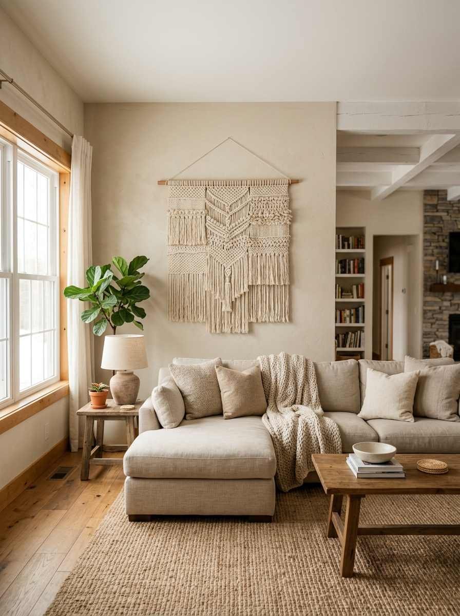
3. Woven or fiber wall art. Texture without color is still texture. A cream or oatmeal wall hanging adds warmth to an all-white room without breaking the palette.
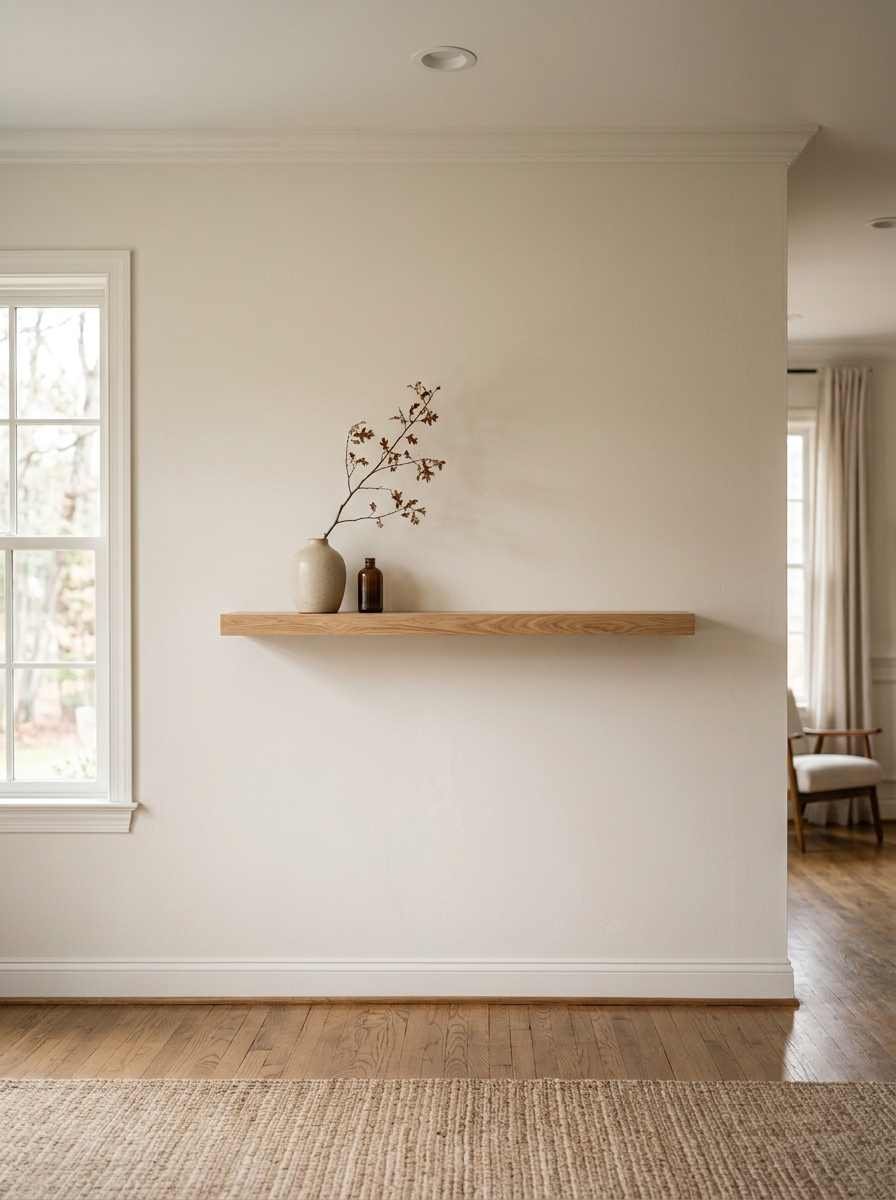
4. A single floating shelf with one object. Not a shelf crammed with trinkets. One ceramic vase, one small plant, nothing else. It sounds too simple to work. It works.
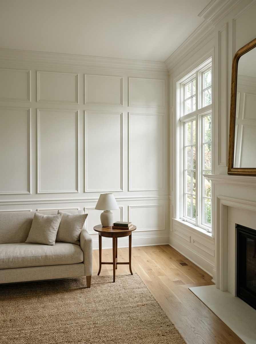
5. Architectural wall molding. Paint-grade picture frame molding, painted the same color as the wall, gives you texture and shadow lines with zero clutter.
This is my personal favorite for renters who can’t hang heavy art anyway, though double check with your landlord before you start drilling into anything structural.
Pick one from this group and stop there for now.
Adding a second statement piece too soon is how a minimalist wall quietly turns into a cluttered one, and you won’t even notice it happening until a friend points it out (mine did, gently, over wine).
Gallery walls, but make it minimal
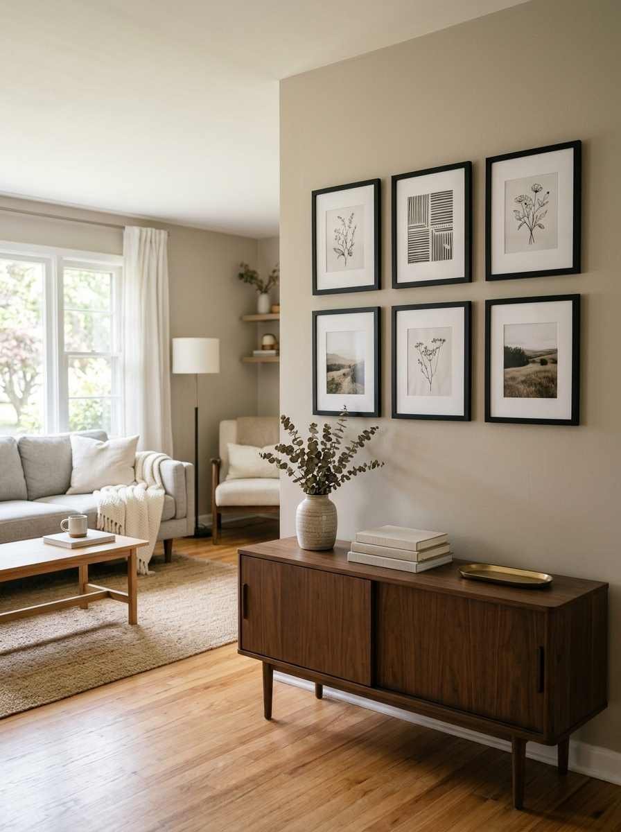
Gallery walls get a bad reputation in minimalist circles, and honestly, that’s a little unfair. The problem was never the format.
It was random frames from four different decades, hung with zero plan, filling every inch of wall out of guilt because you already own the art.
A gallery wall can absolutely be minimalist if you treat it as one composition instead of a dumping ground.
6. A tight three-frame row. Three same-size black frames in a straight horizontal line above the sofa. Clean, easy to level, hard to mess up.
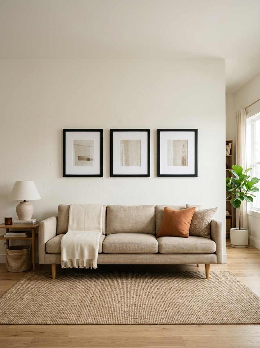
7. Monochrome photography only. Skip color photos entirely and stick to black and white. It reads as curated instead of thrown together.
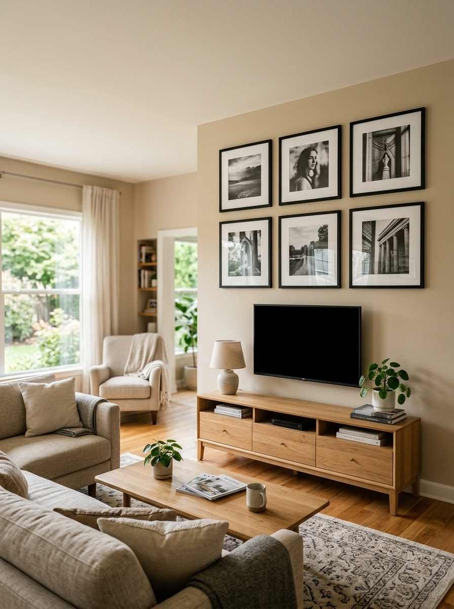
8. Odd-numbered clusters. Three or five pieces, never four or six. Something about even numbers makes a cluster look accidental rather than composed.
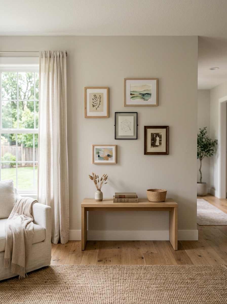
9. Matching frame color, mixed sizes. Keep every frame in the same finish (all matte black, all natural oak) and let the sizes vary. According to design advice on Homes & Gardens’ gallery wall guide, mixing textures and orientations within one cohesive frame family is what separates a designed wall from a cluttered one.
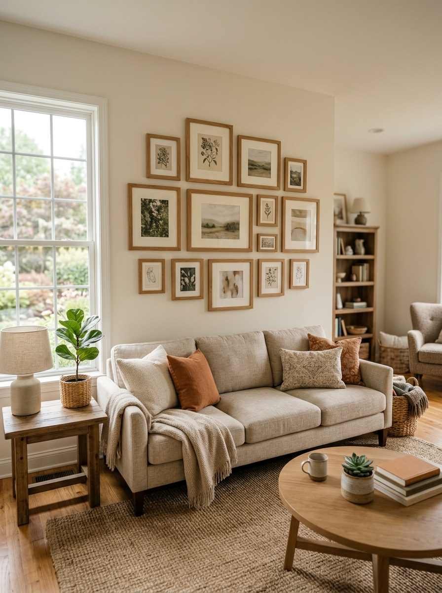
10. Negative space between frames. Leave more air between pieces than feels natural at first. I space mine at least 3 inches apart minimum, sometimes closer to 5.
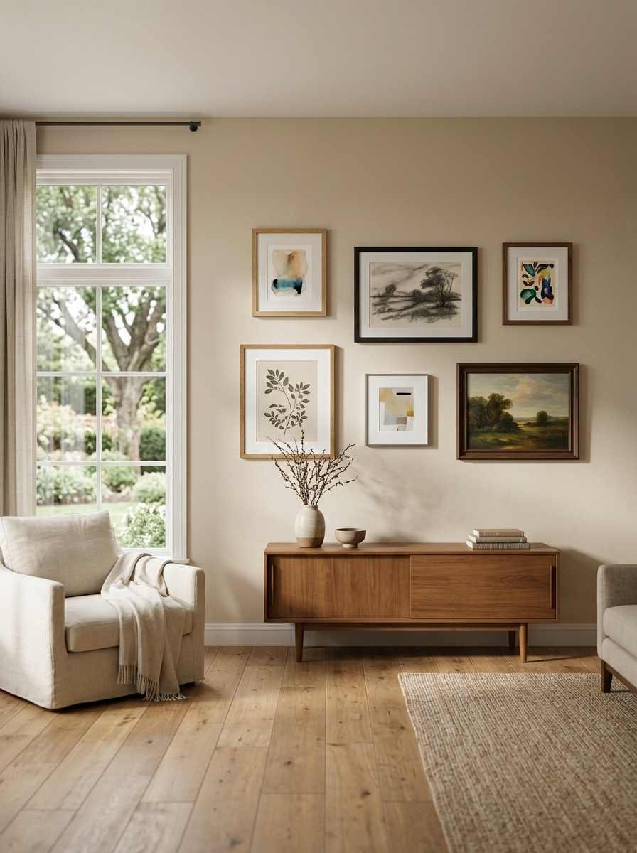
Texture, material and shadow
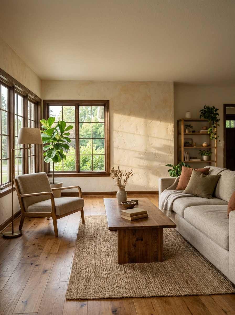
This is the group I recommend most often when someone tells me their minimalist living room feels flat instead of calm. Flat usually means everything is smooth, matte, and one texture. The fix isn’t more stuff, it’s more surfaces.
11. Plaster or lime wash finish. A hand-troweled plaster wall on one accent wall gives depth without a single object hung on it.
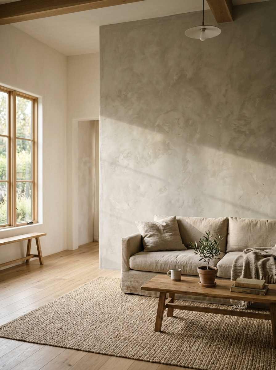
12. Wood slat paneling. Vertical slats, painted or natural, add rhythm and shadow lines. Works especially well behind a TV or sofa.
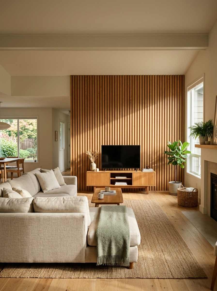
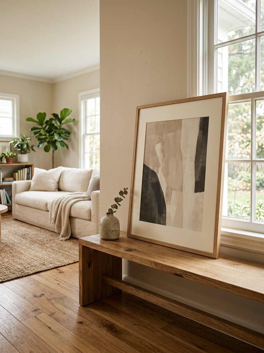
13. A leaning piece instead of a hung one. Lean a large framed print against the wall on a console or the floor. It looks collected, not installed, and you can swap it in thirty seconds.
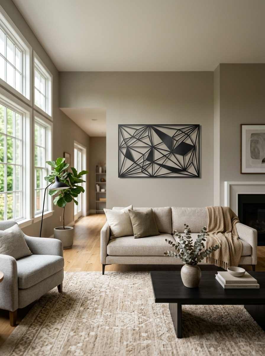
14. Metal wall sculpture. A single geometric metal piece, matte black or brushed brass, gives you dimension that flat art can’t.
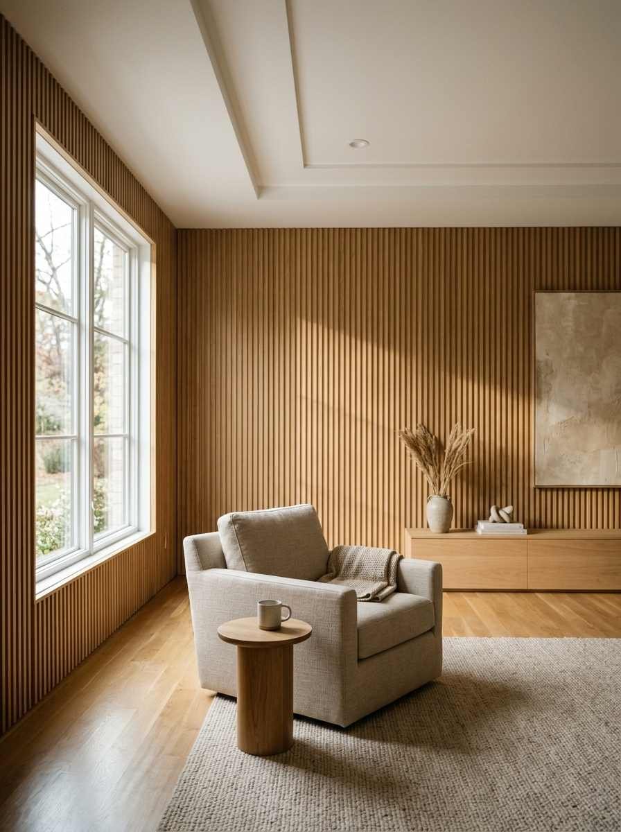
15. Fluted or reeded wall panels. These have shown up everywhere the last two years for good reason. The vertical grooves catch light differently throughout the day, so the wall never looks static.
Color, light and negative space
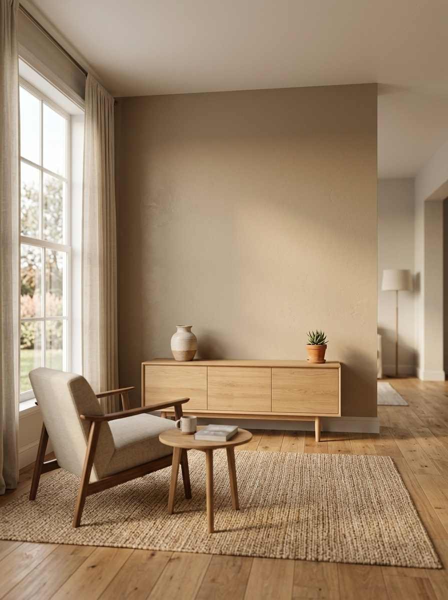
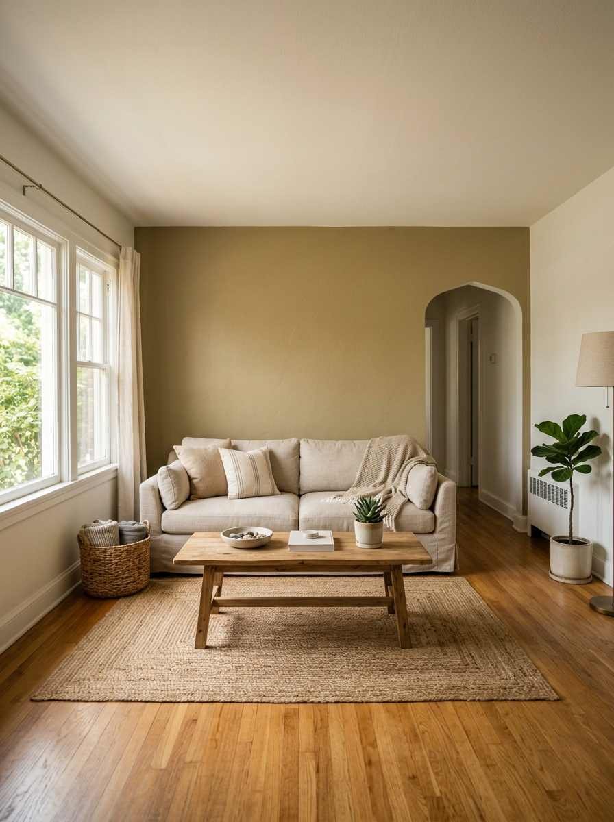
16. One warm neutral accent wall. Sherwin-Williams named Universal Khaki its 2026 color of the year, and it’s a genuinely good pick for minimalist rooms because it reads warm without fighting your existing furniture.
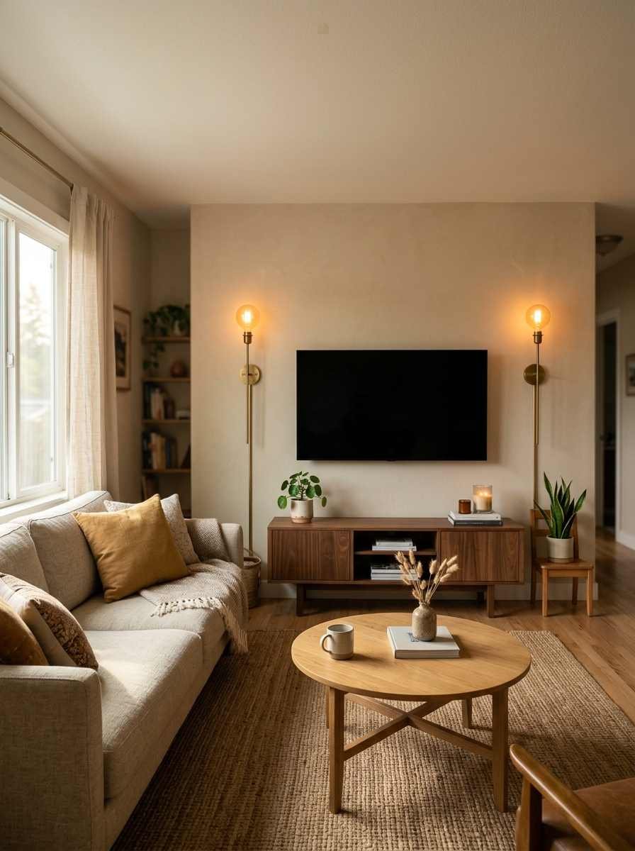
17. Wall sconces instead of art. Two slim sconces flanking a sofa or media unit do decorative work without needing a single frame.
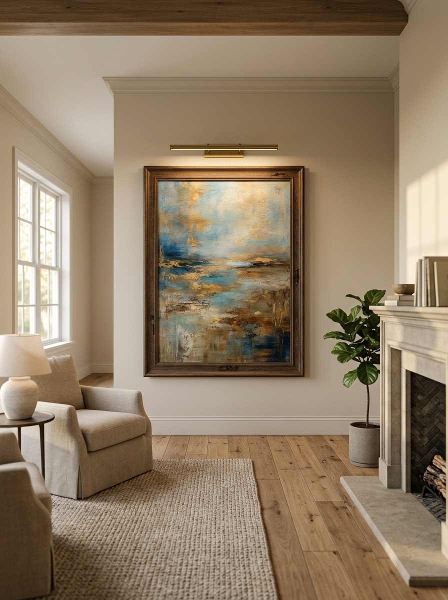
18. A picture light over one piece. A brass picture light above your best art piece turns it into the obvious focal point the second someone walks in.
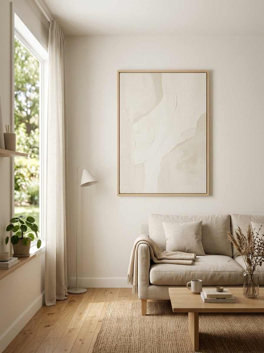
19. Off-white on off-white. A cream abstract print on a warm white wall. Barely-there contrast, but it photographs beautifully and feels calm in person too.
Function-first decor for small or rented living rooms
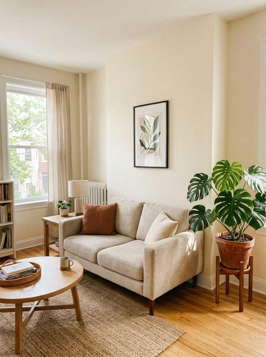
20. Command-strip friendly frames. Lightweight prints in slim frames mean no drilling, which matters if you’re renting or just hate patching walls (same, honestly).
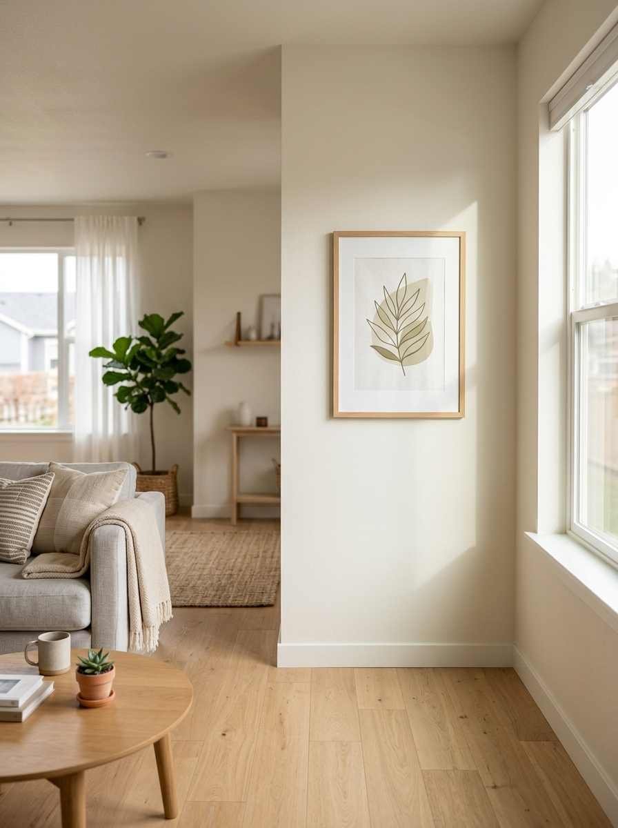
21. A single large plant, no wall art at all. A fiddle leaf fig or olive tree in the corner can outperform a wall full of art in a small room. IMO this is the most underrated minimalist move there is.
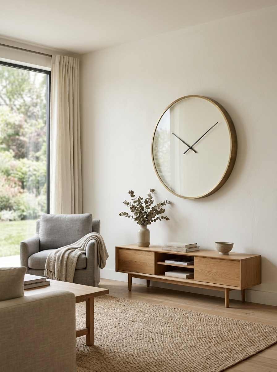
22. A clock as the only wall object. One oversized minimalist clock face does double duty as decor and as, well, an actual clock.
23. A woven basket or two, stacked. Hang two or three flat woven baskets in a slightly offset vertical line for texture that costs under $40 total.
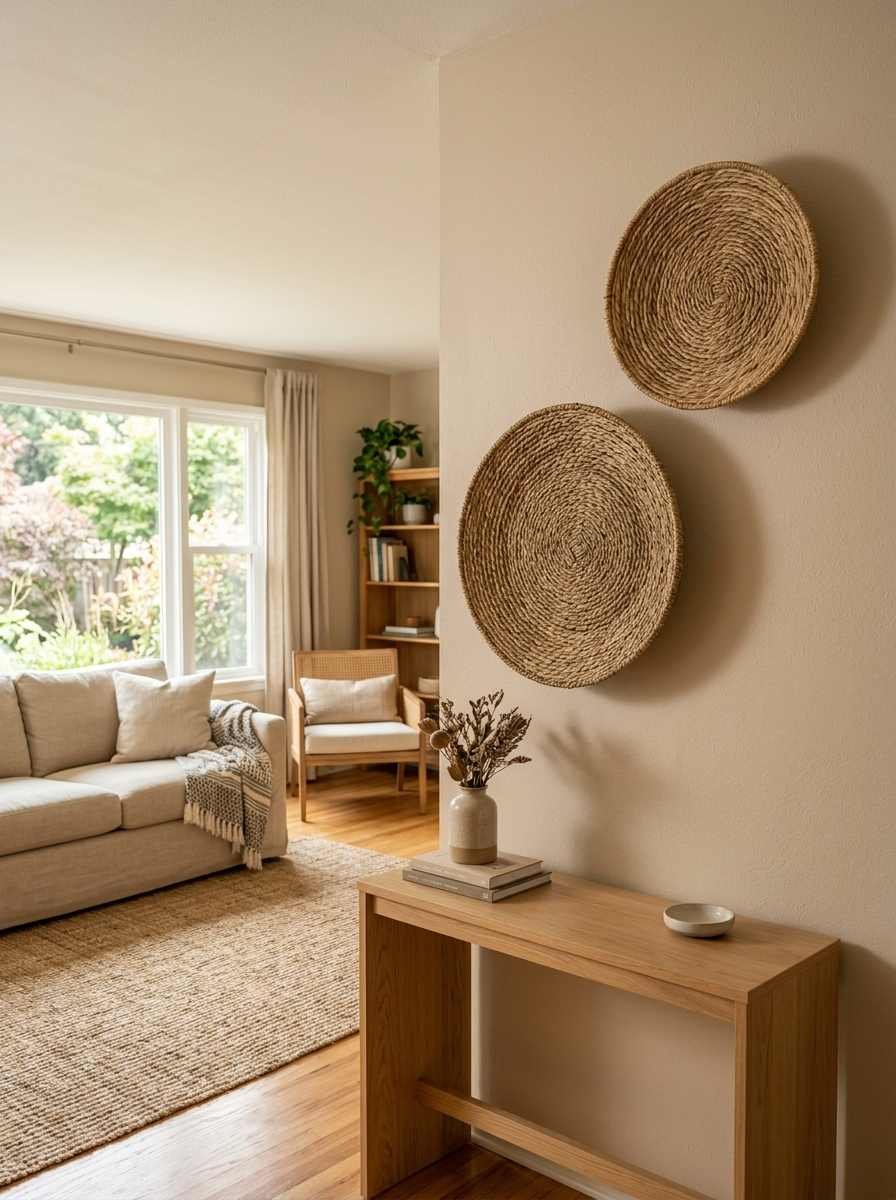
24. Nothing at all on one wall. Seriously. Pick your emptiest, most awkward wall and just leave it. One bare wall in a room full of decor makes everything else look more deliberate.
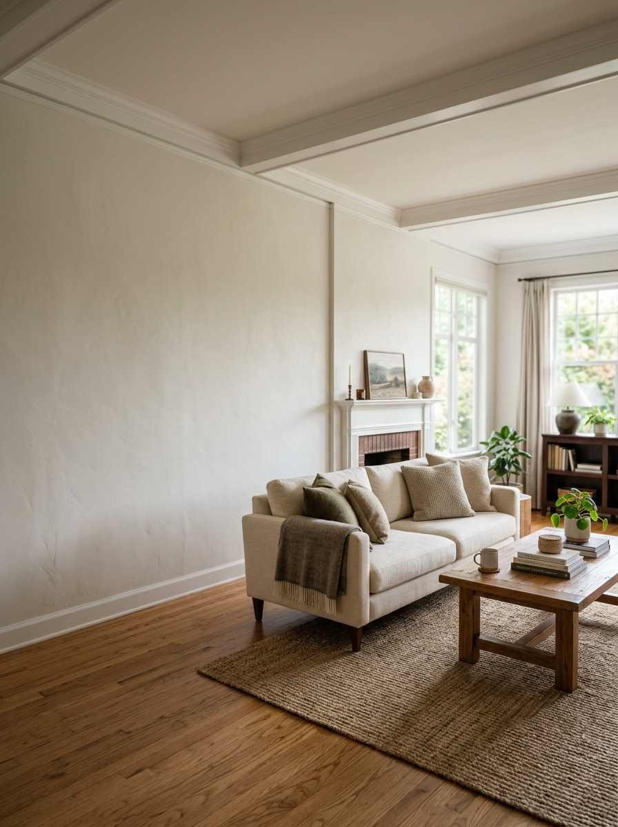
Small side note, because I can’t help myself: I once spent an entire Saturday debating whether to hang art above a radiator, decided against it, and then spent three more months staring at that blank spot wondering if I’d made a mistake. I hadn’t. Sometimes the empty spot really is the decision.
Quick comparison: which idea fits your room
| Room situation | Best pick from this list | Why it works |
|---|---|---|
| Renting, can’t drill | Leaning frame or command-strip print (#13, #20) | No wall damage, easy to swap |
| Small living room | Oversized mirror or single plant (#2, #21) | Opens up the space visually |
| Big blank wall | Oversized canvas or fluted panels (#1, #15) | Fills scale without clutter |
A few things worth checking on Pinterest before you commit
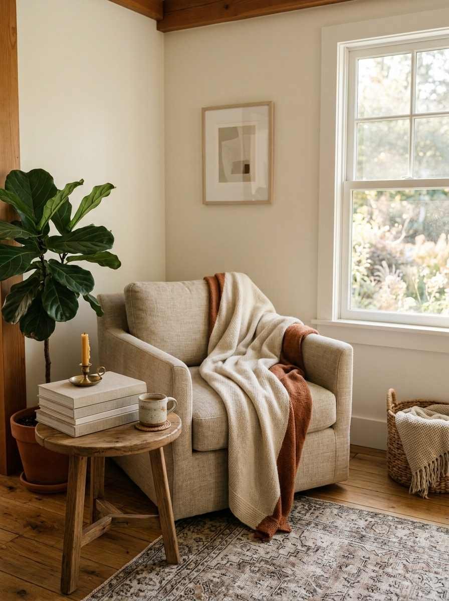
Trends move fast, and what looked fresh two years ago can start to feel dated.
Pinterest’s annual trend report has been a genuinely useful gut-check for me before buying anything for the walls, since it tracks what people are actually searching for months ahead of when it shows up in stores.
Save a board, pin a handful of rooms you actually like (not just admire), and look for the pattern.
Usually it’s simpler than you think: same color family, same frame finish, same amount of empty space.
FAQs
How many pieces of art is too many for a minimalist living room? For most living rooms, 2 to 4 focal pieces is the ceiling.
Past that, you’re back to a gallery wall, which is fine, just not minimalist anymore. Count furniture and plants as “pieces” too, since a busy shelf can cancel out a calm wall.
Do I need to spend a lot to get this look? Not really. A $30 print in a good frame beats a $300 print in a bad one.
Frame quality and spacing do more visual work than the art itself, and I’d rather see someone spend their whole budget on one great frame than split it across five mediocre ones.
What wall color works best behind minimalist art? Warm whites and soft neutrals, like Universal Khaki mentioned above, tend to make art pop without competing for attention. Stark white can work too, but it’s less forgiving of imperfect lighting, and it shows every scuff and shadow a lot faster than a warmer tone does.
Final thought
Twenty-four ideas is a lot to look at in one sitting, so don’t try to use them all. Pick two, maybe three, and give the rest of the wall permission to stay empty.
Which one are you trying first, the leaning frame or the bare wall? I’d genuinely love to know.
