
Have you ever walked into a bedroom and thought, “Why does this feel so put-together?” Nine times out of ten, it’s the wardrobe and wall color doing all the heavy lifting.
It’s one of those small details that makes a massive difference, and honestly, I didn’t realize it until I repainted my own bedroom last year and everything just… clicked.
So if you’re planning a room makeover or just curious about what combos actually look expensive (without the expensive price tag), you’re in the right place. Let’s get into it.
Why Wardrobe and Wall Color Pairing Actually Matters
Most people pick a wardrobe color, then paint the walls whatever feels “safe.” Big mistake. The two elements need to work together — like a team, not strangers sharing a room.
When you get the pairing right, the space feels curated, luxurious, and intentional. Get it wrong, and even a ₹50,000 wardrobe can look blah against the wrong wall.
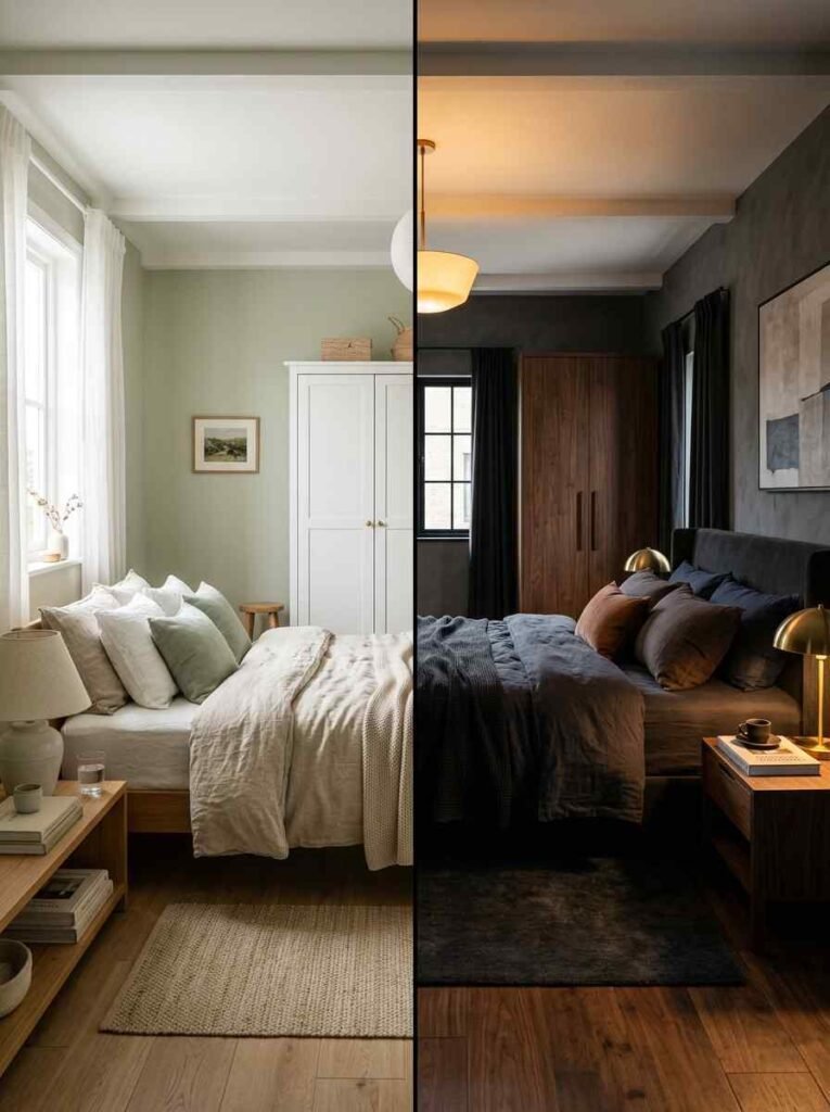
I’ve made this mistake personally. I had a gorgeous walnut-finish wardrobe against a plain white wall, and it looked… fine. Not wow. Just fine. The moment I switched to a warm greige wall? Instant glow-up. IMO, color pairing is the most underrated interior design skill out there.
Quick Reference: Popular Combos at a Glance
| Wardrobe Color | Wall Color | Vibe | Best For |
|---|---|---|---|
| White gloss | Dusty sage green | Fresh, airy | Small bedrooms |
| Dark walnut | Warm greige | Rich, grounded | Master bedrooms |
| Charcoal grey | Off-white/cream | Modern, sleek | Minimalist spaces |
| Navy blue | Soft blush | Bold, luxe | Statement rooms |
The Classic Combos That Never Fail
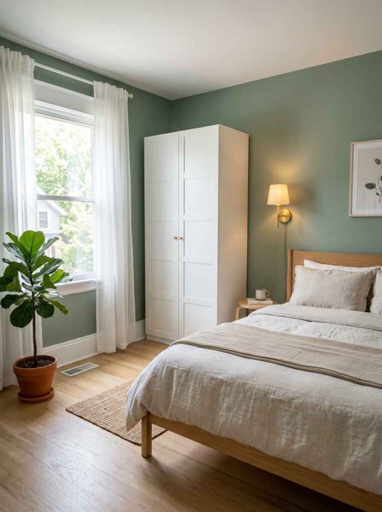
White Wardrobe + Sage Green Walls
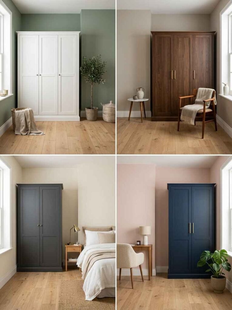
This is the combo that just works, every single time. White wardrobes reflect light beautifully, and sage green walls bring in that calm, organic energy without going full forest-vibes.
It’s fresh, it’s clean, and it photographs incredibly well (great if you’re going for that Pinterest-worthy bedroom look).
I used a similar pairing in my guest room and people genuinely think I hired an interior designer. Spoiler: I did not. 🙂
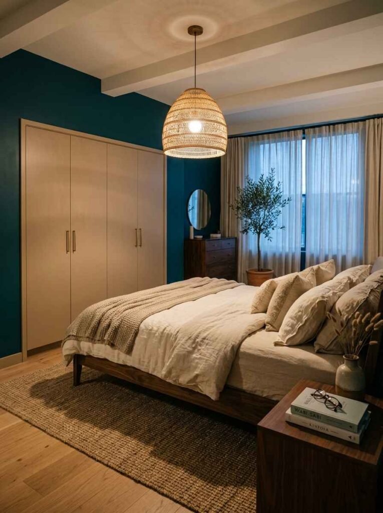
Beige Wardrobe + Deep Teal Walls
Okay, this one sounds risky on paper — but trust me, it’s stunning. Beige wardrobes are warm and understated.
Deep teal walls give the room a moody, boutique-hotel quality that feels expensive. The contrast is bold without being aggressive.
The key is keeping the rest of the room neutral — light bedding, simple fixtures. Let the wall do the talking.
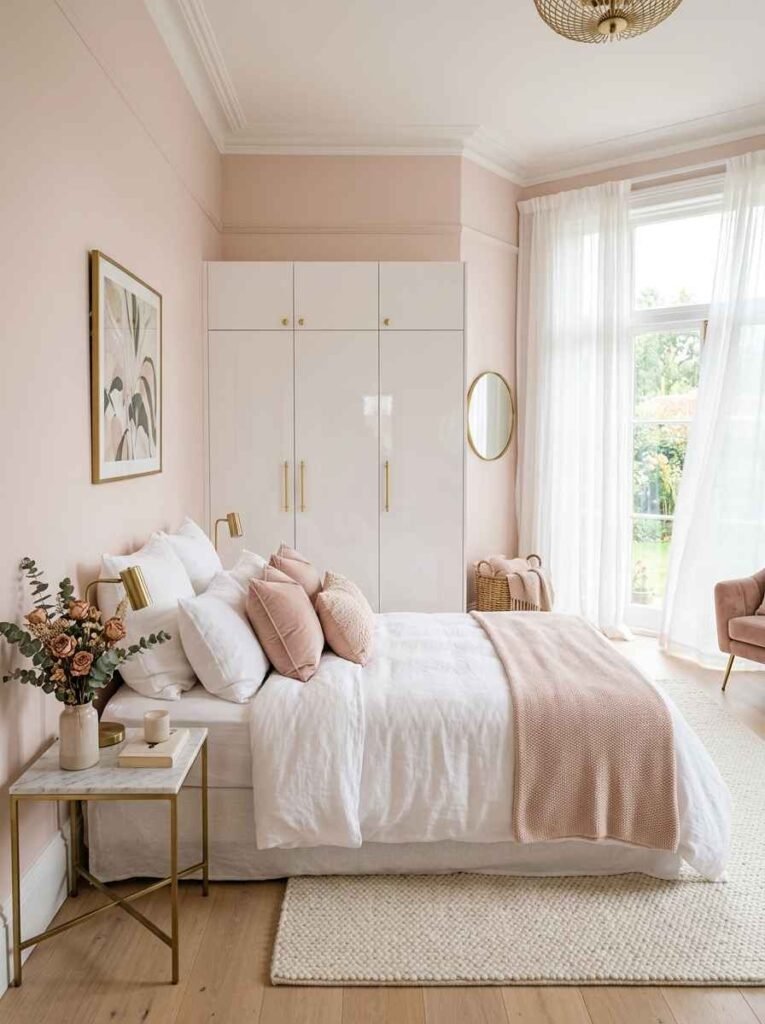
White Wardrobe + Blush Pink Walls
Soft, romantic, and genuinely luxurious-looking. Blush pink has this quality of making white furniture look even brighter and more premium.
This combo works especially well in smaller rooms because the warmth of blush pink makes the space feel cozy rather than cramped.
It’s not just a “girly room” thing either — when done right, with gold or brass hardware accents, this pairing feels like a five-star hotel suite.
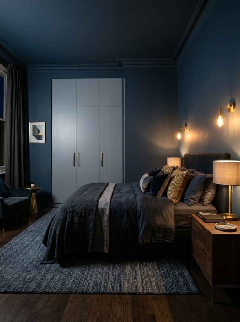
Grey Wardrobe + Navy Blue Walls
This is the combo for people who want drama without chaos. Navy blue is rich and deep, and when you pair it with a cool grey wardrobe, you get this beautifully masculine, refined aesthetic.
Add some brass or gold accents and you’ve basically recreated a luxury showroom in your bedroom.
Honestly though, navy blue can make a room feel smaller if you’re not careful with lighting. Make sure you have good ambient light — natural or artificial.
The Trending Combos Everyone’s Talking About Right Now
Charcoal Wardrobe + Off-White/Cream Walls
Minimalists, this one’s for you. A charcoal wardrobe against cream or off-white walls creates this effortlessly sleek, modern look. It’s the design equivalent of a well-cut black blazer — simple, clean, and always appropriate.
What I love about this combo is how versatile it is. You can add pops of color through cushions or artwork without the base feeling overwhelming. The wardrobe becomes an anchor, not a statement piece.
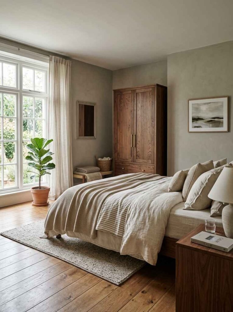
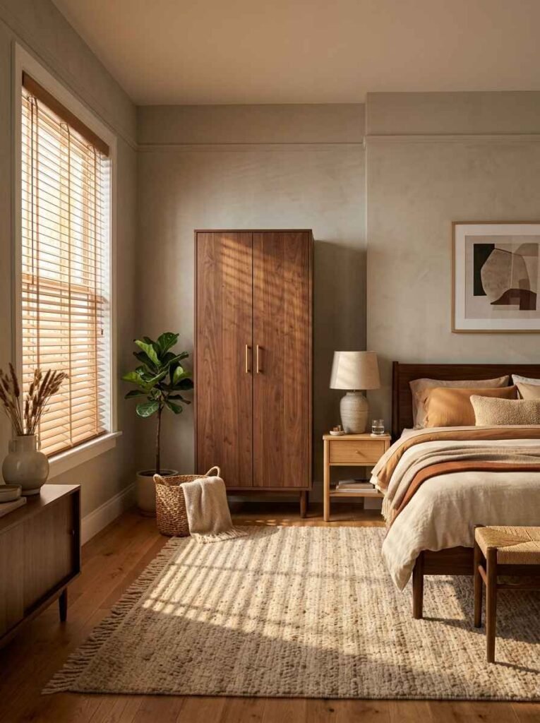
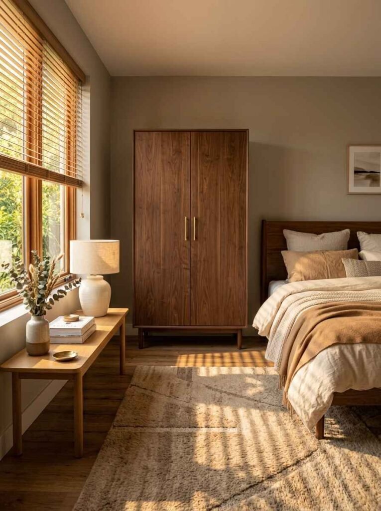
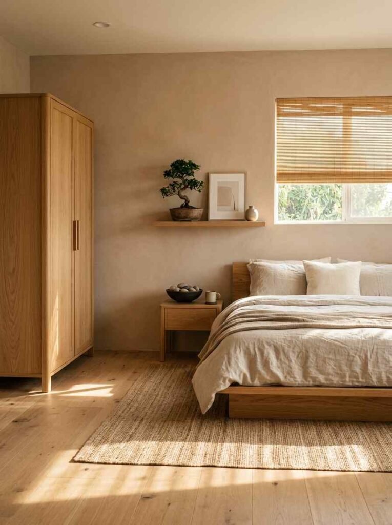
Walnut Finish + Warm Greige Walls
Greige (grey + beige, if you’re new to the term) is basically the neutral that fixed all my interior design problems.
Pair it with a walnut or wood-finish wardrobe and you’ve got warmth, depth, and that organic luxury look that’s everywhere in 2024–2025.
This walnut-toned wardrobe pairs beautifully with greige or earthy wall tones and gives that mid-century modern feel instantly.
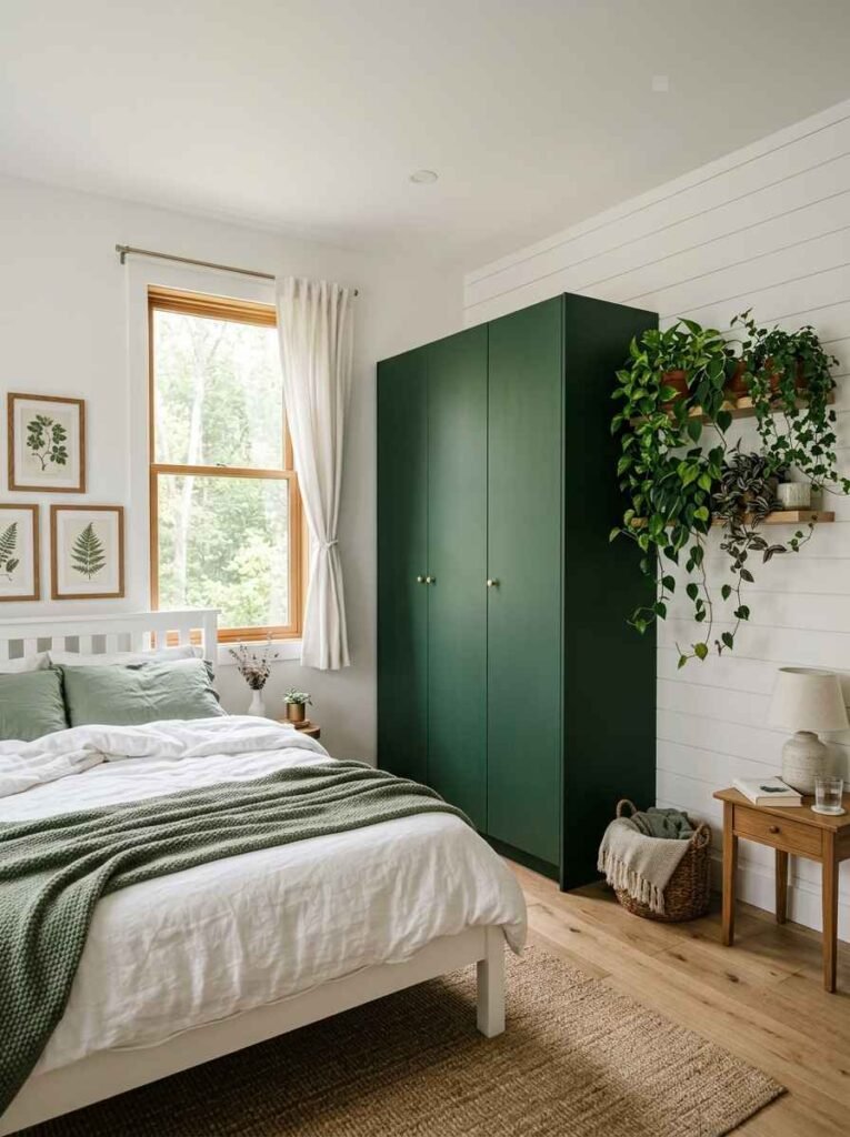
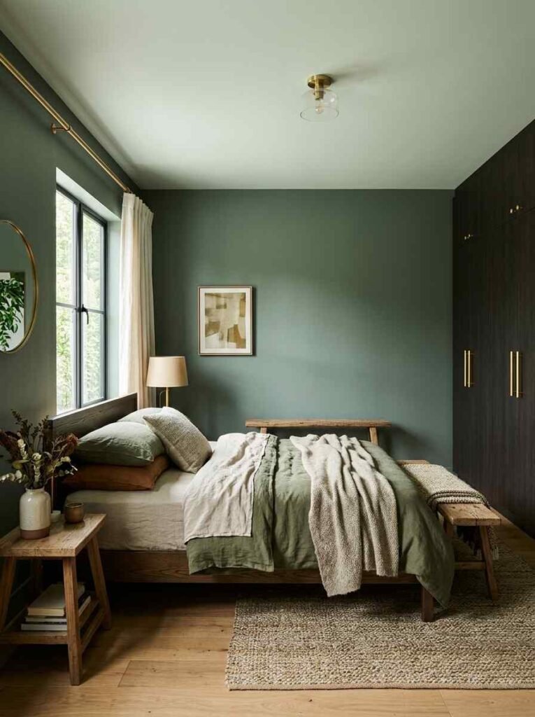
Dark Green Wardrobe + White Walls
Wow! This one is having a serious moment right now. Dark green (think forest green or hunter green) wardrobes against crisp white walls feel incredibly expensive and editorial.
It’s like bringing the outside in without committing to a full botanical theme.
If you’re nervous about committing to a dark-colored wardrobe, this pairing is actually very forgiving — the white walls balance out the boldness of the green perfectly.
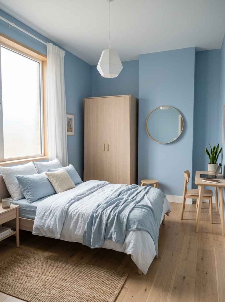
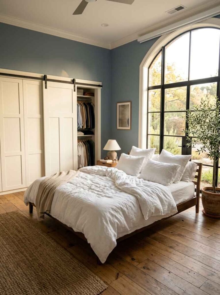
Light Oak + Dusty Blue Walls
Light oak finishes have this natural, Scandinavian quality that pairs brilliantly with dusty or powder blue walls.
The result is calm, collected, and genuinely beautiful. This is also one of the most “timeless” combos on this list — it won’t feel dated in five years.
I tried a version of this in my home office and it made working from home feel significantly less miserable. Highly recommend.
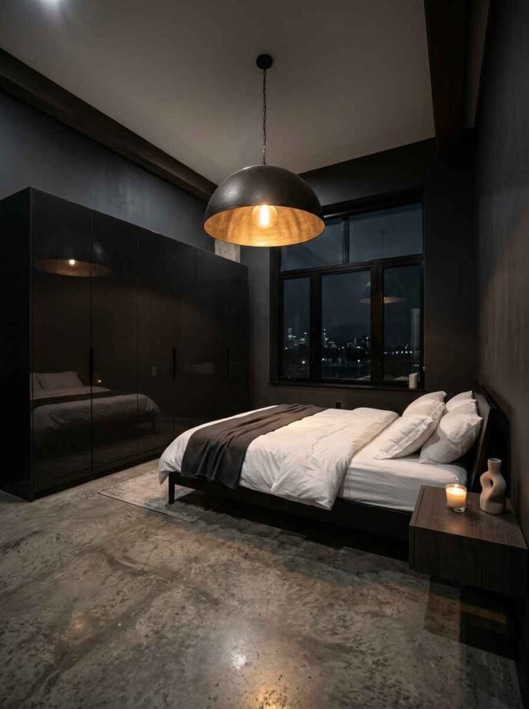
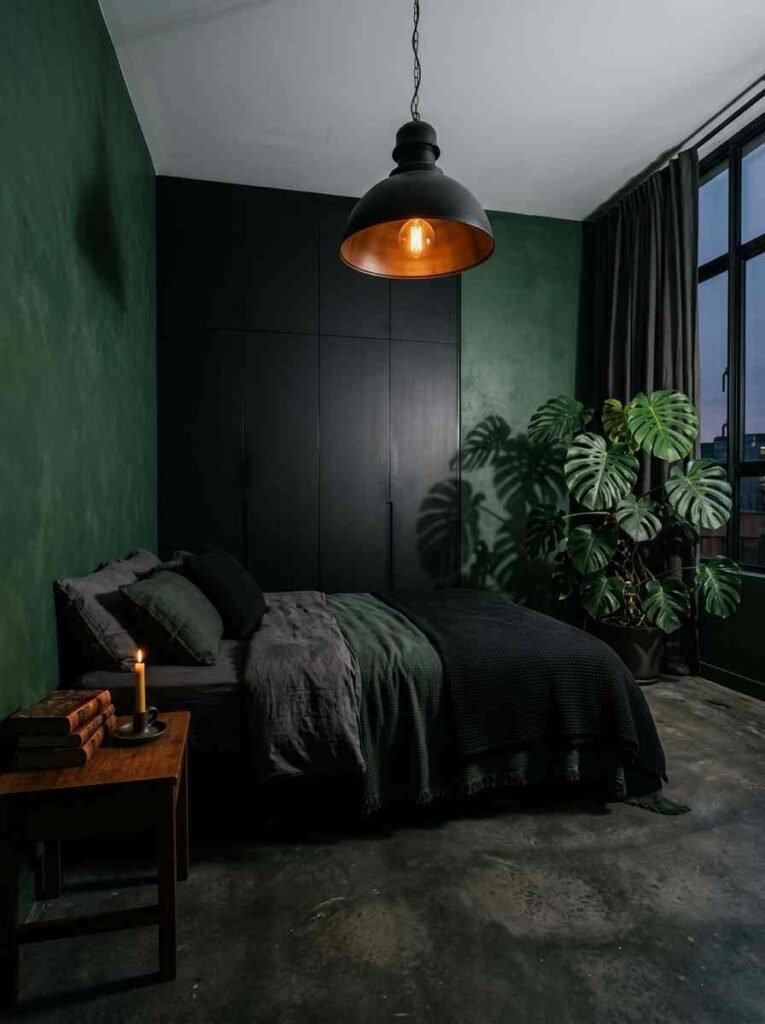
Black Wardrobe + Dark Charcoal Walls
For the bold ones. This is a tonal look — darker wardrobe against a dark wall — and it shouldn’t work, but it absolutely does.
The trick is texture: matte walls against a glossy or handleless wardrobe creates just enough contrast to separate the two elements visually.
Add a statement pendant light and this combo looks like it belongs in an architectural digest spread. No joke.
Budget-Friendly Combos That Still Look Premium
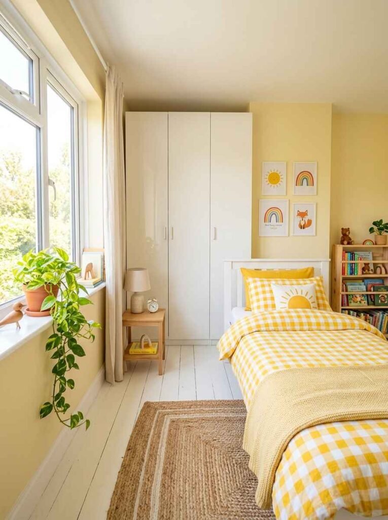
White Gloss + Pastel Yellow Walls
Pastel yellow is underrated. It’s sunny without being aggressive, and against a white gloss wardrobe, it makes the whole room feel bright and happy without any pretension.
This works incredibly well in kid’s rooms or smaller spaces that need some personality.
FYI — pastel yellow also makes wooden floors look warmer, so it’s a win-win if you’ve got timber flooring going on.
Grey Wardrobe + Terracotta Walls
Terracotta is the color of the moment and pairing it with a grey wardrobe is genuinely smart.
The earthiness of terracotta grounds the cool tone of the grey, creating this warm, Mediterranean-inspired aesthetic that feels both modern and timeless.
I’ll be honest — I didn’t think this would work when I first saw it. But seeing it in person? Changed my mind instantly. It’s one of those combos that photographs beautifully too.
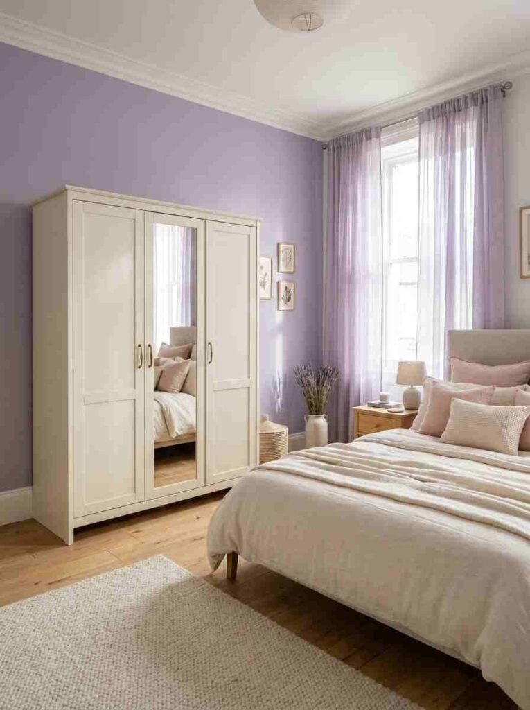
Cream Wardrobe + Soft Lavender Walls
Soft lavender walls are making a comeback and honestly, it’s about time. Paired with a cream or ivory wardrobe, the result is gentle, sophisticated, and surprisingly gender-neutral.
Add some natural linen textures and a few plants and you’ve got a room that feels like a wellness retreat.
Both of these come in cream or light wood finishes that match beautifully with lavender or sage green walls.
Navy Wardrobe + Warm White Walls
Navy is one of those wardrobe colors that instantly looks more expensive than it costs.
Against warm white walls (not cold, bright white — there’s a difference), a navy wardrobe feels rich, classic, and slightly nautical in the best possible way.
Keep the bedding crisp and white, throw in some gold hardware details, and this combo genuinely pops
Statement Combos for People Who Love Bold Choices
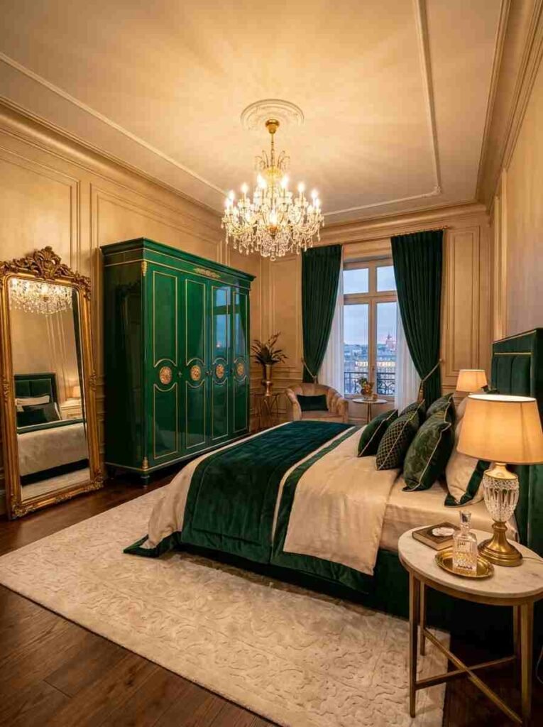
Emerald Green + Champagne/Gold-Toned Walls
This is luxury territory, bro. Emerald green wardrobes are bold, jewel-toned, and absolutely jaw-dropping when paired with champagne or warm gold walls.
It sounds like a lot, but the richness of both tones actually complement each other beautifully.
The key with this combo is restraint everywhere else in the room — simple bedding, minimal décor, clean lines. Let the color do all the work.
Matte Black + Forest Green Walls
Dark on dark, done right. Matte black wardrobes against deep forest green walls create this moody, almost cinematic aesthetic that feels incredibly high-end.
This is the kind of bedroom that makes guests stop and ask, “Wait, did you hire someone?”
Honestly, this trend feels a little maximalist for everyday living, but as a guest room or a creative space? Insane results.
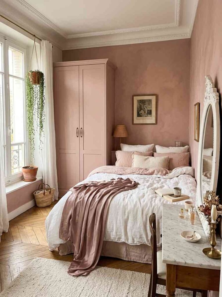
Blush Pink Wardrobe + Dusty Rose Walls
Tonal looks are having a moment, and this one is softer and more subtle than the black-on-charcoal combo.
Blush wardrobes against dusty rose walls create this dreamy, monochromatic effect that feels very French-apartment-chic. It works best in rooms with natural light — the colors really glow in sunlight.
This is a personal favorite of mine. I’d do this in a heartbeat if I had a spare room.
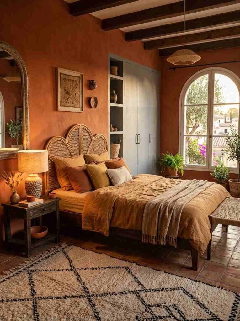
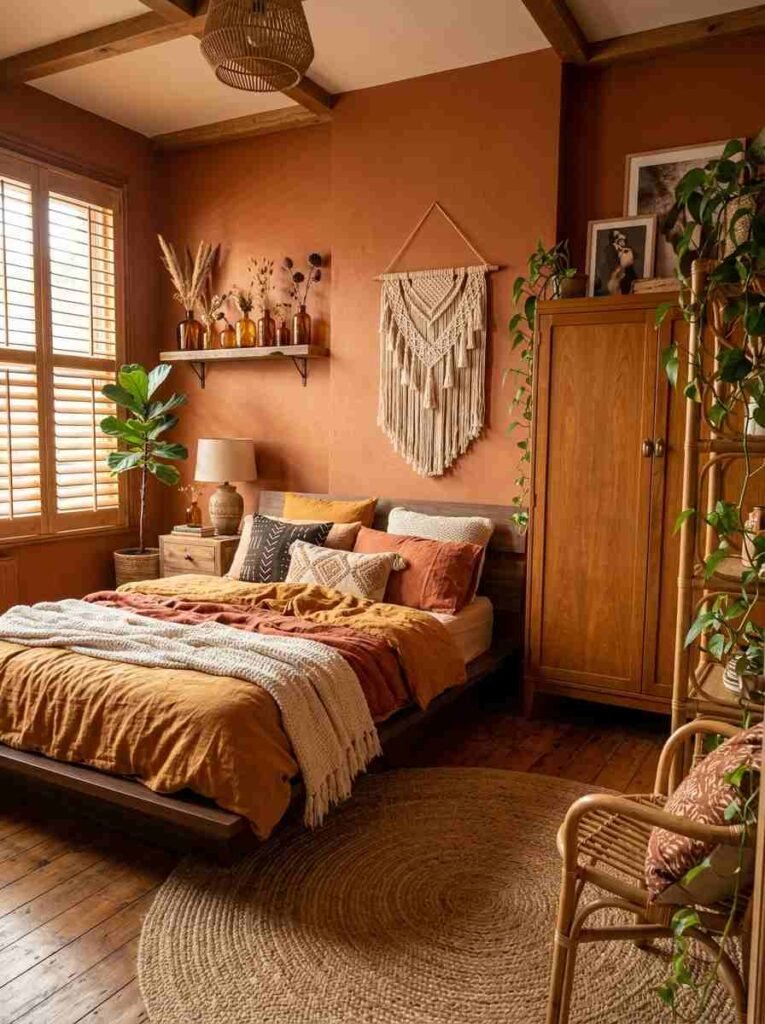
Tan/Caramel Wardrobe + Rust Orange Walls
Warm, earthy, and bold. Tan or caramel-finish wardrobes look incredible against rust orange walls — it’s an autumnal combo that feels grounded and artistic at the same time.
This is a great choice if you’re going for a bohemian or eclectic look without going full maximalist.
For reference, rust orange paint colors I’d recommend looking at include Farrow & Ball’s “Red Earth” or Sherwin-Williams’ “Copper Wire.”
Wardrobe Colors That Work With Almost Any Wall
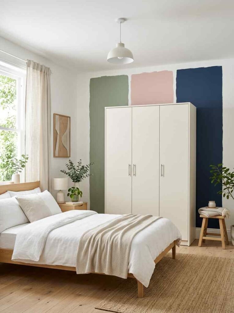
White or Cream Wardrobe
Let’s be real — white and cream wardrobes are the chameleons of interior design. They work with virtually any wall color, from deep navy to blush pink to forest green.
If you’re nervous about committing to a wardrobe color, white or cream is a safe and genuinely stylish bet.
The key is in the finish — gloss white feels more modern and sleek, while matte cream feels softer and more classic.
Light Wood/Oak Finish
Light wood finishes (like ash or light oak) are similarly versatile. They bring warmth and texture to any color palette without dominating the space.
Pair with almost any wall color and it works — blue, green, grey, terracotta, you name it.
This one’s a great pick if you want a light wood finish that works across multiple color palettes.
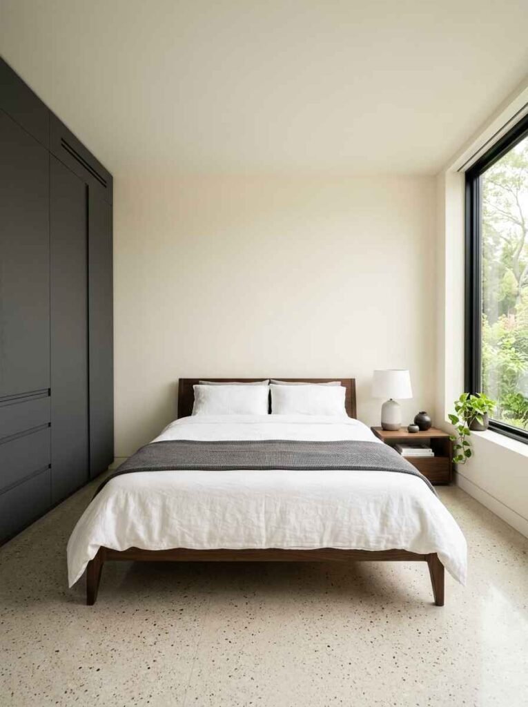
Charcoal or Dark Grey
Charcoal wardrobes are the grown-up version of black — a little softer, a little more versatile.
They pair well with light walls (cream, white, pale blue) but also hold their own against darker, moodier tones. If you want drama without total commitment, charcoal is your best friend.
Tips to Make Any Combo Look More Expensive
Use Matte Paint, Not Gloss
Gloss paint on walls can make a space feel cheap and clinical. Matte or eggshell finishes absorb light beautifully and give walls that high-end, editorial quality. This one tip alone will upgrade any combo significantly.
Match Hardware to Accents
Your wardrobe handles, curtain rods, and light fixtures should all speak the same language. Mixed metals look unintentional; coordinated metals look curated.
Gold, brass, and matte black are the most popular choices right now and each has a very different effect.
Don’t Forget the Ceiling
This is the most underrated tip on this list. Paint your ceiling a shade lighter than your walls, or go for a full tonal look with walls and ceiling in the same color family.
It draws the eye up and makes rooms feel taller and more considered.
How to Choose the Right Combo for Your Space
- Small rooms — stick to lighter walls with a medium-toned wardrobe; avoid dark-on-dark
- Large rooms — you can afford to go bolder; dark walls and statement wardrobes look incredible in bigger spaces
- Low-light rooms — warm tones on walls (greige, blush, cream) will compensate for lack of natural light
- High-light rooms — you can experiment freely; almost any combo works when you’ve got great natural light
- I personally love — walnut wardrobes in warm-lit rooms; it just hits different when the light catches the wood grain
- One thing that flopped for me — I tried a white wardrobe against a cool grey wall once. It looked like a hospital corridor. Never again. :/
Useful Resources to Explore Further
For more inspiration and color theory guidance, check out:
- Farrow & Ball Colour Consultancy — brilliant for understanding undertones
- Sherwin-Williams Color Visualizer — free tool to preview wall colors in your room
Both are genuinely useful, and I’ve spent way too many hours on the Sherwin-Williams one personally.
Wrapping It All Up
So there you have it — 24 wardrobe and wall color combos that genuinely look expensive, no interior designer required.
The big takeaway? It’s less about spending more money and more about pairing intentionally. A mid-range wardrobe against the right wall color will always outperform an expensive wardrobe against the wrong one.
My personal top three? Walnut + greige, charcoal + off-white, and blush pink + dusty rose. But honestly, any of these combos will get you there if you trust the process and keep the rest of the room balanced.
Frequently Asked Questions
What is the most versatile wardrobe color for any wall color?
White, cream, and light oak finishes are the most versatile — they work across virtually any wall color without clashing.
Does dark wardrobe color make a room feel smaller?
Not necessarily. A dark wardrobe against a lighter wall actually creates contrast that can make the room feel more defined. Avoid dark wardrobes and dark walls in very small rooms unless you have excellent lighting.
Can I mix warm and cool tones in the same room?
Yes — and honestly, the best rooms usually do. The key is having one dominant tone and using the other as an accent.
For example, a warm walnut wardrobe against a cool dusty blue wall works because the warmth of the wood anchors the coolness of the wall.
Have you tried any of these combos in your own space? I’d genuinely love to know which one you’re leaning toward — drop it in the comments! And if you found this helpful, share it with someone who’s mid-renovation and spiraling. We’ve all been there. 😄