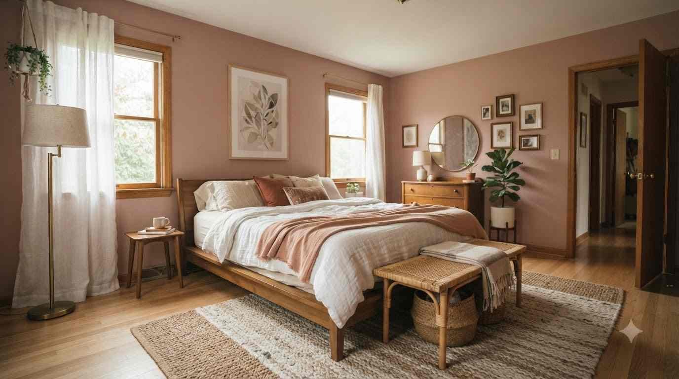
Pink got a glow-up. It’s not the little-girl pink your mom picked out in 1998. It’s moodier, warmer, and honestly a lot more interesting to decorate with.
I redid my own bedroom in shades of pink last year, mostly out of boredom during a rainy weekend, and I haven’t looked back.
FYI, this list comes from actual trial and error, not just scrolling Pinterest boards for an hour (though I did plenty of that too).
If you’ve been saving pink bedroom pins for months and still haven’t pulled the trigger, this is your sign. Let’s get into the 23 trends worth stealing.
Why pink works better than you think
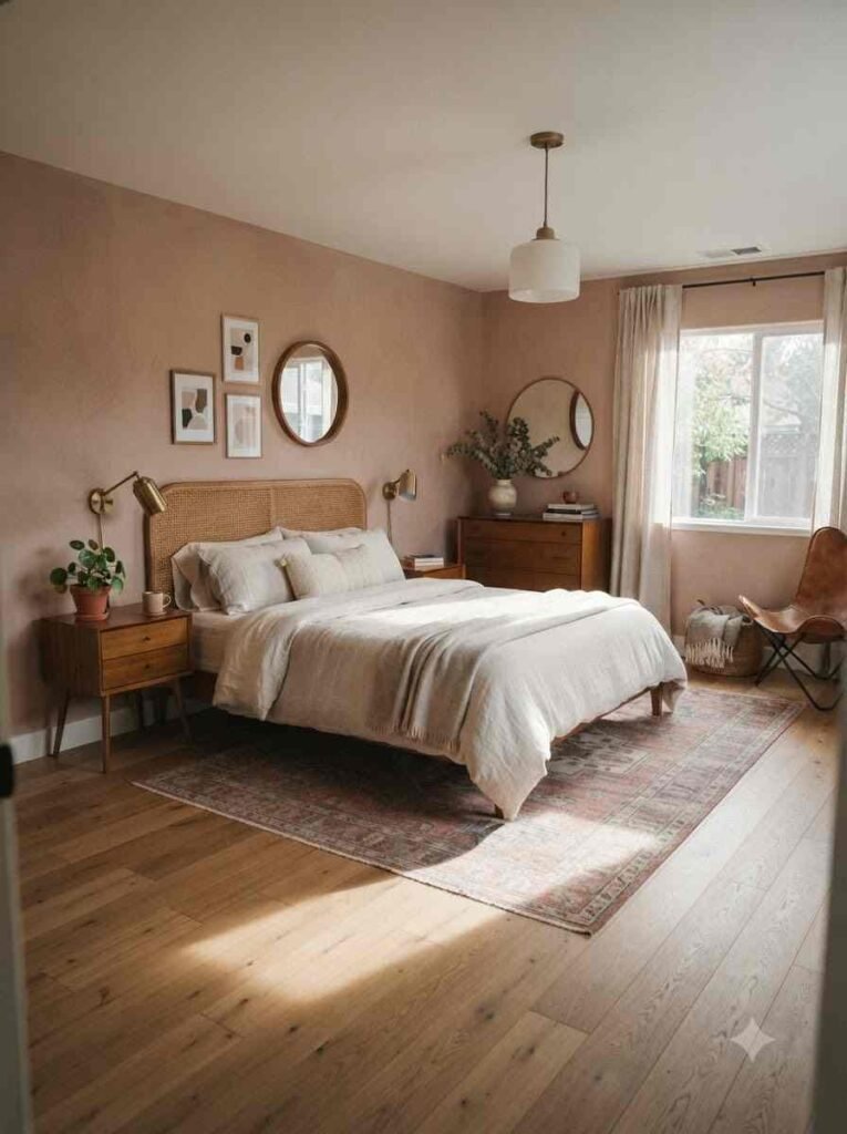
Pink carries a reputation problem. People hear “pink bedroom” and picture cotton candy walls and a plastic vanity. That’s not what we’re doing here.
The right shade of pink reads as warm, grounded, and genuinely sophisticated.
Designers at Sherwin-Williams have pointed to dusty, muted pinks as a steady favorite for bedrooms because they act almost like a neutral, similar to how greige took over living rooms a decade ago.
I’ll admit it: I was skeptical too. My first thought was “won’t this feel like a nursery?” It doesn’t, as long as you pick your shade with intention.
Color palette trends worth copying
Getting the base color right matters more than any accent pillow ever will. Here’s where to start.
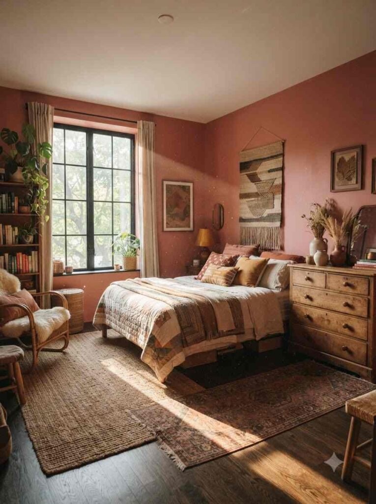
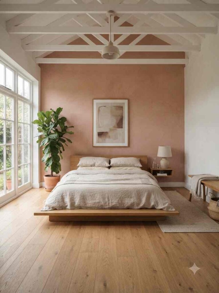
- Terracotta pink. Warm, clay-toned, and it pairs beautifully with wood furniture. This is the shade I went with, and it makes the room feel lived-in rather than staged.
- Dusty rose. Muted, a little gray underneath. Works in almost any lighting, which is more than I can say for brighter pinks.
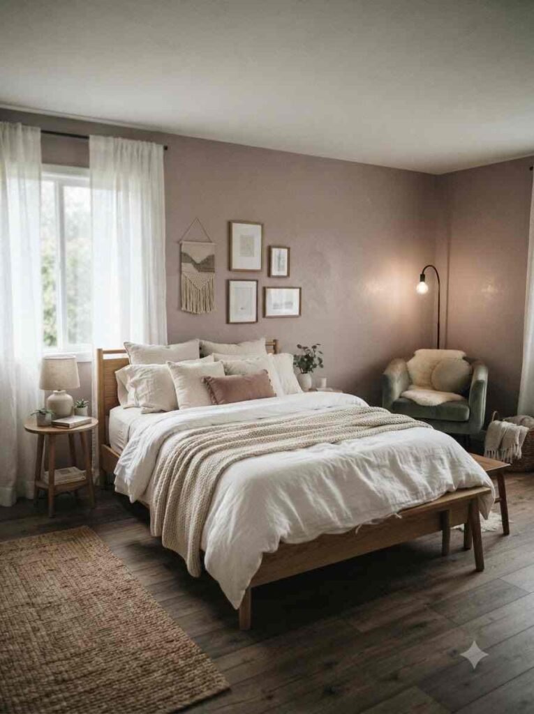
- Blush with warm white trim. Soft and airy. Great if your room doesn’t get much natural light.
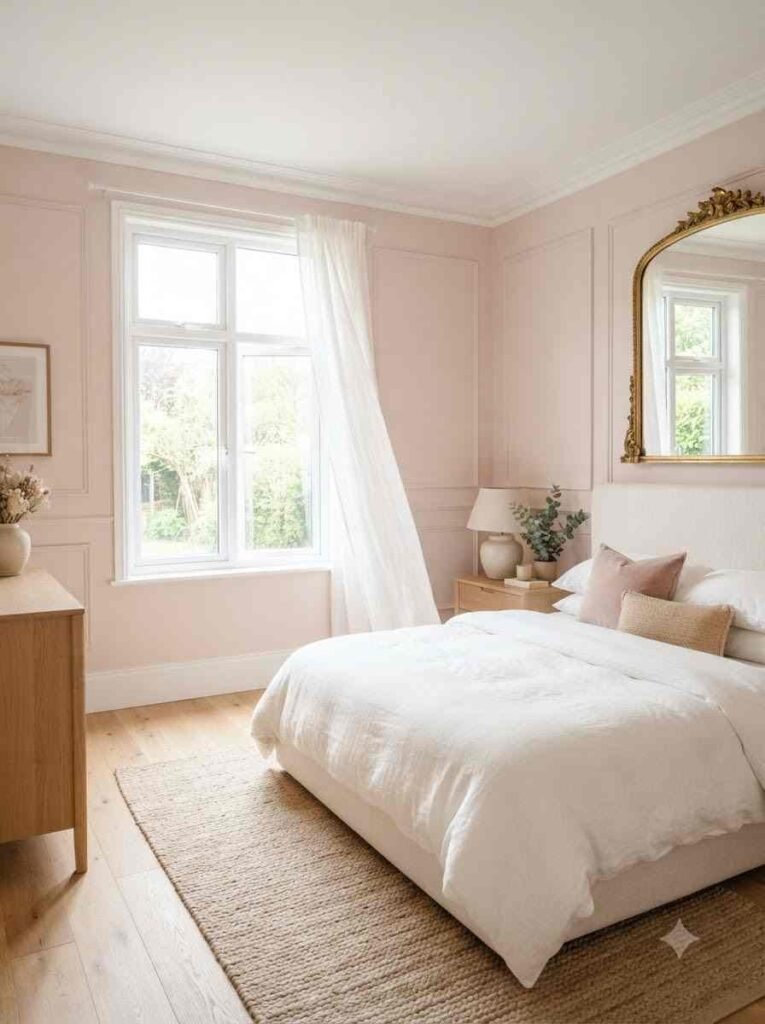
- Mauve. Sits between pink and purple. It reads as moody and a bit dramatic, in a good way.
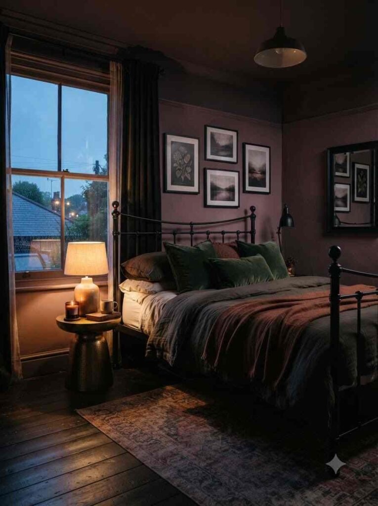
- Millennial pink, but darker. The original trend faded (pun intended), but a deeper, dustier version of it still holds up.
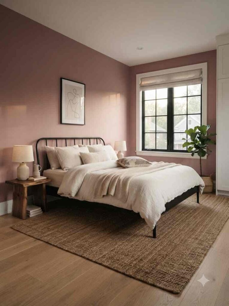
Here’s a quick cheat sheet if you’re still deciding:
| Shade | Feel | Pairs well with |
|---|---|---|
| Terracotta pink | Warm, earthy | Rattan, wood, brass |
| Dusty rose | Calm, muted | Sage green, cream |
| Blush | Soft, airy | White, gold accents |
| Mauve | Moody, rich | Black, deep green |
Texture and material trends
Color gets all the attention, but texture is what makes a pink room feel expensive instead of childish. Skip this step and everything looks a little flat.
- Bouclé everything. Chairs, headboards, throw pillows. The nubby texture softens the pink and keeps it from feeling too saccharine.
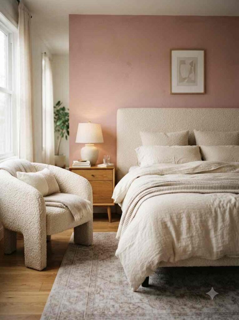
- Velvet headboards. Deep pink velvet catches light in a way flat paint never will. It’s an easy way to add drama without repainting.
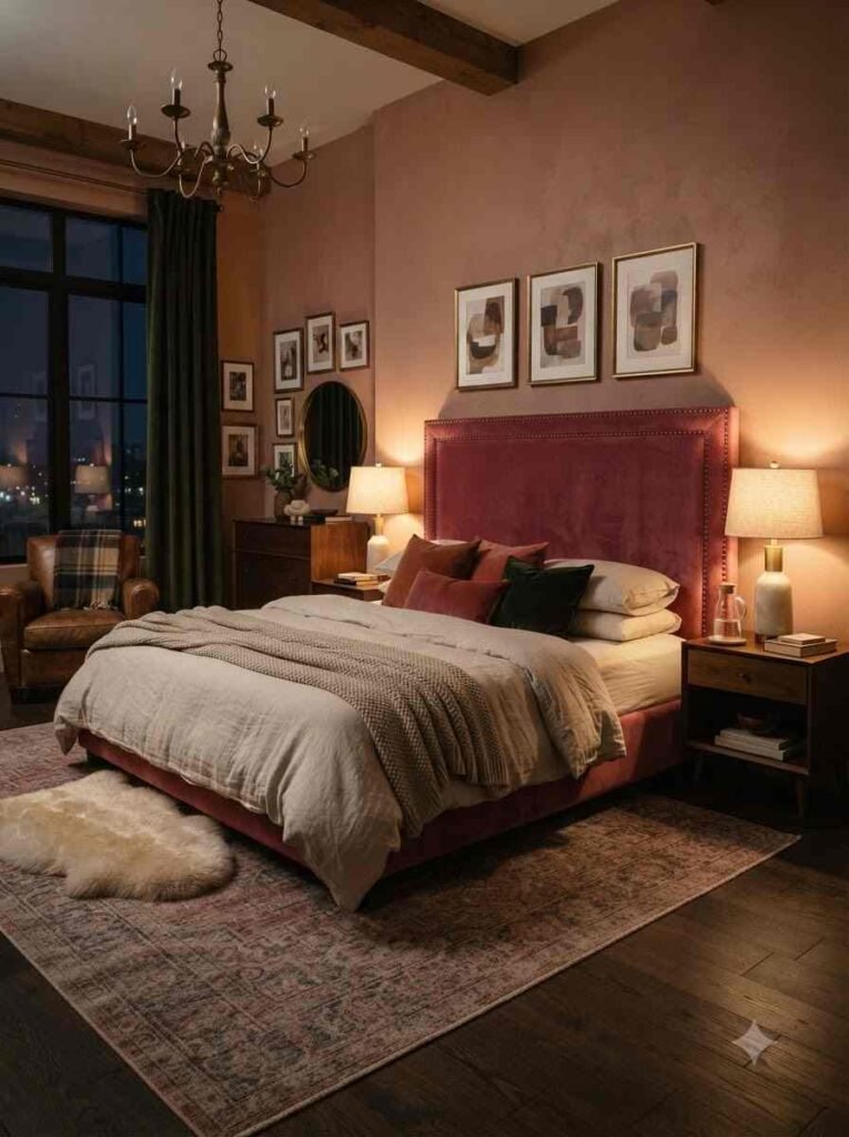
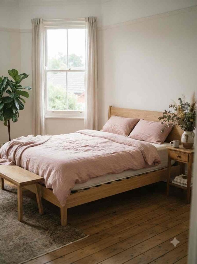
- Linen bedding in a faded rose tone. Crisp cotton can feel a bit stiff. Linen wrinkles on purpose, and somehow that reads as more expensive.
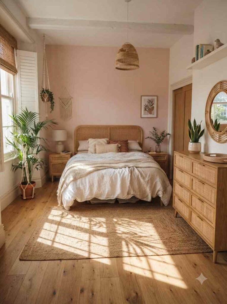
- Rattan and cane furniture. The natural texture keeps a pink room from tipping into “too sweet” territory.
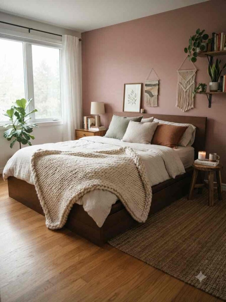
- Chunky knit throws. Cheap to add, big visual payoff. I bought mine secondhand for eight dollars and it’s the first thing people comment on.
A quick tangent
Random thought, but this whole texture-over-color obsession is basically the same reason oatmeal cookies beat sugar cookies. It’s not about how sweet something looks, it’s about what you actually feel when you touch it. Anyway, back to the bedroom.
Furniture and layout trends
Once the palette and textures are locked in, furniture choices either support the look or completely undercut it.
- Curved furniture. Rounded nightstands, arched headboards, oval mirrors. Sharp corners feel a little cold next to a soft pink wall.
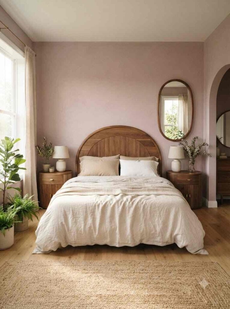
- Low platform beds. They make the ceiling feel higher and the whole room feel calmer.
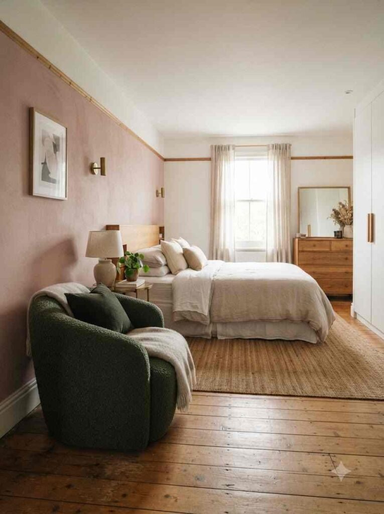
- A single statement chair. Not a whole seating area, just one chair in a contrasting fabric. Mine is a deep green bouclé chair and it does more work than any wall art I own.
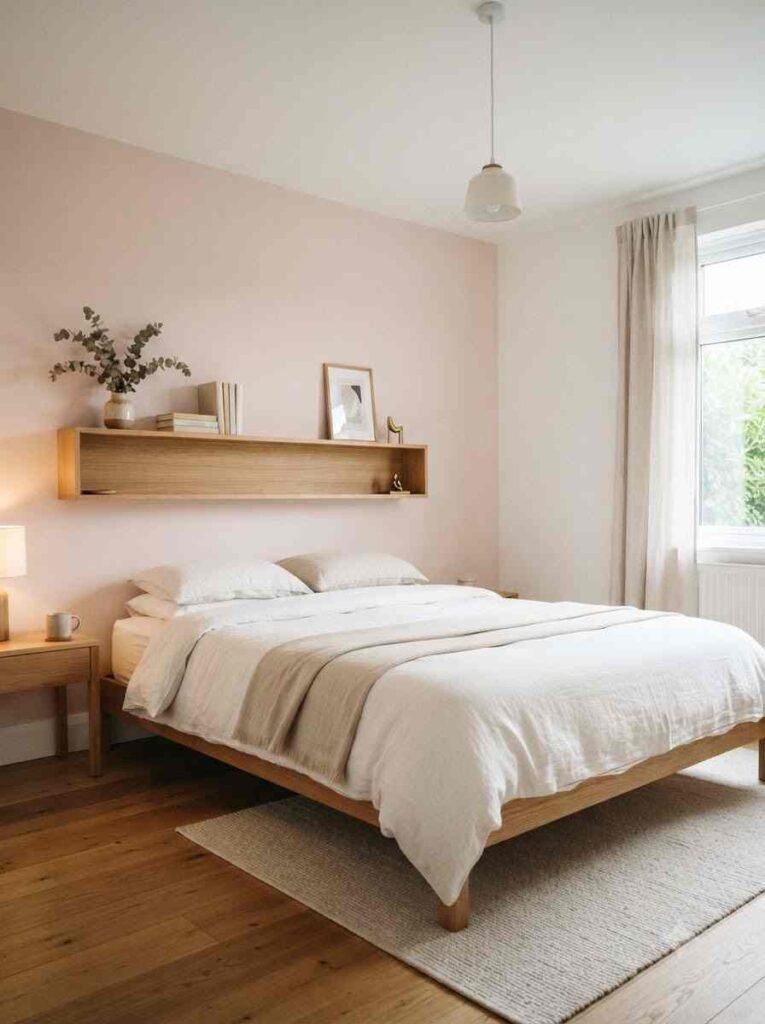
- Open nightstands or floating shelves. Cuts visual clutter, which matters a lot in smaller rooms.
- Mixed metals. Brass and matte black together. IMO this is the easiest way to make a pink room feel current instead of trendy-for-five-minutes.
Wall and decor trends
This is where you can go a little bolder, since you can swap decor faster than you can repaint an entire wall.
- Pink and terracotta color blocking. Paint the lower half of the wall one shade, the upper half another. It’s a commitment, but it looks genuinely custom.
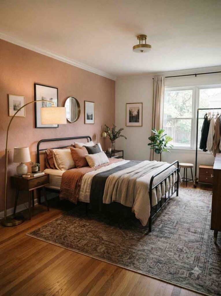
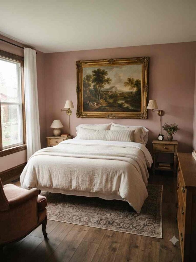
- Vintage-style art in ornate frames. A single striking print does more for the room than five small ones scattered around.
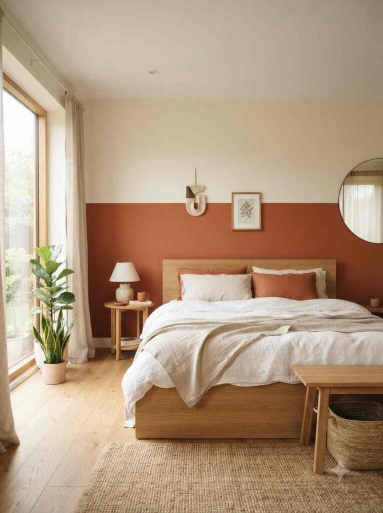
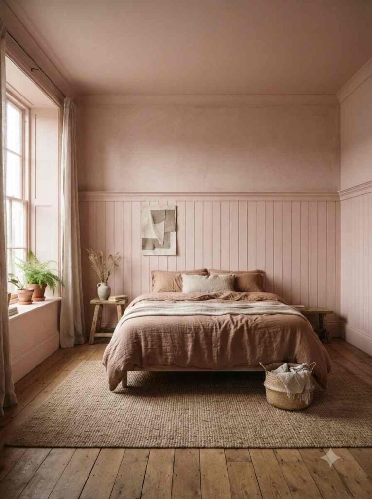
- Textured wall panels or wainscoting. Painted in the same pink as the walls for a tonal, almost monochrome effect.
- Woven wall hangings. Adds texture without adding another color to manage.
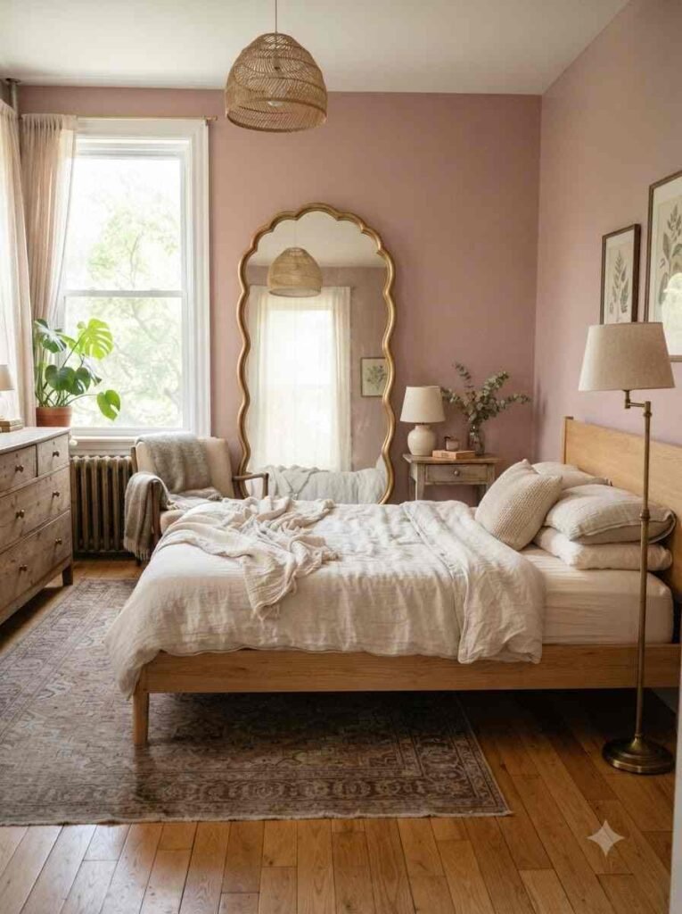
- Mirrors with curved or scalloped edges. They bounce light around and soften every hard line in the room.
Lighting and finishing touches
Lighting decides whether your pink room looks intentional or accidental. This part gets skipped constantly, and it shouldn’t.
- Warm-toned bulbs, always. Cool white lighting makes pink look flat and slightly clinical. Warm bulbs make it glow.
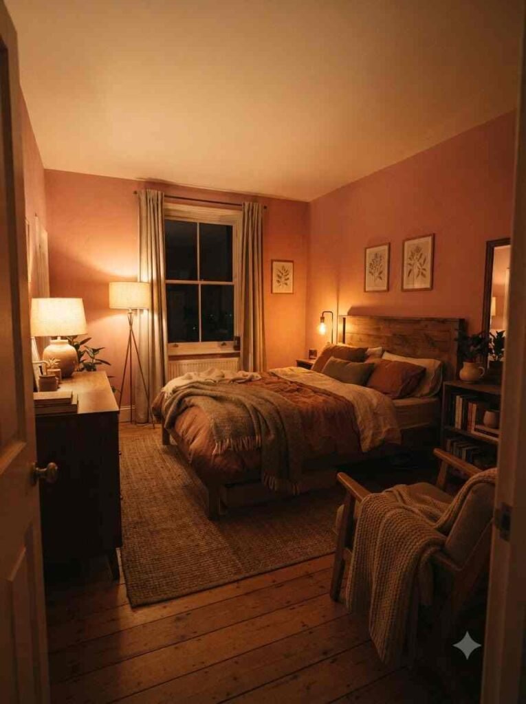
- Table lamps with fabric or glass shades. Skip the exposed bulb look here. It clashes with the softness you just built into the rest of the room.
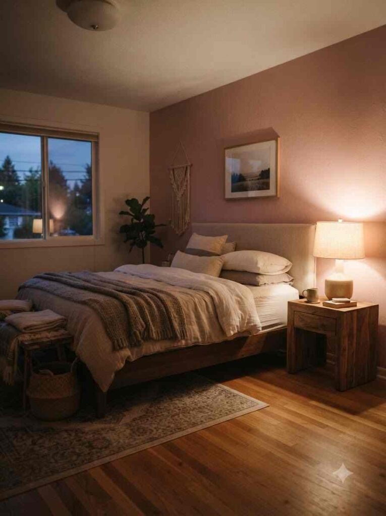
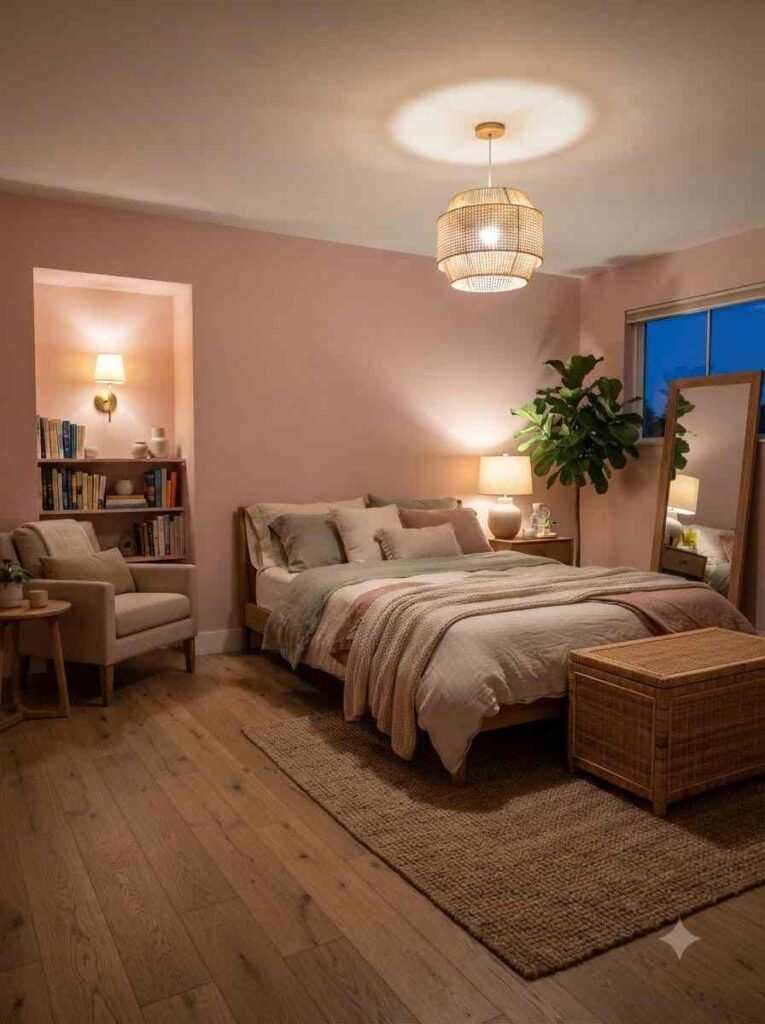
- Layered lighting. One overhead fixture, one lamp, maybe a plug-in sconce. Three light sources at different heights make a small room feel considerably bigger.
Wow, twenty-three trends is a lot to take in at once. You don’t need all of them.
Pick five or six that match your actual life, not the version of your life you wish you had.
How to actually start without overspending
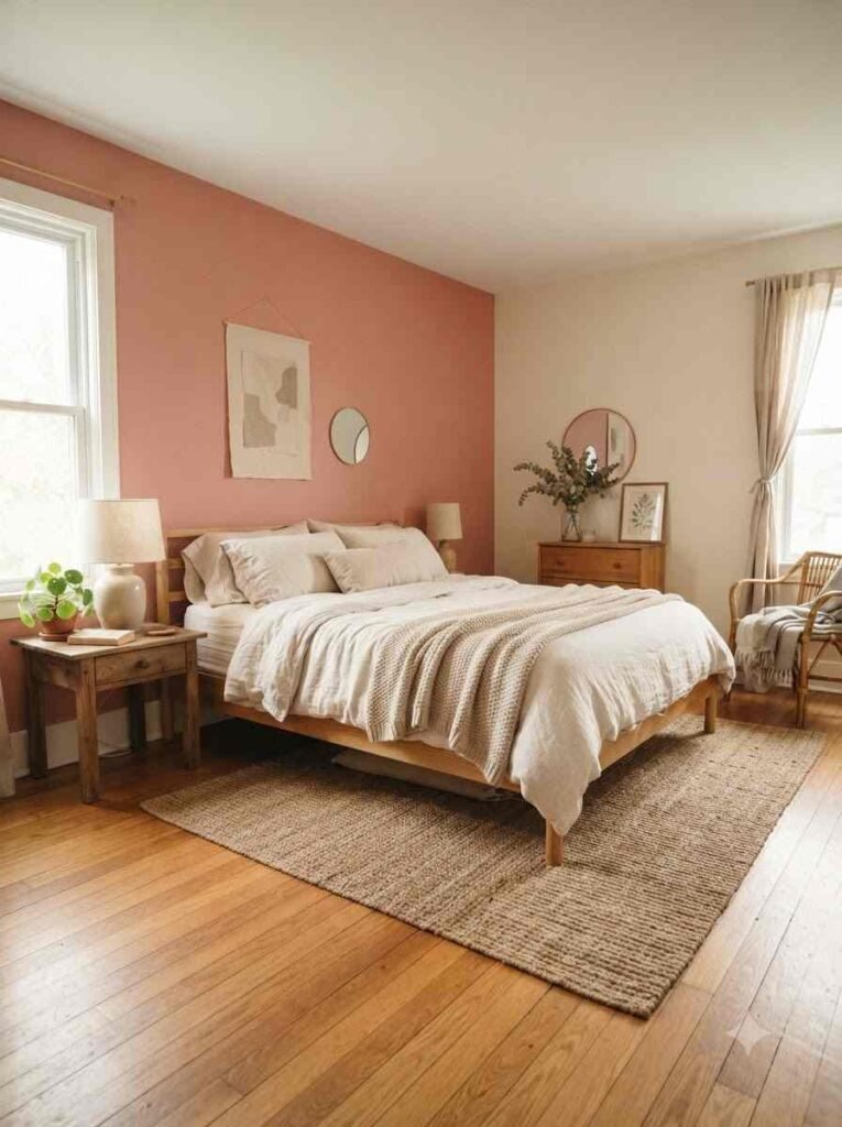
You don’t need a full renovation budget to pull this off. A few honest suggestions:
- Paint one accent wall before committing to the whole room. It’s the cheapest way to test a shade in your actual light.
- Buy one statement piece, like a velvet headboard or a bouclé chair, and build around it.
- Check secondhand shops before buying new furniture. Rattan and wood pieces age well and often look better slightly worn.
- Swap bulbs before swapping furniture. It’s the five-dollar fix nobody thinks to try first.
According to Pinterest’s annual trend report, warm, dusty tones have consistently outranked bright pastels in home decor searches over the past few years, which lines up with everything above.
FAQs
Will a pink bedroom feel too feminine or too young? Not if you pick a muted or dusty shade and balance it with wood, black metal, or deep green accents. Bright bubblegum pink reads younger. Terracotta or mauve reads sophisticated.
What’s the best pink for a room with little natural light? Blush or dusty rose. Both hold up under warm artificial light without turning muddy the way darker shades sometimes do.
Can I do this trend on a tight budget? Yes. Start with one accent wall or a single textured piece like a bouclé pillow or a velvet cushion cover.
You genuinely don’t need to redo the whole room at once.
Final thought
A pink bedroom done right doesn’t scream for attention, it just feels good to sit in. That’s the whole point.
So, which one of these 23 are you trying first? Save this post, pick your shade, and tell me how it turns out.
