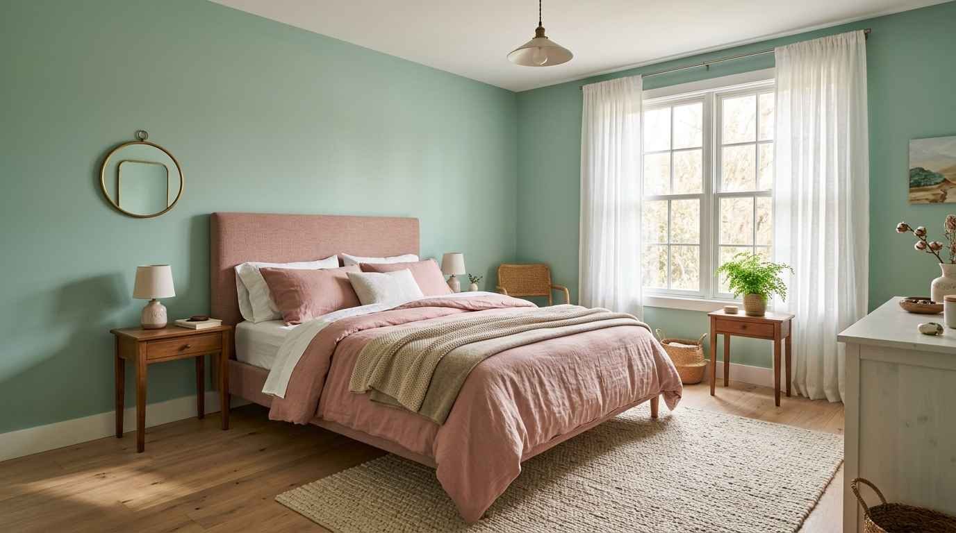
I redid my daughter’s bedroom in mint and pink last spring, and I still walk past that room just to look at it.
That’s the honest starting point for this whole article. There’s something about this color pairing that photographs like a dream and feels calm in person too, which is rare.
A lot of trendy palettes look great on a screen and then feel cold or sugary once you’re actually living in the room.
Mint green and pink work because they sit close together on the color wheel but pull in different emotional directions.
Mint cools a room down. Pink warms it back up.
Put them together and you get a space that reads soft, playful, and surprisingly sophisticated, not childish, unless you want childish, in which case, go wild with it.
I pulled these 22 ideas from real rooms I’ve seen, a few Pinterest boards I keep coming back to, and my own trial and error with paint swatches taped to a wall for three weeks (I’m indecisive, sue me).
Save this one, because you’ll want to reference it more than once.
Getting the balance right between mint and pink
Before the list, one thing I wish someone had told me earlier: pick a dominant color.
Trying to split a room 50/50 between mint and pink usually backfires. It ends up looking like a competition instead of a palette.
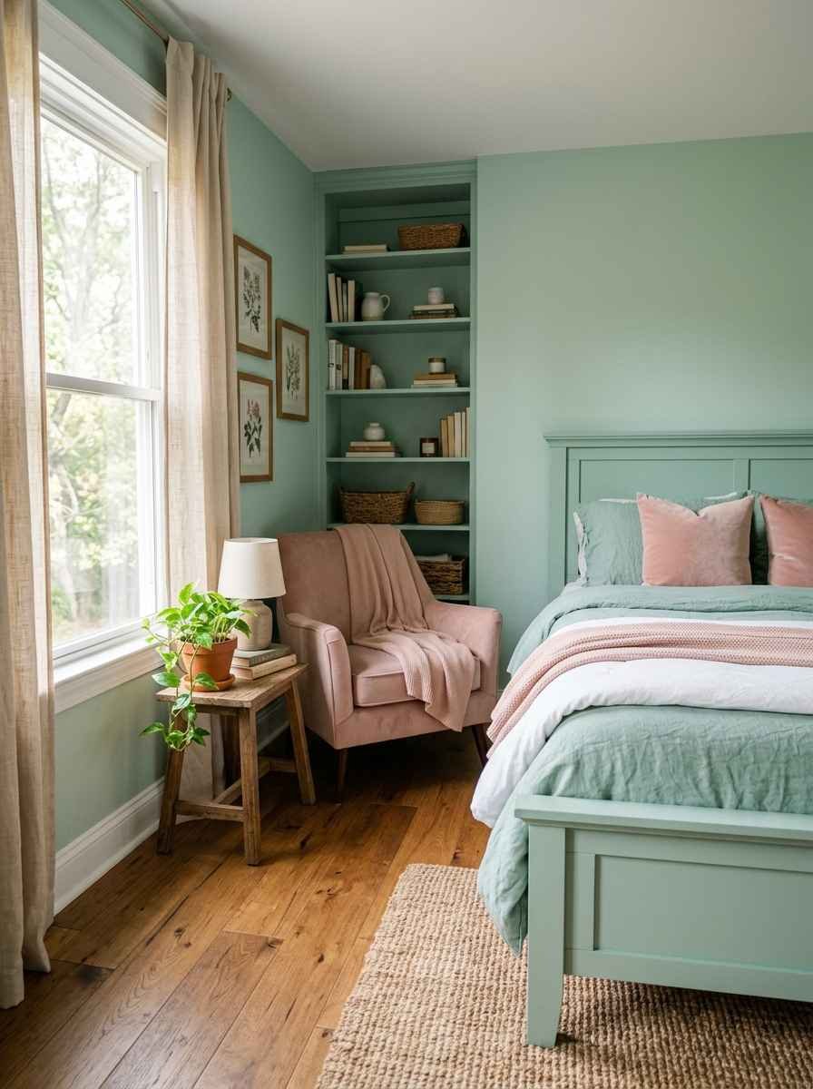
I’d go 70/30. Either mint-dominant with pink accents, or pink-dominant with mint accents. Pick a lane.
- Mint-dominant works well if you want the room to feel airy, beachy, or like a garden.
- Pink-dominant works well if you want warmth, romance, or a bit of glam.
Sherwin-Williams has a solid color visualizer tool if you want to test combinations before buying a single can of paint. I use it constantly and it’s saved me at least two bad decisions.
22 bedroom ideas to steal
Here they are, roughly grouped so you can jump to whatever style fits your space.
Soft and airy looks
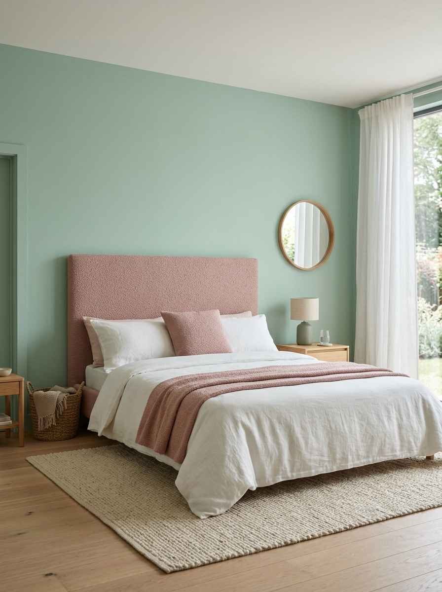
- Mint walls with a blush pink upholstered headboard. This is the combo I did in my daughter’s room and I’d do it again in a heartbeat.
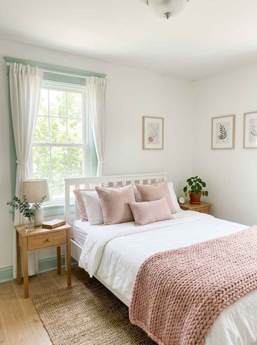
- White base with mint trim and pink throw pillows. Low commitment, high impact, great for renters.
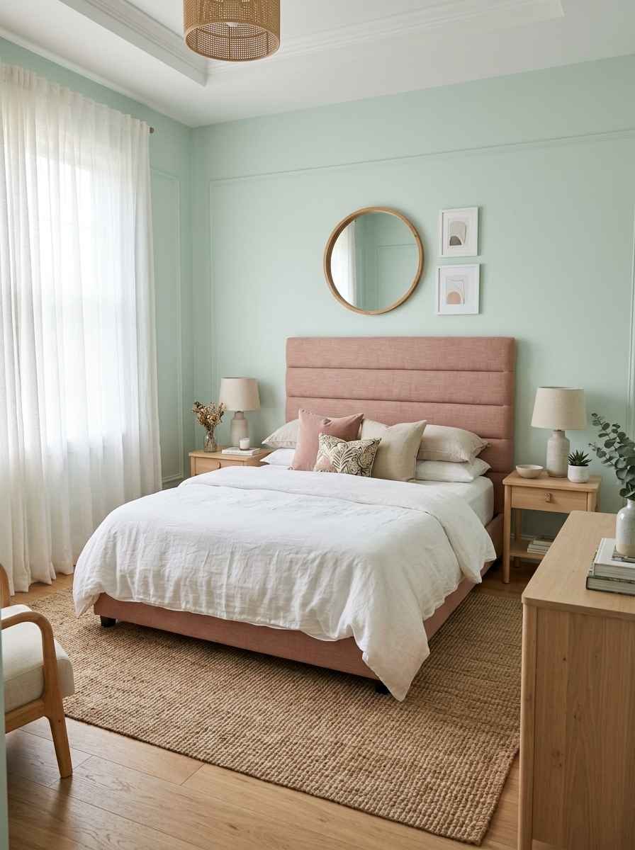
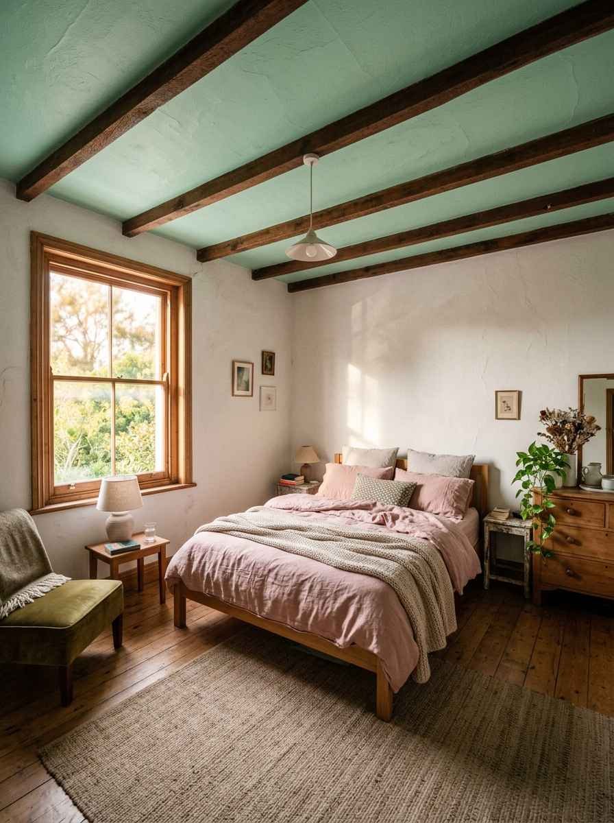
- Pale mint ceiling (“fifth wall”) with dusty pink bedding below. People forget the ceiling counts as a design surface. It really does.
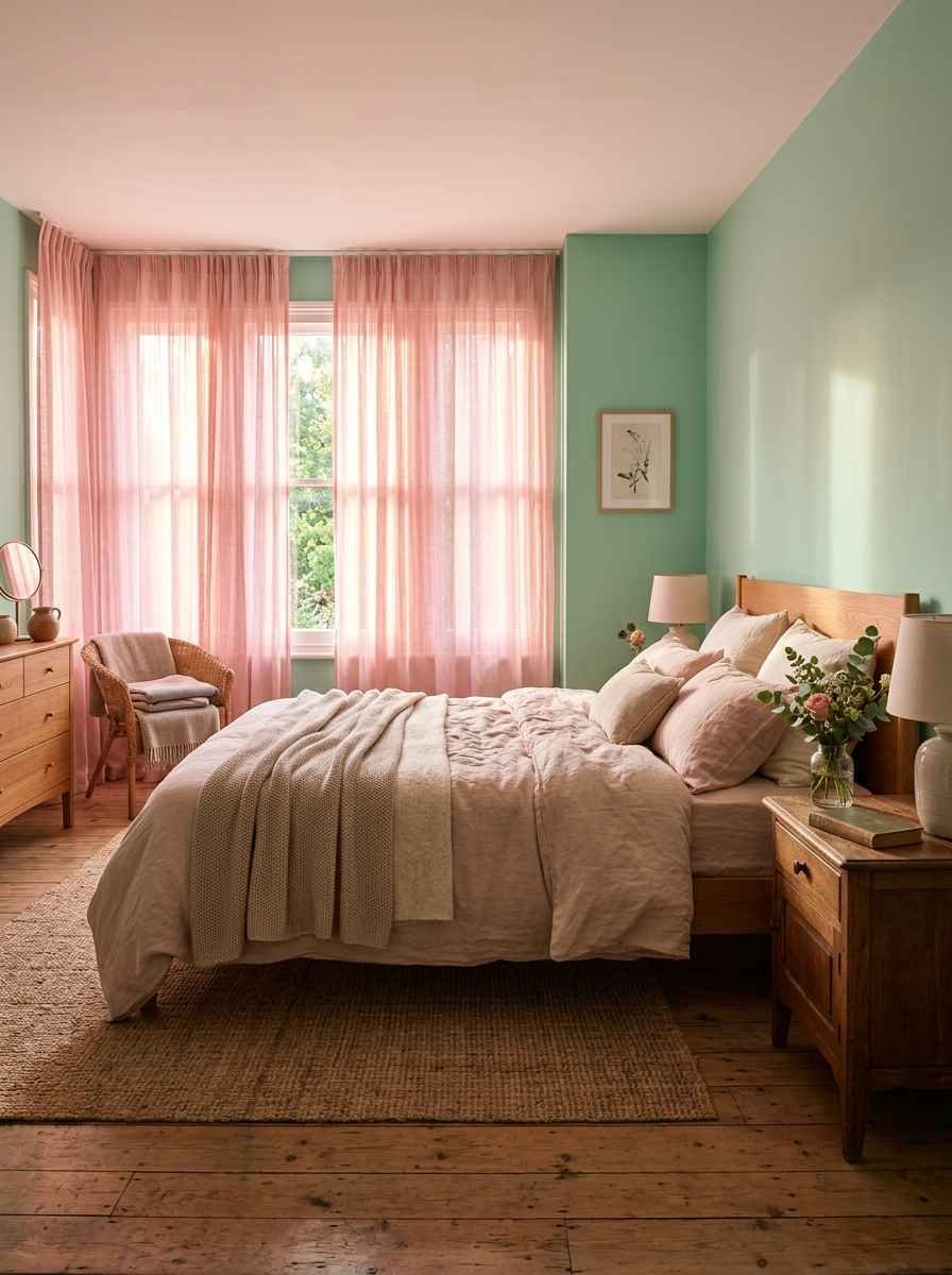
- Sheer pink curtains against mint walls. The light filters through pink and casts a warm glow in the morning. Genuinely gorgeous, not just Instagram bait.
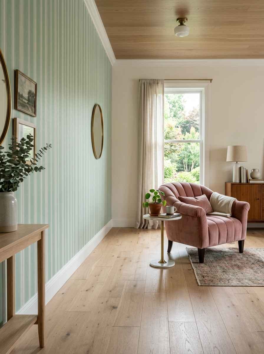
- Mint striped wallpaper with a single pink accent chair. One bold piece does more work than five small ones.
Bold and playful looks
- Hot pink accent wall paired with sage-leaning mint furniture. This one’s not for everyone but it’s unforgettable when it works.
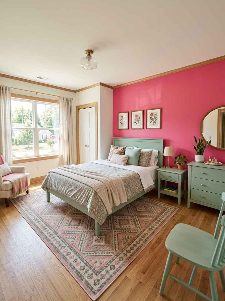
- Mint green bed frame with a pink gallery wall behind it.
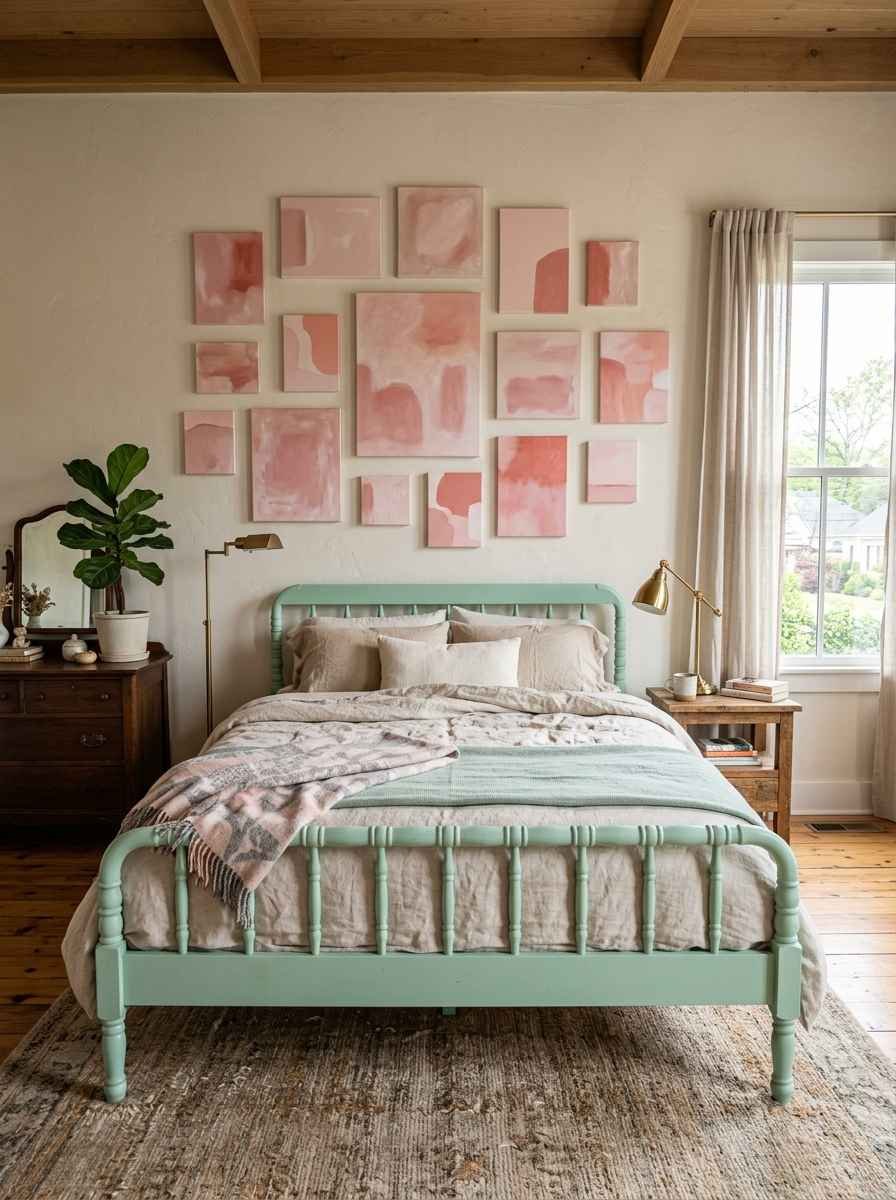
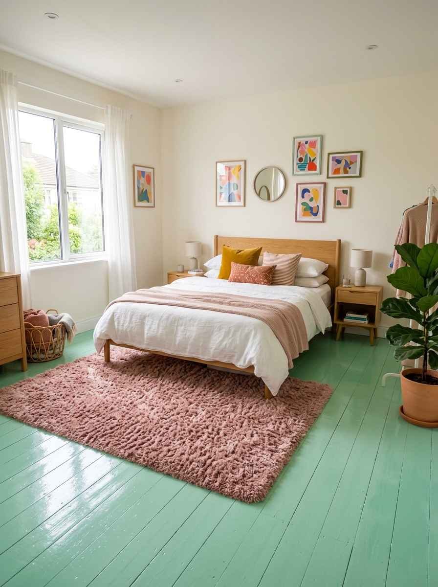
- Pink shag rug on a mint floor (yes, painted floors are back).
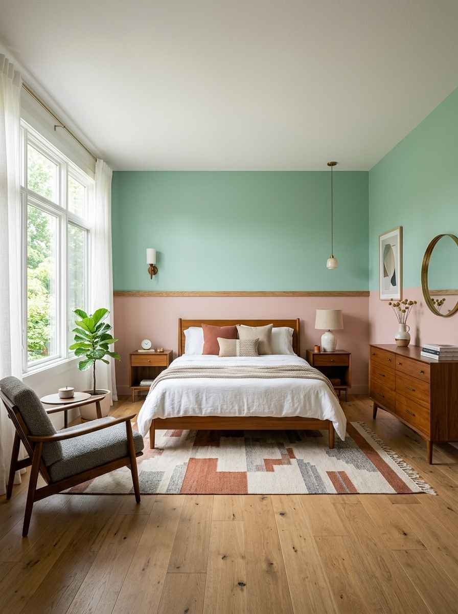
- Color-blocked wall, half mint, half pink, split at chair-rail height.
- Mint and pink polka dot or gingham bedding for a kid’s or teen’s room.
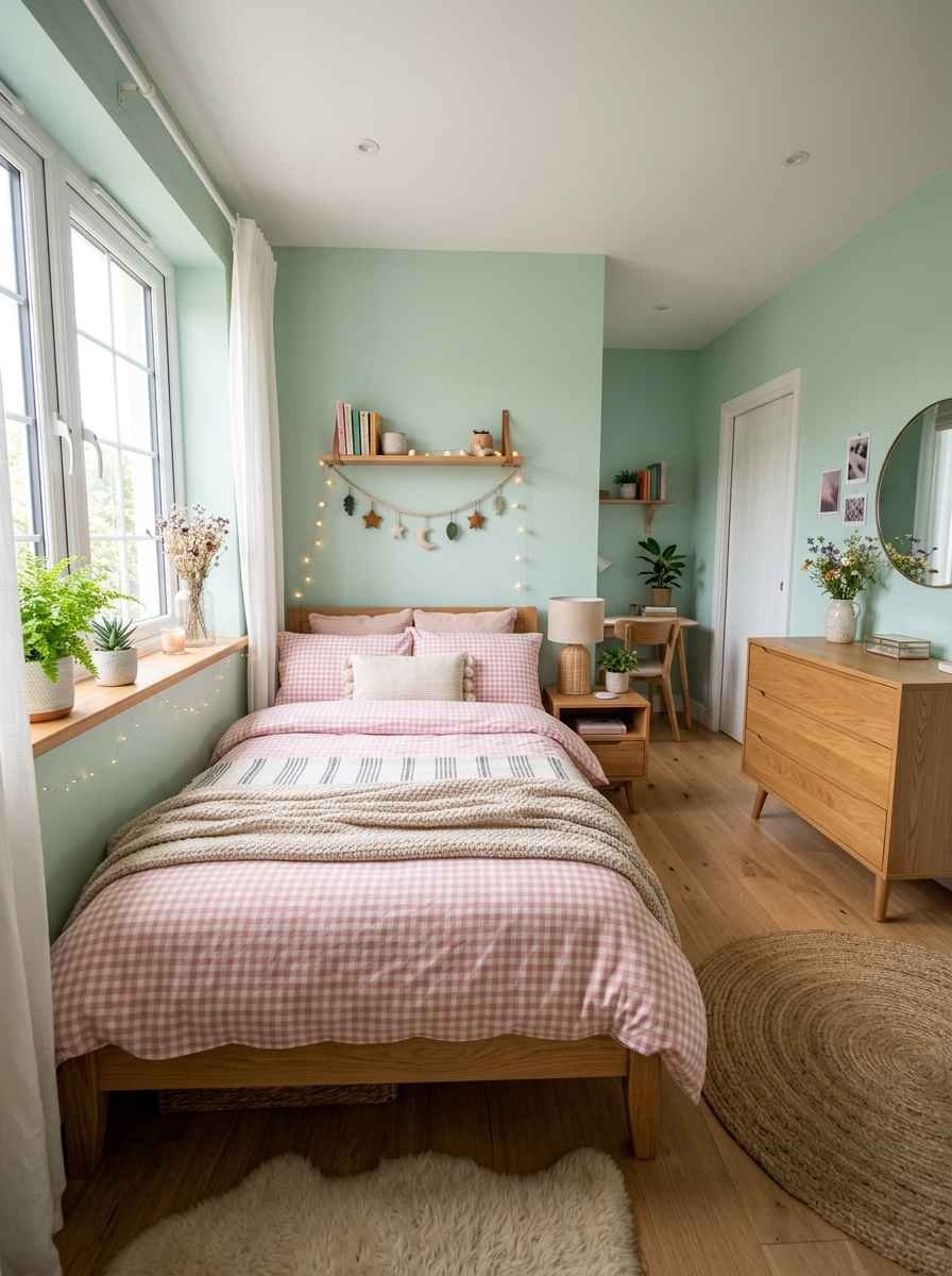
Vintage and retro-inspired looks
- 1950s-style mint dresser with pink hardware. Thrift stores are full of these, honestly. IMO it’s the cheapest way into this whole aesthetic.
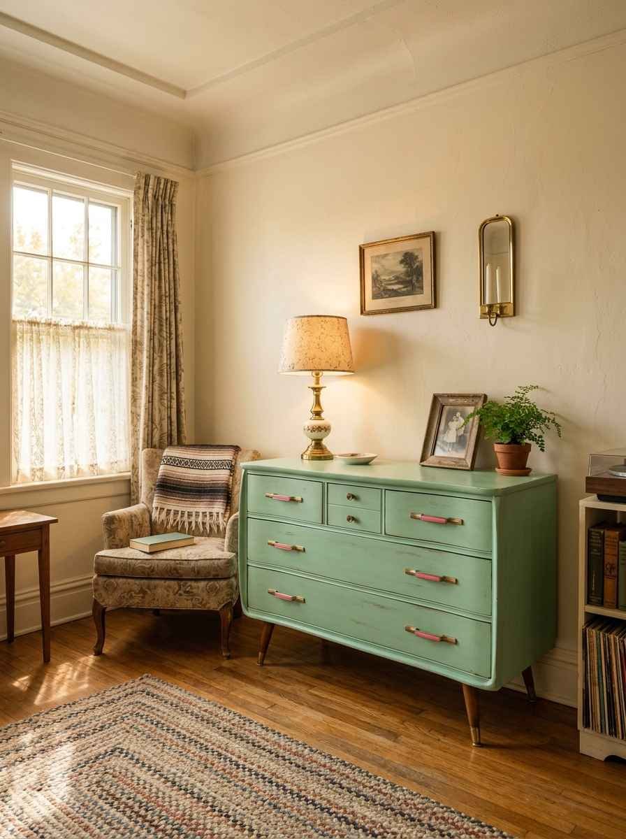
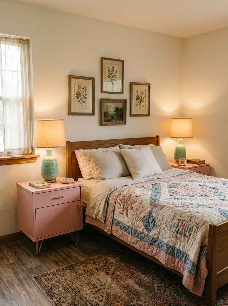
- Pink formica nightstands with mint lamps.
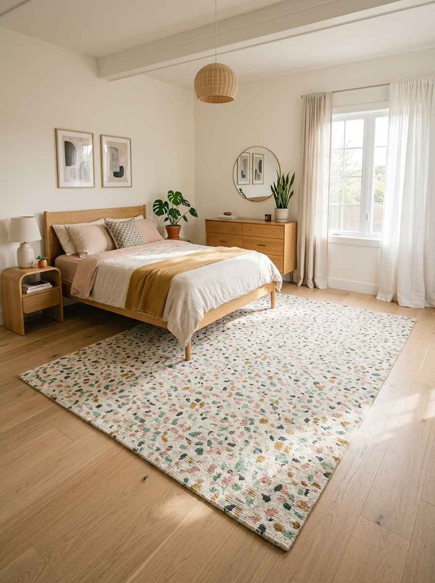
- Terrazzo-print rug in mint and pink tones.
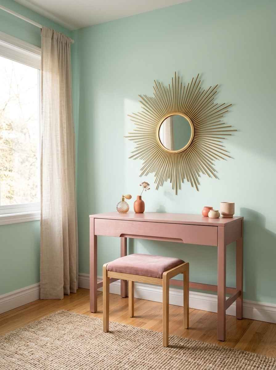
- Retro sunburst mirror in brushed gold, hung on a mint wall above a pink vanity.
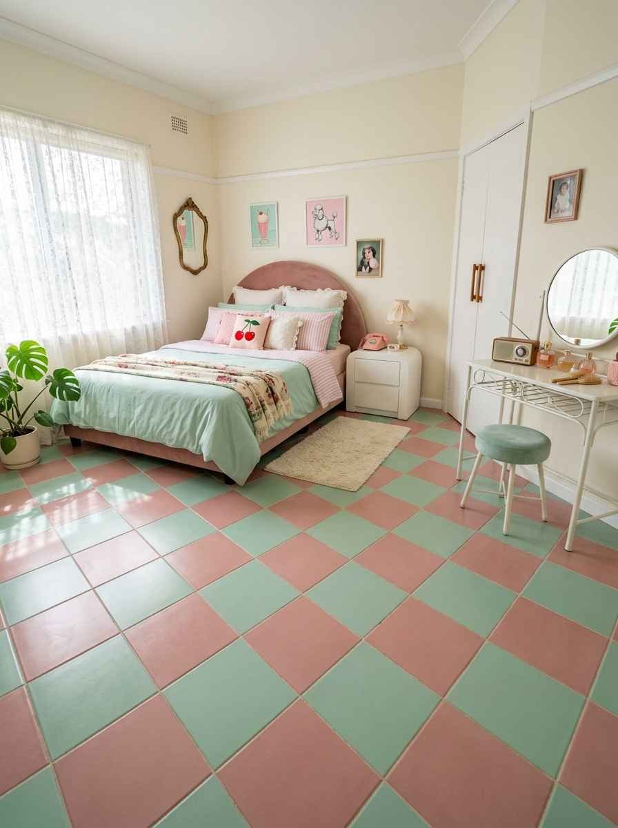
- Pastel checkerboard floor, mint and pink squares, for a diner-meets-boudoir vibe.
Modern and minimalist looks
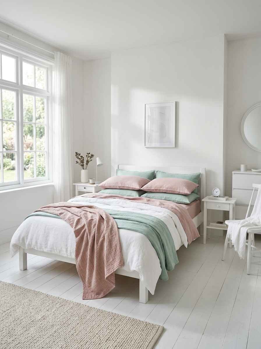
- All-white room with mint and pink existing only in the bedding. Restrained, but still reads as themed.
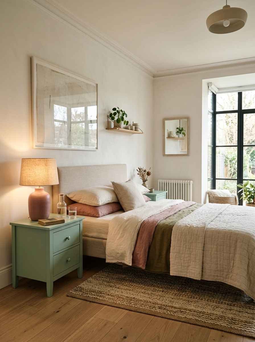
- Matte mint nightstands with a single dusty rose lamp.
- Boucle pink headboard against a plain mint wall, no other pattern in the room.
- Mint linen curtains with pink ceramic vases as the only color accent.
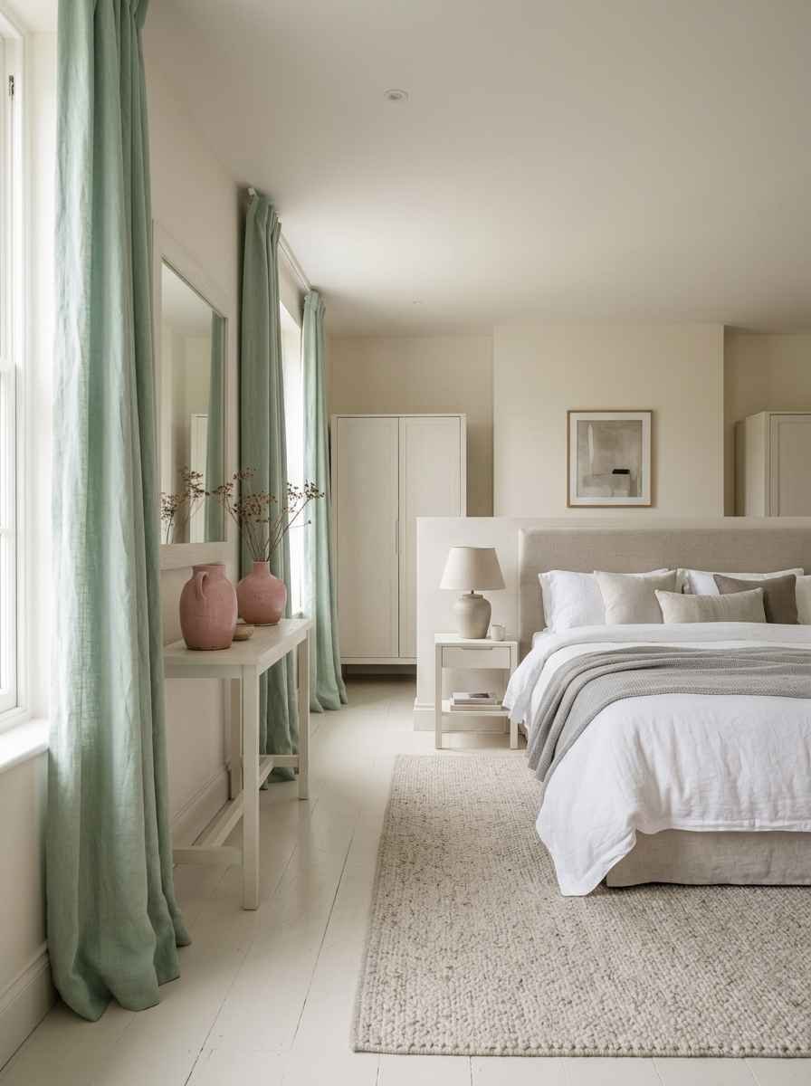
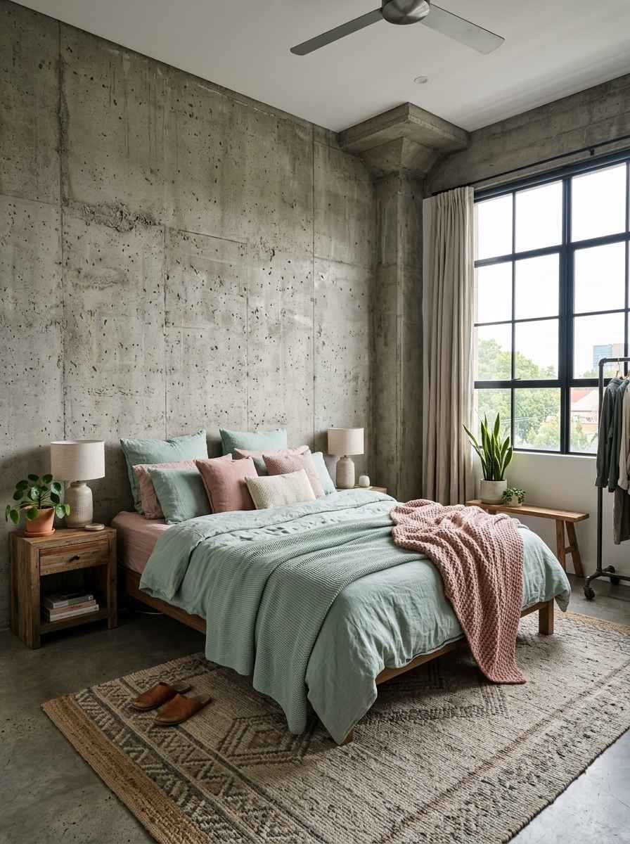
- Concrete-look accent wall with mint and pink textiles layered on top.
Nature-inspired and botanical looks
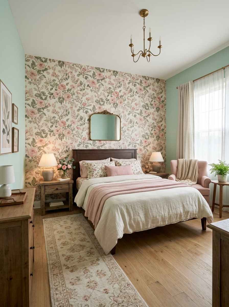
- Mint walls with pink floral wallpaper on one accent wall only. Full-room floral gets overwhelming fast, trust me on this.
- Botanical print bedding in mint and pink with real (or very good fake) eucalyptus in a vase on the nightstand.
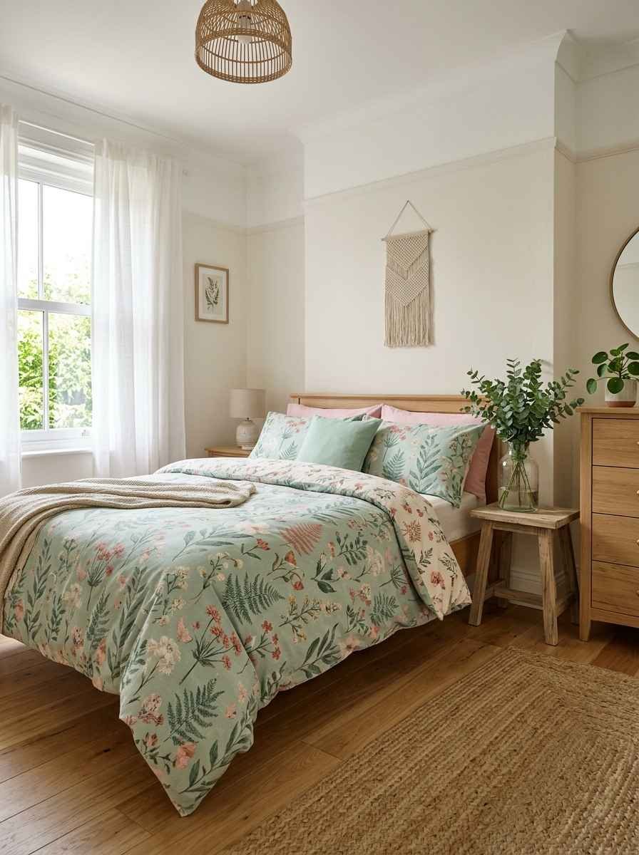
I’ll be honest, idea 21 is my favorite of the entire list. Something about pink flowers against a mint backdrop just works in a way I can’t fully explain.
It’s the one I’d pick for my own room if I ever got sick of my current setup, which, don’t tell my husband, might already be happening.
Quick reference: which combo suits which room
| Room type | Best ratio | Standout element |
|---|---|---|
| Kid’s or nursery | 60% mint / 40% pink | Playful pattern (polka dot, gingham) |
| Teen or young adult | 70% pink / 30% mint | Bold accent wall |
| Adult primary bedroom | 80% mint / 20% pink | Textural pink throw or headboard |
| Guest room | 90% neutral / 10% mint+pink | Small accessories only |
That table alone should save you a good hour of scrolling.
Picking the actual paint colors
This is where people get stuck, and I get it, because “mint green” and “pink” cover a huge range of actual paint chips. A mint that leans too blue starts to feel clinical.
A pink that leans too orange starts to feel dated fast.
Benjamin Moore’s Beach Glass is one of the most popular mints for bedrooms right now, and for good reason: it’s soft without going gray.
For pink, look for something in the “dusty rose” or “clay pink” family rather than a true bubblegum pink, unless bubblegum is exactly the mood you’re going for (no judgment, some rooms need that energy).
A few things I’ve learned the hard way about testing paint:
- Paint a sample on foam board, not directly on the wall. You can move it around the room and see it in different light without repainting later.
- Look at your swatch in the morning, midday, and at night under lamp light. Color shifts more than you’d expect.
- Undertones matter more than the color name. A “mint” with yellow undertones behaves completely differently from one with blue undertones.
Honestly, unrelated thought here, but I’ve noticed the same testing rule applies to picking a new coffee order.
You never really know if you like something until you’ve tried it at 7am, 2pm, and 9pm. Anyway. Back to the bedroom.
Furniture and texture choices that make the palette work
Color does maybe 40% of the work in a room like this. Texture and furniture shape do the rest.
Wicker, rattan, and boucle all soften a mint-and-pink room so it doesn’t feel like a candy shop.
Brass or gold hardware warms things up nicely against mint.
Matte black hardware, on the other hand, gives the room a slightly more grown-up, less “nursery” feel if that’s what you’re after.
I’ve found that mixing in one dark wood piece, a nightstand or a headboard frame, keeps the whole room from floating away into pure pastel. It gives your eye somewhere to land.
A few FAQs before you go
Does mint green and pink work in a small bedroom? Yes, and honestly it can work even better in a small room.
Light colors like mint reflect more light, which helps a small space feel bigger, and a single pink accent keeps it from feeling flat or sterile.
What color curtains go best with a mint and pink bedroom? White or cream curtains are the safest bet and let both mint and pink stay the stars of the room. If you want more drama, sheer blush pink curtains against mint walls look incredible with morning light coming through.
Will this color combo feel too young for an adult bedroom? Not if you keep the shades muted (think sage-mint and dusty rose rather than bright mint and bubblegum pink) and mix in natural textures like linen, wood, and rattan.
That combination reads sophisticated, not childish.
Final thought
Twenty-two ideas is a lot to take in at once, so don’t try to do all of them.
Pick two or three that actually match how you want to feel walking into the room, whether that’s calm, playful, romantic, or a little bit retro, and build out from there.
Which combination from this list would you actually try in your own bedroom, and are you team mint-dominant or team pink-dominant? Save this one, and let me know what you land on.
