
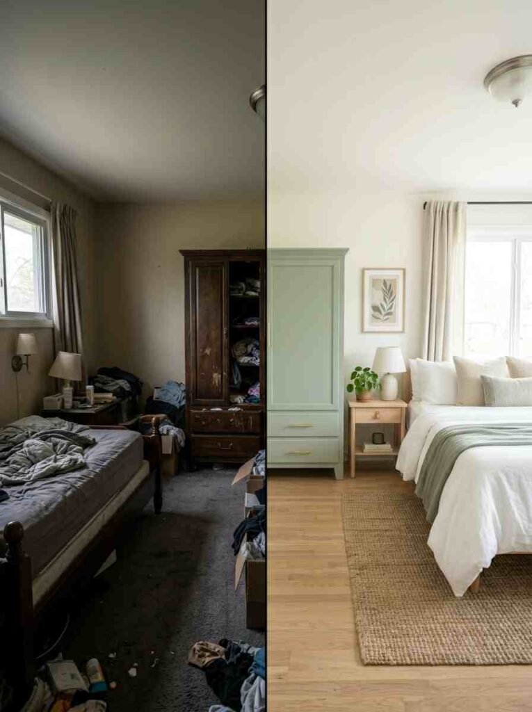
Let me be real with you — I spent three weekends staring at my dull, beige wardrobe thinking, “There has to be a better way.” And honestly? There was.
A fresh coat of paint on your bedroom wardrobe can completely flip the vibe of your entire room. No renovation. No furniture shopping. Just paint, a brush, and a little creativity.
So grab a coffee, get comfy, and let’s talk wardrobe paint ideas that actually work.
Why Your Wardrobe Color Matters More Than You Think
Most people obsess over wall color and completely forget about the wardrobe — which, let’s be honest, takes up a massive chunk of visual space in your bedroom.
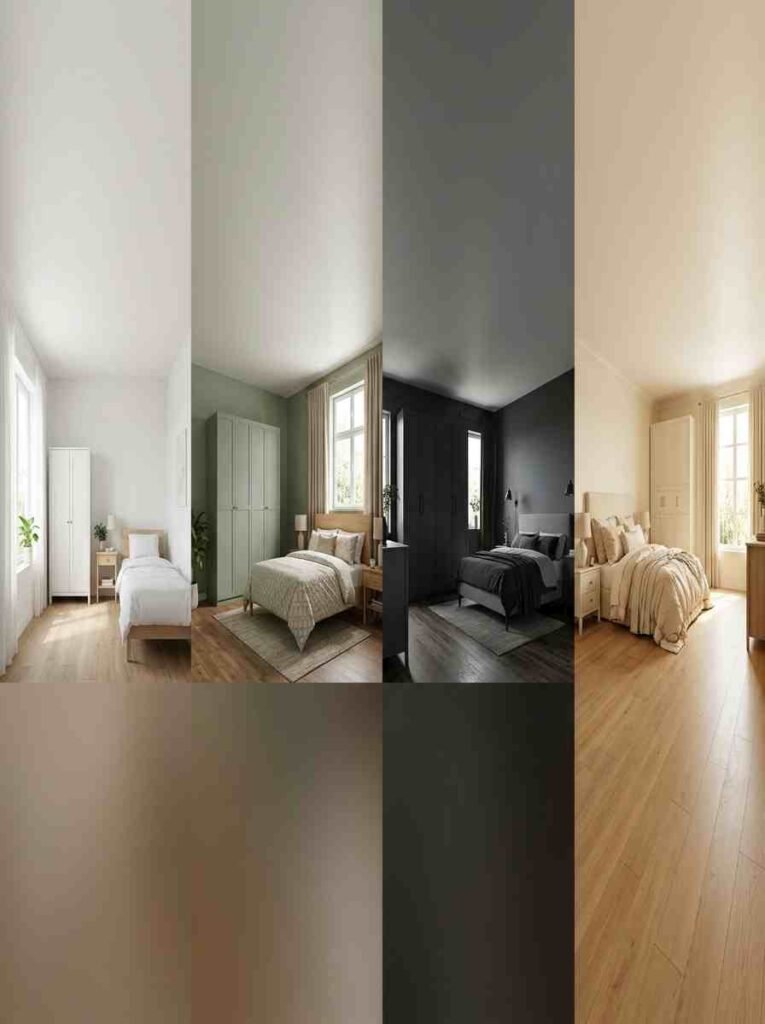
The wardrobe color sets a mood. It can make a small room feel airy and open, or a large room feel cozy and intimate.
I learned this the hard way. My first apartment had a chunky dark oak wardrobe, and the whole room felt like a cave. One weekend, some chalk paint, and a warm white later? Totally different energy. Honestly, it felt like I’d moved into a new place
The Color Psychology Quick Guide
| Color | Mood | Best Room Size | Works With |
|---|---|---|---|
| Soft White | Calm, Clean | Small & Large | Any palette |
| Sage Green | Earthy, Relaxed | Medium | Neutrals, wood |
| Navy Blue | Bold, Dramatic | Large rooms | Gold, cream |
| Dusty Pink | Warm, Playful | Small to medium | White, grey |
20 Smart Bedroom Wardrobe Paint Ideas
1. Crisp White — The Classic That Never Gets Old
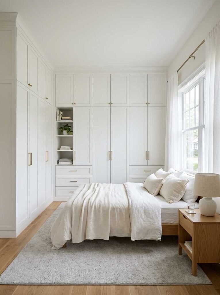
You cannot go wrong with a clean, crisp white wardrobe. It reflects light, opens up the space, and pairs with literally everything.
I’ve seen tiny box bedrooms transformed purely by painting a dark wardrobe white — it’s almost unfair how well it works.
If your room feels cramped or dark, this is your starting point. No debate.
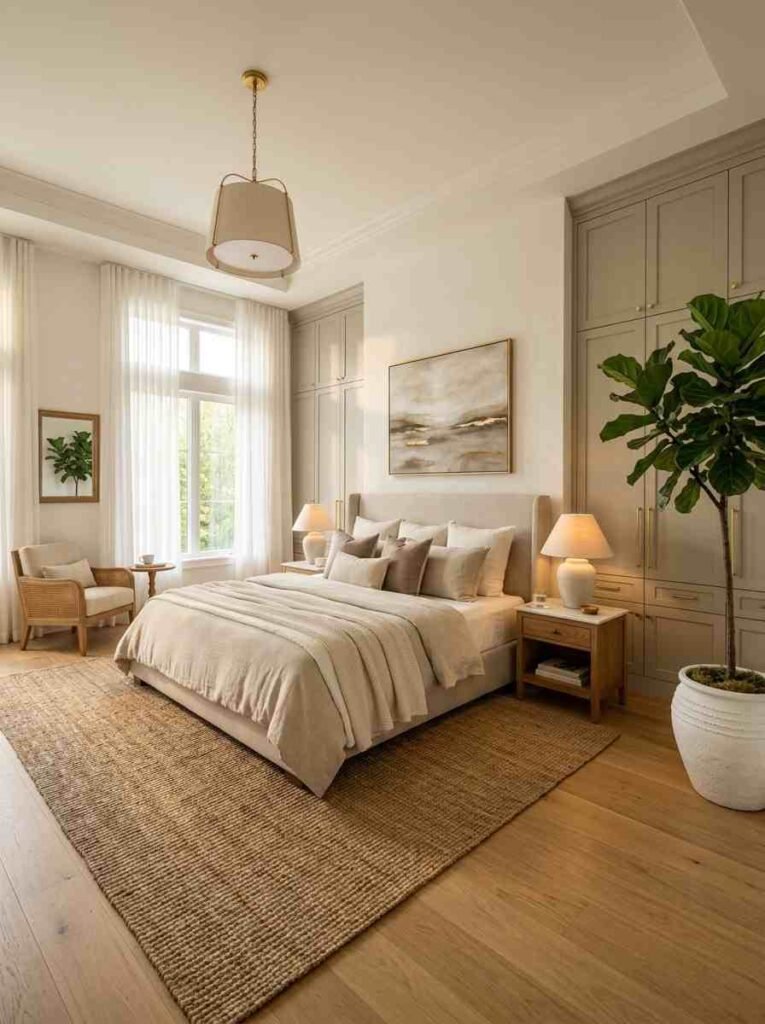
2. Soft Greige — The Chic Middle Ground
Can’t choose between grey and beige? Don’t. Greige — that perfect warm grey-beige blend — gives you both. It’s sophisticated without trying too hard, and it works brilliantly with wooden floors and linen bedding.
IMO, greige is the most underrated wardrobe color out there. People always ask me what makes a bedroom feel “put together,” and nine times out of ten, it comes down to this.
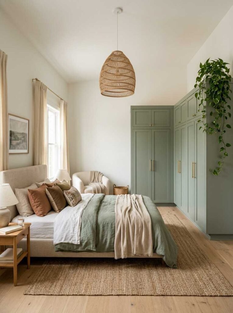
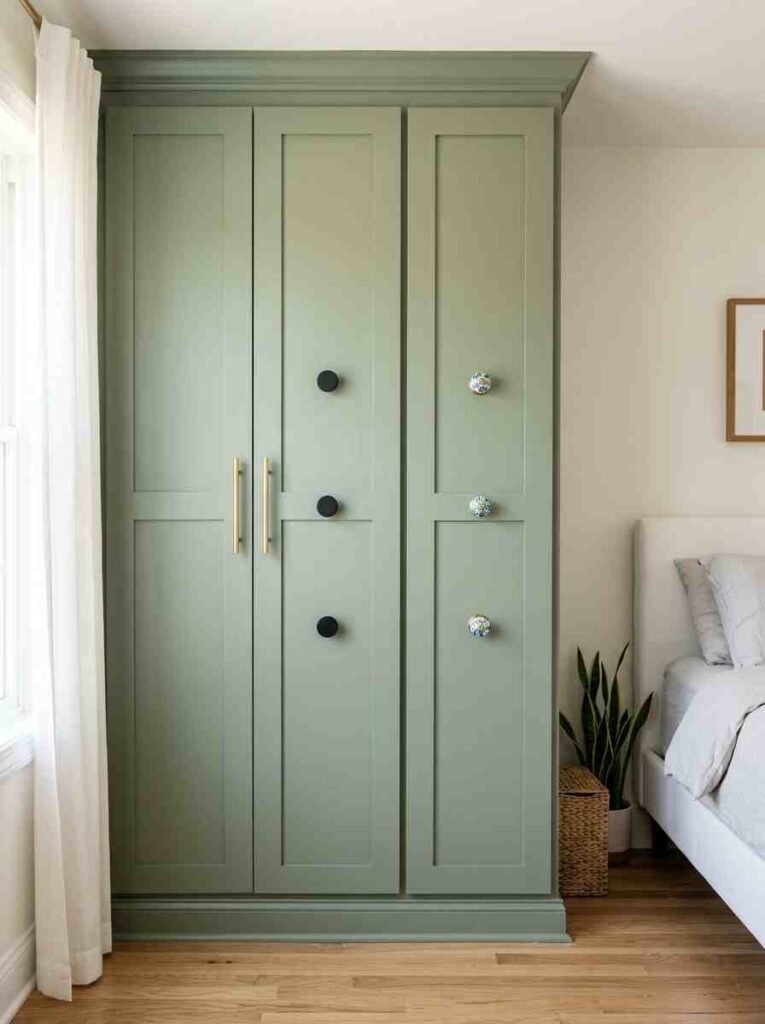
3. Sage Green — Nature Vibes Indoors 🌿
Sage green is having a serious moment right now — and honestly, it deserves it. It’s calming, earthy, and gives your bedroom a quiet, spa-like atmosphere.
I painted my guest wardrobe in sage last spring and genuinely received compliments from everyone who stayed over.
Pair it with rattan furniture and linen curtains and you’ve basically created a boutique hotel experience at home.
4. Dusty Pink — Soft and Dreamy, Not Babyish

Dusty or muted pink is nothing like the hot pink of your childhood bedroom — promise. It’s warm, romantic, and surprisingly versatile. Dusty pink wardrobes look stunning against white walls or deep charcoal accent walls.
This one flopped for me the first time because I chose the wrong tone — too bright. Go muted, go chalky, and you’ll love it.
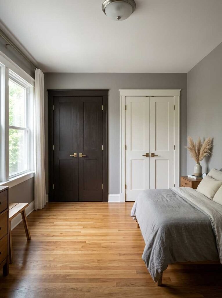
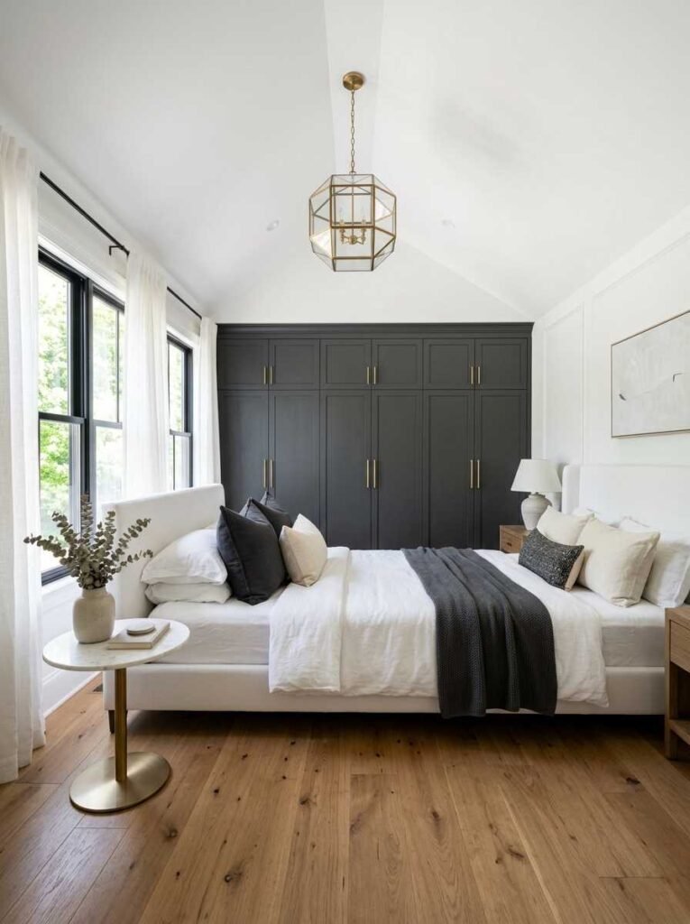
5. Charcoal Grey — The Statement Maker
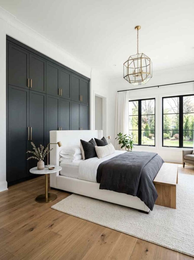
If you want drama without going full-on black, charcoal grey is your answer. It’s bold, modern, and absolutely stunning in bedrooms with good natural light. Without natural light though? It can feel like a dungeon. Be warned :/
Pair charcoal with brushed gold handles and white walls for a look that feels genuinely luxe.
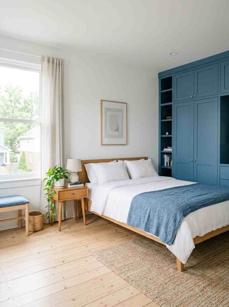
6. Navy Blue — Dark, Rich, and Surprisingly Cheerful
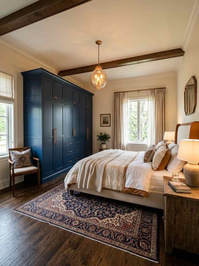
Navy blue wardrobes feel expensive. Full stop. There’s something about that deep, inky tone that makes a room feel curated and intentional. Navy blue works especially well in larger bedrooms where it won’t overwhelm.
Add some warm brass or copper hardware and you’re basically living in a magazine shoot. Wow!
7. Chalk White With Distressing — Rustic Farmhouse Feel
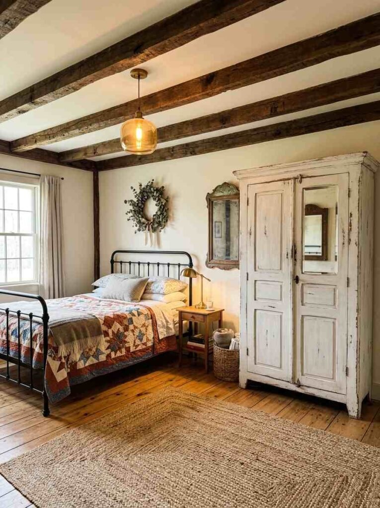
If you love the vintage, farmhouse aesthetic, chalk paint with light distressing on your wardrobe is a game changer. It’s textured, characterful, and looks like something you’d find in a Cotswolds B&B.
The process takes a bit of patience — sand the edges lightly after the paint dries — but the result? Chef’s kiss.
8. Two-Tone — Bold on Top, Light on Bottom
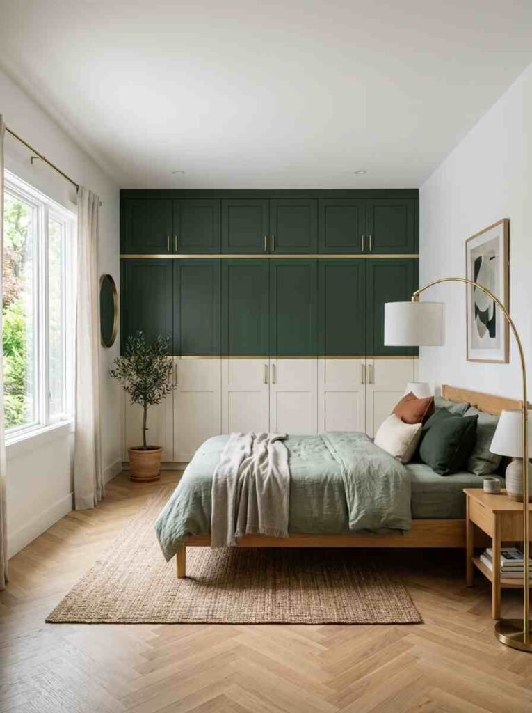
Here’s a trend I genuinely love: painting the upper wardrobe panels one color and the lower panels another. Think navy on top, cream on the bottom. Or forest green up top with a warm white below.
It adds visual interest and breaks up that wall-of-furniture feeling. Not every interior designer talks about this, but bro — trust me on this one.
9. Terracotta — Warm, Bold, and Surprisingly Wearable
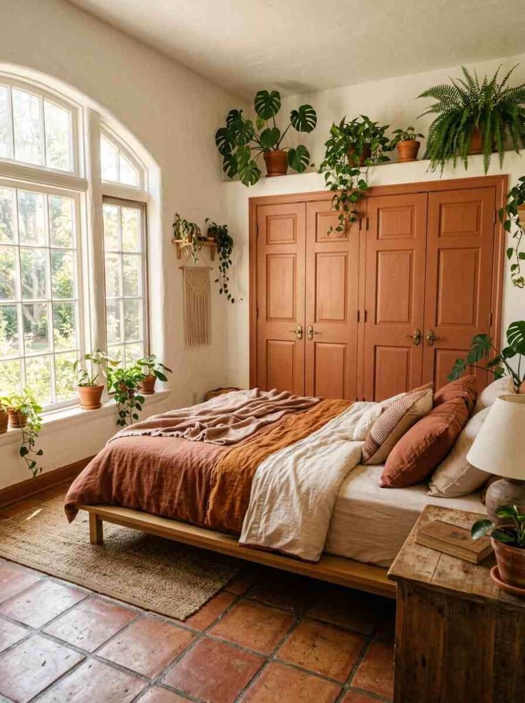
Terracotta had its big moment a couple of years back, but I’d argue it still holds up beautifully on bedroom furniture. A terracotta-painted wardrobe brings warmth and personality to neutral rooms.
It does work best in south-facing rooms where there’s plenty of warm light. In north-facing rooms, it can skew a little muddy. FYI — always test a patch first.
10. Warm Cream — Softer Than White, Just As Bright
If pure white feels too stark for your space, warm cream is the gentler option. It still bounces light beautifully but feels a touch more lived-in and cozy. I think of it as white’s more relaxed, cottagecore sibling.
Great for rooms with exposed wooden beams, stone floors, or vintage-style décor.
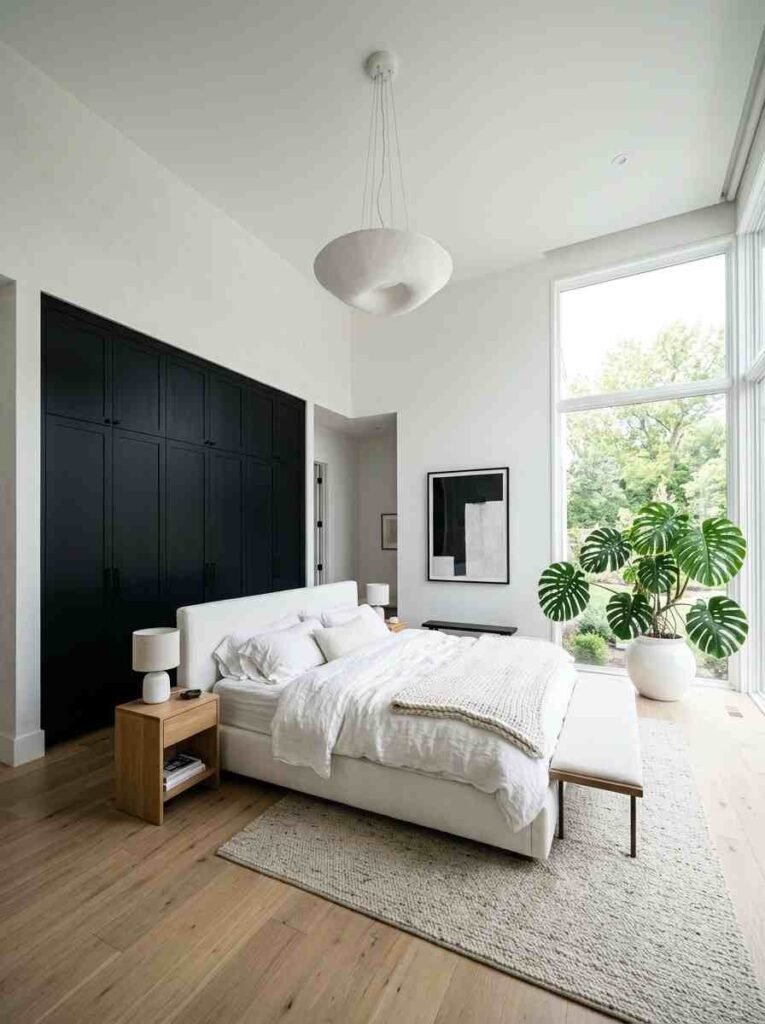
11. Midnight Black — Daring, Dramatic, Unforgettable
Painting your wardrobe black sounds terrifying. I get it. But matte black wardrobes in the right room look absolutely incredible. Think high ceilings, white walls, and some statement plants.
This is not a choice for a small, dark room. But in the right space? It’s genuinely one of the most impressive things you can do with a tin of paint.
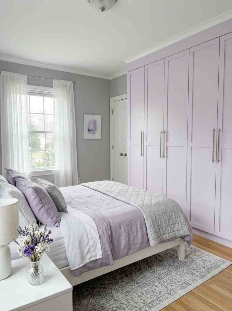
12. Pale Lavender — Calm, Cool, Utterly Lovely
Pale lavender strikes that rare balance between being interesting and being restful. It’s perfect for bedrooms where you actually want to sleep — not just scroll Instagram until 2am.
It works beautifully with silver or brushed nickel hardware and cool-toned grey wal
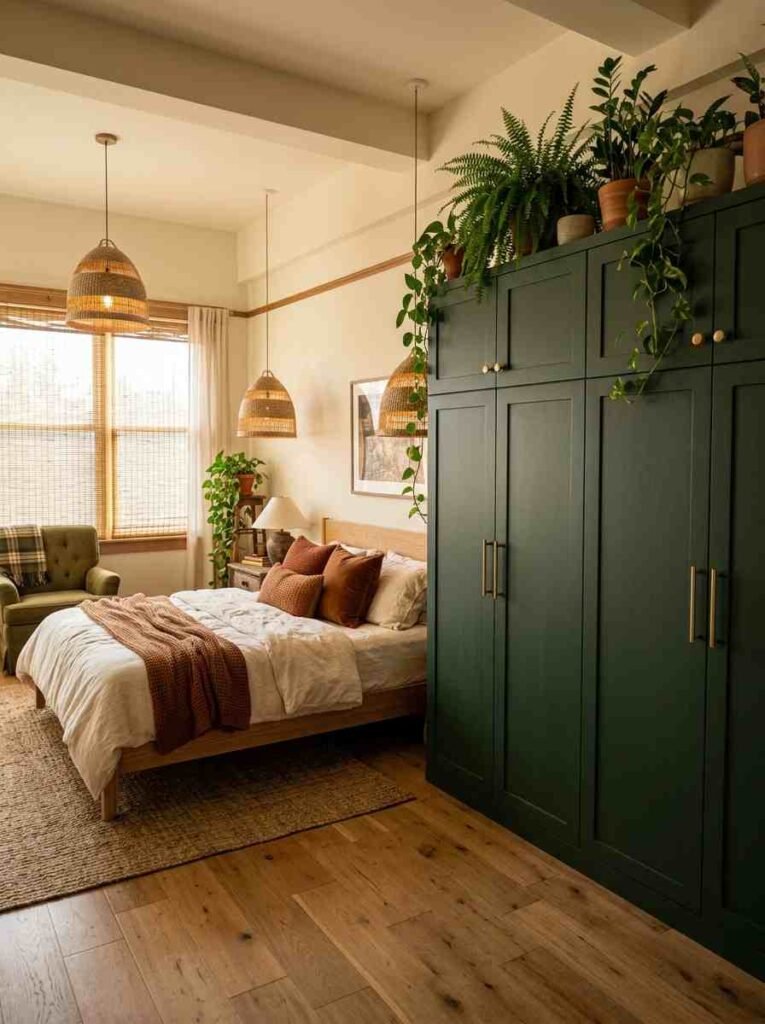
13. Forest Green — Deep, Moody, and Totally Sophisticated
Not quite as dark as black, not as muted as sage — forest green sits right in that sweet spot of bold and beautiful. It pairs wonderfully with warm wood tones and natural textures.
I’ve seen forest green wardrobes styled with rattan pendant lights and plants and it looks, honestly, like something off a Pinterest board. The real kind, not the aspirational kind you’ll never actually recreate.
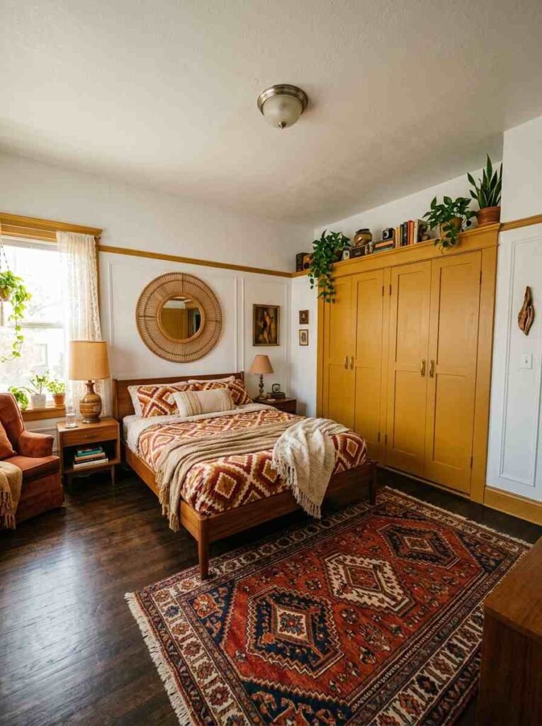
14. Warm Mustard Yellow — Energising and Fun
Okay, mustard isn’t for everyone. Honestly, this trend feels a little outdated now in some interiors circles — but a warm mustard yellow wardrobe in the right eclectic bedroom? Still kind of amazing. It’s playful, retro, and surprisingly flattering.
Pair it with dark wooden floors and white walls. Keep everything else neutral so the wardrobe does the talking.
15. Blush Peach — Softer Than Pink, Warmer Than Cream
Blush peach is that gorgeous in-between shade that’s quietly becoming one of the most searched bedroom paint colors. It’s warmer than blush pink, softer than terracotta, and creamier than peach. A real Goldilocks of paint shades.
I tried this in a small bedroom makeover for a friend and the result was just stunning — soft, glowy, warm.
16. Stone Grey — Understated Elegance at Its Best
Stone grey is what happens when grey grows up. It has those warm, sandy undertones that stop it from feeling cold or clinical. It’s neutral enough to pair with everything but interesting enough to stand on its own.
If you want a wardrobe color that works in any bedroom, any style, any light — stone grey is your answer.
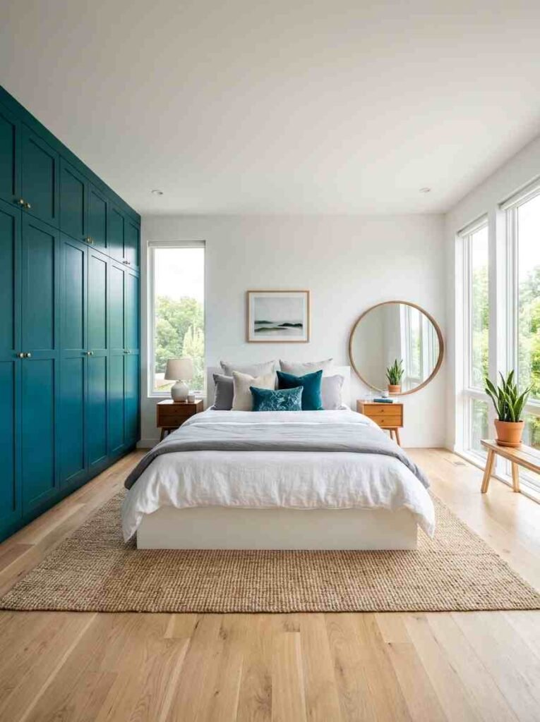
17. Teal — Vibrant, Jewel-Toned, and Surprisingly Calming
Teal wardrobes divide opinions — some people love them, some think they’re too bold. I’m firmly in the love camp. Teal has this incredible quality of being vibrant and calming at the same time, like the ocean.
Use it in a room with plenty of natural light and pair it with warm whites and wood accents for balance.
18. Denim Blue — Relaxed, Cool, Effortlessly Stylish
Not quite navy, not quite sky blue — denim blue is that cool mid-tone that works in everything from Scandi minimalist bedrooms to relaxed boho spaces. It’s casual but killer in the right setting.
Add wooden furniture and some trailing plants and you’ve got yourself a proper lifestyle blog aesthetic going on.
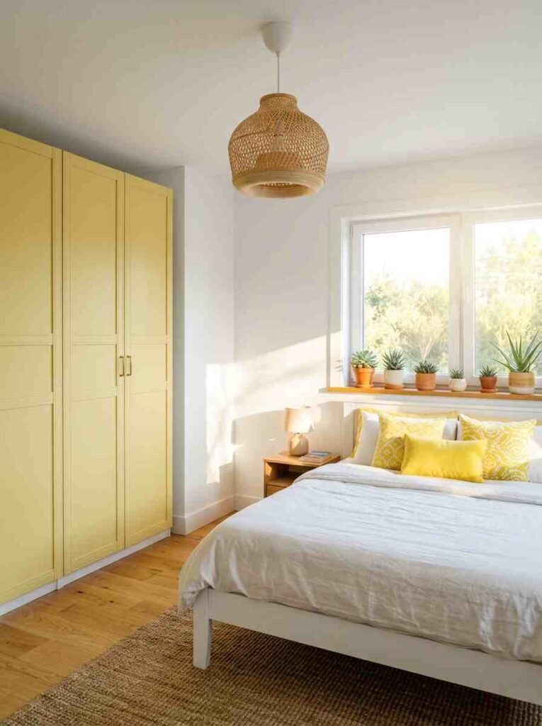
19. Soft Lemon — Cheerful Without Being Overwhelming
Yellow on a wardrobe? Hear me out. Soft, muted lemon yellow adds the most gorgeous touch of sunshine to a bedroom without screaming “I painted my wardrobe yellow.” It’s subtle, fresh, and totally underused in interior design.
Works especially well in east-facing bedrooms that get beautiful morning light.
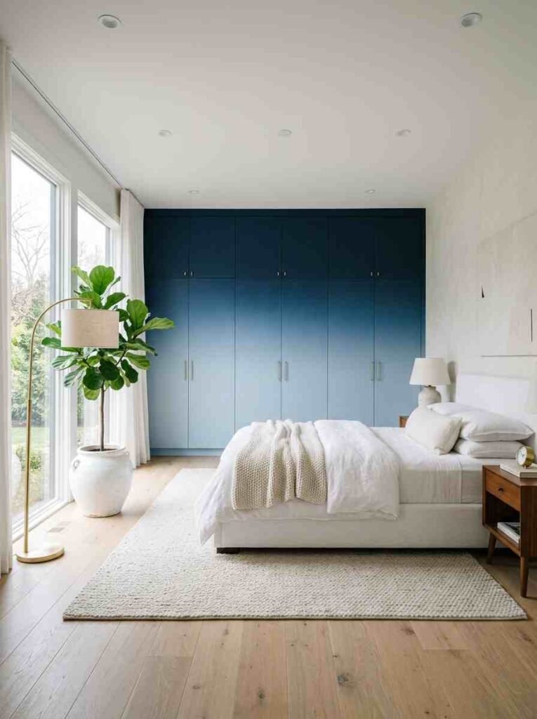
20. Ombre or Gradient Effect — The Wild Card Finish
Save the best for last — a gradient or ombre effect on your wardrobe doors is genuinely breathtaking when done right. Usually dark to light, top to bottom, using the same color family.
It takes skill and patience. I won’t pretend otherwise. But the result is unlike anything else in this list — it’s pure ar
Tips for Getting the Best Finish on Your Wardrobe
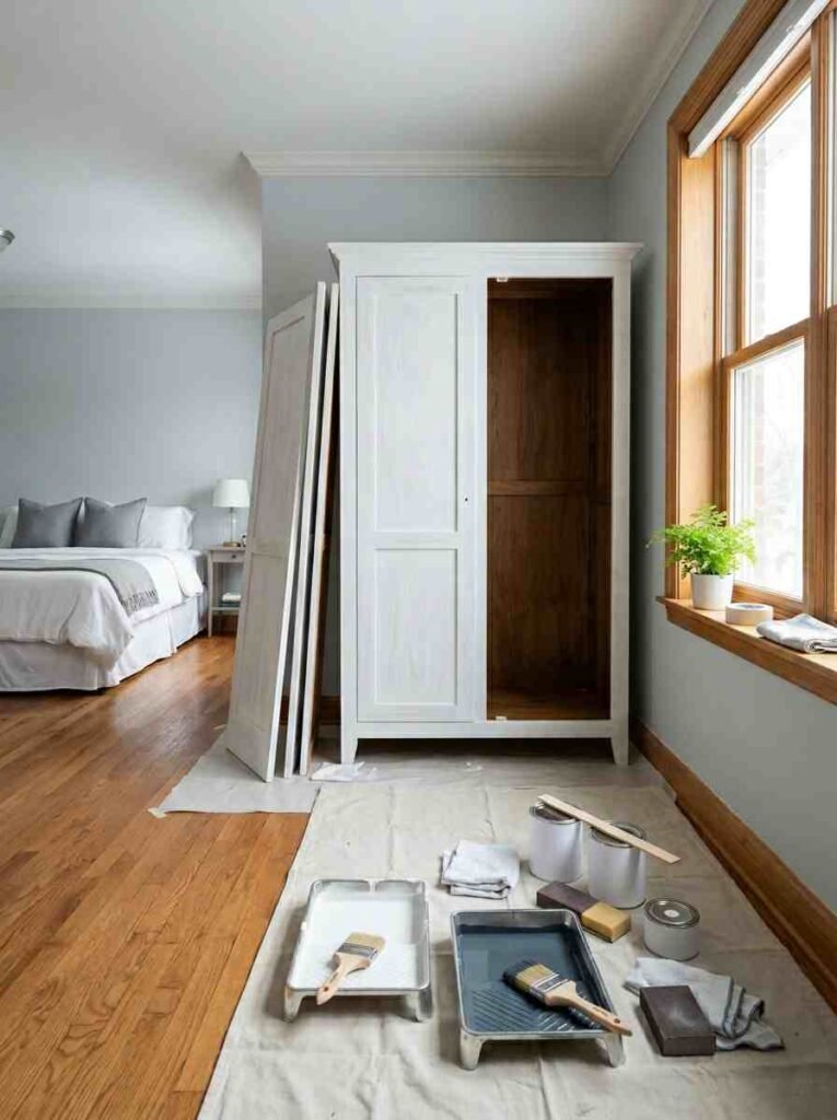
Prep Is Everything
- Clean the surface thoroughly with sugar soap before painting
- Sand lightly to create a key for the paint to grip
- Use a dedicated furniture primer — especially on laminate or veneer surfaces
- I tried skipping primer once. Never again. The paint peeled within a week 🙂
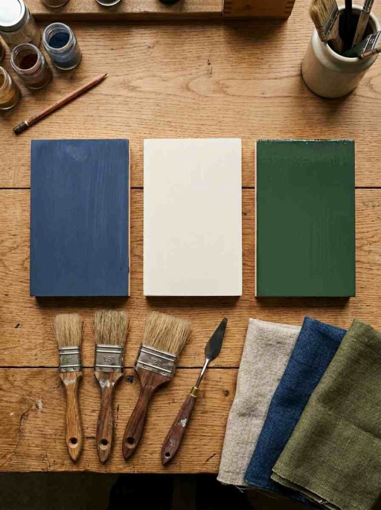
Choosing the Right Paint Type
- Chalk paint — great for a matte, vintage finish; minimal prep needed
- Eggshell or satin — more durable, slightly shiny, easier to wipe clean
- Water-based gloss — best for high-traffic wardrobes with frequent use
- Avoid standard wall emulsion — it won’t hold up on furniture
Hardware Makes a Huge Difference
You can paint the most beautiful wardrobe in the world and ruin it with cheap, mismatched handles. Honestly. Swap out the hardware as part of the project. Brushed gold, matte black, or ceramic knobs can completely elevate the final look.
How to Pick the Right Color for Your Room
| Room Size | Best Wardrobe Colors | Avoid |
|---|---|---|
| Small bedroom | White, cream, pale greige | Dark navy, black |
| Medium bedroom | Sage green, dusty pink, teal | Bright yellow, orange |
| Large bedroom | Forest green, charcoal, navy | Nothing’s off limits |
| Darker rooms | Warm white, soft cream, lemon | Deep muted tones |
External Resources Worth Bookmarking
For color matching and inspiration, I always recommend checking out Farrow & Ball’s online color tool — it’s genuinely brilliant for visualizing shades before you commit. And if you want to understand undertones better, Little Greene’s color guide is one of the most comprehensive free resources out there.
For technique tutorials — especially if you’re attempting the ombre effect — the Annie Sloan Chalk Paint YouTube channel is an absolute goldmine.
FAQ: Your Wardrobe Paint Questions Answered
Q: Do I need to sand my wardrobe before painting it? A: Usually yes — especially if it has a shiny finish. A light sand helps paint adhere properly. For raw wood or already-matte surfaces, you can often get away with just a good clean and a coat of primer.
Q: What’s the best paint for a flat-pack wardrobe (like IKEA)? A: Chalk paint works brilliantly on IKEA surfaces with minimal prep. Alternatively, use a bonding primer first, then any furniture paint of your choice. I’ve done this on a KALLAX and a PAX — both held up great.
Q: How many coats does a wardrobe need? A: Typically two coats, sometimes three for darker colors going over light surfaces (or vice versa). Always let each coat dry completely before applying the next.
Wrapping It All Up
Here’s the thing — your wardrobe doesn’t have to be an afterthought. With the right paint color, it becomes a genuine design statement that ties your whole room together. Whether you go for the safe elegance of soft white, the bold drama of charcoal, or the utterly unique look of an ombre finish, there’s a wardrobe paint idea on this list for every personality and every budget.
I’ve personally tried about half of these ideas across various rooms and renovation projects, and every single time, the transformation has been worth it. Paint is genuinely one of the most powerful — and affordable — tools in any home makeover.
So, which of these 20 ideas is calling your name? Have you already painted a wardrobe and lived to tell the tale? Drop your experience in the comments — I’d genuinely love to hear what worked (and what didn’t!) 🎨