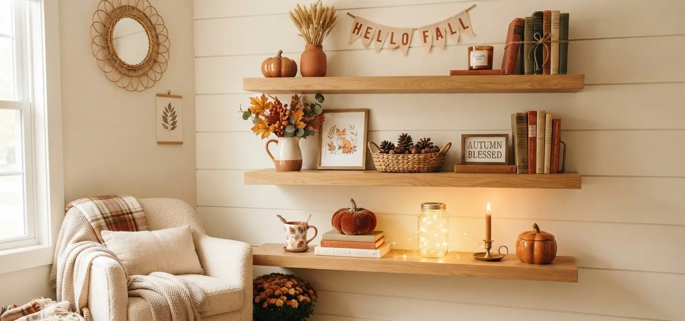
Your shelves have been staring at you since Labor Day, haven’t they?
Bare wood, a few summer candles that smell like coconut in a room that now needs cinnamon.
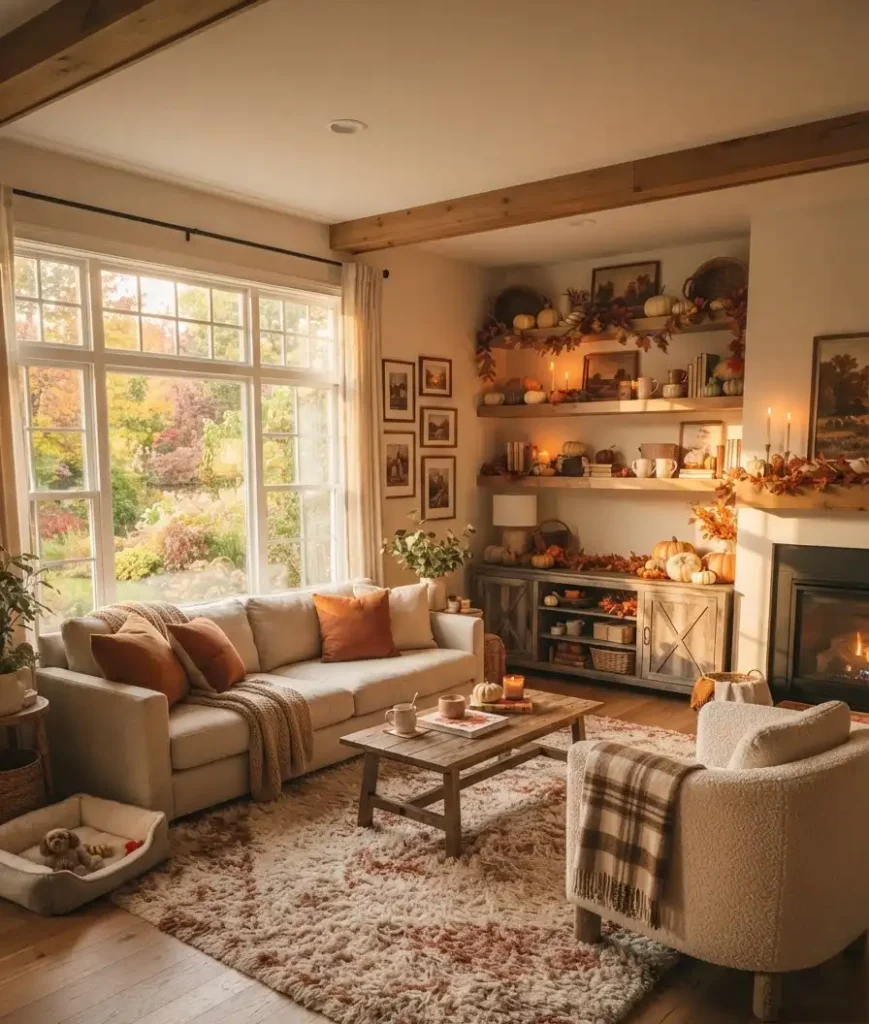
That gap between “still summer” and “okay, it’s fall” is exactly where most living rooms get stuck.
I’ve redone my own shelves for six falls running, and the ones that actually get compliments (not just a nod) always follow the same handful of moves.
This list covers 19 of them. Some take five minutes. A couple take a Saturday afternoon and a trip to a craft store.
All of them work whether you’ve got open floating shelves, a built-in bookcase, or one lonely ledge above the TV.
Why shelf styling matters more in fall than any other season
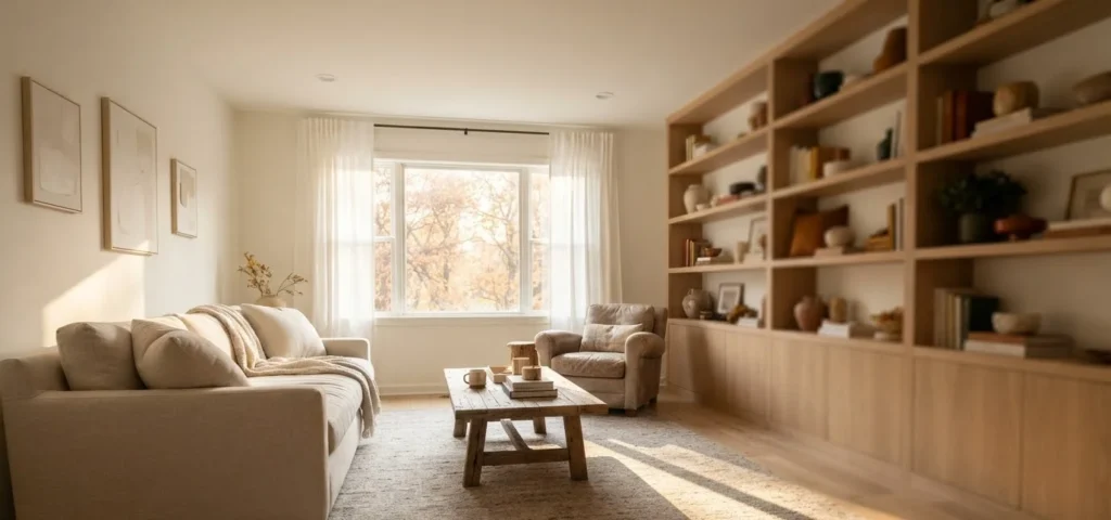
Fall light changes everything in a living room. It’s lower, warmer, and it hits horizontal surfaces (like shelves) longer than summer’s overhead sun does.
That means whatever sits on your shelf gets seen, really seen, for hours at a time.
Design blogs like Better Homes & Gardens have pointed out that fall decor leans on texture and warmth precisely because the season itself is doing less of the visual work for you. No blooming garden outside the window.
No beach towels drying on the porch. Your shelves have to carry more of the mood.
That’s not a bad thing. It’s actually the easiest season to style, IMO, because “cozy” forgives a lot of small mistakes that a crisp summer look never would.
19 fall shelf decor ideas for your living room
Warm textures and cozy accents
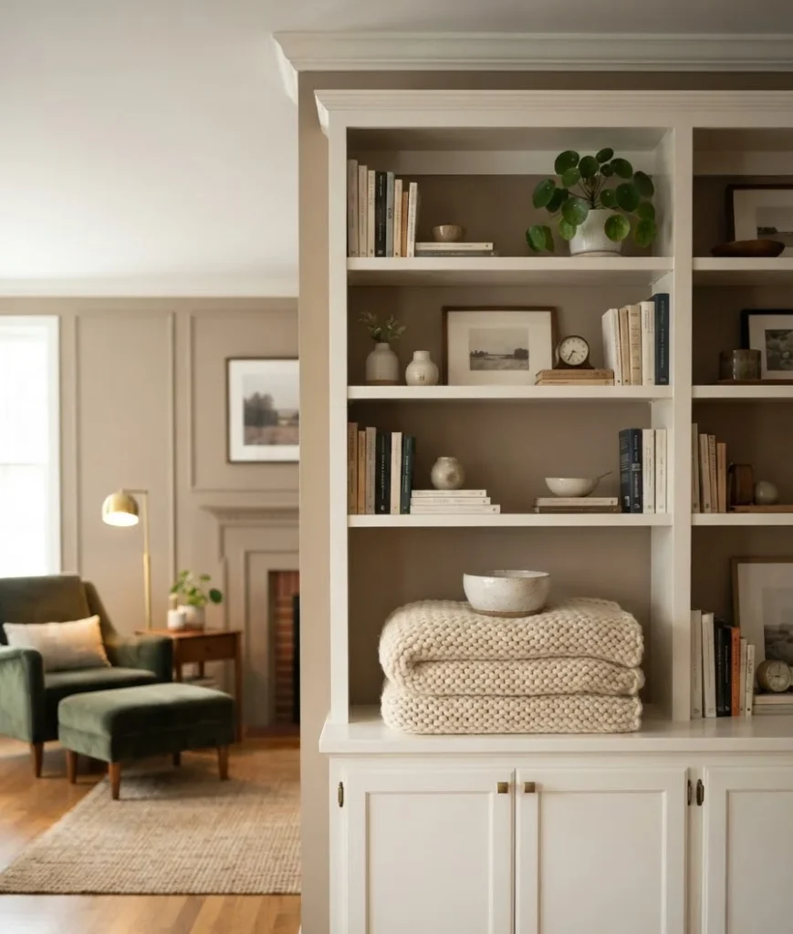
1. Chunky knit throws, folded not draped. A folded throw on a shelf reads intentional. Draped over the shelf edge, it reads like laundry. Fold it in thirds and set a small object on top so it doesn’t slide.
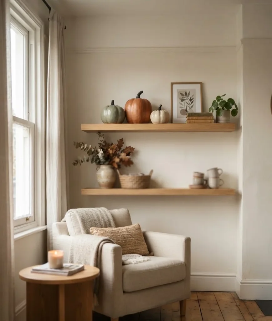
2. Mini stoneware pumpkins. Skip the plastic ones from the grocery store.
Ceramic or stoneware pumpkins in muted sage or terracotta hold up for years and don’t scream “seasonal clearance bin.”
3. Amber and smoked glass vessels. Group three different heights together. Empty is fine. Light passing through smoked glass in the late afternoon does most of the styling for you.

4. Beeswax or soy candles in stone holders. Skip anything with glitter on the jar. A plain taper in a heavy stone holder looks like it belongs in the room year-round, not just October.
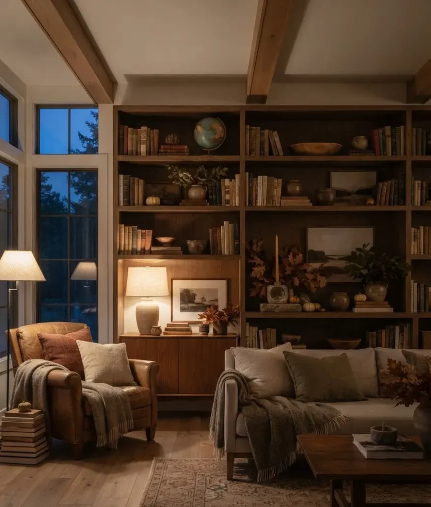
Natural elements that don’t look staged
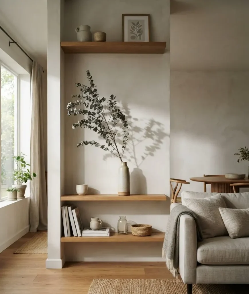
5. A single branch of dried eucalyptus or bittersweet. One stem, leaned in a narrow vase, does more than a full bouquet crammed into a vase too small for it.
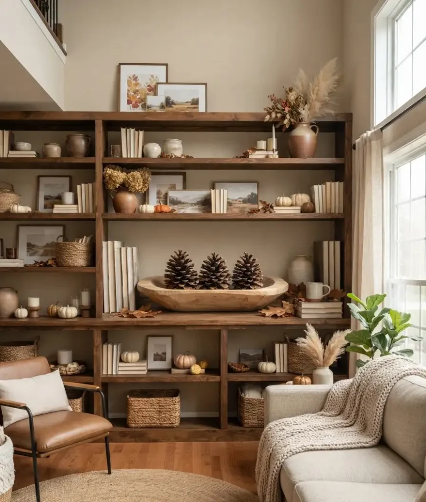
6. Pinecones, but sorted by size. Random pinecones look messy. Three of similar size in a shallow bowl look curated. It’s a small distinction and it matters more than you’d think.
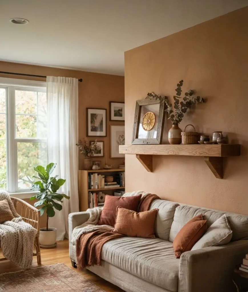
7. A slice of dried orange or apple, framed. This one takes an afternoon (dehydrate the slices, press them in a small frame) but it’s genuinely one of my favorite low-cost projects. Guests always ask about it.
8. Small wood bowls with acorns or chestnuts. Foraged, if you’ve got a park nearby. Free decor that looks better than most of what you’d buy.
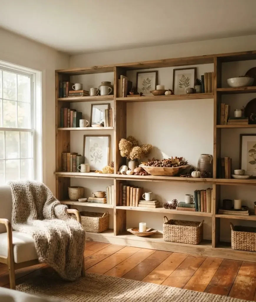
9. A short stack of birch logs. Three or four pieces, cut to the same length, stacked horizontally at one end of the shelf. Works even if you don’t have a working fireplace.
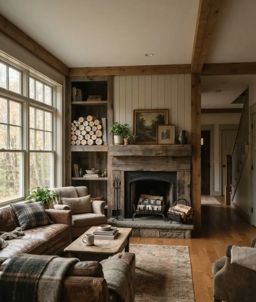
Color and texture play
10. Rust and mustard accent books. Pull the loudest-colored spines from your bookshelf and stack them here instead. Instant seasonal palette, zero new purchases.
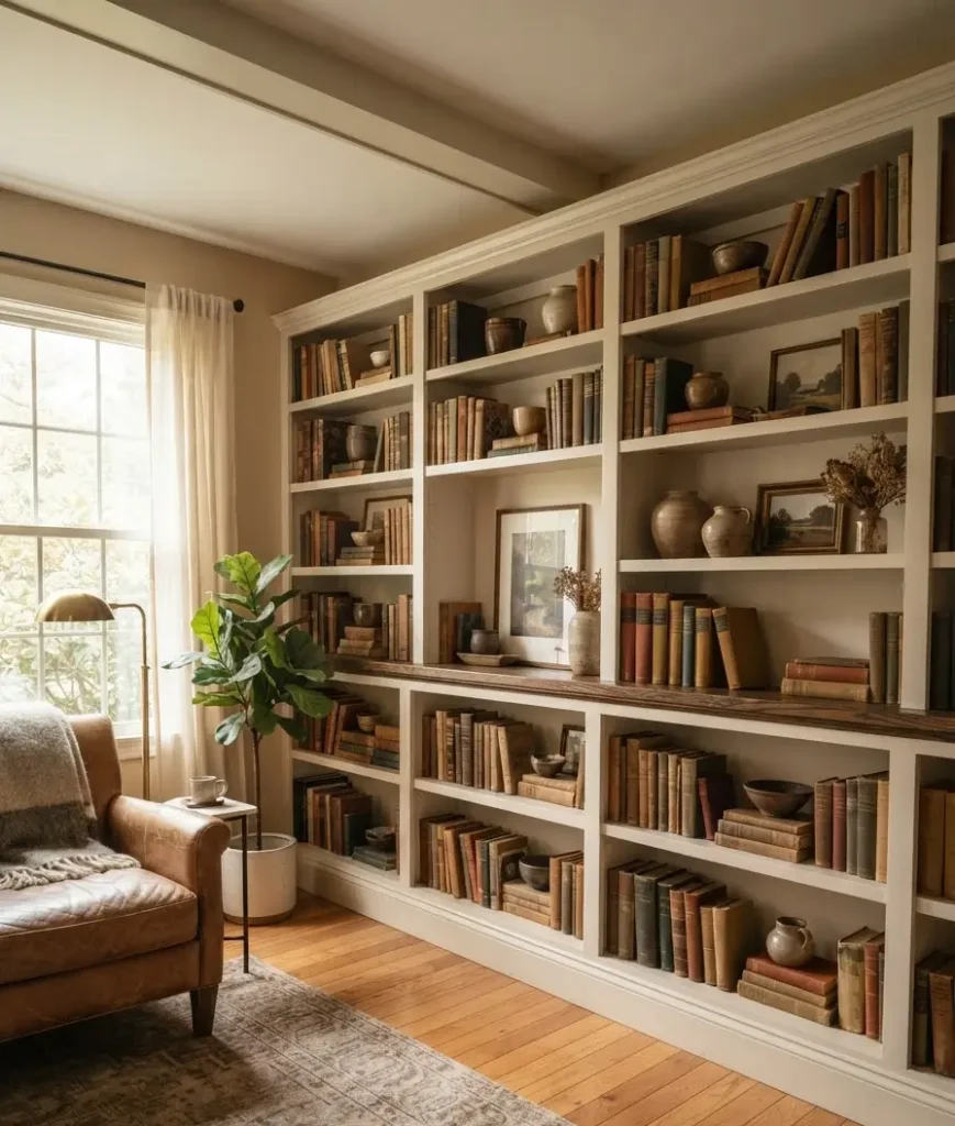
11. A ceramic vase in burnt sienna or olive. One statement color per shelf section is plenty. Two competing bold colors on the same shelf just fight each other.
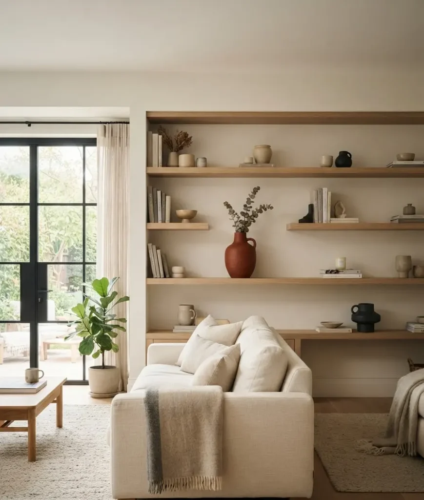
12. Woven baskets, small scale. A tiny woven basket holding matches or a few pinecones adds texture without taking up real space.
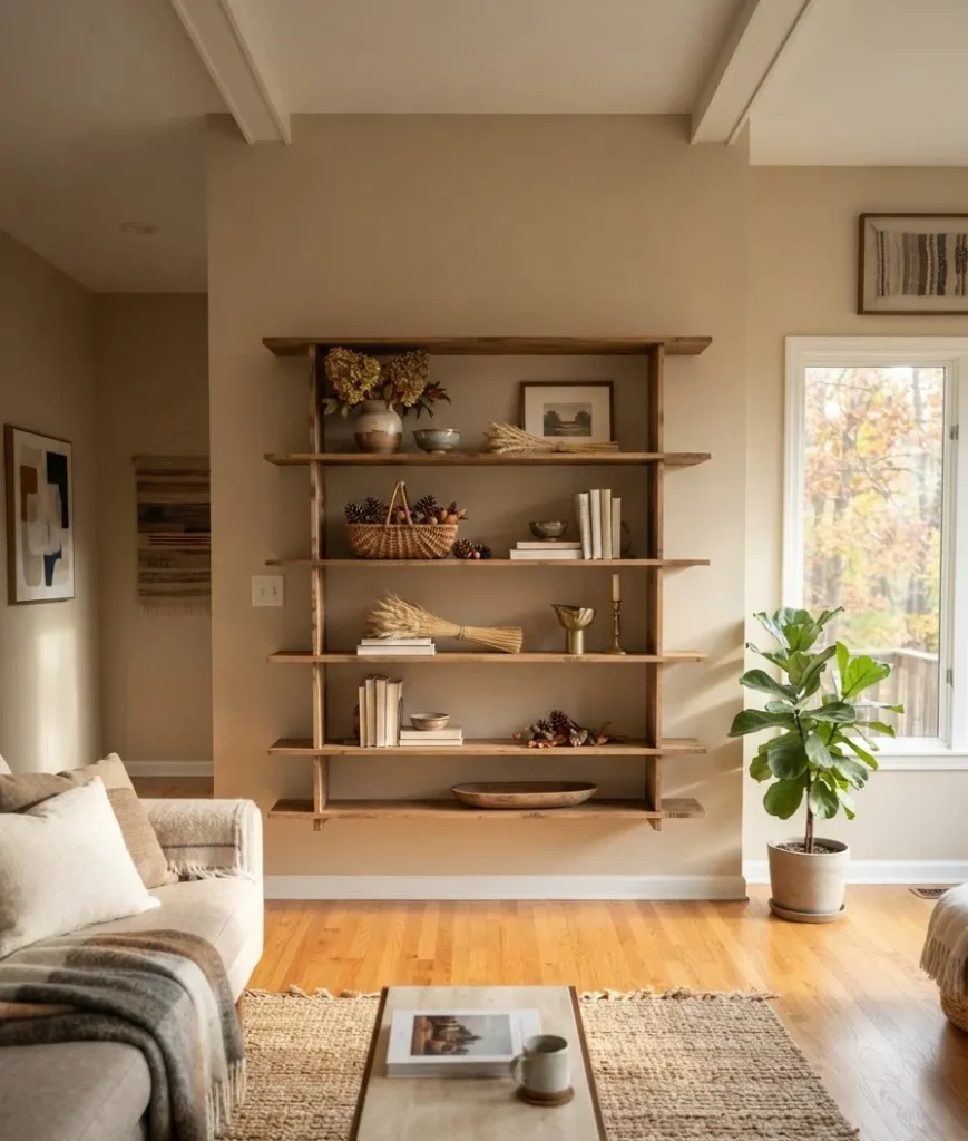
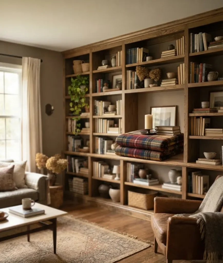
13. Plaid or gingham runner, folded into a square. Lay it flat under a candle or vase instead of draping it. It anchors the vignette without looking like a placemat that wandered off.
Functional touches that still look good
14. A small tray for remotes and coasters. Function and decor aren’t opposites. A wood or leather tray keeps clutter contained and adds another texture layer.
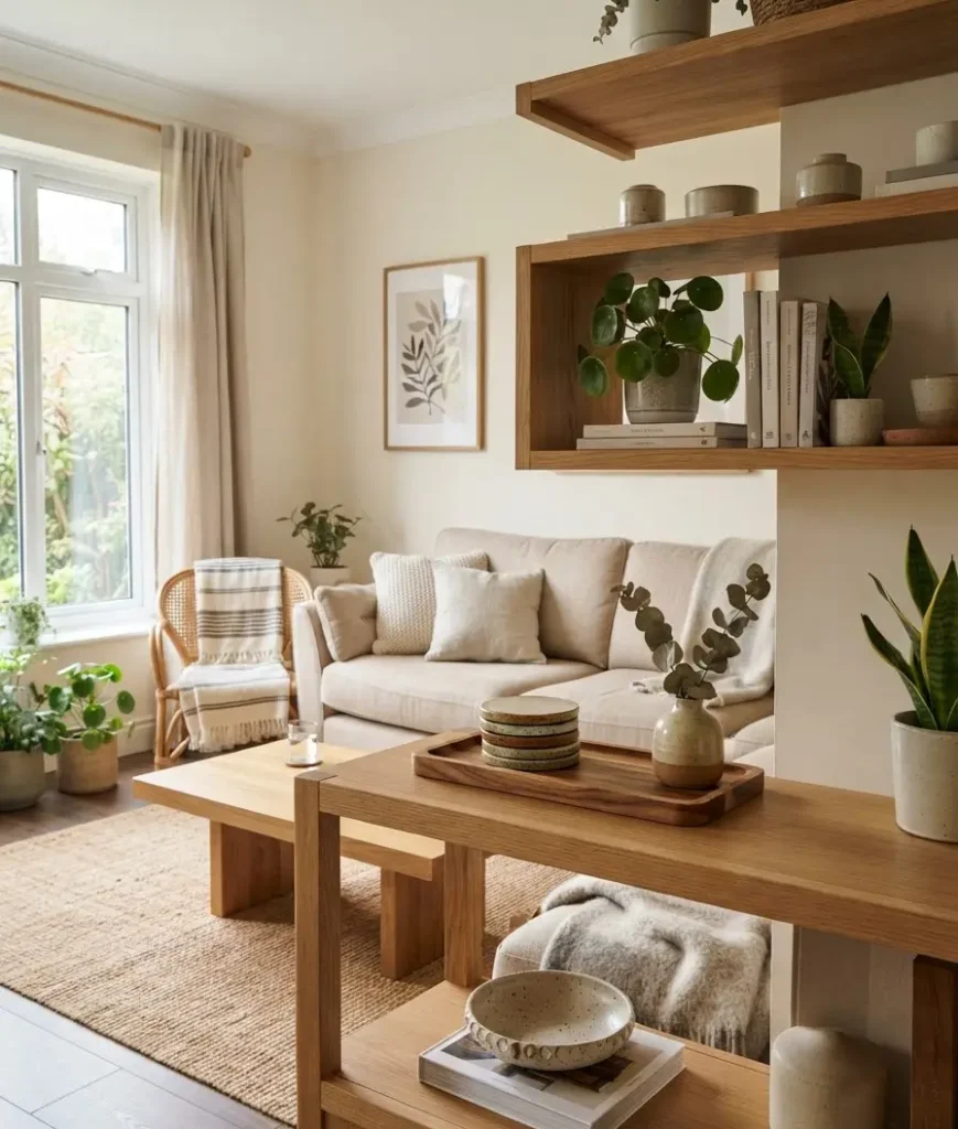
15. Framed photos with warm-toned mats. Swap summer beach photos for something with more autumnal color in the background. Even the frame color matters here; go brass or dark wood over silver.
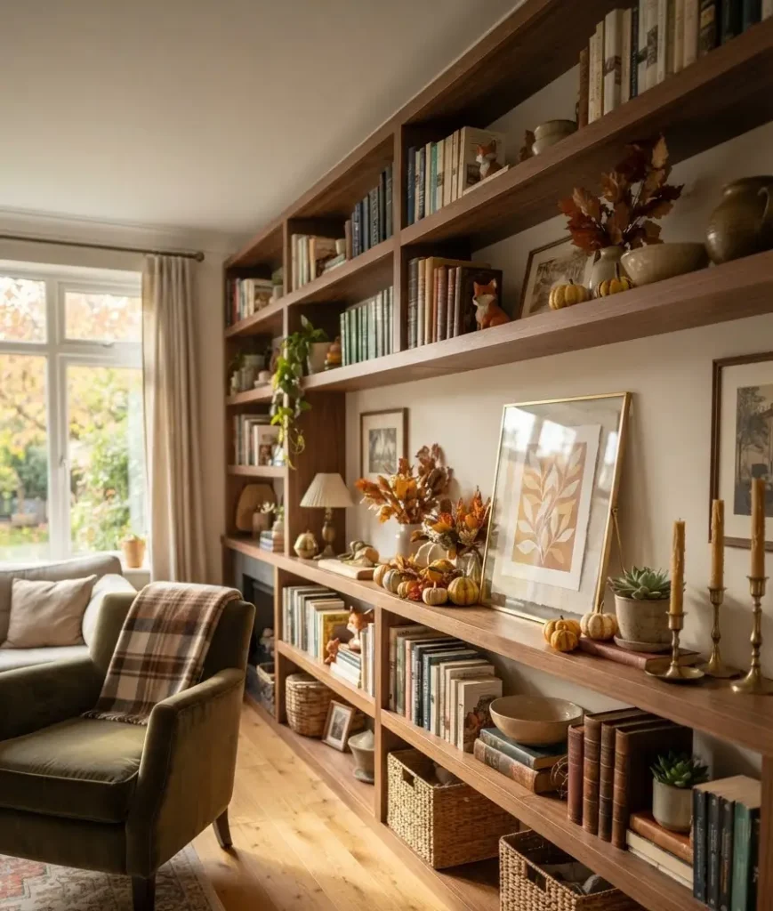
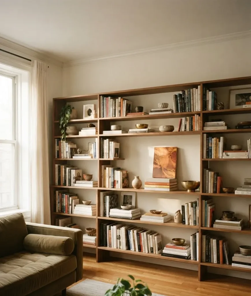
16. A stack of coffee table books, cover out. Face the spine toward the back and let the cover art (ideally something with warm tones) become part of the display.
Statement pieces worth the investment
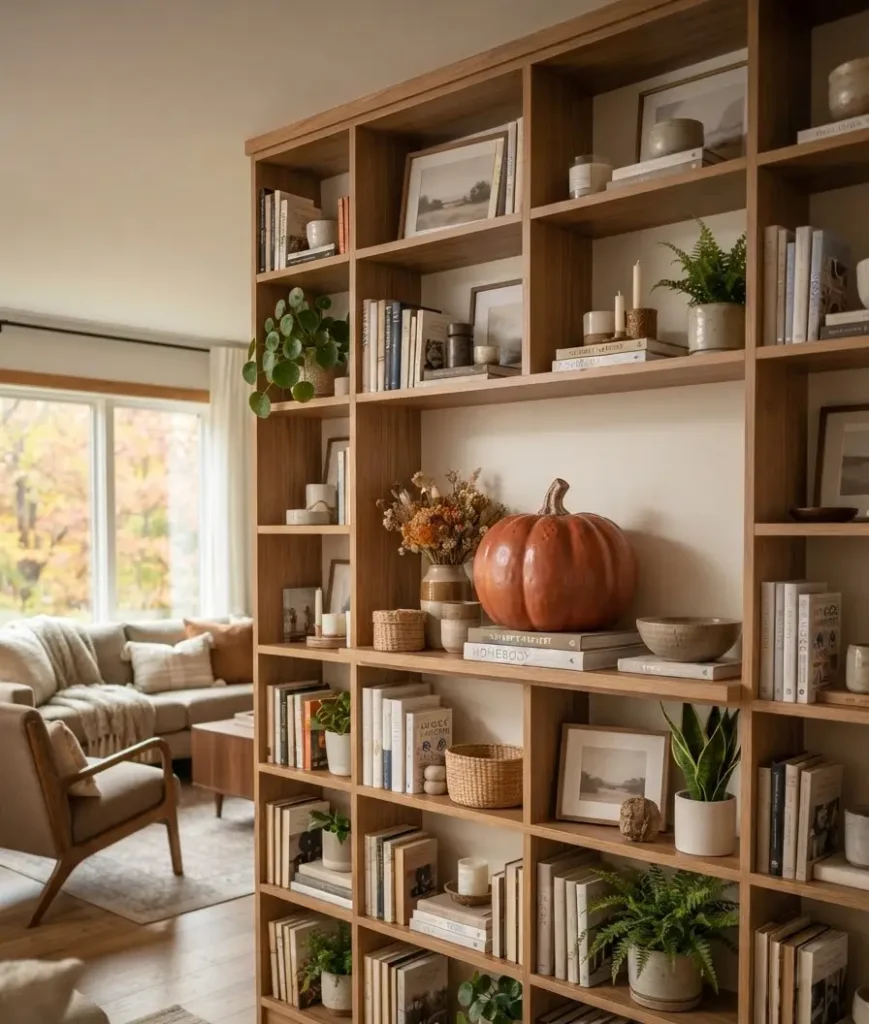
17. A single oversized ceramic pumpkin or gourd. One large piece, off-center on the shelf, reads more intentional than five small matching ones lined up in a row.
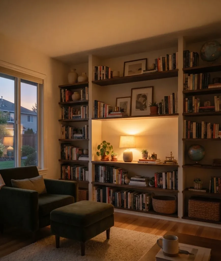
18. A textured wall sconce or small lamp, if your shelf has an outlet nearby.
Warm-toned bulbs (2700K, not the cold 5000K office kind) change the whole feel of a shelf after 5pm.
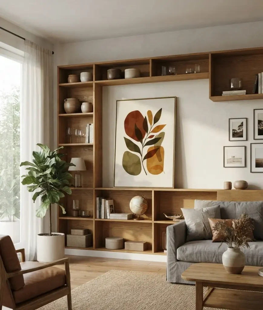
19. A framed botanical print in fall foliage tones. Apartment Therapy has covered how a single well-chosen print does more for a shelf’s cohesion than five small trinkets combined, and honestly, I agree.
Lean it against the wall instead of hanging it. It’s an easy way to rotate your look each season without new nail holes.
Quick comparison: three shelf styling approaches
| Styling approach | Best for | Time needed |
|---|---|---|
| Minimalist (3-5 items max) | Small shelves, modern rooms | 15 minutes |
| Layered (books, vessels, greenery) | Built-in bookcases, eclectic rooms | 45 minutes |
| Statement piece + supporting cast | Floating shelves, single focal point | 30 minutes |
I lean minimalist most years, mostly because I’m impatient.
But the layered look genuinely photographs better for Pinterest, if that’s your goal here.
A quick aside
Random thought, but has anyone else noticed that the “fall shelf” trend basically didn’t exist ten years ago?
It used to just be pumpkins on the porch and maybe a wreath on the door.
Shelves got dragged into this whole seasonal decor thing sometime around when Pinterest itself blew up, and now it’s basically its own subgenre. Wow, decor trends move fast.
Anyway, back to your shelf.
Common mistakes worth avoiding
A few things I’ve learned the hard way over the years:
- Overcrowding. More isn’t cozier, it’s cluttered. Leave breathing room between groupings.
- Matching everything perfectly. A shelf where every item is the same brown or same texture looks like a catalog page, not a home.
- Ignoring scale. A tiny pumpkin next to a huge vase looks like an accident, not a choice.
- Forgetting the back wall. If your shelf sits against a plain wall, a small print or piece of art behind your objects adds depth for almost no extra effort.
The National Association of Realtors has noted that small, low-cost staging updates like shelf styling can meaningfully affect how a room reads to buyers, which tells you something: this isn’t just decor for decor’s sake.
It changes how a whole room feels, sale or no sale.
FAQs
How many items should go on one shelf? Three to five per section is a solid rule of thumb. Odd numbers tend to look more natural than even ones, though this isn’t a hard law, just a strong tendency.
Do I need to buy new decor every fall? No, and honestly you shouldn’t. Rotate what you already own from other rooms, swap colors seasonally, and only buy one or two new pieces a year. Your shelf (and your wallet) will thank you.
What if my shelves are really narrow? Go vertical instead of wide. A tall, slim vase or a single framed print does more on a narrow shelf than trying to cram in three small objects side by side.
Final thought
Nineteen ideas is a lot, and you don’t need all of them. Pick three or four that actually match how you live in your space, not just how the room looks in a photo.
What’s the one shelf in your living room that’s been driving you a little crazy all month? Tell me which idea you’re trying first, and go make that shelf earn its keep this season.
