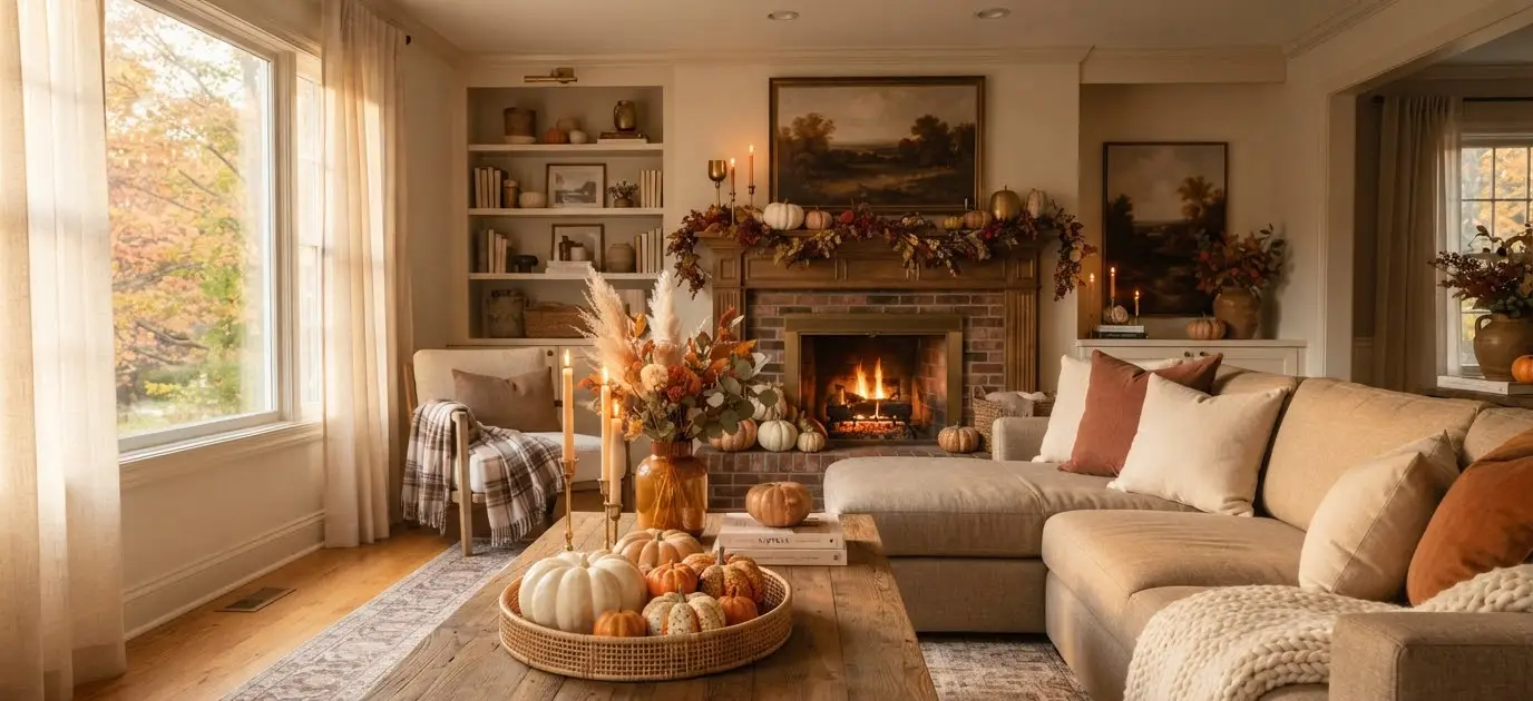
Fall hits differently when your living room actually looks the part.
You know that feeling when the air gets crisp, you light a candle, wrap yourself in a blanket, and glance at your coffee table only to realize it still has three remote controls, a receipt from two weeks ago, and a half-empty water glass? Yeah. We can do better.
I’ve spent way too many autumn seasons obsessing over table styling, testing combinations, and scrolling Pinterest at midnight.
These 17 ideas are the ones that actually work, and a few of them cost almost nothing.
1. Start With a Tray as Your Foundation
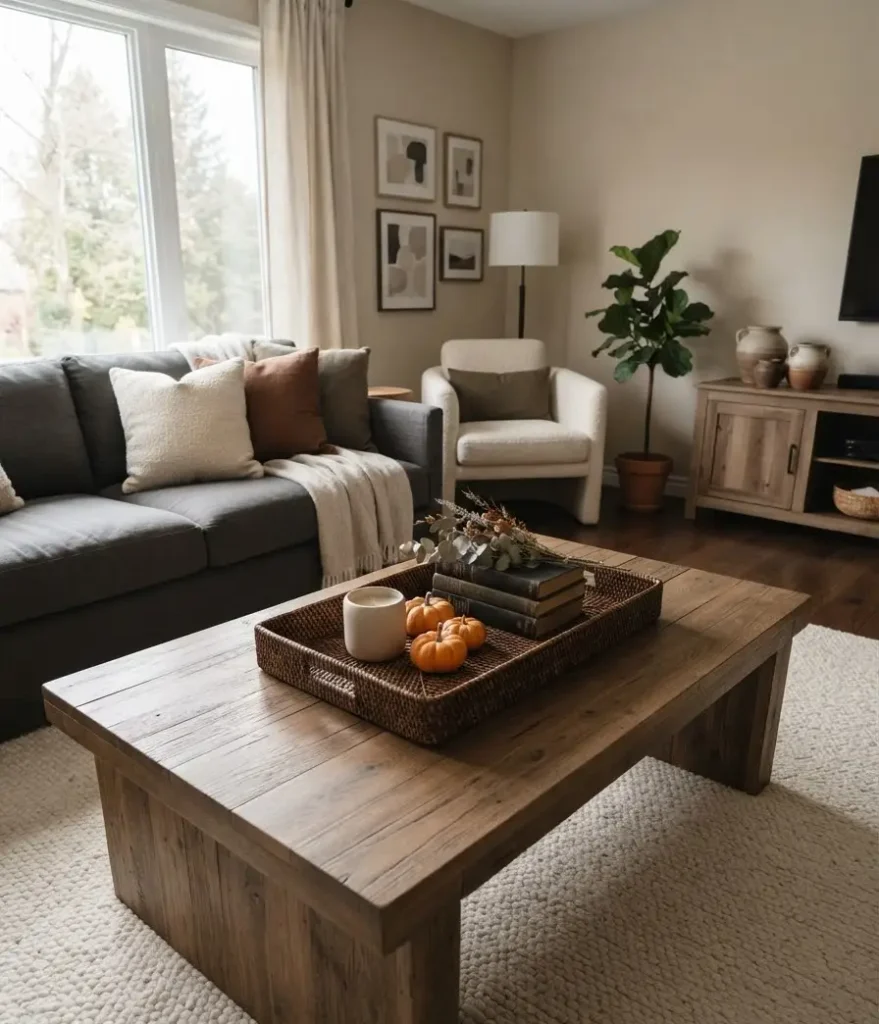
This is the trick that changed everything for me. A wooden, rattan, or dark-lacquered tray gives you an anchor.
Everything on the tray reads as one intentional vignette instead of a scattered pile of stuff.
Go with natural wood tones for a warm, earthy feel. Black or aged brass trays lean more moody and dramatic, which honestly suits fall better than people give it credit for.
2. Layer Textures, Not Just Colors
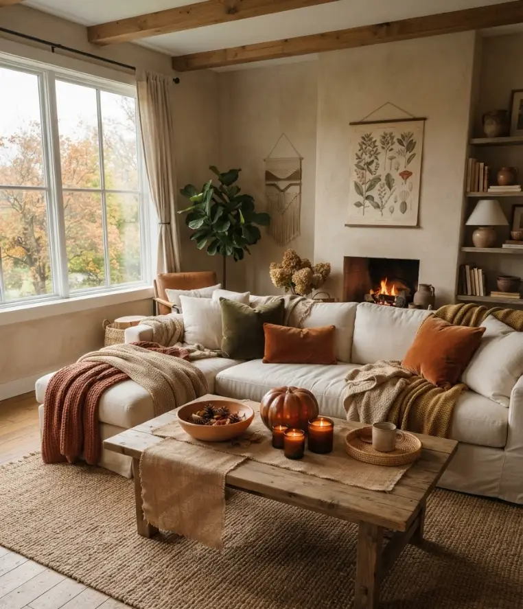
Fall decor lives and dies by texture. Smooth ceramic next to rough burlap, glossy pumpkins beside matte candles, a knit table runner under a polished candlestick.
That layering is what makes a table look styled versus just decorated.
Think less about matching and more about contrast. A velvet pumpkin next to a rough concrete bowl is autumn in one sentence.
3. Use Real Pumpkins (At Least One)
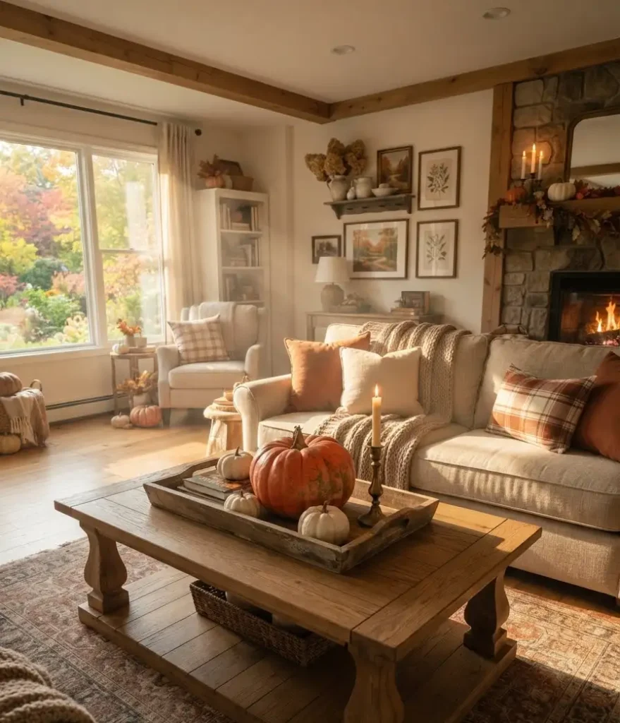
Faux pumpkins have their place, but real ones bring something no ceramic replica can fake.
The irregular shape, the slight color variation, the actual weight when you pick one up. They also age beautifully if you keep them dry.
Mix a small real pumpkin with two or three faux ones in different sizes. Nobody’s going to inspect them, and you get the best of both worlds.
4. Go Vertical With Candlesticks
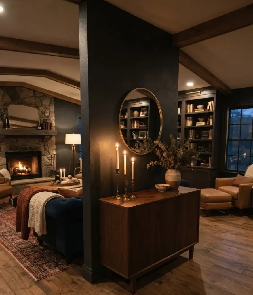
Flat tables need height. Tall candlesticks in brass, iron, or natural wood add verticality without taking up much surface area.
And when you light them at dusk? Genuinely one of the coziest things a living room can do.
Odd numbers work best. Three candlesticks of varying heights almost always look better than two identical ones placed symmetrically.
5. Bring in Dried Botanicals
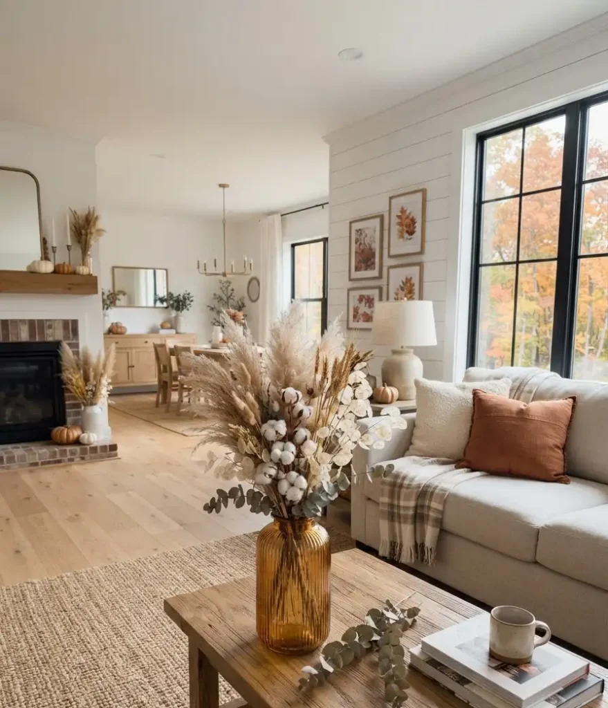
This is massive on Pinterest right now and for good reason.
Dried pampas grass, wheat stalks, cotton stems, and eucalyptus are all having a major moment and they last all season. Pop them in a simple vase and you’ve got instant fall energy.
The neutral tones of dried botanicals also let the rest of your decor breathe. They don’t compete; they complement.
6. Use a Table Runner to Define the Space
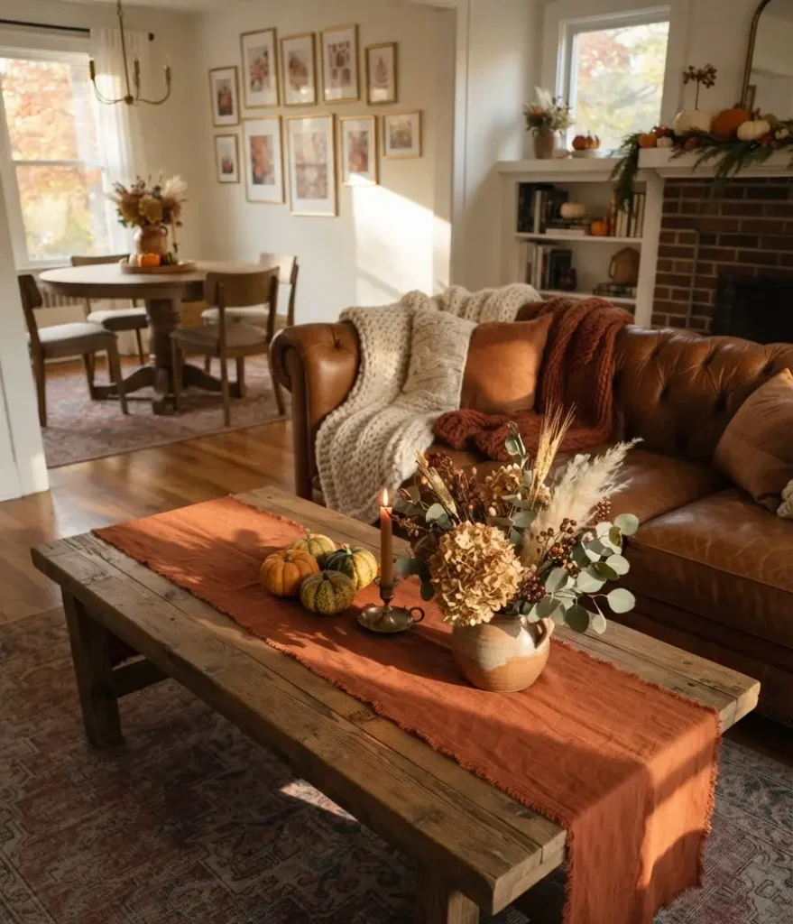
A runner in a fall-appropriate fabric, think linen, velvet, or a loosely woven jute, gives the table a visual spine. Everything else gets arranged around it rather than dumped on top.
Burnt orange, deep burgundy, and forest green are the colors earning real Pinterest saves this season.
7. Add a Bowl of Seasonal Produce
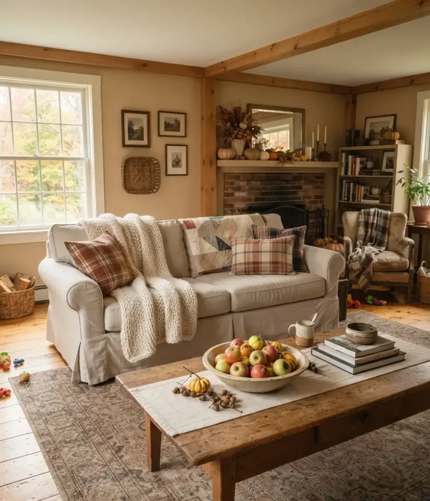
A shallow bowl filled with mini gourds, small apples, or even acorns is genuinely one of the easiest fall decor moves you can make.
It looks intentional, it’s functional (if you actually eat the apples), and it costs almost nothing at a farmer’s market.
Wow, I can’t believe how underrated this is. People spend $40 on a decorative centerpiece when a $6 bag of crab apples does the same job better.
8. Try a Fall-Themed Book Stack
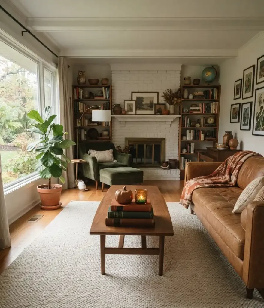
Pick 3 or 4 books with warm or dark-toned spines and stack them. Add a small object on top: a tiny pumpkin, a crystal, a single candle.
This creates a layered, collected-over-time look that feels personal rather than catalog-styled.
FYI, the actual titles don’t really matter. The spines are doing all the visual work here.
9. Introduce Dark, Rich Candles
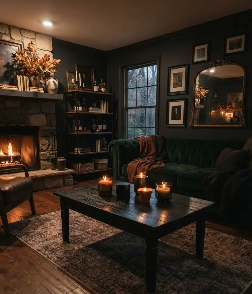
Step away from vanilla. Fall calls for candles in dark amber glass, matte black containers, or deep terracotta. The scent matters too but the vessel is what makes the visual statement.
A quick comparison:
| Candle Type | Visual Impact | Scent Profile | Best Placement |
|---|---|---|---|
| Dark amber glass | Warm, glowing | Woodsy, spice | Coffee table center |
| Matte black tin | Bold, moody | Smoke, leather | Side table corner |
| Terracotta pot | Earthy, casual | Citrus, warm floral | Tray vignette |
| Clear vessel | Minimal, clean | Any | Secondary accent |
10. Style With Acorns and Natural Findings
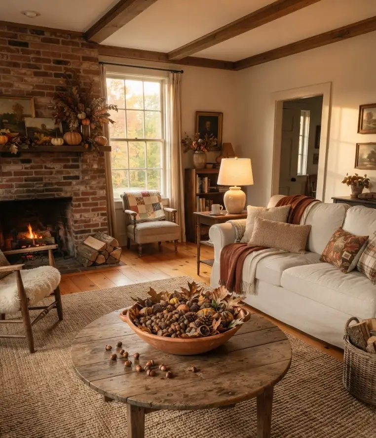
Gather acorns, pinecones, or dried seed pods from outside and scatter them loosely in a bowl or across a tray. It costs nothing and looks completely intentional.
This is one of those ideas that sounds almost too simple until you actually do it. The organic shapes and earthy tones tie everything together without trying.
11. Use a Cloche for a Focal Point
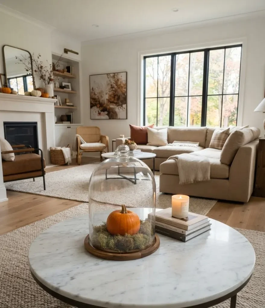
A glass cloche, the bell-shaped dome, turns anything inside it into a display. A small pumpkin, a cluster of moss, a candle, even a bird figurine suddenly looks curated instead of random.
If you don’t own one, they’re incredibly affordable and you’ll use it every single season. It’s one of those buys that pays for itself in vibes alone 🙂
12. Incorporate Amber and Brown Glassware
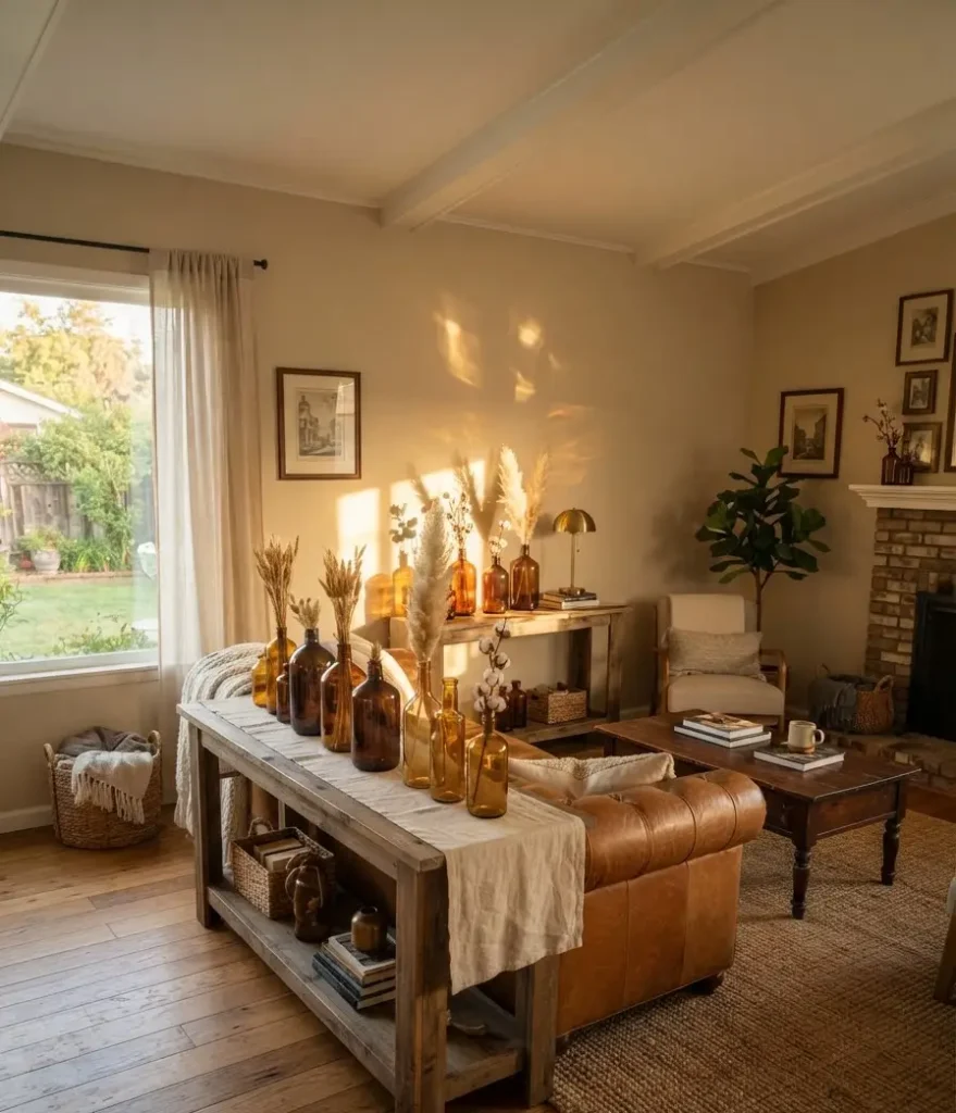
Empty bottles and vases in amber, brown, or smoked glass catch fall light in a way that clear glass just can’t.
Line a few along the back edge of a console table or cluster them on a tray with some dried stems.
Thrift stores are genuinely the best source for these. I’ve found stunning amber apothecary bottles for under $3.
13. Layer a Fall-Scented Diffuser Into the Vignette
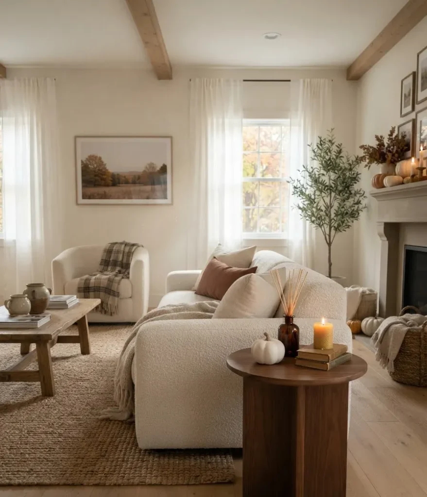
A reed diffuser doesn’t just smell good; it looks intentional when placed within a styled grouping. Choose one with a simple, dark bottle and natural reeds and it doubles as decor.
The scent connection is real. Studies on the psychology of scent and memory (like this overview from Psychology Today) confirm that scent-triggered environments make spaces feel more immersive and emotionally resonant.
Your guests won’t just see the fall decor. They’ll feel it.
14. Try a Dark Floral Arrangement
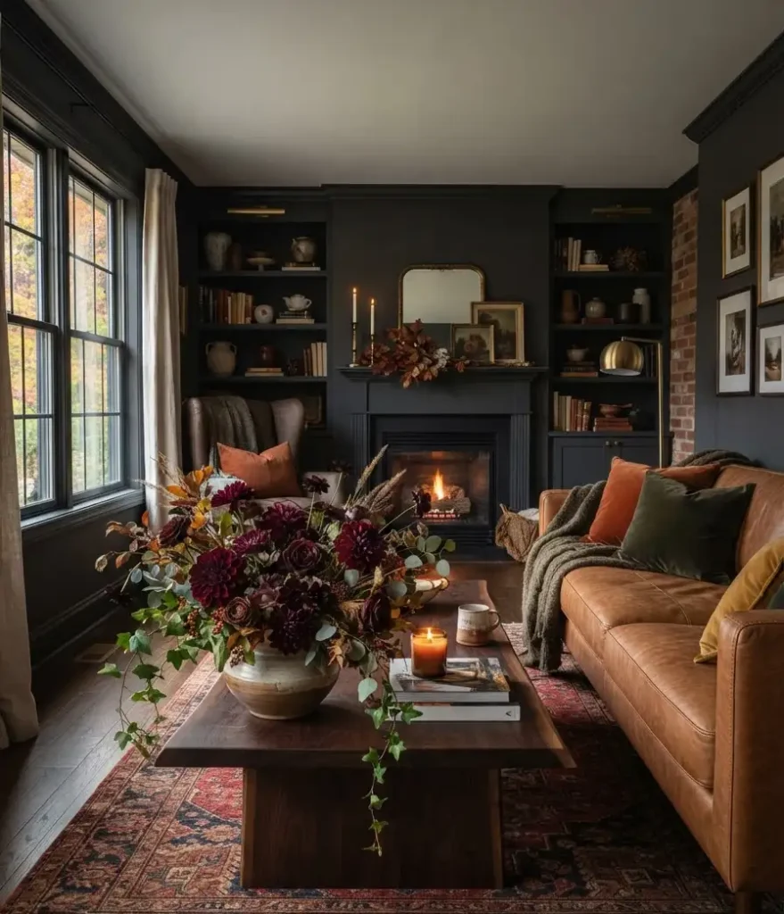
Fall florals aren’t just orange mums. Deep burgundy dahlias, dark plum roses, and chocolate cosmos make seriously dramatic centerpieces.
Pair them with greenery and a few sprigs of dried grass and you’ve got something that looks expensive.
A low, wide vase keeps the arrangement from blocking sightlines across the room while still making a real statement.
15. Add a Moss or Lichen Sphere
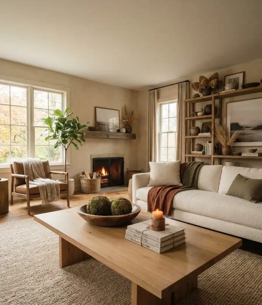
These small, textured spheres come in faux or preserved versions and add an earthy, sculptural element that people always comment on.
They sit well in bowls, on stacked books, or just on their own.
IMO they’re one of those quiet details that make a room look like it was styled by someone who really knows what they’re doing.
16. Create a Mini Lantern Moment
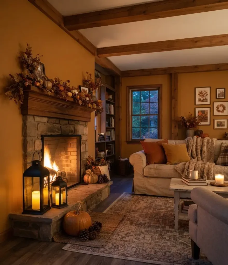
One or two small lanterns with LED candles inside add warmth and light without any fire risk.
Group them with a small pumpkin and a couple of pinecones and you’ve got a complete little vignette.
Black metal lanterns have the biggest visual punch in fall spaces. They read moody without trying too hard, which is honestly the sweet spot.
17. Let the Table Breathe
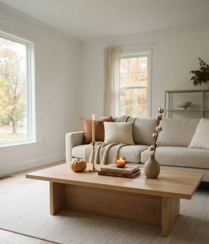
This is the one people consistently get wrong. You don’t need to fill every inch. Negative space is what lets each object read clearly.
Pick 5 to 7 objects maximum, style them in an intentional grouping, and then step back.
If it looks cluttered, remove something. The best-styled tables always have a little room between objects.
How to Pull It All Together
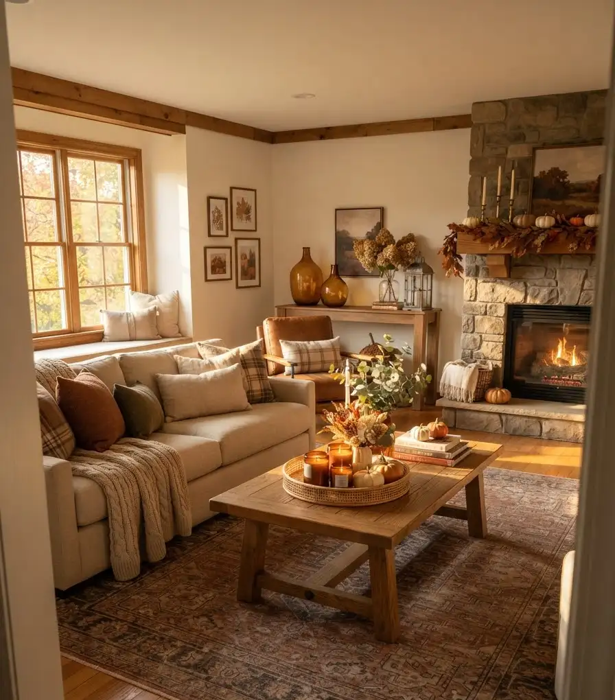
Here’s the honest framework I use every fall when restyling my coffee table:
- Start with your tray or runner as the base layer
- Add height with candlesticks or a tall vase
- Bring in one natural element (real pumpkin, dried botanicals, produce bowl)
- Layer in texture through a small object with tactile contrast
- Add one scent element (candle or diffuser)
- Place 1 or 2 personal objects (a book stack, a small collected item)
- Step back, remove anything that feels like clutter
If you want to go deeper on color theory for seasonal decor, the folks at Architectural Digest have a solid breakdown of warm-tone styling principles that translates directly into table decor.
And for sourcing pieces, Terrain by Anthropologie consistently carries some of the best fall botanicals and vessels if you’re looking for curated options.
Quick-Reference: Fall Color Pairings That Work
| Primary Color | Pairing | Accent | Overall Mood |
|---|---|---|---|
| Burnt orange | Cream + dark wood | Brass | Warm and classic |
| Deep burgundy | Black + natural linen | Aged copper | Moody and rich |
| Forest green | Cognac + cream | Matte gold | Earthy and grounded |
| Warm camel | Rust + white | Terracotta | Casual and cozy |
FAQs
How many objects should go on a fall coffee table?
Keep it between 5 and 7 pieces. Fewer than 5 and the table can feel sparse; more than 7 and you’re heading toward cluttered. The actual number matters less than leaving visible breathing room between objects.
Do I need to buy all new decor every fall?
Absolutely not. The smartest approach is building a small core collection of neutral pieces (trays, candlesticks, vases) and rotating in seasonal accents like pumpkins, dried botanicals, and fall-colored candles. You’ll reuse 70% of your pieces year after year.
What’s the easiest single change for a fall coffee table?
Swap your current candle for one in a dark or warm vessel and add a small real pumpkin beside it. Two moves. Done. It takes about 45 seconds and the difference is genuinely noticeable.
Final Thought
Fall table styling doesn’t need a big budget or a design degree. It needs a tray, some intention, and the willingness to remove two things you almost kept. The ideas above work because they’re built around texture, warmth, and restraint rather than buying more stuff.
So here’s a question worth sitting with: which one of these are you trying first this weekend? Drop it in the comments or save this for later when the leaves actually start turning. Either way, your coffee table is about to have a very good autumn.
