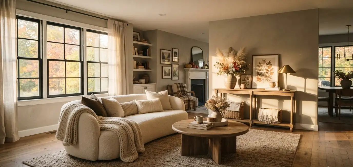
I redid my living room three falls ago with exactly nine dollars of ambition and a Pinterest board titled “someday.”
It took me a full season to get it right, and I made almost every mistake you can make with beige.
So if you’re staring at your living room right now wondering why it looks flat instead of cozy, I get it.
Neutral doesn’t mean boring. It means every piece has to work harder, because there’s no bold color to hide behind. That’s the whole trick, and once you see it, you can’t unsee it.
Why neutral fall decor actually works better than you’d think
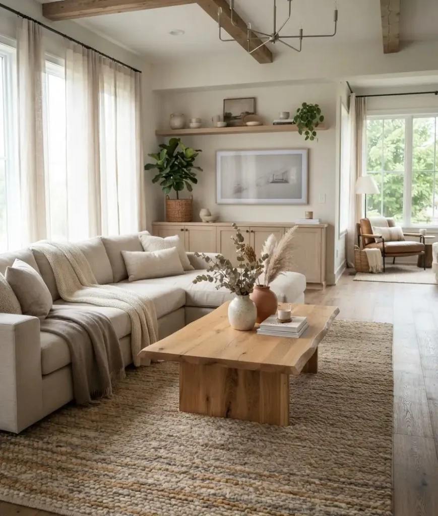
People assume neutral rooms are the safe, forgettable choice. IMO that’s backwards.
A well-done neutral room is the hardest look to pull off well, which is exactly why it looks so expensive when someone gets it right.
Fall gives you an excuse to lean into warmth without touching a single pumpkin-spice candle (please, for the love of good taste, skip those).
Think oatmeal, warm ivory, driftwood brown, soft taupe.
These colors photograph beautifully for Pinterest boards because they let texture and light do the talking instead of competing colors fighting for attention.
Here’s the honest part: a neutral room with zero texture just looks unfinished, not elegant.
That’s the mistake I made the first time around. I painted the walls a gorgeous warm greige and then plopped down a flat gray sofa and called it done.
It looked like a waiting room. A nice waiting room, but still.
Start with your base layer: walls, sofa, rug
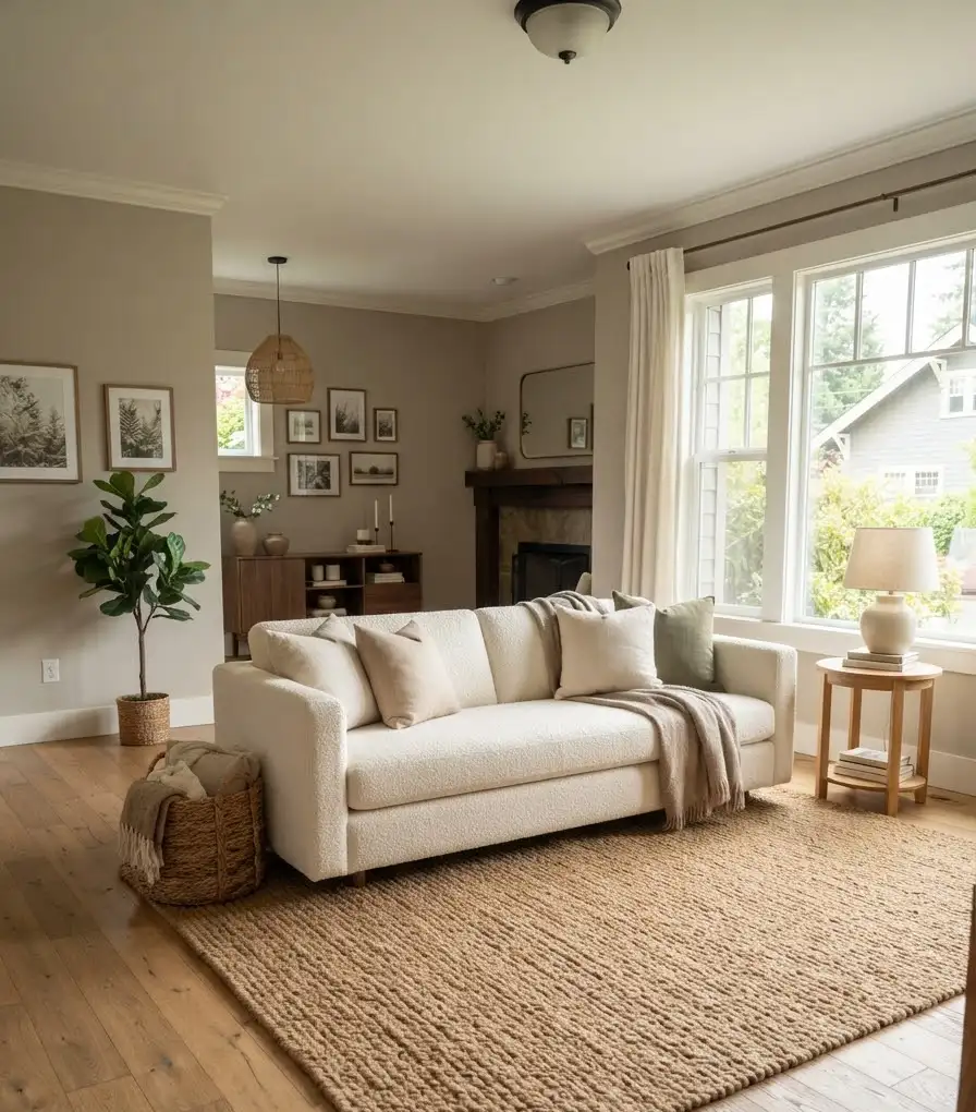
Your base layer sets the temperature of the whole room, literally and visually. Get this part right and everything else becomes easy.
For walls, warm neutrals are having a real moment heading into this fall and winter. Sherwin-Williams named Universal Khaki as its 2026 color of the year, an earthy, warm tan that pulls a room away from that flat gray-box feeling a lot of us are tired of.
I painted my own hallway a color in that family last spring and it changes completely depending on the time of day, which sounds dramatic until you actually watch it happen.
A few base-layer picks worth considering:
- A warm greige or oatmeal wall color instead of cool gray (cool gray reads more like a hospital than a home in fall light)
- A boucle or linen sofa in cream or warm white, since both fabrics catch light in a way flat cotton doesn’t
- A wool or jute area rug with visible texture, not a flat printed one
Ever notice how the rooms you save on Pinterest almost always have a chunky, textured rug?
That’s not an accident. Flat rugs disappear into the floor. Textured ones anchor the whole space.
Layer textures like you mean it
This is the section that actually matters most, so stick with me here.
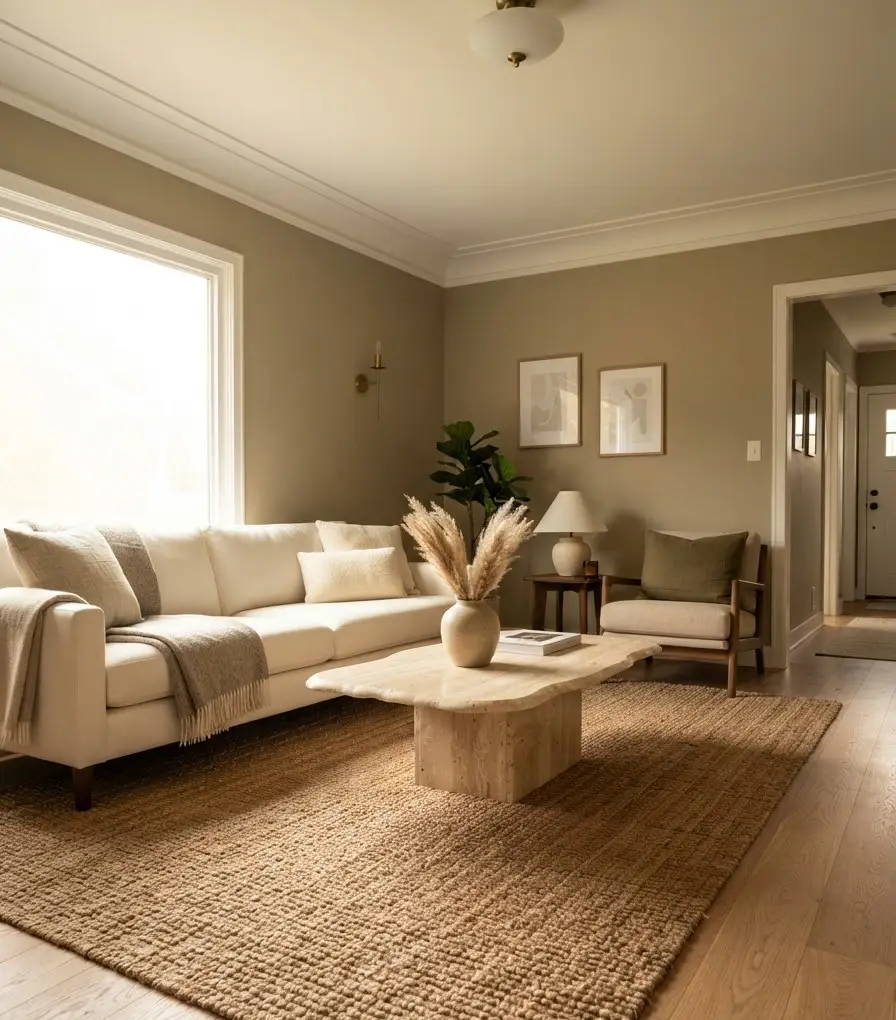
A neutral room lives or dies on texture. Without color to create contrast, your eye needs something else to catch on, and that something is texture.
Rough next to smooth. Matte next to a little bit of shine. Soft next to structured.
Designers who work almost exclusively in neutral palettes talk about this constantly, and for good reason: layering different textures and finishes is what keeps a neutral room from reading as flat, especially once you get past the sofa-and-rug basics into the smaller details.
Here’s how I actually build a textured room, in the order I do it:
- Base fabric on the sofa (boucle, linen, or a nubby weave)
- A chunky knit throw draped over one arm, not folded flat
- Two or three pillow textures mixed together: one velvet, one linen, one something with fringe or embroidery
- A wood or stone coffee table to introduce a hard surface against all that soft fabric
- A woven basket or two for baskets of blankets, magazines, or, let’s be honest, remote controls you can never find
I’ll be honest about something: I used to think mixing three pillow textures on one sofa was excessive.
It’s not. It’s the difference between a room that photographs well and one that looks like a furniture showroom nobody actually lives in.
Bring in fall without going full harvest festival
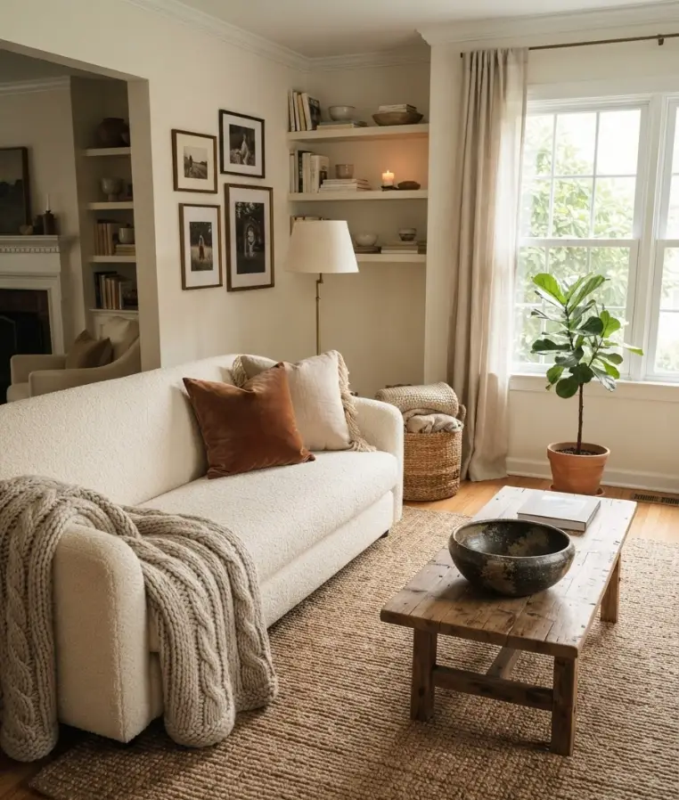
You can absolutely bring fall warmth into a neutral room without a single fake pumpkin in sight, and honestly, your future self will thank you come January when you don’t have to undecorate a theme.
Instead, reach for:
- Deep amber or rust accent pieces in small doses, like one vase or a single throw pillow
- Dried pampas grass or wheat stems in a ceramic vase (these last for months and somehow look more expensive every time I dust them)
- Wood-tone candles or a cedar-scented one instead of anything screaming cinnamon roll
- Sheepskin or faux-fur throws draped over a chair for that lived-in, ready-for-a-blanket-fort feeling
A quick, slightly random thought here: I’ve never once regretted buying real dried florals instead of fake ones, even though the fake ones are technically more practical.
There’s something about the real, slightly imperfect ones that just feels more like a home and less like a display.
Lighting changes everything, and most people skip it
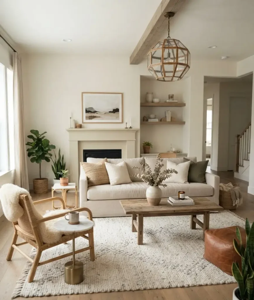
Nobody puts lighting on their decor checklist and that’s a real shame, because it’s doing more work than half the furniture in your room.
Fall means shorter days and softer light coming through your windows, so your artificial lighting has to pick up the slack.
Overhead lighting alone makes a neutral room feel cold and clinical, almost like a dentist’s waiting area.
You want layers here too: a floor lamp in one corner, a table lamp near the sofa, maybe a few candles on the coffee table for evenings.
Warm bulbs matter more than people realize. A cool white bulb in a warm neutral room fights everything you just spent a weekend arranging.
Stick to warm white, somewhere around 2700K, and watch how much cozier the whole space feels without moving a single piece of furniture.
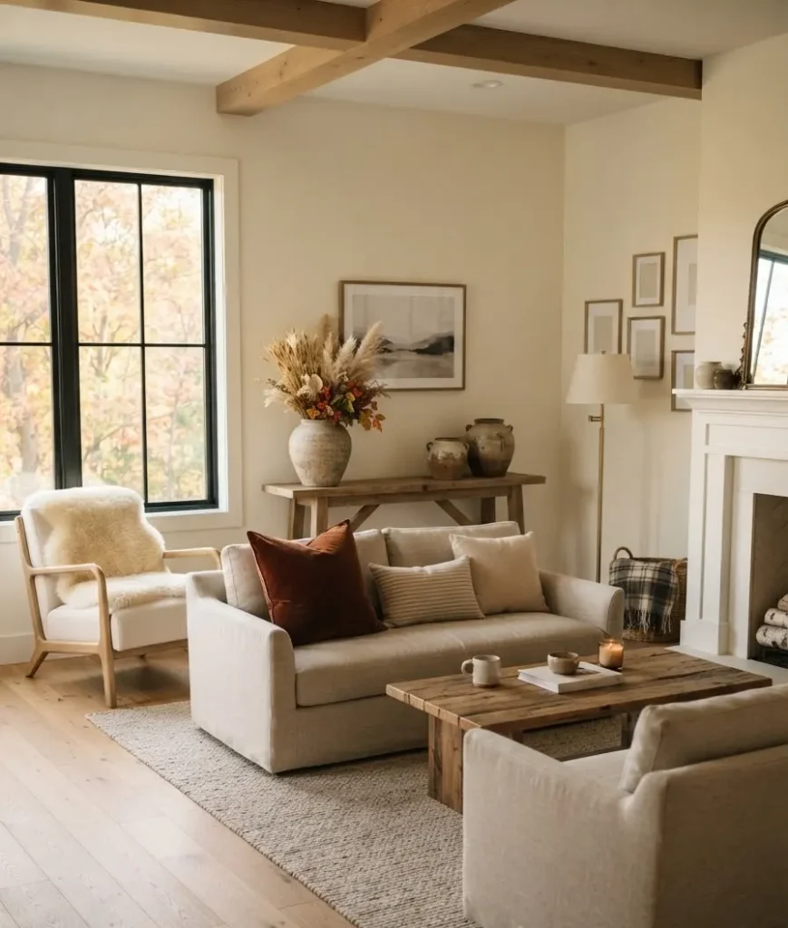
I switched every bulb in my living room over one Saturday afternoon and the difference genuinely surprised me.
This is insane, but a five-dollar bulb swap did more for the “cozy fall living room” feeling than the expensive throw blanket I’d bought two weeks earlier. Lesson learned.
Seasonal swaps that don’t require a full redecorate
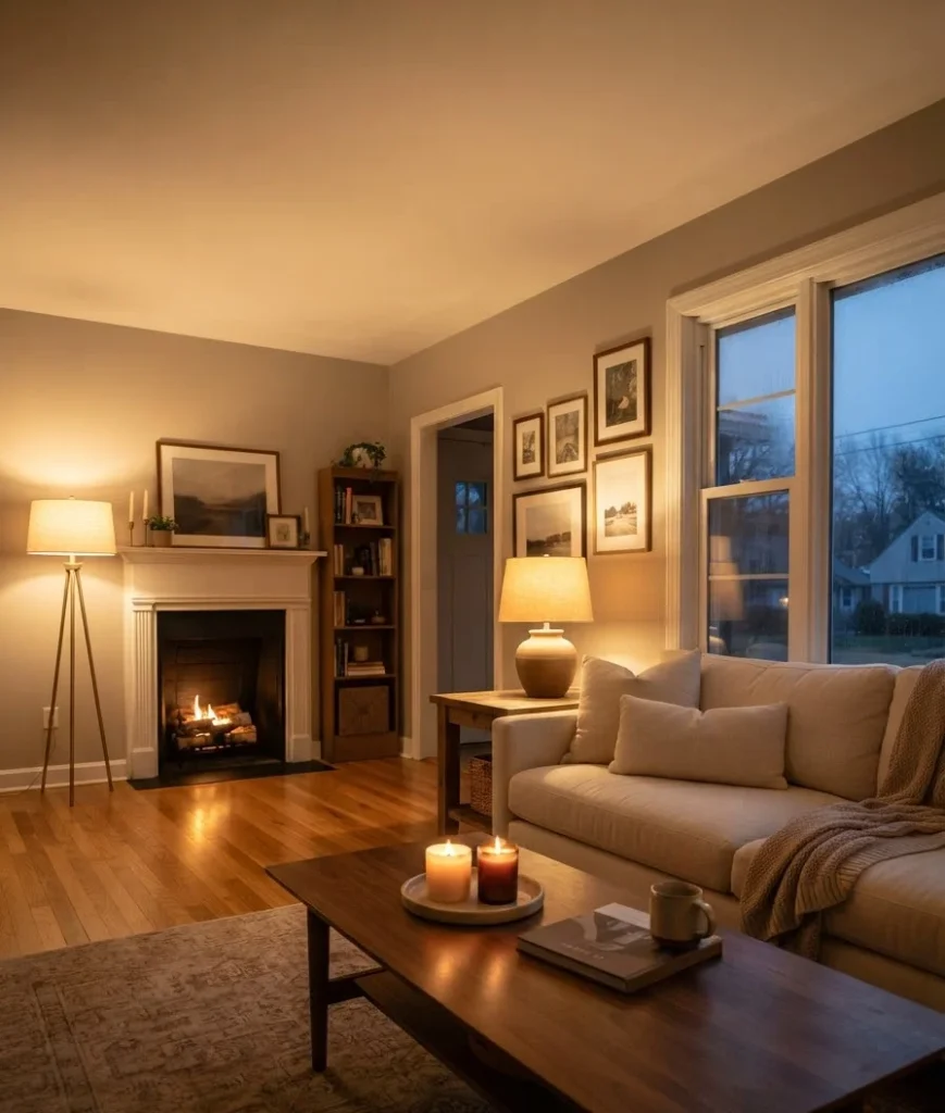
You don’t need to buy a whole new living room every September.
A handful of small swaps carries the whole look, and it means storage stays manageable too, which matters if you live somewhere without a spare closet to spare.
Consider rotating in:
- A darker, richer throw blanket to replace a lightweight summer one
- One or two amber or rust pillow covers that slip over your existing summer pillow inserts
- A wood-wick candle swapped in for whatever citrus scent you had going in July
- Dried stems instead of fresh summer flowers, since they last through the entire season without wilting on you
This approach also saves money, honestly.
Buying pillow covers instead of entirely new pillows, or swapping a candle instead of every piece of decor, keeps the seasonal refresh affordable.
IMO that’s the most underrated part of doing neutral decor well: it’s genuinely one of the cheaper aesthetics to maintain once your base layer is right.
A quick reference table for your neutral fall palette
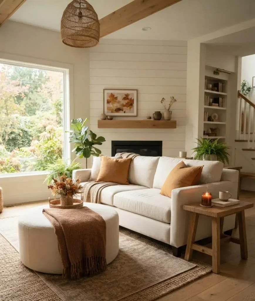
Here’s a short breakdown I wish someone had handed me before my first attempt at this.
| Element | Best fall-friendly neutral | Texture pairing |
|---|---|---|
| Walls | Warm greige or khaki | Matte finish paint |
| Sofa | Warm ivory or oatmeal | Boucle or linen |
| Rug | Soft taupe or camel | Wool or jute weave |
| Accents | Rust, amber, cedar brown | Ceramic, wood, dried florals |
Keep this nearby when you’re shopping. It’s saved me from buying at least two things that would have clashed horribly with everything else in the room, including a chair that seemed perfect in the store and turned out to be the wrong shade of gray under my living room lighting entirely.
Common mistakes people make with neutral rooms
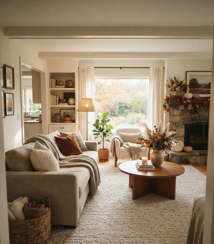
I’ve made a couple of these myself, so consider this a public service announcement.
Going too matchy is the biggest one. If your sofa, rug, curtains, and walls are all the exact same shade of beige, the room goes flat instantly. Wow, does it go flat fast. You want variation within the neutral family, not one single shade repeated everywhere.
Skipping the metal accents is another one people overlook. A little bit of warm brass or aged bronze, on a lamp base or picture frame, keeps a neutral room from feeling too soft and sleepy. It gives the eye one more thing to land on.
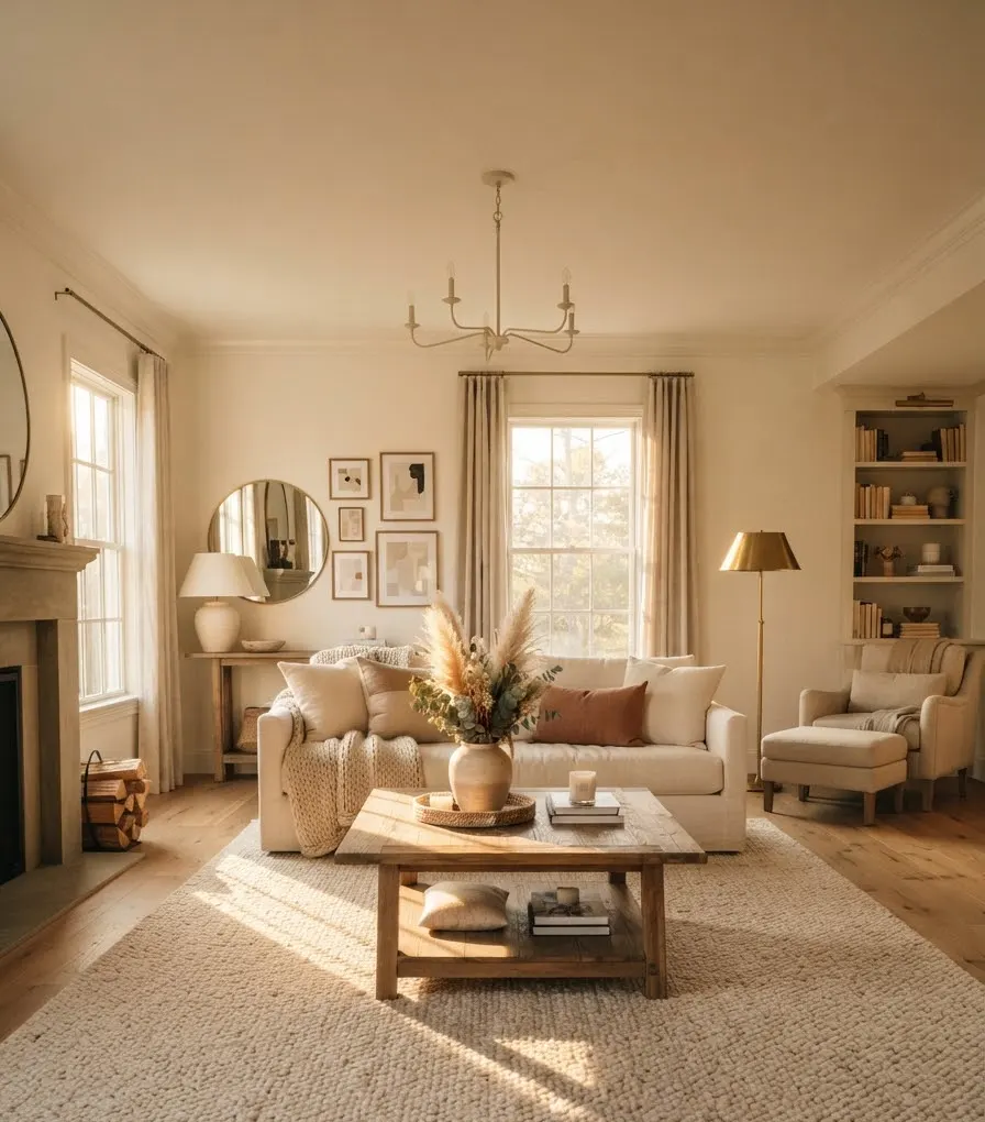
And honestly, forgetting a plant is a mistake I see constantly on Pinterest boards that otherwise look flawless. A neutral room without any greenery reads as staged rather than lived-in. One large plant does more work than five small ones scattered around, in my experience.
FAQ
Does a neutral living room need a pop of color to work? Not necessarily. A well-layered neutral room can absolutely stand on its own using texture and tone variation alone. That said, one small accent color, like a deep rust pillow or an amber vase, adds warmth without breaking the palette.
What’s the easiest way to make a neutral room feel warmer for fall? Swap in textured, tactile pieces: a chunky knit throw, a sheepskin on a chair, dried florals in a ceramic vase. Texture reads as warmth even before you consider color.
Is beige actually still trending, or is that over? Warm, layered neutrals are very much still relevant, though the flat, cool gray of a few years back has fallen out of favor. Think warmer tones like khaki, camel, and oatmeal rather than the stark grays that dominated a decade ago.
How many textures are too many in one room? There’s no exact number, but a good rule I use is three to five distinct textures visible from the main seating area: your sofa fabric, a rug, a throw, and one or two hard surfaces like wood or ceramic. Beyond that, the room starts competing with itself, and you lose the calm feeling that makes neutral decor work in the first place.
So, are you ready to repaint, or at least rearrange a few throw pillows this weekend? Save this one to your fall home board, grab a cup of something warm, and start with just one corner of the room. You don’t need to overhaul everything at once. Pick the base layer first, add texture, and let the rest come together slowly. That’s honestly how the best rooms get built anyway.
