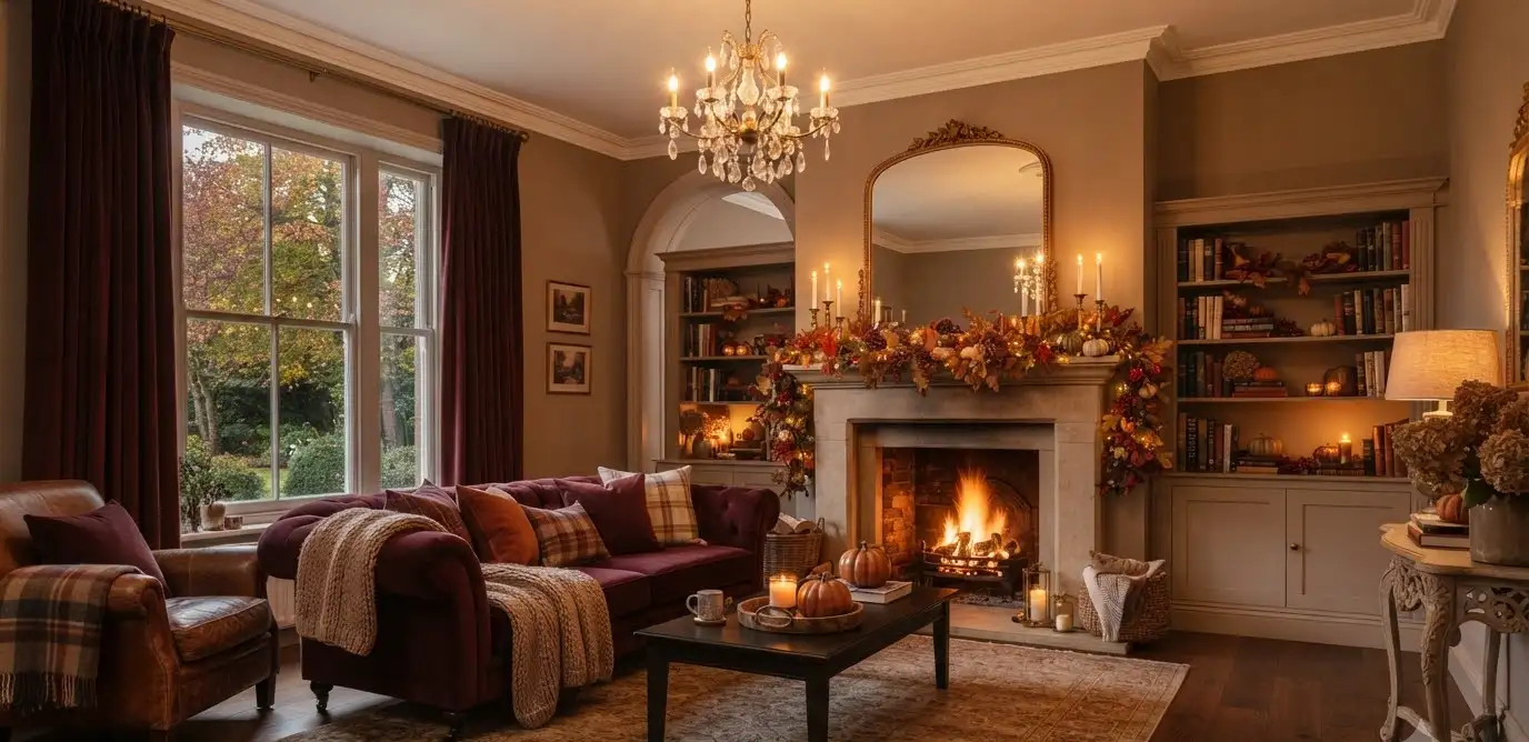
Burgundy is having a moment. Not the loud, “look at me” kind of moment.
The quiet, confident kind, where you walk into a room and just feel settled.
I painted one wall of my living room burgundy two Octobers ago. My husband thought I’d lost it.
Now it’s the first thing guests mention when they walk in, right after “wow, it’s cold outside, isn’t it?”
If you’re on Pinterest hunting for ways to bring that deep, wine-soaked color into your space this fall, you’re in the right place.
I’ve tested a lot of this myself, made some mistakes along the way, and I’m going to walk you through what actually holds up once the candles are lit and the leaves start piling on the porch.
Why burgundy works so well for fall living rooms
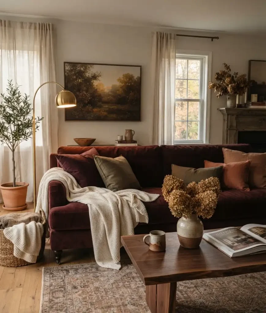
Burgundy sits at a strange intersection. It’s warm like a fall color, but it also has enough depth to feel a little formal, a little grown-up. That’s rare.
Most fall palettes lean orange, rust, or mustard.
Those are great, but they can start to feel like a pumpkin patch exploded in your living room if you’re not careful. Burgundy skips that trap entirely.
It reads as elegant year-round, which means your fall refresh doesn’t have to come down the second Thanksgiving ends.
That’s the real win here. You get seasonal warmth without the seasonal expiration date.
Picking your burgundy base
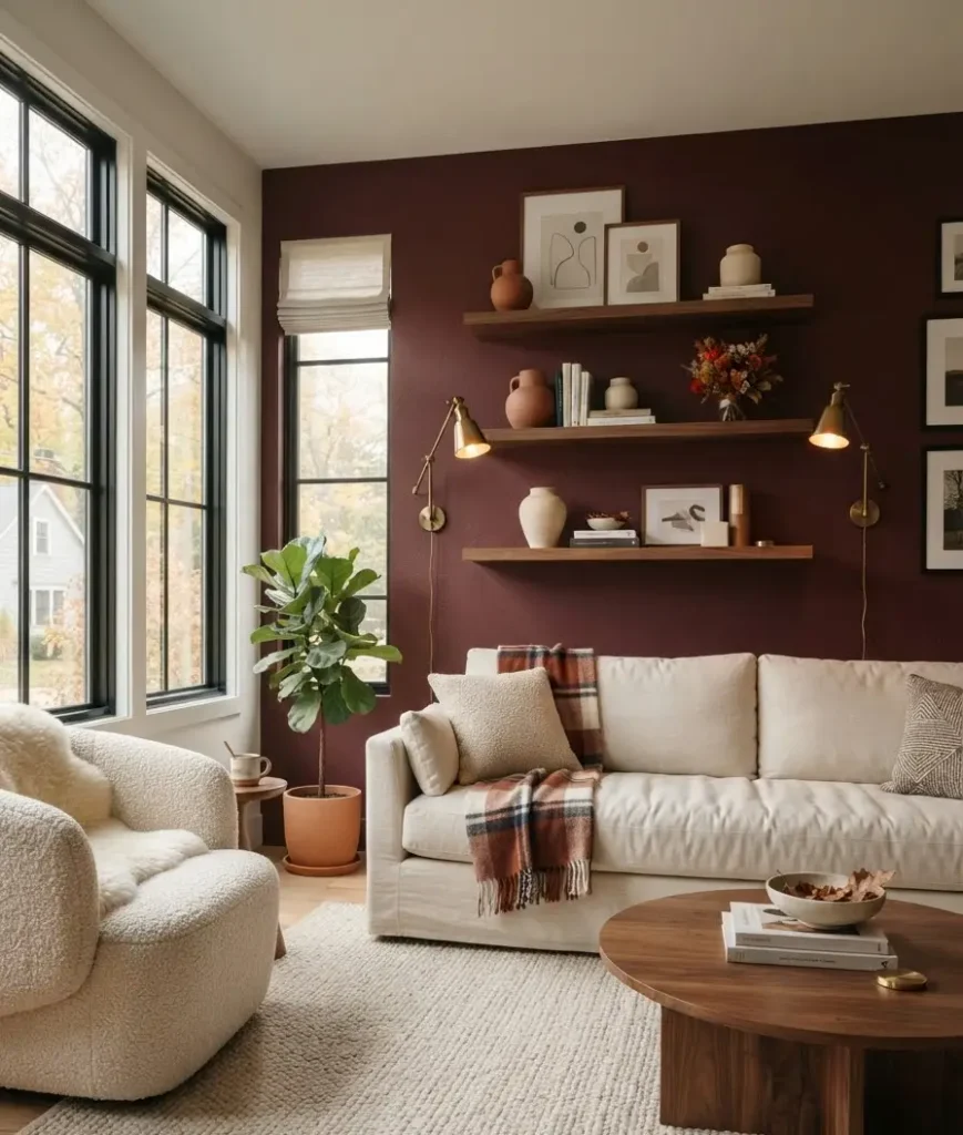
Before you buy a single throw pillow, decide where the burgundy is actually going to live. This matters more than people think.
Paint it on a wall
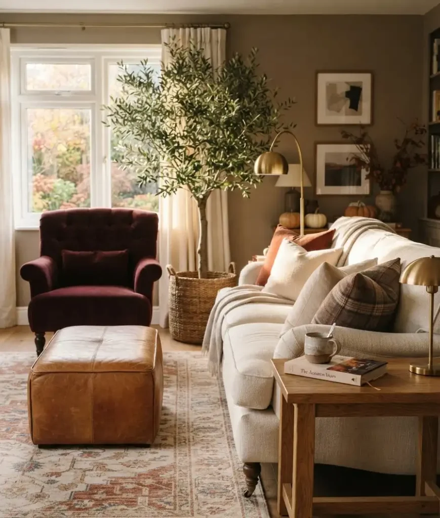
An accent wall is the boldest move, and honestly, it’s the one I’d recommend if you’re someone who commits to things.
Sherwin-Williams’ Burgundy SW 6300 is a solid reference point if you want a true, deep wine tone rather than something that leans too pink or too brown.
Here’s my honest take: paint the wall behind your sofa, not the wall you’re facing when you sit down.
You want to live in front of the color, not stare directly at it every evening. Ask me how I learned that one.
Skip the wall, go with furniture
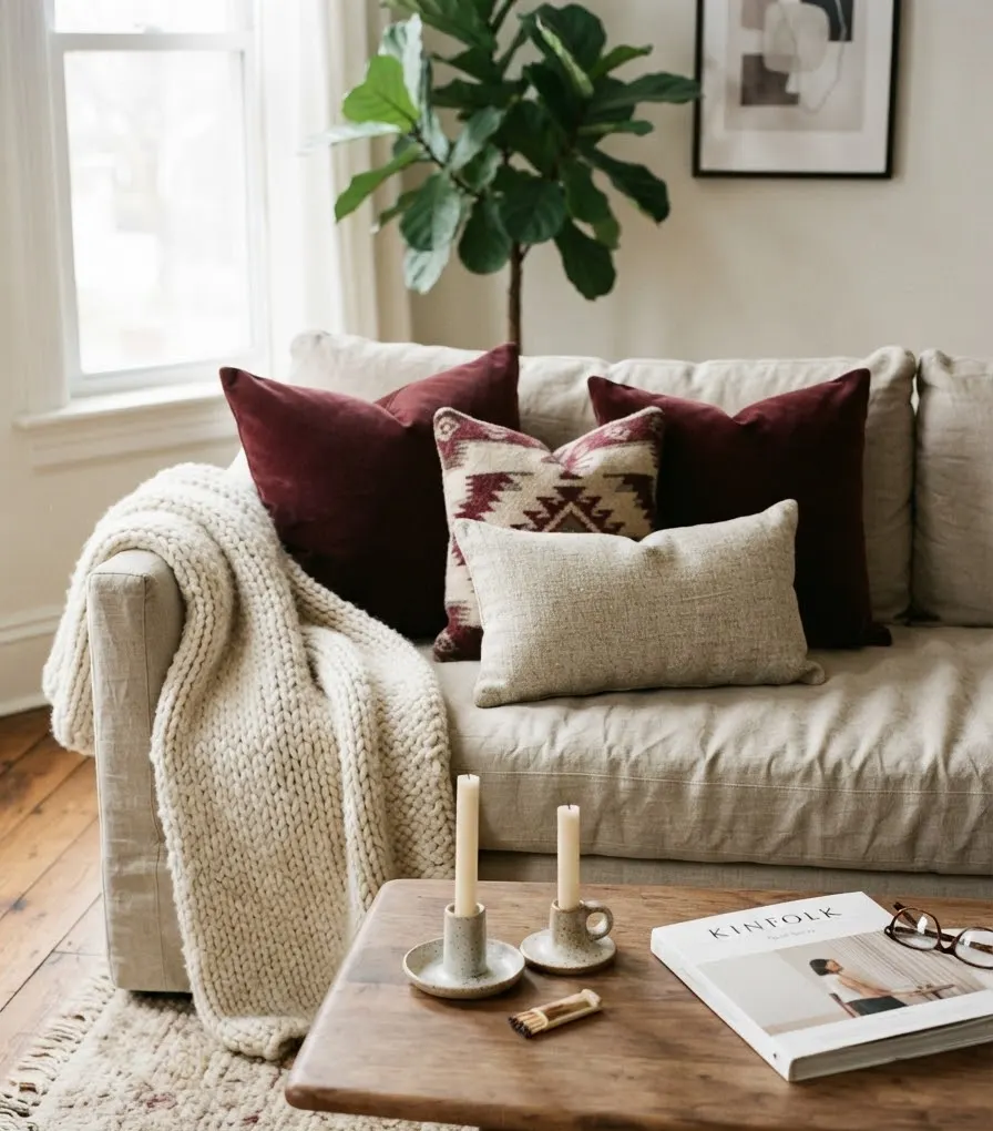
If a whole wall feels like too much of a leap, a burgundy sofa or a pair of velvet armchairs does the job without the commitment.
This is IMO the smarter entry point for renters or anyone who repaints every few years anyway.
A burgundy accent chair next to a neutral sofa gives you that rich pop without swallowing the whole room. It’s also a lot easier to change your mind about later.
Layer it through textiles
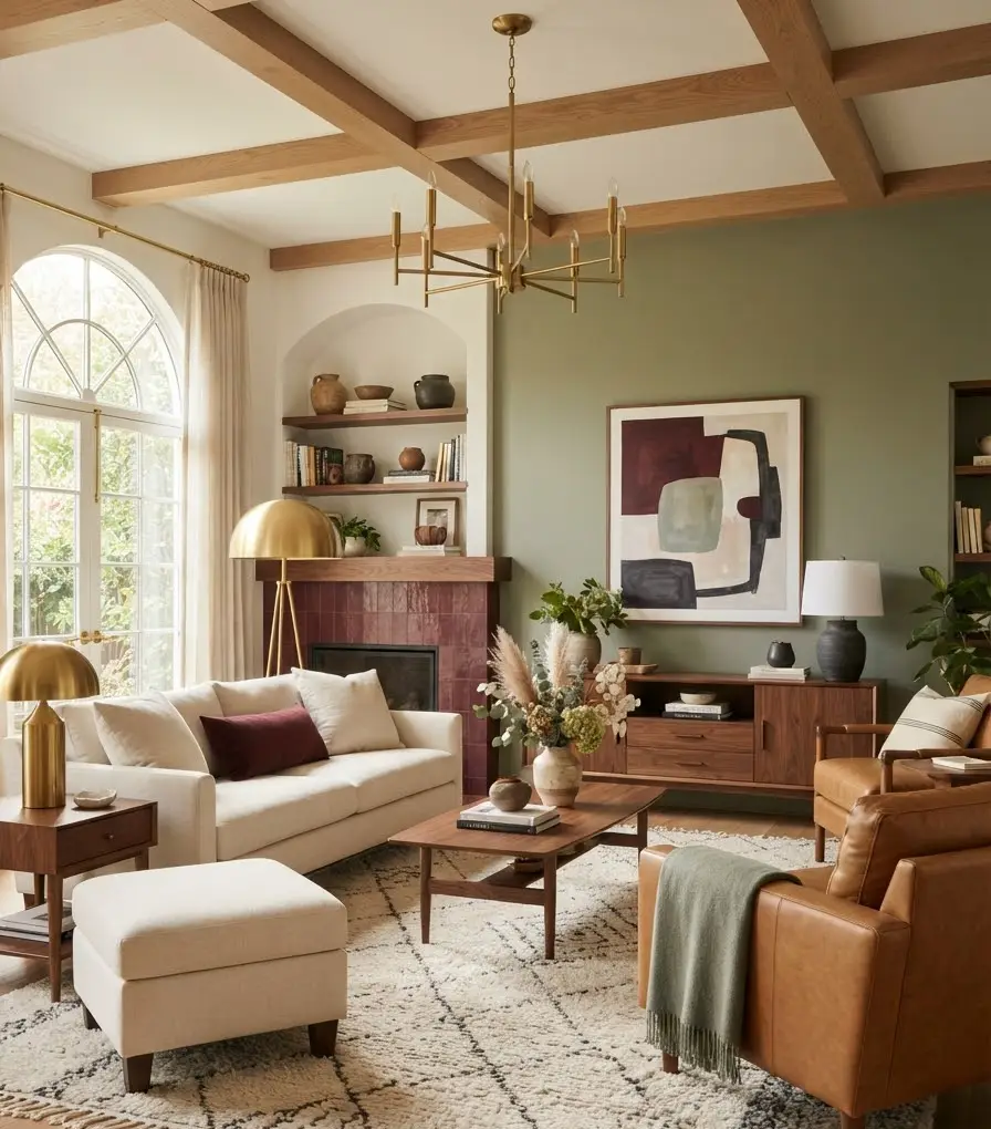
Throw pillows, area rugs, curtains. This is the low-risk, high-reward category, and it’s where most people should actually start.
You can go deep and moody with a burgundy rug, then pull the color back up top with a couple of pillows, and suddenly the whole room feels tied together without a drop of paint involved.
Colors that actually pair well with burgundy
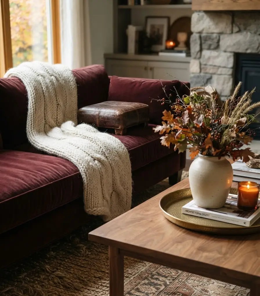
Burgundy is not a color you throw around carelessly. Pair it wrong and the room tips into something closer to a dated hotel lobby than a cozy fall retreat.
A few pairings I’ve either used myself or watched work beautifully in other homes:
- Sage or olive green: this is the combination people talk about most, and for good reason. It reads like a vineyard in autumn.
- Warm camel and tan: leather furniture in these tones grounds burgundy without competing with it.
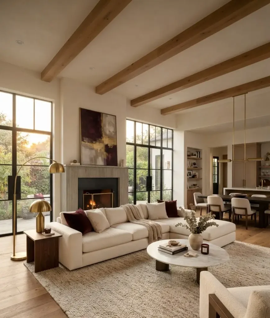
- Brass and gold accents: lamp bases, picture frames, candle holders. Small doses go a long way.
- Cream and off-white: keeps the room from feeling like a cave, which burgundy can absolutely do if you let it.
- Charcoal gray: for anyone who wants a moodier, more dramatic living room this fall.
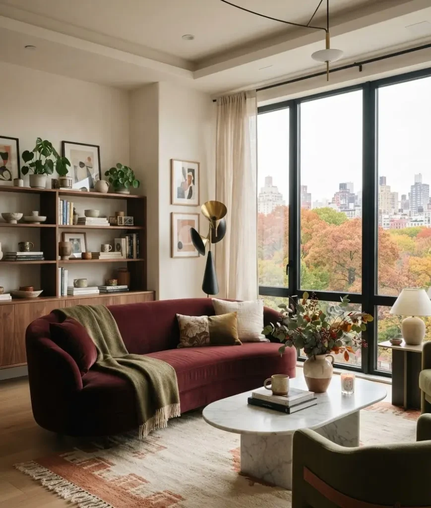
Livingetc’s guide to colors that pair with burgundy backs this up with real designer input, and it lines up with what I’ve seen work in practice.
Here’s a quick reference table if you want the short version:
| Pairing color | Mood it creates | Best used on |
|---|---|---|
| Sage green | Earthy, garden-inspired | Throw pillows, plants |
| Camel or tan | Warm, grounded | Leather chairs, rugs |
| Brass or gold | Refined, a bit glamorous | Lighting, frames |
| Charcoal gray | Moody, dramatic | Walls, drapery |
Texture is doing more work than you think
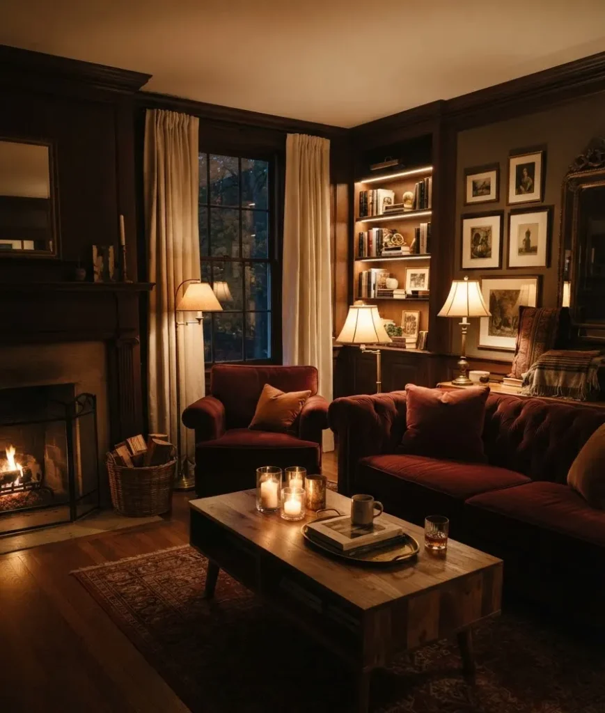
Here’s something nobody tells you outright: color gets you 50% of the way there. Texture finishes the job.
Burgundy loves texture. Velvet especially. There’s a reason velvet burgundy sofas show up in every fall styling roundup on Pinterest right now.
The fabric catches light differently depending on where you’re standing, and that alone makes the color feel richer than a flat cotton version ever could.
Mix in a few different materials and the room stops feeling flat:
- A chunky knit throw draped over the arm of a chair.
- A woven jute or wool rug underneath the coffee table.
- Smooth ceramic vases or ceramic pumpkins, if you’re leaning into the season fully.
- A leather ottoman or ottoman tray for contrast.
Personally, I think people underuse wood in these setups. A dark walnut coffee table next to a burgundy sofa does more for the “expensive-looking room” effect than another pillow ever will.
Lighting changes everything about how burgundy reads
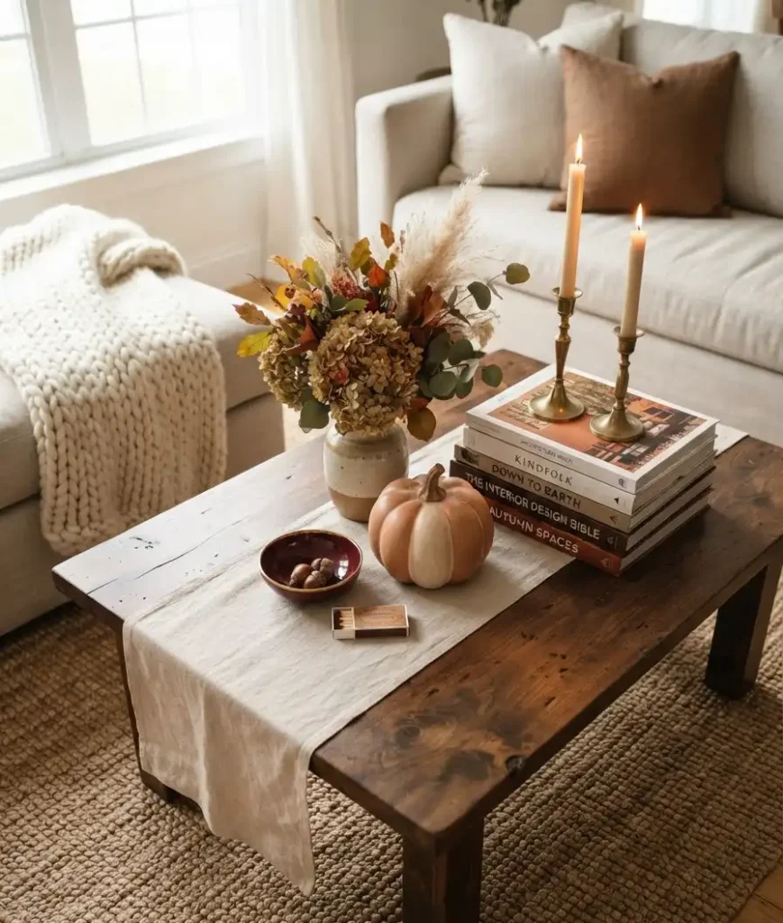
Burgundy is a dark color, and dark colors are picky about light. Get this wrong and your elegant fall living room starts looking more like a dungeon by 6pm.
Layer your lighting instead of relying on one overhead fixture:
- A floor lamp near the reading chair
- A table lamp with a warm bulb, not a cool white one
- Candles, real or flameless, clustered on the coffee table or mantel
Warm bulbs, somewhere around 2700K if you want the exact number, make burgundy glow instead of going flat and muddy.
Cool white bulbs do the opposite. They wash the color out and make it look tired.
Small styling details that pull the whole look together
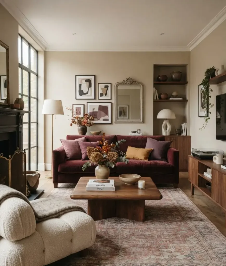
This is the part people skip, and it’s usually the part that separates a “fine” room from one people actually compliment.
Pinterest is full of gorgeous cozy fall living room styling ideas, and if you scroll through enough of them, you start noticing the same small moves repeated over and over:
- Layered throw blankets in at least two different textures
- A stack of coffee table books with warm-toned spines
- Fresh or faux florals in deep, moody colors, dried hydrangeas work great here
- A single oversized piece of art with burgundy tones woven into it
- Brass candlesticks instead of the usual glass jars
One thing I’ll admit I got completely wrong at first: I overdid the pumpkins. Every surface had one.
It stopped looking elegant and started looking like a craft fair. Pull back. Pick three spots. Let the burgundy and the texture do the heavy lifting instead.
Random thought, but does anyone else notice fall decorating season always overlaps exactly with the start of football season, and somehow half your living room budget goes to a new TV instead of throw pillows? Just me? Okay, moving on.
Mistakes I made so you don’t have to
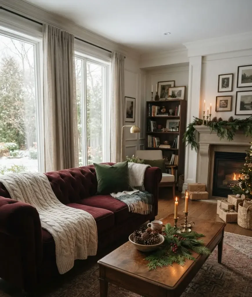
I mentioned the wall placement earlier, but there’s more.
I bought a burgundy rug before I had anything else in the room.
Big mistake. The rug ended up dictating every other color choice I made for the next year, and I still think I would have gone a slightly different direction if I’d started with the sofa instead.
Start with your biggest, most expensive piece and build outward from there, not the other way around.
I also went too matchy for a while. Everything was the exact same shade of burgundy. It looked flat, almost like a showroom display rather than a home.
Varying the shade slightly, a deeper wine on the sofa, a lighter dusty rose-burgundy on the pillows, gives the room depth instead of uniformity.
This is insane to admit, but it took me an embarrassingly long time to figure out that mismatched shades actually read as more expensive than perfectly matched ones. Designers have known this forever. I learned it the hard way.
Shopping this look without blowing your budget
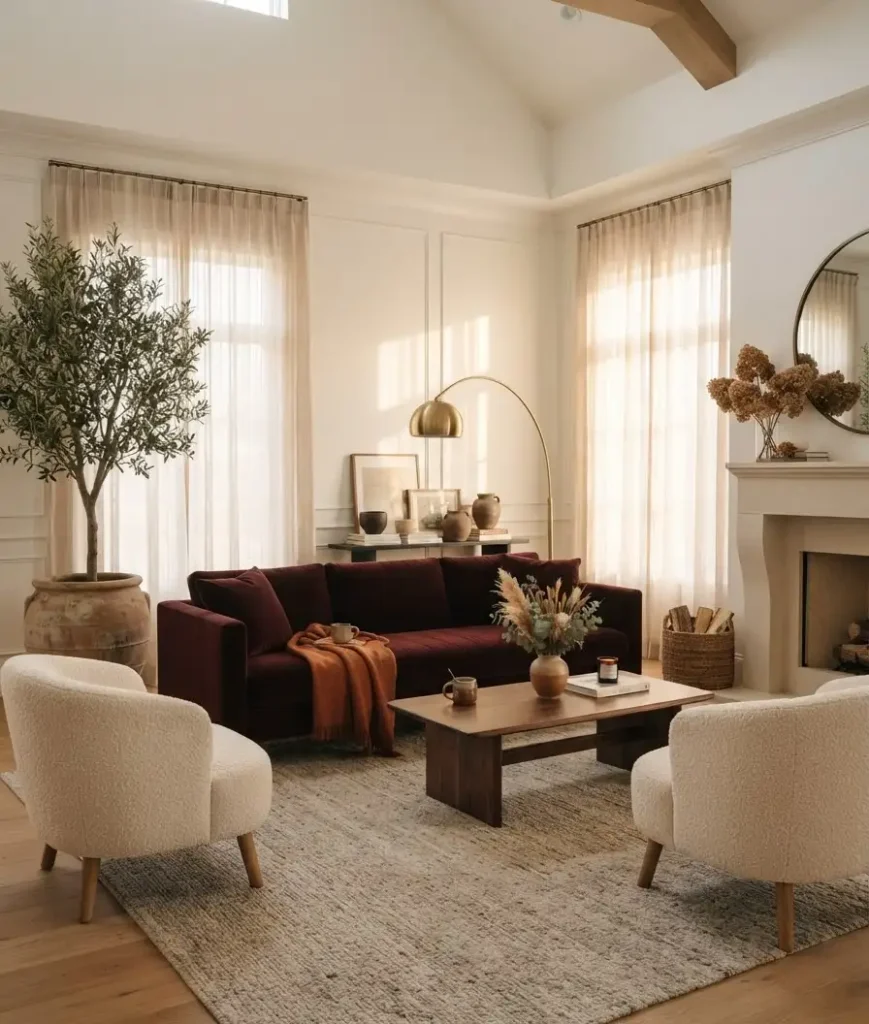
You don’t need a full room overhaul to pull this off. I want to be honest about that, because a lot of Pinterest boards make it look like you need a brand new sofa and a designer on speed dial.
Start cheap, then upgrade the pieces that matter most to you personally:
- Throw pillow covers instead of full pillows. Swap the covers seasonally and store the old ones flat under a bed. This is the single easiest fall refresh, full stop.
- A single statement lamp rather than replacing every light fixture in the room. One warm, well-placed lamp does more visual work than four mediocre ones.
- Secondhand velvet or leather chairs. IMO this is where thrifting actually pays off, because older upholstered furniture tends to have better bones than a lot of the fast-furniture options right now.
- A gallery of small framed prints in burgundy and gold tones, instead of one expensive statement piece. It’s cheaper, and honestly, I like the way it looks better anyway.
If you’re only changing one thing this fall, make it the throw pillows and the lighting.
Those two moves alone will shift the whole feel of the room, and neither one requires touching a paintbrush or committing to anything permanent.
How long does this look actually last?
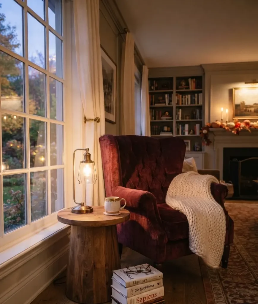
This is the part that convinced me burgundy was worth the investment in the first place.
A pumpkin-orange color scheme has a shelf life of about eight weeks before it starts looking out of place next to a Christmas tree.
Burgundy doesn’t have that problem.
Swap the pumpkins for pinecones and evergreen sprigs in December, and the base palette carries straight through winter without a single wall needing to be repainted.
That’s not nothing. Repainting a room every season gets old fast, both in terms of money and in terms of your Saturday afternoons.
Frequently asked questions
Does burgundy make a small living room feel smaller? It can, if you use it everywhere at once. Stick to one or two focal points, a wall or a sofa, and keep everything else lighter. That balance keeps a small room from feeling closed in.
What wood tones pair best with burgundy furniture? Warm walnut and honey oak both work well. Very cool-toned grays and whitewashed woods tend to fight with burgundy rather than complement it.
Is burgundy too formal for a casual, lived-in living room? Not if you soften it with texture. Chunky knits, jute rugs, and warm lighting pull burgundy into cozy territory instead of leaving it stiff and formal.
Final thought
Burgundy fall decor isn’t about following a trend and moving on to the next one in three months. It’s a color with staying power, and if you build the room around texture and warm light instead of just paint alone, it’ll carry you well past fall into the darker, cozier months ahead.
So, are you going bold with a full accent wall, or easing in with a velvet throw pillow first? I’d genuinely love to know where you’re starting.
