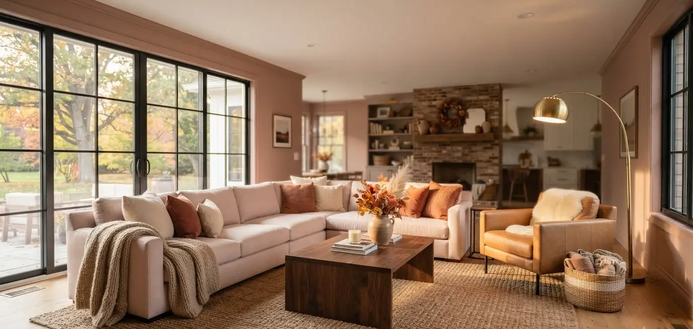
I painted one wall of my living room dusty rose two autumns ago, and my brother-in-law asked if I was “going through something.” I wasn’t. I was just tired of beige.
That’s the thing about pink in a fall living room. People assume it’s a spring color, or worse, a nursery color, stuck somewhere between cotton candy and a birthday card.
But the right pink, paired with the right textures, does something warm neutrals can’t. It gives a room a pulse.
If you’ve spent any time on Pinterest lately, you’ve probably noticed the shift.
Terracotta and burnt orange still show up, sure, but dusty rose, mauve, and clay pink keep sneaking into fall boards next to wool throws and brass candlesticks.
It’s not an accident. Pink with the right undertone reads as warm, grounded, and surprisingly sophisticated once autumn light hits it.
I’ve redecorated my own living room three times in the last five years (my husband has opinions about this hobby), and pink is the one color that’s stuck around through every version.
Here’s how I’d style it for fall, and why I think it works so well for modern homes.
Why pink actually works for fall, not just spring
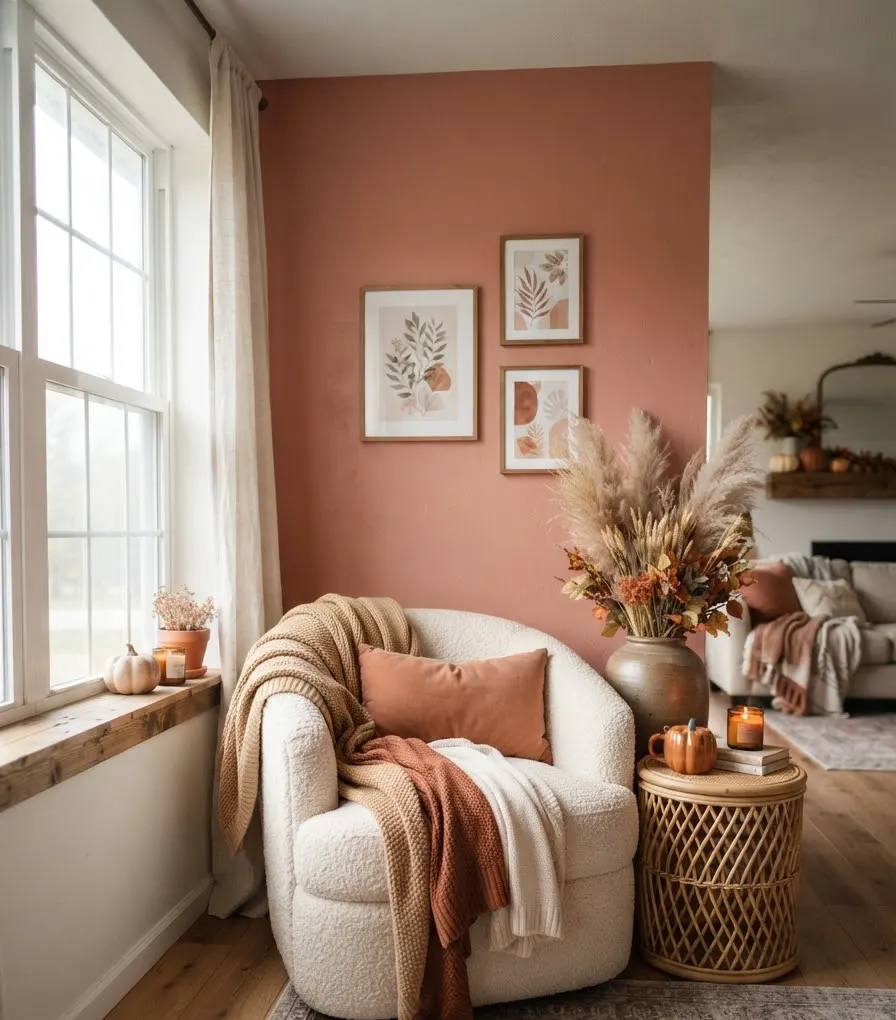
Most people picture bubblegum pink and immediately rule it out for autumn. Fair reaction. But that’s not the pink we’re talking about.
Fall-friendly pinks lean warm. Think dusty rose, terracotta pink, clay, mauve, and blush with a peachy undertone. These shades sit closer to brown and orange on the color wheel than they do to true red-pink, which is exactly why they blend into a seasonal palette instead of fighting it.
Sherwin-Williams color experts have pointed out that warm-undertone pinks read as cozy in smaller spaces, since they play into that cocooning feeling people chase once the weather cools down.
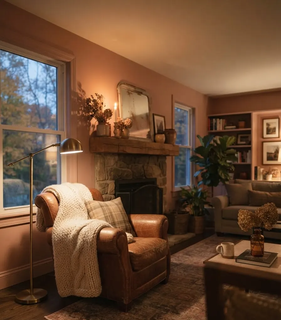
A pink with a peachy or beige undertone next to your fireplace or reading nook does the same visual work a cognac leather chair does. It just does it in a softer register.
There’s also a seasonal timing element working in pink’s favor.
Pantone’s recent fashion color reports have repeatedly flagged dusty rose and rosé-red tones as standout autumn and winter shades on the runway,
which usually trickles down into home palettes about a year later. So if you’re styling pink into your living room this fall, you’re not behind the trend. You’re early to it.
The undertone test (do this before buying anything)
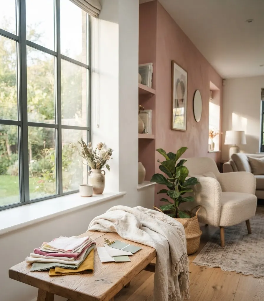
Before you buy a single pillow, figure out whether you’re working with warm pink or cool pink. This single step saves more decorating headaches than almost anything else I can tell you.
Hold your fabric swatch or paint chip against a true white sheet of paper.
- If it leans peachy, orange, or beige: warm pink. This is your fall pink.
- If it leans purple, blue, or gray: cool pink. Save this one for spring or a bedroom.
- If you genuinely can’t tell, put it next to your existing wood floor or trim. Warm pinks harmonize. Cool pinks clash slightly, and you’ll feel it before you can explain it.
I learned this one the hard way with a rug that looked perfectly dusty-rose online and turned out to have a cool lavender cast the second I got it into my living room.
It fought with my oak floors for six months before I finally sold it.
Building the palette: what pairs with pink in fall
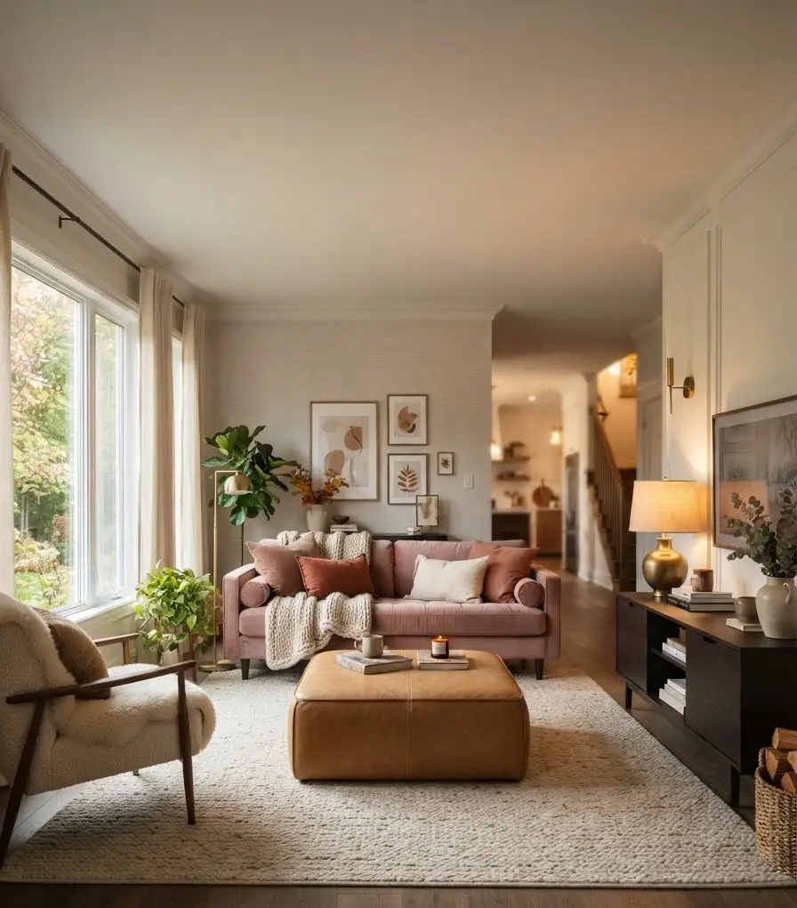
A pink living room only looks intentional when the supporting colors are doing real work. Pink alone, especially in large doses, starts to feel more like a costume than a design choice.
Here’s the palette combination I keep coming back to, and one I’d genuinely recommend to a friend:
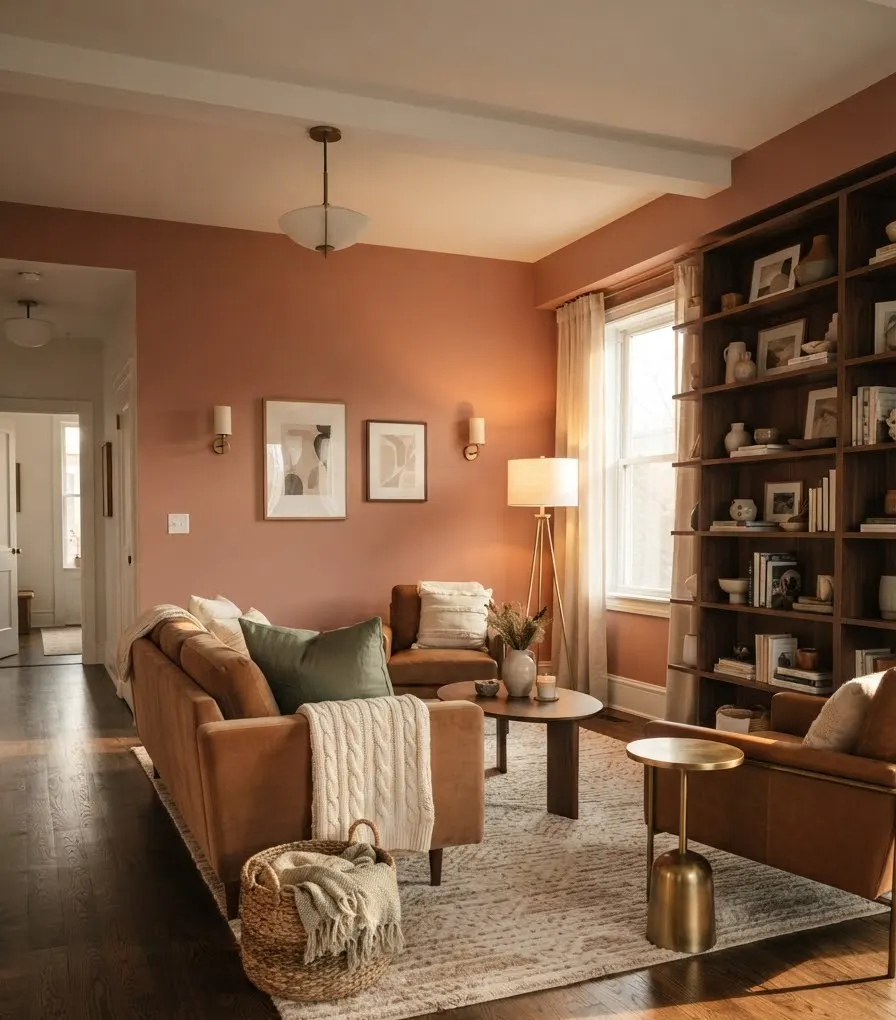
- Dusty rose or clay pink as the anchor tone, used on one wall, a sofa, or a large area rug
- Warm camel or cognac leather for grounding, usually a chair or ottoman
- Charcoal or deep espresso brown for contrast pieces like a coffee table or media console
- Brass or aged gold accents on lighting and hardware
- Cream or warm ivory for walls and larger textiles so the pink doesn’t overwhelm
IMO, the biggest mistake people make is trying to pair pink with cool gray.
It’s not wrong exactly, it just flattens the warmth that makes fall pink work in the first place. Save the gray pairing for a different season.
A quick reference table
| Fall pink shade | Best pairing | Room feel |
|---|---|---|
| Dusty rose | Camel leather, brass | Cozy and grounded |
| Terracotta pink | Espresso wood, cream | Rich and earthy |
| Mauve | Sage green, walnut | Moody and layered |
| Blush with peach undertone | Ivory, warm gold | Soft and airy |
Keep this list nearby when you’re fabric shopping. It’s saved me from a few questionable throw pillow purchases.
Layering pink through texture, not just color
Here’s where a lot of pink living rooms go wrong. People paint one wall pink, add a pink pillow, and call it done. Flat color reads as decoration. Layered texture reads as design.
Ever wonder why the same pink couch looks completely different in two different homes? Texture is almost always the answer, not the paint chip.
For fall specifically, you want texture that already reads as seasonal:
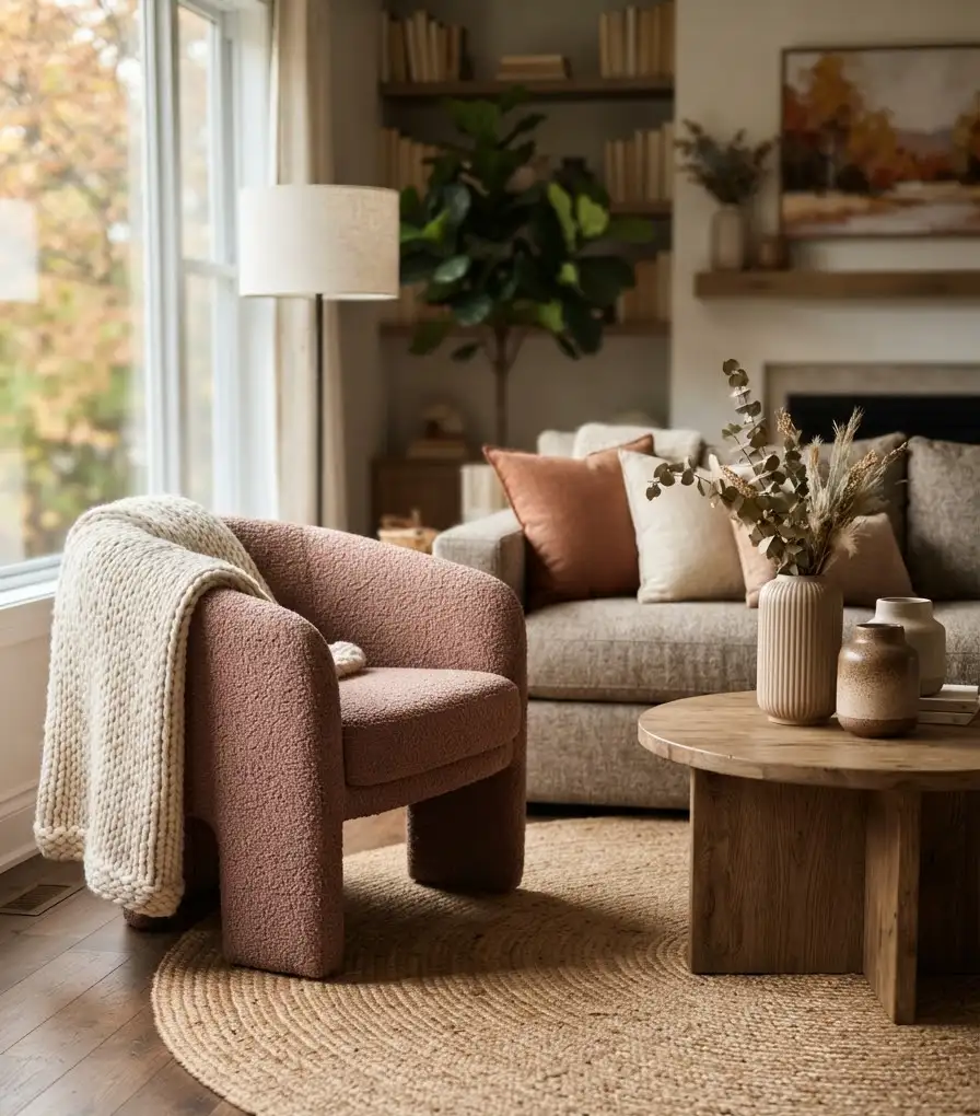
- Bouclé or nubby wool upholstery on an accent chair. It has a handmade, tactile quality that softens pink instantly.
- Chunky knit throws draped over the arm of a sofa, ideally in a contrasting camel or cream.
- Woven jute or wool rugs underneath, which ground the softness of pink with something more rustic.
- Velvet accent pillows in a deeper rose or burgundy, for a slight contrast against a lighter pink base.
- Ceramic or stoneware vases in matte finishes rather than glossy ones, since matte reads warmer under autumn light.
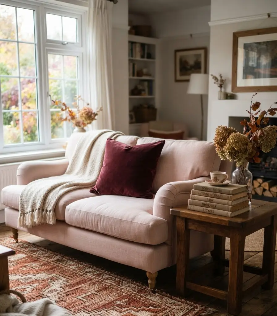
I’ll be honest, the bouclé chair trend annoyed me at first. It felt like everyone’s living room suddenly looked identical.
But I bought one anyway (in a dusty rose, obviously), and I get it now. There’s a reason it stuck around.
Lighting: the detail almost everyone skips
This part barely gets mentioned in most decorating guides, and it’s honestly the difference between a pink room that glows and one that feels flat.
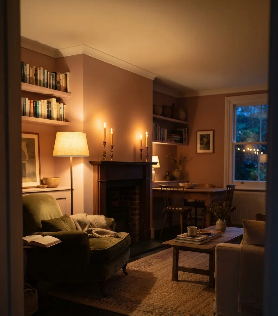
Warm-toned bulbs (look for 2700K to 3000K on the packaging) make pink walls and furniture look richer as the light gets lower earlier in the fall. Cool white bulbs, by contrast, wash pink out and make it look almost gray by 6pm.
If your living room has felt “off” in a way you couldn’t quite name once daylight savings hits, check your bulbs before you touch the paint.
Layer your lighting too. A single overhead fixture flattens a room no matter what color it is. Add:
- A floor lamp with a fabric or linen shade near your reading chair
- A table lamp with a warm bulb on a side table
- Candles or a small lantern for evening ambiance
Bold takeaway: lighting temperature matters more to how pink reads in a room than the actual paint formula does.
Small updates if you’re not ready to commit
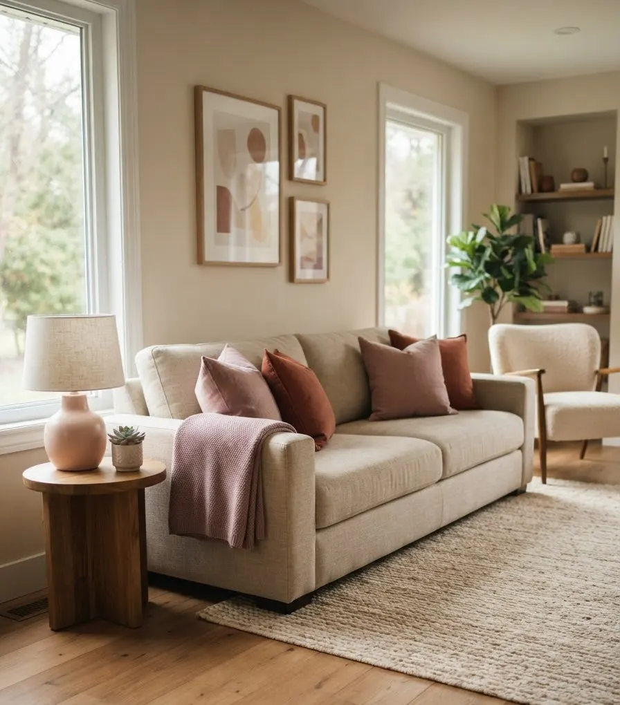
Not everyone wants to repaint a whole wall, and honestly, you don’t need to. A living room can go chic-pink-fall without a single gallon of paint.
- Swap your throw pillow covers for dusty rose or terracotta linen
- Add one statement piece, like a velvet pouf or a ceramic lamp base
- Layer a mauve or clay-toned throw over your existing sofa
- Bring in dried pampas grass or preserved eucalyptus in a blush-toned vase
- Replace brass or gold picture frames with warmer finishes if yours currently lean silver or chrome
This is genuinely the approach I’d recommend to a friend testing the waters. You can always go bigger once you know you actually like living with it, rather than just liking it on a Pinterest board.
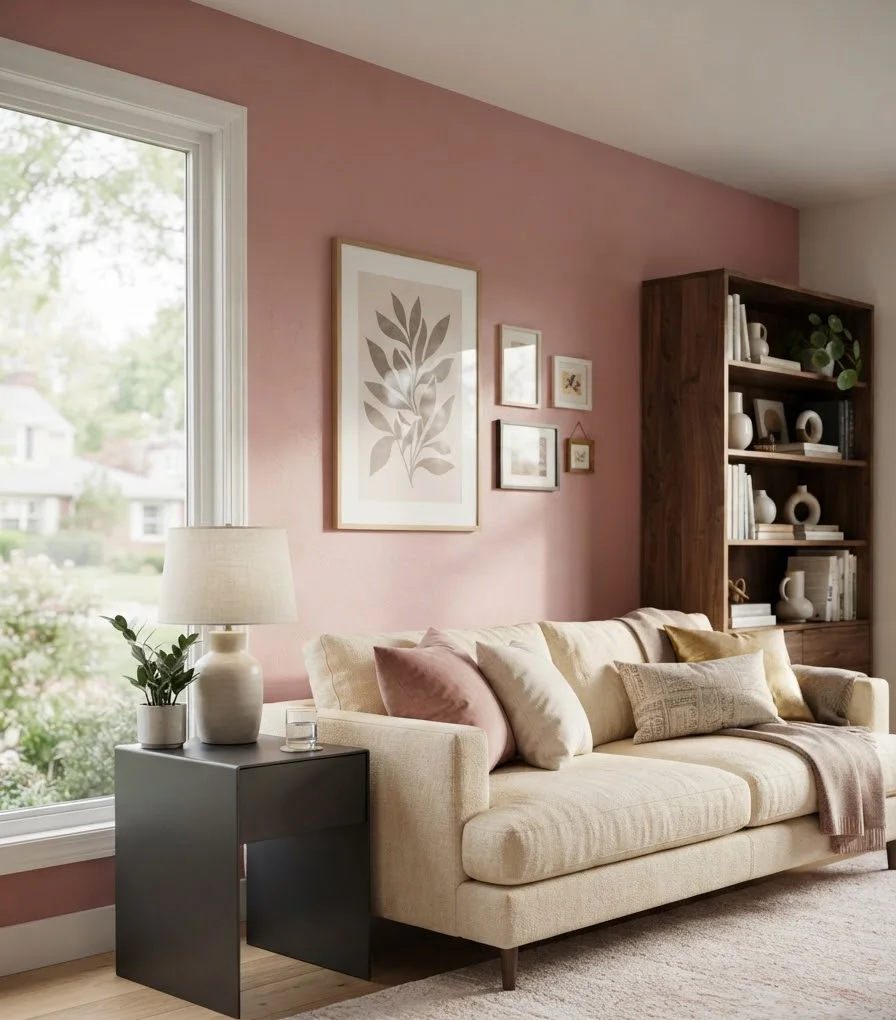
Random thought while I’m at it: does anyone else find that pink rooms photograph better in the morning than in the evening? I’ve never been able to get my living room to look right in photos after 4pm in October. Might just be my north-facing window. Might be something else entirely.
Common mistakes to avoid
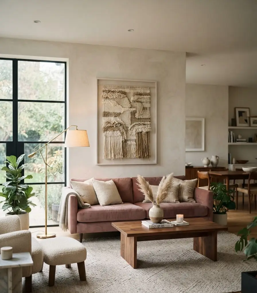
A few things I’ve seen go wrong, some in my own house:
- Using too many different pinks at once. Pick one or two shades max and repeat them. Five different pinks in one room reads chaotic, not curated.
- Skipping a neutral base. Pink needs somewhere to rest. Without cream, ivory, or warm white walls or flooring, the room can feel overwhelming fast.
- Going too glossy. High-shine pink surfaces read younger and less sophisticated. Matte and textured finishes are what make it feel like a grown-up space.
- Forgetting contrast. A room that’s all soft tones, pink included, ends up feeling sleepy. Add at least one deep, dark element (charcoal, espresso, black metal) to keep things sharp.
A few real-world examples worth studying
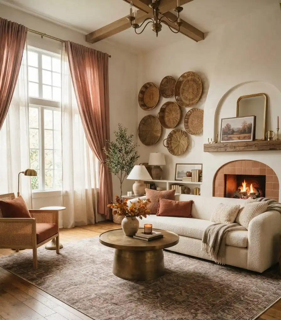
If you want to see how designers actually pull this off instead of taking my word for it, HGTV has put together a solid roundup of pink decorating ideas for living rooms that shows the range from subtle blush accents to full statement walls.
It’s worth a scroll if you’re still deciding how far to take it.
For the paint side specifically, Sherwin-Williams’ own breakdown of pink undertones is genuinely useful if you’re standing in the paint aisle feeling stuck between four nearly identical swatches.
FAQ
Is pink too feminine for a modern living room? Not when it leans warm and gets paired with masculine textures like leather, dark wood, and matte black metal. The femininity comes from bubblegum-bright pinks in glossy finishes, not from dusty rose or clay tones balanced against grounding materials.
What’s the easiest way to test if I’ll like a pink living room? Start with textiles, not paint. A rug, a throw, and two pillow covers give you a real sense of how the color feels in your specific light before you commit to anything permanent.
Does pink work with existing wood floors and trim? Almost always, as long as you choose a warm-undertone pink. Cool pinks can clash with yellow or orange-toned wood, so check the undertone against your floor before buying fabric or paint.
Final thought
Pink isn’t a seasonal gimmick, and it’s definitely not just a spring color hiding out until Easter.
Done with the right undertone, the right texture, and warm lighting, it turns into one of the coziest, most distinctive choices you can make for a fall living room.
So, would you actually try it, or is beige still calling your name? Either way, start small. A single throw pillow has never ruined a living room, and it might just be the thing that convinces you to go further.
