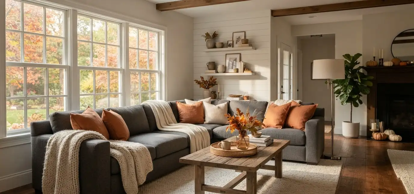
My gray couch sat in my living room for two years before I figured out what to do with it.
Every fall I’d throw an orange blanket on it, call it done, and wonder why the room still looked flat.
Turns out gray isn’t the problem. Gray is actually the best base color you can start fall decorating with. You just need to know which colors make it work.
I’ve rearranged this room more times than I want to admit, tested a dozen pillow combos, and returned at least three throws that looked great online and awful in person.
So here’s what actually works, pulled from real trial and error, not a mood board I made up on the spot.
Why gray couches are perfect for fall decor
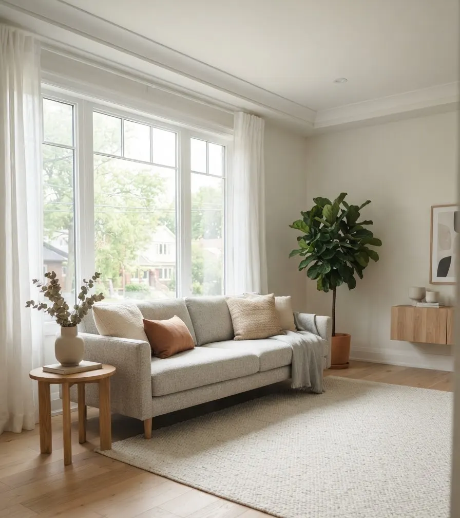
Gray is a neutral with range. It shifts warm or cool depending on what you pair it with, which makes it more flexible than beige or white for seasonal changes.
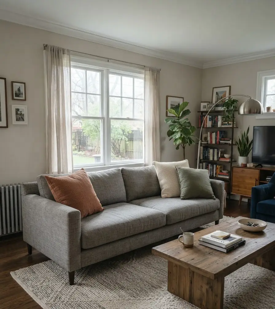
Charcoal gray leans moody. Light gray leans airy. Both work for fall, just in different directions.
That flexibility is exactly why gray couches show up so often on Pinterest fall boards. People are drawn to how easily the color adapts.
I have a medium warm-gray sectional, and I’ve decorated it three different ways over three falls.
Each time it looked like a completely different room. That’s the whole point of a gray base: it lets the accent colors do the talking.
Best color combinations for a gray couch this fall
Rust orange and gray
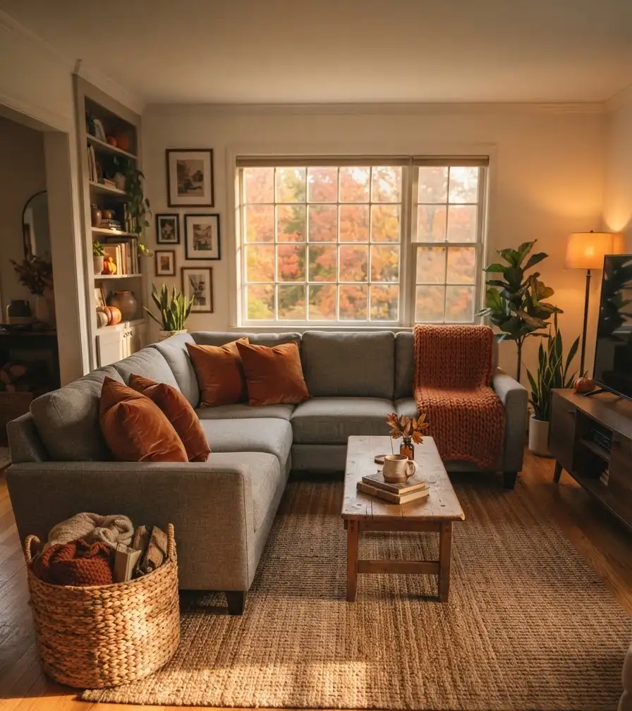
This is the combination everyone pictures when they think fall.
Rust brings warmth without turning the room orange-orange, which honestly can feel like a Halloween store threw up on your sofa.
I went with a rust throw pillow and a slightly darker rust blanket last October. It worked because I kept everything else neutral: no competing patterns, no extra bright colors fighting for attention.
Best for: rooms with a lot of natural light, since rust can look muddy in dim spaces.
Mustard yellow and gray
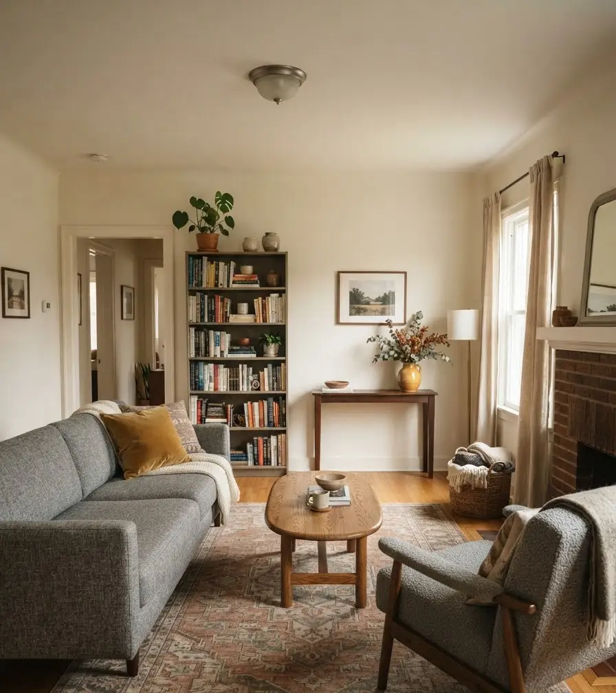
Mustard is trickier than rust. Get the shade wrong and it looks dated fast, more 1970s kitchen than cozy fall living room.
IMO the safest way to use mustard is in small doses: one accent pillow, maybe a vase, nothing more.
I tried a full mustard armchair once. It fought with everything else in the room and I ended up reupholstering it a year later.
- Mustard pillow plus gray throw: clean and simple
- Mustard and rust together: bold, works best in larger rooms
- Mustard candles or vases: low commitment, easy to swap out
Deep forest green and gray
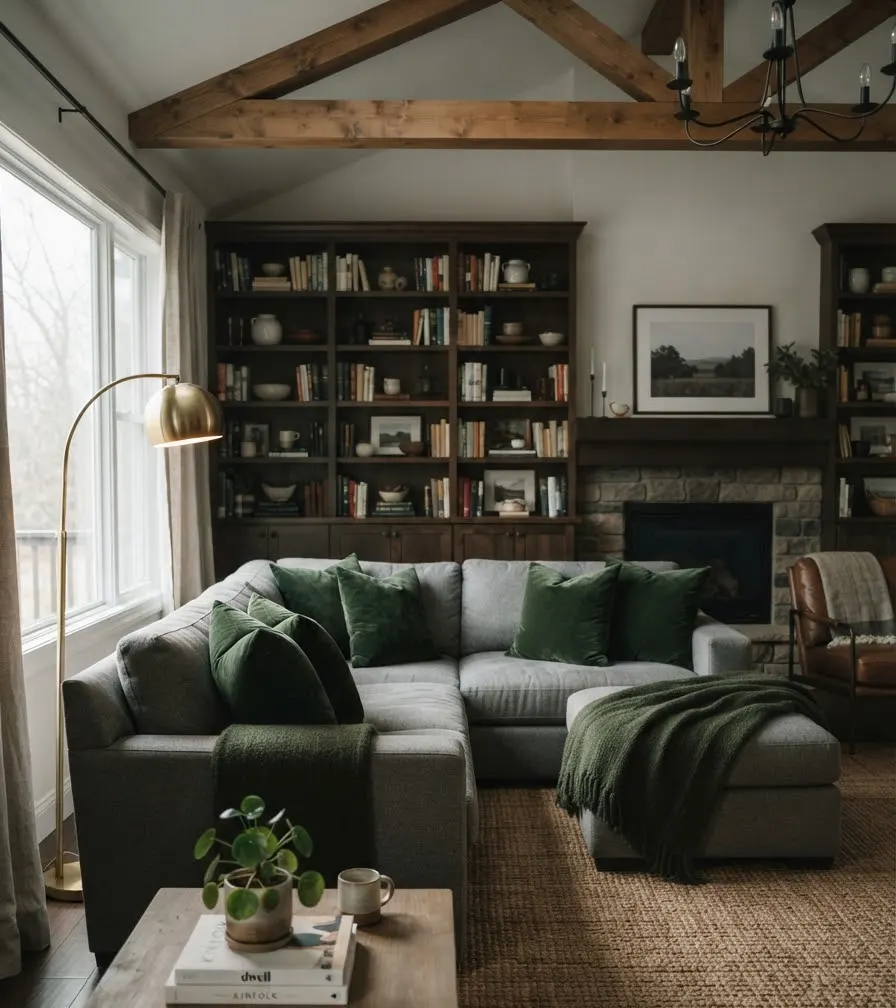
This pairing has quietly become one of my favorites.
Green and gray both read as calm, grounded colors, and together they feel more like “cozy cabin” than “pumpkin spice everything.”
Forest green velvet pillows against a gray sectional look genuinely expensive, even when the pillows cost 20 dollars.
Velvet catches light differently than cotton, and that texture does a lot of visual work on its own.
Burnt sienna and gray
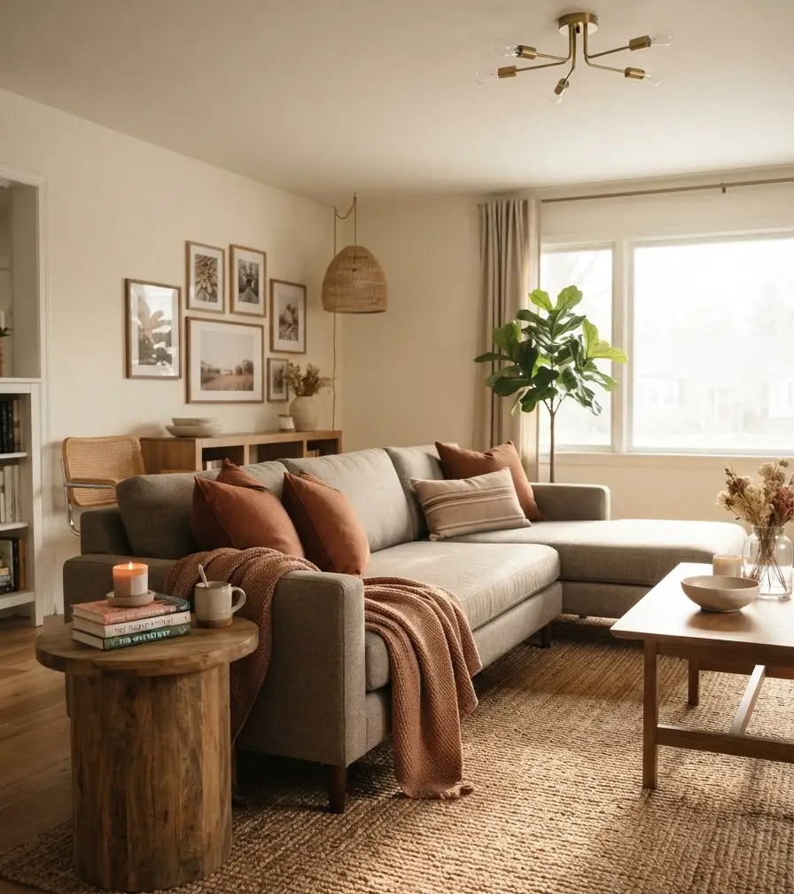
Burnt sienna sits between rust and terracotta, and it’s less common, which is exactly why it stands out.
If your Pinterest feed is full of the same rust-and-gray combo, sienna gives you something that still feels seasonal but not copy-pasted from every other living room.
I’ll admit this one took me longer to warm up to.
My first sienna throw looked more brown than orange under my living room lighting, so I swapped it for a slightly brighter shade and it clicked immediately.
Cream, camel, and gray layered together
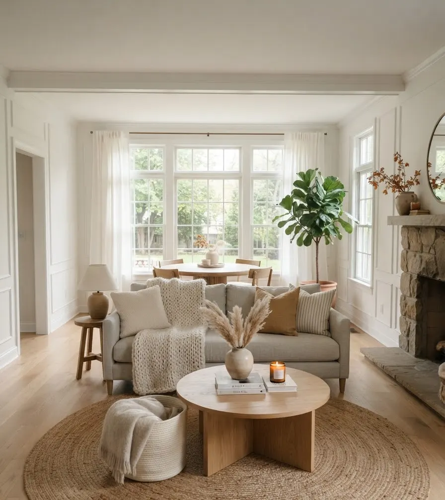
Sometimes fall decor doesn’t need bold color at all.
Layering cream, camel, and gray creates warmth through texture instead: chunky knit throws, woven baskets, and a few wood accents.
This combination photographs beautifully for Pinterest because the tonal layering creates depth without anything competing for attention.
If you’re someone who redecorates often, this palette also transitions into winter with almost no changes needed.
Quick reference: fall color pairings for gray couches
| Color pairing | Mood it creates | Best room type |
|---|---|---|
| Rust and gray | Bold, classic fall | Bright, sunny living rooms |
| Mustard and gray | Warm, retro-leaning | Large or open-concept spaces |
| Forest green and gray | Calm, cozy | Rooms with wood furniture |
| Cream, camel, gray | Soft, layered | Minimalist or Scandi-style spaces |
How to actually apply these combinations
Start with pillows and throws, not paint
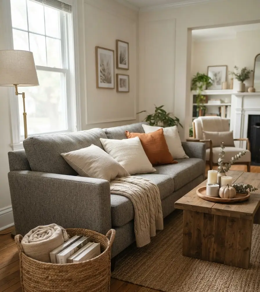
Nobody wants to repaint a wall every October. Pillows and throws give you 90 percent of the seasonal impact for about 10 percent of the effort.
Swap two or three pillow covers and one throw blanket, and the whole room reads differently.
Add texture, not just color
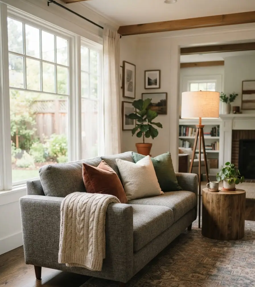
A flat-colored pillow next to a flat gray couch looks a little lifeless, if I’m being honest. Boucle, velvet, chunky knit, and woven textures all add dimension that color alone can’t give you.
Bring in one or two natural elements
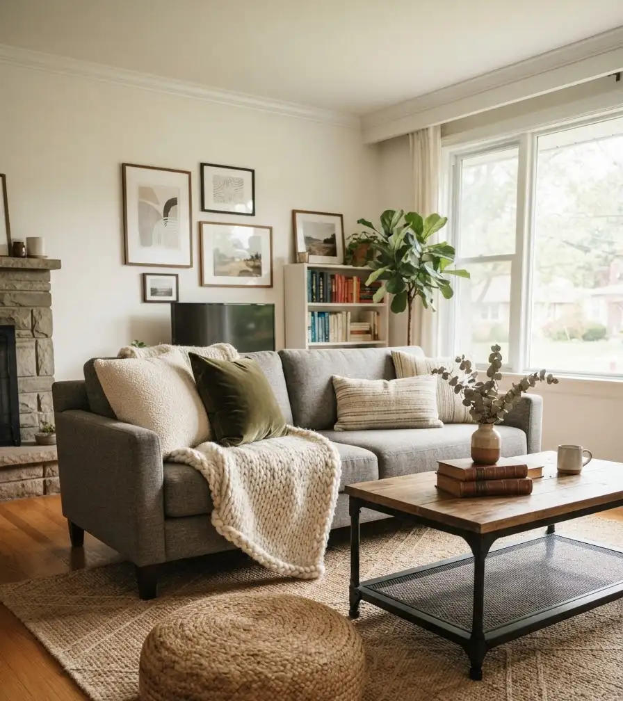
Dried pampas grass, a small pumpkin in a neutral tone (skip the bright orange plastic ones), or a wooden tray on the coffee table ground the whole look.
Real or faux, doesn’t matter much here. Nobody’s grading you on authenticity.
Don’t overload the palette
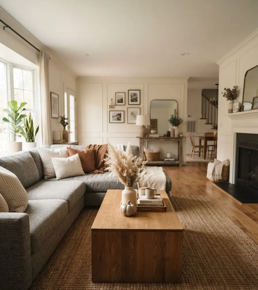
This is where a lot of fall living rooms go wrong. Three colors max, one dominant and two supporting, keeps the room looking styled instead of cluttered.
Trust me, I learned this one the hard way with a coffee table that had four different accent colors competing at once. It looked like a craft store explosion.
For color theory beyond fall specifically, the Pantone Color Institute publishes seasonal palettes that a lot of interior designers reference when planning rooms months in advance.
It’s a genuinely useful resource if you want to understand why certain combinations work before you commit to buying anything.
Where these ideas come from (and why they hold up)
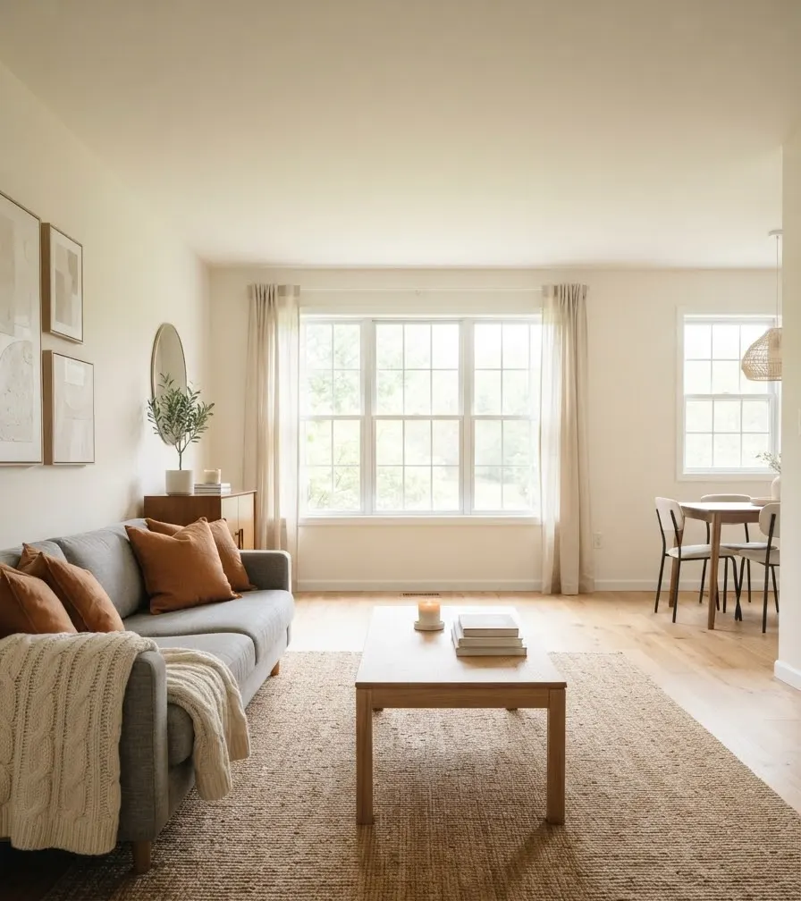
I didn’t pull these combinations from a random Pinterest scroll.
Most of them came from actually testing pillow covers in my own living room over multiple falls, returning the ones that didn’t work, and keeping notes on what held up under different lighting.
That said, professional input matters too. Color consultants at paint companies like Sherwin-Williams spend a lot of time studying how undertones shift gray from warm to cool, which affects which accent colors will actually complement your specific couch rather than clash with it.
If you’re unsure whether your gray leans warm or cool, checking your couch fabric in both daylight and lamp light will usually tell you within a minute.
A few honest thoughts before you commit
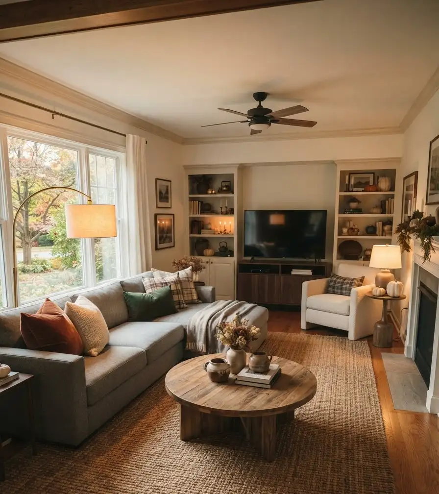
Not every combination on this list will work in every room.
Lighting changes everything. A rust pillow that looks rich and warm in my living room might look dull in a north-facing room with less natural light.
My honest opinion: buy one pillow cover before committing to a full set.
It sounds slow, but it saves you from ending up with four pillows in a color that looked great on a screen and just okay in person. I’ve made that mistake more than once.
Also, completely unrelated, but I’ve noticed candle scents matter more to how a room “feels” cozy than people give credit for.
A cinnamon or fig candle next to your new fall pillows does something a plain throw blanket alone can’t.
Frequently asked questions
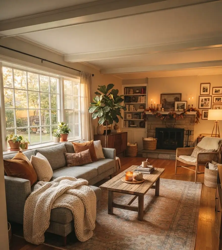
Does a gray couch work with warm fall colors, or should I stick to cool tones? Gray works with both. Warm grays pair naturally with rust, mustard, and camel, while cooler grays lean better with deep greens, navy, or plum. Check your couch in natural light to see which direction it leans before choosing accents.
How many accent colors should I use on a gray couch for fall? Two to three is the sweet spot. One dominant color and one or two supporting tones keeps the room cohesive instead of busy. More than that, and the space starts to look cluttered rather than styled.
Do I need to buy new pillow covers every fall, or can I reuse pieces? You can absolutely reuse pieces. Swap out just one or two elements, a throw or a single pillow, and rotate in something new each year. It keeps costs down and still refreshes the look.
Final thought
A gray couch isn’t a limitation. It’s honestly one of the easiest bases to work with once you know which fall colors actually complement it instead of fighting it.
Start small. Pick one combination from this list, try it for a week, and see how it feels in your actual lighting before you go all in. Which pairing are you leaning toward: rust, mustard, forest green, or the softer cream and camel layering? Save this for later and pin your favorite combo so you can find it again when fall decorating season rolls around.
