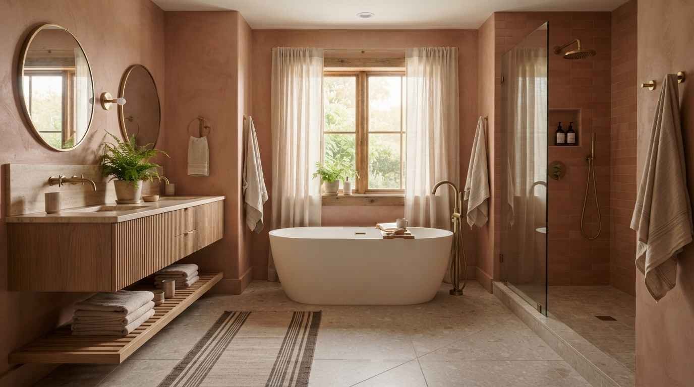
Pink bathrooms are having a real moment on Pinterest right now, and honestly, I get why.
There’s something about a blush wall or a dusty rose vanity that makes a small room feel like a whole vibe instead of just a place to brush your teeth.
I redid my own bathroom two years ago and went with a soft terracotta-pink combo. My contractor thought I was joking.
I wasn’t. And now it’s the room everyone asks about when they come over.
So yes, I’m a little biased here, but I’ve also seen enough pink bathrooms (good and bad) to know what actually works.
Here are 29 ideas, pulled from real design trends, real paint charts, and a few lessons I learned the hard way.
Start with the shade, not the room
This is the part people skip.
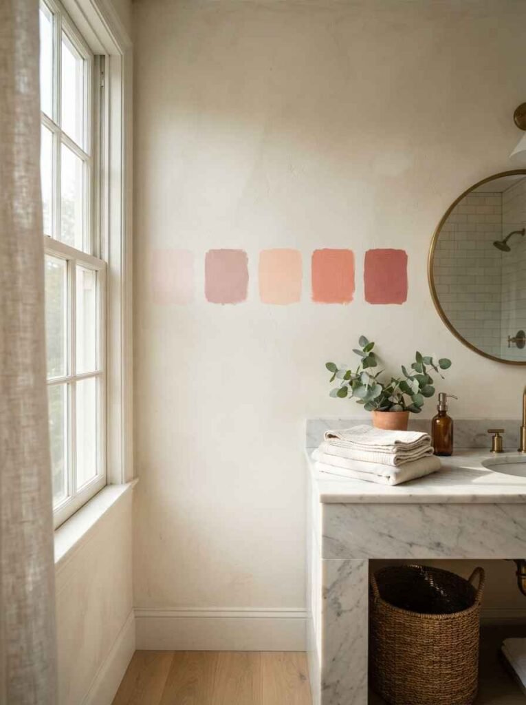
Pink isn’t one color. It’s a whole family, and picking the wrong one is how you end up with a bathroom that looks more “bubblegum birthday party” than “spa retreat.”
- Blush pink walls. Soft, warm, and nearly neutral. Works in tiny bathrooms with almost no natural light.
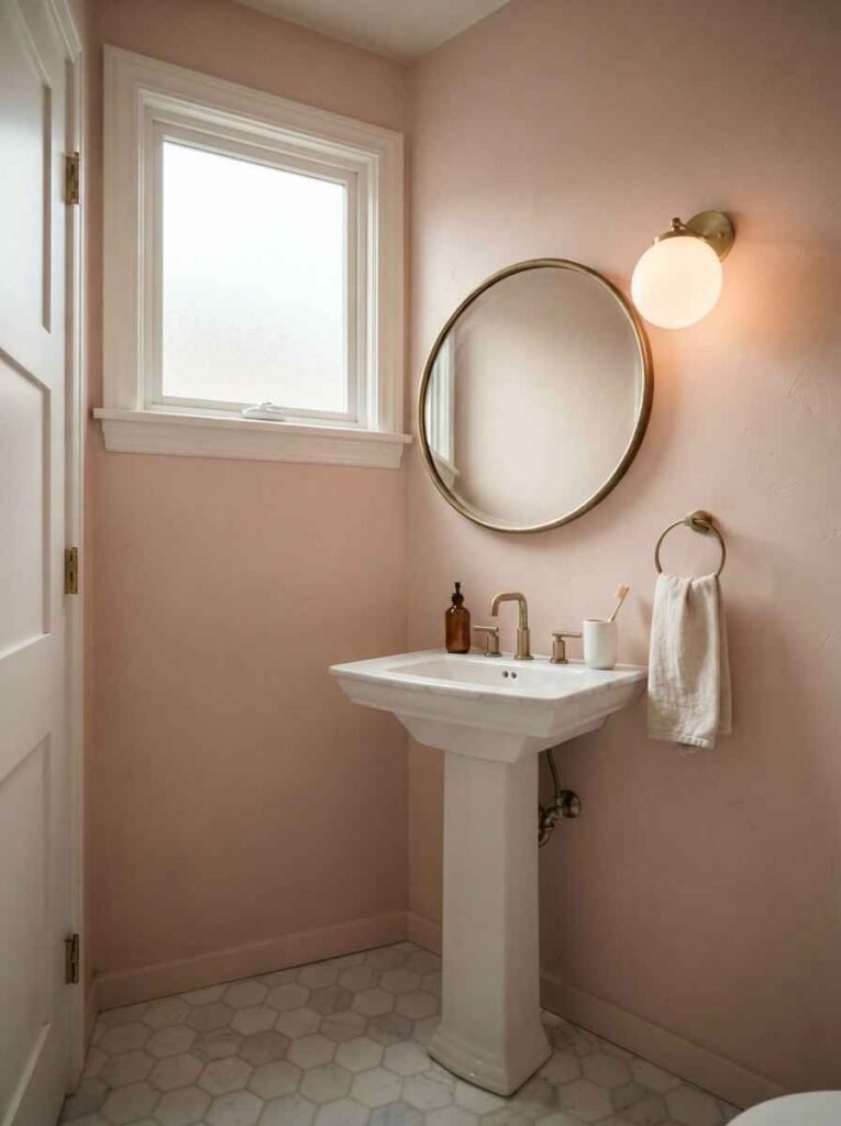
- Dusty rose tile. A little more grown-up than blush. Pairs beautifully with brass fixtures.
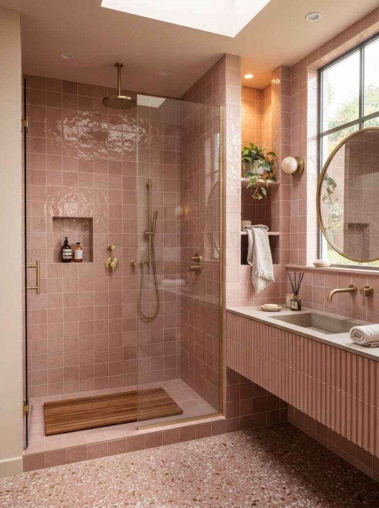
- Terracotta-pink accents. Earthy and warm, closer to clay than candy. This is what I did, and I still love it.
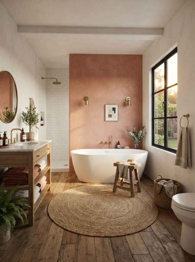
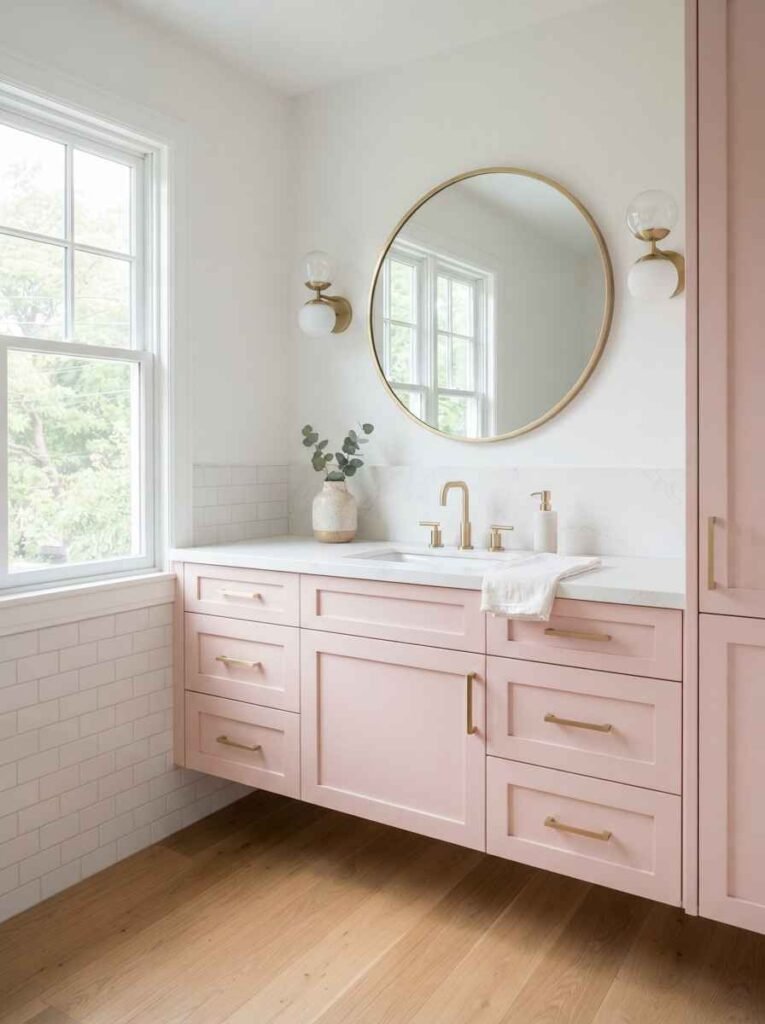
- Millennial pink cabinetry. Yes, it’s still around. IMO it works best on lower cabinets, not full walls.
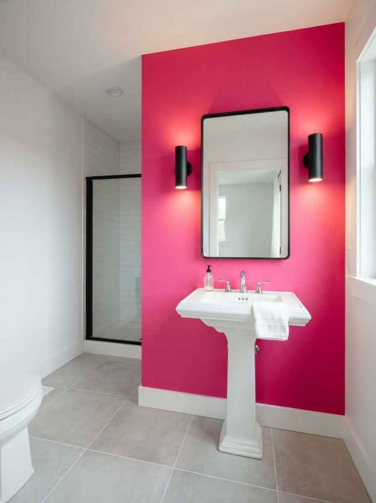
- Hot pink statement wall. Bold, a bit risky, but stunning if the rest of the room stays plain white.
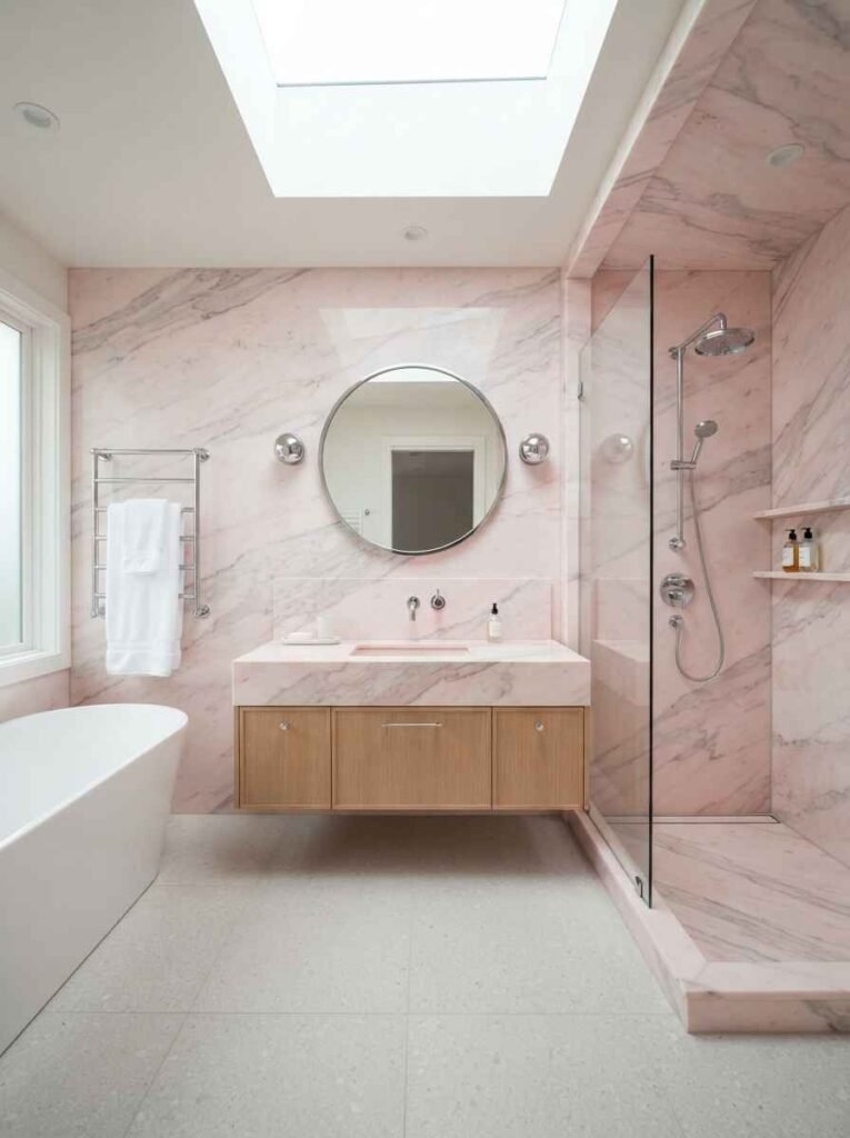
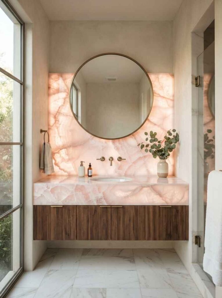
- Pale pink marble. Subtle veining does most of the work here. Costs more, looks like it costs more.
- Mauve tones. A grey-pink hybrid that reads more sophisticated than sweet.
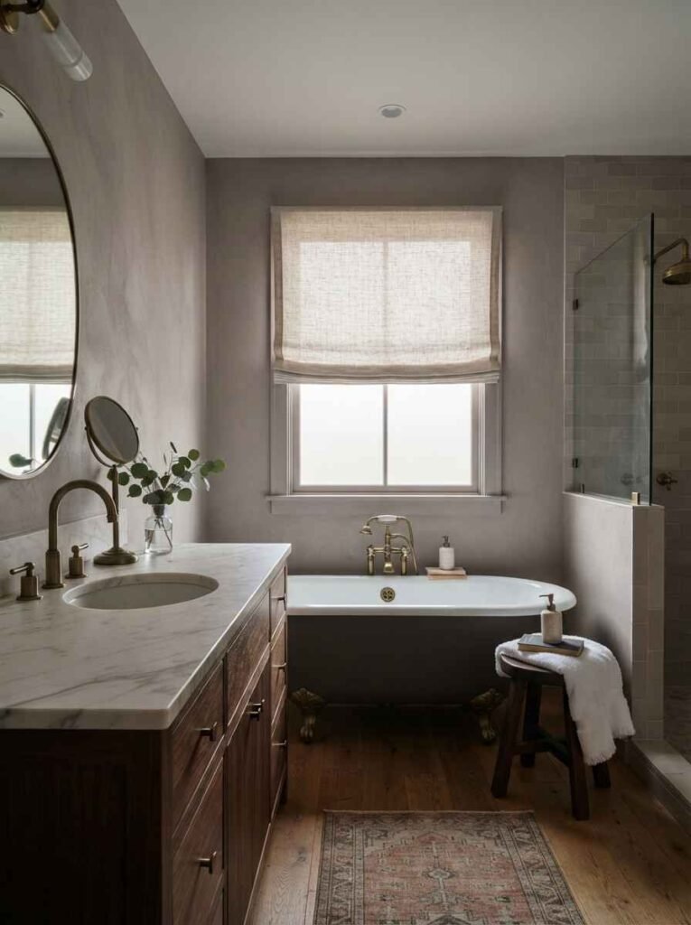
Sherwin-Williams has a solid color visualizer tool if you want to test shades before committing, and Benjamin Moore’s pink paint collection is where I found my own terracotta match, actually.
Tile and surface ideas that don’t scream “trendy”
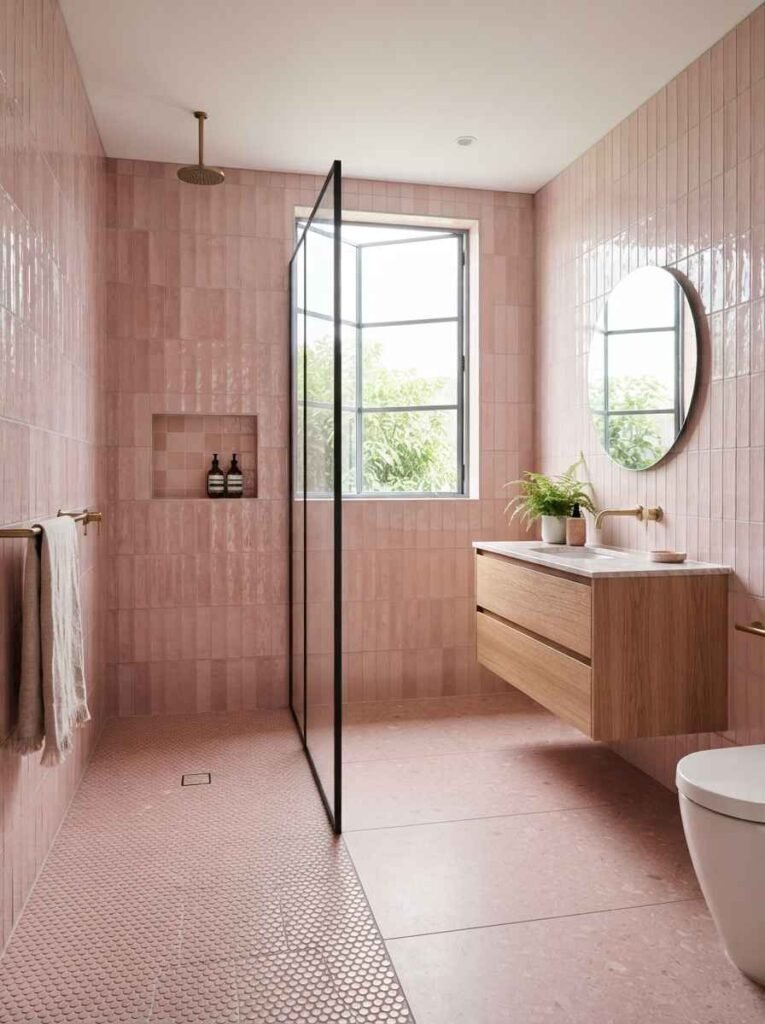
Paint is commitment-lite. Tile is not. Ever wondered why so many pink bathroom photos on Pinterest feature tile instead of paint? It’s because tile ages slower, visually. A painted wall from 2017 already looks dated. Pink zellige tile from 2017 still looks intentional.
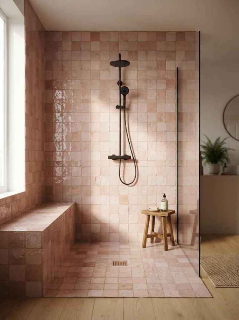
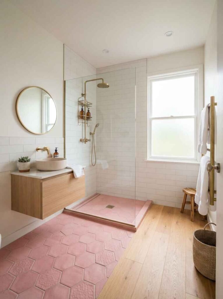
- Pink zellige tile. Handmade, slightly uneven, full of texture. My personal favorite on this whole list.
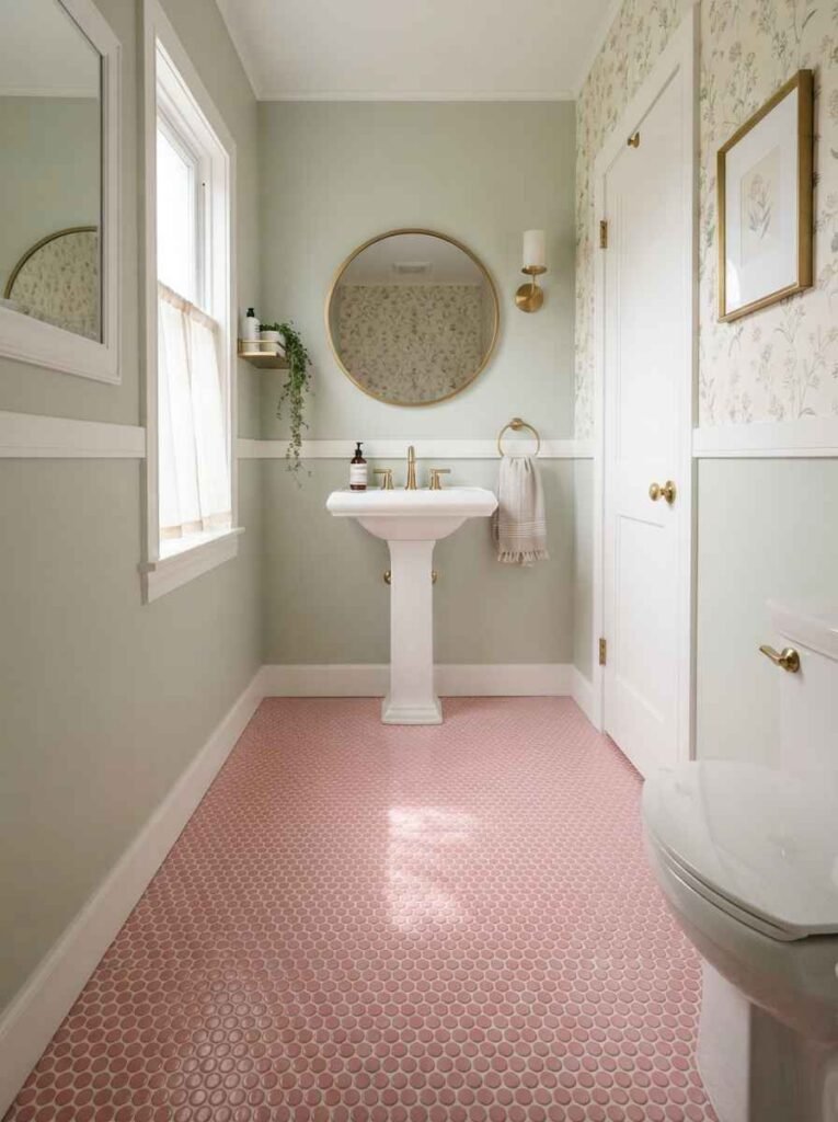
- Pink penny tile flooring. Great in small powder rooms. Grout color matters more than people think.
- Pink subway tile. Classic, forgiving, easy to keep clean.
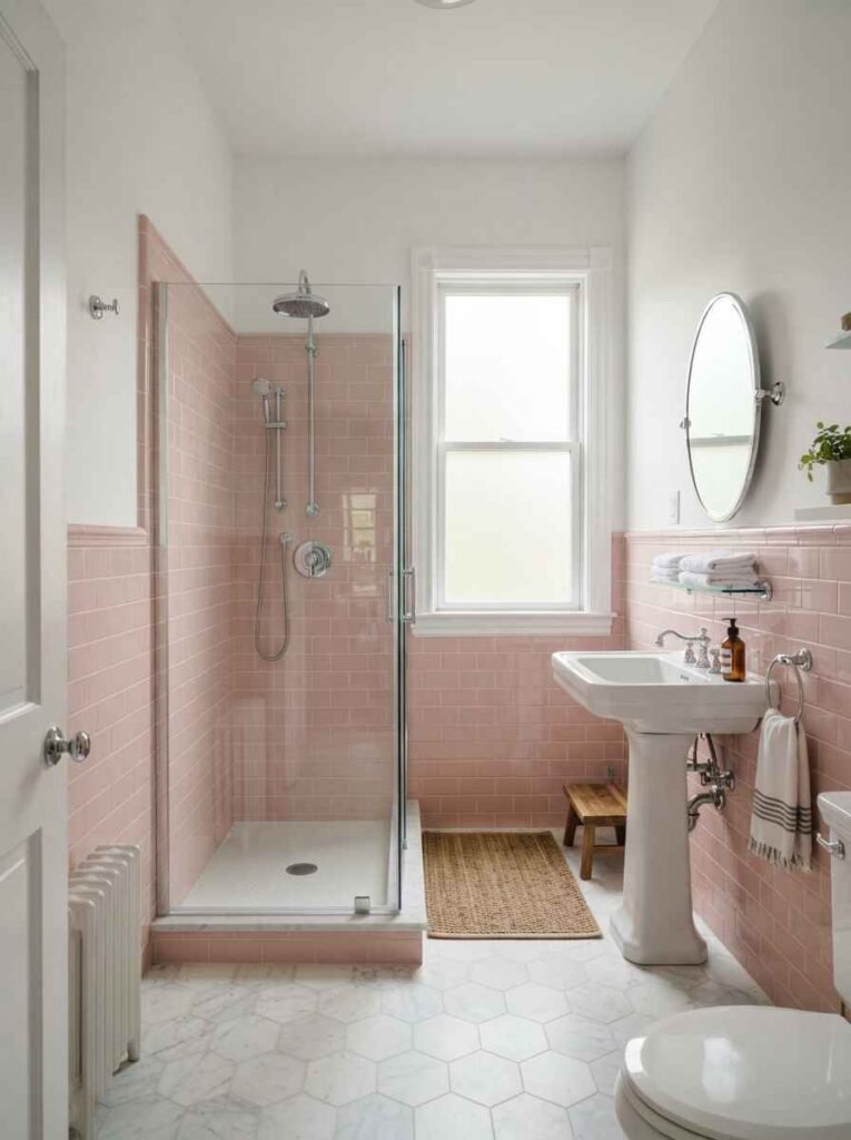
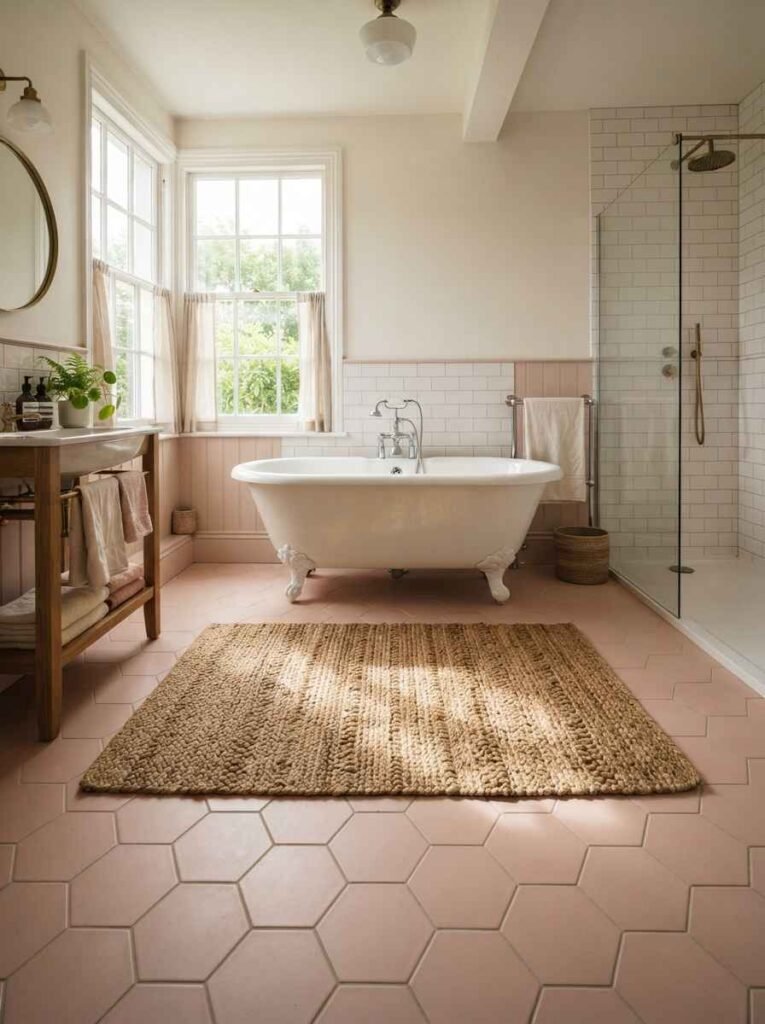
- Pink hexagon tile. More visually busy, so use it sparingly (a shower floor, not every wall).
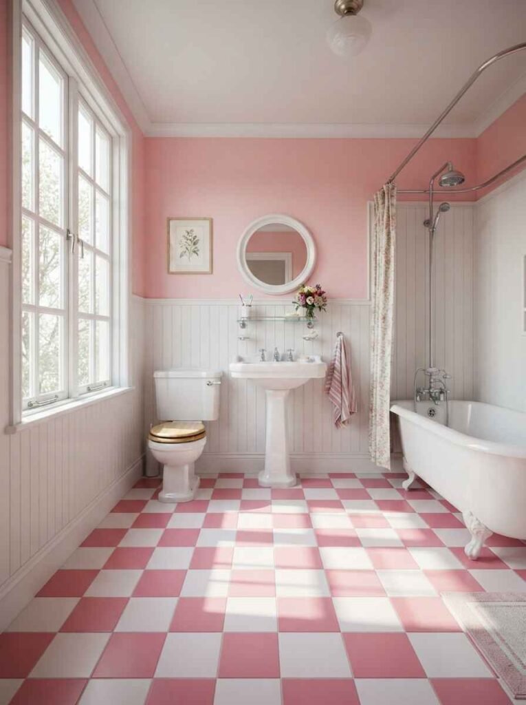
- Pink and white checkerboard flooring. Bold and a little retro. Not for everyone, but it photographs incredibly well.
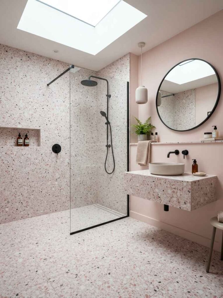
- Pink terrazzo. Trendy right now, and it hides water spots better than solid tile.
- Pink onyx or quartz countertops. Pricier, but it’s the kind of surface that carries the whole design on its own.
Fixtures, fittings, and the small stuff that matters most
Here’s the thing nobody mentions in the big glossy design spreads: fixtures make or break a pink bathroom faster than the color itself. A cheap plastic pink soap dish next to gorgeous tile just looks off.
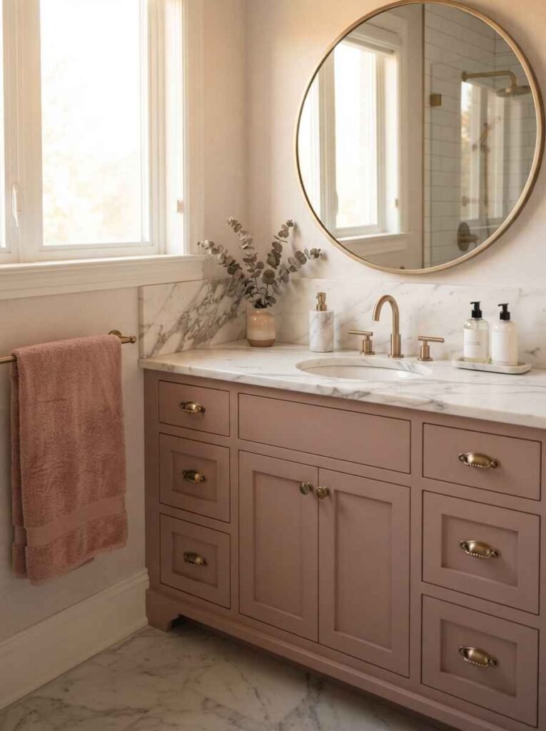
- Brushed brass fixtures. Warms up cooler pinks like mauve or dusty rose.
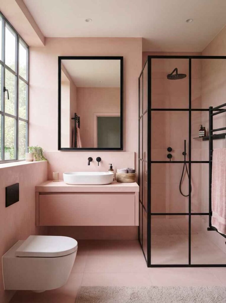
- Matte black fixtures. Creates contrast against blush or millennial pink. Bold choice, works well.
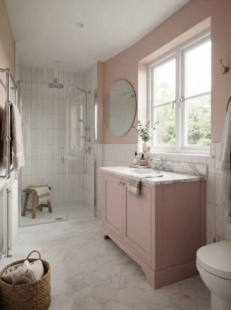
- Pink vanity with a marble top. The two-tone look is everywhere on Pinterest for a reason.
- Scalloped mirror frames. Soft edges match soft colors. Small detail, big difference.
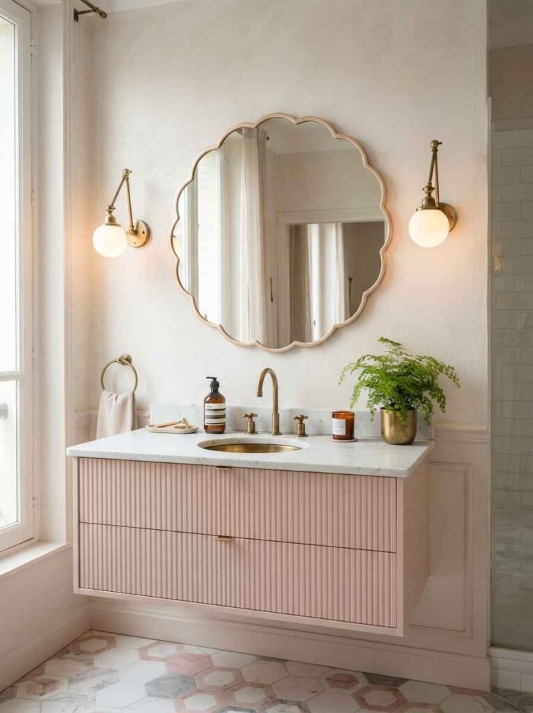
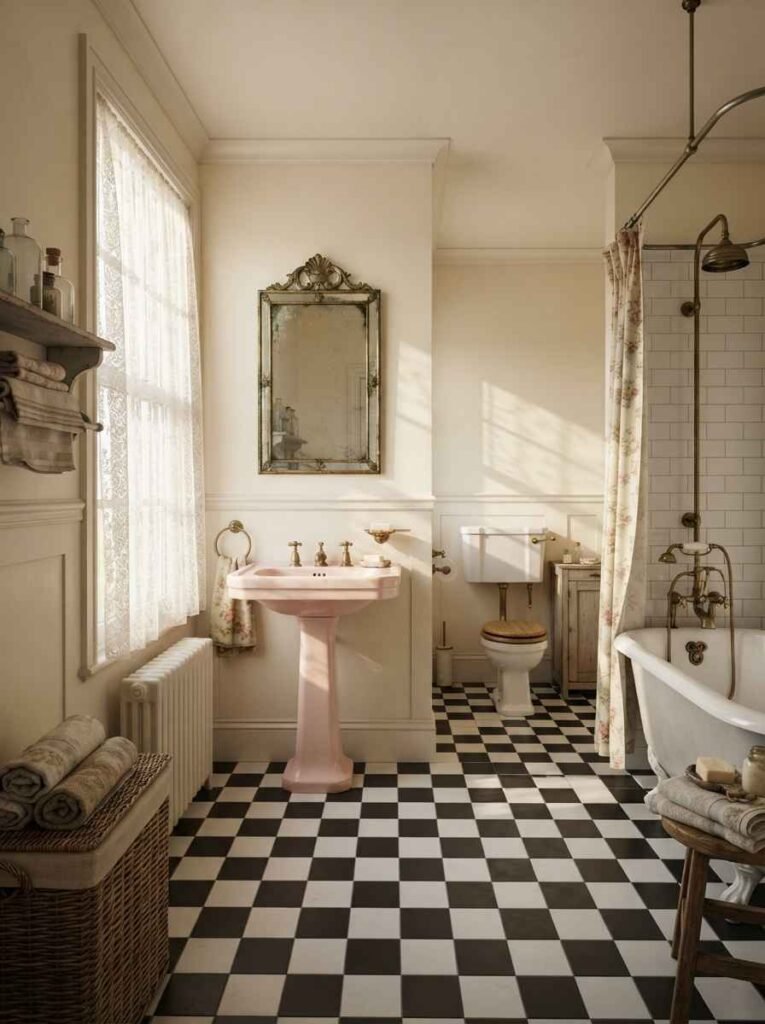
- Vintage-style pink sink. Salvaged fixtures add character that new ones can’t fake.
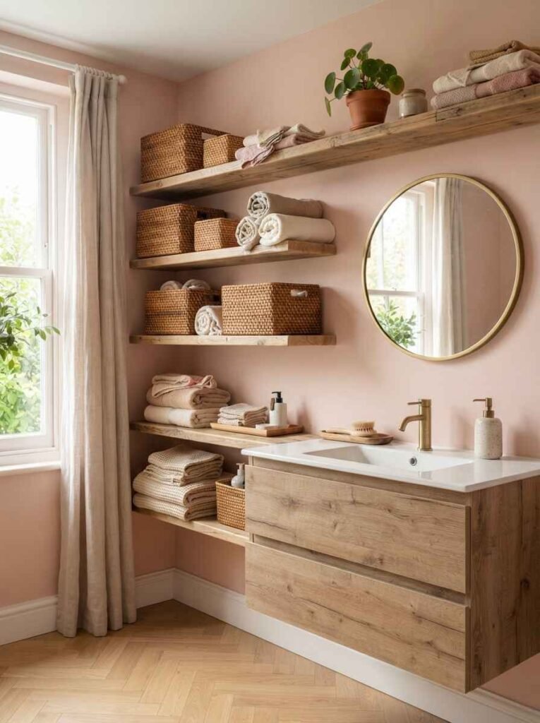
- Woven or rattan storage baskets. Breaks up the pink with texture, keeps things from feeling flat.
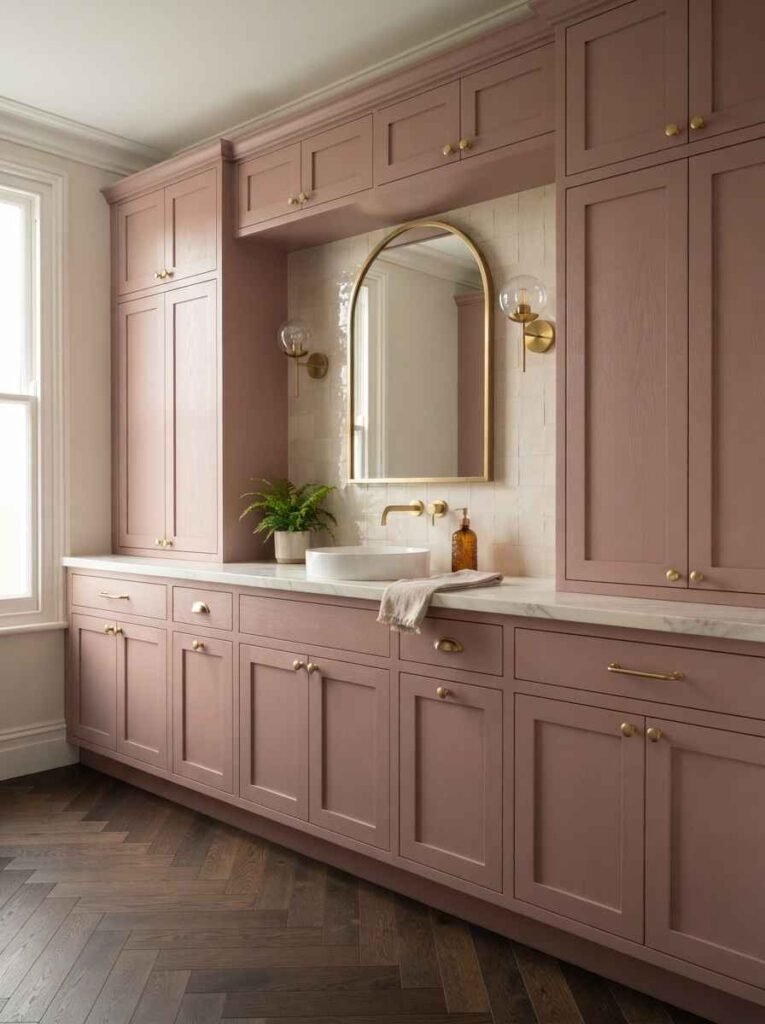
- Brass or gold hardware on cabinets. Cheap-looking hardware is the fastest way to ruin an expensive-looking room.
Here’s a quick comparison table if you’re deciding between finishes:
| Fixture finish | Best paired with | Maintenance level |
|---|---|---|
| Brushed brass | Dusty rose, mauve | Low |
| Matte black | Blush, millennial pink | Medium |
| Polished chrome | Pale pink, hot pink | Low |
| Aged bronze | Terracotta-pink | Medium |
Decor and styling touches
This is where the room gets personality. Anyone can paint a wall pink. Not everyone can style a pink bathroom so it doesn’t look like a theme park bathroom.
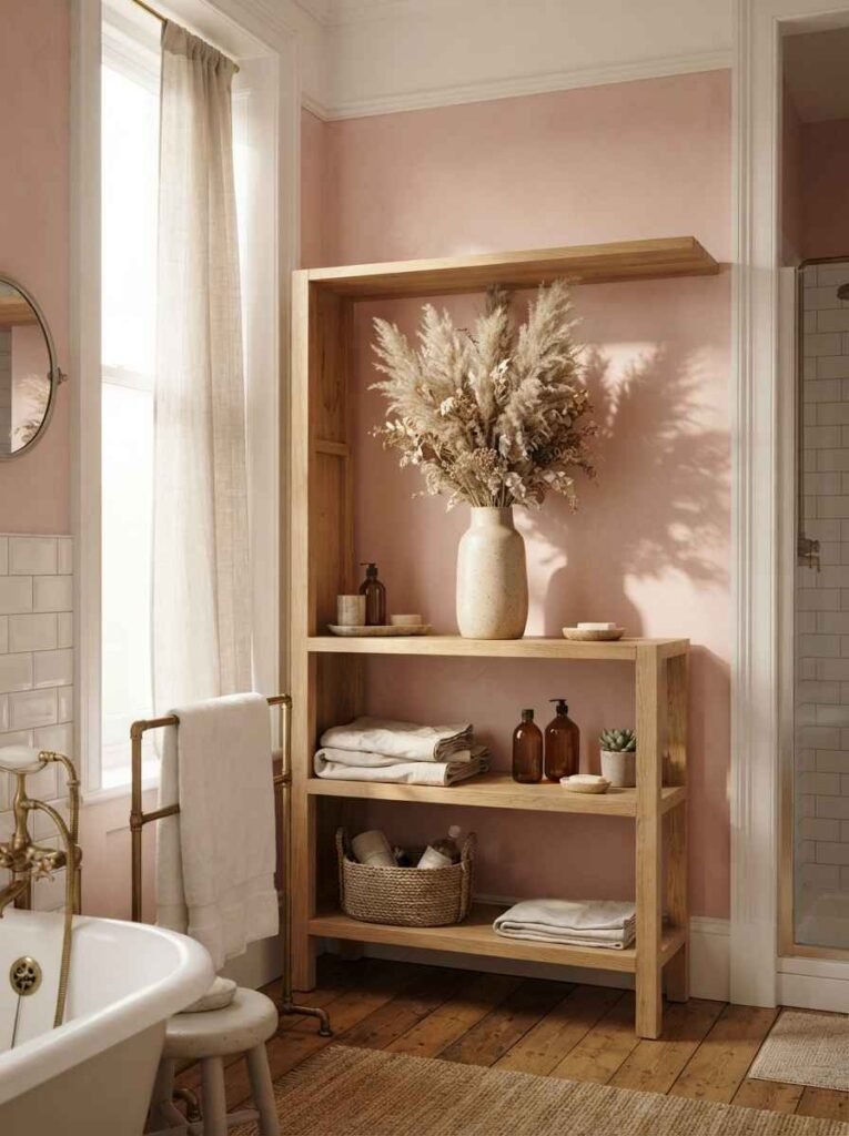
- Dried pampas grass in a ceramic vase. Overused? Maybe a little. Still works.
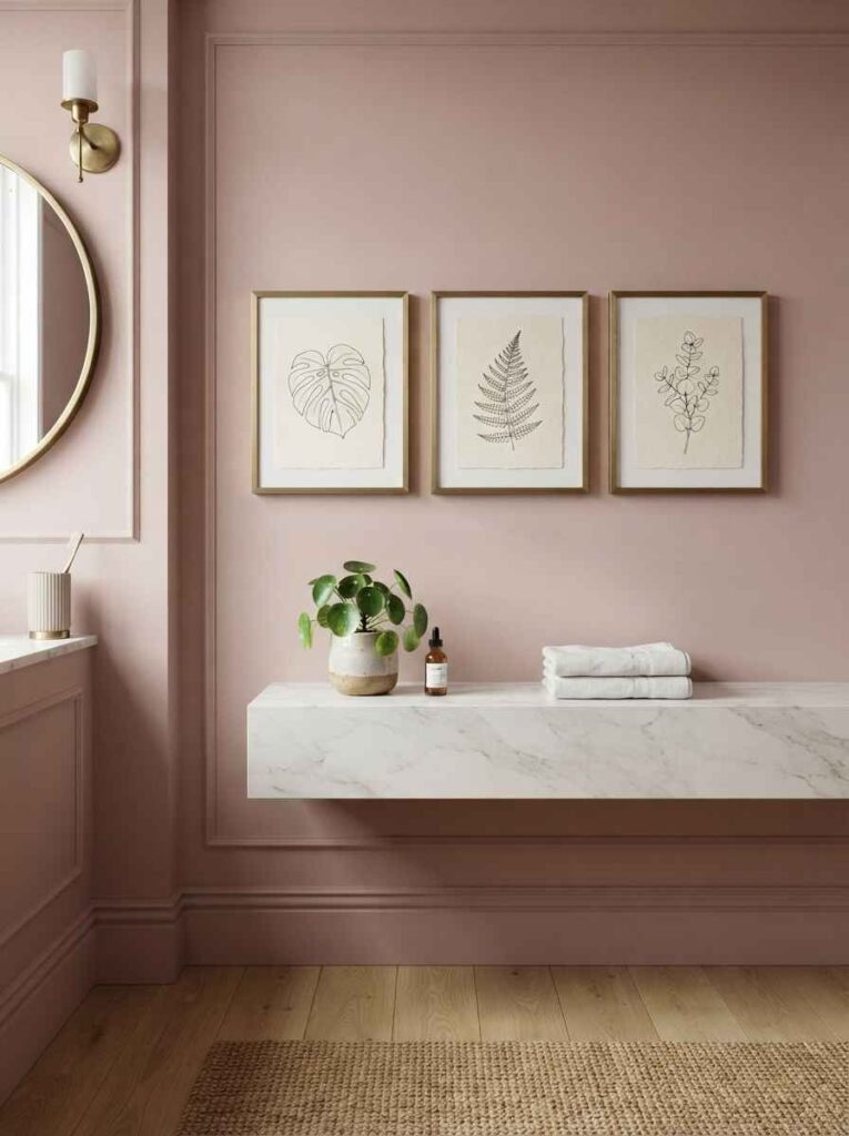
- Framed botanical prints. Green plants against pink walls is an easy win, every time.
- Woven jute bath mats. Neutral texture keeps the pink from feeling overwhelming.
- Brass towel bars. Small upgrade, disproportionately big visual payoff.
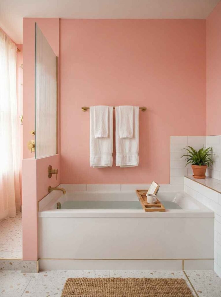
- Fluted glass shower doors. Adds texture without adding another color.
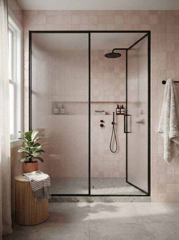
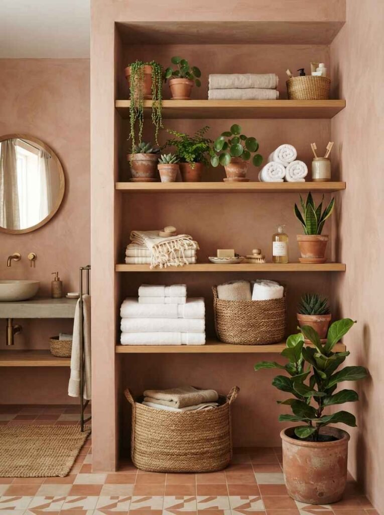
- Terracotta plant pots on open shelving. Ties back to the earthy pink tones if you went that route.
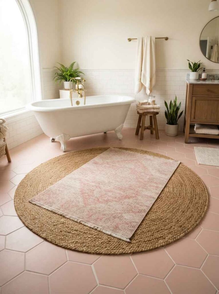
- Layered rugs (a jute base with a smaller printed rug on top). This is one of those Pinterest tricks that photographs way better than it feels practical, but I still do it.
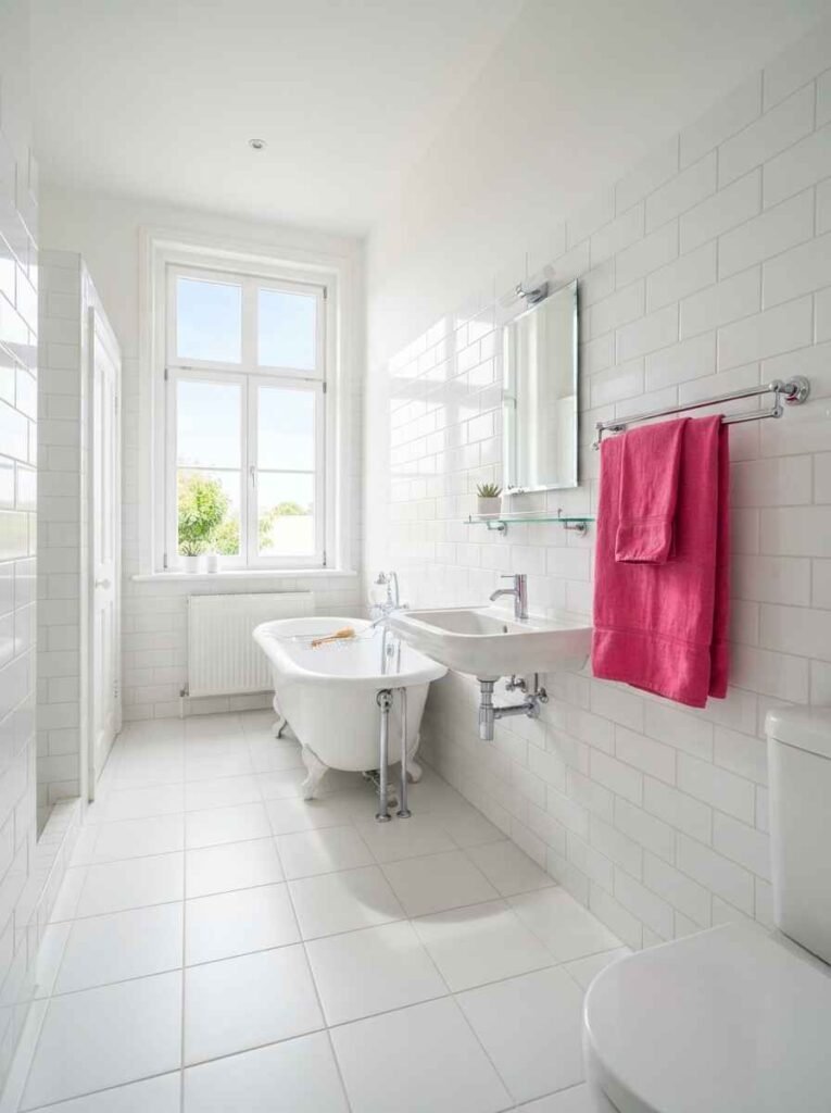
- A single bold pink towel set as the “pop” instead of the whole room being pink. Honestly, this might be the easiest entry point if you’re nervous about committing.
Random thought, since we’re on the topic: I still don’t understand why so many rental apartments default to builder-grade white bathrooms when peel-and-stick pink tile decals exist and take an afternoon to apply. That’s a whole separate rant, though.
Small bathroom or big bathroom, does it matter?
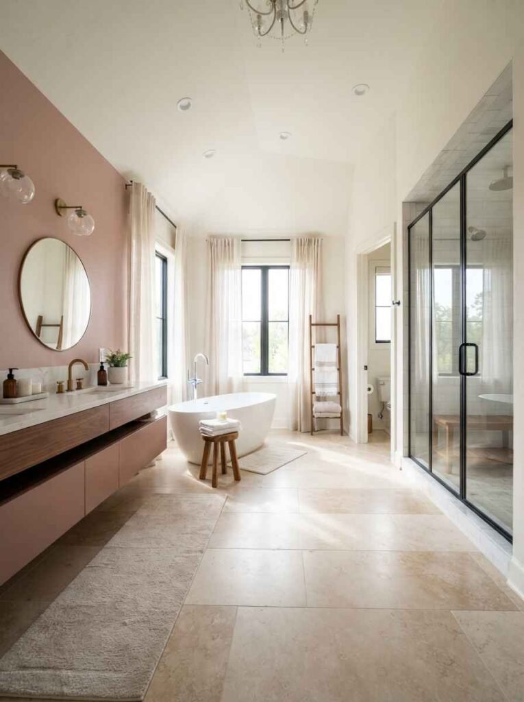
Kind of, yes. Small bathrooms handle bold pink better than you’d expect, because there’s less wall space for it to feel like too much.
A tiny powder room in hot pink can feel like a jewel box. The same color across a large primary bathroom can feel like a lot, fast.
Larger bathrooms tend to do better with a pink accent (one wall, the vanity, or the tile) paired with white, cream, or stone.
This isn’t a hard rule. It’s just what tends to hold up over time, based on the pattern I’ve seen across dozens of renovation photos and my own contractor’s complaints.
Architectural Digest has a good breakdown of scale and color proportion in small spaces if you want a deeper dive into that specific topic.
Common mistakes people make with pink bathrooms
- Going too saturated on every surface at once (walls, tile, and vanity all in the same bright pink). It reads as costume, not design.
- Ignoring grout color. White grout on pink tile can look chalky under certain lighting.
- Skipping a warm-white or brass light fixture. Cool-toned LED lighting makes pink look washed out or, worse, slightly grey.
- Forgetting ventilation. Pink paint shows water damage and mildew faster than neutral tones do, especially in humid climates.
This is insane, but I’ve seen at least three Pinterest-famous pink bathrooms that looked incredible in photos and had zero exhaust fans. Don’t be that bathroom.
FAQs
Does pink work in a small bathroom? Yes, and often better than in large ones. Smaller spaces can handle bolder pink shades without overwhelming the room.
What color grout works best with pink tile? A grout that’s a few shades darker or lighter than the tile itself usually looks more intentional than pure white, which can look stark or dingy over time.
Will a pink bathroom look dated in a few years? It depends on the shade and the surfaces. Muted tones like dusty rose or terracotta-pink tend to age better than bright, saturated pinks, especially when paired with timeless materials like marble or brass.
So, which one of these 29 are you actually going to try? Save this list, screenshot the table, and start browsing tile samples this weekend. Your bathroom (and your Pinterest board) will thank you.
