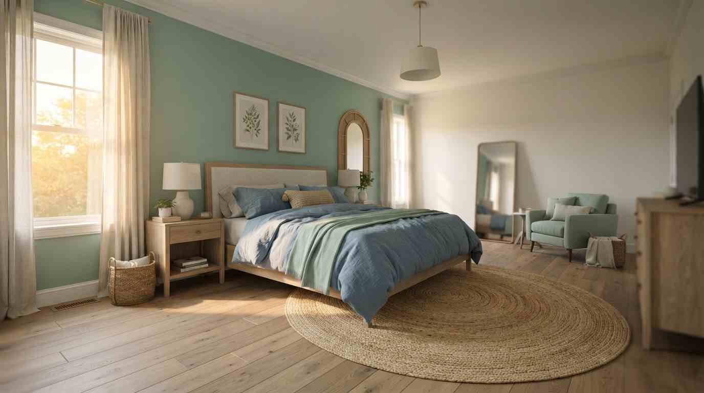
I repainted my bedroom three times in two years before I landed on a mint green and blue combo that finally felt right.
Cheap navy sample pots, a half-finished accent wall, one very confused Saturday with painter’s tape stuck to the ceiling. Worth it, though.
If you’re staring at Pinterest boards trying to figure out whether mint and blue can actually work together in a real bedroom (not just a styled photo), I get it.
They can. They’re both cool, both calm, and both pull from nature in a way that makes a room feel less like a hotel and more like somewhere you’d actually sleep well.
I’ve pulled together 28 ways to use this pairing, from soft and barely-there to bold enough that your guests will ask about it.
Some of these I’ve tried myself. Some come from designers whose work I’ve followed for years.
All of them are things you could pin, save, and actually pull off this weekend.
Why mint green and blue actually work together
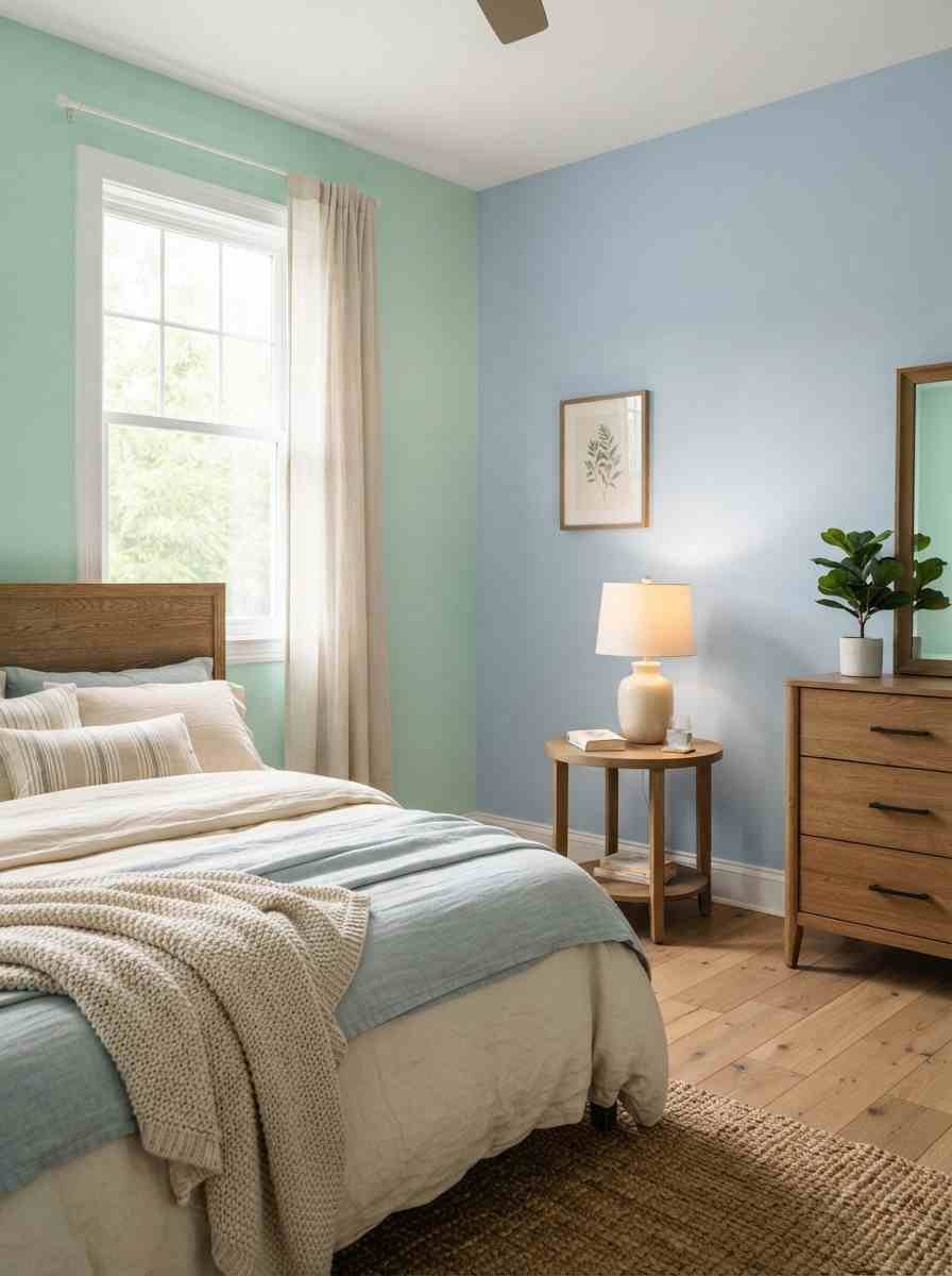
Blue and green sit next to each other on the color wheel, which is the main reason this pairing feels effortless instead of forced.
Colors that are close together like this (designers call it “analogous”) tend to blend rather than compete.
There’s also a sleep angle here, and it’s not just design-blogger talk.
According to the Sleep Foundation’s research on bedroom color, people tend to associate blue with calmness and relaxation, which makes it one of the most reliable choices for a bedroom.
Mint green leans on that same nature-inspired calm, just with a little more warmth to it.
Personal opinion, and I’ll die on this hill: mint on its own can feel a bit clinical, almost dentist’s-office.
Pair it with blue and it softens right up. The blue grounds it.
A few things to sort out before you pick up a brush
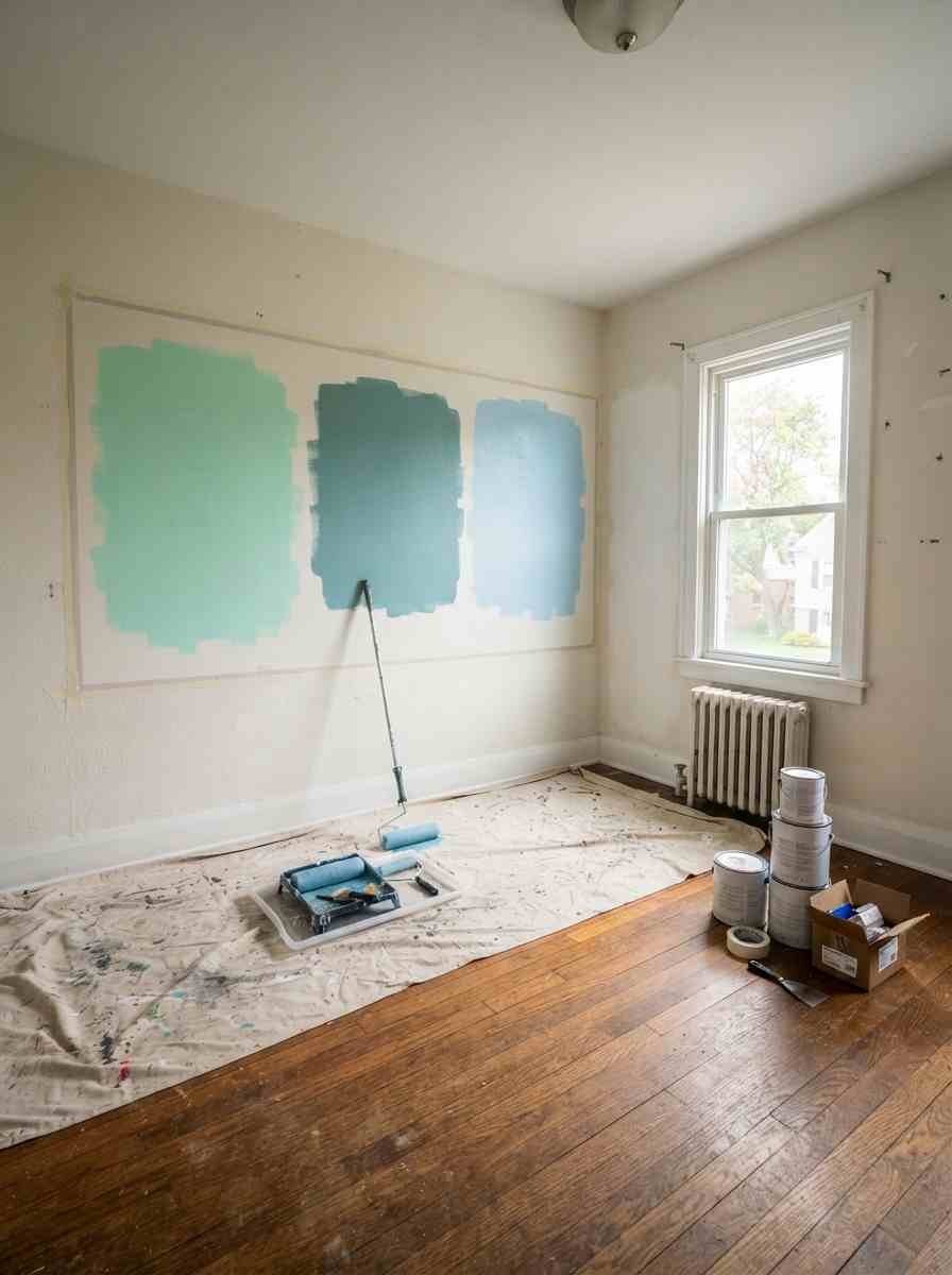
Before you fall down a 3 a.m. Pinterest hole (we’ve all been there), think through these basics. They’ll save you a repaint.
- Natural light matters more than the paint chip. A mint green that looks soft and dreamy in a north-facing room can go grey and flat in a south-facing one. Test it.
- Finish changes everything. A flat or matte sheen reads calmer on walls; anything glossier bounces light around and can feel busier at night. Sherwin-Williams’ own paint sheen guide points to eggshell or satin for a soft, calming bedroom feel.
- Decide which color leads. Pick one as the dominant wall or bedding color and let the other play a supporting role. Fifty-fifty splits rarely look intentional.
- Undertones sneak up on you. Some mints lean yellow, some lean blue. Hold your paint chips next to your blue fabric before committing, not after.
Here’s a quick cheat sheet I wish someone had handed me before my first attempt:
| Element | Mint green pick | Blue pick |
|---|---|---|
| Accent wall | Soft sage-mint | Muted denim or slate blue |
| Bedding | Crisp white with mint piping | Navy or dusty blue throw |
| Finish | Eggshell | Matte |
Soft and dreamy combinations (ideas 1 through 5)
These are the pairings I’d recommend to anyone who’s nervous about color. Low risk, high payoff.
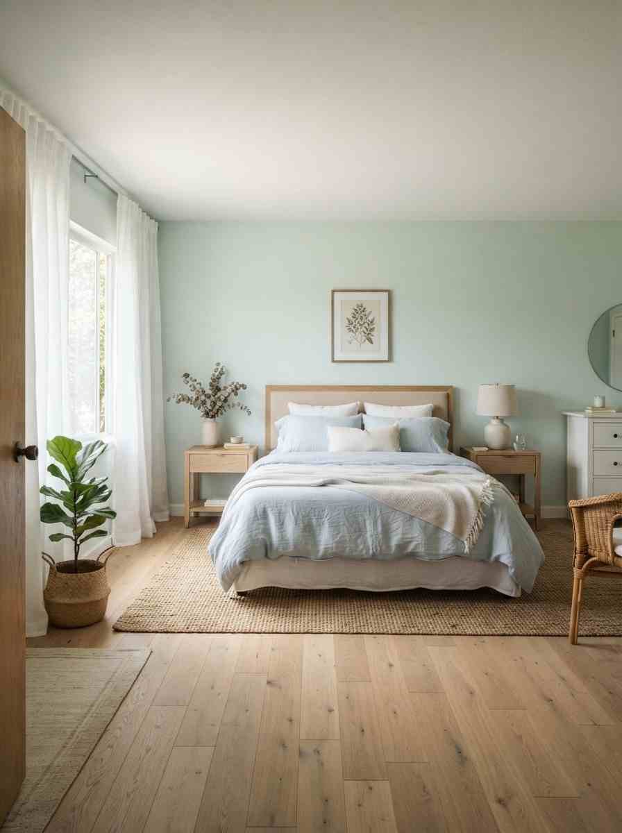
- Pale mint walls with powder blue bedding. Barely-there color on the walls, a slightly deeper blue on the bed. Restful without feeling washed out.
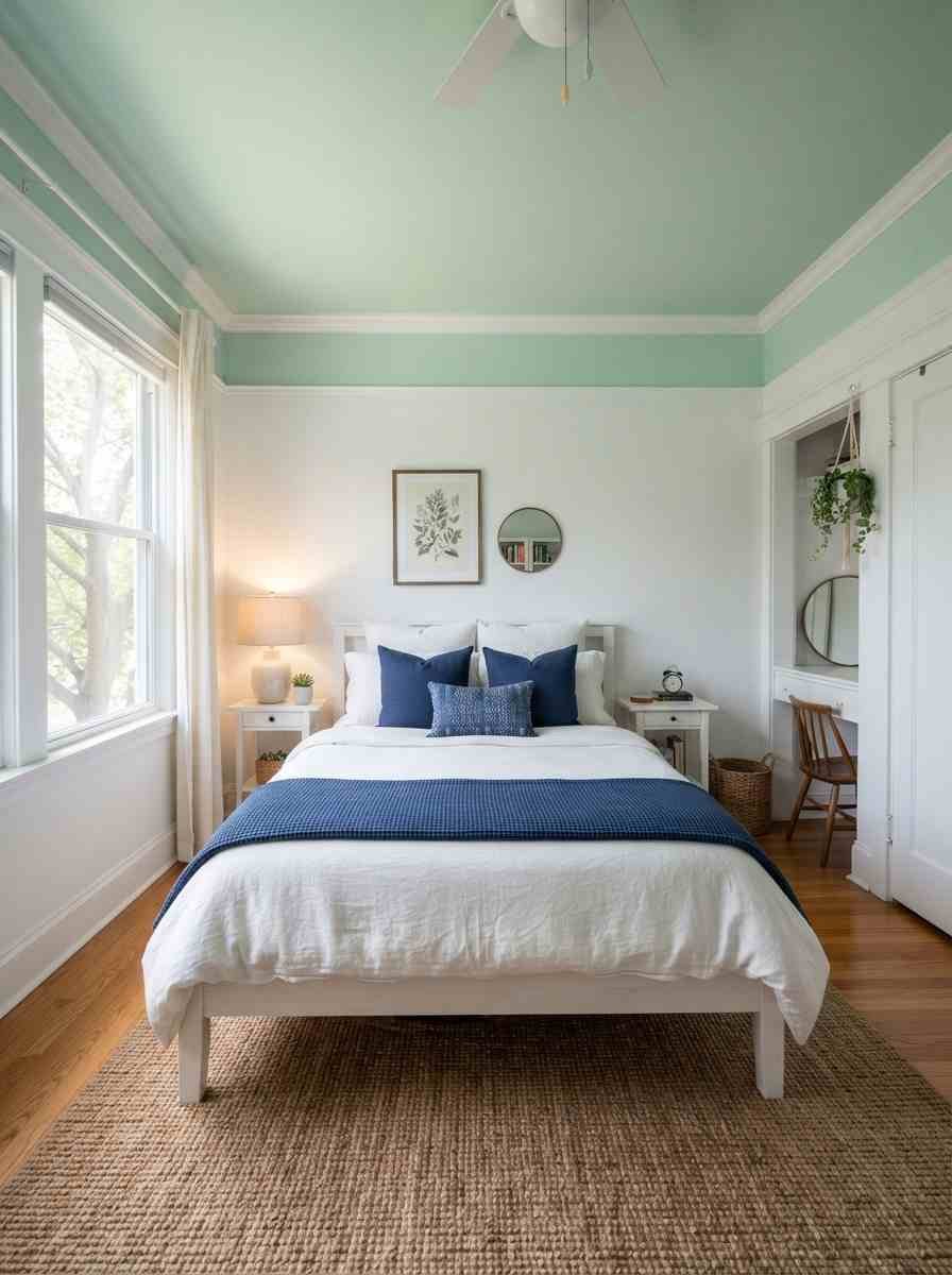
- Mint ceiling, white walls, navy accents. An unexpected place to put color, and it makes the room feel taller than it is.
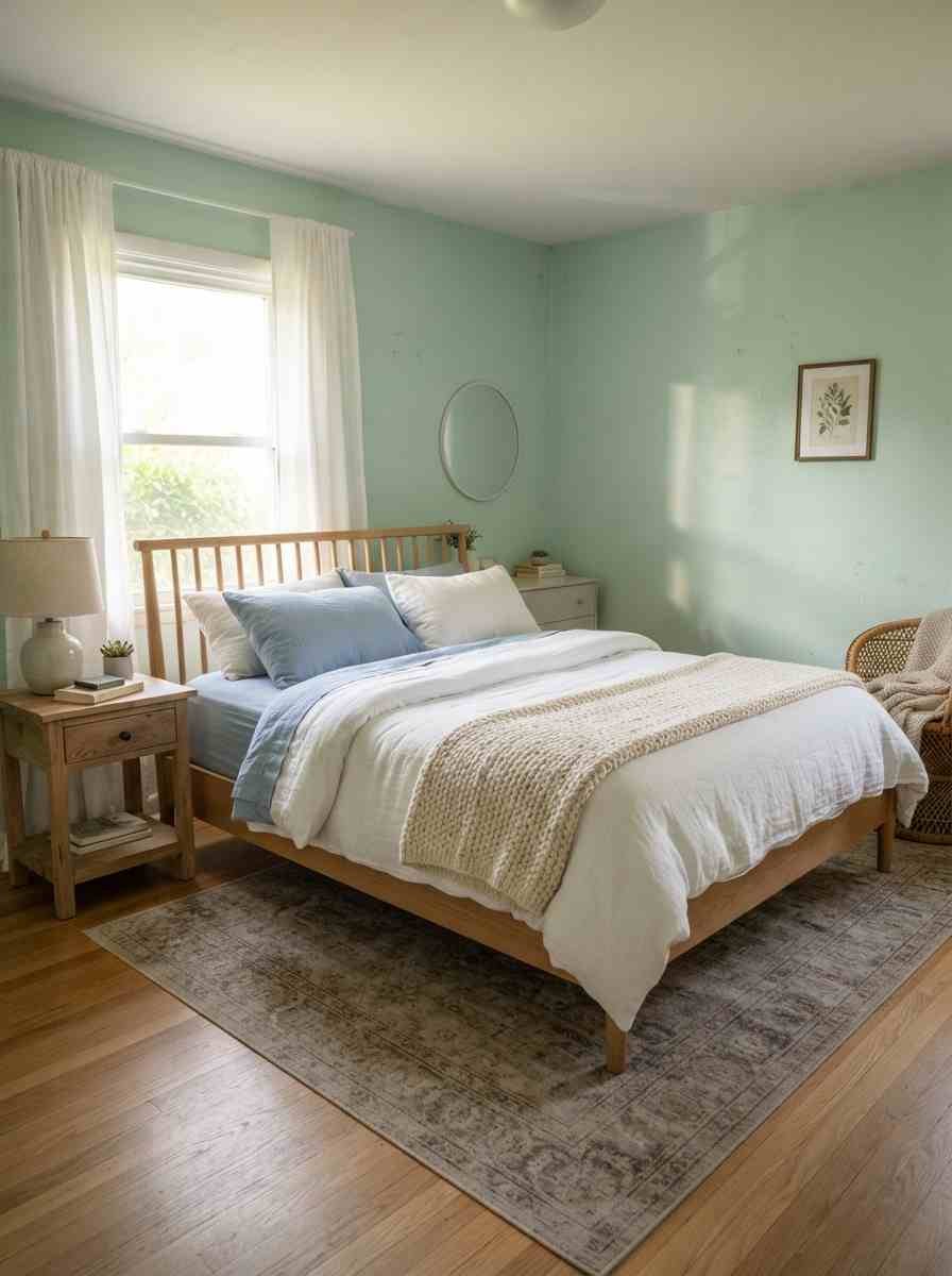
- Blue-grey linens against mint headboard. The headboard becomes the star instead of getting lost in a busy wall.
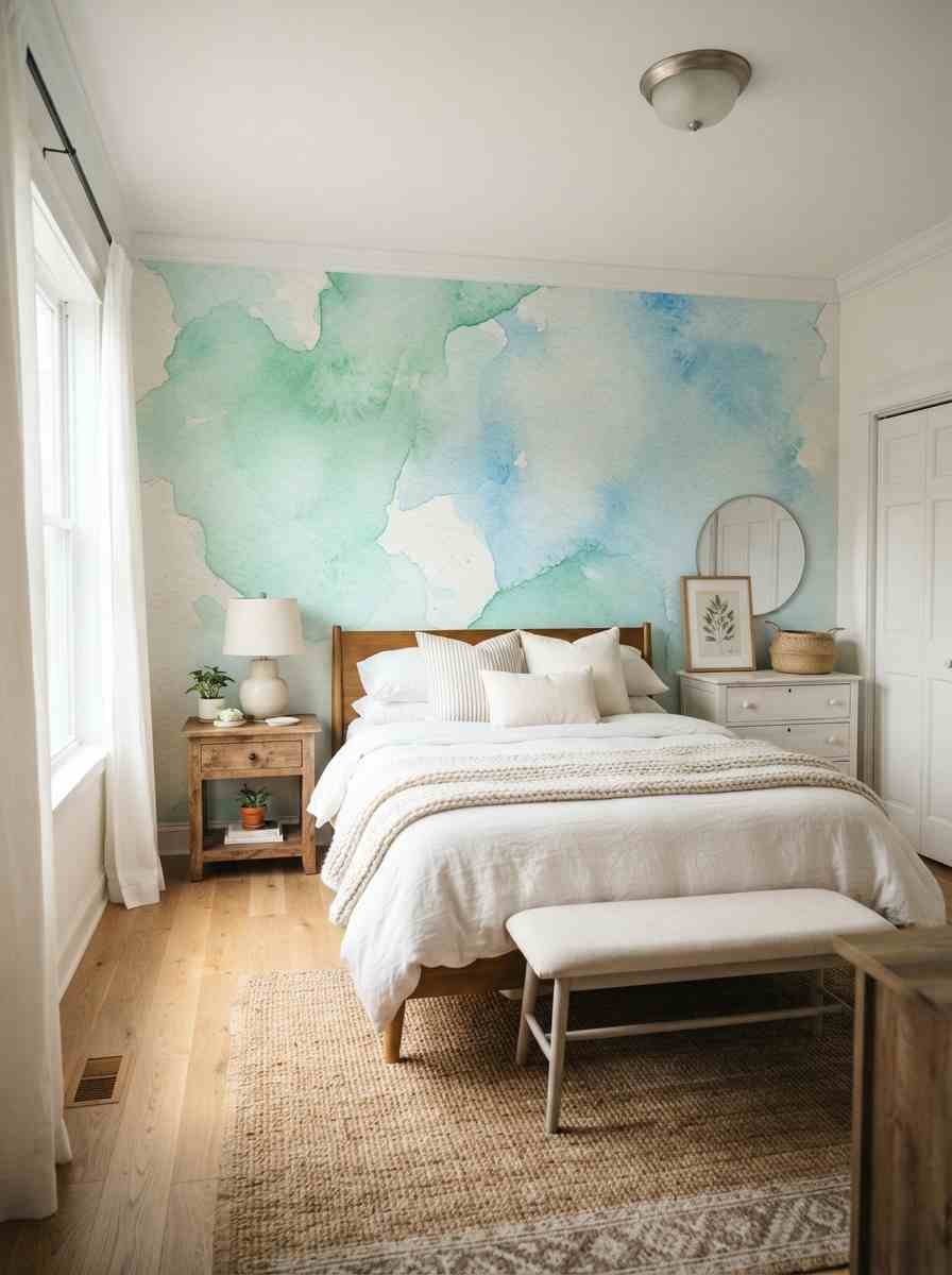
- Watercolor-style wallpaper in mint and sky blue. Great if you rent and can’t paint. Peel-and-stick versions have come a long way.
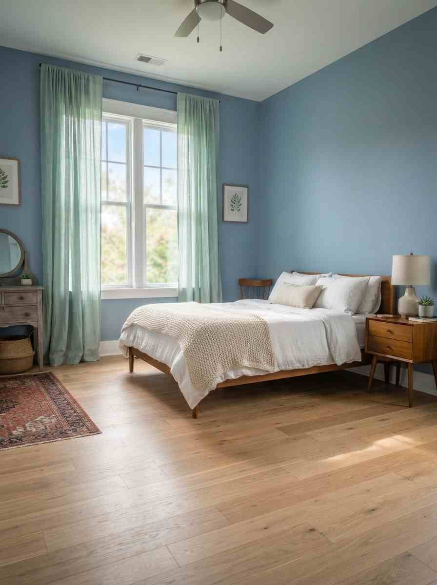
- Mint curtains with light denim blue walls. Sheer curtains let the mint stay airy instead of heavy.
Coastal and beachy takes (ideas 6 through 10)
IMO this cluster is the easiest to shop for, because half of it already exists at your local home goods store.
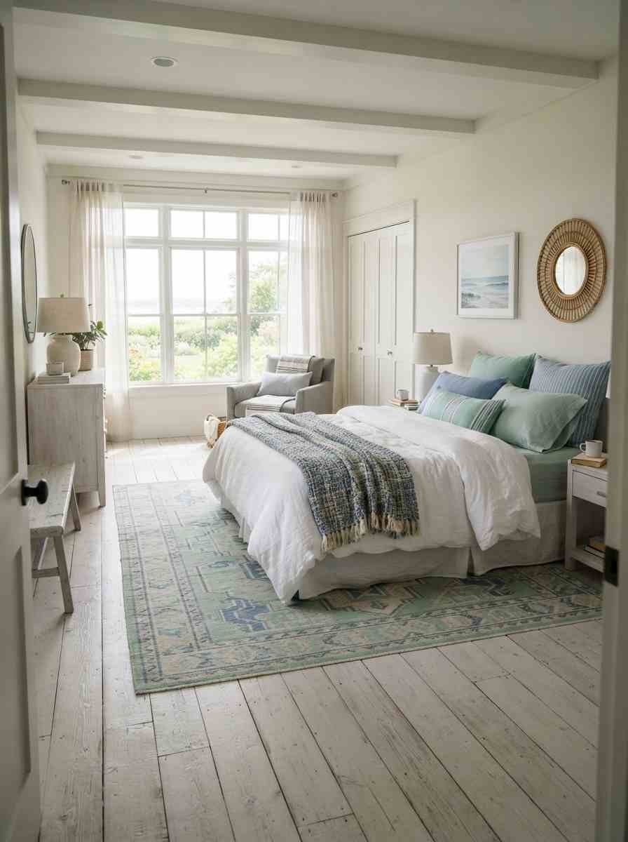
- Sea glass green walls with driftwood furniture. Warm wood tones keep the cool palette from feeling sterile.
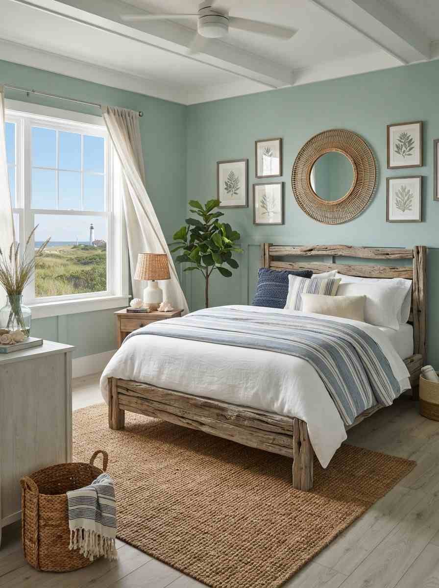
- Striped bedding in mint and marine blue. A classic nautical move that somehow never looks dated.
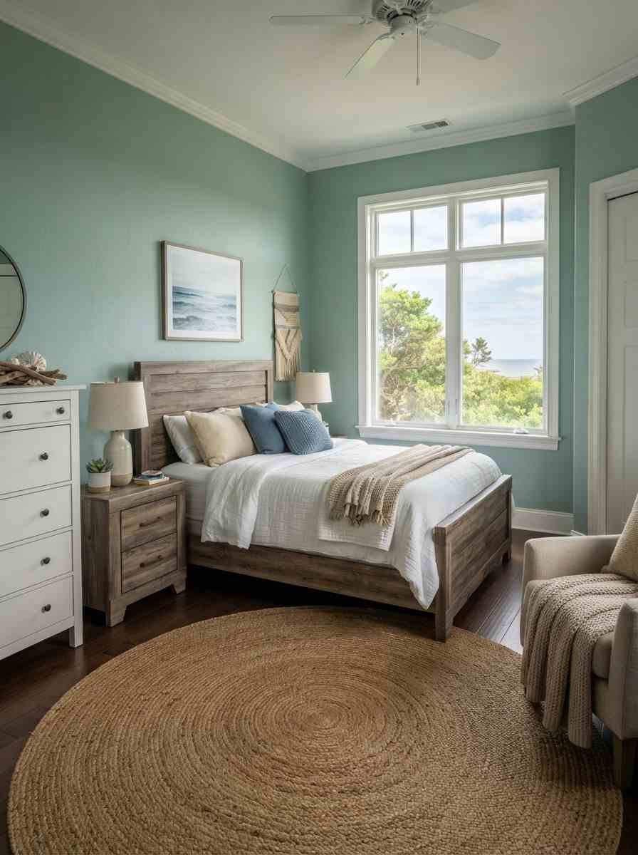
- Rope and rattan accents against a mint wall. Texture does a lot of heavy lifting here.
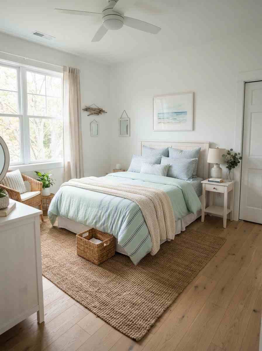
- Ocean-inspired art in a gallery wall. Mix a few prints, a map, a photo you took on an actual trip if you have one.
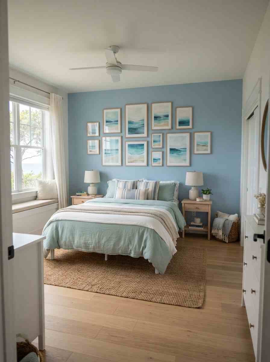
- Whitewashed wood floors with mint and blue textiles. Keeps the room feeling like it belongs somewhere near a coast, even if you’re landlocked.
Bold and moody pairings (ideas 11 through 15)
Okay, quick tangent: I once tried to convince my sister that a moody bedroom is more calming than a bright one, and she looked at me like I’d suggested painting her ceiling black (I had, actually, briefly considered it). She was right to be skeptical, but hear me out on these.
- Deep teal walls with mint accessories. Teal sits right between the two colors, so this feels cohesive rather than clashing.

- Navy accent wall behind a mint velvet headboard. Velvet adds a softness that keeps navy from feeling heavy.
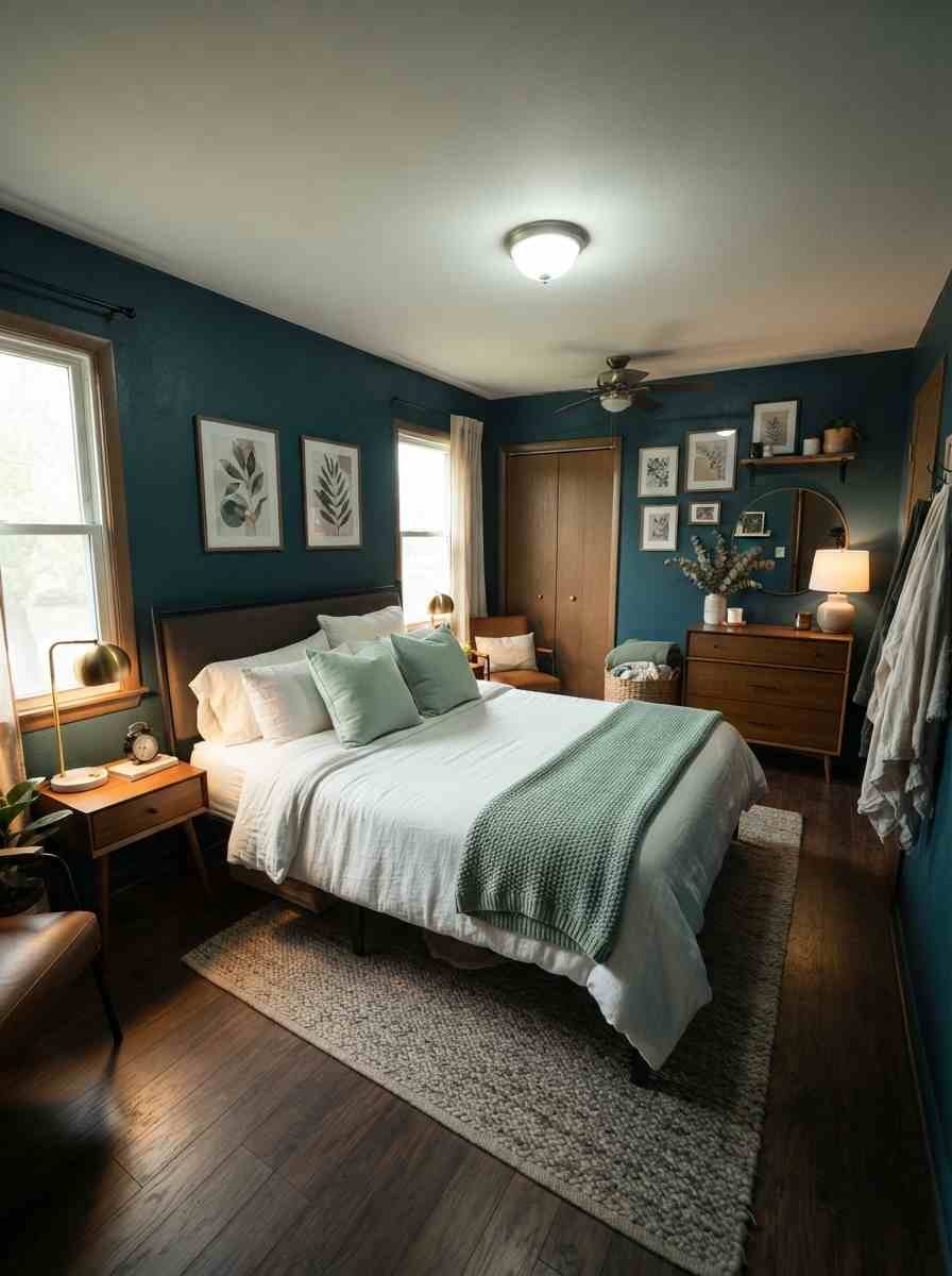
- Forest-adjacent mint green with midnight blue trim. Dramatic, but grounded. Works especially well in larger rooms.

- Dark blue ceiling with mint walls below. This one surprised me. It makes the ceiling disappear instead of drawing your eye up.
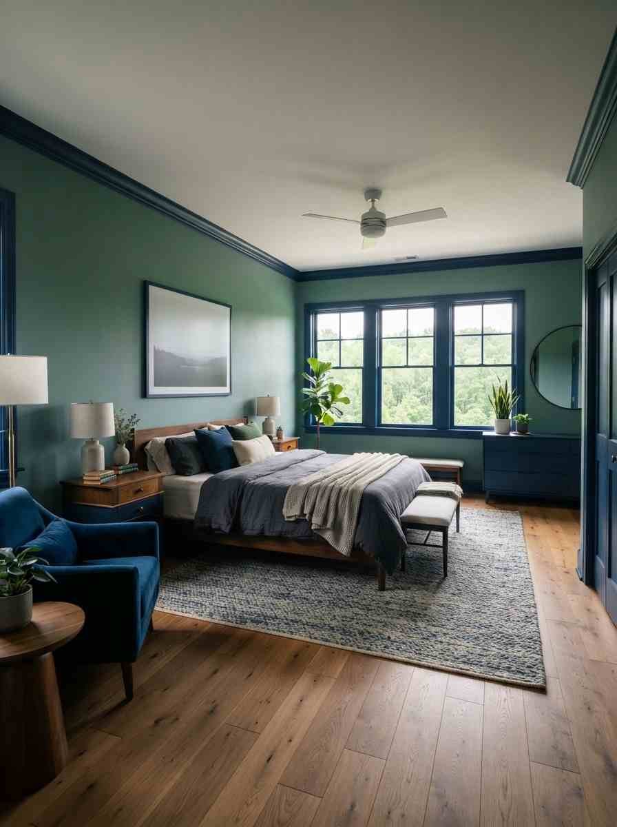
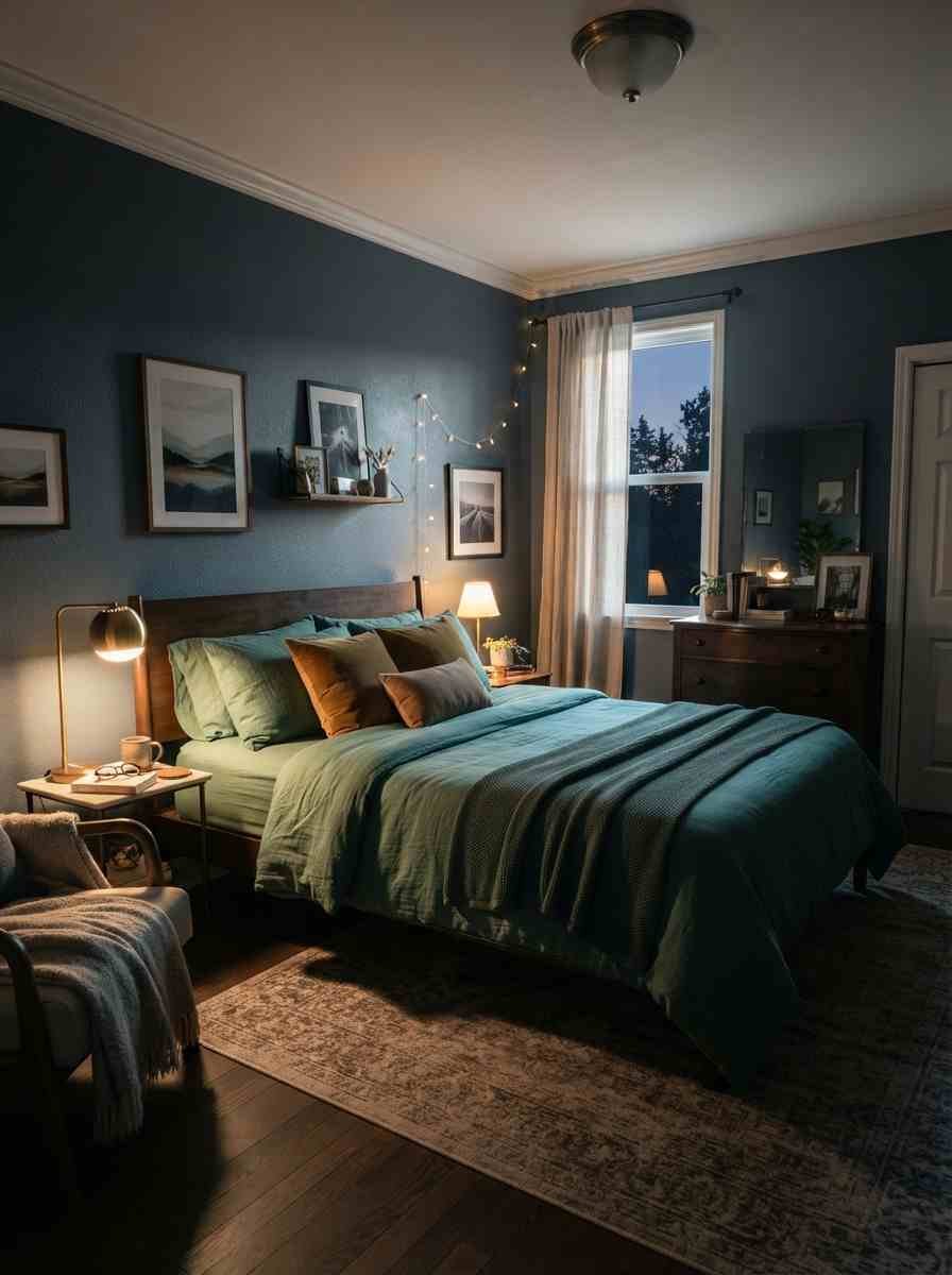
- Moody mint bedding against slate blue walls. Layer in brass hardware and it stops feeling cold.
Modern and minimal setups (ideas 16 through 20)
- Monochrome blue room with a single mint throw pillow. Sometimes one pop of color does more than a full wall.
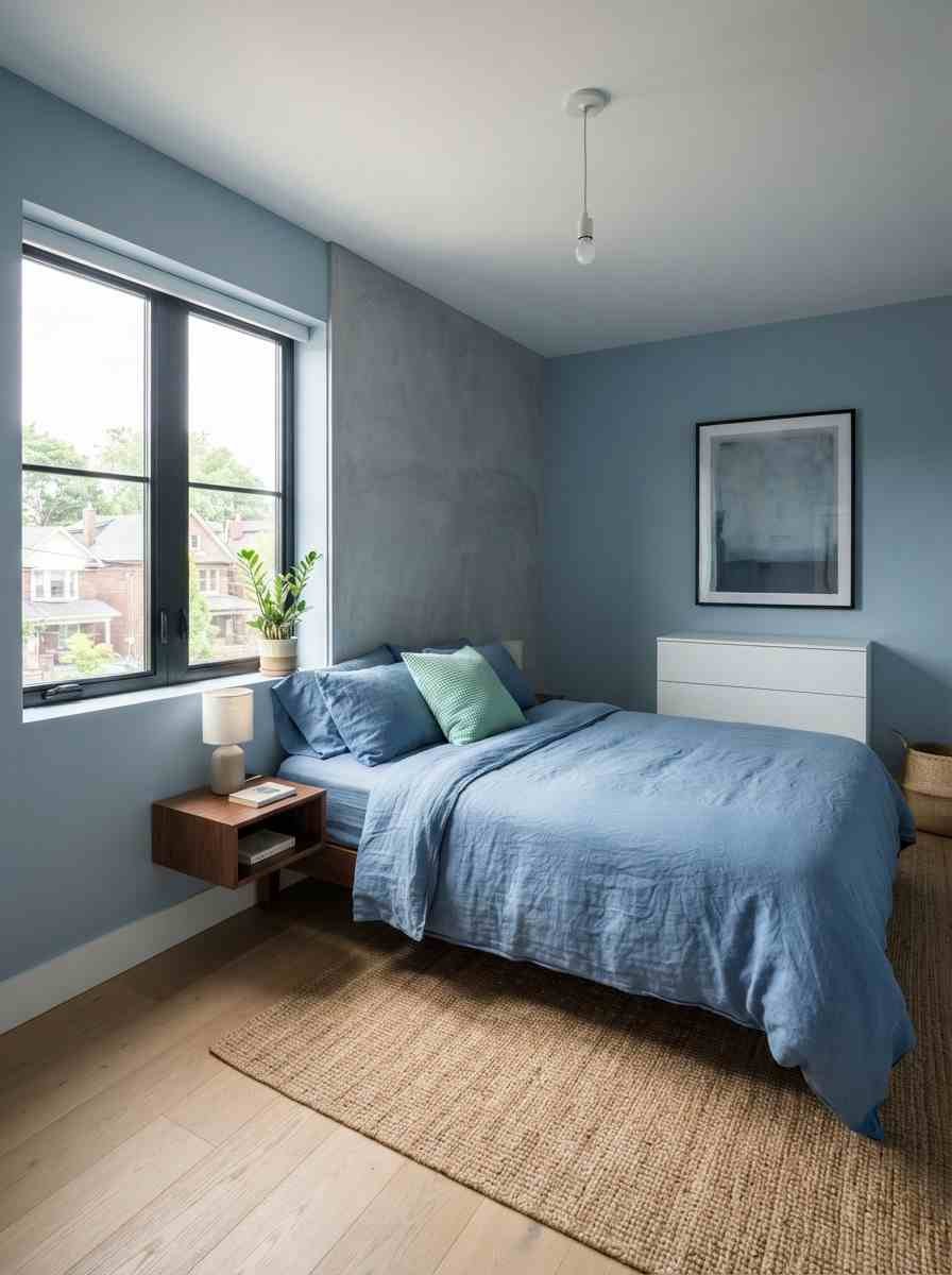
- Geometric mint and blue accent wall. A painted grid or block pattern instead of a solid color, done with painter’s tape and patience.
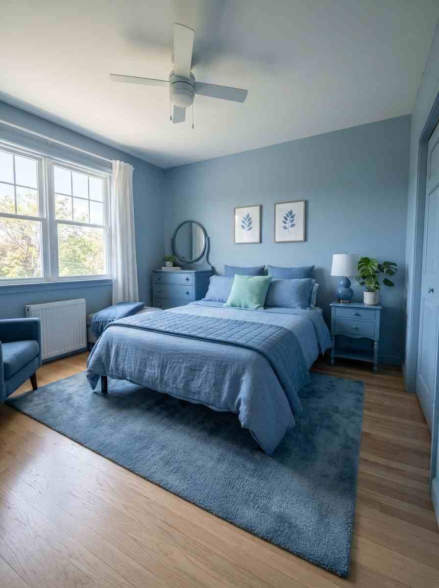
- Matte black frames against soft mint walls. Black keeps a pastel palette from tipping into “nursery” territory.
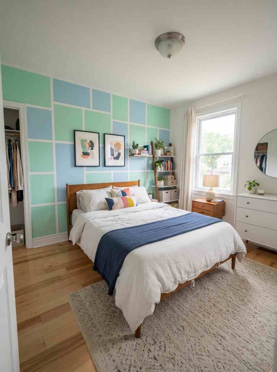
- Blue linen bedding, mint nightstand, nothing else. Minimalism works best when every remaining piece earns its spot.
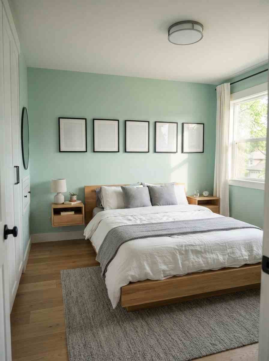
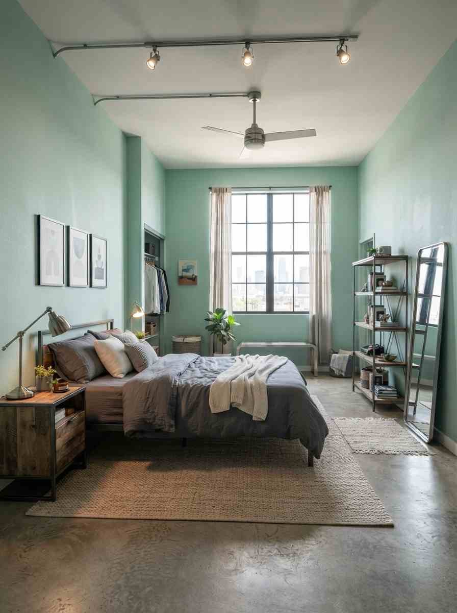
- Cool-toned mint with brushed steel fixtures. Reads more modern loft than cottage.
Vintage and eclectic mixes (ideas 21 through 24)
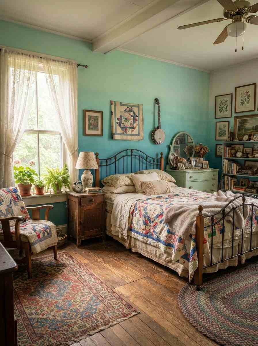
- Mismatched vintage furniture against a blue-mint ombre wall. Thrifted pieces in different woods actually look better together than matching sets, in my experience.
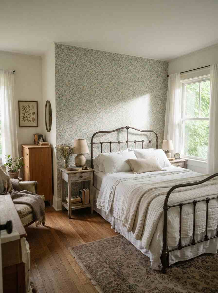
- Floral wallpaper in muted mint and blue tones. Choose a small, tight print if the room is on the smaller side.
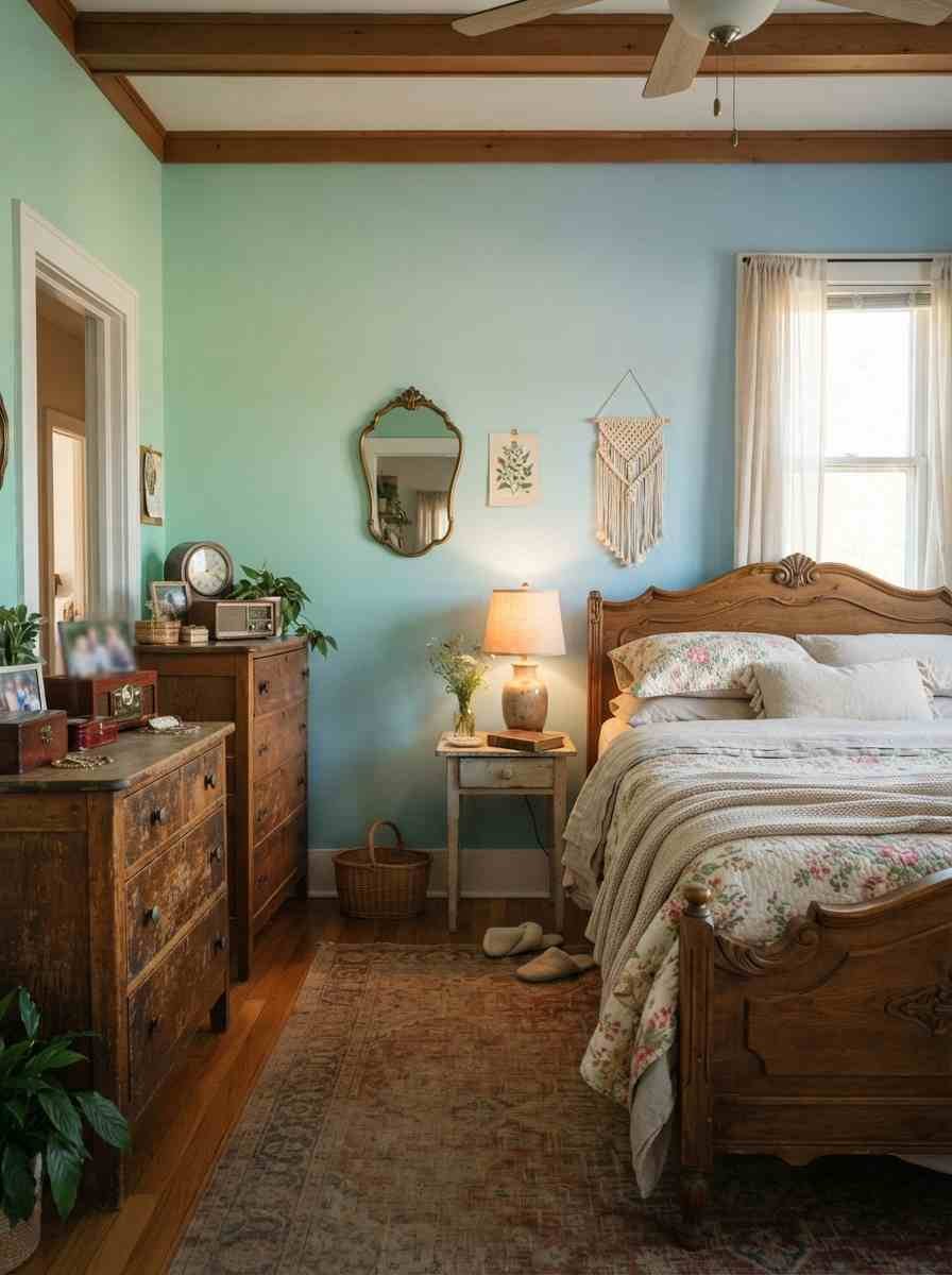
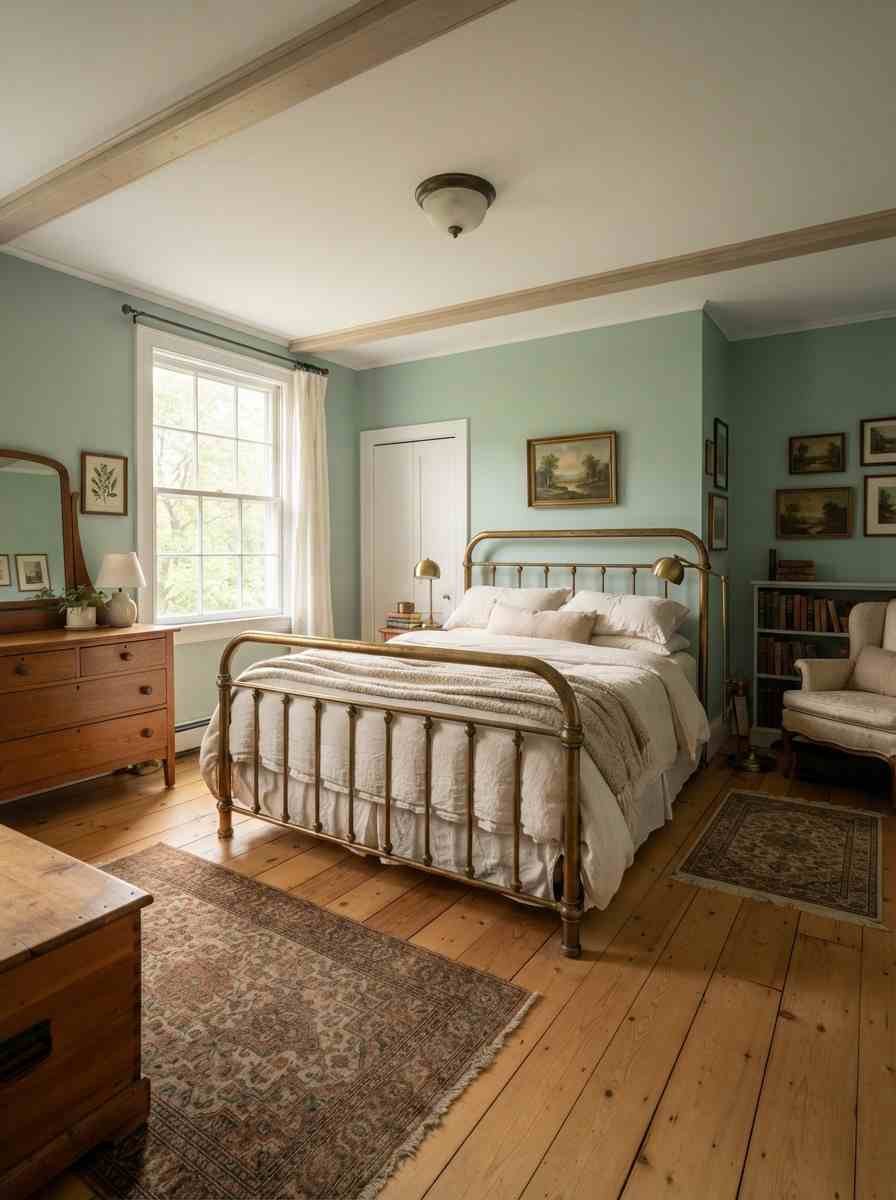
- Antique brass bed frame with sage-mint walls. The warmth in aged brass balances the coolness of the paint.
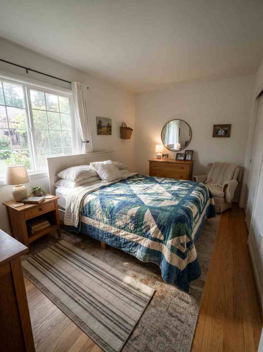
- Patchwork quilt in blues and greens over plain walls. Let the quilt carry the whole color story.
Kid and nursery-friendly versions (ideas 25 through 28)
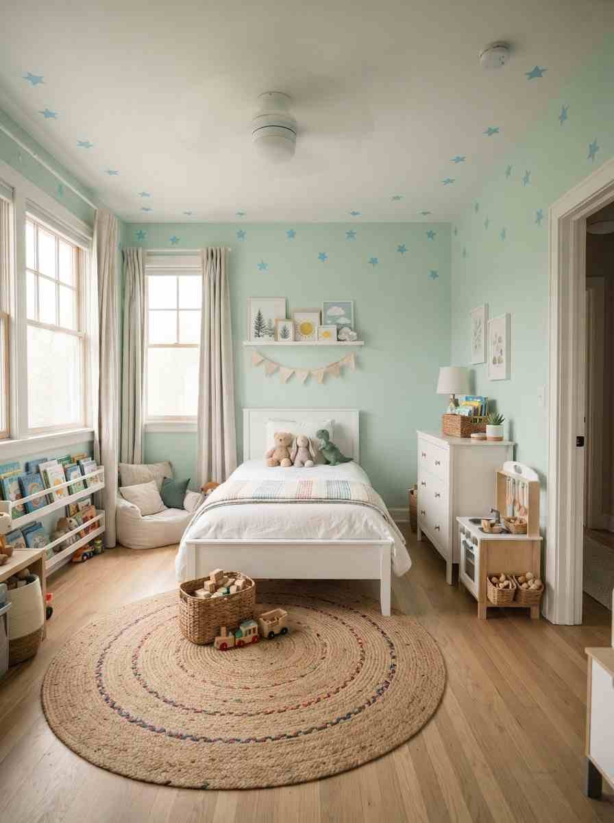
- Soft mint walls with sky blue star decals. Easy to remove and update as tastes change.
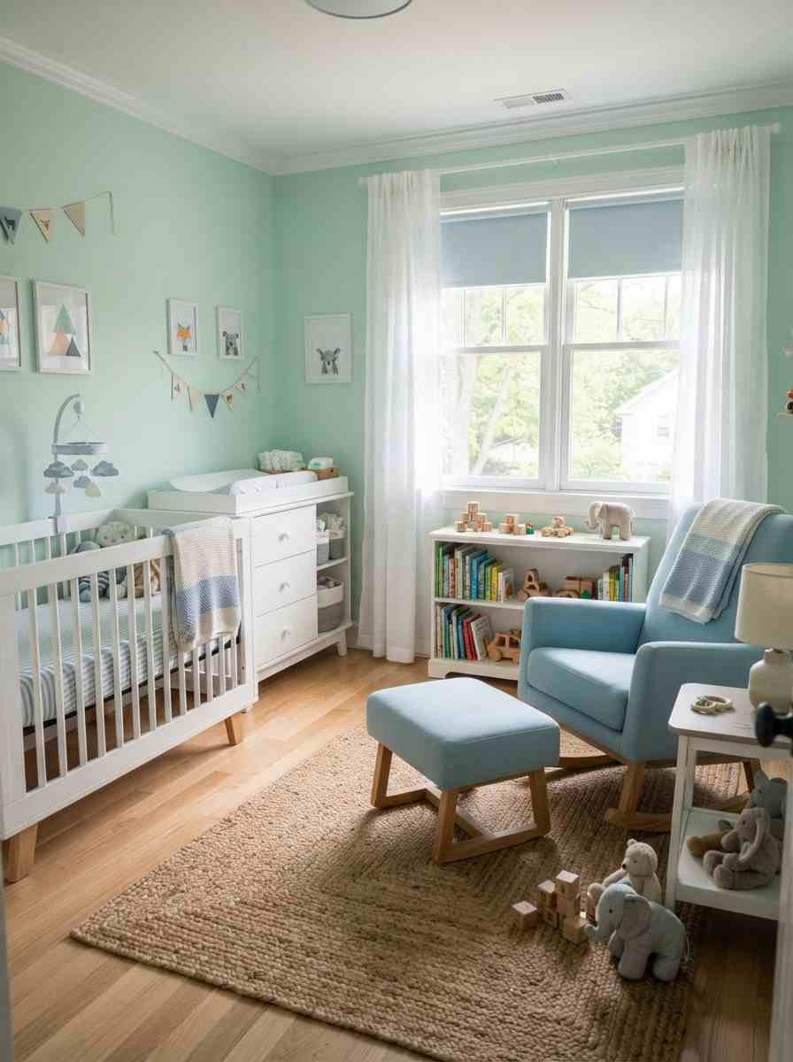
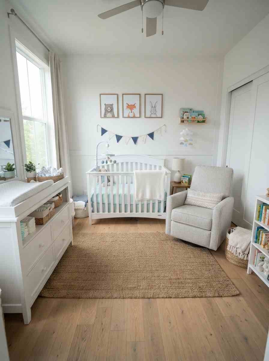
- Blue and mint striped crib bedding with white furniture. Grows well from nursery into toddler room without a full redo.
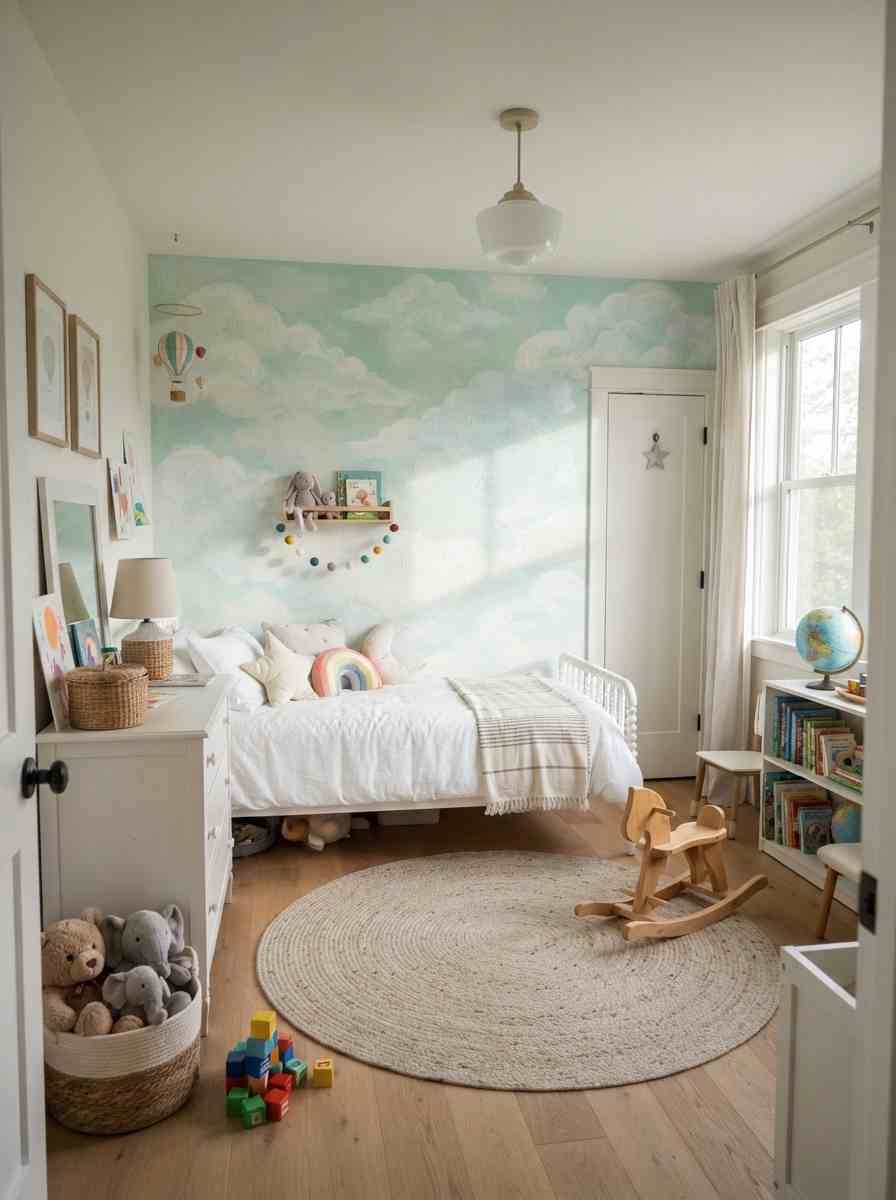
- Painted cloud mural in mint and pale blue. A weekend project, and honestly one of the more forgiving murals to attempt freehand.
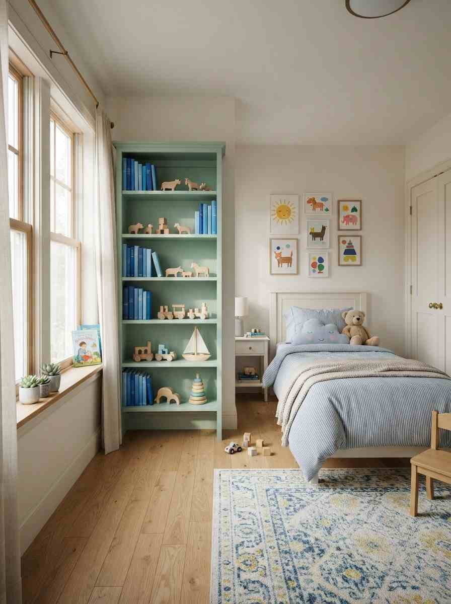
- Mint bookshelf styled with blue-spined books and toys. A small, low-cost way to bring the palette in without touching a single wall.
Mistakes I’ve watched people make (myself included)
- Going too matchy. If your walls, bedding, curtains, and rug are the exact same shade of mint, the room reads flat instead of calm.
- Skipping the sample pot. A 2-inch swatch on a paint chip tells you almost nothing about how a color behaves across four full walls.
- Forgetting warm accents entirely. A room built only from cool colors can feel a little sterile by week two. Wood, brass, or a warm-toned rug fixes this fast.
- Ignoring the ceiling. Painting it a touch lighter than the walls, a trick some 2026 calming bedroom color guides call the “+5% lighter rule,” keeps a cool palette from feeling heavy overhead.
How to build this palette without repainting everything
You don’t need a full weekend and four cans of paint to try this combination. I learned that the hard way after my third repaint, so let me save you the trouble.
Start small. A single mint or blue textile, a throw pillow, a quilt, even a lampshade, tells you more about how you’ll actually live with the color than any paint swatch taped to your wall.
Live with it for a week. If you still love it after seeing it in morning light and lamp light, then go bigger.
Layering matters more than matching.
A room with five different shades of blue and green, in slightly different finishes and textures, almost always looks more considered than a room where everything is the exact same mint from the exact same paint line.
Mix a matte wall with a glossy ceramic lamp. Pair a woven rug with smooth cotton sheets. That contrast is what makes a palette feel designed rather than default.
And if you’re renting, don’t count yourself out.
Peel-and-stick wallpaper, removable decals, and a good throw blanket can get you 80% of the way to any of the 28 looks above, no landlord conversation required.
I’ve done this in two different apartments now, and both times it looked more expensive than it actually was.
One more thing worth saying: trust your own eye over any single rule here.
I’ve seen “wrong” combinations, a too-bright mint next to a navy that theoretically clashes on paper, work beautifully in person because the lighting and the rest of the room pulled it together.
Pinterest boards are a starting point, not a rulebook.
FAQ
Do mint green and blue work in a small bedroom? Yes, and honestly they can help.
Cool, light colors tend to make small rooms feel a bit more open than warm, saturated ones do. Stick to the paler end of both colors if the room is tight on square footage.
What’s the best paint finish for a mint and blue bedroom? Matte or eggshell on the walls. Glossier finishes bounce more light, which can work against the calm mood you’re going for at night.
Can I use mint and blue in a guest room or does it only work for a primary bedroom? It works anywhere you want a restful feel, guest rooms included.
If anything, a guest room is a lower-stakes place to try a bolder combination, like the moody teal and navy pairing above, since you’re not living with it every single day.
Final thought
Twenty-eight ideas is a lot to scroll through, so if you take one thing from this: pick a mood first, then match the shade to it.
Soft and sleepy, coastal and breezy, or moody and dramatic, mint and blue can do all three.
Which combination are you saving for your own room? I’d genuinely love to know, drop it in the comments or tag me if you end up painting one of these.
