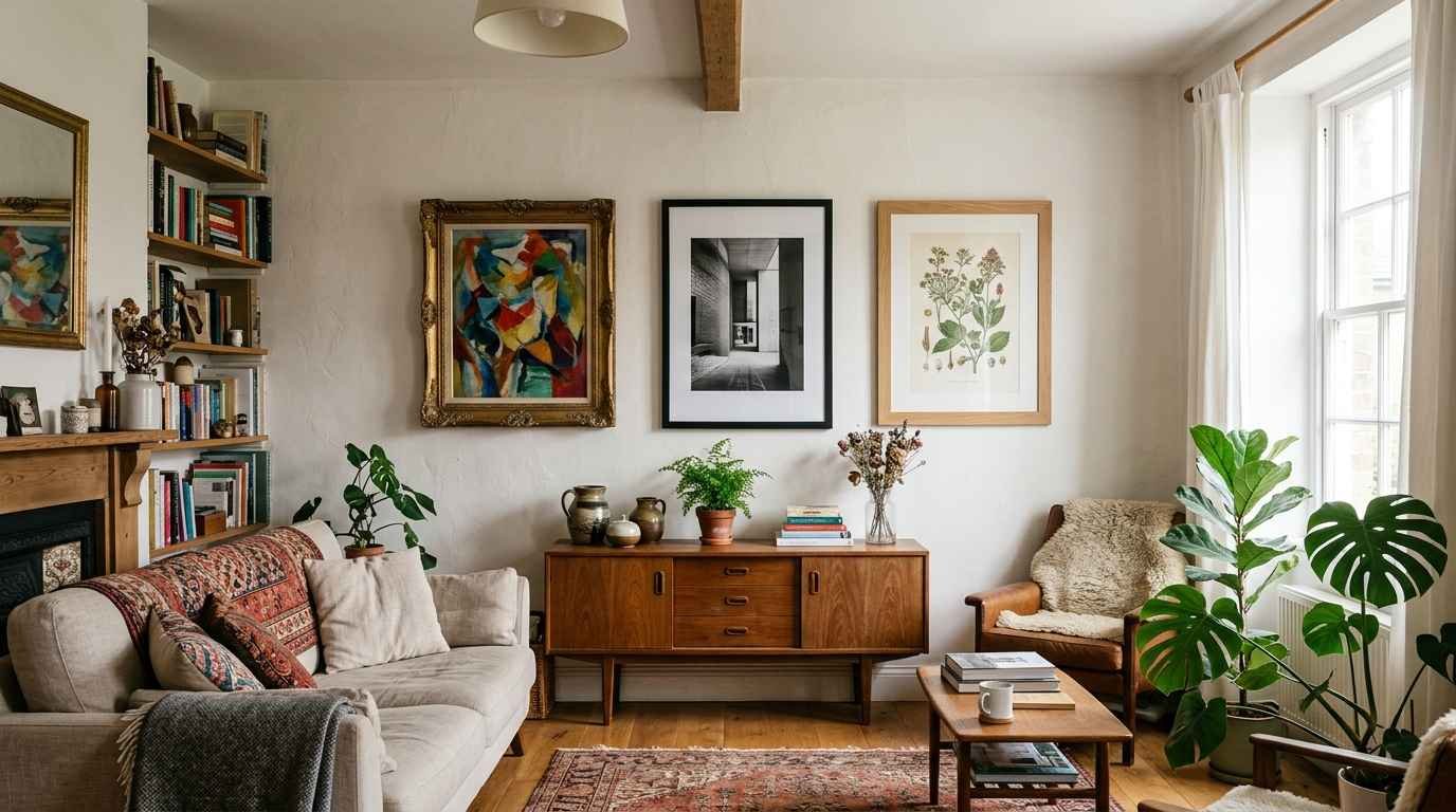
My living room used to look like a discount store threw up on it. Random frames, a clearance-rack canvas print, string lights I bought during a “vibes” phase in 2021.
Then I stripped it all back to almost nothing, and people started asking who did my interior design.
Nobody did. I just learned that empty space is a design choice, not a failure.
That’s the whole secret behind minimalist wall decor that reads as expensive instead of empty.
It’s not about spending less on stuff. It’s about choosing fewer things and making sure each one earns its spot on the wall.
I’ve spent the last few years testing this in three different apartments (rentals, so no drilling holes into brick and hoping for the best).
Here’s what actually works, what looks cheap even when it isn’t, and 21 ideas you can steal today.
Why minimalist walls look pricier than cluttered ones
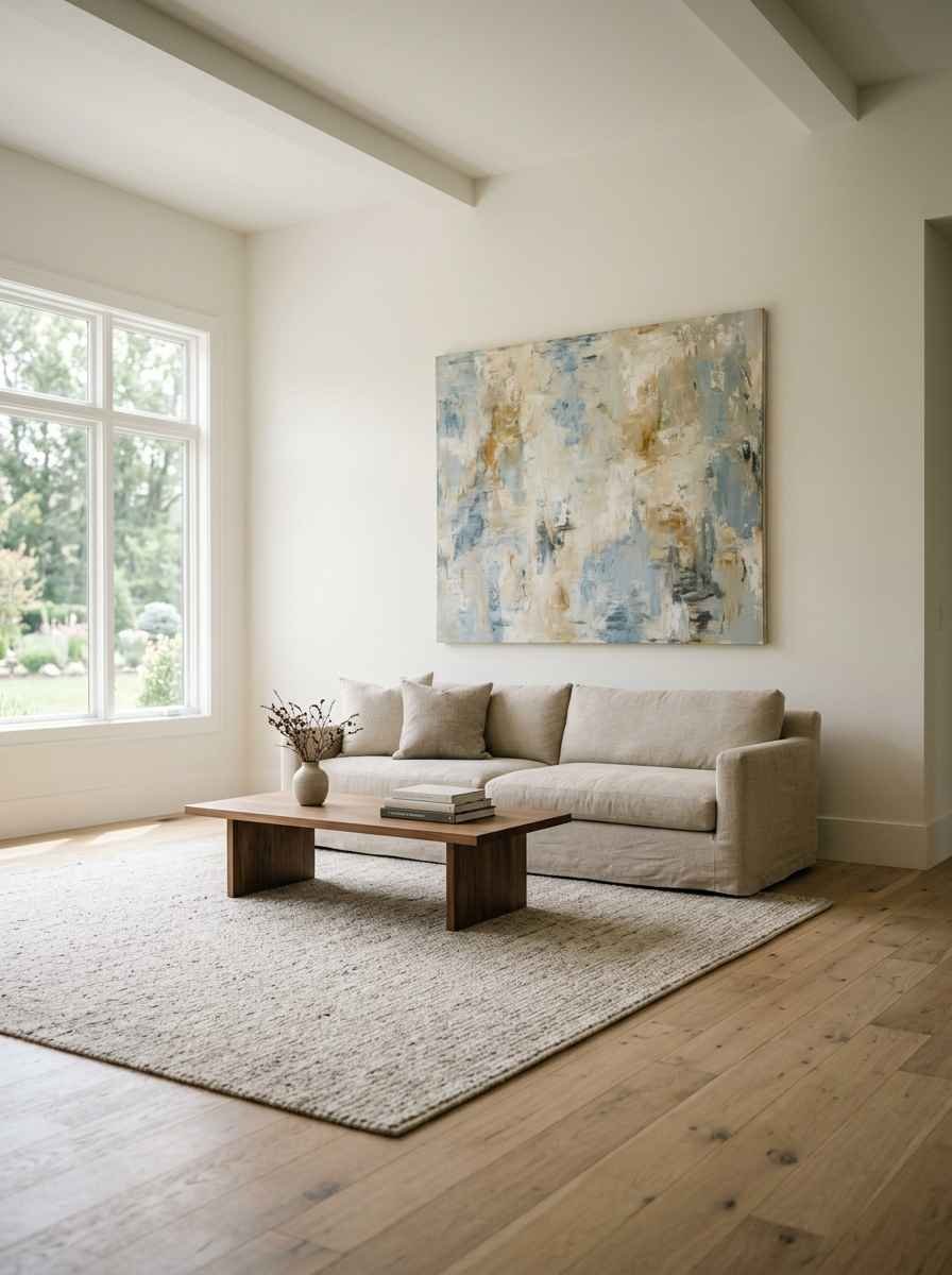
Interior designers call it “visual rest.” Your eye needs somewhere to land.
A wall packed with 15 mismatched frames gives your brain nowhere to settle, so it reads as busy and, honestly, a little chaotic.
A wall with one striking piece, or a tight cluster with real breathing room around it, reads as intentional. Intentional reads as expensive. That’s basically the whole game.
I learned this the hard way after copying a gallery wall from Pinterest that had 22 frames on it. Mine looked like a ransom note.
The original probably had a stylist, professional lighting, and a wall three times the size of my studio apartment.
The core minimalist wall decor ideas
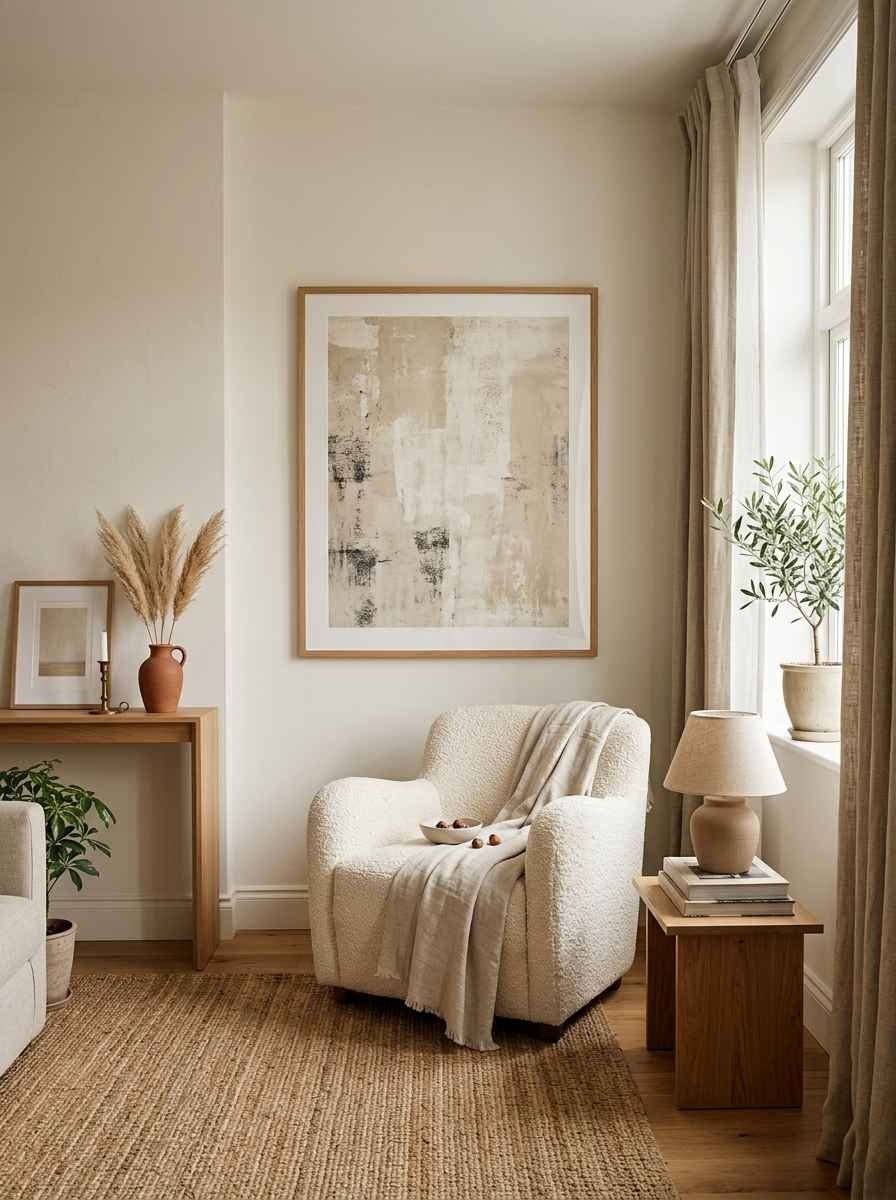
1. One large-scale piece over a small collection
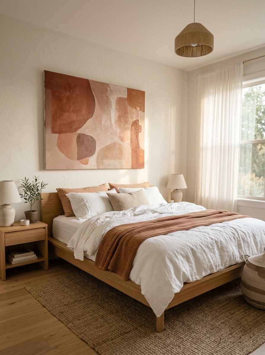
A single oversized print or painting almost always beats five small ones. Scale does the heavy lifting here.
I’d rather have one 40×60 piece than a dozen 8x10s fighting for attention.
2. Negative space as decor
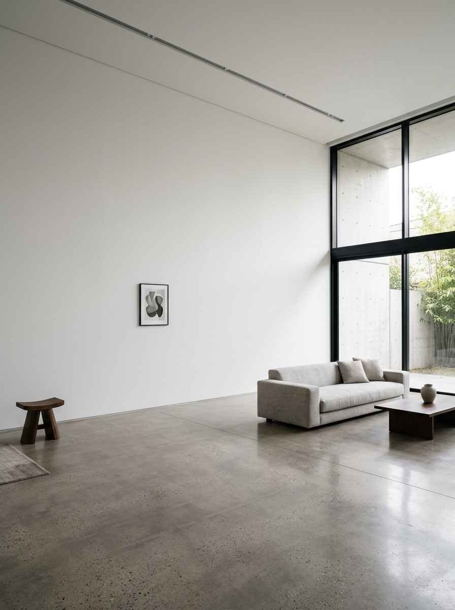
Leave a wall (or most of one) empty on purpose. This one freaks people out at first. It shouldn’t.
A blank wall next to a busy one makes the busy one look curated instead of cluttered.
3. Monochrome art in a neutral frame
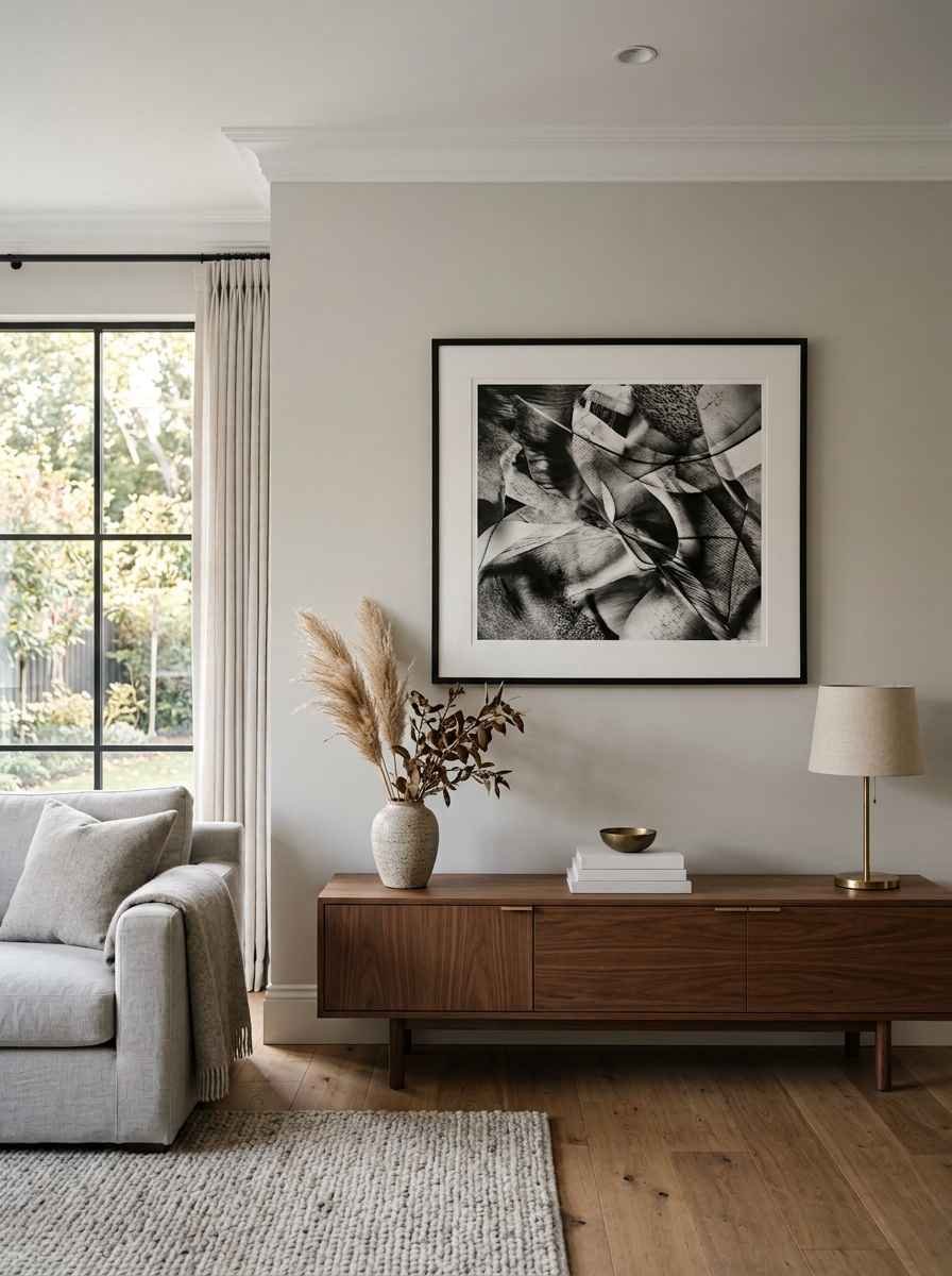
Black and white photography, line drawings, or abstract ink pieces feel timeless. Skip the ornate gold frame.
A thin black or natural wood frame does more for the “quiet luxury” look than anything flashy ever will.
4. Textured wall hangings in one color family
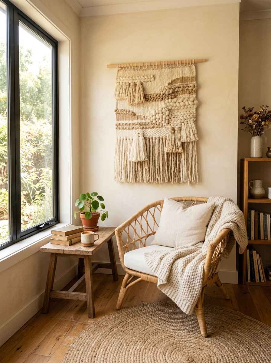
Macrame, woven wall art, or wool tapestries in cream, oat, or sand tones add depth without adding visual noise. IMO this is the most underrated category in the whole minimalist toolkit.
5. A single statement mirror
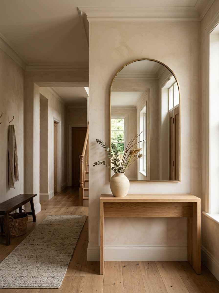
Not a wall of mirrors. One large, simply framed mirror does double duty: it decorates and it makes the room look bigger. Round or arched shapes soften a boxy room.
6. Floating wood shelves, styled sparingly
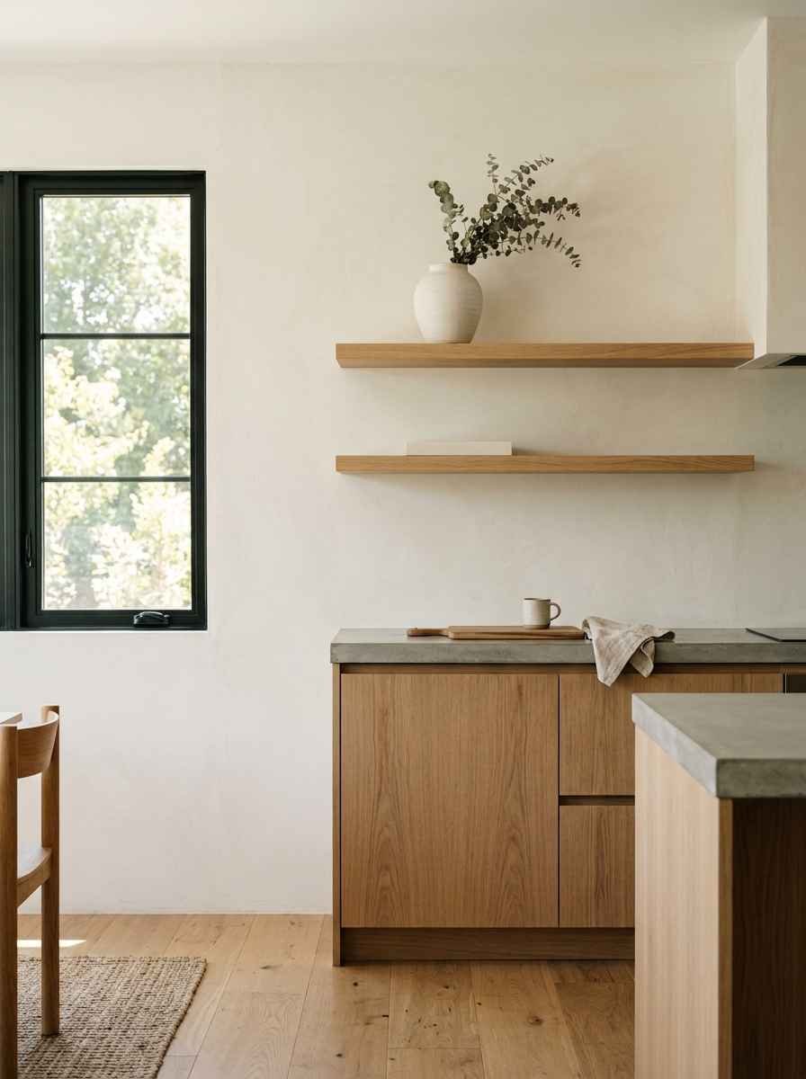
Two or three objects per shelf max. A small vase, one book, maybe a single dried branch. The second you add a fourth item, it starts looking like a garage sale.
7. Sculptural wall objects
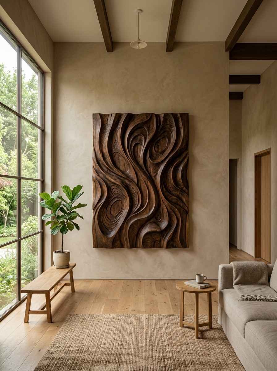
Think a single ceramic plate, a carved wood panel, or a metal wall sculpture. These read as art even without a frame, and they add dimension that flat prints can’t.
8. A limited color palette across the whole wall
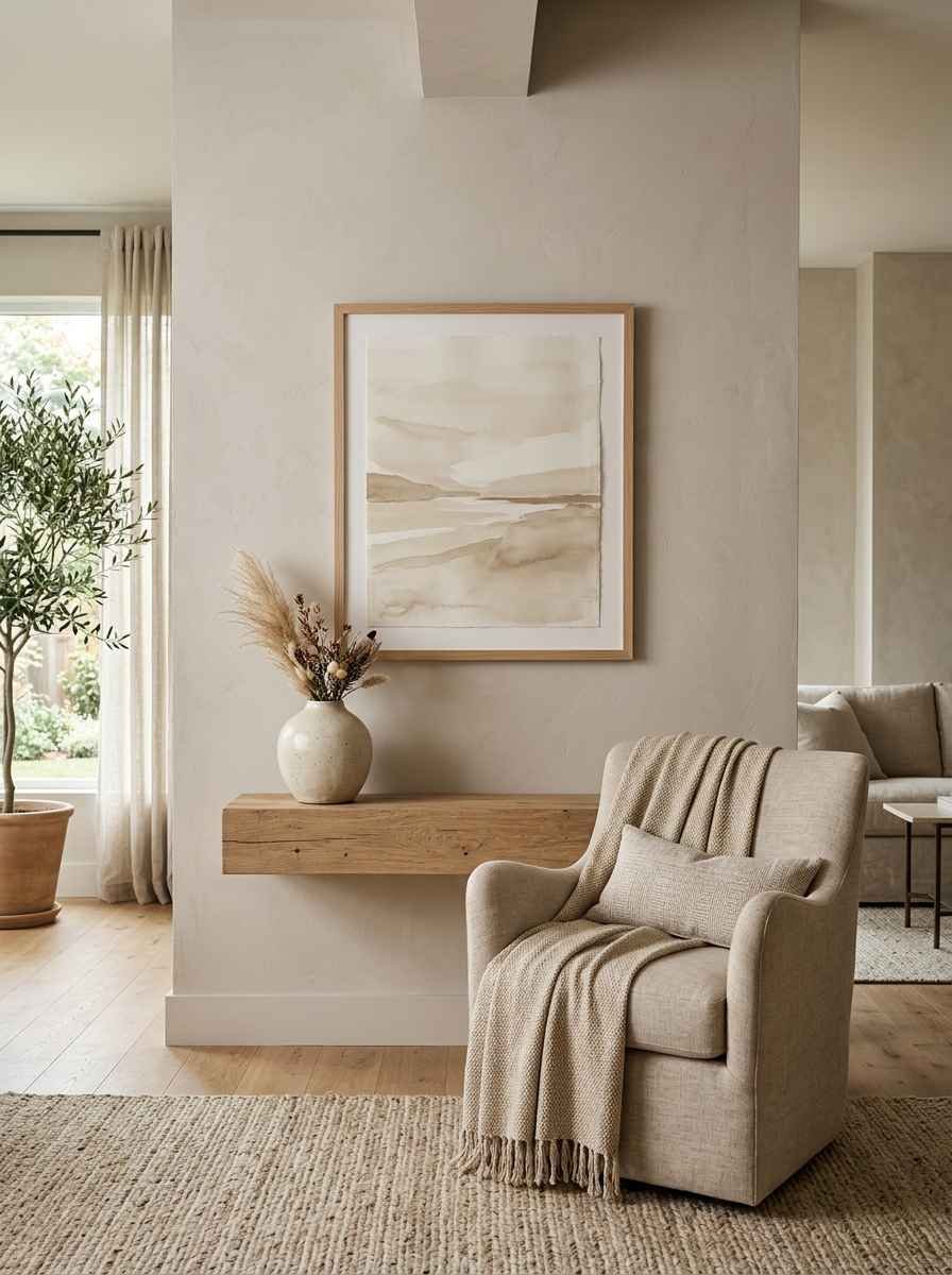
Pick two, maybe three colors max for everything on that wall (frames, art, accents). This is where a lot of “minimalist” attempts fall apart.
People go neutral on the big pieces then throw in a random turquoise frame and wonder why it looks off.
9. Botanical line art
Simple, single-line drawings of leaves or branches. Cheap to print, framed well, and they photograph beautifully for Pinterest boards if that’s your thing.
10. Woven baskets as wall art
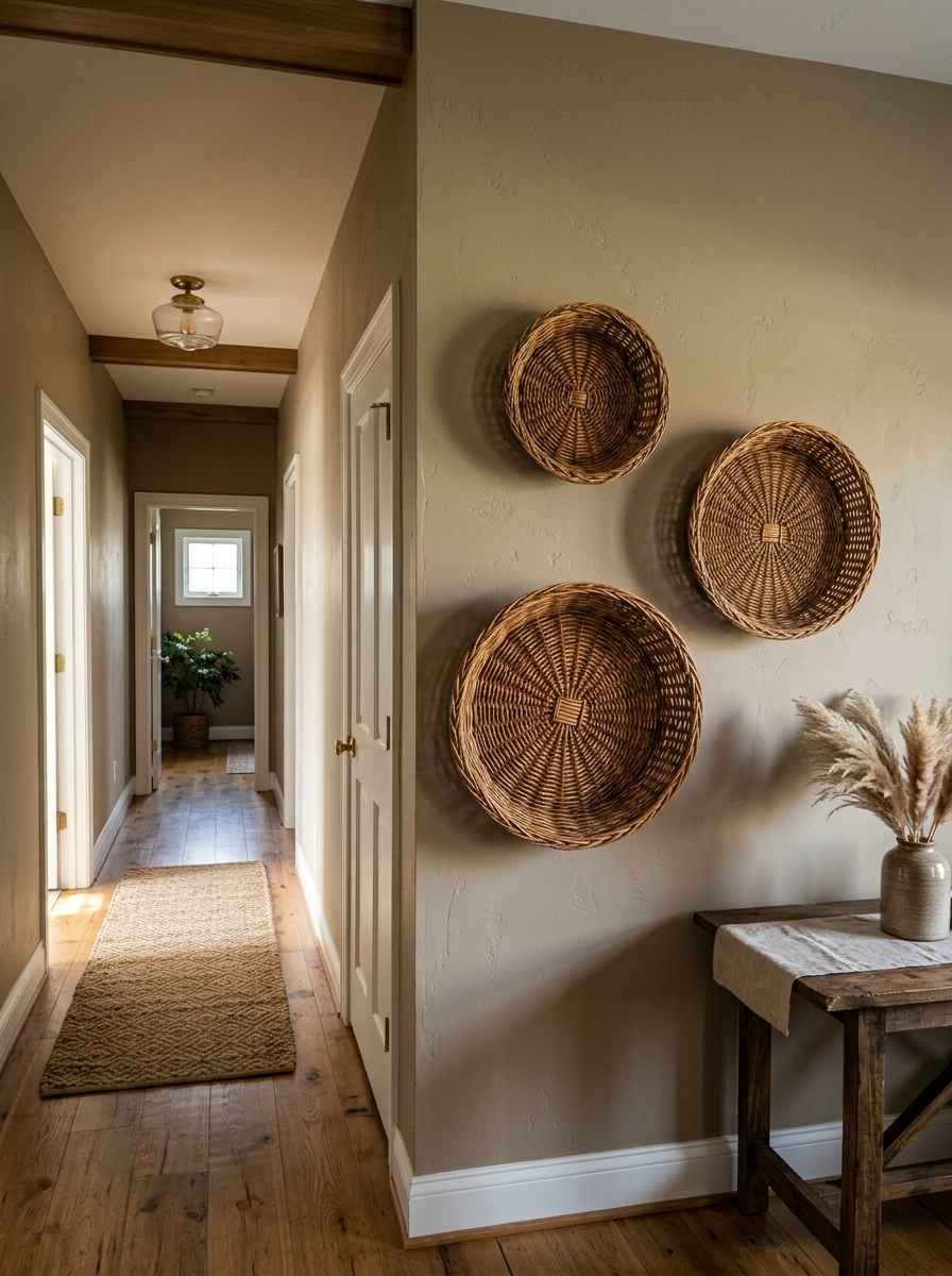
This trend from a few years back never actually left, it just got quieter. A cluster of three baskets in graduated sizes, hung asymmetrically, looks intentional and costs almost nothing.
11. A single oversized clock
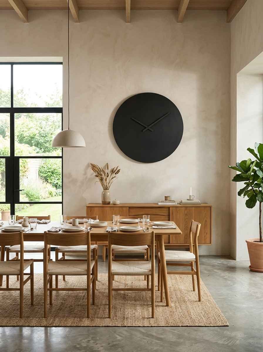
Function as decor. A large, simply designed clock in matte black or brass fills a wall without needing anything else around it.
12. Framed textiles instead of prints
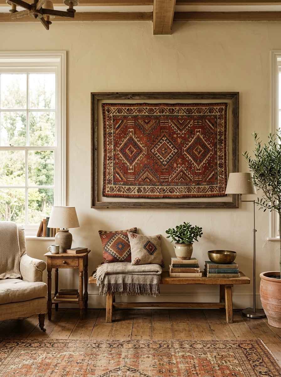
A piece of vintage fabric, a scarf, or a small rug hung and stretched in a frame. Unexpected, textural, and genuinely one of a kind since nobody else has your exact fabric.
13. Plaster or clay wall art
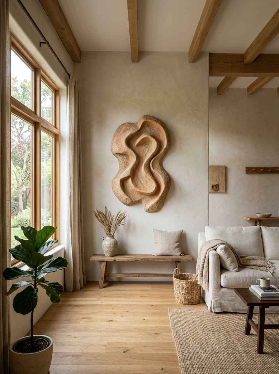
Raw, organic, and increasingly easy to find from small Etsy sellers. These pieces have a handmade quality that mass-produced canvas prints just can’t fake.
14. Vertical art placement to draw the eye up
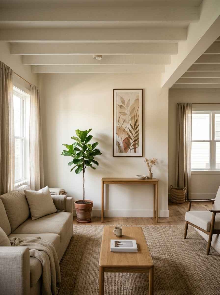
If your ceilings are low, hanging art slightly higher than eye level (with a plant or shelf beneath it) tricks the room into feeling taller.
15. A gallery wall, but disciplined
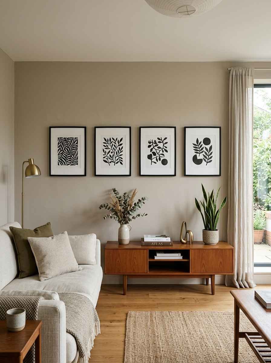
If you want the gallery look, keep it to 3 to 5 pieces max, same frame color, generous spacing. This is the one gallery wall style that actually reads as minimalist rather than maximalist in disguise.
16. Wabi-sabi ceramics mounted on the wall
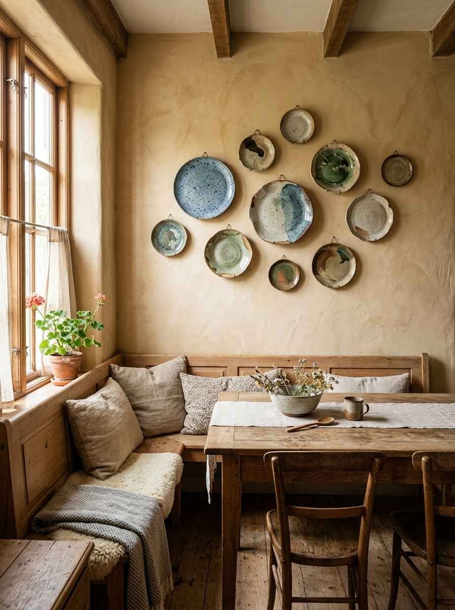
Small wall-mounted bowls or plates with visible imperfections. The imperfection is the point.
17. A single framed photograph, printed large
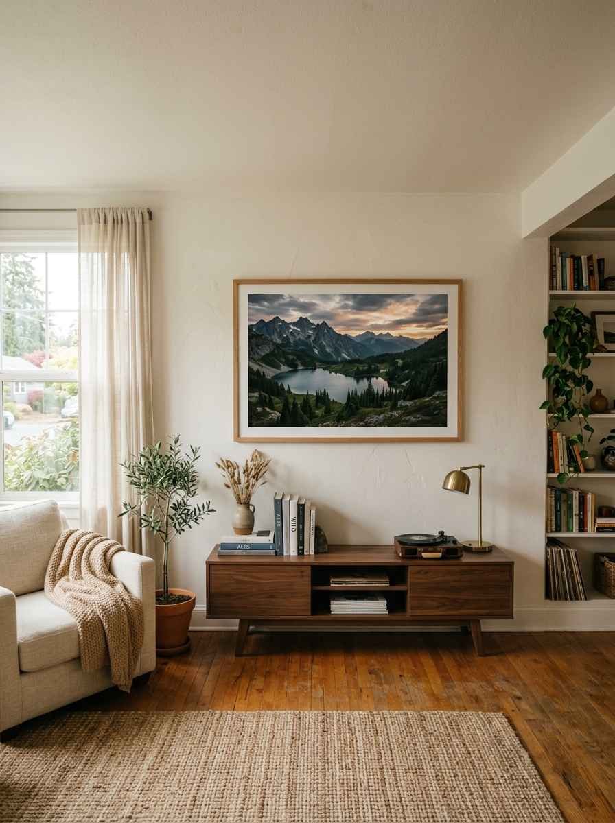
Not a collage. One meaningful photo, printed big, framed simply. This one hits differently when it’s personal instead of stock.
18. Architectural line drawings
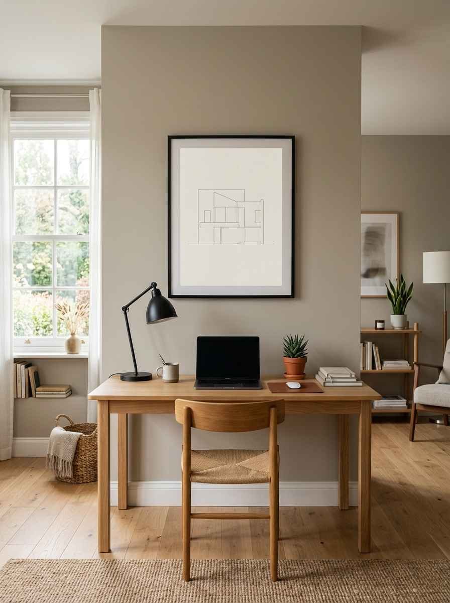
Building outlines, floor plans, simple sketches. These feel a little unexpected and very “design student who has their life together.”
19. Natural material accents (rattan, cork, unfinished wood)
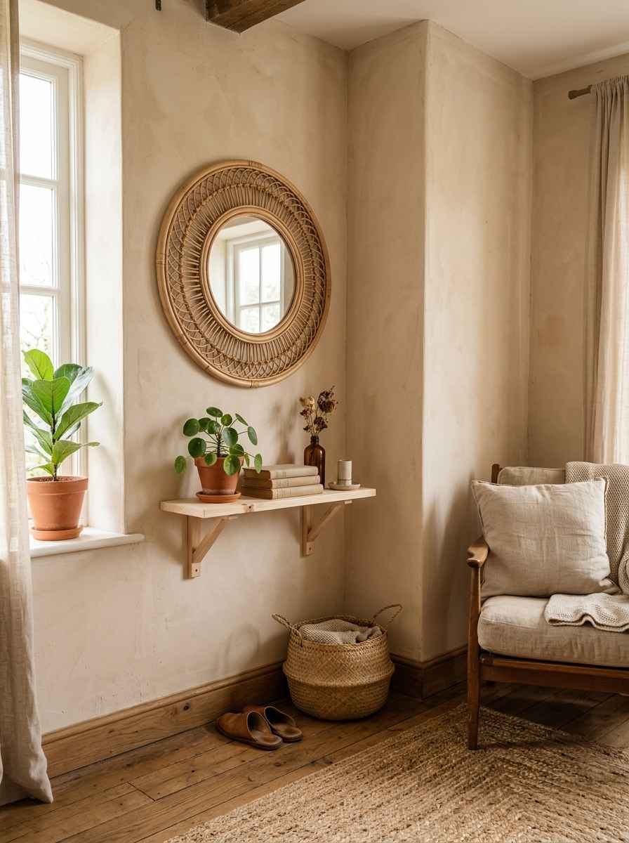
A round rattan mirror or a cork bulletin board styled minimally brings warmth without breaking the neutral palette.
20. Typography, but restrained
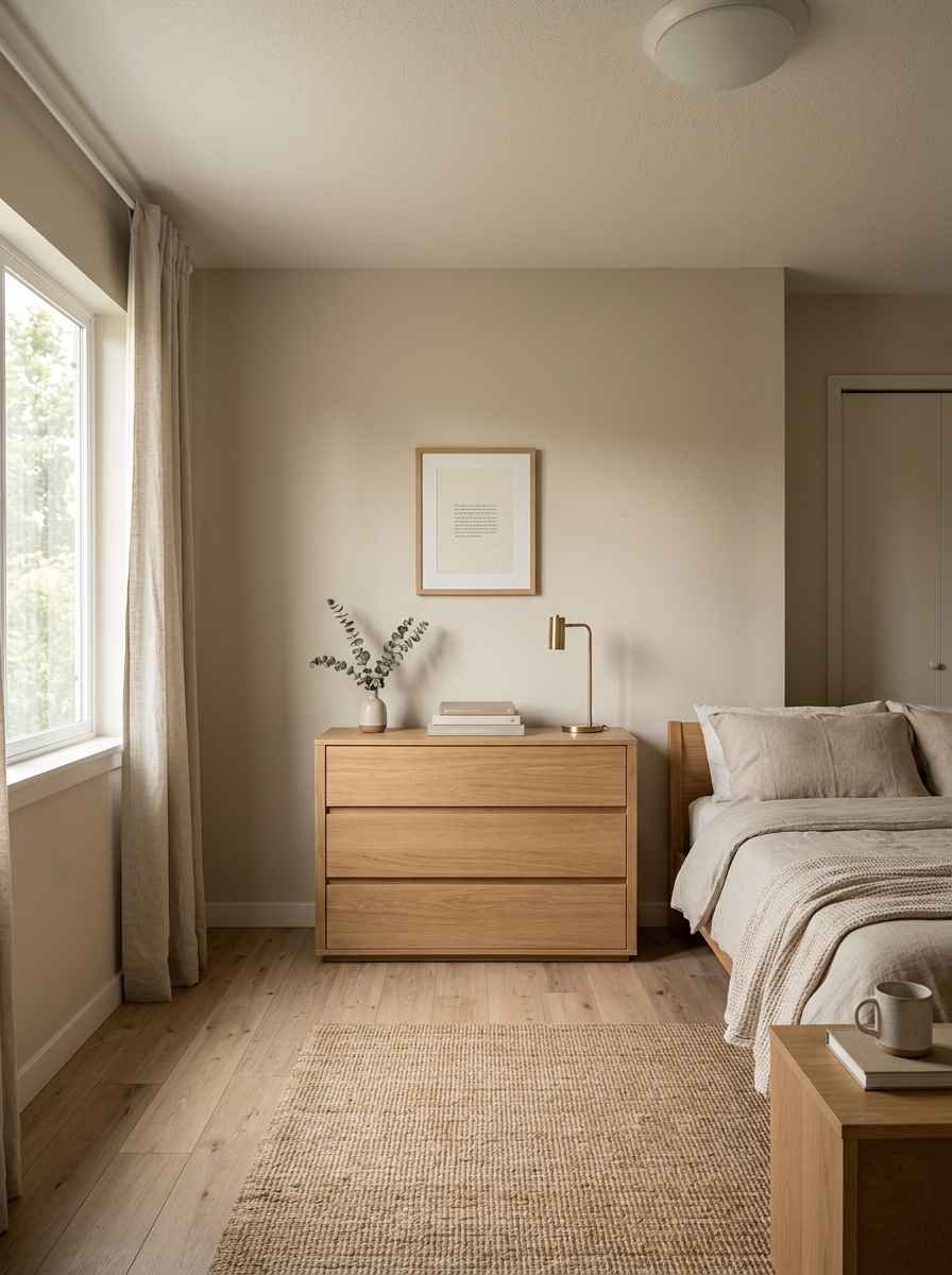
One word, or a short phrase, in a clean sans-serif font. Skip the cursive “Live Laugh Love” energy entirely. Please.
21. Layered but low-profile shelving with art leaned, not hung
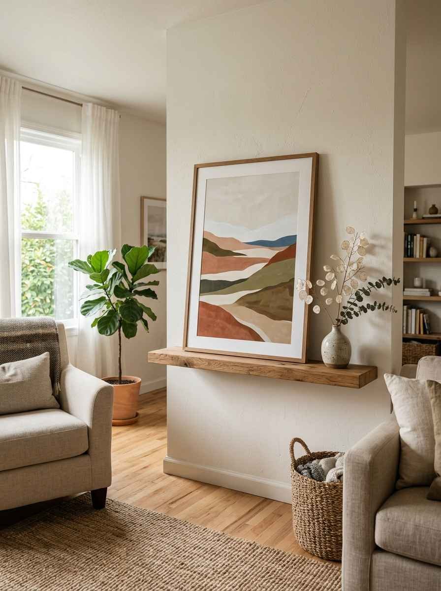
Lean a large framed print against the wall on a shelf instead of hanging it. It looks effortless, and you don’t have to patch a hole if you move.
Quick comparison: which idea fits your room
| Idea Type | Best For | Approx. Cost | Effort Level |
|---|---|---|---|
| Single large art piece | Living rooms, bedrooms | Medium to high | Low |
| Floating shelves | Small apartments, rentals | Low | Medium |
| Textured hangings | Boho-leaning minimalist spaces | Low to medium | Low |
| Leaned art on shelf | Renters, frequent movers | Low | Very low |
Random thought, but has anyone else noticed that the more expensive a house looks on home tour videos, the less stuff is actually on the walls? I went down a whole rabbit hole watching real estate walkthroughs one night instead of sleeping, and it’s wild how consistent that pattern is. Anyway, back to the wall decor.
Mistakes that make minimalism look cheap instead of expensive
A few things quietly tank the whole look, even when the individual pieces are nice:
- Mismatched frame finishes. Gold, black, and natural wood all on one wall reads as leftover, not curated.
- Sizing everything too small. Tiny art on a big wall looks like an afterthought. Go bigger than feels comfortable.
- Skipping wall texture entirely. A completely flat, glossy wall with one print can look sterile rather than calm. A little texture, like linen or a subtle wallpaper, helps.
- Ignoring lighting. A great print in bad lighting looks flat. A picture light or a well-placed lamp changes everything, and it’s IMO the cheapest upgrade on this whole list.
For color pairing on frames and walls, I usually check a paint resource like Sherwin-Williams for their neutral palette guides before committing to anything. It saves a lot of guesswork.
If you’re sourcing handmade pieces, Etsy has genuinely good small-batch ceramics and woven wall hangings that don’t look like everyone else’s living room. And for scouting layout ideas before you commit to nail holes, Pinterest is still the fastest way to visualize a wall before you touch it.
A word on budget
You don’t need a big budget to make this work. Honestly, some of my favorite pieces cost under $30.
The expensive-looking part isn’t the price tag, it’s the restraint. Three cheap, well-chosen items will always beat ten mediocre ones.
Wow, once you start editing your walls down instead of adding to them, it’s hard to go back. My old cluttered gallery wall genuinely makes me cringe looking at old photos now.
Frequently asked questions
How many pieces should be on a minimalist gallery wall? Stick to 3 to 5 pieces with generous spacing between them.
Anything more starts to look busy rather than curated, even if each individual piece is nice on its own.
What wall color works best with minimalist decor? Soft neutrals like warm white, greige, or a muted sage give art room to stand out without competing for attention. Stark white can work too, but it shows imperfections more.
Is minimalist wall decor good for small bedrooms? Yes, and honestly it works even better there. One large piece or a small cluster keeps a tight space from feeling cramped, since there’s less visual clutter pulling your eye around the room.
Final thought
Minimalist wall decor isn’t about having less for the sake of it. It’s about giving the good stuff room to actually be seen.
Pick fewer pieces, size them up, keep your palette tight, and let the walls breathe a little.
Which of these 21 ideas are you trying first? Save this post, pin your favorite, and tag me if you end up redoing a wall this weekend. I’d genuinely love to see it.
