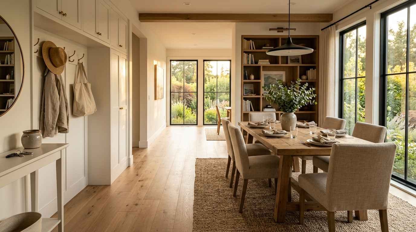
Small homes have a way of forcing creativity. You run out of square footage fast, and suddenly you’re staring at a corner near your front door wondering if it could somehow pull double duty. Spoiler: it absolutely can.
The mud room dining room combo is one of those ideas that sounds a little chaotic on paper but works beautifully in real life when you plan it right.
I’ve been obsessing over this concept for months now.
After touring a friend’s renovated townhouse where her entryway and breakfast nook basically shared a wall (with zero visual clutter),
I became slightly obsessed with figuring out how everyday people make this work without their homes looking like a yard sale.
What I found genuinely surprised me.
Here are 21 ideas worth stealing.
Built-In Bench Seating That Does Both Jobs
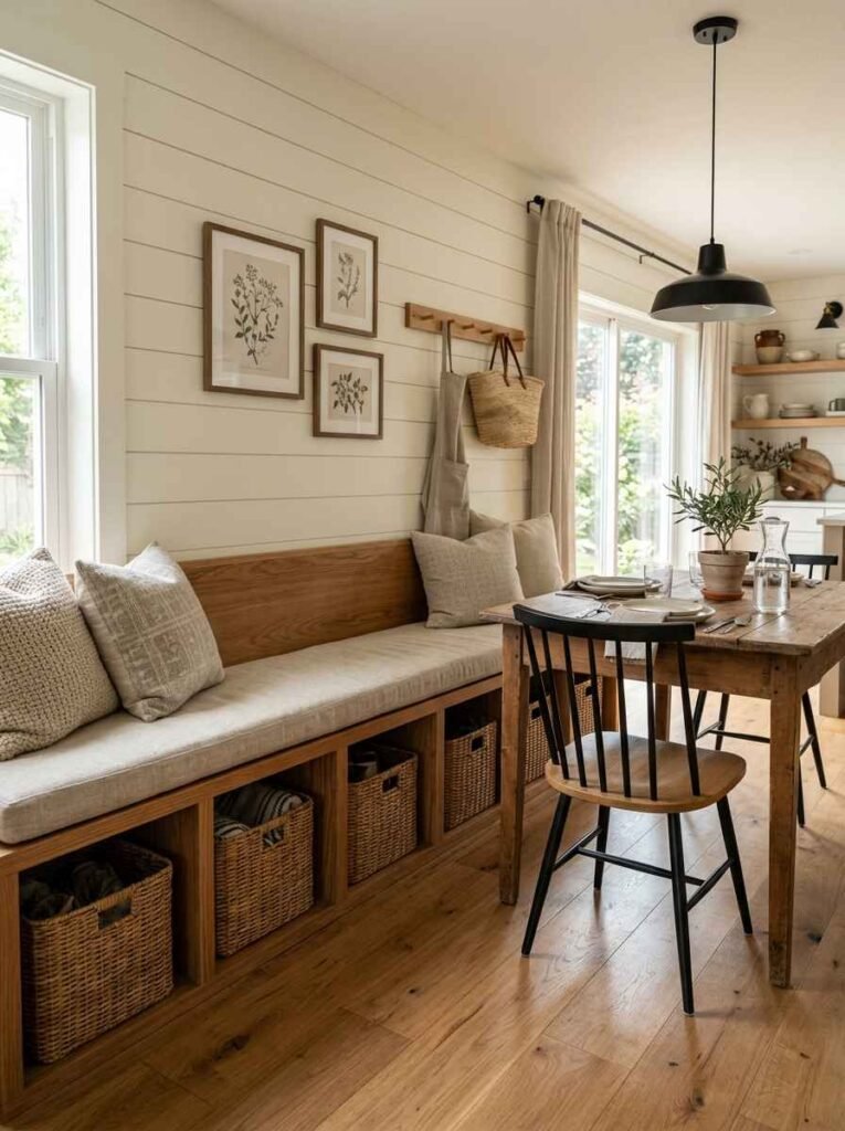
This one is the backbone of almost every successful combo layout. A built-in bench along one wall handles coat storage underneath, shoe cubbies at the base, and seating for your dining table on the other end.
You get two functions from one piece of furniture.
The trick is choosing the right bench depth.
Thirty inches gives you enough seat space for dining comfort while still clearing a walkway. Go shallower and it feels cramped. Deeper and the room loses breathing room fast.
Add a cushion with removable, washable covers. Trust me on this one. Between muddy backpacks and dinner spills, you’ll thank yourself every single week.
Use a Color Divide to Define Each Zone
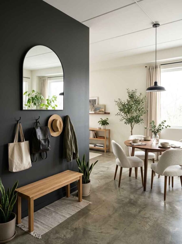
Paint is underrated as a zoning tool. A deep, moody color on the entryway wall (charcoal, navy, forest green) and a lighter tone on the dining side creates a visual boundary without a physical wall. The eye reads the shift as two separate spaces.
This works especially well in open-plan layouts where walls aren’t an option. It’s low-cost, reversible, and honestly more effective than most room dividers I’ve seen.
Interior designer Emily Henderson covers this idea well on her blog if you want deeper inspiration on color zoning (www.stylebyemilyhenderson.com).
Floating Shelves as a Dividing Feature
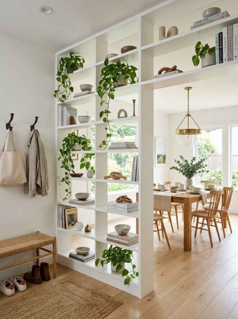
Floor-to-ceiling floating shelves between the two zones create visual separation while keeping the space airy.
Style them with plants, books, and a few hooks on the entryway side for bags and keys. The dining side gets artwork or candles.
Open shelving keeps things from feeling boxed in. The light passes through. The room doesn’t shrink.
Just keep the bottom two shelves empty or lightly styled on the mud room side. You don’t want a bag swinging into your carefully arranged ceramic collection every time someone comes home.
A Narrow Console Table as the Transition Piece
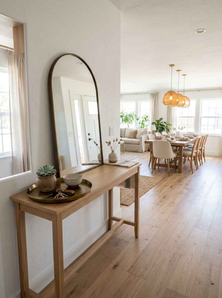
Instead of a hard boundary, use a slim console table running perpendicular to the wall as the dividing element.
The entryway side holds keys, mail, and a mirror. Spin around and you’ve got the dining area.
It’s a softer approach than shelving but still gives the eye something to register as a zone change. Pair it with a statement light fixture over the dining table and the delineation becomes immediately clear.
Concrete Floors in the Entry, Rugs in the Dining Area
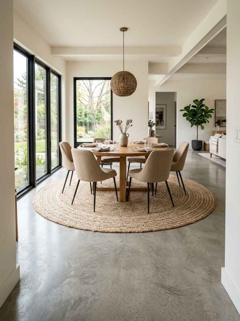
Flooring does a lot of heavy lifting in combo rooms. A polished concrete or tile section at the entryway handles the mess (boots, wet umbrellas,
dogs returning from walks). Transitioning into a warm area rug underneath the dining table signals the shift into a different zone.
You don’t need a threshold or a step change. The material difference does it naturally. It also makes cleaning much more logical since you’re not dragging a mop under your dinner table.
Fold-Down Dining Table Against the Mudroom Wall
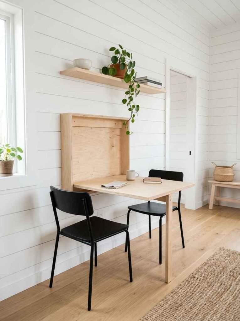
Short on space? A wall-mounted fold-down table flipped against the mudroom side works as a drop zone when closed and a full dining surface when open.
Some families use this setup for breakfast only, leaving it folded most of the day.
It’s wildly practical. Not the most glamorous option, but if square footage is genuinely limited, functionality wins. Pair it with stackable chairs and you’ve got a dining setup that disappears in under two minutes.
A Quick Comparison: Popular Combo Configurations
| Setup Style | Best For | Approx. Space Needed | Visual Impact |
|---|---|---|---|
| Built-in bench + dining table | Families with kids | 120-150 sq ft | High |
| Fold-down table + hooks | Studios, apartments | 80-100 sq ft | Moderate |
| Open shelving divider | Open-plan homes | 130+ sq ft | High |
| Color zone only | Renters, low budget | Any size | Moderate |
Wainscoting That Runs Through Both Spaces
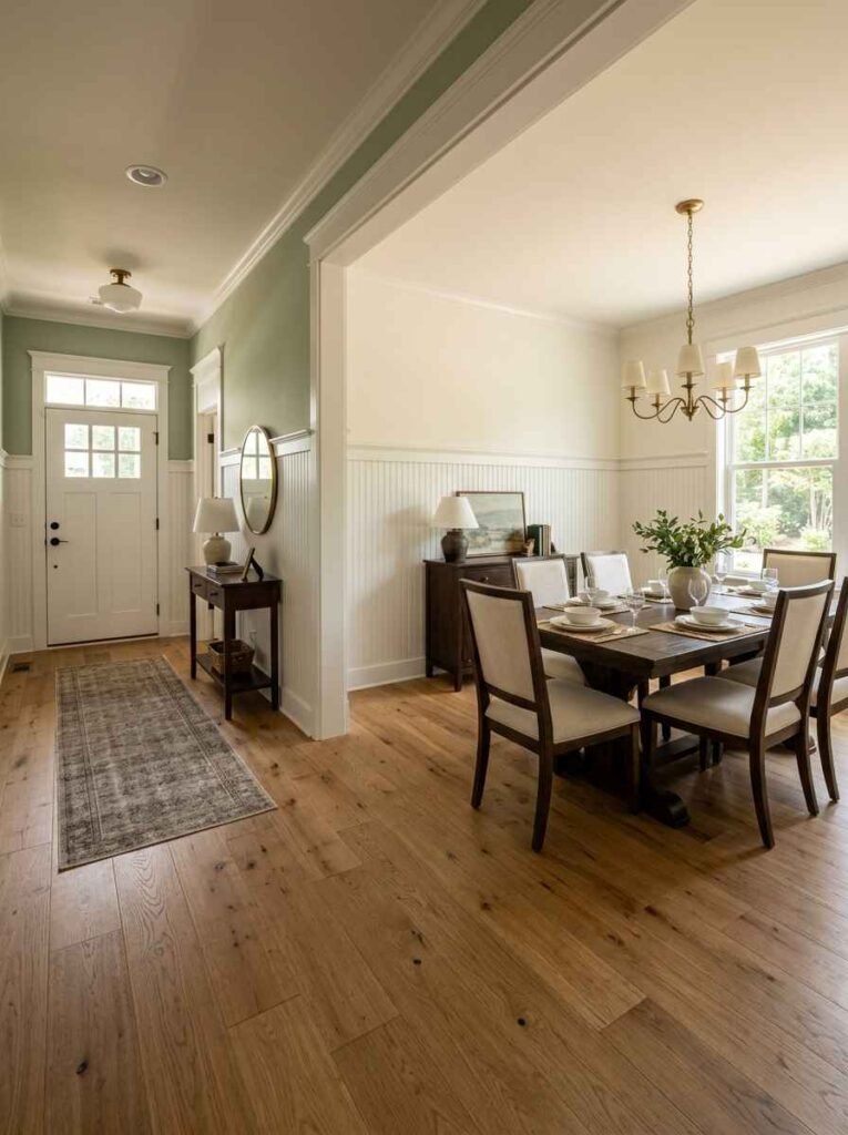
Wainscoting installed continuously from the entry through to the dining area creates visual cohesion. It makes two spaces feel like one intentional design rather than two awkward zones crammed together.
Paint the upper half of the walls different tones on each side if you want subtle separation. The wainscoting below acts like a design handshake between the two rooms. It’s a trick that older homes use instinctively and newer builds forget entirely.
Pendant Lights to Signal Zone Changes
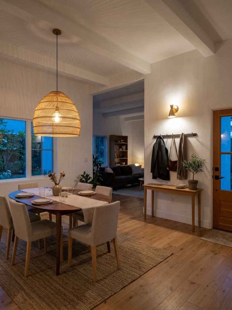
Overhead lighting is one of the fastest ways to define a zone. A statement pendant over your dining table tells the room (and your guests) exactly where eating happens.
A simpler flush mount or wall sconce at the entry keeps that space functional without competing.
Two different light fixtures in one open space. It sounds odd until you see it. Then it makes perfect sense. The lighting hierarchy does what walls would normally do.
Lockers with Doors for a Cleaner Look
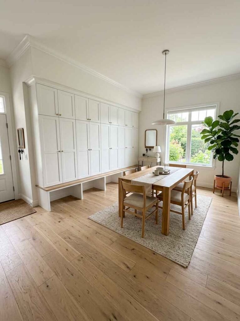
Open hooks work, but they show everything. Individual lockers with solid doors in the entryway section keep coats, bags, and sports gear completely hidden. From the dining side, you just see a bank of doors that could easily be mistaken for a pantry wall.
IKEA’s PAX system works surprisingly well for this if custom cabinetry isn’t in the budget. A few modifications and it looks fully built-in. Lots of people in the DIY community have documented these hacks in detail over on Pinterest if you want step-by-step walkthroughs.
A Bench With a Built-In Table Extension
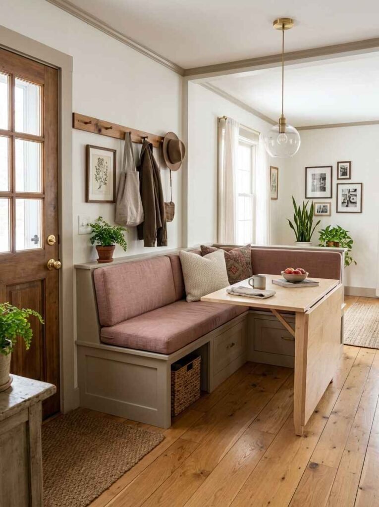
Some furniture makers now produce bench pieces with a flip-out table section on one end. It’s a hybrid piece designed specifically for compact mud room dining room combos. Pull the table section out when you need it, fold it flat when you don’t.
Honestly, when I first saw this in a small-space catalog, I thought it looked too clever to work well in practice. But the reviews tell a different story. People with kids especially love it.
Mirrors to Expand the Entry and Brighten the Dining Area
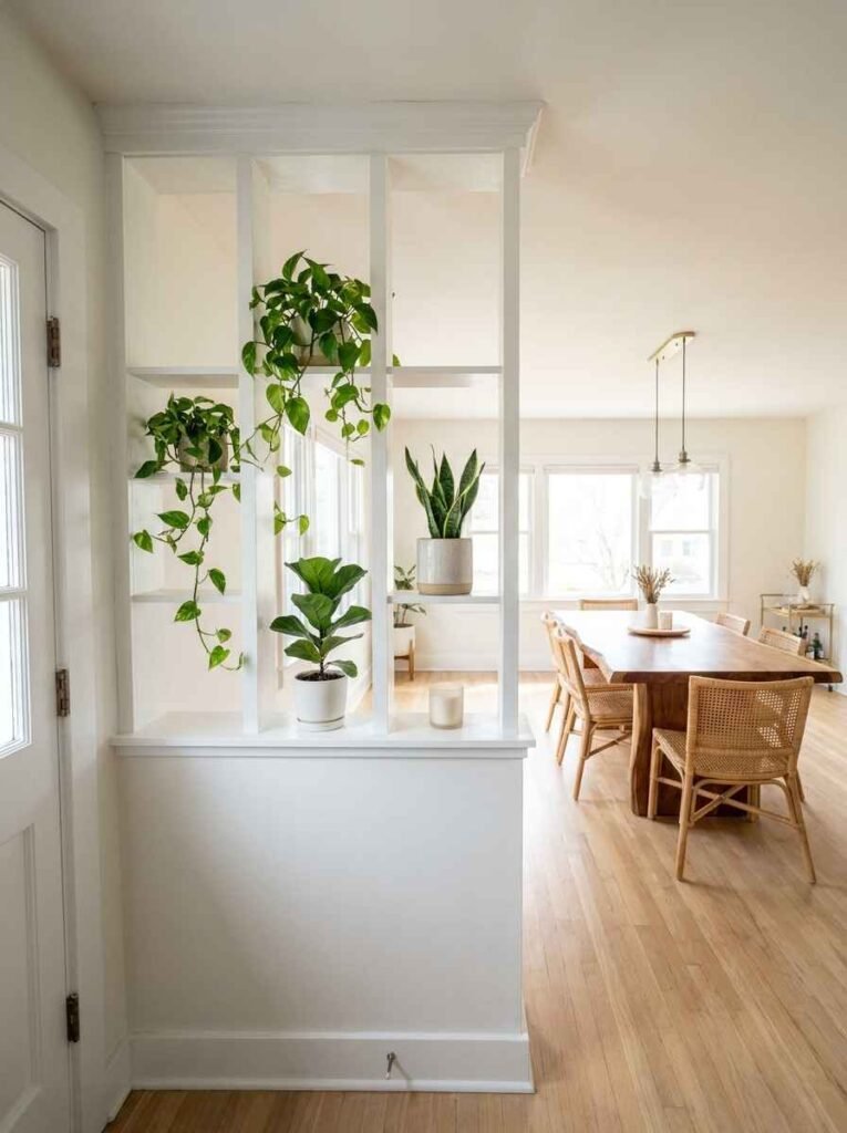
A large mirror in the entryway reflects light back into both zones. It makes the mud room feel less like a compressed hallway and adds a sense of depth to the dining area beyond it. This one costs almost nothing relative to the impact it has.
Positioning matters. Hang it opposite a window if possible. Even a cloudy day outside will reflect enough light to make the whole combo space feel bigger and more open.
A Low Room Divider with Plant Shelve
A low divider, roughly waist height, with built-in plant shelves works as a living boundary between the two zones. The greenery softens the transition. The height keeps things open and light-filled.
This is one of my personal favorites because it adds something living to a space that might otherwise feel utilitarian. Plants near a busy entryway also happen to clean the air, which, given how many muddy things pass through that zone daily, feels fitting.
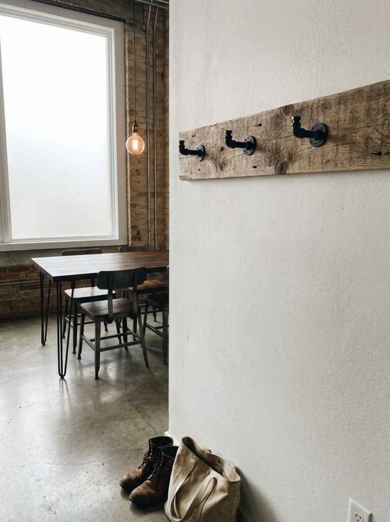
Industrial Pipe Hooks for an Edgy Look

Black iron pipe hooks mounted on raw wood planks bring a cool, industrial feel to the entry side. They’re sturdy, easy to install, and genuinely look intentional rather than makeshift. In a combo room, you want the mud room elements to feel designed rather than tolerated.
The visual weight of the dark pipes creates a natural stopping point for the eye. Beyond them, the dining area reads as a different, softer environment. The contrast actually helps both zones look better.
A Kitchen Island That Serves as the Boundary
In open floor plans where the kitchen connects to both the entry and a small dining space, a kitchen island positioned slightly off-center can serve as the informal divider. One end of the island faces the entry and catches bags and mail. The other faces the dining table.
This works best when the island has storage on both sides. Drawers toward the kitchen, hooks or shelving toward the entry. One object, three purposes. That’s the kind of thinking that makes small spaces genuinely liveable.
Sliding Doors Between Zones
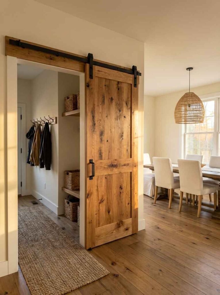
If some physical separation is needed without permanently closing off the space, sliding barn doors or pocket doors let you divide and open up the combo at will. Closed during dinner parties (goodbye, muddy chaos). Open during casual mornings when the kids are flying in and out.
The hardware has become significantly more affordable in the last few years. Real Homes UK has a solid breakdown of door styles and installation costs if you want to compare options before committing (www.realhomes.com).
A Long Farm Table Positioned Close to the Entry
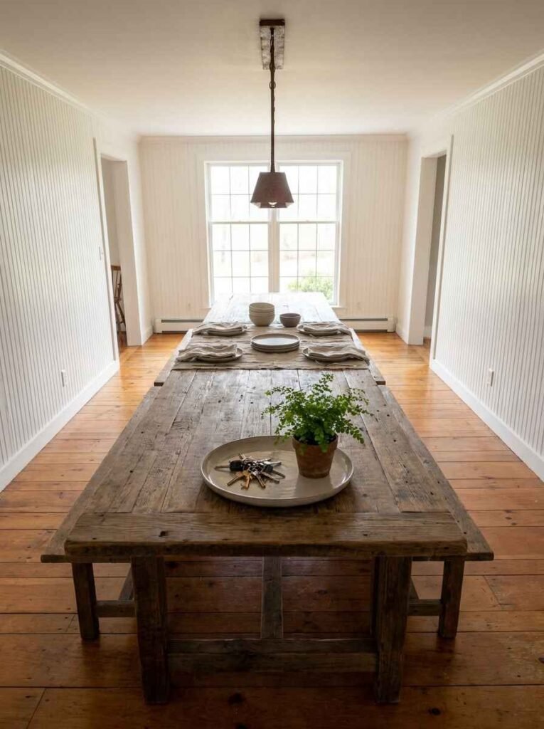
Some homes skip the separate zones entirely and simply push a long farmhouse table toward the back of an oversized entry hall. The near end functions as a drop zone for mail, bags, and odds and ends. The far end is where people sit down to eat.
It’s casual and a little unconventional. But in the right space, with good lighting and a runner down the middle, it looks completely intentional. Worth considering if your entry hall runs deep rather than wide.
Chalkboard Wall as a Functional Feature
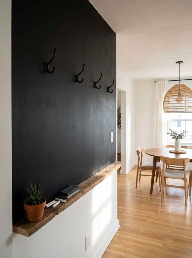
A chalkboard painted section in the entryway serves as a message board, shopping list, kids’ activity zone, and general family communication hub. It’s practical and adds personality to what can otherwise feel like a transitional, forgotten space.
Keep the chalkboard wall on the entry side only. The dining area needs a different atmosphere. The contrast between the functional, slightly chaotic entry and the calmer dining space is part of what makes the combo feel balanced.
Ceiling Height Tricks to Define Zones
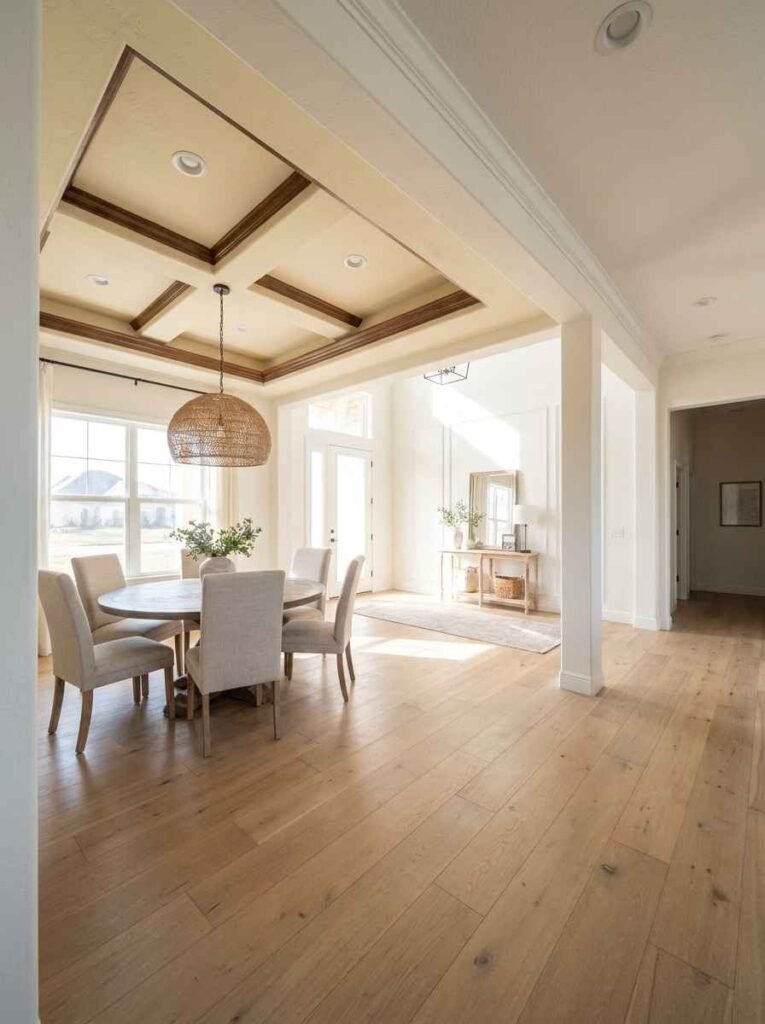
A dropped ceiling section over the dining area, even just a few inches lower with a different finish, creates a cozy, enclosed feeling for eating while the higher ceiling in the entry feels more open and airy. It’s a subtle architectural trick that high-end designers use often.
Coffered ceilings over the dining table do the same job with more visual drama. If you’re doing a full renovation, this is worth the conversation with your contractor. It changes the feel of the whole room.
Oversized Entry Mat as a Design Element
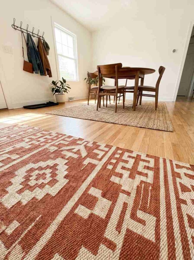
A large, patterned entry mat that extends further than expected draws a natural boundary on the floor. It tells everyone walking in exactly where the “landing zone” ends. Beyond the mat, the dining area starts.
Choose a mat that complements the dining rug rather than matching it exactly. Related but distinct. The visual relationship between the two floor coverings reinforces the zone divide without feeling forced.
Smart Storage Ottomans as Dual-Use Pieces
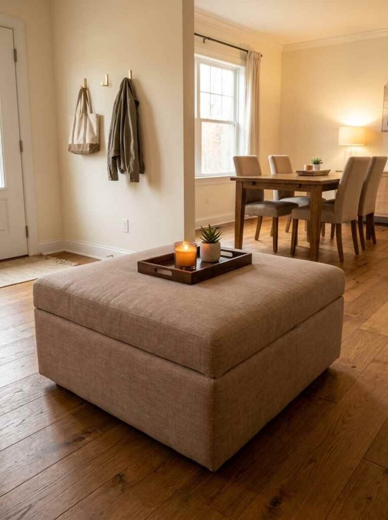
Upholstered ottomans with internal storage near the entry/dining boundary pull double duty constantly. Seating overflow when guests arrive. Storage for seasonal items, spare placemats, or kids’ stuff during the week. Extra surface for setting down grocery bags.
Get one large enough to feel substantial in the space. A tiny ottoman in a combo room looks like it got lost. You want something that anchors the transition point between the two zones.
A Gallery Wall That Spans Both Zones
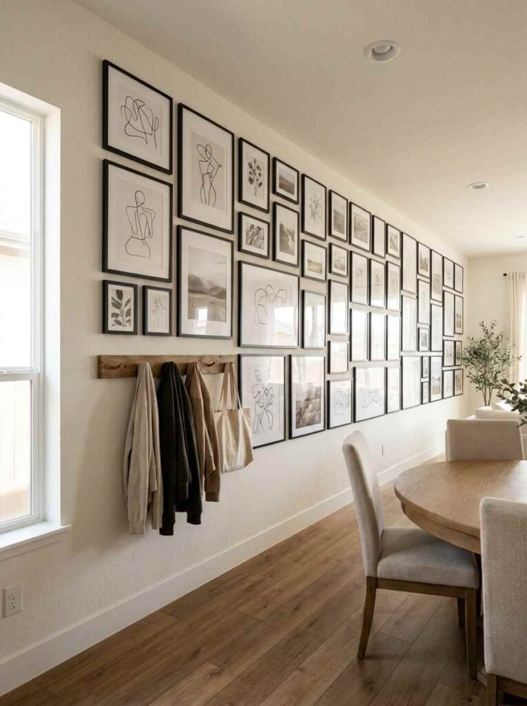
Here’s something slightly off the beaten path, but it works. A continuous gallery wall that runs from the entry through to the dining area visually connects both zones into one intentional design. The artwork creates a shared story across the two spaces.
Choose frames in a consistent finish, even if the artwork varies wildly. Cohesion in the frame style lets the subjects be eclectic without the wall looking disorganized. It’s one of those ideas where the planning pays off more than the execution.
Wrapping It Up
Getting a mud room dining room combo right comes down to one thing: treating both zones with equal design respect. Too often, people decorate the dining area beautifully and just throw hooks on the wall for the entry. The result feels half-finished.
When both zones look intentional, the combo reads as a smart design choice rather than a compromise. Every idea on this list works best when you commit to the whole concept rather than just adding a hook rail next to your dinner table and calling it done.
The resource that helped me think through a lot of these spatial ideas was the Small Homes section at Dezeen (www.dezeen.com/tag/small-homes). Genuinely useful for seeing how professionals handle limited square footage without sacrificing style.
Now I’m curious: which of these 21 ideas fits your space? Are you working with a narrow entry hall, an open-plan layout, or something in between? Drop your situation in the comments. I’d actually love to help you think it through.
Frequently Asked Questions
Can a mud room and dining room really share the same space without looking messy? Yes, genuinely. The key is deliberate zoning through flooring, lighting, or furniture placement. When both areas look designed rather than accidental, visitors rarely notice the shared footprint. The mess concern is mostly about storage quality, not proximity.
What’s the minimum square footage needed for a functional mud room dining room combo? Most designers suggest around 120 square feet for a comfortable combo that doesn’t feel cramped. You can make it work in 80 to 100 square feet with a fold-down table and minimal furniture, but every inch counts and you’ll need to be ruthless about clutter.
How do I stop the mudroom side from making the dining area feel dirty or chaotic? Closed storage is your best friend here. Lockers with doors, cabinets, or ottomans with lids keep the entry zone’s contents hidden. A clear visual boundary, whether color, flooring, or furniture, also helps the dining area feel like its own world even when the entry is temporarily chaotic.
